Adding text on image hover is one of those classic web design techniques that just works. At its core, it's a simple idea: when a user moves their cursor over an image, you reveal hidden information like a caption, a link, or even a call-to-action.
This little bit of interactivity does wonders for decluttering layouts. You can keep secondary text tucked away until it’s actually needed, which results in a much cleaner and more engaging experience for your visitors.
Why Text on Image Hover Still Matters
Let's be honest, the text-on-hover effect is a staple for a reason. When done right, it transforms a flat, static webpage into a dynamic space that delivers context exactly when a user shows interest.
It’s the difference between a portfolio that just sits there and one that invites you to explore with every mouse movement. This small detail can seriously boost engagement and guide users without burying them in text from the get-go.
At its heart, this technique is a powerful form of visual feedback, giving users instant cues about interactive elements on the page. If you want to dig deeper into the psychology behind it, this is a great read on What Is Visual Feedback.
Choosing Your Method
Before you jump into the code or the builder, you need to pick the right tool for the job. Your choice really boils down to your comfort level with code, how complex you want the effect to be, and whether you're working in Divi or a different environment.
We'll break it down into three main paths:
- Pure CSS: This is the universal approach. It’s perfect for anyone comfortable with a bit of code, offering maximum flexibility and the best performance.
- The Divi Builder: If you're a visual designer who lives in Divi, this is your sweet spot. You can create some seriously impressive hover effects using Divi’s built-in settings—no code required.
- Specialized Divi Plugins: For those moments when you need something more—like a form, a video, or other dynamic content inside your hover effect—plugins like Divi Areas Pro are the answer. They open up advanced triggering and content possibilities that go beyond the basics.
To make it even clearer, this decision tree can help you figure out which path is the best fit for your skills and project needs.
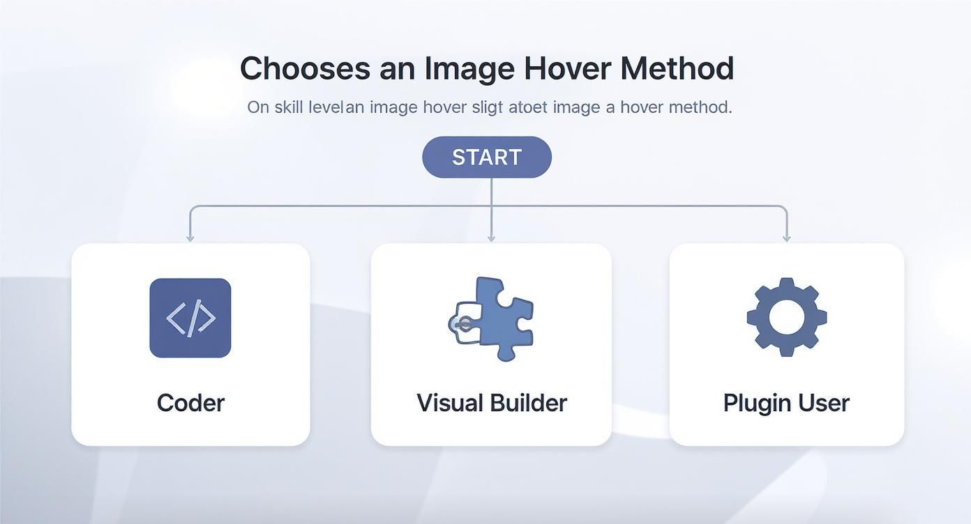
As you can see, the flowchart maps out an ideal starting point whether you're a seasoned developer or a visual builder enthusiast.
Hover Effect Methods at a Glance
To give you a quick summary, here's how the three main methods stack up against each other. This table should help you quickly decide which approach aligns best with your goals.
| Method | Best For | Technical Skill | Flexibility |
|---|---|---|---|
| Pure CSS | Universal application, performance, and custom effects. | Intermediate | High |
| Divi Builder | Quick, code-free effects directly within the Divi ecosystem. | Beginner | Medium |
| Divi Plugins | Complex interactions, dynamic content, and advanced triggers. | Beginner-Intermediate | Very High |
Ultimately, each method has its place. The pure CSS route offers unparalleled control, while the Divi Builder provides a fantastic, accessible entry point. Plugins bridge the gap for more advanced, dynamic needs without requiring deep coding knowledge.
Creating Hover Effects with Pure CSS
If you want the most flexible and lightweight way to add text over an image on hover, pure CSS is the way to go. This method gives you total control, works on any website (not just Divi), and doesn't require a single plugin. It's all about setting up your HTML correctly and then applying a few key CSS properties to bring the interaction to life.
The secret to any great CSS hover effect is a solid HTML structure. You can't just slap some text on top of an image and hope for the best. You need a container to hold both the image and the text overlay, creating a parent-child relationship that makes the magic possible.
Setting Up the HTML Structure
The standard approach is to wrap your image and the hover text inside a single container element, usually a <div>. This container becomes the anchor for positioning everything inside it.
Here’s a simple, rock-solid structure:
- A main
divwith a class like.image-container. This element gets itspositionset torelative. - An
imgtag placed right inside the container. - Another
divfor your text, with a class like.text-overlay. This one will be set toposition: absolute;.
This setup tells the browser that the .text-overlay should be positioned relative to its parent (.image-container), not the entire webpage. That's the key.
The Core CSS Properties
Once your HTML is in place, the real work begins in the CSS. Three properties are the stars of the show here: position, opacity, and transition.
- Positioning the Overlay: By setting
.text-overlaytoposition: absolute;, you can place it precisely over the image. Properties liketop: 0;,left: 0;,width: 100%;, andheight: 100%;stretch it to cover the entire container. - Hiding the Text: At first, you want the text to be invisible. The easiest way to do this is by setting the
opacityof the.text-overlayto 0. - Revealing on Hover: This is where the
:hoverpseudo-class shines. You create a CSS rule like.image-container:hover .text-overlayand set itsopacityback to 1. This tells the browser to make the text visible only when the cursor is over the main container.
The one thing that separates an amateur effect from a professional one is the
transitionproperty. Just by addingtransition: opacity 0.3s ease;to the.text-overlayclass, you create a smooth fade instead of a jarring on-off flash. It makes the entire interaction feel polished and intentional.
Example Fade-In Overlay Effect
Let's put it all together with a code snippet you can use right now. This example creates a dark overlay with centered text that smoothly fades in when you hover over the image.
Here's the HTML:

And here’s the CSS that makes it all happen:
.image-container {
position: relative;
width: 100%;
}
.text-overlay {
position: absolute;
top: 0;
left: 0;
width: 100%;
height: 100%;
background-color: rgba(0, 0, 0, 0.6);
color: white;
display: flex;
flex-direction: column;
justify-content: center;
align-items: center;
opacity: 0;
transition: opacity 0.3s ease-in-out;
}
.image-container:hover .text-overlay {
opacity: 1;
}
This is just a starting point, but the principles are universal. You could easily create a slide-in caption by swapping opacity for transform: translateY(100%); on the initial state and transform: translateY(0); on hover. If you want to explore more complex CSS animations, check out this guide on creating stunning image hover effects for some great inspiration.
For anyone using Divi, the good news is you don't need to touch a single line of code to create a slick text-on-image hover effect. The Divi Builder has some seriously powerful controls baked right in, letting you design these kinds of interactions visually. Once you get the hang of the module settings and the hover state options, you can pull off professional-looking results in just a few minutes.
The whole process boils down to a clever little trick: you set the default state of your text or overlay to be completely invisible, then make it appear only when someone's cursor hovers over the module. It's all handled right there in the Design tab.
Leveraging Divi's Hover State Options
The key to this entire workflow is the little hover icon that pops up next to tons of Divi settings. When you click it, you unlock the ability to define different styles for the "default" state and the "hover" state. This is where you'll build the entire effect.
My personal workflow usually involves either the Image Module or the Blurb Module, since both are perfect for this task. I find the Blurb module is especially handy because it already has dedicated fields for an image, a title, and body text.
Here's the typical setup I use:
- Default State: In the module's Design tab, I'll navigate to the text or overlay settings I want to hide. The goal here is to set the opacity to 0%. You'll find this under the "Overlay" settings for a color overlay, or in the respective text settings (like Title Text or Body Text) for the typography.
- Hover State: Next, I click that little cursor icon to switch over to editing the hover styles. Now, I just crank the opacity back up to 100%.
That's it. Divi handles the transition between the two states automatically, creating a nice, smooth fade effect.
A Practical Walkthrough with the Blurb Module
Let's say you're building a "Meet the Team" section. You've got headshots for everyone and you want their name and title to pop up on hover. The Blurb module is the perfect tool for this job.
First, drop a Blurb module onto your page. Add the team member's photo using the "Image & Icon" toggle. Then, pop their name into the Title field and their job title into the Body content area.
Now for the magic. Head over to the Design tab and open up the Overlay settings.
- Set "Use Icon On Hover" to NO.
- Choose an "Image Overlay Color" for your hover state. A semi-transparent dark color usually works well.
- Click the hover icon next to the overlay color option. Set the default state's color to be fully transparent, and make sure the hover state's color is set to your chosen overlay.
Next, open the Title Text settings.
- Set the default text color to be fully transparent.
- Click the hover icon next to the color and set the hover state's color to white or another color that will contrast well with your overlay.
- Do the exact same thing for the Body Text.
By adjusting the opacity and colors on the default and hover states, you create a seamless reveal. The user sees a simple image at first, but hovering brings the context to life. This is a fundamental technique for creating clean, interactive layouts in Divi.
This visual method is a fantastic entry point for designers. If you want to go deeper and learn some more advanced techniques, you can explore our complete guide on how to create stunning Divi hover effects, which covers even more module-specific tricks.
Going Pro: When You Need More Than Just Text on Hover
Divi's built-in tools are fantastic for creating a slick text on image hover effect, but you'll eventually hit a ceiling. What happens when you need to show more than just a line or two of text? What if your hover content needs a contact form, a video, or even a mini WooCommerce product gallery? This is where pure CSS and the standard Divi modules start to fall short, and it's time to bring in a more powerful tool.
When the content you want to reveal is complex, a dedicated plugin like Divi Areas Pro steps in to bridge the gap. Instead of being limited to a simple text overlay, you can design an entire layout with the Divi Builder and trigger it to appear on hover. This opens up a whole new world of interactivity.
When a Plugin Is the Right Tool for the Job
Think of it this way: Divi’s standard modules are for adding simple text to an image. A plugin like Divi Areas Pro is for revealing a fully-designed content block from an image.
Here are a few real-world scenarios where a plugin is the only practical way to get it done:
- Team Member Bios: Hovering over a headshot could reveal a detailed bio, social media icons, and a short paragraph.
- Product Previews: Show a "Quick View" button, star ratings, and a brief description for an e-commerce item.
- Portfolio Details: Unveil a project summary, a client testimonial, and a link to the full case study.
- Interactive Maps: Trigger a popup with location details when a user hovers over a specific pin on a map image.
In each of these examples, you're doing much more than adding a simple caption. You're creating a rich, functional experience that invites the user to dig deeper. Being able to embed any Divi module—or even shortcodes from other plugins—into your hover content is a massive advantage.
How Divi Areas Pro Changes the Game
The idea behind Divi Areas Pro is both simple and powerful. First, you create a piece of content called a "Divi Area" using the same Divi Builder you already know and love. This Area can be anything you can build in Divi—a single text module, a complex multi-column row, or an entire section.
Once your content is ready, you just need to assign a trigger. For what we're doing here, the magic is in the "On Hover" trigger. You simply tell the plugin which image (or button, or icon) on your page should activate this Area.
The beauty of this approach is how it separates your content from the trigger. You can design your complex hover layout in one central place, then attach it to any image on your site with a simple CSS class. This makes managing and updating your hover effects incredibly efficient.
Setting it all up is a pretty straightforward process:
- Build Your Content: Head over to Divi Areas and create a new Area. Build out your dream hover layout using the Divi Builder—think text, buttons, forms, you name it.
- Set the Trigger: In the Area's settings, find the trigger options and select "On Hover."
- Tag Your Trigger Element: Go to the page with your image. In the image module's Advanced settings, give it a unique CSS class (like
show-bio-on-hover). - Connect the Dots: Back in the Divi Area's settings, enter that exact same CSS class into the trigger field.
That's it! Now, whenever someone's cursor passes over that specific image, your custom-designed Divi Area will appear seamlessly. This method transforms a basic hover effect into a dynamic and highly functional interaction. For a deeper look at what's possible, check out this guide on Divi's hover areas and template library support.
Designing Accessible and Engaging Hover Effects
https://www.youtube.com/embed/7w__xLqlCBU
Creating a slick text on image hover effect is more than just a cool visual trick. A truly great design is one that feels responsive, intuitive, and most importantly, works for everyone, no matter how they’re browsing your site. This is where we separate the amateur attempts from professional, user-focused design.
The details really matter here, starting with the timing of your transitions. An effect that snaps into view instantly can feel jarring, while one that takes too long to appear feels sluggish and unresponsive. From my experience, the sweet spot is a transition duration between 200ms and 500ms. It's fast enough to feel snappy but slow enough for the user’s eye to register the change smoothly.
Making Hover Effects Keyboard Accessible
One of the most common oversights I see with hover effects is forgetting about keyboard-only users. People who rely on the 'Tab' key to navigate a website don’t have a mouse cursor, which makes a standard :hover state completely useless to them. This isn't just a minor inconvenience; it can make your content completely inaccessible.
Thankfully, the fix is both simple and powerful: always pair the :hover pseudo-class with its keyboard equivalent, :focus. When you do this, you ensure that anyone who tabs onto your image gets the exact same experience as someone hovering with a mouse.
Here’s how you’d combine them in your CSS:
/* This rule applies to BOTH mouse hover and keyboard focus */
.image-container:hover .text-overlay,
.image-container:focus .text-overlay {
opacity: 1;
transform: translateY(0);
}
This tiny addition makes a world of difference for inclusivity and is a cornerstone of accessible web design. As you design these effects, it’s a good idea to ensure they align with broader standards. For a deeper look, this guide on ADA compliant website requirements is a great resource.
Remember: If the information revealed on hover is critical for understanding the content, it must also be accessible via keyboard focus. This isn't just a best practice; it's a fundamental part of creating an equitable web experience.
Ensuring Readability with Color Contrast
Another critical piece of the puzzle is text readability. What good is a beautiful design if no one can actually read the text? The color of your text has to have enough contrast against the overlay or background image it sits on.
The Web Content Accessibility Guidelines (WCAG) give us clear benchmarks for this:
- AA Standard: Requires a contrast ratio of at least 4.5:1 for normal text.
- AAA Standard: A much stricter ratio of at least 7:1.
The evolution of these effects is closely tied to digital accessibility standards. The WCAG 2.1 update in 2018 specifically mandated that content appearing on mouse hover must also be accessible via keyboard focus. Today, you'll find that approximately 40% of Fortune 500 company websites use hover text effects that meet these dual standards. This is incredibly important, as nearly 15% of the world's population experiences some form of disability that can affect how they interact with the web.
Got Questions About Text on Image Hover?
Putting these hover effects into practice almost always brings up a few common questions. From wrestling with stacking order to figuring out how it all plays out on a phone, you're definitely not alone. Let's walk through some of the most frequent hurdles I see people run into.
How Do I Make This Work on Mobile Devices?
This is the big one. Touchscreens don't really "hover," so we need a tap-friendly alternative.
For pure CSS, a common workaround is to add an onclick="" attribute to your main container. This little trick can coax iOS devices, in particular, into treating the first tap like a hover event.
If you're in the Divi Builder, you have a much cleaner option: use the built-in responsive controls. Simply disable the hover effect on tablet and mobile views. This makes the text visible by default on smaller screens, ensuring no one misses out on important info. It's a simple, reliable fix.
Why Is My Hover Text Appearing Behind the Image?
Ah, a classic! If your text is hiding behind the image, you've run into a z-index issue. This CSS property is all about controlling the stacking order of elements on a page. Think of it like layers in Photoshop.
To get your text on top, you need to tell the browser how to stack the layers. Here’s the fix:
- On the parent container holding both the image and text, set
position: relative;. This creates a new "stacking context." - On your text overlay element, set
position: absolute;. - Finally, give that text overlay a higher
z-indexvalue, likez-index: 2;.
This combination explicitly tells the browser to render the text layer on top of everything else inside that container. Problem solved.
Can I Add a Link to the Text on an Image Hover?
Not only can you, but you absolutely should if it's meant to be a call to action.
The most intuitive way is to wrap the entire container—both the image and the text overlay—in a single anchor (<a>) tag. This makes the whole unit clickable. It’s what users have come to expect from an interactive element like this and provides a much larger, user-friendly target for their cursor or finger.
You could just link the text, but making the whole block clickable is a much better user experience.
Key Takeaway: For the sake of good SEO and accessibility, always make sure your image has a descriptive
alttag. Search engines can read both the alt text and the text in your hover overlay, so use relevant keywords in both places to give crawlers and screen readers the full picture.
Ready to build hover effects that go way beyond simple text? With Divimode, you can trigger complex layouts, forms, and even dynamic content on hover using Divi Areas Pro. Learn more and grab your copy of Divi Areas Pro today!
