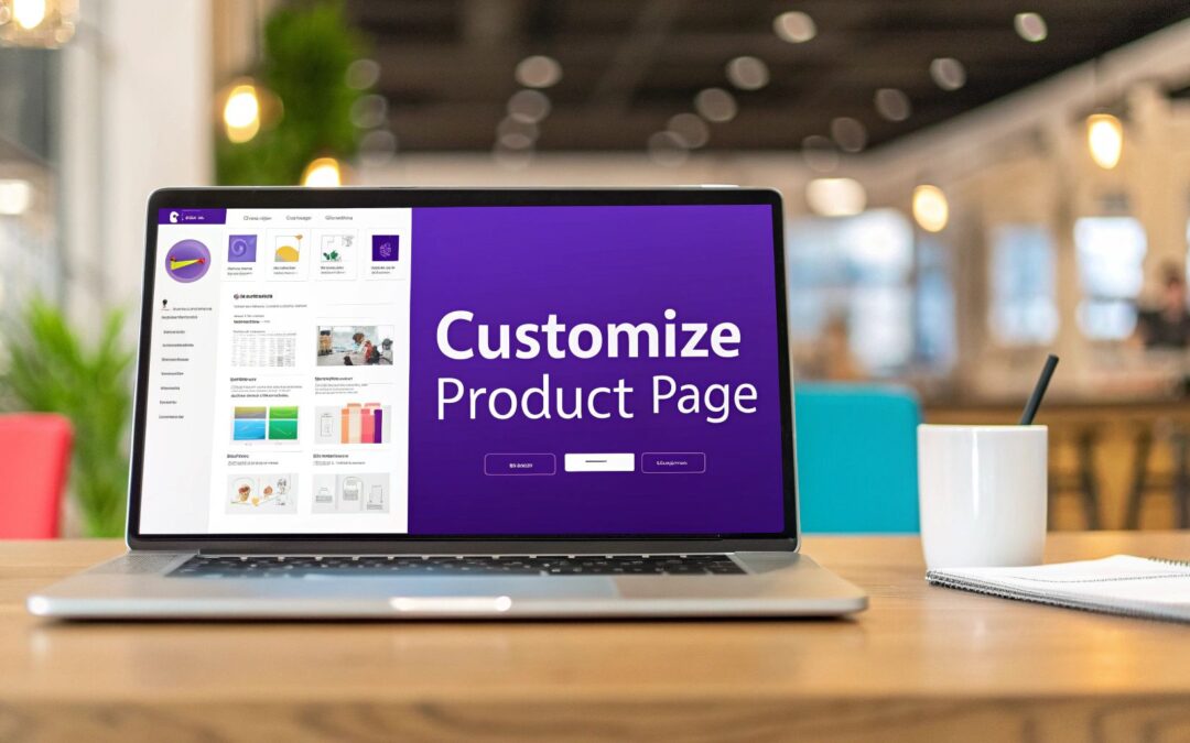
If you think a few quick tweaks are enough to modify your WooCommerce product page, you're on the right track, but the real magic happens with a full strategic overhaul. Let's be honest, a default product page isn't designed to tell your brand's unique story or smoothly guide a customer to checkout.
Why Your Default Product Page Is Costing You Sales
The standard WooCommerce product page is functional, sure. But "functional" doesn't create desire or build trust. It's a generic, one-size-fits-all framework that treats every single product and every store exactly the same. In today's competitive market, that cookie-cutter approach is a surefire way to leave money on the table. It just doesn't create a compelling buying experience.
Put yourself in your shopper's shoes for a second. They land on a page and are immediately hunting for specific info: crystal-clear pricing, high-quality images, social proof like reviews, and detailed descriptions. If any of those pieces are missing, confusing, or just plain ugly, you've created friction. And friction kills sales.
The High Cost of Missing Information
It’s not just a hunch—the data backs this up. One revealing study found that while 87% of shoppers pore over product content before buying, a staggering 98% admitted that missing or unclear information has stopped them from completing a purchase. You can dig into more data on how page content influences buying decisions yourself. This proves a generic layout isn't just uninspiring; it's actively driving customers away.
A simple visual can really highlight how small modifications can give you a significant lift compared to the default setup.
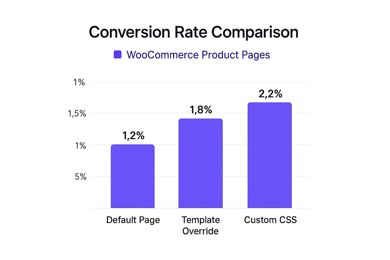
As you can see, the further you move from the default layout, the better the performance. Custom CSS, for example, delivers the highest lift by far.
To put this into perspective, let's compare the out-of-the-box experience with what's possible when you take control.
Default vs. Customized Product Page Features
| Feature Area | Default WooCommerce Functionality | Potential Customization | Impact on Sales |
|---|---|---|---|
| Product Gallery | Basic grid or single-column layout. | Video embeds, 360° views, lifestyle shots, user-generated content. | Increases Engagement: Helps shoppers visualize the product in their own lives. |
| Call-to-Action | Standard "Add to Cart" button. | Sticky buttons, custom button text, micro-animations, trust badges nearby. | Boosts Conversions: A prominent, trustworthy CTA reduces hesitation. |
| Social Proof | Basic star ratings and text reviews. | Photo/video reviews, Q&A sections, featured testimonials. | Builds Trust: Authentic customer feedback is more persuasive than any ad copy. |
| Product Info | Single block for the long description. | Tabbed layouts, accordions for specs, feature icons, size guides. | Improves Clarity: Makes complex information easy to digest and scan. |
| Upsells/Cross-sells | Simple "You may also like…" grid. | Bundles ("Complete the look"), frequently bought together sections, one-click upsells. | Increases AOV: Makes it easy for customers to add more relevant items to their cart. |
Ultimately, a custom product page allows you to guide the narrative and address potential customer concerns head-on, which is something a default template can never do effectively.
Seizing the Conversion Opportunity
Every single element on your product page is an opportunity. Instead of a standard gallery, why not implement a dynamic carousel that includes lifestyle photos and even a short video? Instead of a plain "Add to Cart" button, you could create a call-to-action that truly pops with custom styling and subtle micro-interactions.
The goal is to transform your page from a simple product listing into a persuasive sales tool. A well-designed page answers questions before they're asked, builds confidence, and makes the path to purchase feel effortless.
When you take full control of your page layout, you can strategically place trust signals—like customer testimonials, security badges, and clear shipping information—right where users need them most. This kind of targeted design reduces hesitation and directly boosts your bottom line.
Foundational Tweaks with Hooks and Template Files

Before you even think about firing up a visual builder, it’s worth getting to know the engine running under the hood. For those comfortable with a little bit of code, WooCommerce hooks and template files give you surgical precision to modify your WooCommerce product page in ways plugins and builders just can't touch.
This approach gives you the ultimate say over both the function and layout of your product pages. Think of it as the difference between rearranging the furniture in a room and actually moving the walls.
First things first, though: you absolutely must set up a child theme. This is non-negotiable. It creates a safe sandbox for all your custom code, making sure your hard work doesn’t vanish the next time your theme gets an update.
Harnessing the Power of WooCommerce Hooks
Hooks are basically designated connection points scattered throughout the WooCommerce code. They let you "hook" your own functions into the product page's rendering process without ever touching the core files. You'll mainly work with two types:
- Actions: These let you add new content or features. You could use an action hook to display a "Free Shipping Over $50" banner right under the product price.
- Filters: These let you modify existing data. A filter could change the standard "Add to Cart" button text to something more compelling, like "Get It Now."
Using hooks allows you to make very specific, targeted adjustments. For example, the woocommerce_single_product_summary action hook is a goldmine for injecting content around the main product details. With just a few lines of PHP in your child theme's functions.php file, you can add trust badges, size chart links, or custom fields.
Using hooks is about working with WooCommerce, not against it. It's a clean, upgrade-safe method that keeps your site stable and your customizations modular.
When to Override Template Files
Sometimes, a hook just won't cut it. If you need to fundamentally restructure an entire section of the product page—like completely overhauling the product tabs or changing the HTML of the image gallery—you'll need to override a template file.
The process is surprisingly straightforward:
- Find the original template file inside the WooCommerce plugin directory (e.g.,
/plugins/woocommerce/templates/). - Copy that file into a matching folder structure within your child theme (e.g.,
/themes/your-child-theme/woocommerce/). - Now, you can safely edit the copied file in your child theme. WooCommerce is smart enough to use your version instead of the default.
A classic example is editing content-single-product.php. This file is the master blueprint for the entire product information layout. By tweaking this file, you can completely reorder core elements like the title, price, and add-to-cart button, giving you total structural control. It's the most powerful way to customize a product page, but it demands a careful hand. Always test your changes on a staging site first
Visually Building Your Product Page with Divi
If grappling with hooks and template files sounds more like a headache than a solution, you're not alone. For many of us, the goal is to modify the WooCommerce product page without ever touching a line of code. This is exactly where the Divi Theme Builder steps in, turning what used to be a technical task into a creative, visual process.
Using Divi, you can build a custom product page template from the ground up with its drag-and-drop interface. Instead of being locked into your theme’s default layout, you get complete control over every element, from the product gallery to the "Add to Cart" button.
Getting Started with a New Product Template
Your first move is to jump into the Divi Theme Builder in your WordPress dashboard. Here, you'll create a new template and assign it to "All Products." Or, you can get more specific and assign it to certain product categories if you want different layouts for different types of items.
I’ve seen this work really well for clothing stores, for example. They might have one template with a prominent size guide for apparel but a completely different, more technical layout for accessories.
Once your template is set up, you'll build out the body using Divi's dedicated Woo Modules. These are special Divi modules designed to pull in dynamic product information automatically, so you're not building a static page.
Here’s a quick look at the visual power you get with Divi for crafting these layouts.

This screenshot gives you a great sense of the clean, intuitive interface. You can drag, drop, and style every component of your product page in real-time.
Structuring Your Page with Woo Modules
Remember, you're building a dynamic blueprint, not a static page. So, you aren't just adding an image; you're adding the Woo Images module, which will automatically display the correct product gallery for whichever product is being viewed. This is the core concept that makes the Theme Builder so powerful.
A few of the essential modules you'll probably use are:
- Woo Breadcrumb: Helps users with navigation, showing them where they are in your store's hierarchy.
- Woo Images: Displays the product's main image and gallery thumbnails.
- Woo Title: Pulls in the product's name.
- Woo Price: Shows the current price, including any sale pricing.
- Woo Add to Cart: The all-important button, which you can style extensively.
- Woo Tabs: Organizes the long description, additional information, and reviews into a clean, tabbed interface.
The real magic of the Divi Theme Builder isn't just placing these elements—it's styling them. You have granular control over fonts, colors, spacing, borders, and animations for every single module.
For instance, you can make your Woo Add to Cart button larger and change its color on hover to really grab attention. I often add an icon for extra visual appeal. A well-designed call-to-action can have a noticeable impact on conversion rates.
Similarly, you can customize the typography of the Woo Price module to make sale prices pop in a bold, eye-catching color.
This visual approach empowers you to design a page that not only aligns perfectly with your brand but is also strategically structured to guide customers toward making a purchase. You can experiment with layouts, A/B test different button styles, and refine your design until it's a high-performing sales machine—all without writing a single line of code.
Taking Your Design to the Next Level with Divi Extensions
While the Divi Theme Builder gives you a fantastic foundation for your WooCommerce product pages, you'll eventually hit a ceiling. Sometimes, you just need features that go beyond what the standard Woo Modules can offer. This is where third-party Divi extensions come into play, acting like power-ups that unlock truly advanced functionality and interactive elements.
Think of it this way: Divi provides the architectural blueprints, but extensions give you the specialized tools to add the custom wiring and smart features. These plugins are built to solve specific conversion problems that the default modules simply aren't designed to handle.
Beyond Standard Divi Modules
Sure, Divi's standard modules for titles, images, and pricing are essential. But what about a highly stylized, filterable product carousel? Or a system for injecting targeted banners based on user behavior? Divi doesn't have an out-of-the-box solution for that. Extensions fill these gaps perfectly.
Let's say you want to replace the default "Related Products" grid with something far more engaging. A specialized carousel extension could let you:
- Customize the layout with granular control over columns, spacing, and navigation arrows.
- Add slick hover effects that reveal a quick-view modal or a second product image.
- Boost performance by lazy-loading the images inside the carousel.
These small tweaks can transform a static grid into an interactive discovery tool, encouraging shoppers to browse more products and bumping up your average order value.
Injecting Dynamic Content with Conditional Logic
One of the most powerful ways to use an extension is to add conditional logic to your product page templates. This is where a static page becomes a dynamic, responsive sales tool that adapts to each customer. It's a core strength of plugins like Divi Areas Pro.
Imagine you sell apparel. With a tool like this, you could set up a rule that automatically injects a "T-Shirt Size Guide" banner only on products within the 'T-Shirts' category. Or, you could display a "Limited Time Offer" popup that triggers only when a user is about to leave the page for a product that's on sale.
This isn't just about aesthetics; it's about delivering the right information to the right person at exactly the right moment. This level of personalization directly answers customer questions and overcomes objections, smoothing the path to checkout.
The ability to create and inject this kind of targeted content is what separates a good e-commerce experience from a great one. It’s the same principle you'd apply to streamlining the entire buying journey. In fact, many of these strategies can be adapted when you learn how to customize the checkout page in WooCommerce, ensuring a consistent, high-converting experience from the moment a customer lands on your site to the final click.
By using the right extensions, you're not just designing a page—you're building a smarter, more intuitive shopping experience that actively works to increase your sales.
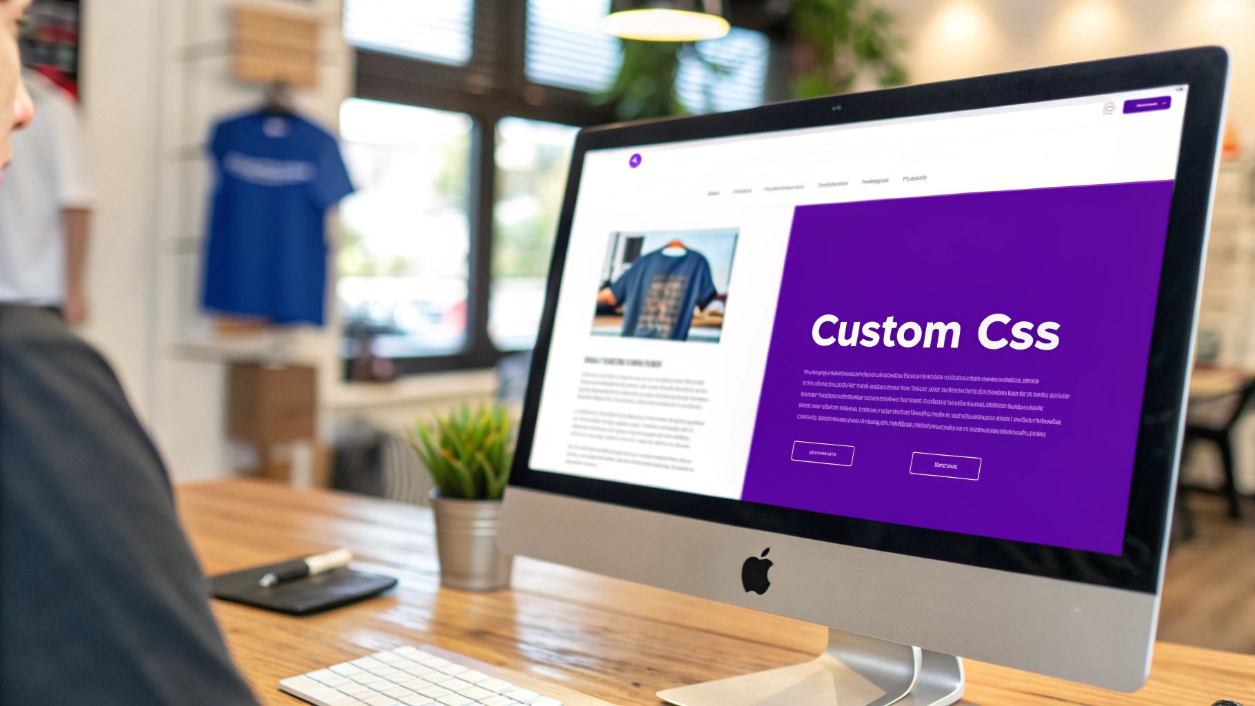
Adding Polished Finishing Touches with Custom CSS
Even with a powerhouse like the Divi Theme Builder, you'll eventually run into small details that just don't quite match your brand's vision. A button might be a few pixels off, or a default color clashes with your palette. This is exactly where custom CSS comes into play. Think of it as the final layer of polish that elevates your design from great to perfect.
With just a few lines of CSS, you can modify your WooCommerce product page in ways a visual builder might not easily allow. Maybe you want to change that bright red "Sale!" badge to your brand's signature color. Or perhaps you need to refine the typography in your product tabs for better readability. These are the small, deliberate touches that create a cohesive and professional user experience.
Mastering the Browser Inspect Tool
If there's one skill you need for CSS customization, it's learning to use your browser's "Inspect" tool. It's a game-changer. Just right-click on any element on your page—like the product title or the "Add to Cart" button—and select "Inspect."
This opens up a developer panel that shows you the page's HTML structure and, more importantly, the CSS rules currently applied to that specific element. This tool is your treasure map. It reveals the exact class or ID you need to target with your own CSS. Once you have that selector, you can write a new rule to override the existing styles.
Don't let the code in the Inspect tool intimidate you. You don't need to understand every line. Your goal is simply to find the name of the element you want to change. It gives you the power to style virtually anything on the page with absolute precision.
You have a few safe spots to add your custom CSS:
- The Additional CSS section in the WordPress Customizer.
- The Custom CSS box within Divi's Theme Options.
- Your child theme's
style.cssfile (this is the best practice for larger, more complex customizations).
Practical CSS Snippets for Common Tweaks
To get you started, here are a few copy-and-paste snippets I use all the time for common product page tweaks. Just remember to swap out placeholder values like color codes (#ff6600) and font sizes with your own.
Customize the Sale Badge
.woocommerce span.onsale {
background-color: #ff6600 !important;
color: #ffffff !important;
}
This snippet targets the default WooCommerce sale badge and lets you set a new background and text color, ensuring it fits your branding perfectly.
Refine Product Tab Fonts
.woocommerce-tabs .tabs li a {
font-size: 16px;
font-weight: 600;
}
If the default tab text feels a bit generic or hard to read, this CSS allows you to bump up its size and weight for better legibility and style.
Add a Subtle Image Hover Effect
.woocommerce-product-gallery__image:hover {
opacity: 0.8;
transition: opacity 0.3s ease-in-out;
}
This is a simple rule that adds a nice, professional touch. It slightly fades the product image when a user hovers over it, creating a subtle interactive feel. Armed with these fundamentals, you're ready to tackle any styling change you can imagine.
Frequently Asked Questions About WooCommerce Customization
When you start digging into customizing your WooCommerce product pages, a few questions almost always pop up. I’ve heard them time and time again from store owners. Getting these sorted out early on can save you a world of hurt and help you pick the right path for your shop.
Let’s get right into the big ones.
Will All These Customizations Slow Down My Website?
This is easily the number one concern, and for good reason. The short answer is: not if you’re smart about it.
A well-coded tool like the Divi Theme Builder is your best friend here. The real performance killers aren't the customizations themselves, but things like poorly written plugins or massive, uncompressed images. If you optimize your images and stick to quality tools, you'll be fine. In fact, a strategic redesign can dramatically improve the user experience, which is often worth more than a few milliseconds of load time.
Can I Create Different Layouts for Different Product Categories?
Absolutely, and you really should. This is where using the Divi Theme Builder pays off big time. You can design unique product page templates and then assign them to specific product categories, tags, or even individual products.
Imagine a clothing store. They could have a template for shirts that puts a size guide front and center, while the template for accessories focuses more on high-resolution image galleries and details about materials. It's all about making the layout serve the product, not the other way around. This kind of targeted design can have a huge impact on sales, which we cover in our guide to optimizing your ecommerce website.
What Is the Safest Way to Add Custom Code?
This is a critical one. If you’re getting into PHP modifications—like using hooks or adding custom functions—the golden rule is to always use a child theme. A child theme acts as a protective layer, so when you update your parent theme, all your hard work doesn’t get wiped out. It's a non-negotiable for serious customization.
When it comes to CSS, you’ve got a couple of solid options:
- For theme-specific styles, the Divi Theme Options > Custom CSS box is quick and easy.
- For more significant changes, adding them to your child theme’s
style.cssfile is the way to go.
Whatever you do, never, ever edit the core theme files directly. It might seem like a quick fix, but it's a surefire way to create massive headaches for yourself later on.
Let's be real: not everyone needs to be a developer. While hooks and template overrides offer incredible control, visual builders like Divi were made specifically for people who don't live and breathe code. They give anyone the power to build something professional.
This accessibility is a huge reason why WooCommerce has exploded in popularity. As of early 2025, it powers over 6 million active stores across the globe, and retention rates have climbed to 92% for stores that stay active past their first year. The platform's flexibility is what makes it work for hardcore developers and DIY business owners alike.
Ready to unlock what your Divi product pages can really do? With Divimode, you can build advanced popups, dynamic content areas, and high-converting product layouts without ever touching a line of code. Start building smarter with Divi Areas Pro today!
More Articles You Will Like