That abandoned cart notification pinging your inbox is more than just a missed opportunity—it's a direct hit to your bottom line. The real secret to reducing shopping cart abandonment isn't some complicated marketing trick; it's about finding and fixing the little moments of friction in your checkout, from surprise shipping costs to a clunky form.
This guide will walk you through turning those almost-sales into real, completed orders.
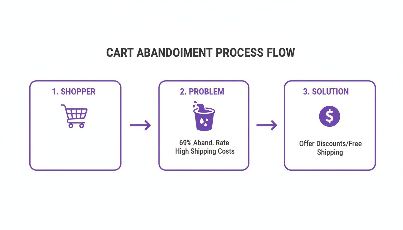
The Hidden Costs of an Abandoned Cart
Every abandoned cart starts with an interested customer, someone who liked your products enough to add them to their basket but hit a wall before checking out. This isn't just a minor hiccup; it's a serious leak that quietly drains your store's profitability. To plug that leak, you first have to understand just how big it is.
When a shopper walks away, you don't just lose the sale. You also lose every dollar you spent getting them there—whether it was on ads, content, or social media. That entire investment vanishes the second they abandon their cart.
Understanding the Financial Impact
The numbers here are genuinely eye-watering. Globally, almost 7 out of every 10 shopping carts are left behind before the purchase is complete. That adds up to trillions of dollars in merchandise abandoned annually, with e-commerce stores losing hundreds of billions in sales they could have recovered.
This isn't just a problem for the big players; it hits Divi and WooCommerce store owners hard. For a smaller business, even a small improvement in this rate can translate into a significant bump in monthly revenue.
An abandoned cart isn't a 'no.' It's a 'not right now.' Your job is to figure out what went wrong in that moment and provide a clear, compelling reason for the customer to return and complete their purchase.
Why Shoppers Really Leave
To really learn how to reduce shopping cart abandonment, you have to get inside your customer's head and understand the "why." People don't abandon their carts for no reason. It's usually a specific point of friction that creates doubt, frustration, or sticker shock.
Here are the usual suspects I see time and time again:
- Surprise Costs: This is the big one. High shipping fees, taxes, and other charges that only pop up at the very end are the #1 reason people leave.
- Forced Account Creation: Nobody wants to create yet another account just to buy something. Forcing them to register instead of offering a guest checkout is a guaranteed way to lose sales.
- Complex Checkout Process: Too many steps, too many fields, or a confusing layout will kill a buyer's motivation in a heartbeat.
- Security Concerns: If your checkout page looks unprofessional or doesn't have obvious trust signals (like SSL badges and payment logos), shoppers will get nervous about entering their credit card details.
Tackling these core issues is the first step to plugging the leaks in your sales funnel. For a deeper dive into practical strategies, I highly recommend this comprehensive guide on reducing shopping cart abandonment. The next sections will give you actionable steps you can put into practice right away.
Finding the Leaks in Your Sales Funnel
Before you can slash your cart abandonment rate, you need to put on your detective hat. The first job is to figure out exactly where and why shoppers are bouncing. Just knowing your abandonment percentage isn't enough; you've got to find the specific leaks in your sales funnel to have any hope of plugging them.
This diagnostic phase is all about pairing the "what" with the "why." Analytics will tell you what page they left from, but user behavior tools will show you why they got frustrated and clicked away.
Starting With the Numbers in Google Analytics
Your investigation kicks off with hard data. Tools like Google Analytics 4 (GA4) are non-negotiable for mapping out your customer's journey and spotting the biggest drop-off points. You can build a funnel exploration report that visually tracks how people move from a product page, to the cart, and through each step of your checkout.
Think of it like this: you identify a problem, which lets you implement a solution that ultimately recovers lost sales.
By setting up a proper funnel, you’ll immediately see which stage is bleeding the most customers. Is it the moment they hit the cart page? Or maybe it’s when they're asked for shipping details? That data gives you a clear bullseye for where to focus your energy first.
Uncovering the "Why" With User Behavior Tools
Numbers only paint half the picture. To really get what’s going on, you need to see your store through your customers' eyes. This is where tools like Hotjar or Microsoft Clarity become absolute game-changers.
These platforms give you a window into the human behavior behind the clicks:
- Session Recordings: Watch anonymized videos of real user sessions. You’ll see exactly where their mouse hesitates, where they rage-click in frustration, or when they hit a bug you never even knew existed.
- Heatmaps: See a visual breakdown of where people are clicking, scrolling, and moving their cursors. A heatmap might show you that a critical button is being completely ignored or that people are trying to click on something that isn't even a link.
I’m convinced that watching session recordings is one of the most humbling—and insightful—things a store owner can do. You’ll find out pretty quickly that the checkout flow you thought was perfectly intuitive is actually confusing the heck out of real people.
For example, a recording might show a user trying to apply a coupon code over and over, watching it fail, and then leaving in a huff. Analytics just marks that as an "exit." The recording shows you the exact reason you lost the sale.
Auditing Your Checkout Process
Once you have both your quantitative and qualitative data, it's time to run a full audit on your checkout experience. Go through the entire process yourself, on both desktop and mobile, and pretend you're a brand-new customer. Be brutally honest about any friction points.
Ask yourself these questions:
- Are shipping costs and taxes shown upfront? Surprise fees are the #1 reason for abandonment. Be transparent from the very beginning.
- Is guest checkout obvious? Forcing account creation is a massive conversion killer for over 25% of shoppers. Don't do it.
- How many form fields am I forcing them to fill out? Every single extra field increases the odds they'll just give up.
- How fast does the page load? A slow checkout, especially on a phone, feels clunky and untrustworthy.
Answering these honestly will point you straight to the low-hanging fruit. If you want to go deeper, our conversion rate optimization checklist provides a structured way to audit every piece of your sales funnel. Nailing these fundamentals is the most reliable way to start chipping away at that abandonment rate.
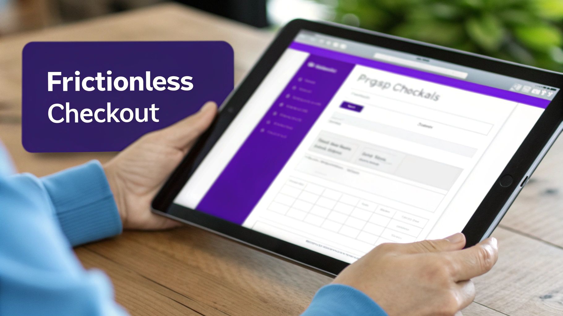
Creating a Frictionless WooCommerce Checkout Experience
Now that we’ve found the leaks, it’s time to pave over the potholes in your checkout process. Think about it: a smooth, transparent, and surprisingly fast checkout doesn't just feel professional—it directly turns hesitant shoppers into happy customers.
Friction, in any form, is the enemy here.
Every extra click, confusing field, or unexpected surprise is a tiny seed of doubt planted in your customer's mind. It's a reason to second-guess the purchase. Our goal is to make buying from you feel easier than leaving. Research consistently shows that a complicated or long checkout is why over 20% of potential buyers just give up. Let's get rid of those barriers for good.
To really nail this, you need to understand why people leave. Let's break down the biggest offenders and how you can tackle them directly in Divi and WooCommerce.
Top Reasons for Cart Abandonment and Corresponding Solutions
| Abandonment Reason | Divi/WooCommerce Solution | Example Tactic |
|---|---|---|
| Unexpected Costs (shipping, taxes) | Display all costs upfront | Add a shipping calculator to the cart page or display a "free shipping over $X" banner. |
| Forced Account Creation | Enable guest checkout | Make the "Checkout as a Guest" button the most prominent option on the page. |
| Long/Complex Forms | Streamline and simplify checkout fields | Use address auto-completion and remove non-essential fields like "Company Name" or "Apartment." |
| Limited Payment Options | Offer multiple payment gateways | Integrate Apple Pay, Google Pay, and a Buy Now, Pay Later service like Afterpay or Klarna. |
| Security Concerns | Add trust signals and SSL certificate | Prominently display trust badges (Norton, McAfee) and ensure your site has a valid SSL certificate. |
| Slow Site Performance | Optimize page speed | Use a caching plugin (like WP Rocket), compress images, and choose high-quality hosting. |
By addressing these common pain points directly, you're not just improving the user experience—you're plugging the biggest holes in your sales funnel.
Eliminate Surprises with Upfront Costs
The absolute number one reason for cart abandonment is sticker shock. Unexpected shipping fees and taxes that only appear on the final step feel like a bait-and-switch, and it’s a massive breach of trust.
Be transparent from the get-go. A great tactic is to include a shipping calculator right on the cart page. This empowers customers to see their all-in cost before they even start the formal checkout process, which builds confidence and manages expectations perfectly.
To Guest Checkout or Not to Guest Checkout
Forcing users to create an account before they can buy is a monumental conversion killer. If you require registration, you can expect to lose more than a quarter of your shoppers right there.
The solution is incredibly simple: always offer a guest checkout option.
Make it the most obvious, easiest path forward. You can still gently offer the option to create an account after the purchase is complete, maybe by letting them save their details with a single click. This gives you the best of both worlds—a frictionless sale and a potential new account holder.
A seamless checkout is an invisible one. The customer should feel like they are gliding toward their purchase, not climbing a mountain of forms and required fields. Every optimization you make is a step in that direction.
Streamline Your Checkout Forms
A long, intimidating checkout form is another major source of friction. Every single field you ask a customer to fill out is a tiny hurdle. Your job is to remove as many of them as possible.
Here are a few quick wins for simplifying your forms:
- Use Address Autocompletion: Integrating a tool that suggests addresses as the user types is a game-changer. It doesn't just speed things up; it also cuts down on shipping errors from typos.
- Hide Optional Fields: Use a single checkbox for "Shipping address is the same as billing." Never make users type the same information twice.
- Smart Field Layout: Stick to a single-column layout. It’s generally much easier to scan and complete on both desktop and mobile. Keep it clean and logical.
For Divi users, customizing the default WooCommerce checkout page can feel a bit restrictive. But with the right plugin, you can get total control. For those who want to learn how to customize the checkout page in WooCommerce with Divi, there are powerful tools that let you redesign the entire layout, remove unnecessary fields, and create a truly bespoke experience.
Offer Modern Payment Options
Today’s customers expect choice and convenience at the payment stage. Just offering a credit card field and PayPal isn't always going to cut it. A lack of their preferred payment method can be a deal-breaker for a big chunk of your audience.
Integrating digital wallets like Apple Pay and Google Pay is non-negotiable. They enable one-click payments by automatically pulling saved shipping and billing info. This is especially critical for mobile shoppers, where typing in credit card numbers is a major pain point and a huge cause of abandonment. Services like Klarna or Afterpay (Buy Now, Pay Later) are also fantastic for converting shoppers making larger purchases.
The more you can do to remove hesitation, the better. To make the shopping process truly seamless, consider integrating a virtual dressing room feature that allows customers to confidently preview items, reducing one more layer of uncertainty before they even reach the checkout. By creating an effortless path from "add to cart" to "purchase complete," you directly address the core reasons shoppers leave and build a checkout experience that actively works to close sales.
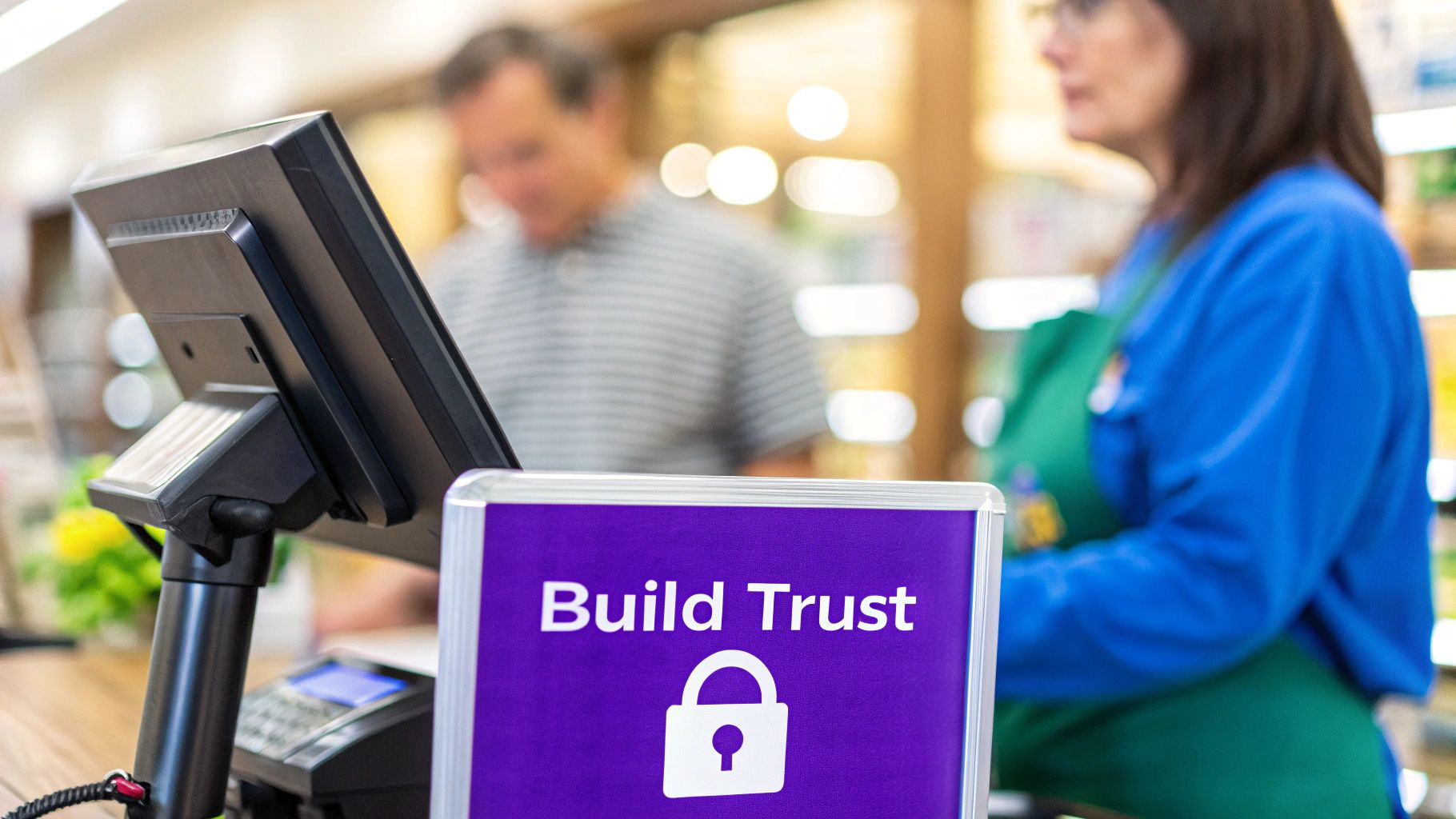
Building Unshakeable Trust at Checkout
When a customer lands on your checkout page, they’re just a click away from a sale. This is the moment of truth where trust is everything. The slightest hint of insecurity, a whiff of unprofessionalism, or any confusing detail can send them scrambling, leaving another abandoned cart behind.
Building that unshakeable trust isn't about some grand, sweeping gesture. It's all in the details—the small things that make a buyer feel secure and confident in their decision.
Think of your checkout page as the final handshake in a deal. A weak, hesitant handshake leaves you feeling uneasy. A firm, confident one seals it. The reality is, a huge chunk of shoppers—around 25% according to some studies—bail on their purchase because of security concerns. Your job is to make that digital handshake as firm and reassuring as possible.
Displaying Essential Trust Signals
The first line of defense is visual reassurance. Over the years, online shoppers have been conditioned to look for specific cues that signal a website is safe. If those cues are missing, their internal alarm bells start ringing.
You need to make these trust signals obvious without cluttering up the page. Here’s what’s absolutely non-negotiable:
- SSL Certificate: That little padlock icon in the browser's address bar is the most basic, yet powerful, trust signal. Make sure your entire site, especially the checkout process, is running on HTTPS.
- Payment Provider Logos: Showing the logos of trusted names like Visa, Mastercard, PayPal, and Apple Pay lends you their credibility. It immediately tells shoppers you’re partnered with legitimate, secure payment processors.
- Security Badges: Logos from security firms like Norton or McAfee might feel a bit old-school, but they can still provide a lot of comfort to less tech-savvy customers who need that extra confirmation that their data is safe.
If you’re using Divi, it’s incredibly easy to add these logos. Just drop in an Image module or a Blurb module and place them near your payment fields or in the checkout page footer. That’s where people instinctively look when they need that last bit of reassurance.
Leveraging the Power of Social Proof
Beyond the technical stuff, shoppers need to trust you and your business. This is where social proof becomes your secret weapon. Seeing that other people have already bought from you—and had a great experience—is often the final nudge a hesitant buyer needs.
Don't just sprinkle testimonials across your site randomly. Place them strategically where they’ll have the most impact. A short, punchy review right on the checkout page can work wonders.
Think about adding a simple quote like, "Fast shipping and the product was exactly as described! I'll be back for more." When placed discreetly in the checkout sidebar, it breaks the buyer’s anxiety and reminds them of the positive outcome waiting on the other side of that "Complete Purchase" button.
For Divi users, the built-in Testimonial module is perfect for this. You can style it to blend seamlessly with your checkout design and even add a real customer's photo for an extra layer of authenticity. It’s a simple tweak that answers that nagging subconscious question: "Can I really trust this store?"
Making Policies Clear and Accessible
Nothing screams "scam" like hidden or confusing policies. Your customers want to know what happens if something goes wrong. If they have to go on a scavenger hunt to find your return policy or shipping details, they’re going to assume the worst and bolt.
Make your key policies impossible to miss. Link to them directly from your checkout page.
- Return Policy: Is it 30 days? Is return shipping on you? Spell it out.
- Shipping Information: Give them clear estimates for delivery times. No surprises.
- Contact Information: A visible phone number or a clear link to a contact page shows you're a real business run by real people who aren't afraid to talk to their customers.
This kind of transparency isn't just about reducing anxiety; it's about actively building confidence.
It's also worth remembering that trust issues vary by region. Cart abandonment rates are wildly different around the world, often peaking in areas where online trust is a bigger cultural concern. For instance, rates in the Middle East and Africa can hit 93 percent, with Asia-Pacific and Latin America not far behind at 87 percent. These numbers are often tied to concerns about payment security and shipping reliability—problems you can solve with clear policies and visible trust signals.
You can discover more insights about these global e-commerce trends to fine-tune your approach. By building a checkout experience founded on transparency and security, you address these universal fears head-on and show every customer that their purchase is safe with you.
Recovering Lost Sales with Strategic Popups
Optimizing your checkout is a solid defensive play, but what about going on offense? Proactive interventions—when timed perfectly—can stop an abandoning user in their tracks and gently guide them back to finishing their purchase. This is where smart popups and fly-ins become a game-changer, turning a nearly lost sale into a win.
The key is to be helpful, not disruptive. We’re not talking about those obnoxious, full-screen ads that kill the user experience. Instead, we'll use a tool like Divi Areas Pro to create targeted interventions that feel less like an ad and more like a helpful store associate stepping in at just the right moment.
These popups are designed to address the final points of hesitation that even the most streamlined checkout can’t solve on its own. They provide that last compelling reason for the user to stay and finish what they started.
Using Exit-Intent to Make a Last-Minute Offer
The classic, and for good reason, most effective intervention is the exit-intent popup. This trigger detects when a user’s cursor moves toward the top of the browser window—a dead giveaway they’re about to close the tab or bounce. It’s your last chance to make your case.
On a checkout page, this is the perfect moment to slide in a compelling, time-sensitive offer. You're not just throwing a random discount at them; you're directly addressing their final hesitation, which, let's be honest, is often about the price.
Here’s a peek at the kind of display and trigger settings you can dial in with a tool like Divi Areas Pro.
As you can see, you get incredibly granular control over when and how your popup appears, ensuring it's a helpful nudge, not an annoying interruption.
A go-to strategy I've used with great success is a simple popup that offers 10% off or free shipping. The copy is everything here. Something direct like, "Wait! Complete your order now and get free shipping on us," can be incredibly effective.
The goal of an exit-intent popup isn't to be pushy. It's to acknowledge the user's hesitation and provide an immediate, valuable solution. When done right, it feels less like an ad and more like a helpful hand.
With Divi Areas Pro, this is a breeze to set up. You just configure the "Area" to:
- Trigger: On Exit Intent.
- Display As: A Popup or Lightbox.
- Condition: Only show on the "Checkout" page.
This precise targeting ensures your offer only appears at that critical moment, maximizing its impact without bugging users who are just browsing. Our guide to transforming abandoned carts into sales dives deeper into these kinds of effective popup strategies.
Answering Questions with On-Page Triggers
Sometimes, abandonment isn’t about price—it’s about uncertainty. A user might be hesitating because they have a nagging question about shipping times, your return policy, or product sizing. If the answer isn't right there in front of them, they're gone.
You can tackle this head-on by using on-page triggers, like scroll depth or a time delay, to display a helpful fly-in. For instance, if a user has been hanging out on the checkout page for more than 30 seconds without doing anything, it’s a good sign they might be stuck.
This is the perfect opportunity to trigger a subtle fly-in from the bottom corner of the screen with a message like:
- "Have questions? We offer a 30-day money-back guarantee!"
- "Need help? Chat with us live."
- "Standard shipping usually takes 3-5 business days."
This simple move turns a static page into a dynamic, helpful environment. It anticipates the user's needs and provides answers before they even have to ask, effectively dismantling their reasons for leaving.
Tackling High Mobile Abandonment Rates
The battle against cart abandonment is often won or lost on a tiny screen. Mobile is a huge challenge, with shoppers abandoning carts at rates between 75.5 percent to 85.65 percent. That’s consistently about 10 percentage points higher than on desktop.
Typing on a small screen is a pain, and security concerns can feel more pronounced. This is where device-specific targeting is an absolute must. Using Divi Areas Pro, you can create popups that are shown exclusively to mobile users.
For example, you could set up a mobile-only exit-intent popup that offers a slightly more aggressive discount or highlights the security of your checkout with trust badges. Since mobile abandonment is a bigger problem, a more direct intervention is often warranted.
Another smart tactic is to use a fly-in to remind mobile users they can save their cart and complete the purchase on their desktop later—capturing their email in the process.
By combining intelligent triggers with specific conditions like page and device targeting, your popups become a precision tool for recovering sales, not a blunt instrument that annoys everyone.
Frequently Asked Questions
When you're trying to figure out how to reduce shopping cart abandonment, it's easy to get lost in the weeds. Let's clear a few things up. Here are some of the most common questions I hear from store owners, with straight-to-the-point answers.
What Is a Good Shopping Cart Abandonment Rate?
This is the million-dollar question, isn't it? While you'll see stats throwing the industry average around 70%, a "good" rate is all about context. A fashion store will naturally have a higher abandonment rate than a site selling replacement parts for a specific machine. Why? Because one encourages browsing, while the other is a high-intent, need-it-now purchase.
Instead of chasing a magic number, focus on your number. The real goal is progress, not perfection. Use your analytics to find your baseline. If you're at 80% today, getting that down to 75% is a huge win. That’s real money back in your business.
Think of your abandonment rate not as a pass/fail grade, but as a compass. It tells you if your optimizations are pointing you in the right direction. A small, steady decrease is a sign of a healthy, growing business.
How Soon Should I Send a Cart Abandonment Email?
Timing is everything. Send it too soon, and you look desperate. Too late, and they’ve already moved on. You’re walking a fine line between a helpful nudge and an annoying interruption.
From my experience building and testing these flows, a simple three-part sequence is a great place to start:
- First Email (1-3 hours later): This is your best shot. The purchase is still fresh in their mind. Keep it simple and helpful. Frame it as customer service—"Did you run into any trouble checking out?"
- Second Email (24 hours later): If the first one didn't do the trick, it's time for a gentle nudge. This is a good time to introduce a small incentive, like a free shipping code. You could also sprinkle in some social proof, like a glowing review for one of the products they left behind.
- Third Email (3-5 days later): This is the final attempt. Create a little friendly urgency. Mention that the items in their cart might go out of stock or that their discount code is expiring. Keep it short and to the point.
Always remember to test these timings. Your audience might respond differently. The goal is to find the sweet spot that brings back the most customers without burning out your list.
Will Adding Popups Annoy My Customers?
I get this question all the time, and it's a valid concern. The short answer is: only if they're dumb popups. A generic, full-screen popup that blocks content for no reason? Yes, that's annoying.
But a smart popup—one that's helpful, relevant, and well-timed—is a different beast entirely. When you use a tool like Divi Areas Pro, you stop interrupting and start assisting.
Think about it:
- An exit-intent popup that appears only on the checkout page offering a 10% discount isn't annoying; it's a solution to price sensitivity.
- A fly-in that slides in after 30 seconds of inactivity to remind a user about your free 30-day returns isn't disruptive; it's a confidence booster.
- A popup offering a shipping calculator right on the cart page isn't an interruption; it's a useful feature that answers a key question.
With precise targeting, you ensure your popups add value at the moment of hesitation. They become powerful tools for customer support and sales recovery, not just another ad to close.
What Is an Overlooked Strategy to Reduce Cart Abandonment?
Hands down, the most overlooked strategy is website performance. We get so caught up in clever email sequences and exit-intent offers that we forget the absolute basics. A slow, clunky checkout will kill your conversions faster than anything else.
Study after study confirms that even a one-second delay in page load time can send your conversion rate plummeting. When a customer is ready to hand over their credit card details, the last thing they want is a loading spinner. It creates friction, breeds distrust, and makes your site feel unprofessional or insecure.
Before you spend a dime on complex recovery campaigns, do a performance audit of your Divi and WooCommerce site. This is especially critical for mobile shoppers, who have even less patience for lag.
Here’s a quick-and-dirty checklist:
- Crush your image file sizes.
- Use a high-quality caching plugin.
- Invest in decent, fast web hosting. It's not the place to cheap out.
- Keep your checkout page lean. Minimize heavy scripts or unnecessary plugins.
A snappy checkout process is the foundation. It builds confidence and makes sure you aren't losing sales to something as simple and fixable as a slow server.
Ready to turn those almost-sales into actual revenue? Divimode gives you the tools and insights to do just that. With Divi Areas Pro, you can build the intelligent, targeted popups and interventions we've talked about here to seriously cut down your cart abandonment rate.
Take control of your checkout experience with Divimode today!
More Articles You Will Like