Ever landed on a website and just thought, 'Wow, I love that font!'? We’ve all been there. You're not just looking at text; you're connecting with a critical piece of a brand's identity. Learning how to check a font on a website is a seriously handy skill for designers, marketers, and really, anyone curious about what makes a great website tick.
Why Bother Identifying Website Fonts?

Typography is so much more than just picking pretty letters. It’s a powerful communication tool that hits you on a subconscious level, shaping how you perceive a brand, making text easy (or hard) to read, and even influencing your trust in a site. The right font choice tells a story without saying a single word.
Think about it. Elegant serifs often give off a vibe of tradition and luxury, which is why you see them all over high-end retail sites. On the flip side, clean and modern sans-serifs feel simple and efficient—no surprise they're the go-to for tech startups. Getting this connection is the first step to understanding why identifying fonts is such a game-changer.
Practical Perks of Playing Font Detective
Knowing which fonts a site is using gives you some real, tangible advantages, whether you're building a brand from scratch or just fine-tuning what you already have. It lets you:
- Gather Inspiration: See a font you love? Snag it. Building a library of typefaces you admire is a fantastic way to inform your own design projects.
- Keep Your Brand Consistent: For marketers, this is huge. You can quickly verify that all your digital assets—from the website to social media graphics—are using the correct, on-brand fonts.
- Improve User Experience: Digging into other sites' font choices teaches you a ton about what works for readability and accessibility, and what doesn't.
Beyond just aesthetics, a website's font choices are a huge piece of the puzzle for website performance optimization. A poorly chosen or implemented font can seriously slow down your page, frustrating visitors before they even read a word. This guide will give you the context you need before we jump into the "how-to" part.
Using Browser Developer Tools for the Real Font Details
If you want the definitive, 100% accurate answer, the best tool for checking a website's font is already built right into your browser. Forget downloads or extensions; this method uses the exact same tools that web developers rely on every single day. It's the most reliable way to pull typographic data directly from the source code itself.
This powerful approach involves using your browser's "developer tools," a feature that became standard in major browsers around 2010. By simply right-clicking an element and hitting 'Inspect,' you open up a panel that reveals the CSS properties driving the site's design—including all the font details. It’s a hands-on method favored by pros. If you want to get even more familiar with this toolkit, you can learn more about how to access the JS console, which is right next door.
To get started, find a chunk of text on a webpage that you're curious about. Right-click directly on it and choose "Inspect" from the little menu that pops up. This will open a new panel, usually docked to the side or bottom of your browser window, showing the website's HTML on one side and its CSS styles on the other.
Finding the Font in the Styles Panel
With the developer panel open, you’ll see the HTML for your selected text is highlighted. Now, look over to the CSS panel for a tab named "Styles" or "Rules". This is where the magic happens.
Scroll through the different CSS rules until you spot the font-family property. This line of code lists the fonts the website is trying to use, in its preferred order.
Pro Tip: The very first font listed in the
font-familyproperty is the one you're seeing on the page. All the other names that follow are fallback fonts. The browser will try each one in order if the first one fails to load, making sure the text is always readable.
Using the Computed Tab for a Cleaner View
The "Styles" tab can sometimes feel a bit messy, with lots of crossed-out or overridden rules from different stylesheets. For a much cleaner, straight-to-the-point view, click on the "Computed" tab, which is usually right next to "Styles." This tab cuts through the noise and shows you only the final, active CSS properties being applied to the text you selected.
In here, you'll easily find the definitive font-family, along with other crucial details:
font-size: The exact size of the text, typically in pixels (px) or rems.font-weight: This tells you the thickness, like '400' for regular or '700' for bold.line-height: The vertical space between lines of text.
The screenshot below shows the Computed tab in action, neatly displaying all the font properties for a selected piece of text.
As you can see, this panel gives you a complete typographic breakdown. It removes all the guesswork and hands you the precise data behind the design, so you can confidently identify not just the font's name, but exactly how it’s being used.
If digging through a website’s code feels like a chore, browser extensions are about to become your new best friend. They offer a ridiculously fast and easy way to check a font on any website. Forget inspecting elements—you just click an icon, hover over the text you’re curious about, and get an instant answer.
Tools like WhatFont and Fonts Ninja do all the heavy lifting for you. In my experience, they turn a technical task into a simple point-and-click process. Once you activate the extension, a tooltip with the font's name appears right under your cursor. Click again, and a detailed typography profile pops up.
This method is a game-changer for designers, marketers, and content creators who need quick answers without derailing their creative flow. There's no code to interpret; just a clean, organized panel with all the info you need.
Choosing Your Go-To Font Finder
While most font-finder extensions do the same basic job, they differ slightly in their interface and extra features. I’ve found that WhatFont is perfect for quick, no-fuss checks, while Fonts Ninja offers a more design-centric interface where you can even test out the font with your own text.
Both options give you a full breakdown of the font's properties. You’ll typically see a summary box that visualizes all the core details at a glance.
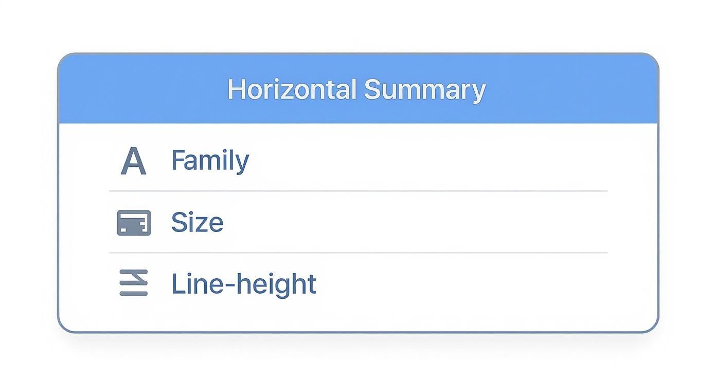
This graphic gives you a sense of the essential CSS properties—like font family, size, and line height—that these extensions instantly pull for you. They package everything up into an easy-to-read format, so you don't have to hunt for it.
The real power of these extensions is their ability to deliver a full typographic profile. Beyond the basics, they often show you the rendered font weight, the exact color hex code, and sometimes even provide a direct link to acquire the font from services like Google Fonts or Adobe Fonts. This makes going from identification to implementation incredibly smooth.
To help you decide which one fits your workflow, here’s a quick comparison of the most popular options.
Comparing Popular Font Identifier Extensions
| Feature | WhatFont | Fontanello | Fonts Ninja |
|---|---|---|---|
| Primary Use | Quick & simple font identification | Detailed CSS properties at a glance | In-depth font analysis & testing |
| Interface | Minimalist tooltip & panel | Clean, developer-focused panel | Rich, interactive design overlay |
| Unique Feature | Detects services (Google Fonts, etc.) | Displays fallback fonts & CSS stack | Live font testing & bookmarking |
| Best For | Marketers & content creators | Developers & UI/UX designers | Graphic designers & typographers |
Ultimately, choosing the right extension comes down to personal preference. My advice? Try a couple of them out. See which one feels most intuitive for how you work. You’ll probably settle on a favorite pretty quickly.
Finding Fonts from an Image or Logo
So, what happens when the font you’re eyeing isn’t live text on a webpage? Maybe it’s locked inside a slick logo, a beautiful graphic, or just a screenshot you saved for inspiration. When the browser’s "Inspect" tool can’t help you, you’ll need a different approach.
This is where image-based font identifiers are a total game-changer. I’ve leaned on powerful online services like MyFonts' WhatTheFont or Font Squirrel's Matcherator countless times. They’re lifesavers for designers tasked with matching a brand’s visual identity or for anyone who spots some killer typography out in the wild.
How Image-Based Font Finders Work
The process is surprisingly simple: upload an image, and the tool gets to work analyzing the letterforms to find the closest matches in its massive database. But to get the best results, you need to give the tool a clean sample to work with.
Here are a few pro tips I've picked up for getting an accurate match:
- Use High-Contrast Images: Make sure the text is crystal clear and stands out from its background. A crisp, high-resolution screenshot will always work better than a blurry photo.
- Isolate the Text: If you can, crop the image so only the specific text you want to identify is visible. This stops the tool from getting distracted by other logos or graphic elements. Our guide to using images with Divi has some great pointers on prepping graphics.
- Keep Text Horizontal: Straighten out any rotated or skewed text before you upload. This gives the character recognition software the best shot at success.
The WhatTheFont tool has a dead-simple interface where you just drag and drop your file to get started.

Once it's uploaded, the tool automatically highlights the text and pulls up a list of potential font matches for you to look through.
This technology just keeps getting better, too. AI-powered font recognition can now identify fonts from images with over 90% accuracy, even when dealing with the kind of experimental or fluid styles that would have stumped older methods. This evolution is essential for keeping up with modern design, which you can read more about in this great piece on typography trends from unifiedinfotech.net.
After you upload your image, the tool will ask you to confirm the characters it has identified. You can then scroll through a list of suggested fonts, comparing them side-by-side with your original image to find the perfect match.
Recognizing the Most Common Fonts on the Web
As you start peeking behind the curtain on different websites, you'll begin to notice some familiar faces. It's not a coincidence. Many sites lean on a core group of highly readable and accessible typefaces that are chosen for one simple reason: they just work.
These fonts are popular because they offer fantastic on-screen readability, load quickly, and look consistent across pretty much any device or browser you throw at them. That kind of reliability is gold. For instance, some of the most dominant fonts are web-safe classics. Statistically, Arial is the heavyweight champion, appearing on roughly 23% of all websites globally. Its massive popularity comes from being a default on countless operating systems, which guarantees a predictable experience for visitors. You can dig deeper into the stats on the most popular fonts on designrush.com.
The Usual Suspects from Google Fonts
Beyond the built-in classics, Google Fonts provides a massive, open-source library of high-quality typefaces that you'll spot everywhere. Getting to know these can cut your font-finding time in half.
Here are a few you're almost guaranteed to run into:
- Roboto: A modern, geometric sans-serif that strikes a great balance between friendly and professional. It's the default font for Android, so you've seen it more than you realize.
- Open Sans: Known for its neutral yet approachable feel, making it incredibly versatile for everything from body copy to big, bold headlines.
- Lato: This is a semi-rounded sans-serif that gives off a sense of warmth and stability. It's a favorite for corporate and tech websites that want to appear trustworthy.
- Montserrat: With its clean, urban style, Montserrat is a go-to for designers aiming for impactful headlines and minimalist aesthetics.
Learning to spot these common fonts on sight is more than just a party trick for designers. It builds a solid foundation for making smarter typographic choices in your own work. Once you understand why these fonts are so popular, you can start to master how to pair the right fonts for your website.
Got Questions About Website Fonts? We’ve Got Answers.
Once you start poking around with the tools we've covered, a few common questions almost always come up. Getting clear answers to these can help you handle everything from the legal fine print to the little technical hiccups you might run into.
Can I Legally Use Any Font I Find on a Website?
Nope, definitely not. This is a huge one that trips a lot of people up. Spotting a cool font is just the first step; actually using it is a whole other ballgame.
Many typefaces, especially the ones you see on major brand websites, are commercial products. That means they require a license to use. Before you even think about downloading a font, you have to hunt down its End-User License Agreement (EULA). While services like Google Fonts offer open-source fonts that are free to use, premium fonts from professional foundries will require a paid license for web or print. Trust me, ignoring this can lead to some seriously unpleasant legal letters.
Why Did a Font Identifier Give Me the Wrong Result?
While those online font identifiers feel like magic, they're not infallible. If you upload an image and get a weird or just plain wrong result back, it's usually for a handful of reasons:
- Low-resolution images are the biggest culprit. The algorithm just can't see the letterforms clearly enough.
- Stylized or distorted text, like curved words or heavily edited letters, will almost always confuse the software.
- Poor contrast between the text and its background makes it tough for the tool to make an accurate guess.
In these situations, the tool is just doing its best to suggest the closest visual match in its database, which might not be the real deal. And for live text, sometimes a font is a custom-built or slightly modified version of a known typeface. That’s why the browser's "Inspect" tool is still the gold standard for guaranteed accuracy.
What Is a Fallback Font and Why Is It Important?
Think of a fallback font as a backup plan for your text. In the website's code (the CSS), developers list fonts in order of preference. It looks something like this: font-family: 'Montserrat', Arial, sans-serif;.
The browser will first try to load 'Montserrat'. If that fails for any reason—maybe the file is blocked or the visitor has a slow connection—it "falls back" to the next font in the list, which here is 'Arial'. If Arial is also unavailable, it just uses whatever the device's default sans-serif font is.
This system is crucial because it ensures your content is always readable. It’s a simple trick that prevents a broken, unstyled mess if the primary, more decorative font doesn't load properly for every single visitor.
Is It Better to Use an Extension or the Inspect Tool?
Honestly, it just depends on your goal and workflow. I use both all the time.
For pure speed and convenience, you can't beat an extension like WhatFont. You get the answer in a single click, which is perfect when you just need quick inspiration or aren't a developer.
For 100% accuracy and all the nerdy details—like the exact font size, line height, and color hex codes—the 'Inspect' tool is king. It shows you precisely what the browser is rendering, no guesswork involved. Most pros have a hybrid approach: they use an extension for quick checks and dive into the developer tools for any serious analysis or design work.
At Divimode, we believe in giving you the tools and knowledge to build better websites. With plugins like Divi Areas Pro, you can create stunning popups, fly-ins, and mega menus that captivate your audience, all while using the perfect fonts you've just learned to identify. Take control of your site's design and user experience by checking out our powerful solutions at https://divimode.com.
More Articles You Will Like