Adding fonts in WordPress used to be a real headache. For years, we relied on a patchwork of plugins, custom code snippets, and theme-specific settings just to get the typography right. It was clunky, bad for performance, and a maintenance nightmare.
Thankfully, that era is over. With the WordPress Font Library introduced in version 6.5, everything has changed. We can now upload, install, and manage fonts directly from the dashboard—a massive leap forward that gives us proper control over a site's visual identity.
A New Era for WordPress Typography
Before this update, making a simple global font change often meant digging deep into the Styles UI or juggling multiple tools. The new Font Library centralizes everything, providing full control across all blocks and themes right within the familiar WordPress admin. It's a game-changer. For a deeper dive into the technicals, the team at Hostinger.com breaks down the update well.
This move simplifies the entire process and brings WordPress up to speed with modern design workflows.
Why This Is Great News for Divi Users
If you're building with Divi, this native functionality is a welcome addition. While Divi has always offered powerful typography controls, the core Font Library creates a more unified and future-proof system for managing your assets.
Here’s what this shift really means for your workflow:
- Simplified Branding: You can easily upload and apply your brand’s custom fonts across your entire site, not just within the Divi Builder. Think blog posts, WooCommerce pages, and other areas a theme builder might not touch.
- Less Plugin Bloat: Relying less on third-party font plugins means a leaner, faster website. That's always a win.
- Better Consistency: It's now far easier to ensure your typography is consistent everywhere, from pages built with Divi to posts created with the standard block editor.
Bringing font management into the WordPress core acknowledges a fundamental truth of modern web design: typography is not an afterthought. It's an essential element of user experience, brand identity, and site performance.
A Foundation for Better Design
Ultimately, this evolution is about more than just convenience. It’s about empowering creators with the right tools to build more beautiful, performant, and cohesive websites.
A streamlined workflow means you can spend less time fighting with technical hurdles and more time focusing on what really matters—crafting a compelling visual narrative for your clients or your own brand. This new approach lays the groundwork for more sophisticated and integrated design systems, all managed from the dashboard you use every single day.
Integrating Google and Adobe Fonts in Divi
Connecting your Divi site to massive font libraries like Google Fonts and Adobe Fonts is pretty simple on the surface, but the real art is in doing it efficiently. Divi has slick, built-in integrations for both services, which thankfully handles the heavy lifting so you can focus more on design and performance.
When it comes to Google Fonts, the integration is practically effortless. The entire library comes pre-loaded and ready to use right inside the Divi Builder and Theme Customizer. Just navigate to any module with text, pop open the Design tab, and pick your font from the dropdown. Divi handles the rest automatically.
But here’s a common mistake I see all the time: loading way too many font weights. If your design only uses Regular (400) and Bold (700), you absolutely do not need to load all nine weights of a font like Montserrat. Every extra weight adds unnecessary HTTP requests and bloats your page size, which is a direct hit to your load times.
Connecting Adobe Fonts with Your Project ID
Getting Adobe Fonts (formerly Typekit) hooked up requires one small but crucial extra step. You need to link your specific Adobe Fonts project to Divi using a Project ID. This is a great system because it guarantees you only load the exact fonts you've hand-picked for that website.
Here’s the quick rundown on getting it connected:
- Create a Web Project: First, log in to your Adobe Fonts account and create a new "Web Project."
- Add Your Fonts: Browse the library and add the specific fonts and weights your design needs to this project. Be selective!
- Find Your Project ID: In your project's settings, Adobe will give you a unique Project ID. It's just a short string of letters and numbers. Copy it.
- Add it to Divi: Head over to Divi > Theme Options > General in your WordPress dashboard. Scroll down to the Adobe Fonts section, paste your Project ID into the field, and hit save.
Once you save, the fonts from that specific Adobe project will magically appear in all of Divi’s font menus. I love this method because it's incredibly efficient—it only loads the precise fonts you curated.
Let's say you're building a new e-commerce site. You might select a premium serif like "Lust" for headings and a clean sans-serif like "Proxima Nova" for body text. By adding only the necessary weights to your Adobe Fonts project, you ensure the site loads just those two font families, keeping it lean and fast from day one.
Making the Right Choice for Your Workflow
So, when should you use Divi’s built-in integrations versus the new WordPress Font Library?
For quick, Divi-centric projects where you're working exclusively within the builder, the built-in connections are perfect. They're fast, super convenient, and require zero extra setup for Google Fonts.
However, if you're building a site where a lot of content will also be managed through the standard block editor, using the WordPress Font Library to install Google Fonts is a much more global solution. This approach makes the font available everywhere, ensuring true brand consistency across every single part of your website.
Ultimately, understanding these different pathways empowers you to make smarter typography decisions. Properly pairing fonts is just as vital as the technical setup. For a deeper dive on that, our guide on how to pair the right fonts for your website lays out some great design principles. Choosing the right method and being ruthless about what you load are the keys to a website that is both beautiful and performant.
While massive font libraries like Google and Adobe Fonts are fantastic, sometimes your brand's identity is locked into a specific premium or custom typeface. This is where self-hosting shines.
By uploading font files directly to your WordPress site, you gain total control over your typography. It cuts out third-party dependencies and is often a smarter play for both performance and data privacy.
There are a few solid ways to get this done, and the best one for you really depends on your workflow. You can use the new WordPress standard, stick with Divi's built-in tools, or go old-school with a bit of CSS.
This visual guide breaks down the common paths for integrating fonts into your WordPress and Divi setup.
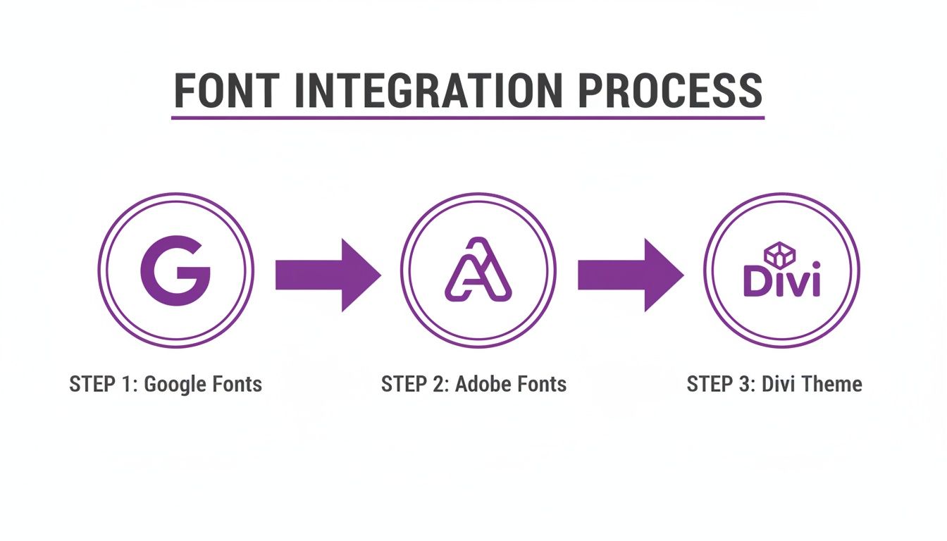
Whether you start with a third-party service or your own file, the end goal is always a seamless integration within your theme.
Using the WordPress Font Library
The cleanest and most future-proof method is now built right into WordPress itself. The Font Library, introduced in version 6.5, lets you upload font files like .woff2, .woff, and .ttf straight into your media library. It's a game-changer.
To get there, head to your Site Editor (Appearance > Editor), then navigate to Styles > Typography. Look for the "Manage Fonts" icon to open the library. From there, just drag and drop your font files to upload them.
Once they're in, the font becomes available everywhere—in the block editor, site editor, and even within Divi. For simplicity and broad compatibility, this is now the recommended approach.
The Divi Uploader Method
If you live and breathe the Divi Builder, using its native uploader is an incredibly simple alternative. This approach keeps all your font management contained within the Divi ecosystem, which can be super convenient for theme-specific projects.
Here's how it works:
- Open any page with the Divi Builder.
- Add or edit a text-based module (like a Text, Blurb, or Header module).
- In the Design tab, go to the font dropdown menu.
- Click the "Upload" button.
- Give your font a name and select the font file from your computer.
That’s it. After uploading, your custom font will pop up in all of Divi’s font selection menus. It's fast, code-free, and perfect for designers who prefer to stay within a familiar interface.
And if you've ever spotted a font you love on another site and wondered what it was, our guide on how to detect any website's font can help you find your next inspiration.
Pro Tip: Always, always prioritize the WOFF2 (.woff2) font format when uploading. It offers the best compression, which means significantly smaller file sizes and faster load times compared to formats like TTF or OTF. Any decent premium font you buy will include a WOFF2 version specifically for web use.
The Classic CSS @font-face Method
For developers and anyone who needs absolute, granular control, the manual @font-face CSS rule is a rock-solid, timeless technique. This method involves uploading your font files to your server—usually inside a child theme's folder—and then declaring them in your style.css file.
It gives you direct control over font properties like font-display, which is crucial for optimizing against Cumulative Layout Shift (CLS) and nailing your performance scores.
Here's a basic example of what the code looks like in your child theme's style.css:
@font-face {
font-family: 'MyCustomBrandFont';
src: url('fonts/MyCustomBrandFont-Regular.woff2') format('woff2'),
url('fonts/MyCustomBrandFont-Regular.woff') format('woff');
font-weight: 400;
font-style: normal;
font-display: swap;
}
After adding this code, you can apply the font to any Divi module or custom CSS class simply by using font-family: 'MyCustomBrandFont';. It requires a few more technical steps, sure, but this method bypasses any theme or plugin UI, making it extremely reliable and portable across projects.
Comparing Custom Font Implementation Methods
Choosing the right way to add custom fonts can feel tricky, but it really boils down to your specific needs and technical comfort level. This table breaks down the three main approaches to help you decide which path is best for your next Divi project.
| Method | Best For | Pros | Cons |
|---|---|---|---|
| WordPress Font Library | Most users, especially on modern block themes. Great for future-proofing your site. | – Native to WordPress core – Globally available fonts – Simple drag-and-drop UI |
– Requires WordPress 6.5+ – Managed outside the Divi Builder |
| Divi Uploader | Designers who want to stay within the Divi ecosystem for a streamlined workflow. | – Incredibly easy and fast – No code required – Fonts are managed directly in Divi |
– Fonts are tied to the Divi theme – Less control over performance settings like font-display |
| CSS @font-face | Developers and users needing maximum control over font loading and performance. | – Full control over CSS properties – Not dependent on any UI – Best for performance optimization (CLS) |
– Requires FTP/file manager access and CSS knowledge – More complex setup process |
Ultimately, there's no single "best" method—just the one that fits your project. The WordPress Font Library is the new standard for a reason, but the Divi Uploader is perfect for quick projects, and @font-face remains the top choice for developers who need that extra layer of control.
Optimizing Fonts for Performance and Accessibility
Let's be honest, a beautiful font doesn't mean much if it tanks your site's speed and leaves visitors frustrated. Optimizing how your fonts on WordPress load is every bit as crucial as picking the right typeface in the first place. Poorly loaded fonts are a classic cause of layout shifts, which wreck the user experience and can even hurt your SEO.
The main villain here is something called Cumulative Layout Shift (CLS). You’ve probably seen it: a visitor starts reading, and then—poof—the web font finally loads, shoving all the content down the page. It’s jarring. People lose their place, click on the wrong thing, and get annoyed.
Google takes this stuff seriously, and you should too. A high CLS score hurts your Core Web Vitals, telling search engines your site is clunky. Fortunately, fixing this is usually pretty simple.
Preventing Layout Shifts and Boosting Speed
The most powerful tool in your arsenal against font-related CLS is a single line of CSS. Just add font-display: swap; to your @font-face rule. This one little command tells the browser to show the text immediately with a standard system font. Once your custom font is ready, it swaps it in seamlessly.
This ensures your content is readable right away, even if the fancy font takes a second to download. Content first, style second—it's always the right move for performance.
Want to take it a step further? Preload your most important font files. This signals the browser to grab those essential fonts with high priority so they're ready to go even sooner.
Here are a few other strategies I always use:
- Self-Host Your Fonts: Pulling fonts from your own server cuts out the extra trip to Google Fonts, shaving off precious milliseconds of load time.
- Use Modern Formats: Stick with the WOFF2 (.woff2) format. It has the best compression, which means smaller files and quicker downloads.
- Limit Font Weights: Don't load the entire font family. If you only use Regular 400 and Bold 700 in your design, only load those two weights. Anything else is just dead weight.
By focusing on these small technical details, you can significantly enhance your site's perceived performance. A faster, more stable loading experience keeps users engaged and search engines happy. If you're looking for more ways to speed up your site, check out our complete guide to optimize WordPress speed.
Designing for Accessibility and Readability
Speed is just half the battle. Your site also needs to be accessible, meaning everyone—including people with visual impairments—can read your content without a struggle. Your font choices are a huge part of this.
Start with a font that has a generous x-height (that’s the height of a lowercase "x"). Fonts with taller lowercase letters, like Lato or Open Sans, are much easier to read in long blocks of text.
Next, you have to nail the size and contrast. For body copy, 16px is the gold standard minimum. Anything smaller is asking for eye strain.
Just as important is color contrast. Your text color needs to stand out clearly from its background. I always recommend using a contrast checker tool to make sure your color pairs meet the Web Content Accessibility Guidelines (WCAG) AA standard, at a minimum. At the end of the day, simple, clear typography is the bedrock of a website that welcomes everyone.
Creating a Typography Strategy for a Global Audience
Taking a website international brings a whole new set of typography challenges that go way beyond just looking good. When your content needs to be read in multiple languages, your font choices suddenly become a critical part of the user experience. The main goal? Keep your brand looking consistent and, most importantly, readable for everyone, no matter where they're from.
This whole process kicks off with picking fonts that have really broad character support. It's easy to fall in love with a beautiful typeface designed only for Latin scripts, but that means it's missing the characters you need for languages like Spanish (ñ, á), German (ß), or French (ç).
When a font doesn't have a specific glyph, browsers will awkwardly swap in a default system font. It completely breaks your design and creates a jarring, unprofessional look.
Managing Fonts for Multilingual Sites
Let's say you're building a site that needs to shine in both English and Spanish. Your strategy has to account for both Latin and non-Latin character sets from the very beginning. This often means using different font families for different languages and being smart about how you implement them in WordPress.
A real-world example might be setting up a store with Divi and WooCommerce.
- For your English content: You might use a brand font like "Montserrat" for headings and something clean like "Lato" for body text.
- For your Spanish content: While "Lato" has excellent character support, you could run into trouble if "Montserrat" is missing key glyphs needed for Spanish words. You might need to find a different, more comprehensive header font just for that language.
The key is to plan ahead. Before you get too attached to a font, test it out. Grab some sample text from all your target languages and see what happens. Look for missing characters, weird spacing, or inconsistent font weights that could totally undermine your brand's global presence.
The web is becoming more multilingual every day. While English is still the big player, Spanish now holds the secondary position at 8.7% market share among WordPress sites. On top of that, the number of users publishing multilingual content has jumped by 22% in recent years.
When you're mapping out a typography plan for a global audience, it's a good idea to look into tools for translation-friendly formatting. These can help ensure your chosen fonts render correctly across different languages and platforms. This extra bit of thought ensures the brand experience you worked so hard to create stays intact, no matter who's visiting your site.
Of course, here is the rewritten section.
Common Questions About Managing WordPress Fonts
Working with fonts in WordPress and Divi can sometimes throw you a curveball, but most issues are surprisingly simple to fix. Let's tackle some of the most common questions I see from Divi users to get your typography looking perfect.
First up, what's the best font format for the web? Hands down, it's WOFF2 (.woff2). It offers the best compression, which means smaller file sizes and faster load times for your visitors. While the older WOFF format is a decent fallback, WOFF2 is the modern standard and should always be your first choice.
Why Is My Custom Font Not Showing in Divi?
This one is incredibly common and always frustrating: you upload a custom font, but it's nowhere to be seen on the live site. Before you start pulling your hair out, run through this quick checklist. The fix is usually a lot simpler than you think.
- Clear Your Caches: This is always step one. Clear out Divi's static CSS file cache and your browser cache. Nine times out of ten, you're just looking at an old, stored version of your site.
- Check Font Naming: Make absolutely sure the font name you gave the font in Divi's uploader perfectly matches the
font-familyname you're using in your CSS or in a module's settings. Even a tiny typo will break it. - Verify File Paths: If you're using the
@font-facemethod in a child theme, a wrong URL path to your font file is a classic culprit. Double-check that path—it's an easy mistake to make. - Inspect for Overrides: Pop open your browser's developer tools (just right-click and hit "Inspect"). This is your best friend for spotting if another CSS rule is bulldozing your custom font styling.
Here's a pro tip from experience: Pick one method for managing fonts and stick with it. You can technically use both the new WordPress Font Library and Divi’s built-in uploader, but it can get messy. For site-wide consistency, the Font Library is the modern way to go. If you're just working on a project that will only ever live inside the Divi Builder, Divi’s uploader is perfectly fine.
And if you've decided to go all-in on self-hosted or Adobe fonts, you can easily stop Divi from loading its default Google Fonts. Just head over to Divi > Theme Options > General and toggle off "Use Google Fonts." It's a simple flick of a switch that gives you a nice little performance boost by preventing unnecessary files from loading.
Ready to create stunning, interactive content without the headache? Divimode empowers you with tools like Divi Areas Pro, letting you build advanced popups, fly-ins, and mega menus effortlessly. Learn more and elevate your Divi designs at divimode.com.
More Articles You Will Like