Personalization has moved from optional to expected. Shoppers respond better when product suggestions, offers, and messages reflect what they're doing on the site instead of treating every visit the same.
For Divi and WooCommerce stores, the challenge usually is not design. It is implementation. A store can have polished layouts and still miss revenue because every visitor gets the same popup, the same promo bar, and the same recommendations regardless of page intent or behavior.
Divi, WooCommerce, and Divimode's Divi Areas Pro solve that problem in a practical way. Divi handles the visual build. WooCommerce provides the shopping context. Divi Areas Pro controls when, where, and to whom each message appears, using rules and triggers you can manage without custom code. If you want a quick foundation before building these campaigns, behavioral targeting for WordPress and Divi explains the logic behind it well.
This guide focuses on execution. Each personalization example is paired with a realistic use case, the trade-offs to watch, and a step-by-step way to build it with Divi, WooCommerce, and Divi Areas Pro. If you're also working through broader growth priorities, HDM's guide to e-commerce success is a useful companion read.
1. Behavioral Popups for Timely Lead Capture

A popup can still work. A lazy popup won't.
The difference is timing and page relevance. If someone lands on a broad category page and gets hit with a generic newsletter form in three seconds, that's interruption. If they've spent time reading a niche category, then see a useful offer tied to that interest, it feels closer to assistance.
What works on real stores
For anonymous traffic, behavior is often your best signal. VWO notes that 73% of ecommerce visitors are anonymous, while 68% of personalization strategies still rely on historical purchase data or login-based profiles. That mismatch is exactly why behavior-triggered overlays matter.
A good example is a category-specific guide, fit finder, or starter bundle offer that appears only after real engagement. On a supplements store, that might be a beginner guide after time on a “daily wellness” category. On a fashion store, it could be a sizing help fly-in after scroll depth on a dresses archive.
Practical rule: Match the popup to the page topic first. Match the timing second. Design comes third.
How to build it in Divi Areas Pro
Create a new Divi Area and design the popup in the Visual Builder. Keep it tight: headline, one benefit, one form, one clear next step. Don't dump a full landing page into a popup.
Then configure it like this:
- Set the trigger: Use On Delay so it appears only after a meaningful amount of time.
- Limit the page scope: In Rules, target a specific WooCommerce category or product archive URL.
- Choose one offer per intent: Don't reuse the same lead magnet across unrelated categories.
If you want a stronger framework for that logic, Divimode's guide to behavioral targeting in WordPress maps well to this setup.
What doesn't work is blasting a discount popup across the whole site. You'll collect low-intent email addresses and train buyers to wait for a coupon.
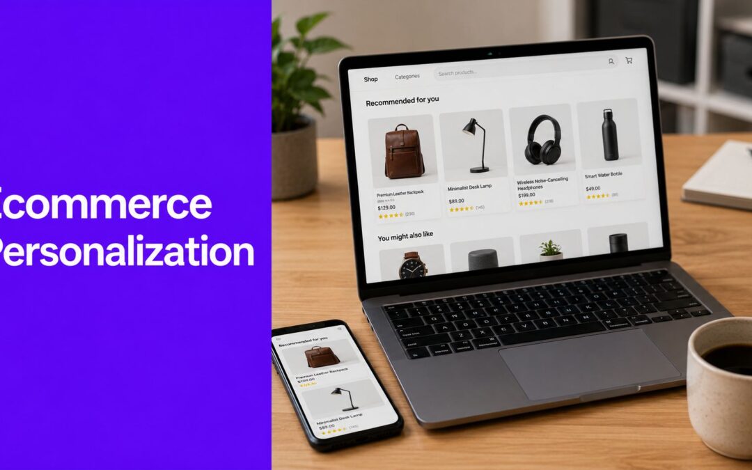
2. Dynamic Product Recommendations

This is one of the most important ecommerce personalization examples because it touches revenue directly. Rivo cites data showing product recommendation engines drive nearly 31% of total ecommerce site revenues for brands that implement them effectively, increase conversion rates by an average of 288%, and often improve AOV in the 10% to 15% range.
Those gains don't come from dropping WooCommerce's default related products block onto every product page and calling it personalization. They come from recommendation logic with intent behind it.
Better recommendation placements
On product pages, I've seen the strongest results from recommendations that answer one of three questions:
- What goes with this: Cross-sells for accessories, refills, or matching items
- What's the better version: Upsells to a premium model or larger size
- What else fits this need: Alternatives for shoppers still comparing
A camera product page might inject memory cards, a bag, and an extra battery below Add to Cart. A skincare product page might inject the matching cleanser and moisturizer, not five random bestsellers.
How to build it in Divi Areas Pro
Create a Divi Area with a product grid, row layout, or custom product cards. Set the Area type to Inject and place it using a WooCommerce hook below the Add to Cart button or near product meta.
Then split recommendation content by product context:
- Category rules: Show one Area for shoes, another for skincare, another for electronics.
- Product-specific rules: Build hand-picked bundles for top sellers.
- Cart-aware logic: If you've got a strong add-on item, reserve it for cart and checkout instead of forcing it too early.
Recommendations should reduce decision effort. If they add clutter, they're in the wrong place or they're the wrong products.
What doesn't work is overloading the page with three different recommendation sections. One strong block beats a stack of widgets every time.
3. Dynamic Content Injection for UTM-Aware Banners

Campaign traffic arrives with context. The URL already tells you what message brought the visitor in, so the page should respond to it.
UTM-aware banners are one of the fastest personalization wins in WooCommerce because they do not require a recommendation engine or a major theme rebuild. They help preserve message match between the ad, email, partner link, and the first content block on the page. If someone clicks a spring sale email and lands on a generic homepage hero about bestselling winter items, the disconnect is immediate.
I use this tactic most often on pages that collect traffic from several sources at once. Homepages, shop pages, and broad category pages are common examples. One base layout stays in place, then Divi Areas Pro swaps in the right banner when a visitor arrives with a matching UTM parameter.
Where this works best
The strongest use cases are campaign-driven, not cosmetic:
- Email traffic: Repeat the offer, collection, or deadline from the email
- Paid social clicks: Match the angle that earned the click, such as gifting, bundles, or a product category
- Affiliate and partner traffic: Show a banner specific to that audience or promotion
- Influencer campaigns: Continue the same product story instead of sending traffic into a generic storefront
This is a good example of content personalization for WordPress sites. The page changes based on a clear acquisition signal, not guesswork.
If you want a broader segmentation example outside WordPress, this guide on how to boost Shopify revenue with segmentation is useful for the strategy behind matching offers to traffic source.
How to build it in Divi Areas Pro
Build one Divi Area for each campaign banner. Keep the layout structure consistent so you can swap headlines, images, buttons, and promo copy without redesigning the whole section every time.
Then set each Area to Inject and place it above your default hero, below the header, or inside the category archive intro area. In Rules, add a URL Parameter condition such as utm_campaign=spring-launch or utm_source=influencername. Use exact naming conventions from your ad platform and email tool. If marketing calls the campaign spring_sale_2026 but your rule looks for spring-sale, the banner will never fire.
A simple setup looks like this:
- Create a default banner for all traffic
- Duplicate it for each campaign
- Change the headline, image, CTA, and destination URL
- Add a URL parameter rule to each campaign version
- Set rule priority so the campaign-specific banner overrides the default one
Two implementation details matter in practice. First, decide which parameters your team will standardize on before building rules. I usually start with utm_campaign and only add utm_source or utm_medium if the messaging really needs that extra split. Second, keep the number of variants under control. Three strong campaign banners that clearly match intent will outperform a messy setup with twelve near-identical versions nobody maintains.
Measure this by campaign behavior. Check click-through rate on the banner, session engagement, add-to-cart rate, and conversion rate for each tagged traffic source. If one injected banner gets clicks but does not move shoppers deeper into the store, rewrite the offer or send people to a better-matched destination page.
Small change, strong payoff.
4. Segmented Offers for New vs. Returning Visitors
Not every visitor should see the same offer. A first-time shopper usually needs reassurance or a low-friction reason to buy. A returning visitor often needs a better reason than “join our newsletter.”
That's why segmenting new and returning users is one of the easiest personalization wins in WooCommerce.
The offer should match the relationship
For new visitors, use a welcome message, first-order incentive, or category quiz. For returning visitors, push them deeper: new arrivals, loyalty messaging, replenishment prompts, or products related to what they browsed before.
This is also where many stores over-discount. If you show a first-purchase incentive to everyone, loyal customers notice. If you hide loyalty-oriented messaging from returning visitors, you leave retention value on the table. If you need inspiration from a broader segmentation angle, this example on how to boost Shopify revenue with segmentation is useful conceptually even if your stack is WordPress.
How to build it in Divi Areas Pro
Set up two Divi Areas with different messages and formats. One might be a popup for first-time visitors. The other might be a top bar or fly-in for return traffic.
Configure them with visitor rules:
- New visitor Area: Use the Visitor rule set to Is New
- Returning visitor Area: Use the Visitor rule set to Is Returning
- Page targeting: Limit each message to high-value pages, not the entire site
Returning shoppers don't need another “welcome.” They need a reason to continue the relationship.
What doesn't work is making the returning-visitor message too subtle. If it's just a line of text no one notices, the segmentation exists technically but not commercially.
5. Exit-Intent Savings on Cart and Checkout Pages

Cart and checkout exits cost more than casual page bounces because the shopper has already done the hard part. They found products, added them to the cart, and got close enough to buying that a small objection can stop the order.
That is why exit-intent belongs here, not across the whole site.
A good cart or checkout popup does one job. It answers the last hesitation with a message tied to the page the shopper is leaving. On cart, that might be free shipping or a threshold reminder. On checkout, it is often stronger reassurance such as secure payment language, delivery clarity, or a one-time recovery offer.
The trade-off is obvious. Discounts can recover revenue, but they can also train shoppers to wait for a coupon. I usually set this up in tiers. Start with reassurance on checkout and a softer cart message first. Use a price-based incentive only after you have confirmed that friction, not trust or usability, is the main reason people leave.
What to offer before the shopper leaves
Match the offer to the objection:
- Shipping friction: free shipping code, shipping threshold reminder, or delivery estimate
- Price hesitation: small one-time coupon, not a sitewide habit-forming discount
- Trust concerns: returns policy, payment security, or support contact option
- Decision delay: save cart prompt or reminder that the cart is about to expire
The mistake is stacking all four into one popup. That usually lowers response because the shopper has to sort through too much copy at the worst possible moment.
How to build it in Divi Areas Pro
Create one Divi Area for cart and another for checkout if the messages need to differ. In Divi, keep the layout tight: short headline, one supporting line, one button. This tactic works best when it feels like a quick intervention, not another landing page.
Then configure it like this:
- Trigger: Enable On Exit-Intent
- Display conditions: Target only cart and checkout pages
- Frequency: Limit repeat displays so returning users do not see the same message every session
- Content: Use one primary offer or reassurance point per popup
- Button action: Send the shopper back to the cart, keep them on checkout, or apply the next logical step
If you want a more detailed setup path, Divimode's guide to reducing cart abandonment in WooCommerce covers the mechanics well.
What fails in practice is broad targeting. The same exit popup should not appear on blog posts, category pages, product pages, cart, and checkout. Personalization works here because the message matches the stage of intent, and Divi Areas Pro gives you enough control to build that logic without custom code.
6. Back-Button Recovery to Prevent Page Bounces
Back-button behavior on a product page usually signals a problem you can still fix. The shopper may be comparing options, checking whether the product fits their use case, or leaving because the page did not answer a practical question fast enough.
That makes this a good personalization moment for assistance, not pressure.
A back-button recovery message should help the shopper make the next decision with less effort. Good offers here include a comparison block for similar products, a short fit or compatibility note, review highlights, or a direct path to top-rated alternatives in the same category. The message works best when it feels like guidance built into the shopping flow.
If a shopper hits back, offer a clearer next step.
How to build it in Divi Areas Pro
Use a fly-in Divi Area rather than a full modal. On product pages, a large popup often feels intrusive because the visitor has already signaled they want to leave or compare. A compact fly-in keeps the intervention visible without trapping the user.
A practical setup looks like this:
- Trigger: Enable On Back-Button
- Display conditions: Show it only on WooCommerce product pages
- Format: Use a fly-in with a short headline, one support line, and one primary action
- Personalization logic: Match the content to product type or category
- Primary CTA: Send shoppers to a comparison page, related collection, or filtered product list
The category-level content matters. Electronics shoppers usually need comparison help. Apparel shoppers respond better to fit guidance, returns reassurance, or bestsellers in the same style. Accessory pages often need compatibility help first.
The common mistake is treating every back-button event the same way. If the fly-in says “Wait, don't leave” on every product page, it reads like a generic retention popup. If it says “See compatible models” on a parts page or “Compare top-rated alternatives” on a high-consideration product, it does real recovery work.
That is the difference between a personalization example and an implementation plan. In Divi and WooCommerce, Divi Areas Pro gives you enough control to map the trigger, page type, and message without custom JavaScript for every case.
7. On-Site Messaging for Micro-Conversions

Small messages often do more conversion work than large campaigns. A sizing hint beside Add to Cart, a stock note tied to a variation, or a cart message about shipping thresholds can remove hesitation at the exact point it appears.
That matters because micro-conversions sit one step before revenue. Size guide clicks, variant selections, coupon reveals, and shipping checks all signal buying intent. If those steps feel unclear, shoppers stall. If the interface answers the question in one line, they keep moving.
For Divi and WooCommerce stores, this is one of the easiest personalization tactics to implement well because the message can stay tied to context. Product pages need fit, material, or delivery guidance. Cart pages need threshold, timing, or support reassurance. The mistake is showing the same generic note everywhere and calling it personalization.
How to build it in Divi Areas Pro
Use Divi Areas Pro to place small interventions close to the action, not over the whole screen. In practice, three formats do most of the work:
- Tooltip on hover or click: Add a short size guide, shipping explanation, or compatibility note beside the field that causes hesitation
- Contextual fly-in: Trigger a small reminder after a cart update or after time on page
- Conditional bar or inline block: Show a free shipping progress note, returns reassurance, or support contact only when the cart or product state matches
The build plan should start with one question: what is the shopper trying to confirm right here?
If the answer is sizing, attach the message to the size selector or size guide link. If the answer is shipping cost, place it near Add to Cart or inside the cart summary. If the answer is product fit, show the message only for the categories where fit issues slow purchase decisions.
Keep the copy tight. One headline or one sentence is usually enough. If the message needs three paragraphs, it belongs in a modal, accordion, or separate help page.
A practical setup in Divi looks like this:
- Placement: Inline near Add to Cart, beside variation fields, or above cart totals
- Trigger: Hover, click, scroll position, or cart update
- Display conditions: Match by product category, tag, cart contents, or page type
- Message goal: Clarify one decision, not every possible objection
- CTA: Use only when the next step is obvious, such as “View size guide” or “See delivery options”
I have seen stores get better results from a precise shipping threshold note than from a discount popup shown to everyone. The trade-off is scale. Micro-messages take more planning because each one needs the right trigger and placement. The upside is that they feel like part of the shopping experience, not a campaign interrupting it.
That is what makes this a strong personalization example for Divi users. Divi Areas Pro lets you map a message to behavior, page context, and WooCommerce conditions, then deploy it as a repeatable pattern across the store.
8. Personalized Banners on Search Results Pages
Search visitors hand you their intent in one of the highest-signal actions on the site. A shopper who types a query is usually closer to a decision than someone casually browsing category pages.
That is why search results deserve more than a generic product grid.
Turning search into guided discovery
A search for “running shoes” can mean very different things. One visitor wants the fastest path to a product. Another needs help choosing between road, trail, and stability models before they can buy. A banner at the top of search results can serve both jobs if it points to the right next step, such as a fit guide, a filtered collection, or a curated bundle.
The key is relevance. Search-page personalization works best when the banner reduces decision time instead of adding another promotion to ignore. I have seen this work especially well for stores with broad catalogs, technical products, or gift-oriented searches where shoppers need direction before they compare items.
How to build it in Divi Areas Pro
Create a Divi Area with three parts. A short headline, one line of supporting copy, and a single CTA. Then inject it at the top of your search results template with Divi Areas Pro.
Use display rules tied to the search query in the URL. Start with a small set of terms that already drive revenue or create friction in product discovery.
Examples:
- Running shoes: Send shoppers to a fit guide or filtered category page
- Gift set: Send them to pre-built bundles or best-selling gift collections
- Protein powder: Send them to a comparison page organized by goal, diet, or ingredient type
Keep the implementation disciplined. Do not try to build a custom banner for every long-tail query. That turns into maintenance work fast, and weak coverage usually creates inconsistent results. A better approach is to map banners to your top search themes first, review clicks and assisted sales, then add new variants only where search volume and commercial value justify the effort.
One practical rule helps here. If the banner cannot answer the shopper's likely next question, it should not be there. Search personalization should guide the visit, not compete with the results.
8-Point Ecommerce Personalization Comparison
| Technique | 🔄 Implementation complexity | ⚡ Resource requirements | 📊 Expected outcomes | ⭐ Key advantages | 💡 Ideal use cases |
|---|---|---|---|---|---|
| Behavioral Popups for Timely Lead Capture | Medium, configure time triggers & page rules | Low–Medium, design + trigger logic | Higher lead conversion; better-quality subscribers | Contextual timing increases relevance and engagement | Category pages, content browsing, lead magnets |
| Dynamic Product Recommendations | Medium–High, hooks, product logic, content injection | Medium–High, product data, curation, testing | Increased AOV; more products per order | Effective cross-sell/upsell using product synergy | Product pages, cart upsells, post-add-to-cart areas |
| Dynamic Content Injection for UTM-Aware Banners | Medium, URL-parameter rules per campaign | Low–Medium, create campaign-specific banners | Lower bounce; higher campaign conversion rates | Consistent ad-to-site messaging builds trust | Paid ads, email campaigns, seasonal promotions |
| Segmented Offers for New vs. Returning Visitors | Medium, visitor segmentation rules and variants | Low–Medium, two message variants, tracking | Higher new-customer conversion; improved LTV | Tailors offers to relationship stage for relevance | Welcome promos, loyalty messaging, first-time discounts |
| Exit-Intent Savings on Cart & Checkout Pages | Low–Medium, exit-intent trigger + page scope | Low, single targeted offer creation | Reduced cart abandonment; recovered revenue | Last-moment targeted offer maximizes recovery | Cart and checkout pages with high abandonment |
| Back-Button Recovery to Prevent Page Bounces | Medium, back-button trigger + targeted rules | Low–Medium, recovery content per product | Reduced product-page bounces; increased discovery | Subtle, non-blocking re-engagement on exit signal | High-consideration product pages, comparison pages |
| On-Site Messaging for Micro-Conversions | Low, tooltips, bars, hover/few rules | Low, small content pieces, simple rules | Increased AOV; fewer support queries; smoother UX | Minimally invasive nudges that guide behavior | Free-shipping thresholds, size guides, complex items |
| Personalized Banners on Search Results Pages | Low–Medium, search-URL or query rules | Low–Medium, banners for top queries | Higher search engagement; better conversion from intent | Converts search intent into curated guidance | On-site search for popular keywords; guides/promos |
Your Personalization Blueprint for Divi and WooCommerce
Personalization can improve store revenue, but the actual result on a Divi and WooCommerce build depends less on big promises and more on execution quality. The stores that get value from it respond to clear visitor signals with the right message, on the right page, with rules that are easy to maintain.
That makes this article's approach practical for small teams and in-house builders. You do not need a custom stack to put personalization to work. You need a plan that maps each tactic to a trigger, a page context, a content variation, and a success metric. That is the difference between a nice-looking idea and something you can launch, measure, and keep improving inside WordPress.
If I were setting priorities on a live store, I would start with three builds.
First, behavior-based lead capture on category or product pages where interest is already clear. Second, product recommendations injected into high-intent areas such as product templates or cart-adjacent sections. Third, cart and checkout recovery messages with tight display controls so they help hesitant shoppers without interrupting buyers who are already converting.
Start there. Keep the first round small.
After that, expand in a controlled order. Add UTM-specific banners for paid traffic. Add different offers for new and returning visitors. Add search-result banners for your highest-value queries. Personalization gets hard to manage when every rule launches at once. It gets easier to scale when each campaign has one job, one audience, and one reporting goal.
This is also where the Divi-specific setup matters. Each example in this article can be built as a repeatable workflow with Divi layouts, WooCommerce page targeting, and Divi Areas Pro display conditions and triggers. That gives you a usable implementation system, not just a list of inspiration. Build the content variant, assign the trigger or rule, limit it to the right page set, then track the outcome before adding the next layer.
If you want to test one tactic quickly, Popups for Divi covers the basics. If you need broader targeting, content injection, fly-ins, tooltips, and behavior rules, Divi Areas Pro is the tool in Divimode's stack that fits the use cases covered here. For teams evaluating adjacent tools beyond on-site personalization, this roundup of top AI solutions for online retail is a useful next read.
If you're ready to turn these ideas into working campaigns, Divimode gives Divi users the tools to build popups, fly-ins, tooltips, content injection, and behavior-based targeting directly inside WordPress. Start with one high-intent use case, get the tracking in place, and expand from proven results.
More Articles You Will Like