 Alex Martin
The Divi Toggle module is one of those core, unassuming elements that can make a huge difference in how clean and professional your web pages feel. At its heart, it's all about condensing large amounts of information into clickable headings. This prevents visitors from getting hit with a massive wall of text, which is a surefire way to make them click away.
What the Divi Toggle Module Does and Why It Matters
Let's be real: no one likes scrolling through endless paragraphs to find a single piece of information. The Toggle module is Divi’s native solution to this exact problem. It lets you neatly tuck away details inside expandable sections, which visitors can open with a simple click.
This isn’t just about hiding text for the sake of it. It’s a strategic design choice that guides your user's attention and makes your content far more digestible. A well-organized page feels more thoughtful and is just plain easier to use. I’ve found it to be an indispensable tool on content-heavy layouts, whether I'm building a detailed FAQ section, outlining tiered service packages, or even creating a scannable menu for a restaurant.

To see the real difference it makes, just look at how it can transform the user experience on a content-heavy page.
Page Experience With and Without Toggles
| Metric | Page Without Toggles | Page With Toggles |
|---|---|---|
| Initial Impression | Overwhelming "wall of text" | Clean, organized, scannable |
| User Action | Frantic scrolling to find info | Clicks directly on relevant topic |
| Time to Find Info | High (15-20 seconds) | Low (3-5 seconds) |
| Bounce Rate | Likely higher due to user fatigue | Likely lower due to ease of use |
As you can see, implementing toggles is a simple move that yields some pretty significant improvements in clarity and user engagement.
Real-World Scenarios and Strategic Benefits
The true power of this module really shines when you start applying it to common design challenges. Think about where a toggle can make all the difference on your own sites:
- Scannable FAQ Pages: This is the classic use case. You can organize dozens of questions and answers without creating an intimidating, cluttered page. Users can scan the questions and only open the ones they care about.
- Complex Feature Lists: When you're showcasing a product, you want to highlight core benefits upfront. You can then tuck the more advanced, technical features inside toggles for the power users who want to dig deeper.
- Clean Service Descriptions: Present a quick summary of your services, then use toggles to provide the in-depth details, pricing, or scope for visitors who are ready to learn more.
While Divi is a WordPress-specific tool, it's always helpful to understand the broader builder ecosystem. For instance, a WordPress vs Webflow comparison can provide valuable context on different platform philosophies. If you want to dive deeper into Divi's place in the market, you can learn more about how it stacks up in our page builder landscape in our guide.
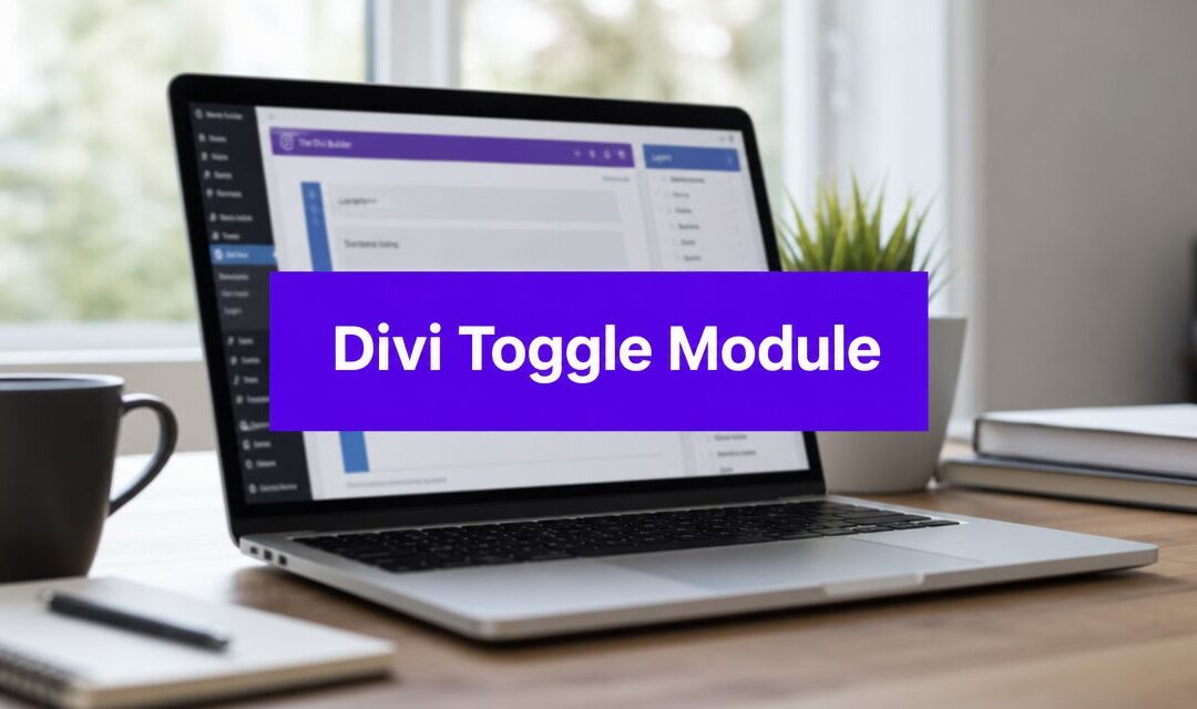
Alright, let's get our hands dirty with one of Divi's most useful and versatile modules: the Toggle. It's a fantastic tool for organizing content and creating a cleaner, more interactive user experience.
Once you're inside the Divi Builder, adding a toggle is simple. Just pop open the module library, search for "Toggle," and click to add it to your layout. You'll immediately see the settings panel, which opens to the Content tab. This is where you'll give your toggle its substance.
The first two fields, Title and Body, are the bread and butter. The Title is the visible text—the question or heading a user clicks on. The Body is the hidden content that gets revealed. Simple enough, but the real magic happens with the setting right underneath.
The Strategic Importance of the State Setting
Look just below the main content fields and you'll find a small but mighty dropdown called State. This setting lets you decide if the toggle should be Open or Closed when a visitor first lands on the page. It might seem like a minor detail, but your choice here can completely change the user's journey.
Closed State: This is the default setting and, in my experience, the one you'll use most often. It keeps your layout tidy and is perfect for things like FAQ pages where you don't want to hit the user with a wall of text. They can scan the titles and choose what to explore.
Open State: You'll want to use this one more deliberately. Setting a toggle to "Open" by default immediately highlights that specific piece of information, making it impossible to miss.
Let's imagine you're building an FAQ page for a new e-commerce product. You've noticed that 90% of your support tickets are asking about shipping times. Instead of making people hunt for it, you can set that one specific toggle to "Open" by default.
Now, when a visitor arrives on the page, the most critical answer is already waiting for them. This small tweak transforms a simple toggle from a passive content holder into a proactive, user-guiding tool. You're anticipating their needs, improving their experience, and likely cutting down on future support requests.
This is the kind of hands-on approach that separates a good website from a great one. Your toggles stop being just containers for text and become intentional elements designed to guide your audience. Think of the "State" option as your first move in curating the user's experience on that page.
Customizing Toggles for a Branded Look
Stock Divi toggles get the job done, but with a little customization, you can make them feel like a truly integrated part of your website's design. Going beyond the default settings is how you transform a simple component into a polished user experience. Let's get into the Design tab and see how to make a generic element feel perfectly on-brand.

Thankfully, the Divi Toggle module has come a long way, and it now offers a ton of styling options right out of the box. You can control everything from titles and body content to icons and backgrounds without touching a line of code. This native flexibility is your best starting point for creating a branded look.
Fine-Tuning Core Visuals
I always start with the small details that make a big impact: the Icon and Toggle settings. Here you can swap out the default plus-and-minus icons for something more unique, like a chevron. It's a quick win that immediately looks more polished.
You can also set distinct background colors for the toggle's open and closed states. This is a subtle but incredibly effective way to give users visual feedback. For example, try using a neutral, muted background for closed toggles and a light, on-brand color for the active one.
Next, let's talk typography. The Title Text and Body Text sections give you full control over your fonts, weights, and colors, which is crucial for brand cohesion. If you’re struggling to find the right combination, our guide on how to pair the right fonts for your Divi website can help. While you're at it, remember that general design principles apply everywhere; you can find some expert advice on WordPress landing page optimization that is surprisingly relevant here, too.
Pro Tip: Add a subtle box shadow to the open state of your toggle. Just navigate to
Design > Border, click the "Open Toggle" tab, and add a soft shadow. This tiny detail adds depth, making the active toggle appear slightly lifted off the page and drawing the user's eye.
Finally, while Divi’s built-in options are powerful, a little custom CSS can add that final layer of polish. By default, toggles open and close instantly, which can feel a bit jarring. A simple CSS snippet can add a smooth transition, making the interaction feel much more fluid and professional.
Creative Ways to Use the Toggle Module
Most people see the Divi Toggle module and immediately think "FAQs." It's a fair assumption, but honestly, that's like using a Swiss Army knife just for the toothpick. You're missing out on its best features. Thinking of it only for questions and answers is a huge missed opportunity to solve some common, and often frustrating, layout challenges.
Let's break out of that box. Imagine you're putting together an "Our Process" section for a client. Instead of a wall of text that makes a potential customer's eyes glaze over, you can use individual toggles for each step. "Step 1: Discovery" can be a simple, clean title, with all the juicy details revealed only when a user clicks. Right away, a complex workflow feels manageable and way less intimidating.
This same mindset can completely change how you build pricing tables.
Building Smarter Pricing Tables
We've all been there. You're trying to design a pricing table, but the feature lists are a mile long. The whole thing becomes a cluttered mess, and it's impossible to see what really matters. This is where the Divi Toggle module becomes your secret weapon.
Design your pricing table to highlight the core, high-impact features—the ones that actually sell the plan. Then, for each column, add a toggle at the bottom that says something like, "View All Features." Inside that toggle, you can list all the other nice-to-have features that detail-oriented buyers will appreciate.
This approach gives you the best of both worlds:
- Clarity for Scanners: Most visitors can get a quick, high-level comparison without feeling overwhelmed.
- Depth for Researchers: The buyers who need to know every single detail can easily expand the list to make their decision.
By tucking away secondary information, you guide the user's focus to what matters most first. This is a simple but powerful UX principle: reduce cognitive load to create a clearer path to conversion.
From Glossaries to Guided Tutorials
The possibilities don't stop with pricing. Ever written a technical article full of industry jargon? You can create an inline glossary by putting definitions inside toggles right next to the terms. This keeps readers on the page and engaged, instead of sending them off to Google. If you're looking for more ways to engage users, you can also learn more about how to add interactive content on your Divi website.
Here are a few other use-cases I turn to all the time:
- Organizing Staff Bios: On a team page, I'll show each person's name, photo, and title. Their full bio and social links? Neatly tucked away inside a toggle.
- Creating Mini-Tutorials: Break down a complex process into individual toggles. This lets users follow along at their own pace, opening one step at a time.
- Showcasing Case Study Details: Start with a punchy project summary. Then, use a toggle to reveal the deep-dive "Challenge, Solution, Results" for anyone who wants the full story.
The next time you're looking at a cluttered design or a page with too much text, just ask yourself, "Could a toggle fix this?" More often than not, the answer is a resounding yes.
When to Use an Accordion or Other Modules
The Divi Toggle module is a fantastic tool for tidying up busy pages, but it’s not a one-size-fits-all solution. Knowing when to use it—and when to reach for something else—is a hallmark of smart, user-focused design. One of the most common points of confusion I see is the difference between the Toggle and Divi’s Accordion module.
The main distinction boils down to user interaction. With toggles, a visitor can open multiple items at once. This is perfect for something like an FAQ page, where someone might want to compare two answers side-by-side. The Accordion module, on the other hand, works differently.
When a user opens one item in an accordion, any other open item automatically closes. This makes it the superior choice for sequential information, like step-by-step instructions or detailing a process where you want the user to focus on only one stage at a time.
Knowing When to Upgrade to a Plugin
Sometimes, you'll hit a wall where neither the Toggle nor the Accordion module has the power you need. What if you want to show content in a popup triggered by a specific user action? For example, when a visitor scrolls 50% down the page or when they show exit intent by moving their mouse toward the browser's back button.
For these kinds of advanced, dynamic interactions, the native Divi modules just won't cut it. This is where a dedicated plugin becomes essential. Our own Divi Areas Pro, for instance, was built specifically to handle these scenarios. It gives you the power to trigger content in popups, fly-ins, or tooltips based on precise user behaviors, bridging the gap between static content and a truly interactive experience.
The infographic below shows a few creative ways to think about the Toggle module beyond a simple FAQ.

As you can see, while FAQs are a solid use case, the toggle's flexibility really shines when you use it to organize process steps or hide secondary pricing details to reduce visual clutter. Ultimately, understanding the entire toolkit—from the foundational Toggle module to specialized plugins—empowers you to choose the right tool for the job every time.
Common Questions About the Divi Toggle Module
No matter how simple a module seems, there are always those little "what-if" questions that come up mid-project. The Divi Toggle is no exception. After building countless sites, I've run into the same practical questions time and again, so I’ve gathered the most common ones right here with some quick, battle-tested solutions.

One of the first things a client asks for, especially with a long FAQ section, is an "expand all" button. Divi doesn’t include this out of the box, but don’t worry, it’s an easy fix. A small snippet of JavaScript added to your Divi theme options is all you need. This little addition allows users to open and close all toggles at once, which is a massive usability win.
Enhancing Toggle Content and Accessibility
A question I get a lot is, "What can I actually put inside a toggle?" The short answer: pretty much anything you want. The body content area of the Divi Toggle module is a full-fledged text editor, just like you’re used to elsewhere in Divi.
This means you can easily drop in:
- Images and even full galleries
- Embedded videos from YouTube or Vimeo
- Buttons and other call-to-action modules
- Shortcodes from other plugins to add more complex features
Then there's the classic mobile styling headache. Your toggle looks flawless on desktop, but on a phone, it’s a mess. This is almost always a responsive styling problem. Make it a habit to click through Divi’s responsive views in the Design tab. You’ll need to check and set specific font sizes, margins, and padding for tablet and mobile to get that polished, consistent look everywhere.
A pro-level tip for a much better user experience is to link directly to a specific toggle so it opens when the page loads. It's surprisingly simple. Just assign a unique CSS ID to the toggle in its Advanced settings (something like
shipping-info). Then, you just tack that ID onto the end of your URL:yourwebsite.com/faq/#shipping-info.
This is a game-changer for customer support. You can send a customer directly to the exact answer they need, cutting out all the friction.
Here at Divimode, we're all about helping you build better websites, faster. If you're ready to go beyond what standard toggles can do and create some truly dynamic popups, fly-ins, and other interactive elements, you should check out our powerful plugins at Divimode.
More Articles You Will Like