
 Alex Martin
CSS Grid has revolutionized how we build web layouts, moving us away from float-based hacks to a powerful, two-dimensional system. But moving from theory to practice can be challenging. This guide bridges that gap by breaking down 8 essential CSS Grid layout examples you can implement today, from the classic Holy Grail to complex magazine and dashboard designs.
We'll go beyond surface-level code, providing deep strategic analysis for each pattern, tactical insights for implementation, and actionable takeaways to help you build responsive, sophisticated, and maintainable designs. The goal is to show you not just how to write the code, but why specific grid properties are used in each scenario. This approach ensures layouts adapt seamlessly across devices, a crucial component of effective mobile-friendly website design.
Whether you are a seasoned developer or just starting, these practical examples will equip you with replicable strategies to master modern web layout design. By understanding the core logic behind these common patterns, you can confidently build more complex and creative interfaces for your own projects. Let's dive into the examples and see how to leverage the full power of CSS Grid.
1. Holy Grail Layout
The "Holy Grail" is a classic web page layout that developers historically struggled to implement cleanly. It consists of a header, a footer, and a central content area flanked by two sidebars. Before CSS Grid, achieving this layout required a mix of floats, positioning hacks, and complex Flexbox rules, often leading to fragile and hard-to-maintain code. This is one of the best css grid layout examples because it showcases how Grid transforms a difficult problem into a simple, elegant solution.
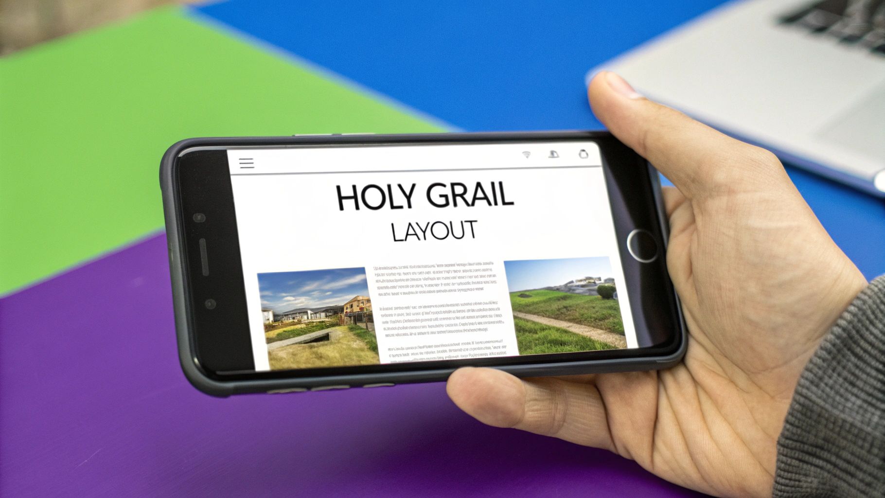
With CSS Grid, you can define this entire structure with just a few properties, creating a robust and flexible foundation for many types of websites.
Strategic Breakdown
The magic behind the Holy Grail layout in CSS Grid lies in the grid-template-areas property. This property allows you to name grid areas and arrange them in a visual, intuitive way right in your CSS.
You define a three-column grid for the main body and use grid-template-areas to assign the header and footer to span all columns, while the sidebars and main content fill the columns in between. This approach makes the layout's structure immediately understandable from the CSS.
Key Tactic: Use
grid-template-areasto create a semantic and readable layout map. This not only simplifies initial implementation but also makes future maintenance significantly easier, as the code directly mirrors the visual structure.
Practical Applications & Tips
This layout is incredibly versatile and serves as a strong foundation for various sites.
- When to Use It: It's ideal for documentation sites, news portals, and e-commerce platforms where persistent navigation or supplementary content (like ads or related links) is needed alongside the main content.
- Flexible Sizing: Use
frunits (e.g.,1fr 3fr 1fr) for your columns. This ensures the main content area grows and shrinks fluidly while the sidebars maintain their proportional width. - Mobile Responsiveness: A simple media query can redefine the
grid-template-areasto stack the elements vertically on smaller screens, ensuring a seamless user experience on any device.
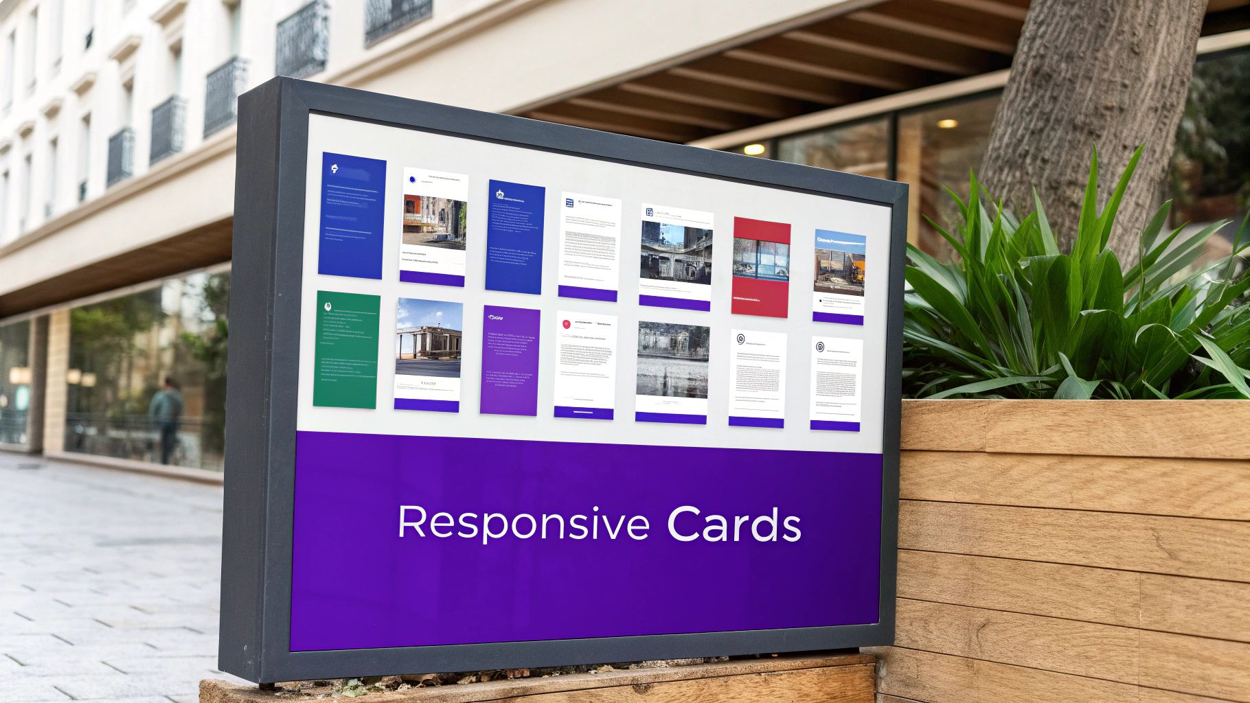
2. Card Grid Layout
A card grid is a ubiquitous pattern on the modern web, perfect for displaying collections of content like products, articles, or portfolio items. Before CSS Grid, creating a truly responsive grid that automatically adjusts the number of columns required complex calculations, media queries, or JavaScript. This is one of the most powerful css grid layout examples because it shows how a single line of CSS can create a fully responsive, flexible, and robust grid.
With CSS Grid, you can build a layout that automatically reflows its items into the optimal number of columns based on the available container width, without any media queries. This makes it a go-to solution for dynamic content displays seen on platforms like Pinterest and Dribbble.
Strategic Breakdown
The core of this powerful layout is the combination of repeat(), auto-fit, and the minmax() function within the grid-template-columns property. The auto-fit keyword tells the grid container to create as many columns as will fit into the available space.
The minmax() function defines a size range for these columns. For example, minmax(250px, 1fr) tells each column to be at least 250px wide but to stretch equally to fill any remaining space. As the container shrinks, columns that can no longer fit the minimum width will automatically wrap to the next row.
Key Tactic: Use
grid-template-columns: repeat(auto-fit, minmax(min_width, 1fr));to create a truly "intrinsic" responsive grid. This single declaration replaces multiple media queries, simplifies the CSS, and ensures your grid adapts perfectly to any screen size or container.
Practical Applications & Tips
This pattern is extremely versatile and is a fundamental building block for many modern interfaces.
- When to Use It: It's ideal for e-commerce product catalogs, portfolio galleries, blog post archives, and team member sections where you need to display a variable number of items in a clean, organized manner.
- Consistent Image Sizing: Use
object-fit: coveron your card images to prevent them from distorting or breaking the layout, regardless of their original aspect ratio. - Control Spacing: The
gapproperty is your best friend here. A simplegap: 1rem;will add consistent spacing between all grid items, both vertically and horizontally, without extra margins. - Prevent Over-stretching: On very wide screens, a single card might stretch too wide. You can prevent this by setting a
max-widthon the grid container itself, ensuring the layout remains visually balanced.
3. Magazine Layout
The Magazine Layout uses CSS Grid to emulate the sophisticated, dynamic, and often asymmetrical structure of print publications. Before Grid, achieving this layered and column-spanning effect required complex positioning and float-based hacks that were difficult to manage and rarely responsive. This pattern stands out among css grid layout examples because it highlights Grid's power to control both the macro and micro-placement of elements with precision.
With CSS Grid, you can define an intricate base grid and then instruct individual items on how many rows or columns to span. This creates a visually rich hierarchy that guides the reader's eye, perfect for content-heavy sites like news portals and creative portfolios.
Strategic Breakdown
The core strategy for a magazine layout is defining a multi-column grid (often 12 or more columns for flexibility) and then using grid-column and grid-row to place items precisely. This allows you to have a featured article span multiple columns, an image occupy a specific set of rows, and smaller content blocks fill in the remaining space.
Unlike more symmetrical layouts, this approach embraces asymmetry to create visual interest and establish a clear content hierarchy. The key is to manage the overall structure while giving individual elements unique placement instructions.
Key Tactic: Use
grid-column: span <number>to make elements like headlines or featured images break out of the standard column flow. This creates a focal point and breaks up the monotony of a uniform grid, mimicking classic editorial design techniques.
Practical Applications & Tips
This layout is ideal for websites that need to present a large amount of diverse content in an engaging way.
- When to Use It: It excels on news websites, editorial blogs, and creative portfolios where visual storytelling and content hierarchy are critical. Publications like The New York Times and Vox Media use these principles effectively.
- Plan Ahead: Sketch your layout before writing code. A visual plan helps you decide on the number of base columns and how featured elements will be positioned, saving significant time during development.
- Responsive Variations: On smaller screens, simplify the grid. You can reduce the column count or use
grid-auto-flow: denseto stack items, ensuring the layout remains readable and well-organized on mobile devices. - Maintain Gutters: Use the
gapproperty to establish consistent spacing between all grid items. This visual cohesion is crucial for preventing a complex layout from feeling cluttered or chaotic.
4. Dashboard Layout
A dashboard layout is designed to present a dense amount of information, like widgets, charts, and data panels, in an organized and easily scannable grid. Its primary goal is to provide a clear, at-a-glance overview of key metrics and data points. Before CSS Grid, creating these complex, responsive grids required cumbersome frameworks or float-based hacks that were difficult to manage and customize. This is a powerful entry in our list of css grid layout examples because it shows how Grid handles complex, multi-element arrangements with simplicity and precision.
With CSS Grid, developers can define a flexible grid and easily place items of varying sizes across columns and rows, making it perfect for dynamic interfaces like those found in analytics platforms and admin panels.
Strategic Breakdown
The core strength of using CSS Grid for a dashboard is its ability to create a consistent, multi-column track system. You can define a main grid container (e.g., 12 columns) and then use grid-column and grid-row to make individual widgets span a specific number of tracks.
This approach allows for precise control over placement and size. For example, a key performance indicator (KPI) widget might span 3 columns, while a larger line chart spans 6. This granular control ensures every element fits perfectly without disturbing the surrounding layout.
Key Tactic: Use
grid-auto-flow: dense;to automatically fill in gaps in the grid. This algorithm places smaller items into empty spaces left by larger ones, creating a tightly packed, "masonry-style" layout that maximizes screen real estate without leaving awkward empty spots.
Practical Applications & Tips
This layout is the standard for any data-intensive web application where information hierarchy and scannability are critical.
- When to Use It: It is essential for business intelligence platforms, project management tools like Asana, and admin panels. When considering real-world applications, you might explore various examples, such as a practical customer dashboard.
- Consistent Gaps: Use the
gapproperty (e.g.,gap: 1rem;) on the grid container. This ensures uniform spacing between all widgets, creating a clean, organized look without needing to add margins to individual items. - Responsive Resizing: Use media queries to change the number of grid columns. For example, a 12-column grid on desktop could become a 6-column grid on a tablet and a 2-column grid on mobile, allowing widgets to reflow naturally.
5. Masonry Layout
The Masonry layout, popularized by platforms like Pinterest, arranges items of varying heights to fit together snugly, minimizing empty space. Unlike a standard grid where rows maintain a consistent height, Masonry creates a "brick-like" pattern by stacking items vertically to fill gaps. Before native CSS solutions, this required JavaScript libraries, but it remains one of the most requested css grid layout examples due to its aesthetic appeal and efficiency.
While a pure CSS solution is still in development for CSS Grid Level 3, developers currently use a clever technique with Grid to create a "faux" Masonry effect. This involves setting a fixed number of columns and using grid-auto-rows to manage the vertical flow, with some JavaScript to orchestrate item placement for a perfect fit.
Strategic Breakdown
The core strategy for a near-perfect Masonry layout with CSS Grid involves creating a multi-column grid and allowing items to automatically flow into the next available space. You can define the number of columns and let each item span a single column, but its height will be determined by its content.
The grid-auto-flow: row dense; property is crucial here. It instructs the grid to attempt to fill any holes left by taller items with smaller items that come later in the document order. This creates the signature staggered, gap-minimizing look of a Masonry wall.
Key Tactic: While CSS Grid can create a solid Masonry-like structure, achieving a "perfect" layout often requires a small amount of JavaScript to calculate and assign the
grid-row-endproperty to each item, ensuring no awkward gaps remain.
Practical Applications & Tips
This layout is perfect for content-heavy sites where visual appeal and space efficiency are paramount.
- When to Use It: It’s ideal for image galleries, product catalogs with varying descriptions, social media feeds, and digital portfolios where content dimensions are unpredictable.
- Performance First: Masonry layouts often feature many images. Implement lazy loading to ensure images only load as they enter the viewport, dramatically improving initial page load times.
- Future-Proofing: Keep an eye on the development of CSS Grid Level 3, which is expected to include native
masonrysupport. This will eliminate the need for JavaScript workarounds, making implementation much simpler and more performant.
6. Sidebar Navigation Layout
The Sidebar Navigation Layout is a ubiquitous pattern in modern web applications, featuring a persistent sidebar for navigation alongside a main content area. Popularized by platforms like GitHub and Slack, this layout provides users with constant access to primary navigation, which is crucial for applications, dashboards, and documentation sites. This is one of the most functional css grid layout examples as it demonstrates how to create a highly practical and user-friendly interface with minimal, clean code.
CSS Grid simplifies the creation of this two-column structure, allowing for easy control over proportions, alignment, and responsiveness. It provides a robust framework for building complex, app-like interfaces that remain intuitive and accessible.
Strategic Breakdown
The core of this layout is a simple two-column grid. You can define the grid with display: grid and then set the column widths using grid-template-columns. A common approach is to give the sidebar a fixed width (e.g., 250px) and let the main content area take up the remaining space using the 1fr unit.
This technique ensures the sidebar maintains a consistent size for navigation elements, while the content area fluidly adapts to different viewport sizes. This clear separation of concerns in the CSS makes the layout both predictable and easy to manage.
Key Tactic: Define a two-column grid with a fixed-width sidebar and a flexible content area (
grid-template-columns: 250px 1fr;). This provides stability for navigation while allowing the main content to be fully responsive, creating a perfect balance for application interfaces.
Practical Applications & Tips
This layout is the go-to choice for interfaces that require persistent navigation or contextual controls. For more complex navigation needs, you might explore building a mega menu with Divi for your main header.
- When to Use It: It is ideal for admin dashboards, documentation sites, web applications (like file managers or project management tools), and e-learning platforms where users need to switch between different sections frequently.
- Sticky Sidebar: For long navigation lists, apply
position: sticky; top: 0;to the sidebar. This keeps the navigation visible as the user scrolls through the main content, improving usability. - Mobile Experience: On smaller screens, the sidebar can be hidden by default and revealed with a toggle button (an "off-canvas" menu). Use a media query to change the grid layout to a single column and handle the sidebar's visibility with JavaScript.
7. Image Gallery Grid
An Image Gallery Grid is a specialized layout perfect for showcasing visual content. It arranges images in a clean, uniform grid, ensuring consistent spacing and alignment even when dealing with photos of different sizes and aspect ratios. Historically, creating such galleries required complex JavaScript libraries or float-based hacks that were prone to breaking. As one of the most visual css grid layout examples, this pattern demonstrates how Grid provides a powerful, CSS-native solution for creating beautiful, responsive image collections.
With CSS Grid, you can effortlessly create a dynamic grid that adapts to any screen size, making it a go-to choice for photography portfolios, e-commerce product listings, and art galleries like those seen on Unsplash or Adobe Portfolio.
Strategic Breakdown
The core strategy for an image gallery is using grid-template-columns with the repeat() function and minmax() to create a responsive column layout without media queries. By setting repeat(auto-fit, minmax(250px, 1fr)), you instruct the browser to create as many columns as can fit, each with a minimum width of 250px and a maximum of one fractional unit. This allows the grid to automatically reflow, adding or removing columns as the viewport changes.
Combining this with the object-fit: cover property on the images themselves ensures they fill their grid cell without distortion, creating a clean, professional look.
Key Tactic: Use
repeat(auto-fit, minmax(value, 1fr))to create a fluid, self-adjusting grid. This single line of CSS replaces complex media queries, simplifying responsive design and making the layout inherently flexible and robust.
Practical Applications & Tips
This layout is ideal for any visually-driven website or section that needs to display multiple images in an organized and appealing way.
- When to Use It: Perfect for photography portfolios, real estate listings, e-commerce product catalogs, and travel blogs where visual storytelling is key. While static grids are excellent, for interactive showcases, you might also explore how to add an image carousel to a website.
- Consistent Sizing: Always apply
width: 100%,height: 100%, andobject-fit: coverto your<img>tags. This forces images to fill their grid cell completely, cropping them neatly instead of stretching or squashing them. - Performance First: Implement lazy loading for images to improve initial page load speed. Also, ensure all images are optimized for the web by compressing them and serving them in modern formats like WebP.
8. Responsive Form Layout
Creating forms that are both user-friendly and aesthetically pleasing across all devices has always been a significant challenge. A responsive form layout needs to maintain logical grouping, readability, and ease of use, whether on a wide desktop monitor or a narrow smartphone screen. Before Grid, this often required complex media queries and fragile float-based systems. This makes the responsive form one of the most practical css grid layout examples, as it demonstrates how to build robust, professional, and accessible forms with minimal effort.
CSS Grid allows you to arrange form fields, labels, and buttons into a flexible and adaptive structure, ensuring a seamless user experience for complex inputs like registration or checkout processes.
Strategic Breakdown
The core strategy for a responsive form layout is to use CSS Grid to define a multi-column structure that can easily collapse into a single column. Properties like grid-template-columns with repeat(auto-fit, minmax(250px, 1fr)) are instrumental here. This command tells the browser to create as many columns as can fit, with each being at least 250px wide, and to distribute any extra space evenly.
This approach makes the form fields naturally wrap and reflow as the viewport size changes. For fields that need to span multiple columns, like a text area or a submit button, you can use grid-column: span 2 to control their placement precisely without disrupting the overall flow.
Key Tactic: Leverage
repeat()withauto-fitandminmax()to create an intrinsically responsive grid. This powerful combination eliminates the need for multiple media query breakpoints, as the form layout adapts fluidly to the available space on its own.
Practical Applications & Tips
This layout is essential for any modern website that requires user input, from simple contact forms to complex multi-step applications.
- When to Use It: Perfect for registration forms, e-commerce checkout processes, detailed survey forms, and application portals where maintaining a clear visual hierarchy is crucial for user completion rates.
- Logical Field Grouping: Use
grid-columnandgrid-rowto group related fields together, such as "First Name" and "Last Name" on the same row on desktop, while allowing them to stack vertically on mobile. - Consistent Sizing: Maintain consistent field heights and spacing using grid properties like
gapfor a clean, professional appearance. Exploring some tips for better forms can also significantly improve their design and functionality. Learn more about improving form design on divimode.com.
CSS Grid Layout: 8 Example Comparison
| Layout | 🔄 Implementation Complexity | 💡 Resource Requirements | 📊 Expected Outcomes | 💡 Ideal Use Cases | ⭐ Key Advantages |
|---|---|---|---|---|---|
| Holy Grail Layout | Beginner to Intermediate | Moderate understanding of CSS Grid | Clean, semantic, responsive multi-column layout | Blogs, news sites, e-commerce, documentation | Minimal CSS, equal height columns, responsive |
| Card Grid Layout | Beginner | Low | Responsive card grid that auto-fits columns without media queries | Product catalogs, portfolios, blogs, social feeds | Truly responsive, easy maintenance, modern look |
| Magazine Layout | Advanced | High (careful planning, creative input) | Visually dynamic, asymmetrical content hierarchy | Online magazines, editorial blogs, creative portfolios | Excellent content hierarchy, visually engaging |
| Dashboard Layout | Intermediate to Advanced | Moderate to high (data-heavy, widgets) | Organized, scannable data/dashboard layout | Business intelligence, admin panels, analytics | Maximizes info display, modular, professional |
| Masonry Layout | Advanced | High (JavaScript or future CSS Grid) | Organic, space-efficient layouts with varying item heights | Image galleries, Pinterest-style feeds, social feeds | Efficient vertical space use, dynamic appearance |
| Sidebar Navigation Layout | Beginner to Intermediate | Moderate | Persistent sidebar navigation with flexible main content area | Admin dashboards, web apps, documentation sites | Always accessible nav, good for complex structures |
| Image Gallery Grid | Beginner to Intermediate | Moderate (image optimization needed) | Clean, consistent image presentation | Photography, art galleries, e-commerce products | Professional image handling, lightbox-ready |
| Responsive Form Layout | Intermediate | Moderate (accessibility, testing) | Accessible, well-structured responsive forms | Registration, checkout, surveys, contact forms | Improves UX, accessibility compliant, maintainable |
Putting It All Together: Your Next Steps with CSS Grid
Throughout this guide, we have deconstructed a diverse collection of powerful CSS Grid layout examples, moving far beyond simple code snippets. We've explored the strategic thinking behind everything from the foundational Holy Grail layout to the intricate demands of a modern dashboard. The journey has taken us through practical applications like responsive card grids, dynamic magazine layouts, and visually engaging masonry galleries.
The true power of CSS Grid lies not in mastering a single pattern, but in understanding the core principles that make them all work. By dissecting each example, we've uncovered replicable strategies for defining explicit grids, leveraging grid-template-areas for semantic clarity, and using auto-fit with minmax() for truly fluid responsiveness. This knowledge empowers you to stop merely copying code and start architecting sophisticated, custom layouts with confidence.
From Examples to Expertise: Key Takeaways
The most crucial takeaway is that these CSS Grid layout examples are not isolated solutions; they are building blocks. The real magic happens when you begin to combine them. Imagine embedding a responsive form layout within the main content area of a dashboard or using a card grid to display featured posts inside a magazine-style structure.
Consider these core principles as you move forward:
- Semantic Structure is Key: Use
grid-template-areasto make your layout's intent clear in your CSS. This not only simplifies your code but also makes it significantly easier to manage responsive adjustments with media queries. - Embrace Intrinsic Sizing: Functions like
minmax(),fit-content(), and thefrunit are your best allies for creating components that adapt gracefully to their content and container, reducing the need for rigid, pixel-perfect declarations. - Combine and Conquer: Don't view these patterns in a vacuum. A complex interface is often just a combination of simpler grid layouts nested within each other. A sidebar navigation can live alongside a main content area that itself contains an image gallery grid.
Actionable Next Steps for Divi Creators
Mastering these grid concepts unlocks a new level of design freedom, especially for Divi users aiming to push beyond the builder's standard modules. Your next step is to apply this knowledge. Pick a layout from this article that resonates with a current or upcoming project and challenge yourself to implement it from scratch. Start by building a simple card grid or a two-column sidebar layout, then progressively add complexity.
By internalizing the "why" behind each CSS property and value, you transform from a Divi user into a true web architect. This strategic understanding is what separates good design from great, future-proof design. The CSS Grid layout examples we've covered provide the perfect foundation for building faster, more maintainable, and creatively ambitious websites for your clients or your own business.
Ready to supercharge your Divi layouts with even more power and interactivity? Divimode offers premium plugins like Divi Areas Pro, allowing you to create advanced popups, fly-ins, and mega menus that can be beautifully structured with your new CSS Grid skills. Elevate your user experience by combining sophisticated layouts with powerful dynamic content triggers at Divimode.
More Articles You Will Like