 Alex Martin
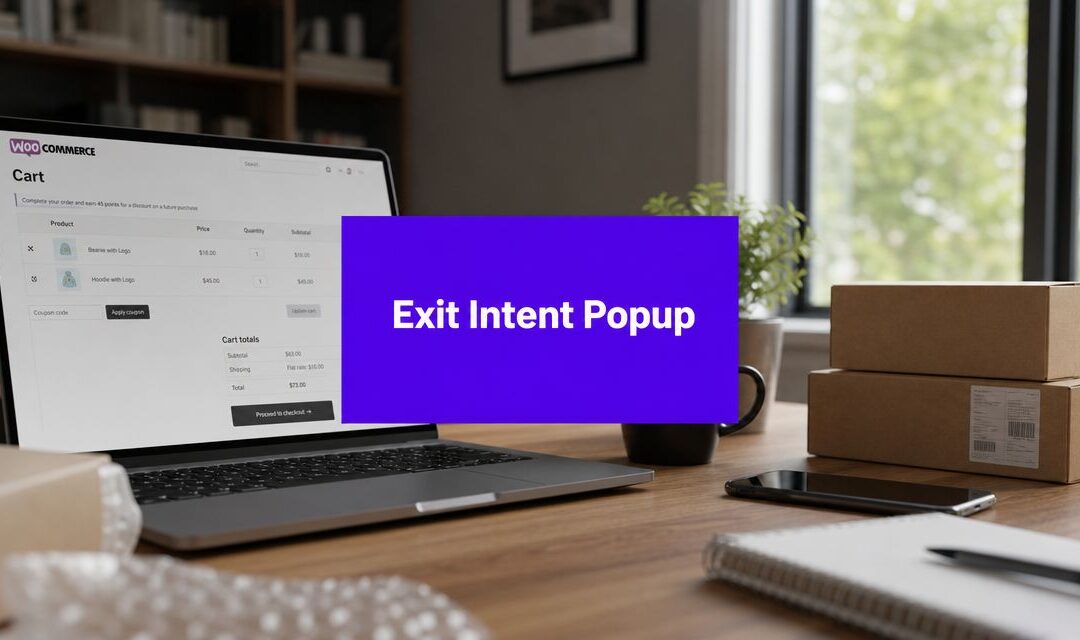
You know the pattern. A shopper browses a product page, adds something to the cart, hesitates, and then starts to leave. No complaint. No support ticket. Just a lost sale.
That's exactly where a well-built exit intent popup for WooCommerce earns its keep. Not as a flashy interruption, but as a last-moment recovery layer that gives the shopper one good reason to stay, finish checkout, or at least leave their email before they disappear. In a Divi store, the workflow matters even more because the popup has to do two jobs at once: match the site design and behave intelligently around WooCommerce conditions.
Why Exit Intent Popups Are a WooCommerce Superpower
Cart abandonment isn't abstract when you're running a store. It shows up as incomplete orders, abandoned high-intent sessions, and customer journeys that stop right before payment.
An exit intent popup works because it appears at the exact moment hesitation turns into exit. On desktop, that usually means movement toward the browser controls. On mobile, the logic has shifted toward broader behavior signals, including back-button intent, scrolling patterns, and timed triggers, as described in WordPress exit-intent guidance from OptiMonk.

Why store owners keep using them
This isn't just a design trend. Published guidance commonly estimates a 5% to 15% lift in conversion or visitor recovery when exit-intent popups are implemented well, and some WooCommerce-focused sources note that stores using them correctly often see higher conversion rates and fewer abandoned carts, according to WPFactory's overview of exit-intent popups.
That range matters because it changes the decision from “should I add a popup?” to “what should this popup try to recover?” In most WooCommerce builds, the answer falls into one of three buckets:
- Recover the order: Offer a coupon, free shipping prompt, or reminder tied to the cart.
- Capture the lead: If the shopper isn't ready to buy, collect an email for follow-up.
- Redirect the path: Move them to a stronger page, such as a bestsellers category, FAQ, or shipping information page.
Practical rule: Don't design the popup first. Pick the job first.
A discount popup on every product page often underperforms because it trains visitors to wait. A shipping-threshold reminder on the cart page can be far more useful. A size-guide prompt on apparel pages may save more sales than a coupon ever will. The popup should resolve friction, not just shout an offer.
If you're comparing approaches before you build, this guide on how to reduce cart abandonment with exit popups is a useful companion because it frames exit popups around abandoned-cart recovery rather than generic list building.
What actually makes one effective
The stores that get results don't treat exit intent as a site-wide blast. They treat it like a controlled intervention.
A strong WooCommerce popup usually has these traits:
| Situation | Better popup goal | Weak popup goal |
|---|---|---|
| Cart has items | Recover checkout | Generic newsletter signup |
| Product page bounce | Answer objection | Immediate discount with no context |
| Returning visitor | Reinforce urgency or trust | Repeating the same offer |
| Mobile exit behavior | Use simpler fallback trigger | Force desktop-style logic |
The superpower isn't the popup itself. It's the timing plus the context.
Designing Your Popup in the Divi Builder
Build the popup layout as if you're designing a landing block, not a floating ad. In Divi, the cleanest approach is to create the content in the Builder first, save it to the Divi Library, and only then turn it into a popup.

That separation keeps the visual work simple. You can focus on layout, copy, spacing, mobile responsiveness, and calls to action without getting distracted by trigger settings.
Start with one focused layout
The most reliable popup layouts in Divi are compact and single-purpose. I usually build them with one section, one row, and only the modules needed to complete the action.
A practical structure looks like this:
- Headline module with one clear promise.
- Text module that explains the benefit in plain language.
- Email opt-in or button module depending on the goal.
- Optional image only if it supports the offer.
- Microcopy for reassurance, such as shipping, returns, or privacy.
If your popup tries to explain your whole brand, it's too big. If it asks for too much information, it adds friction at the exact moment the shopper is already pulling away.
What to include and what to remove
Strong popup design is mostly about subtraction.
- Keep the headline specific: “Complete your order and save” beats vague copy.
- Use one action: One button or one form. Not both unless the hierarchy is obvious.
- Cut extra navigation: Menus and unrelated links give the visitor more exits.
- Respect mobile spacing: Tight padding and oversized text make popups feel clumsy on phones.
For inspiration on layout treatment, button styling, overlays, and animation handling, this article on ways to customize your Divi popups is worth reviewing before you lock the design.
A popup should feel like part of the store, not a plugin layered on top of it.
That usually means reusing your product-page typography, your button styles, and your existing brand color accents. The more it matches the surrounding WooCommerce templates, the less intrusive it feels.
Match the offer to the page type
Different WooCommerce contexts need different designs. A cart popup should look more transactional. A product-page popup can feel more editorial or supportive.
Here's a simple decision framework:
| Page context | Good primary message | Better module choice |
|---|---|---|
| Product page | Answer objections or offer guidance | Button to shipping, sizing, or FAQ |
| Cart page | Recover checkout intent | Coupon CTA or reminder text |
| Category page | Capture unsure browsers | Email opt-in with curated follow-up |
| Sale page | Reinforce urgency | Button plus concise supporting copy |
When you want to see the design workflow in action, this walkthrough helps:
Build for the close, not just the click
A lot of designers obsess over the CTA button and ignore the dismissal experience. That's a mistake. If the popup is hard to close, people remember the irritation more than the offer.
Design the close state deliberately:
- Visible close control: Don't hide it behind hover-only styling.
- Reasonable dimensions: Avoid fullscreen unless the offer justifies it.
- Readable contrast: The overlay should isolate the popup, not black out the site.
- Short copy blocks: Dense paragraphs drop response and increase bounce.
Once the layout is saved in the Divi Library, you're ready to give it popup behavior.
Configuring the Popup with Divi Areas Pro
Once the layout exists, turn it into a working modal. In a Divi workflow, that means creating a new area, assigning the saved Divi Library layout, and defining how it appears on the front end.
This part isn't about exit logic yet. It's about mechanics. The content has to load correctly, size correctly, and close correctly before any trigger is worth testing.
Create the popup container properly
Inside your popup system, create a new item and set its type to Popup. Then assign the layout you built in Divi.
At this stage, keep the setup plain. Use a centered modal, give it enough width to breathe on desktop, and make sure the content stack collapses cleanly on mobile. If your design includes columns, check that the order still makes sense when those columns stack.
A helpful reference for handling area display logic, placement, and content behavior is this guide on displaying content with Divi Areas Pro.
Set the foundation before styling details
The popup should be usable even before it looks polished. That means checking the following in order:
- Popup width and height: Keep it large enough for readability but small enough to preserve context from the page behind it.
- Overlay behavior: Dim the background enough to focus attention without making the site feel blocked.
- Close interaction: Confirm the close button is obvious and that outside-click behavior works the way you want.
- Animation choice: Use a simple fade or slide. Overdone entrance effects weaken trust on ecommerce pages.
If the popup contains a form, test the field focus state and tab order. If it contains a button that sends users to cart or checkout, make sure that action is visible without scrolling on common laptop sizes.
Treat popup setup like checkout UX. Small friction points compound fast.
Avoid the common build mistakes
A visually strong Divi popup can still fail in implementation. These are the errors I see most often on WooCommerce stores:
| Mistake | What happens | Better move |
|---|---|---|
| Popup is too wide | It looks like a page takeover | Use a moderate modal width |
| Long content stack | Users scroll inside the popup | Shorten the message and CTA path |
| Tiny close icon | Visitors feel trapped | Increase size and contrast |
| Heavy animation | Popup feels promotional | Use restrained motion |
| Unchecked mobile layout | Text and buttons break | Review every breakpoint manually |
One more thing matters here. Don't overload the popup content with WooCommerce elements just because you can. Product grids, long reviews, and multiple discount blocks often make the modal feel like a second page. A popup works better when it resolves one objection or presents one decision.
Define sensible defaults
If you're building for clients or managing multiple campaigns, set a repeatable baseline:
- Modal format: Centered and medium-width.
- Overlay: Soft but noticeable.
- Close button: Always present.
- Animation: Minimal.
- Spacing: More white space than your instinct suggests.
That default setup gives you a stable starting point. Then you can adjust for campaign-specific cases, like a smaller reminder popup on cart pages or a wider popup for seasonal promotions with product imagery.
By the time you finish this configuration stage, the popup should already feel native to the site. The next step is where it becomes useful: deciding exactly when it appears, who sees it, and who should never see it.
Mastering Exit Intent and WooCommerce Targeting
The largest portion of conversion lift happens. Not from the design. From the rules.
A generic popup that appears for everyone on every WooCommerce page usually underperforms because it ignores buyer state. The stronger approach is event-gated display. For WooCommerce, the most reliable implementation is event-gated: the popup should only fire when at least one cart item exists, the visitor is not already identified, and a cooldown has elapsed. On mobile, back-button detection is the practical substitute for desktop mouseleave detection, as explained in CartBounty's exit-intent technology guide.

Build your rule stack in layers
The cleanest way to configure an exit intent popup for WooCommerce is to layer conditions in this order:
Behavior trigger
Start with exit intent on desktop and a mobile-friendly fallback for smaller devices.WooCommerce state
Restrict the popup to sessions where the cart contains something, or to specific shop contexts such as product or cart pages.Audience filters
Exclude logged-in customers if the popup is meant for anonymous recovery. Exclude users who already submitted the form or reached checkout.Repeat control
Add a cooldown so the same shopper doesn't get interrupted repeatedly.
This is the difference between recovery logic and annoyance logic.
Good targeting combinations
The best-performing popup setups usually solve a narrow problem. Here are combinations that make sense in real WooCommerce stores:
Cart page plus cart has items plus exit behavior
Good for a shipping reminder, coupon reveal, or checkout reassurance.Specific product category plus exit behavior
Useful when a category needs help with fit, shipping, or technical clarification.New visitors only plus product page plus delayed trigger
Better for lead capture than immediate discounts.Mobile device plus back-button intent plus simple CTA
Better than forcing a detailed form into a small modal.
A useful example set for abandoned-cart strategy in the Divi ecosystem is this article on transforming abandoned carts into sales with popup targeting.
If the popup can't answer “why this shopper, on this page, at this moment,” it probably shouldn't fire.
Desktop and mobile shouldn't use identical logic
Desktop exit intent is fairly intuitive. The cursor leaves upward, the modal appears. Mobile is messier.
Documentation across WordPress popup tools has moved toward broader behavioral triggers on phones because mobile exit detection is less precise than classic desktop mouse tracking. In practical terms, your mobile version should be simpler, later, and easier to dismiss.
A good mobile configuration usually means:
- Shorter copy: One message, one action.
- Larger tap targets: Buttons and close controls need thumb-friendly spacing.
- Alternative triggers: Back-button intent, time delay, or scroll threshold.
- Less aggressive targeting: Avoid repeated interruptions on every page.
Offers should follow cart context
WooCommerce targeting gains significant power. The popup shouldn't offer the same thing to every cart state.
| Cart state | Better offer | Weak offer |
|---|---|---|
| Single low-commitment item | Trust or shipping reassurance | Immediate discount |
| Higher-value cart | Checkout incentive or urgency | Generic email signup |
| Category-specific cart | Product guidance or bundle suggestion | Broad site-wide message |
| Returning anonymous shopper | Save cart or capture email | Same cold welcome offer |
If you manage the rule stack carefully, the popup stops feeling like an interruption and starts behaving like a sales assistant. It appears late, only when useful, and only to the right segment.
That's the sweet spot for an exit intent popup in WooCommerce. Relevance first. Trigger second.
Design and UX Best Practices for Popups That Convert
A targeted popup can still fail if the experience feels cheap, pushy, or confusing. Conversion comes from restraint.
The easiest way to improve results is to make the popup feel helpful within two seconds. Shoppers should understand the offer, know what to do next, and know how to close it if they don't want it.

The UX rules that matter most
Guidance from MailPoet suggests setting the display delay above 15 seconds to avoid user annoyance, especially on mobile where detection is less precise, and related recommendations include pairing exit intent with scroll- or time-based triggers plus an easy-to-close design in MailPoet's WordPress popup guide.
That timing advice lines up with what works in stores. A popup shown too early feels desperate. A popup shown after meaningful engagement feels contextual.
Here's the checklist I use when reviewing popup UX:
- Lead with the value: State the benefit before the ask.
- Keep copy conversational: Short sentences beat marketing slogans.
- Make the close obvious: Visitors shouldn't have to hunt for the exit.
- Use one visual focal point: Usually the CTA button, not an image.
- Design for smaller screens first: If it works on mobile, desktop is easy.
Offers that usually make sense
The offer should match the friction point. That sounds simple, but many stores still default to a coupon when the main issue is uncertainty.
A few examples:
- On a cart page, free shipping progress often feels more natural than a discount.
- On technical product pages, supportive guidance can outperform promotions.
- On first-touch visits, email capture with a clear benefit can be more sustainable than training customers to wait for a deal.
A popup converts better when it reduces doubt than when it increases noise.
Small details carry a lot of weight
Trust signals matter, but they should be subtle. A short note about secure checkout, fast shipping, or straightforward returns is often enough. Long blocks of reassurance copy usually create more friction than confidence.
The best popups also respect refusal. A visible “No thanks” link or a clean close icon lowers resistance because the shopper stays in control. Ironically, giving people an easy way out often makes the popup feel safer to engage with.
Testing Performance and Ensuring Compliance
A popup that looks good in the builder can still lose sales in production. I treat launch as the start of validation, not the end of setup.
Test one change at a time so the result means something. Start with the offer, because that usually moves revenue more than button color or layout tweaks. On WooCommerce stores, the tests that matter most are usually incentive type, product or cart targeting, trigger timing, and copy length. If a popup underperforms, the problem is often the match between the offer and the page context, not the design itself.
Inside a Divi workflow, that matters because setup is split across two jobs. The popup design lives in the Divi Builder. The business logic lives in your trigger and targeting rules. Review both sides after launch. A strong layout with weak WooCommerce targeting will still interrupt the wrong shopper at the wrong time.
Accessibility needs the same level of scrutiny. Check that keyboard users can open, move through, and close the popup without getting trapped. Make sure focus shifts into the modal correctly, returns to the original element when dismissed, and every field has a clear label. If a screen reader user cannot understand the form or dismiss the popup, the job is not finished.
Privacy and browser behavior need real testing too. Repeat suppression often depends on cookies or local storage, which may behave differently based on consent settings and browser rules. Safari and mobile devices deserve their own pass. Popup Maker's guide to exit-intent popups explains why trigger behavior and suppression logic can vary across devices and browsers: Popup Maker's guide to exit-intent popups.
Use this checklist before calling the popup done:
- Run controlled tests: Change one variable per test, then measure email signups, coupon use, and recovered carts.
- Validate WooCommerce targeting: Confirm the popup appears on the intended product, cart, or checkout context and stays hidden where it should not fire.
- Check consent handling: Do not assume repeat-display rules work the same for every visitor.
- Review form disclosure: If you collect email addresses, state what the shopper is signing up for.
- Test accessibility: Verify keyboard support, focus handling, field labels, and a clear close action.
- Test across browsers and devices: Review desktop and mobile behavior, especially on Safari.
That final pass is what separates a popup that gets in the way from one that recovers abandoning shoppers inside a clean Divi and WooCommerce workflow.
More Articles You Will Like