
 Alex Martin
Your website's header is its digital handshake. It’s that small strip of real estate at the very top of the screen, and it’s often the first—and most critical—point of interaction a visitor has with your brand. Get it right, and it sets a positive tone for the entire experience. Get it wrong, and you might lose them before they even scroll.
This isn't just about looking pretty. A well-designed header directly impacts visitor trust, bounce rates, and how people perceive your entire brand.
Why Your Website Header Is Your Most Important Asset

Think of your header like the storefront of a physical shop. A cluttered, confusing storefront makes people turn around and walk away. But a clean, inviting one encourages them to step inside and explore. Your website's header works in exactly the same way.
A thoughtfully crafted header is so much more than just a navigation bar; it’s a constant, guiding presence for your visitors. To really appreciate its role, you have to understand the top reasons your business needs a website in the first place.
Establishing Trust and Credibility
The moment a user lands on your page, the header starts doing its job. A professional, polished design immediately builds confidence. On the flip side, an outdated or messy header can make your entire brand feel untrustworthy, sending visitors packing before they even see your content. That first impression is formed in milliseconds.
A great header serves three primary purposes: it reinforces your brand identity, simplifies navigation, and directs users toward your most important conversion goals.
Driving User Engagement and Conversions
The header is also a powerful tool for steering user behavior. It provides a clear, frictionless path for visitors, helping them find what they need without getting frustrated. This seamless experience keeps them engaged longer and slashes bounce rates.
It's also become a critical factor in driving sales and sign-ups. Brands that regularly A/B test their website headers see up to a 25% improvement in conversion rates. This proves that optimizing this space isn’t just about aesthetics; it’s about generating real, measurable results. If you want to dive deeper, you can read the full research about header design and see the data for yourself.
The Anatomy of a High-Performing Header
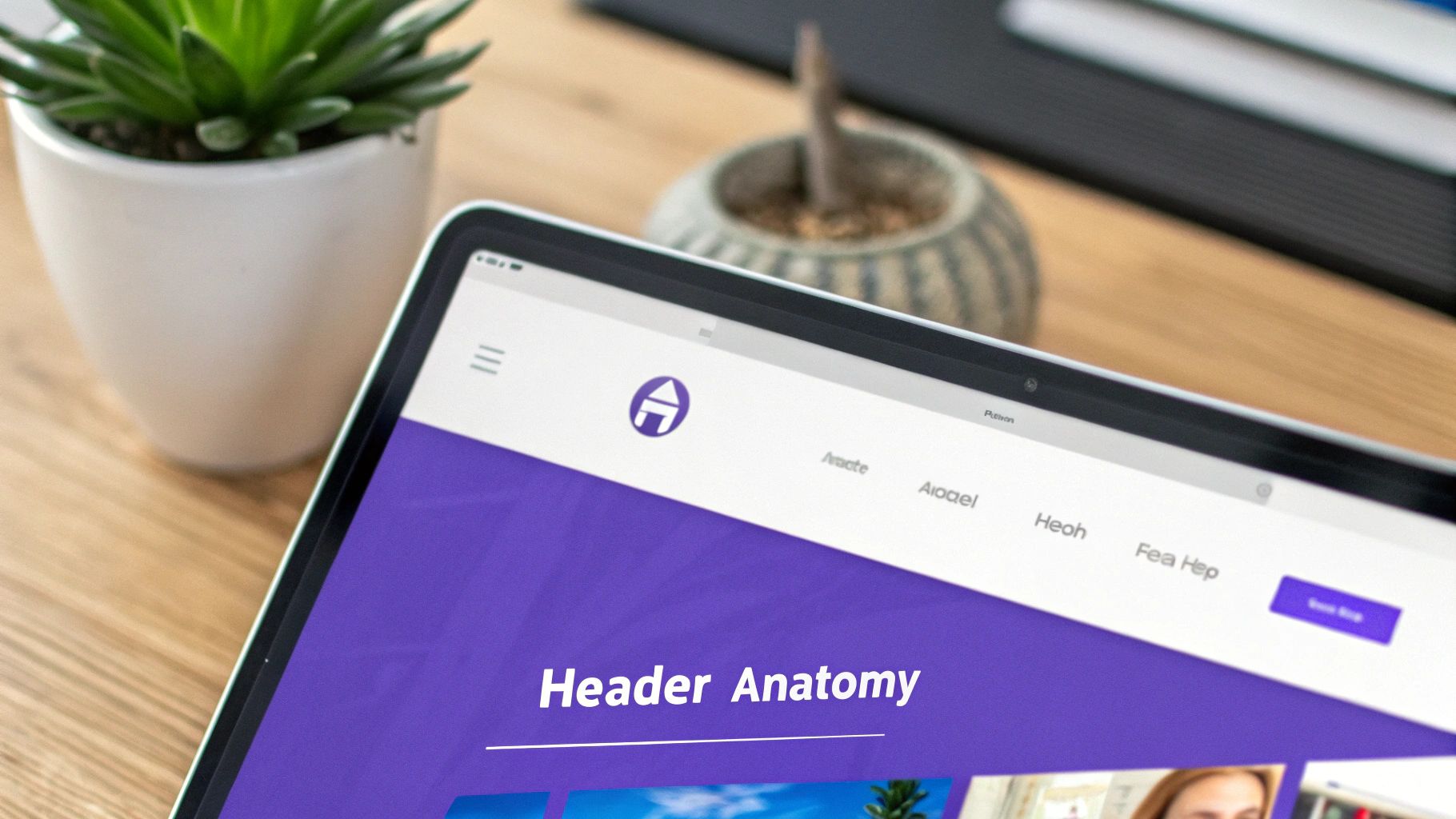
To build a great header, you first need to know what makes one tick. Think of a well-designed header like the dashboard of a car—every dial, button, and screen has a specific job, but they all work together to get you where you need to go smoothly and safely. A truly high-performing header is more than just a cluster of links; it’s a strategic control panel for your entire website.
When each piece is thoughtfully arranged, the header becomes an intuitive guide that helps users, reinforces your brand, and pushes people toward action. Let’s pop the hood and look at the essential parts.
The Five Essential Header Components
1. The Logo
Your logo is the visual anchor for your entire brand. It’s almost always placed in the top-left corner, and for good reason—research shows this placement can boost brand recall by as much as 89%. But it's more than just a pretty picture; it's a clickable beacon that should always link back to your homepage. Think of it as a reliable escape hatch that users can count on from anywhere on your site.
2. The Navigation Menu
This is your website’s roadmap, the primary way visitors find what they’re looking for. A clean, simple navigation menu (the nav element in code) is absolutely critical. Best practice is to keep it tight, with just five to seven essential items. Any more than that, and you risk overwhelming people with too many choices—a phenomenon known as "analysis paralysis."
For a deeper dive into crafting menus that guide users effectively, our complete guide offers a ton of information on effective headers for website design.
3. The Call-to-Action (CTA) Button
The CTA is arguably the most important conversion tool in your header. This button needs to pop. Use a contrasting color to make it stand out visually, and fill it with clear, action-oriented text like "Get a Quote" or "Start Free Trial." Its job is to steer visitors toward the single most important action you want them to take.
A great header acts as a silent guide, effortlessly leading visitors to their destination while reinforcing brand trust at every step of the journey.
4. The Search Bar
If you run a content-heavy site like a blog or an e-commerce store, a search bar is non-negotiable. It gives users the power to find exactly what they need in an instant, which dramatically improves their experience. A prominent search icon or a visible search field cuts down on friction and keeps people on your site longer.
5. Utility Navigation
This is a secondary group of links, usually tucked away in the top-right corner, that gives users access to practical, account-related functions. It's the "housekeeping" section of your header.
Essential Components of a Web Page Header
Here’s a quick breakdown of these core elements and what they do. Getting this right is the foundation of a header that works for both your users and your business goals.
| Component | Primary Function | Best Practice Example |
|---|---|---|
| Logo | Brand recognition and homepage navigation. | A clickable logo in the top-left corner. |
| Navigation Menu | Guides users to key pages on the site. | A simple menu with 5-7 clear, concise labels. |
| CTA Button | Drives a primary conversion goal. | A brightly colored button with action text. |
| Search Bar | Allows users to find specific content. | An easy-to-spot search icon or field. |
| Utility Navigation | Provides access to account/support links. | Small icons for cart, login, and contact. |
By carefully thinking through each of these pieces, you can put together a header that’s not just visually sharp but also incredibly functional.
Foundational Principles of Effective Header Design
A great web page header never happens by accident. It’s the result of applying a handful of proven, foundational principles—the invisible architecture that separates a confusing header from one that feels completely intuitive. When you get these right, you can make intentional choices that aren’t just beautiful but are seriously effective.
Think of it like building a house. You wouldn't just start throwing up walls without a blueprint. In the same way, your header needs a solid plan built on visual hierarchy, consistency, and responsiveness. These pillars make sure every element has a purpose and works together to create a seamless user experience.
Create a Clear Visual Hierarchy
Visual hierarchy is all about guiding your user's eye to the most important elements first. Your header isn’t a democracy; some parts, like your logo and main call-to-action (CTA), absolutely deserve more attention than others. You can make this happen using size, color, and placement.
For example, your primary CTA button should pop with a contrasting color that makes it stand out from the rest of the navigation links. Your logo should be prominent, but not so big it bullies everything else off the page. This deliberate arrangement creates a natural flow, telling visitors exactly where to look without them even realizing it. For a deeper dive into making your whole site user-friendly, this practical guide to website design best practices is packed with insights you can apply directly to your header.
Maintain Unwavering Brand Consistency
Your header is often the only element that stays put on every single page of your site. This makes it the perfect vehicle for cementing your brand identity. The colors, typography, and logo you use here must be a perfect match with your overall brand guidelines.
This kind of consistency builds trust and recognition. When a visitor sees the same familiar look on your "About Us" page as they do on the "Contact" page, it creates a powerful sense of reliability and professionalism. It’s a subtle but mighty way to make your brand feel cohesive and dependable.
Prioritize Intuitive Navigation
Good navigation feels like walking through a well-organized store where every aisle is clearly marked. The goal is to make finding information so simple that your users don't even have to think about it. Stick to clear, concise labels for your menu items—this isn't the place for clever jargon that might leave visitors scratching their heads.
The ultimate measure of a great header is its invisibility. When users can find what they need without friction or frustration, the design has succeeded. It becomes a silent partner in their journey.
This principle of clarity is absolutely critical. You have a tiny window to make an impact. In fact, by 2025, users will spend an average of just 5.94 seconds looking at a website’s main image, which is usually right there in the header. You can discover more stats like this on how users interact with websites on UserGuiding.com.
Ensure Flawless Responsiveness
These days, responsive design is completely non-negotiable. With more than half of all web traffic coming from mobile devices, your header has to look and work perfectly on every screen size, from a huge desktop monitor down to a small smartphone.
This means more than just shrinking everything down. A truly responsive header adapts its layout strategically. For instance, a horizontal desktop menu often transforms into a compact "hamburger" icon on mobile to save precious screen real estate. Testing your design across a bunch of different devices isn't just a good idea—it's essential to guarantee a smooth, functional experience for every single visitor.
Choosing the Right Header Type for Your Website
Picking the right header for your website isn't just a design choice—it's a strategic move that fundamentally changes how people use your site. Think of it like the dashboard in a car; a race car needs a different layout than the family minivan. Your website is no different. The right header feels intuitive and helps you achieve your goals, whether that's selling products or getting your message across.
One of the first forks in the road is deciding between a static header and a sticky header. A static header is the classic approach: it sits at the top and disappears when you scroll down. It's clean, simple, and gets out of the way, which is perfect for smaller sites where you don't need constant access to navigation.
On the other hand, a sticky header does exactly what it says—it "sticks" to the top of the screen as you scroll. This is a huge win for user experience on longer pages or e-commerce sites because it keeps your logo and main navigation links within easy reach at all times. In fact, studies show that sticky headers can make finding your way around a site up to 22% faster. No more scrolling all the way back to the top just to get to another page.
Common Header Styles and Their Uses
Beyond the classic static vs. sticky debate, there are plenty of other styles that bring their own unique flavor to the table. A transparent header, for instance, overlays your main hero image for a sleek, modern feel. A shrinking header is a clever compromise, starting full-size and then slimming down as you scroll to save precious screen real estate. The best choice really boils down to your content and who you're building the site for.
The best header type is one that feels like a natural extension of your content. It should assist the user's journey, not interrupt it.
To make things a little easier, check out this decision tree. It'll walk you through the key questions you should be asking yourself when planning your header.
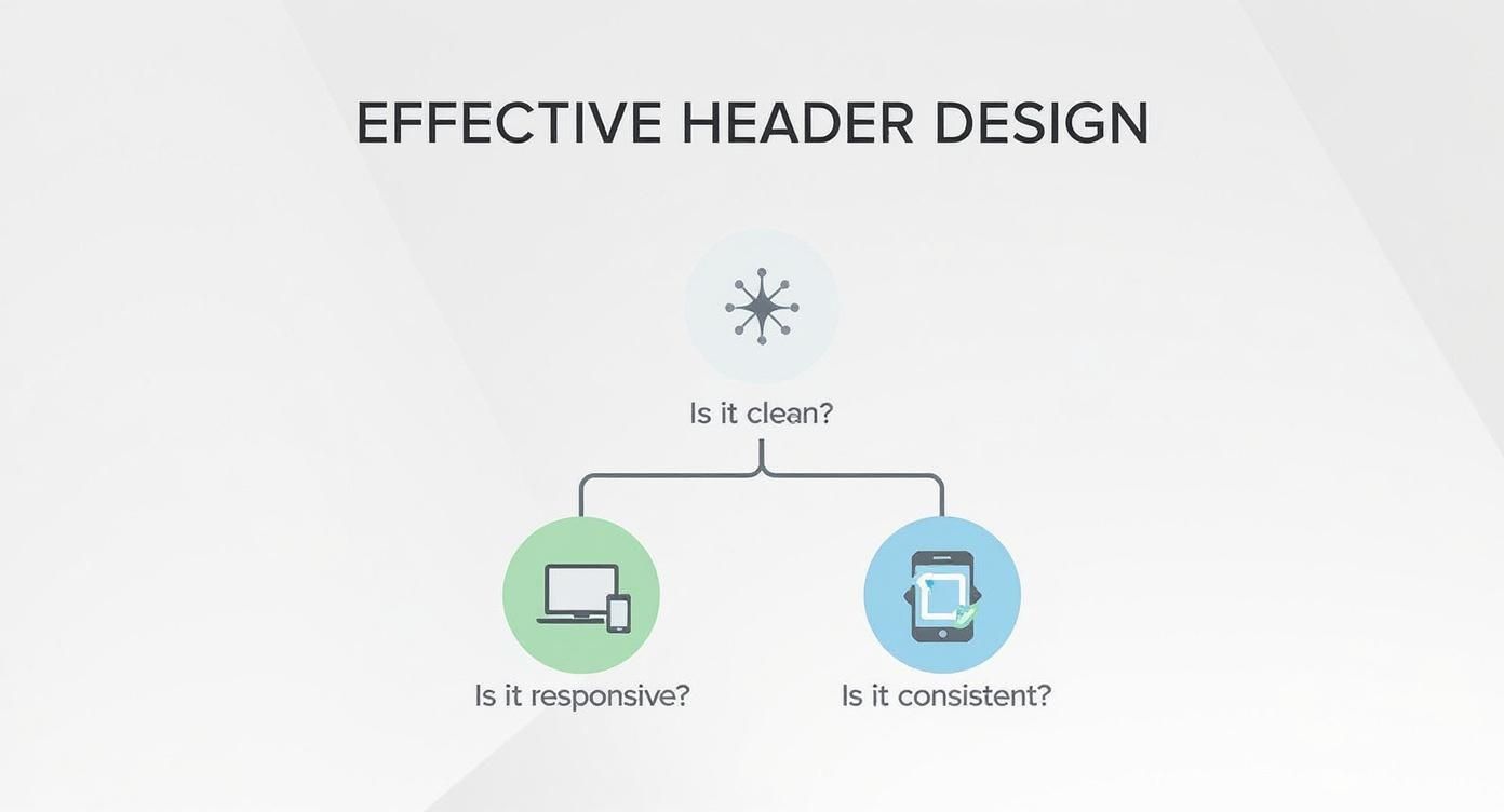
As the graphic shows, a great header is always clean, responsive, and consistent. It's your website's most reliable guide. If you're building with Divi and want to start putting these ideas into practice, our guide on the basics of building website headers with Divi is packed with step-by-step instructions to get you started.
Matching Header Type to Website Goal
The perfect header style always aligns with what your site is trying to accomplish. Let's break it down with a few real-world examples:
- E-commerce Stores: A sticky header is practically a requirement here. Keeping the search bar, shopping cart, and main product categories visible at all times makes the shopping experience smoother and helps drive sales.
- Creative Portfolios: For artists and designers, a minimalist or transparent header is often the way to go. It puts the focus squarely on the visual work, creating an immersive first impression without any unnecessary distractions.
- Corporate Websites: A classic static header is a solid choice for conveying professionalism and trust. It provides clear, no-fuss navigation to important pages like "Services," "About Us," and "Contact."
- Mobile-First Sites: A hamburger menu is non-negotiable. It neatly tucks the navigation away into an icon, freeing up valuable screen space on phones and tablets to keep the interface clean and uncluttered.
Common Header Design Mistakes and How to Fix Them
Even a tiny flaw in your web page header design can throw a wrench in the works for your visitors. We've all seen them—well-intentioned designs that accidentally create friction, leading to higher bounce rates and missed opportunities. Let's walk through some of the most common traps and, more importantly, how to sidestep them.
Overcrowded Navigation
This is probably the number one offender. A cluttered, overloaded navigation menu is like a crowded room where everyone is shouting at you. When users are hit with too many options, they get bogged down by choice paralysis, making it impossible to decide where to click next. The easiest path forward? Leaving your site entirely.
The fix is simple in theory but tough in practice: be ruthless with simplification. Your main navigation should only feature the absolute essentials—think five to seven items, max. Everything else can find a home in the footer or be neatly tucked away in a dropdown menu.
- Audit Your Links: Go through every single item in your navigation and ask, "Is this absolutely mission-critical for a new visitor?"
- Group Related Items: If you have separate pages for "Company History," "Our Team," and "Careers," bundle them under a single, clean "About Us" dropdown.
This focused approach instantly cleans up your header and does a much better job of guiding users to the pages you actually want them to see.
Weak or Hidden Calls to Action
Another classic mistake is a call-to-action (CTA) that plays camouflage. If your "Request a Demo" or "Buy Now" button looks just like every other navigation link, it completely loses its punch. A CTA isn't just another link; it's a giant, flashing arrow pointing to the most important action on the page.
Your header’s CTA should be the most visually distinct element. It’s not just another link; it's the primary action you want a user to take. Make it impossible to ignore.
To fix this, give your CTA button a high-contrast color that pops against your brand's main palette. Make sure the text is short, snappy, and action-oriented. Its entire job is to grab the eye and scream, "Click me!"
Ignoring Mobile Responsiveness
Finally, a header that looks amazing on a 27-inch monitor but falls apart on a smartphone is, simply put, a failed header. With over 60% of web traffic now coming from mobile devices, a non-responsive design just isn't an option anymore. We've all seen the results: overlapping text, unclickable buttons, and navigation menus that turn into a garbled mess. It makes your site unusable for most of your visitors.
The solution is to flip your design process on its head and adopt a mobile-first approach. Design the header to work perfectly on a small screen first—this usually means using a hamburger menu to keep things tidy. Once that's solid, you can expand the design for tablets and desktops. This way, you guarantee a smooth, functional experience for everyone, no matter what device they're holding.
Advanced Strategies to Optimize Your Header
https://www.youtube.com/embed/buECUbQQzRM
Okay, so you've got a solid header in place. The foundation is there. Now, it's time to shift gears and turn that header into a high-performance machine. These next-level strategies go beyond the basics, giving you a serious competitive edge and making your header a powerful tool for engagement.
Think about sites with massive amounts of content, like a sprawling e-commerce store or a university website. For them, a mega menu can be a total game-changer. Unlike a standard dropdown that just lists links, a mega menu opens up into multiple columns, often jazzed up with icons and images. It lets visitors see a huge range of options at a glance, making it dead simple to navigate even the most complex site structures.
Drive Action and Ensure Accessibility
Here's another trick I love: adding a top bar or notification bar just above your main header. This little strip of screen real estate is perfect for shouting out timely promotions, big announcements, or urgent alerts. It grabs attention without messing with the primary navigation, making it an incredibly effective way to drive specific, time-sensitive actions.
But it doesn't stop with adding new elements. You have to keep refining what you've got. A/B testing your navigation labels and call-to-action (CTA) buttons is where the real magic happens. Does "Get Started" pull in more clicks than "Free Trial"? You'd be amazed how tiny tweaks can lead to huge shifts in user behavior. The only way to know for sure what clicks with your audience is to test, test, and test again.
Accessibility isn't just a box to check—it's the bedrock of professional web design. When your header is accessible, it means every visitor, regardless of ability, can find their way around your site.
Ultimately, a truly great header is one that works for everyone. That means following the Web Content Accessibility Guidelines (WCAG), making sure your header can be navigated with a keyboard, and that it plays nice with screen readers. This isn't just about expanding your audience; it’s about building some serious brand trust.
And for my fellow Divi users, don't forget to dial in the mobile experience. It's well worth checking out some key tips for better Divi mobile responsiveness to ensure your slick, advanced header works flawlessly no matter the device.
Got Questions About Header Design? We've Got Answers
Even with the best roadmap, you're bound to hit a few questions once you're in the thick of a design project. Let's tackle some of the most common queries about web page headers to clear up any confusion and get you back to building with confidence.
What Should a Header Always Contain?
At the absolute bare minimum, every header needs two things: your brand logo and a primary navigation menu. Think of the logo as a reliable "home" button and the navigation as the main highway system for your site.
Of course, most high-performing headers also throw in a clear call-to-action (CTA) button to steer visitors toward that one crucial next step.
Can Different Pages Have Different Headers?
Yes, absolutely! While consistency is your best friend, it's perfectly fine for different pages to have slightly varied headers, as long as there's a good reason for it. For example, your homepage might rock a big, transparent header that sits beautifully over a hero image. Internal pages, on the other hand, might use a smaller, solid-colored version to keep the focus squarely on the content.
The real key here is to maintain a consistent brand vibe. Your logo, colors, and fonts should stay the same across the board to avoid disorienting your visitors. A simplified header is smart, but a completely different design is a recipe for confusion.
How Tall Should My Header Be?
There’s no magic number, but a good rule of thumb is to think in terms of proportion. The header needs to be large enough for easy clicking and tapping, but not so tall that it shoves your most important content "below the fold," especially on mobile.
You're aiming for a sweet spot where the header feels present but doesn't hog the screen. A common target is to have the header take up no more than 15-20% of the screen's height when the page first loads. This keeps your web page header design helpful without being overbearing.
Ready to build headers that do more than just navigate? With Divimode's Divi Areas Pro, you can create stunning mega menus, sticky promotional bars, and dynamic headers that truly engage visitors and drive action. Explore Divi Areas Pro and elevate your designs today.
More Articles You Will Like