 Alex Martin
Sizing your website's header is a real balancing act. You need it to be bold enough to establish your brand and guide visitors with clear navigation, but it can't be so big that it shoves your most important content "below the fold." Nail this balance, and you're well on your way to a great user experience.
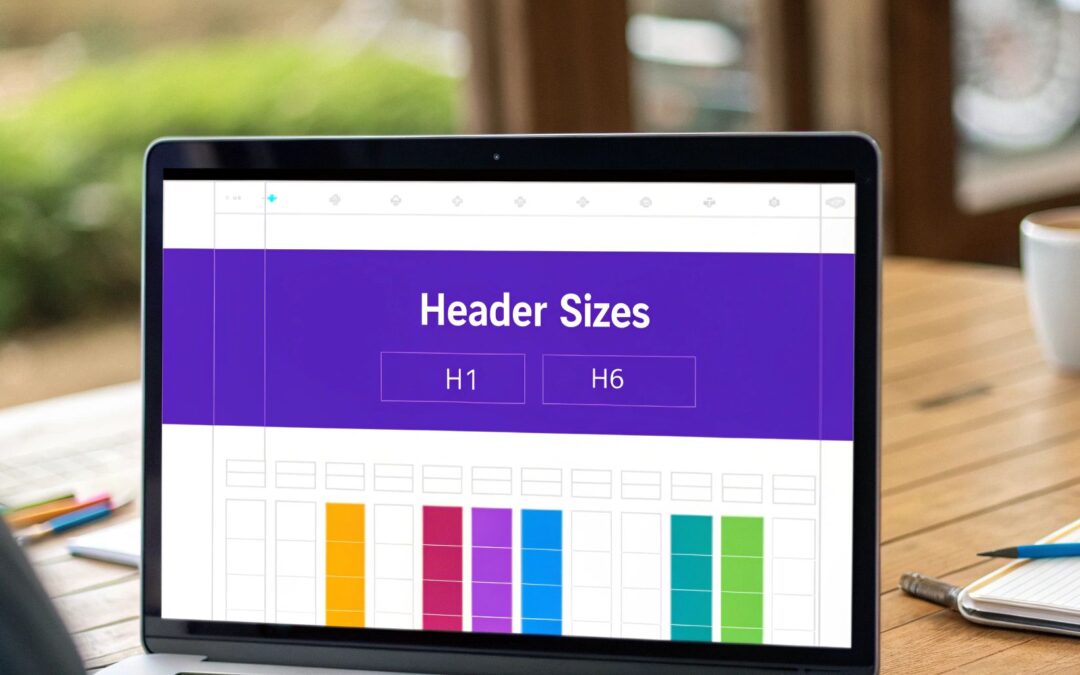
Why Your Website Header Size Matters

I like to think of a website header like the entrance to a physical store. If the sign above the door is massive and over-the-top, it blocks the view of the awesome products inside. But if it's tiny or cluttered, customers might just get confused and leave. Your digital header functions in the exact same way, which makes its size a surprisingly critical piece of your site's success.
A well-proportioned header instantly tells visitors who you are and what they can do next. It serves as a constant, reliable anchor, housing your logo, navigation, and maybe a call-to-action. On the flip side, an oversized header can create a terrible first impression, especially on mobile where every pixel counts. When someone has to scroll just to see why they came to your site in the first place, frustration builds, and your bounce rate can climb.
The Impact on User Experience and SEO
The ripple effects of a poorly sized header go way beyond just looking bad. A header that's too large directly impacts the user experience by pushing valuable content down the page. This is a big deal because it can drag down your Core Web Vitals—a set of metrics Google uses to measure a page's real-world usability.
A slow-loading or intrusive header can actively harm your SEO rankings. Search engines reward sites that deliver a smooth, fast, and mobile-friendly experience, and an optimized header is a huge part of that puzzle.
This balance has a direct line to your most important metrics:
- Bounce Rate: If visitors can't immediately see what they came for, they're far more likely to click away.
- Engagement: A smart, intuitive header encourages people to explore, leading to more page views and longer visits.
- Conversions: When your navigation and calls-to-action are clear and accessible, you're paving a smooth path for users to make a purchase or sign up.
Once you get these principles, you can start making much more informed decisions about your site's design. If you're looking for some inspiration, checking out a collection of excellent headers for website design can spark some great ideas for striking that perfect balance.
How Header Design Evolved with Screen Sizes
To really get a feel for modern header sizing, it helps to take a quick trip back in time. The early internet was a much simpler place, designed almost exclusively for a world of similar, boxy desktop monitors. Designers needed a predictable canvas, and that’s what gave rise to the fixed-width layout.
For years, the 960px grid system was the undisputed king. It gave designers a reliable, consistent width that fit perfectly on the most common screens of the era without forcing anyone to scroll sideways. Headers were built with static, pixel-perfect dimensions because you could pretty much assume every visitor was seeing the same thing. It was a one-size-fits-all approach that worked beautifully… back when one size really did fit most.
The Responsive Revolution
And then, everything changed. The explosion of smartphones, tablets, and massive widescreen monitors completely shattered the old model. All of a sudden, a header designed for a 960px layout looked comically tiny on a 27-inch monitor and was completely unusable on a phone. The rigid, fixed-width approach became obsolete almost overnight.
This forced a fundamental rethinking of web design and gave birth to the principles of responsive design. Instead of building for one specific screen, developers started creating fluid, flexible layouts that could adapt to any screen.
Responsive design isn't just about shrinking a website. It's about intelligently reconfiguring content and navigation to provide the best possible experience for the device being used, whether it's a tiny phone or a massive desktop display.
This new reality meant that header sizes for websites could no longer be a single, static number. Designers had to ditch pixel-perfect thinking and embrace more dynamic units and strategies. This transition marks the single most important evolution in the history of web layouts.
From Pixels to Percentages
The tools of the trade had to evolve, too. Static pixel values gave way to more flexible units that allowed headers to scale and adapt gracefully.
- Percentages (%): Widths could now be defined relative to the parent container, letting elements grow or shrink right along with the browser window.
- Media Queries: This CSS feature became the absolute cornerstone of responsive design. It allows developers to apply completely different styles based on screen width, height, or even orientation.
- Flexible Grids: Layouts were no longer rigid structures. They became fluid, allowing columns and content to reflow and stack as needed for the screen size.
Throughout the 2010s, the standard ‘safe width’ for websites grew from 960px to around 1140–1280px to better accommodate popular Full HD screens. Today, it’s a given that any professional website is built to dynamically scale its header based on the device—a direct result of this journey. You can find more insights on how website dimensions have changed at Alliance Interactive.
Finding the Right Header Size for Desktops
Alright, let's move from theory to practice and figure out the perfect header size for desktop screens. To get this right, you need to master two key measurements: width and height. These two work together to create a header that feels balanced and functional, guiding users without hogging the spotlight.
Think of your header’s width less like a fixed number and more like a flexible container. On a massive monitor, a header that stretches from edge to edge can make your logo and menu items feel like they're in different time zones. To fix this, designers use a handy CSS property called max-width. It creates an invisible boundary that stops your header content from stretching too far, keeping everything looking tidy and centered.
Mastering Header Width and Height
Today, the most common max-width values for desktop sites fall somewhere between 1140px and 1440px. This range creates a comfortable viewing area and keeps your navigation elements well within a user's natural line of sight, even on those ultrawide displays. It’s a simple trick, but it makes a huge difference in usability on larger screens.
While width is all about containment, height is about presence. A good desktop header should be tall enough to get noticed but short enough that it doesn’t get in the way of your actual content. The sweet spot for most websites is a height between 80px and 120px. This gives you plenty of room for a crisp logo, readable navigation links, and other must-haves like a search bar or a call-to-action button.
The perfect header height is a strategic decision, not just a design choice. It's influenced by your logo's shape, the number of menu items, and the core actions you want users to take. A feature-rich e-commerce site will naturally require a taller header than a minimalist blog.
Actionable Header Height Recommendations
Ultimately, the best dimensions depend on what your website is trying to do. A complex site just needs more real estate for navigation, while a simple portfolio can get away with something more compact. If you're ready to get your hands dirty with the technical side, exploring the basics of building website headers with Divi is a great next step for implementation insights.
To give you a practical starting point, I’ve put together a quick cheat sheet with some common recommendations based on website type.
Desktop Header Height Recommendations by Website Type
Here's a breakdown of typical desktop header height ranges. These aren't rigid rules, but they're a fantastic starting point for figuring out what will work best for your project.
| Website Type | Typical Height Range | Key Considerations |
|---|---|---|
| Blog or Portfolio | 80px – 95px | The main goal is content visibility. You only need enough space for a logo and simple navigation. |
| Corporate or Business | 90px – 110px | Needs to balance branding with more complex navigation, often including dropdown menus. |
| E-commerce Store | 100px – 120px | Requires extra space for a search bar, shopping cart icon, user login, and maybe a promotional top bar. |
| News or Media Site | 110px – 130px | Often the largest to accommodate multiple navigation categories, ad placements, and prominent branding. |
By starting with these guidelines, you can pick a header size that not only looks good but also aligns with your site's goals. This ensures you're creating a seamless and intuitive experience for everyone visiting on a desktop.
Optimizing Header Sizes for Mobile Screens
When you switch from desktop to mobile, the rulebook for headers gets thrown out the window. On a smaller screen, vertical real estate is king. Simply shrinking your desktop design just won’t work. A bulky header can easily swallow the screen, forcing visitors to scroll before they even see what your page is about—a huge user experience faux pas.
The goal is to get out of the way of the content while keeping navigation within easy reach. This means your mobile header needs to be slim, functional, and touch-friendly. A popular and effective approach is to use a much shorter header on mobile, often just a thin strip with the logo and essential controls.
Creating a Compact and Functional Mobile Header
For mobile, the sweet spot for header height is usually somewhere between 60px and 80px. This size keeps the header present without being obtrusive, dedicating the maximum amount of screen space to the content your visitors actually came to see.
This infographic shows the typical measurements for a desktop header, which really highlights the difference in priorities when you compare it to the compact mobile approach.
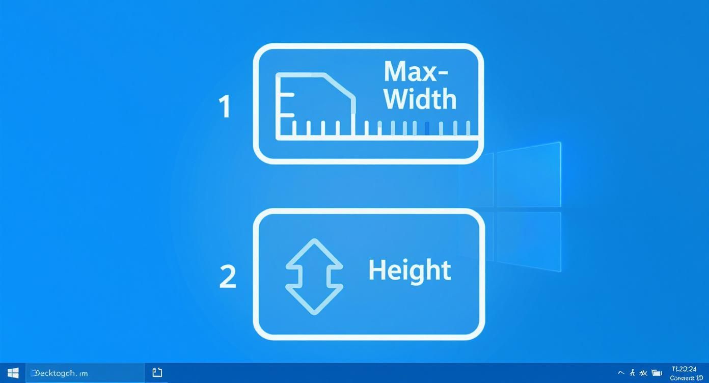
As you can see, desktop headers are often constrained by a max-width, but on mobile, the game completely changes. The top priority becomes minimizing height.
To get this compact design, designers lean on a few trusted mobile-first navigation patterns. These patterns are perfect for condensing a full menu into a single, clean icon.
- The Hamburger Menu: This is the undisputed champion of mobile navigation. The three-lined icon tucks your full menu into a slide-out panel or a full-screen overlay, ready to go with a simple tap.
- The “Sticky” Header: This header stays put at the top of the screen as the user scrolls. It's incredibly handy on mobile because it keeps the main navigation just a thumb-tap away, no matter how deep into the page someone has scrolled.
Balancing Size with Usability
While you might still have a hero banner that spans the full mobile width of 320px to 360px, the functional header itself gets squeezed into that much smaller strip—sometimes as slim as 40px to 100px tall. This isn't just a design trend; it's a direct response to user behavior. By 2025, an estimated 75% of global internet users will access the web mainly on mobile, making this kind of optimization non-negotiable. If you want to dig deeper into these trends, Shopify has some great guides on mobile image sizes.
The key takeaway for mobile is ruthless prioritization. If an element isn't absolutely essential for initial navigation, it should be tucked away behind an icon or moved to the footer. Your goal is a header that feels intuitive and seamless, not like a roadblock.
By adopting these mobile-first strategies, you create a header experience that feels perfectly at home on any device, from a small smartphone to a large tablet. It’s all about making sure your design serves the content instead of competing with it.
How Ad Placements Shape Header Dimensions
Let's talk about a powerful, real-world factor that often dictates header sizes: money. Beyond branding and navigation, for many blogs, news outlets, and media sites, advertising revenue is a primary business goal, and that directly impacts how a header is built.
Once you introduce monetization into the mix, you're working with a whole new set of constraints. Designers aren't just creating a clean space for a logo and menu anymore; they have to strategically carve out room for ad banners without completely wrecking the user experience. This is exactly why you'll often see larger, more complex headers on publisher websites.
Integrating Ad Slots into Your Header
The most common ad format you’ll see in desktop headers is the 728×90 pixel "leaderboard" banner. This ad is wide and relatively short, designed to sit prominently right at the top of a page. To make it fit, designers often create a dedicated zone either directly above or just below the primary navigation bar. That separation is key—it prevents the ad from feeling like it's part of the site’s own navigation, which would just confuse users.
On mobile, the go-to ad size is the much smaller 320×50 pixel banner. Given how little vertical space there is to work with on a phone, integrating this requires some careful planning. Trying to squeeze a 50px-tall banner into an already compact 60-80px header can make the entire area feel cramped and frustrating to use.
A common solution is to place the mobile ad banner in a thin, sticky bar at the very top or bottom of the screen. This keeps it separate from the primary header, preserving that precious space for the logo and hamburger menu while making sure the ad stays visible.
Balancing Revenue with User Experience
The real challenge here is to make these ad placements feel intentional rather than intrusive. A poorly integrated ad can easily push your most important content too far down the page, leading to high bounce rates and a genuinely bad user experience.
Here’s how to strike the right balance:
- Dedicated Ad Zones: Create visually distinct areas just for ads. Something as simple as a subtle border or a different background color can signal to users that the space is commercial.
- Maintain Navigation Integrity: Never, ever sacrifice the clarity or usability of your main menu for an ad. Your primary navigation must always be the hero of the header.
- Consider "Above the Fold": Placing a huge ad banner at the very top can push your H1 title and opening paragraph below the fold, which is bad for both your users and your SEO.
Even as we head toward 2025, common web banner sizes like the 728×90 leaderboard and the 320×50 mobile banner are still the popular choices for top-of-page ad placements. Large publishers frequently design their headers with these fixed-height zones in mind, strategically balancing their revenue needs with clean, functional navigation. You can discover more insights about effective website banner sizes at Avada.io.
Building Responsive Headers with CSS
A responsive header is one of the first things a user interacts with, so it has to work perfectly on any device. Getting it right means blending form and function, ensuring your header is both useful and sleek, whether on a giant desktop monitor or a tiny phone screen.
Let's walk through how to use a few core CSS tools to make that happen. The first step is to set a max-width on your header's container. This simple trick prevents it from stretching awkwardly wide on massive screens, keeping your layout tidy. From there, it's all about using relative units like percentages (%) and viewport width (vw) to allow for fluid scaling.
This is where modern layout systems like CSS Flexbox and Grid really shine. They make aligning logos, menus, and call-to-action buttons incredibly simple. A flex container, for instance, can vertically center all your header items with just a single line of code. This kind of flexibility ensures everything flows naturally as the screen size changes.
Here's a quick rundown of the game plan:
- Set a
max-widthcontainer to put a ceiling on your header's width for desktops. - Use
%orvwfor typography and spacing, letting elements grow and shrink smoothly. - Apply Flexbox or Grid to intelligently arrange your logo, navigation, and other key areas.
- Use media queries to trigger style changes at key breakpoints like 768px or 1024px.
Aligning Layouts with Flexbox and Grid
Flexbox is your go-to for arranging items in a single line, either horizontally or vertically. It’s perfect for distributing space and aligning elements inside your header. Grid, on the other hand, is built for two-dimensional layouts, letting you define both rows and columns with ease.
For a classic header structure, Flexbox is often all you need. Here’s a simple snippet to get you started:
header {
display: flex;
align-items: center;
justify-content: space-between;
max-width: 1200px;
margin: 0 auto;
}
Then, you can use a media query to completely switch up the styles for mobile screens. This is where you'd hide the main navigation and show a hamburger icon instead.
@media (max-width: 768px) {
header {
padding: 0 20px;
}
nav {
display: none;
}
.hamburger {
display: block;
}
}
A truly fluid header adapts gracefully to every viewport, creating a seamless and predictable experience for the user.
Demystifying Media Queries
Media queries are the secret sauce of responsive design. They let you apply specific CSS rules only when the screen size hits a certain point, known as a breakpoint. This is how your navigation can transform from a full horizontal bar on desktop to a compact, touch-friendly icon on mobile.
Think of it as setting up a series of "if/then" rules for your design. "If the screen is smaller than 768px, then hide the main menu."
- Start by picking common breakpoints. 1024px (tablets in landscape) and 768px (tablets in portrait and large phones) are great starting points.
- Inside your media queries, adjust padding and font sizes. Using rem or em units here will help ensure your text remains readable.
- For any screen under 768px, it’s standard practice to swap out the full navigation for a hamburger menu.
- Finally, always test your work. Check your header on multiple browsers and real devices to make sure it behaves exactly as you expect.
Want to dive deeper? You can learn more about crafting fluid layouts and responsive headers in our in-depth guide to responsive web page CSS at Divimode.
Got Questions About Website Header Sizes?
Even with the best guides in hand, a few specific questions about website headers always seem to pop up. Let's tackle some of the most common ones to give you clear, straightforward answers.
What Is the Best Header Size for SEO?
This is a bit of a trick question. There’s no magic number that search engines are looking for. Instead, your SEO is all about how that header affects your site's performance and the user's experience. A header that’s way too big, especially on mobile, can seriously slow down your site and shove your actual content below the fold.
That’s a direct hit to your Core Web Vitals and engagement metrics—two things that are huge SEO ranking factors. Your goal should always be a snappy, lightweight, and mobile-first header that gets the content in front of your visitors as quickly as possible.
Should My Website Header Be Sticky?
A sticky header—one that stays put at the top as users scroll—can be a super helpful tool, but it's definitely not a one-size-fits-all solution. They're fantastic for long pages or e-commerce sites where people need constant access to the navigation or their shopping cart.
But here's the trade-off: a sticky header eats up precious screen space. On a phone, that's a big deal.
Only use a sticky header when the convenience it offers is a clear win over the vertical screen real estate it costs. If your page is short and sweet, it's often better to just let the header scroll out of sight.
What Is a Good Header Size for an E-commerce Site?
E-commerce headers have a lot on their plate. They often need to cram in a search bar, a shopping cart icon, a user login, and a whole lot of navigation. Because they’re so functionally dense, they usually need to be a bit taller to keep things from feeling cluttered. A height between 90px and 120px on desktop is a pretty common and effective range.
A popular strategy many successful online stores use is adding a thin "top bar" above the main header. This little strip is the perfect spot for promotions or important announcements, letting you add functionality without making the main navigation feel bloated.
More Articles You Will Like