If you're trying to boost your website's conversions, the first thing you need to do is stop guessing. Forget about randomly changing button colors or tweaking headlines. Real, sustainable growth starts with data. You need to build a solid foundation by figuring out what a "conversion" actually means for your business and then using analytics to find where your funnel is leaking.
This approach gives you a clear roadmap, ensuring every change you make is a calculated move, not just a shot in the dark.
Building Your Conversion Optimization Foundation
Before you touch a single thing on your website, you have to know where you stand. The first step? Define what a "conversion" is. It's not always a sale, especially if you're not running an e-commerce store.
A conversion is simply any valuable action you want a visitor to take. The big one, like a purchase, is what we call a macro-conversion. But don't overlook the smaller steps along the way—the micro-conversions. These are just as crucial for tracking user engagement and intent.
Think about actions like:
- Newsletter Signup: Capturing a lead for future email campaigns.
- Demo Request: A huge buying signal for SaaS companies.
- "Add to Cart" Click: Shows strong interest, even if they bail later.
- Ebook Download: Trading valuable content for an email address.
Once you know what you’re measuring, you can fire up a tool like Google Analytics and start hunting for the leaks. Your mission is to find high-traffic pages that are dropping the ball and figure out exactly where people are giving up. This isn't about blaming a page; it’s about understanding what's tripping up your visitors.
Pinpointing Performance Gaps
Start by looking for pages that get a lot of visitors but have a surprisingly high exit rate. Is it a product page with confusing specs? A checkout process that feels clunky and insecure? Your data will shine a light on these friction points. For a deeper dive into turning more visitors into customers, check out these proven tips to improve website conversion rates.
A data-first approach is non-negotiable. Without a baseline, you're just making changes in the dark. With data, every decision becomes a calculated step toward better performance.
This chart is a perfect example of what to look for. It compares traffic volume against drop-off rates for a site's top pages, immediately flagging where the opportunities are.
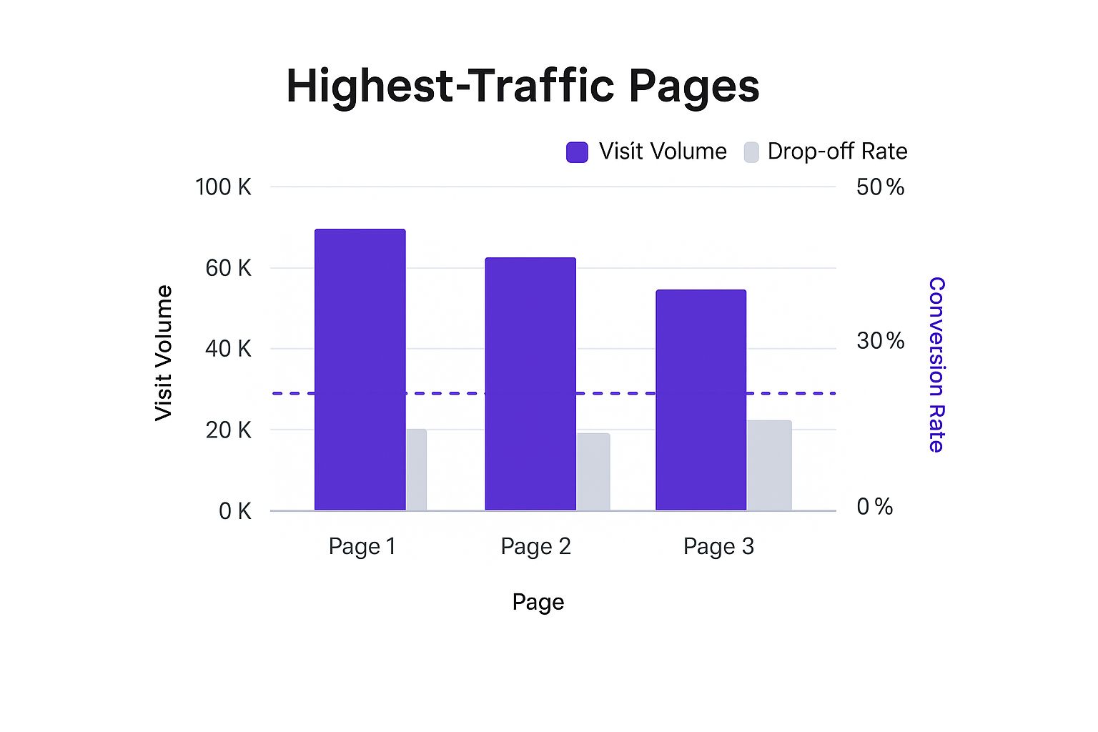
You can see right away that the "Services" page gets a ton of traffic, but its massive drop-off rate is a red flag. That's a major leak in the funnel, and it's exactly where you should focus your attention first.
Designing Landing Pages That Actually Convert

Think of your landing pages as your digital storefronts. When it comes to conversions, that first impression is everything. A visitor shows up with a problem to solve or a question in mind, and you have just a few fleeting seconds to prove you're the right answer.
This isn't the time for generic, one-size-fits-all designs. We're talking about crafting pages that are laser-focused on a single goal. Every single element, from the headline down to the button text, needs to work together to guide that user toward one specific action.
Craft Compelling Headlines That Resonate
Your headline is the first thing people read, and honestly, it can make or break their entire visit. It has to immediately answer their silent question: "What's in it for me?" It also needs to perfectly match the promise of whatever ad or link they just clicked.
A truly great headline does more than just describe what you're offering. It taps directly into a user's pain point and positions your product or service as the obvious solution. Ditch the feature-speak and focus on the benefit.
For example, a headline like "Our New CRM Software" is a total snoozer. But "Stop Juggling Spreadsheets and Close More Deals"? Now you’re talking. That second option instantly connects with a real-world frustration and promises a tangible result.
A landing page without a clear, benefit-driven headline is like a storefront with no sign. Visitors will arrive confused and leave quickly, costing you valuable opportunities to increase website conversions.
Align Page Design with Your Campaign Goal
Not all landing pages are created equal, mainly because not all campaigns have the same end goal. The way you design and lay out your page should directly support what you want the user to do. Getting this strategic alignment right is one of the quickest ways to see better results.
Let's look at what the data says. It turns out that landing pages built for simple click-throughs tend to perform much better than those designed solely for lead capture.
Median Conversion Rates by Campaign Goal and Industry
| Category | Median Conversion Rate |
|---|---|
| Click-Through Landing Pages | 11.3% |
| Lead Capture Landing Pages | 4.1% |
| Top Industry (Catering/Restaurants) | 18.2% |
As you can see, the median conversion rate for click-through campaigns sits at a healthy 11.3%, which is more than double the 4.1% median for form-based lead generation. And some industries, like catering and restaurants, can hit an impressive 18.2% average.
This doesn't mean you should abandon lead capture forms. It just means you need to tailor the design to the goal.
Here’s a quick breakdown of how to approach this:
- For Click-Throughs: The key here is to minimize distractions. You want a bold, singular call-to-action (CTA) button, powerful product visuals, and just enough copy to build excitement and make them curious about the next step.
- For Lead Captures: This is all about building trust. You need to incorporate social proof like testimonials or case studies, keep your form fields to an absolute minimum, and be crystal clear about the value they'll get for handing over their information.
If you're a Divi user, you've got some powerful tools right at your fingertips to build these specialized pages. For those looking to really dial in their landing pages, working with some of the best landing page conversion design agencies can provide that expert touch. Of course, you can always get started with our own guide on how to build landing pages to nail the technical side.
By matching your design to your user's intent, you create a frictionless path that makes converting feel like the natural next step.
Why Website Speed Is Your Secret Conversion Weapon
When we chase higher conversion rates, it's easy to get lost in the weeds of fancy headlines and pixel-perfect button colors. But one of the most powerful conversion levers you can pull is completely invisible: speed. How fast your site loads isn't just a nerdy technical detail anymore—it's a critical part of the user experience that hits your bottom line, hard.
A slow website is the silent killer of conversions. Think about it. With every tick of the clock a visitor waits for your page to appear, their patience evaporates. That "back" button starts looking mighty tempting. In a world of instant everything, a sluggish site just feels broken and unprofessional.
The Direct Link Between Speed and Sales
The data on this is painfully clear. There’s a direct, undeniable link between how fast a page loads and how many people buy. Websites that load in one second can see conversion rates up to 2.5 times higher than sites that take five seconds.
And it gets worse. A one-second site can convert a staggering five times higher than one that keeps visitors waiting for 10 seconds. That's not a small difference. This shows just how much a real investment in faster hosting, optimized images, and clean code can directly multiply your revenue. If you want to dig into the numbers, research from places like Wordstream really drives home the impact of speed.
Put it this way: if your site takes five seconds to load, you're likely leaving more than half your potential sales on the table. All because of performance.
Your website is in a constant battle against the visitor's back button. Every millisecond you shave off your load time is a small victory that keeps them engaged and moving toward your call-to-action.
Identifying and Fixing Speed Bottlenecks
Okay, so where do you even start? First, you need to know what you're up against. Tools like Google PageSpeed Insights or GTmetrix are your best friends here. They'll give you a detailed report card on your site's performance and point out the biggest troublemakers.
More often than not, the culprits are the usual suspects:
- Unoptimized Images: Huge, high-resolution image files are the number one cause of slow sites. Compressing them without turning them into a pixelated mess is non-negotiable.
- Bloated Code: Piles of messy or unnecessary CSS, JavaScript, and HTML can bog down your server and make visitors wait.
- Slow Hosting: Your hosting plan is the engine of your website. A cheap, shared plan might feel like a good deal, but it can cost you a fortune in lost sales.
- Lack of Caching: Caching is like your site’s short-term memory. It stores a ready-made version of your page so it can be delivered almost instantly to repeat visitors, instead of being rebuilt from scratch every single time.
Tackling these issues is one of the highest-impact things you can do to boost conversions. For a step-by-step game plan, our guide on 8 steps to decreasing website loading time by 50% gives you an actionable list to start making immediate improvements. When you make speed a priority, you're making sure your brilliant designs and compelling offers actually get a chance to be seen.
Using A/B Testing to Drive Real Improvements
Let's be honest: the fastest way to get more conversions is to stop guessing what your audience wants and start listening to what their actions are telling you. This is the whole idea behind A/B testing—a method where you pit two versions of something on your site against each other to see which one performs better.
Instead of making changes based on a gut feeling, A/B testing gives you hard data. It turns your optimization efforts from a creative guessing game into a science. You're no longer just changing things; you're running controlled experiments to get specific, measurable results.
Forming Your Hypothesis
Every good test I've ever run started with a solid hypothesis. This isn't a random guess, but an educated assumption you make based on data you've already collected.
For example, say you've noticed a ton of people are dropping off on a product page without buying. Your hypothesis might sound something like this: "I believe that changing the generic 'Add to Cart' button text to a more benefit-driven 'Get Your Instant Download' will increase clicks because it clarifies the immediate value."
That simple statement frames the entire test perfectly. It identifies:
- The Problem: Low clicks on the main CTA.
- The Proposed Solution: Changing the button copy.
- The Expected Outcome: An increase in clicks.
This structure makes sure your tests have a purpose and aren't just random tweaks. If you're new to the concept and want to go deeper, our complete guide explains what is A/B testing in much more detail.
Choosing What to Test First
With endless things you could test, where do you actually start? My advice is always the same: focus on high-impact, low-effort changes first. This isn't the time to redesign your entire homepage. Instead, test single, critical elements on your most important pages.
The goal of A/B testing isn't just to find a winning variation. It's to continuously learn what resonates with your audience, with each test providing valuable clues that lead to sustained growth.
Some of the most effective elements to test include:
- Headlines: Does a question-based headline get more engagement than a bold statement?
- Call-to-Action (CTA) Buttons: Test the color, size, and especially the text. "Buy Now" vs. "Get Started" can make a huge difference.
- Hero Images: Does a picture of a real person using your product work better than a polished product shot?
- Form Fields: Would removing that optional phone number field actually boost form submissions? (Hint: it usually does.)
Start with the one element you believe will have the biggest influence on your conversion goal. Tools like Google Optimize, Optimizely, or VWO make running these tests surprisingly straightforward, often without needing a developer.
Just remember to test one thing at a time. If you change the headline and the button color at the same time, you'll never know which change actually caused the result. This methodical approach is how you turn small, incremental wins into significant, long-term gains.
Optimizing Your Mobile Experience for More Sales

Let's be blunt: ignoring your mobile users is one of the fastest ways to kill your sales. With most website visits now happening on a small screen, a clunky, frustrating mobile experience isn’t just an inconvenience—it's a direct leak in your revenue bucket.
Too many businesses treat mobile as an afterthought, simply shrinking their desktop site down to fit. This is a fundamentally flawed approach. Mobile users are in a completely different mindset; they’re often on the go, distracted, and have zero patience for friction. To really boost your website conversions, you need a mobile-first strategy that respects these realities.
Simplify Navigation and Reduce Clicks
On a desktop, a sprawling mega menu might feel comprehensive. On a phone, it’s a usability nightmare. Your mobile navigation needs to be ruthlessly streamlined. Figure out the most critical pages and tuck everything else away behind a clean, recognizable hamburger icon.
The goal here is simple: get users where they want to go with the fewest taps possible.
- Implement a Sticky Header: Keep your logo, search bar, and cart icon visible as users scroll. This simple tweak prevents them from having to swipe all the way back to the top just to take action.
- Use Clear, Obvious Icons: Don't make people guess. A magnifying glass for search and a shopping cart for the cart are universally understood. Stick with what works.
- Keep Your Hierarchy Shallow: Avoid burying important pages three or four levels deep in your menu. A user should never have to tap more than twice to reach a main product category.
This isn’t just about making things look pretty; it’s about reducing cognitive load. When a user doesn’t have to think hard about how to find something, they’re far more likely to stick around and actually buy.
Every extra tap, pinch, or zoom on mobile is another opportunity for a potential customer to get frustrated and leave. A truly great mobile experience feels effortless and intuitive from the moment the page loads.
Design for Thumbs and Speed
Mobile design is tactile. People navigate with their thumbs, and your layout must accommodate that. This means buttons and links need to be large enough to be tapped easily without accidentally hitting something else. Make sure you place key calls-to-action—like "Add to Cart"—in the "thumb-friendly zone" at the bottom or center of the screen where they're easy to reach.
Beyond the physical interface, performance is everything. Slow load times feel even slower on mobile, where connections can be spotty. You need to compress images aggressively and minimize any heavy scripts that might bog down a device.
The data highlights this mobile-desktop divide in stark terms. While mobile accounts for a whopping 73% of traffic, it converts at just 2.9%—a long way behind desktop’s 4.8%. This gap often boils down to a poor user experience and friction at checkout, where mobile cart abandonment can soar to 77.2%. You can discover more insights on how a simplified mobile journey can boost your sales.
By designing for thumbs and prioritizing speed, you build a mobile site that not only looks good but also feels responsive and easy to use. This directly tackles the core issues that suppress those crucial mobile conversions.
Your Burning Questions About Website Conversions, Answered
Jumping into conversion optimization always kicks up a few questions. I get it. To help you move forward with confidence, here are some straightforward answers to the questions I hear most often from clients and fellow designers.
What Is a Good Website Conversion Rate?
Honestly, a "good" conversion rate is a moving target. It really depends on your industry, who you're selling to, and what you're asking them to do. While you'll often see the e-commerce average quoted around 2-4%, fixating on a generic number like that can be a trap.
I've seen B2B SaaS companies thrilled with a 1% conversion rate for demo requests, while a niche e-commerce store might be pushing for 5% or more.
The only benchmark that truly matters is your own. The best goal is to see consistent, steady improvement. A genuinely good conversion rate is one that’s heading in the right direction because you’re actively testing and learning from your users—not just chasing someone else's numbers.
How Long Should I Run an A/B Test?
The perfect length for an A/B test comes down to one thing: your site's traffic. Your goal is to run the test long enough to achieve statistical significance, which is just a fancy way of saying your results are real and not just a lucky guess.
For most sites, I always suggest running a test for at least two full business weeks. This gives you a chance to see how different user behaviors on weekdays and weekends might affect the outcome. One of the biggest mistakes people make is pulling the plug as soon as one version seems to be winning. Don't do it! Let the test run its course so you can collect data you can actually trust.
Resist the urge to call a test early. A premature conclusion from a small data set is often worse than no data at all. Patience is your best friend when it comes to getting results that will genuinely improve your conversions.
What Should I Optimize First for Quick Wins?
If you want to see the biggest impact in the shortest amount of time, you have to focus on the low-hanging fruit. Go straight to your high-traffic pages that have disappointingly low conversion rates. Fixing the biggest leaks first is always the quickest path to a win.
Based on my experience, these are the three things I check first for a fast lift:
- The Headline and Value Proposition: When someone lands on your page, is it immediately obvious what you offer and why they should care? If they have to work to figure it out, they’re gone.
- The Main Call-to-Action (CTA): Is your primary button impossible to miss? Is the text compelling? It needs to be frictionless and use clear, action-oriented words that tell people exactly what happens next.
- Page Load Speed: We've talked about this, but it's worth repeating: slow pages are conversion killers. Just shaving a single second off your load time can lead to a real, measurable boost.
Tackling these core elements on your most popular pages almost always delivers a noticeable improvement right away, giving you the momentum you need for bigger optimization projects down the road.
Ready to turn these insights into action? With Divimode, you can build high-converting popups and interactive elements directly within Divi. Grab Divi Areas Pro and start creating smarter, more engaging experiences that drive real results.
More Articles You Will Like