 Alex Martin
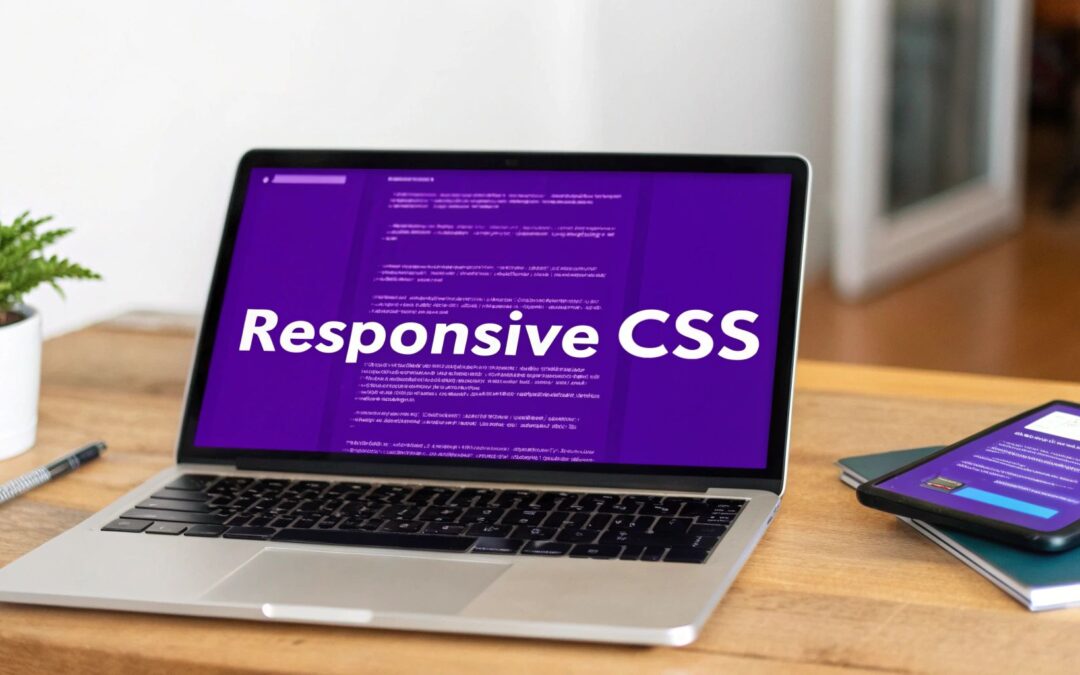
Responsive design with CSS is simply the art of building websites that look great and work perfectly on any screen. It's about using flexible grids, fluid images, and a little magic with media queries to create a smooth, consistent experience whether someone's on a giant desktop monitor, a tablet, or a smartphone.
This isn't just a "nice-to-have" feature anymore. Frankly, it's an absolute must for any modern website.
Why Responsive Design Is No Longer Optional
Let's be real: in a world with a dizzying array of screen sizes, a website that doesn't adapt is a dead end. When you ignore the mobile experience, you're not just making a design mistake—you're making a huge business blunder. The consequences are real, from engagement rates falling off a cliff to losing actual revenue.
A fluid, adaptable layout is a core part of a smart business strategy. It directly shapes how users see your brand and, ultimately, affects your bottom line. Using responsive design with CSS is how you build sites that just work, everywhere.
The Mobile-First Reality
This whole shift is fueled by one simple fact: everyone is on their phone. The explosion in mobile device usage has completely flipped web design on its head. Mobile browsing isn't just a slice of the pie; it's the whole dessert.
Smartphones alone drive around 59.16% of all global website traffic. In major markets like the United States, that number is even higher, hitting 60% of total traffic. And if your site isn't ready for them? A jaw-dropping 73.1% of visitors will hit the back button and leave a site with a bad mobile experience.
A website that isn't mobile-friendly is basically invisible to a massive chunk of its audience. You're not just losing clicks; you're losing trust before a visitor even gets a chance to see what you have to offer.
The Impact on Visibility and Conversions
Beyond just annoying users, a non-responsive site actively hurts your ability to be found online in the first place. Search engines like Google have been championing mobile-friendly websites for years with their mobile-first indexing policy. Put simply, if your site isn't responsive, it's going to have a much harder time showing up in search results, cutting you off from a vital stream of organic traffic.
This is why responsive design has such a massive impact on how easily people—and search engines—can find you. If you want to dig deeper into making your site more visible, there are many strategies for improving website visibility worth exploring.
At the end of the day, a seamless user experience is what drives conversions. When visitors can easily navigate, read, and interact with your site on any device, good things happen. They are far more likely to:
- Stick around longer, which lowers your bounce rates.
- Complete the actions you want them to, like making a purchase or filling out a form.
- See your brand as professional, credible, and trustworthy.
Laying the Groundwork with Viewports and Media Queries
Before you even think about CSS layouts, there's a crucial first step. It's a single, vital line of HTML that you absolutely must add to your <head> section. I'm talking about the viewport meta tag. This little tag is the bedrock for everything else we're about to build.
Without it, mobile browsers will try to cram your full desktop site onto a tiny screen, creating an unreadable, zoomed-out mess. This tag is your way of telling the browser, "Hey, render this page at the actual width of the device, not some imaginary desktop."
Think of it as setting up a proper canvas. It's a non-negotiable starting point for any responsive design with CSS.
Applying Styles with Media Queries
Once the viewport is correctly set, we can bring in the real magic: media queries. These are essentially the "if" statements of CSS. They let you apply specific styles only when certain conditions are met, like the screen being wider or narrower than a set amount.
The big strategic decision here is your approach. Will you build for small screens first and then scale up (mobile-first)? Or will you design for the desktop and then scale down (desktop-down)?
From my experience, mobile-first is the way to go. It’s the modern standard for a reason—it forces you to prioritize what's truly important for the most constrained environment. If you want to dive deeper into this mindset, our guide on how to optimize Divi for mobile devices has some great insights.
A mobile-first approach keeps your base styles simple and clean. You then progressively enhance the experience as more screen real estate becomes available, which almost always results in more efficient CSS.
Let's imagine a simple two-column layout. On a desktop, they sit side-by-side. On a phone, they need to stack. Here’s how a mobile-first media query handles that beautifully.
/* Base styles (for mobile screens first) /
.container {
display: block; / Default to stacked columns */
}
.column {
width: 100%; /* Columns take full width on mobile */
}
/* Media query for tablets and larger screens /
@media (min-width: 768px) {
.container {
display: flex; / Switch to a flex layout for more space */
}
.column {
width: 50%; /* Make them sit side-by-side */
}
}
This image captures the developer workflow perfectly. You're at your laptop writing code, and media queries are the bridge that translates that code into a fluid experience on a mobile device.
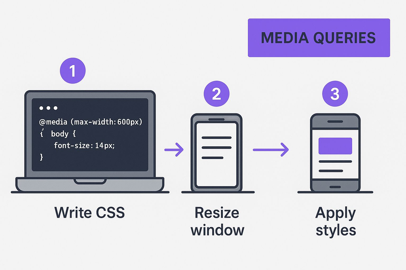
It’s a great visualization of how these conditional CSS rules are the engine driving the responsive experience.
Choosing Your Breakpoints
So, when do these style changes happen? That's where breakpoints come in. These are the specific viewport widths where your media queries activate to alter the layout.
Honestly, there's no single magic number for breakpoints. The best ones are determined by your content—you add a breakpoint where your layout starts to look awkward. That said, it's practical to start with some common device widths as a guide.
I've put together a quick reference table with some standard breakpoints I often use as a starting point. It helps in quickly targeting the major device categories.
Common Device Breakpoints for Media Queries
A quick reference guide for standard CSS breakpoints used in responsive design, helping developers target specific device categories effectively.
| Device Category | Viewport Width Range | Example CSS Media Query |
|---|---|---|
| Small Phones | 320px to 480px |
@media (max-width: 480px) { ... } |
| Tablets (Portrait) | 481px to 768px |
@media (min-width: 768px) { ... } |
| Tablets (Landscape) & Laptops | 769px to 1024px |
@media (min-width: 1024px) { ... } |
| Desktops & Large Screens | 1025px and up |
@media (min-width: 1200px) { ... } |
This table provides a solid foundation, but always remember to test your design and let your content dictate the final breakpoints.
By setting the viewport and using media queries at key breakpoints, you’re building the essential skeleton for a truly responsive site. This groundwork is what makes it possible for more advanced CSS tools like Flexbox and Grid to work their magic across every device.
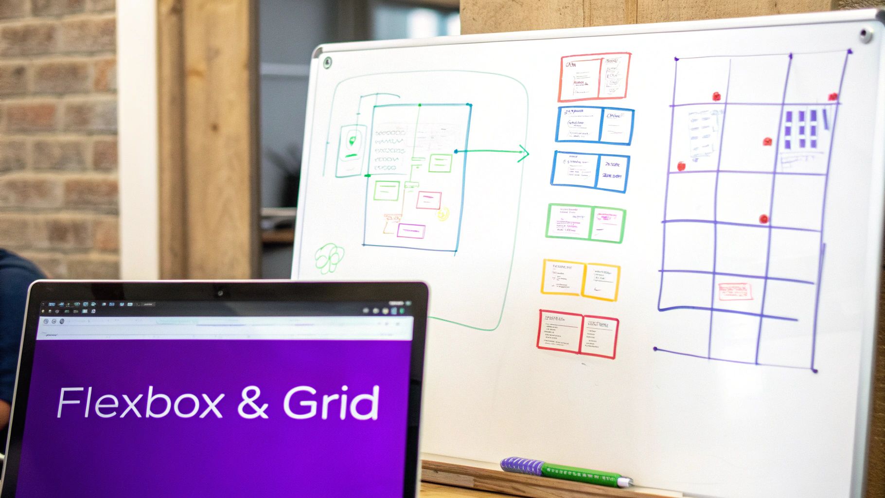
Creating Fluid Layouts with CSS Flexbox
When you need to wrangle a layout in a single dimension—either a row or a column—CSS Flexbox is your best friend. It takes tasks that used to be incredibly frustrating, like perfect vertical alignment or creating equally spaced items, and makes them almost trivial. Going beyond just display: flex unlocks a whole suite of powerful properties that solve real-world layout headaches.
Think about a standard website header: logo on the left, navigation links on the right. With Flexbox, getting this right is refreshingly straightforward. You just define the header as a flex container and then use a single property to manage how the space is distributed.
Controlling Alignment and Spacing
The real magic of Flexbox becomes apparent when you start playing with its alignment and distribution properties. These tools give you granular control over how items are positioned along both the main and cross axes.
Let's break down the most essential ones with some practical uses.
justify-content: This property aligns items along the main axis (which is horizontal by default). It’s perfect for spacing out navigation links. For instance,justify-content: space-between;pushes the first and last items to the edges and distributes the rest evenly.align-items: This one works its magic along the cross axis (vertically, by default). Ever struggled to vertically center some text next to an icon?align-items: center;is the one-line fix.flex-direction: By default, flex items line up in a neat row. But settingflex-direction: column;stacks them vertically, which is incredibly handy for re-ordering content on smaller mobile screens.
I constantly find myself using
justify-contentandalign-itemstogether to perfectly center a single element, like a loading spinner or a modal dialog. Just two lines—justify-content: center;andalign-items: center;—achieve true horizontal and vertical centering. It's a classic combo.
A Real-World Navigation Bar Example
Let's put this into practice and build a simple, responsive navigation bar. On desktop screens, we want the logo on the far left and the links on the far right. On mobile, we’ll stack them neatly for easy tapping.
First, the HTML is nice and simple: just a <nav> container holding a logo and a <ul> for our links.
Now for the CSS. We’ll start with a mobile-first approach, stacking the elements by default.
/* Mobile-first styles /
.main-nav {
display: flex;
flex-direction: column;
align-items: center; / Center items for a clean mobile look */
}
/* Styles for larger screens /
@media (min-width: 768px) {
.main-nav {
flex-direction: row; / Switch to a horizontal layout /
justify-content: space-between; / Push logo and links apart */
}
}
This short snippet is a perfect example of how responsive design with CSS allows our layout to adapt gracefully to different screen sizes.
Handling Overflow with Flex Wrap
So what happens when you have more items than can fit in a single line? The default behavior is pretty ugly—they shrink and overflow their container. This is where flex-wrap saves the day.
By simply adding flex-wrap: wrap;, you tell the browser to allow items to flow onto the next line once they run out of space. This is essential for things like a gallery of user avatars or a list of product tags.
The items wrap beautifully, creating a multi-line layout that stays contained and readable on any screen. This one property prevents a common responsive design headache, all without needing complex media queries.
Building Robust Page Structures with CSS Grid
While Flexbox is a true master of one-dimensional layouts, CSS Grid is the powerhouse you reach for when things get complex. I’m talking about full-on, two-dimensional structures.
When you need precise control over both rows and columns at the same time, Grid is the tool for the job. It was literally designed to solve the kind of full-page layout puzzles that, for years, forced developers like us into using messy hacks and fragile floats.
With Grid, you can build incredibly robust, predictable page structures. Think dashboards, intricate article layouts, or product galleries. The real magic is its ability to manage both axes, which means less nested HTML and much cleaner, more maintainable CSS. This approach is absolutely fundamental to modern responsive design with CSS.
Defining Your Grid Template
The foundation of any Grid layout is the container and its template. You kick things off by setting display: grid; on a container element. From there, you map out your columns and rows using grid-template-columns and grid-template-rows.
One of my favorite features here is the fractional unit (fr). It’s a game-changer. It lets you assign a fraction of the available space to a column or row, making fluid designs unbelievably simple.
For a classic article layout with a main content area and a sidebar, you could do something like this:
.article-layout {
display: grid;
grid-template-columns: 2fr 1fr; /* Main content is twice as wide as the sidebar /
gap: 20px; / Adds space between grid items */
}
This simple setup creates a flexible two-column layout that just works. It automatically adjusts to the container's width while keeping that perfect ratio, all without you having to write a single complex calculation.
Placing Items with Precision
Once your grid structure is in place, you have some seriously powerful ways to place child elements onto it. You can let the browser auto-place them, or you can take full control.
- Line Numbers: Every grid you create has numbered lines. You can explicitly tell an item where to start and end. For instance,
grid-column: 1 / 3;makes an item span from the first column line all the way to the third. - Named Areas: For even more readable and maintainable layouts, you can name your grid areas. Honestly, this is my go-to method for any complex page structure.
Using
grid-template-areasfeels like drawing a map of your layout right in the CSS. It's semantic, incredibly easy to visualize, and makes re-ordering entire sections for different viewports an absolute breeze.
Let's look at a full-page structure using these named areas:
.page-container {
display: grid;
grid-template-areas:
"header header header"
"nav main sidebar"
"footer footer footer";
grid-template-rows: auto 1fr auto;
grid-template-columns: 200px 1fr 200px;
}
/* Then assign elements to those areas /
.main-header { grid-area: header; }
.main-nav { grid-area: nav; }
/ and so on… */
This approach doesn't just organize your desktop layout beautifully; it also makes creating a mobile-friendly version almost trivial. For those using page builders, many modern tools have built-in interfaces for creating responsive layouts. You can actually learn how to make a mobile-friendly website with Divi to see these core principles in a real-world tool.
Mastering these CSS techniques is becoming more critical every day. In fact, the global Responsive Web Design Services market is projected to grow at a CAGR of about 3.0% through 2031. North America holds over 40% of that market, largely driven by massive mobile device usage.
This demand is what fuels innovation in CSS solutions that can adapt layouts automatically. By combining Grid with media queries, you can transform a complex, multi-column desktop view into a clean, single-column layout for mobile with just a few lines of CSS, meeting modern user expectations head-on.
Fine-Tuning the User Experience
Getting your major layout blocks to play nicely with Flexbox and Grid is a huge part of the battle, but it's not the whole war. What really separates a functional site from a genuinely great one are the finer details—the pro-level tweaks that polish the user experience until it feels seamless and snappy.
This level of polish isn't just a "nice-to-have" anymore. User expectations on mobile are sky-high, and a clunky, slow site is an absolute deal-breaker. Research shows that about 50% of users bail if a mobile page doesn't load in under two seconds. On top of that, sites that aren't optimized for mobile can see bounce rates as high as 60%.
When you consider that 72% of online shoppers say a mobile-friendly site is critical, it’s clear these fine-tuning techniques have a direct impact on your bottom line. You can see more on how these web design statistics shape user behavior on linearity.io.
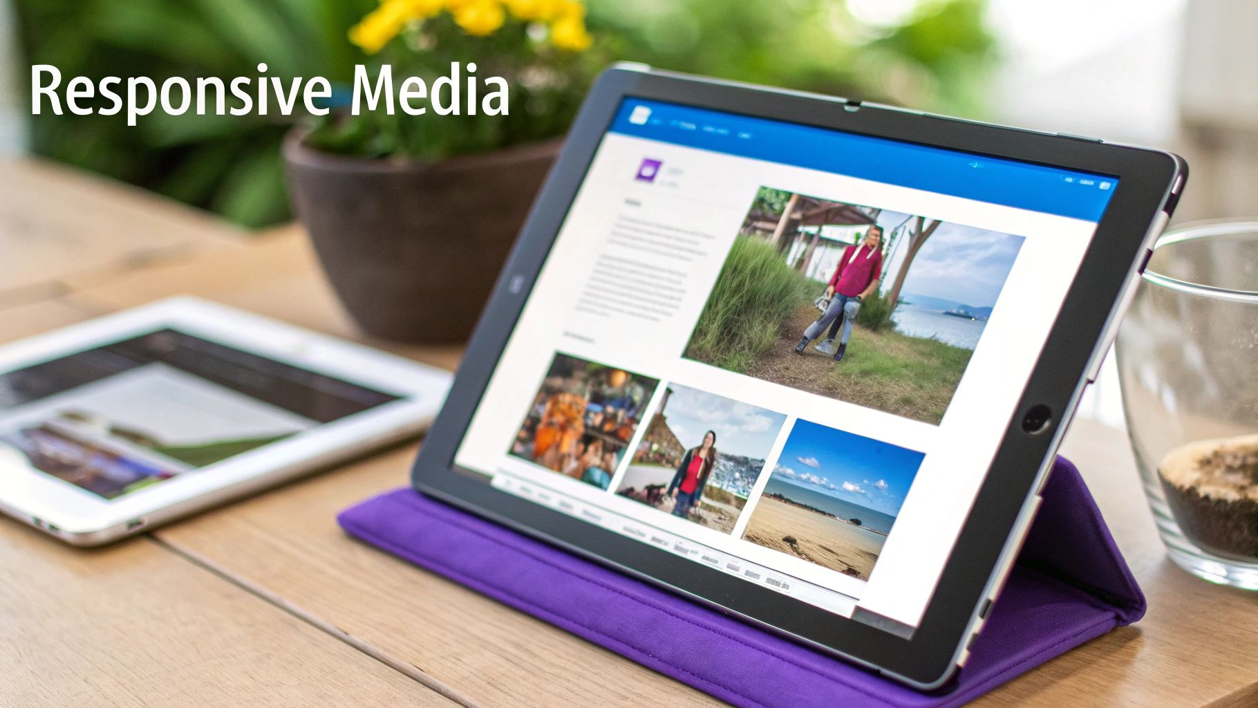
Serving Perfectly Sized Images
One of the biggest culprits behind slow mobile load times? Shoving massive, desktop-sized images down the throats of small-screen devices. It’s a total waste of bandwidth and creates a sluggish, frustrating experience.
The fix is using responsive images with the <picture> element and the srcset attribute. This approach lets you hand the browser a menu of image sources, and it intelligently picks the best one for the job based on the viewport size or screen density.
Here’s what that looks like in practice:

With this snippet, the browser serves image-large.jpg on screens wider than 1200px and image-medium.jpg on screens between 768px and 1200px. For everything smaller, it defaults to image-small.jpg. This is a foundational technique for any performance-focused responsive design with CSS.
Think of it like ordering a pizza. You wouldn't get an extra-large for just one person; you get the size that fits the situation.
srcsetdoes the same for your images, making sure users only download what’s necessary for their screen.
Creating Fluid Typography
Manually writing a bunch of media queries just to tweak font sizes is tedious and brittle. A much cleaner, more modern approach is to let the clamp() CSS function do the heavy lifting. It allows your font size to scale fluidly between a minimum and maximum value you define.
The clamp() function takes three arguments: a minimum value, a preferred value (which often uses viewport units like vw), and a maximum value.
font-size: clamp(1rem, 2.5vw, 1.5rem);
This single, elegant line of CSS tells the browser:
- The font size should never get smaller than 1rem.
- It should never get bigger than 1.5rem.
- Between those two extremes, it should try to be 2.5% of the viewport’s width.
The result is perfectly smooth text scaling without any jarring jumps at breakpoints. For a deeper dive into mobile optimizations like this one, you might find these key tips for better Divi mobile responsiveness really helpful.
When it's time to show off your work, especially for remote client demos or user testing across different devices, using collaborative platforms can be a game-changer. I’ve found that efficient browser-based screen sharing tools are perfect for demonstrating these fluid changes in real-time. Paying attention to these kinds of details is what elevates your design from just being responsive to being truly user-centric.
Of course. Here is the rewritten section, following all the specified guidelines.
Tackling Common Responsive CSS Questions
Even when you feel like you have a good handle on Flexbox, Grid, and media queries, some practical questions always seem to pop up during a real-world build. Let's be honest, responsive CSS is often about navigating specific trade-offs and knowing which tool is the right one for the job.
I get asked about these specific sticking points all the time, so let's break them down.
Flexbox vs. Grid: Which One Should I Use?
This is probably the most common question I see. The answer isn't about which one is "better," but which is more appropriate for the task at hand. It took me a while to get this straight, but now I think of it in simple terms.
I use Flexbox for one-dimensional layouts—meaning either a row or a column. It’s absolutely perfect for things like aligning items in a navigation bar or centering a group of buttons.
On the other hand, I reach for Grid for two-dimensional layouts that involve both rows and columns. Think of a complete page structure with a header, a sidebar, main content, and a footer. Grid was literally made for that.
When To Use Pixels vs. Relative Units
Another classic point of confusion is when to use absolute units like pixels (px) versus relative units like rem or percentages (%). For years, I was a px purist for almost everything, but my approach has completely changed based on what works best in modern browsers.
Now, I follow a simple set of rules that has served me well on countless projects:
- Use
remforfont-size,padding, andmargin. This is a massive accessibility win. It ensures your spacing and text scale gracefully if a user adjusts their browser's default font size. - Use
%orfrunits for layout widths. This is the key to creating those fluid containers that adapt perfectly to whatever parent element they're in. - Use
pxfor the small stuff that should never scale. Think of a crisp1pxborder or a fixedbox-shadowvalue. You want those to stay consistent.
This hybrid approach gives you the best of both worlds: the consistency of pixels where you need it, and the flexibility of relative units everywhere else.
I’ve learned from experience that sticking rigidly to one unit type is a mistake. The best responsive layouts mix units strategically. A pro-tip is to use
remfor your media query breakpoints (@media (min-width: 50rem)), not pixels. This makes your entire layout, not just the text, respond to a user's text-size preferences.
What Is The Best Way To Handle Images?
Getting images right is absolutely crucial for performance. The last thing you want is to serve a gigantic, high-resolution image to someone on a small phone with a slow connection. The modern way to handle this involves a couple of key techniques working together.
First, get comfortable with the <picture> element. Using it with multiple <source> tags and the srcset attribute lets the browser pick the most appropriate image file based on the viewport size or screen density. It's a game-changer. For a background image in your CSS, you can get a similar effect with the image-set() function.
Second, this CSS snippet should be in every single one of your projects. No exceptions.
img { max-width: 100%; height: auto; }
This simple rule is foundational. It prevents images from breaking out of their containers and messing up your layout, and it makes sure they keep their aspect ratio as the container resizes.
Ready to create stunning, responsive popups and interactive elements on your Divi site? Divimode provides the powerful tools you need. With Divi Areas Pro, you can build advanced popups, fly-ins, and mega menus that adapt perfectly to any device. Explore Divimode's powerful plugins and take your Divi site to the next level.
More Articles You Will Like