 Alex Martin
It's a classic headache for anyone building websites: a feature looks pixel-perfect in Chrome but completely falls apart in Safari. These are cross-browser compatibility issues in a nutshell. They pop up when your website's code gets interpreted differently across various browsers, creating a jumbled and inconsistent experience for your visitors.
Fixing them isn't just about tidying up code; it's about making sure your site works for everyone, no matter how they choose to browse the web.
Why Cross-Browser Compatibility Still Matters
Ever tried to tell the same story to three different people, each with their own unique slang? You tell it once, assuming everyone gets the point. But one person gets it perfectly, another misses a few key details, and the third is just plain confused. That's exactly what happens with your website's code.
Each major web browser—like Chrome, Safari, and Firefox—has its own "rendering engine." Think of it as a unique translator for your HTML, CSS, and JavaScript. The problem is, these translators don't always agree on the rules.
To really understand the challenge, you need to know who the main players are. The web is largely run by just three core technologies, even though it feels like there are dozens of browsers.
The Big Three Browser Engines Driving the Web
This table shows the dominant browser rendering engines and their primary browsers, revealing the technical diversity at the heart of compatibility challenges.
| Rendering Engine | Primary Browser(s) | Who It Reaches |
|---|---|---|
| Blink | Google Chrome, Microsoft Edge, Opera, Brave | The vast majority of desktop and Android users. |
| WebKit | Apple Safari | The default for every iPhone, iPad, and Mac user. |
| Gecko | Mozilla Firefox | A loyal base of privacy-focused users and developers. |
Because these engines read the rulebook with their own slight variations, the same line of code can look and behave differently from one browser to the next. A button that’s perfectly aligned in a Blink-powered browser might be skewed in WebKit. An animation that’s silky-smooth on Gecko could be jerky or just plain broken somewhere else. This digital divide is where all our cross-browser frustrations are born.
The Real Impact on Your Users and Business
These inconsistencies are way more than just minor technical glitches. They have a direct, and often negative, impact on your audience and, ultimately, your bottom line. When a user runs into a broken layout, a button that doesn't work, or a form that won’t submit, they don't stop to think, "Oh, my browser must be rendering this wrong." They think, "This website is broken."
The real impact isn't on the code, but on the user. Inconsistent layouts or broken buttons lead to user frustration, a loss of professional credibility, and abandoned shopping carts.
That frustration erodes trust almost instantly. A site that looks sloppy or unprofessional leads to higher bounce rates, tanking conversions, and a tarnished brand reputation. For an online store, a faulty checkout process in a popular browser is just lost money. For a service-based business, it's a lead that never came through.
The Modern Browser Landscape
If you choose to ignore this, you're essentially choosing to shut the door on a huge chunk of your potential audience. The browser market is far from a monopoly. While Chrome dominates the global desktop market with 66.16% share as of early 2025, Safari isn't far behind, especially when you factor in every Apple device. You can dig into more browser usage stats over at TestDevLab.com.
On top of that, browsers are constantly evolving. They have their own update schedules and timelines for adopting new web features. This means a website that works flawlessly everywhere today might suddenly develop a compatibility bug tomorrow after a browser update. For developers, even small API changes can cause a ripple effect of issues, like we saw with some of the recent Divi API 1.2.0 changes.
Staying on top of this isn't just good practice—it's essential for maintaining a professional, accessible, and profitable presence online.
Diagnosing the Most Common Compatibility Culprits
When a website looks perfect in one browser but falls apart in another, it’s time to play detective. The good news is that most cross-browser compatibility issues are repeat offenders. Once you learn to spot the usual suspects in both CSS and JavaScript, you can go from confused to confident with a clear plan of attack.
Most of these frustrating bugs boil down to two sources: CSS and JavaScript.
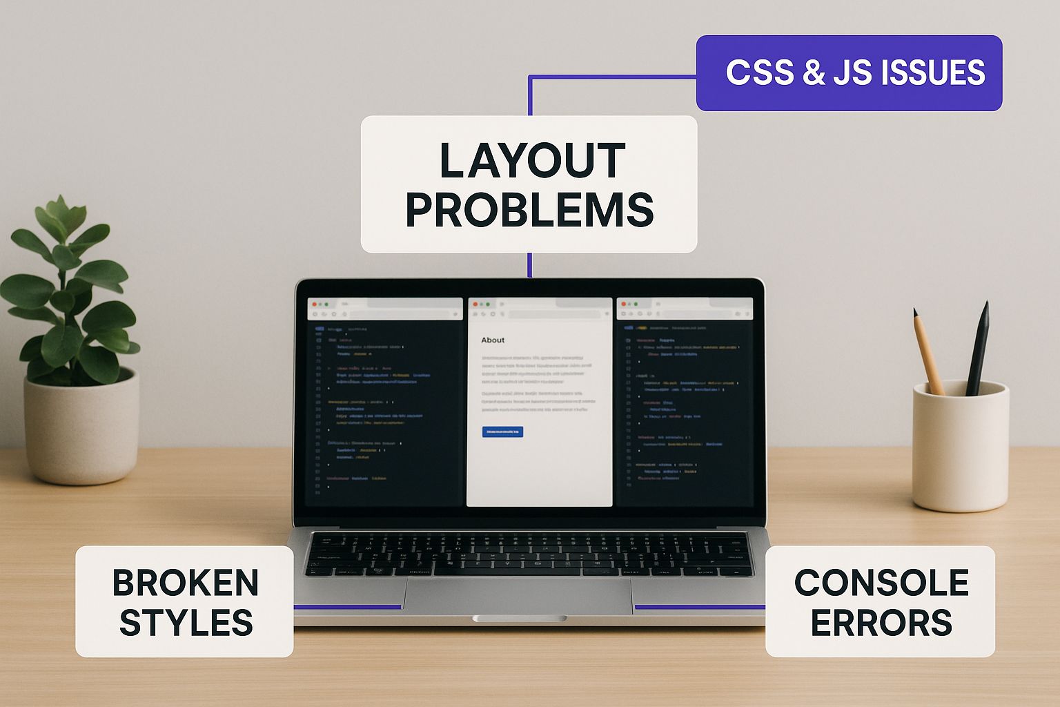
As the visual shows, these problems aren't isolated. They're tangled together, usually because different browsers have their own unique ways of interpreting modern web standards.
The Most Common CSS Issues
Modern CSS has blessed us with powerful layout tools like Flexbox and Grid, but they're also a frequent source of compatibility headaches. An element that aligns perfectly in Chrome might completely collapse or overflow in an older version of Safari. Why? Simply because that browser's engine implements the CSS spec a little differently or is just plain out of date.
Another classic culprit is the inconsistent handling of the CSS box model. This is what dictates how an element's padding, border, and margin interact with its actual size. While box-sizing: border-box; has thankfully standardized this for the most part, older browsers or a forgotten CSS reset can still cause bizarre layout shifts.
Finally, while their use is fading, vendor prefixes like -webkit- (for Safari and Chrome) and -moz- (for Firefox) are still occasionally needed for newer or experimental CSS properties. If you forget to include them, a feature like a slick animation or a custom gradient might just fail to appear for a whole chunk of your audience.
Common JavaScript Compatibility Problems
On the JavaScript side, the biggest challenge often comes from using modern ES6+ features. Things like arrow functions (=>) or const and let declarations feel standard now, but they can trigger outright script errors in older browsers that simply don't recognize the syntax. A script that runs flawlessly in Edge might break the entire page for someone on an un-updated browser.
Inconsistent DOM (Document Object Model) APIs are another sore spot. A developer might use a handy method to manipulate an element, only to discover it’s a Chrome-specific feature and not part of the universal web standard. This leads straight to the classic "it works on my machine" scenario when a teammate tests the site in Firefox.
Event handling can also be quirky. The way a click, hover, or scroll event is registered and processed can vary in subtle ways, leading to interactive elements that feel buggy or just plain unresponsive on certain browsers.
A Diagnostic Checklist for Developers
So, a bug report lands on your desk claiming an issue "only happens on Firefox." It's time to start a systematic diagnosis. Don't just guess—follow a process to find the cause efficiently.
This checklist can help you narrow things down fast.
Replicate the Issue: First, you have to see it to believe it. Use your browser's developer tools or a cloud testing platform to mimic the user's environment as closely as you can.
Isolate with Developer Tools: Once you've replicated the bug, pop open the browser's inspector and examine the broken element. The 'Computed' styles tab is your best friend here; it shows you exactly what CSS the browser is actually applying. Compare this between the working browser and the broken one.
Check the Console for Errors: Open the JavaScript console. Red error messages are your smoking gun. Errors like "SyntaxError" or "is not a function" point directly to unsupported JS features or API differences.
Disable CSS and JavaScript: Start turning things off. Systematically disable CSS rules or entire JavaScript files until the problem vanishes. This is the quickest way to confirm whether you're dealing with a styling issue or a scripting bug.
Once you’ve identified a compatibility issue, documenting it properly is key to getting it fixed quickly. To make sure your findings are clear and actionable, it's worth following these essential bug reporting best practices. A clear report saves everyone time and frustration, letting you methodically stamp out even the most stubborn cross-browser bugs.
Building Your Modern Cross-Browser Testing Toolkit

Alright, so you've tracked down a pesky bug. The next logical step isn't just to fix it—it's to build a reliable testing strategy that prevents these kinds of issues from ever slipping through to your users. A modern testing toolkit isn't about collecting a pile of old phones and laptops. It’s about being smart, combining quick local checks with powerful cloud-based platforms to create a solid defense against cross-browser compatibility issues.
Your first line of defense should always be local testing. It's the fastest and most affordable way to spot obvious problems right away. Modern browsers are packed with fantastic developer tools that let you simulate different screen sizes and even network speeds, making them perfect for quick checks as you're building.
But here's the catch: relying only on local tests and emulators can leave you with a massive blind spot. An emulator can only guess how a real device will behave. It can't perfectly replicate the tiny, subtle differences in rendering engines, hardware acceleration, or the quirks of an operating system—which, let's be honest, are often the source of the most maddening bugs.
Beyond Local Testing With Cloud Platforms
This is exactly where cloud-based testing platforms become your best friend. Services like BrowserStack or LambdaTest are total game-changers. They give you instant access to a massive library of real browsers running on real devices and operating systems.
You no longer need a pricey, in-house device lab just to make sure your Divi site looks perfect on an iPhone running Safari or an older version of Edge on Windows. With a few clicks, you can pull up your site on virtually any configuration you can imagine.
These platforms give you a huge leg up when tackling tricky cross-browser compatibility issues:
- Real Environments: You get to test on thousands of real desktop and mobile browser combinations, which takes all the guesswork out of emulators.
- Live and Screenshot Testing: You can interact with your site live on a specific device or, even better, generate full-page screenshots across dozens of browsers at once to quickly spot any layout inconsistencies.
- Developer Tools Integration: Need to debug? You can get direct access to the developer console on those remote devices, making it much easier to squash bugs that only show up in certain environments.
Embracing Automation for True Consistency
While manually testing on these cloud platforms is incredibly powerful, the real magic happens when you bring in automation. Let’s face it, manually checking dozens of browser combinations before every single release is not only tedious but also leaves plenty of room for human error. Automation is how you build a testing workflow that's both robust and scalable.
By integrating these cloud platforms into a Continuous Integration/Continuous Deployment (CI/CD) pipeline, you can set up a system that runs all your tests for you automatically.
Here’s a simplified look at how it works:
- Write Test Scripts: Using a testing framework, you create scripts that simulate user actions like clicking buttons, filling out forms, or navigating through pages.
- Integrate with CI/CD: You set up your pipeline (using something like GitHub Actions) to kick off these tests every time new code is pushed.
- Run Tests in the Cloud: The CI/CD service then sends your scripts to a platform like BrowserStack, which runs them across your entire list of target browsers all at once.
- Get Results: If a single test fails on any browser, the pipeline stops the deployment, and you get notified immediately. This creates an automated safety net that catches regression bugs—where new code accidentally breaks an old feature—before they ever go live.
This is the gold standard for modern web development. For example, using a framework built for modern web testing with Playwright can seriously streamline your workflow, since it’s designed to work seamlessly across Chrome, Firefox, and Safari. This proactive approach shifts your process from reactive bug-fixing to proactive quality assurance, ensuring everyone gets a consistent and reliable experience on your site.
Practical Fixes for CSS and Layout Headaches

Alright, so you’ve hunted down a frustrating layout bug. What’s next? When it comes to fixing cross-browser compatibility issues in your CSS, the goal isn't just to slap on a quick patch. It’s about building a solid, predictable foundation that prevents these problems from happening in the first place.
Think of it like this: every browser—Chrome, Firefox, Safari—comes with its own "opinion" on how things should look by default. One might give your headings a bit more margin, while another adds extra padding to your lists. A CSS Reset or Normalizer is like applying a coat of primer before you start painting; it creates a smooth, consistent surface across all browsers.
By resetting or normalizing default browser styles, you guarantee that every element on your page starts from the same visual baseline. This one simple step can save you countless hours of debugging those "Why does this look different in Firefox?" moments.
This proactive approach is so much more efficient than chasing down one-off inconsistencies later. It's a cornerstone of professional web development.
Establishing a Consistent Baseline
Your first line of defense is to get rid of browser-specific quirks right from the start. Two main philosophies can help you do this, each with a different approach.
- CSS Resets: These are the more aggressive option. A reset stylesheet literally strips away all default browser styling—margins, padding, font sizes, you name it—and takes them down to zero. This gives you a completely blank slate, but it also means you have to define every single style yourself.
- CSS Normalizers (like Normalize.css): This is the gentler, and frankly, more common approach. Instead of wiping everything clean, a normalizer adjusts default styles to be consistent everywhere. For example, it makes sure an
<h1>tag has the same font size and margin in Chrome, Safari, and Firefox, keeping useful defaults while ironing out the bugs.
For most Divi projects, using a normalizer is the way to go. It gives you a sensible, predictable starting point without forcing you to reinvent the wheel for every basic HTML element.
Automating Vendor Prefixes
Vendor prefixes—those little CSS keywords like -webkit- or -moz-—are what browsers use for experimental or non-standard features. Forgetting to add them is a classic cause of compatibility headaches, like when a cool CSS animation works perfectly in Chrome but falls flat in Safari.
Trying to manage all these prefixes by hand is a nightmare. It's tedious, and you're bound to miss something. This is where modern build tools become your best friend.
An Autoprefixer is an absolute must-have tool. It automatically scans your CSS and adds all the necessary vendor prefixes based on the browsers you tell it to support. It pulls data from "Can I Use" to apply prefixes intelligently, so your site works on older browsers without bloating your code with prefixes that are no longer needed.
Conquering Flexbox and Grid Bugs
Flexbox and CSS Grid are game-changers for layout, but they’ve had their share of bugs, especially in older versions of browsers like Safari. You might run into common issues where items don’t stretch correctly, alignment is off, or gaps between elements just don't appear. Instead of giving up on these powerful tools, you can use targeted fixes.
For example, an old Flexbox bug in WebKit browsers can often be solved by adding min-width: 0 to a flex item. For Grid, you might need to provide an older syntax for certain properties as a fallback for browsers that don't support the modern standard.
This is where feature queries are incredibly useful. The @supports rule in CSS lets you check if a browser actually understands a feature before you apply styles that depend on it.
/* A basic fallback layout using floats */ .container { float: left; width: 100%; }
/* Apply the modern Grid layout ONLY if the browser supports it / @supports (display: grid) { .container { display: grid; float: none; / Make sure to undo the fallback style */ grid-template-columns: 1fr 1fr; } }
This "progressive enhancement" strategy ensures that everyone gets a functional layout, while users on modern browsers get the souped-up experience.
These CSS fixes work beautifully with backend performance tweaks. For Divi users, we've put together a guide on how to speed up your Divi website that covers server-side optimizations that perfectly complement these front-end strategies.
Comparing CSS Fixing Strategies
Navigating CSS compatibility issues often means choosing the right tool for the job. Some problems need a broad, foundational solution, while others require a precise, surgical fix. Here's a quick look at the different methods we've discussed and when to use each one.
| Technique | What It Solves | Best For | Effort Level |
|---|---|---|---|
| CSS Normalizer/Reset | Inconsistent default browser styles (margins, padding, font sizes). | Starting any new project to create a consistent baseline. | Low |
| Autoprefixer | Missing or outdated vendor prefixes (-webkit-, -moz-). |
Automatically ensuring new CSS features work across browsers. | Low (with build tool) |
| Fallbacks | Older browsers that don't support a specific CSS property. | Providing a simple, functional alternative for unsupported features. | Medium |
@supports Queries |
Applying modern layouts (Grid/Flexbox) only to browsers that can handle them. | Progressive enhancement; delivering a better experience to modern browsers. | Medium |
By combining these techniques, you can move from reactive bug-hunting to proactive, resilient web design, ensuring your Divi site looks and works great for every visitor, no matter their browser.
Taming Inconsistent JavaScript Behavior
While a wonky CSS layout is annoying to look at, inconsistent JavaScript can be downright destructive. A single JS error on one browser can bring your site’s interactive elements—popups, forms, animations—to a screeching halt, leaving users with a broken page. This is a classic example of cross browser compatibility issues: everything works perfectly in Chrome, but fails silently in Safari or Firefox.
The problem usually boils down to browsers speaking different dialects of JavaScript. Modern JS features, especially those from the ES6+ standards, simply don't exist in older browsers. When your code tries to use one, the browser's engine has no idea what you're asking it to do. It throws an error and often gives up on running the rest of the script.
Using Transpilers to Bridge the Syntax Gap
So, how can you write clean, modern JavaScript without abandoning users on older browsers? The secret is a tool called a transpiler, and the industry standard is Babel.
Think of a transpiler as a universal translator for your code. You write your JavaScript using all the latest and greatest features, like arrow functions or const/let variables. Then, as part of your website's build process, Babel steps in and translates that modern code into an older, more universally understood version (ES5) that pretty much every browser can execute without a problem.
This approach gives you the best of both worlds. You get to write clean, efficient code, and your users get a stable, functional website, no matter which browser they're using. It's a must-have for preventing a huge range of JavaScript-related cross browser compatibility issues.
By transpiling your code, you ensure that syntax differences between browsers become a non-issue. It’s like writing a speech in a modern dialect and having an interpreter instantly translate it for every listener, ensuring your message is understood by all.
Filling the Gaps with Polyfills
Transpilers are great for fixing syntax, but what about features that are completely missing? For instance, the fetch() API, a modern way to make network requests, is standard in today's browsers but is totally absent in older ones like Internet Explorer 11. If your code calls fetch(), it’ll just break on that browser.
This is where polyfills come to the rescue. A polyfill is a piece of code that teaches old browsers new tricks. It "fills in the hole" by providing a custom implementation of a modern feature that the browser doesn't have built-in.
So, if a browser doesn't support modern features like Promise or Array.prototype.includes(), you can add a polyfill for it. The polyfill first checks if the feature exists. If it doesn't, it adds its own version, allowing the rest of your modern code to run exactly as you wrote it, error-free.
It's a two-part strategy:
- Transpilers change the syntax of your code (the "how" it's written).
- Polyfills add missing features to the browser (the "what" it can do).
Together, they form a powerful defense against most JavaScript compatibility headaches.
Proactive Defense with Feature Detection
The most bulletproof way to handle inconsistencies is to check if a feature exists before you use it. This practice is called feature detection. Instead of just assuming a browser can do something, you ask it first. It's a simple but incredibly effective defensive coding habit.
For example, before running a fancy animation that depends on a specific Web API, you could write a quick check:
if (window.requestAnimationFrame) { // The browser supports it, so let's run the smooth animation. runMySmoothAnimation(); } else { // It's an older browser. Time for a simpler fallback. runBasicFallbackAnimation(); }
This approach is key to building resilient websites. It ensures that even if a feature isn't supported, your entire site doesn't fall apart. Instead, it gracefully degrades, offering a functional—if simpler—experience to every user.
When you suspect a JavaScript bug is at play, the browser's developer console is your best friend. For a step-by-step guide, check out our tutorial on how to check the console for errors on your Divi website. By combining transpilers, polyfills, and smart feature detection, you can tame JavaScript's wild side and deliver a reliable experience to everyone.
Frequently Asked Questions
Even with a solid game plan for tackling browser bugs, a few questions always seem to surface. Here are some quick, no-nonsense answers to the most common queries I hear from developers, designed to help you sharpen your testing strategy and build more dependable websites.
Which Browsers Should I Prioritize for Testing?
Honestly, the best answer is hiding in your own analytics. Go look at which browsers and devices your actual visitors are using. That’s your golden ticket—your number one testing list.
But if you're starting a project from scratch and don't have any data yet, a great baseline is to cover the last two versions of these four heavy hitters:
- Google Chrome: With its huge market share, making sure things work on Chrome is non-negotiable.
- Apple Safari: This one is absolutely essential if you want to reach anyone using an iPhone, iPad, or Mac.
- Mozilla Firefox: It has a dedicated following of developers and folks who are serious about privacy. Don't overlook them.
- Microsoft Edge: As the default on Windows, its user base is massive and still climbing.
And I can't stress this enough: don't forget the mobile versions. Traffic from phones often blows desktop traffic out of the water. That means Chrome on Android and Safari on iOS are just as critical as their desktop counterparts. One more thing—if you work with B2B clients, especially big companies, you might need to support older browser versions. Their IT departments don't always update things quickly.
What Is the Difference Between a Polyfill and a Transpiler?
This one trips people up, but it's simpler than it sounds. Both solve JavaScript compatibility headaches, but they attack completely different problems. Imagine you're dealing with a language barrier.
A transpiler, like Babel, changes how the code is written. A polyfill, however, adds missing functionality. They work together to ensure your code runs everywhere.
A transpiler is like a syntax translator. It takes shiny, modern JavaScript code (think arrow functions or let/const) and rewrites it into an older, more traditional syntax (like ES5) that virtually every browser can understand. It changes the words but keeps the meaning.
A polyfill, on the other hand, is like teaching an old browser a new trick. If a browser doesn't know a modern function like Array.prototype.includes(), a polyfill provides a little snippet of code that replicates that exact feature. Now, your scripts can use it without a problem. So, in short: transpilers handle syntax, and polyfills handle missing features.
How Can I Automate Cross Browser Testing in My Workflow?
Automation is where you gain real efficiency and consistency. The smartest way to do it is by baking testing right into your CI/CD (Continuous Integration/Continuous Deployment) pipeline.
First, you'll use a framework like Cypress or Playwright to write scripts that mimic what a user does—like logging in, adding an item to a cart, or submitting a form. Then, you link those scripts to a cloud testing platform like BrowserStack or LambdaTest.
The final step is to set up your CI tool (like GitHub Actions) to automatically kick off your entire test suite across all your target browsers every single time new code is pushed. If just one test fails on any browser, the whole process stops, and you get an immediate notification. This is how you catch bugs before they ever make it to your live site.
Are CSS Vendor Prefixes Still Necessary?
Yes, but thankfully, much less than they used to be. A few years ago, it was a wild west of prefixes. Today, most mainstream CSS properties are standardized and work perfectly without them.
However, some newer or more experimental CSS features still need prefixes like -webkit- or -moz- to work correctly in specific browsers—especially anything WebKit-based, like Safari.
Here’s the golden rule: do not manage them by hand. It's a tedious, error-prone nightmare.
Instead, let a tool like Autoprefixer handle it for you. You integrate it into your build process, and it uses data from the "Can I Use" database to automatically add (or remove) the prefixes you need based on the browsers you've decided to support. This keeps your CSS clean, future-proof, and backward-compatible with almost zero effort.
Ready to stop worrying about popups and fly-ins breaking on different browsers? Divimode provides the tools to create stunning, interactive elements that just work. With Divi Areas Pro, you can build advanced popups, mega menus, and more, all within the Divi builder you already love.
Explore Divi Areas Pro and build with confidence
More Articles You Will Like