 Alex Martin
Think of a standard website menu like a simple table of contents in a book. It gives you the chapter titles, but you have to flip through the pages to see what's actually inside. Functional, but not very insightful.
A WordPress mega menu, on the other hand, is like opening up to a full-color, detailed appendix right from the start. It doesn't just list the chapters; it lays out all the key topics, complete with visuals and highlights, in one organized, easy-to-scan view.
What Is a WordPress Mega Menu and Why Use One
This visual-first approach completely changes the game for navigation. It transforms a boring list of links into an experience that actually helps your visitors find what they're looking for. Instead of overwhelming them with choice, a well-designed mega menu organizes a huge amount of information into a layout that's both engaging and incredibly clear.
When a Mega Menu Is Essential
Not every website needs to pull out the big guns with a mega menu. But for content-heavy sites where getting lost is a real possibility, they are an absolute lifesaver. They bring immediate structure and clarity to sites with deep or complex navigation.
You should seriously consider a WordPress mega menu if your site is a:
- Large E-commerce Store: Imagine displaying product categories, sub-categories, best-sellers, and even promotional banners right in your navigation. It’s a fantastic way to help shoppers discover products they might have otherwise missed.
- News and Media Portal: Let your readers jump straight to what interests them by organizing content by topic, author, date, or trending stories.
- Corporate Website: Make it easy for different audiences to find what they need by structuring your menu around business units, services, industries you serve, or resource hubs.
- Educational Institution: Showcase everything from departments and courses to admissions info and campus life in a logical format that prospective students and faculty can easily digest.
The real magic of a mega menu is its ability to make a massive website feel smaller and more approachable. By showing lower-level pages right from the main navigation, you slash the number of clicks a user needs to make, which dramatically improves their entire journey.
The Strategic Advantage of Visual Navigation
The power of a mega menu really comes down to its visual storytelling. You're no longer limited to just text. You can bring in icons, images, and powerful calls-to-action (CTAs). This isn't just about making things look pretty; it's about improving comprehension and guiding user behavior.
For example, an online clothing store could use thumbnail images for different apparel types like shirts, pants, and shoes. Those visual cues help people process information way faster than reading a list of words ever could.
In a world where WordPress powers 43% of all websites, mega menus have become a go-to tool for crafting better navigation. While a traditional dropdown can feel cramped with more than 10 items, a mega menu can comfortably showcase dozens of links. In fact, research shows that on sites with over 50 pages, mega menus can boost user efficiency by 25-30% simply by cutting down the clicks needed to find content. You can discover more about these website design trends and see how they're shaping user experience.
Essential Design Principles for an Effective Mega Menu
Okay, so you know what a mega menu is and why you might need one. That's the first step. Now for the fun part: designing it so it’s actually a powerful navigation tool and not just a cluttered, confusing mess.
A great mega menu isn’t about cramming in as many links as possible. It’s about creating an intuitive, crystal-clear pathway for your users.
Think of your mega menu like an airport terminal. If there are no clear signs, organized gates, or logical groupings, travelers will be completely lost. Your menu needs that same level of thoughtful organization to get visitors to their destination without any friction. To make sure your mega menu is a genuine asset, sticking to proven Website Navigation Best practices is the key to improving user experience and, ultimately, driving conversions.
Prioritize a Logical Content Hierarchy
The absolute foundation of a killer mega menu is its structure. Just dumping dozens of links into a big panel is a surefire way to overwhelm your users and defeat the whole purpose. The goal here is clarity, not chaos.
Start by grouping related items under distinct, logical headings. Your language needs to be super clear and descriptive for columns and sub-sections, so people instantly get what they’ll find in each spot. For instance, an e-commerce site shouldn't just list out a random jumble of products; it should organize them into columns like "Shop by Category," "Featured Brands," and "Current Sales."
This kind of logical grouping drastically cuts down on the mental effort—the cognitive load—required from your users. They can scan the menu and find what they need in seconds, not minutes.
Embrace Visual Cues and White Space
Visuals are your best friend when you're building a mega menu. They do a fantastic job of breaking up text, guiding the user's eye, and making the whole navigation experience feel less like a chore.
- Use Icons: Simple, universally understood icons next to labels help people process information way faster. Think of a small shopping cart icon next to "My Account" or a star next to "Best Sellers"—they add immediate context.
- Incorporate Images: Small product thumbnails or lifestyle images can be incredibly effective, especially for e-commerce or portfolio sites. Seeing a picture of a product category is often much more compelling than just reading the text.
- Leverage White Space: Please, don't cram every last pixel with content. Ample white space—that empty area around your links and images—is absolutely crucial for readability. It gives everything room to breathe and keeps the menu from feeling claustrophobic.
An effective mega menu uses design to create order from complexity. It’s not about how much you can show, but how well you can organize it. The best menus feel spacious and scannable, guiding the user's eye rather than overwhelming it.
Design for Accessibility and Performance
A beautiful mega menu that’s inaccessible or slow is completely useless. These two things are non-negotiable for a good user experience, and they're becoming more and more important for SEO, too.
First, make sure your menu is 100% navigable using only a keyboard. A lot of users rely on screen readers or keyboard controls, and they need to be able to tab through every single link logically. This means getting your HTML semantics and ARIA labels right. For a deeper dive into creating user-friendly layouts across your entire site, check out our complete design guidelines for websites.
Second, keep a close eye on performance. Dropping huge, unoptimized images into your mega menu can seriously slow down your page load times. Always compress your images and use modern formats like WebP. Even a delay of a few milliseconds for the menu to appear can frustrate users enough to make them leave. A fast, responsive menu is a trustworthy one.
Choosing the Right Method to Build Your Mega Menu
So, you’ve decided a mega menu is the right move for your site. Great! The next big question is how to actually build it. There’s no single "best" way to do it; the right approach really boils down to your project's needs, your comfort level with tech, and your budget.
Think of it like getting across town. You could hop on the public bus, drive your own car, or hire a custom-built limo. Each one gets you to your destination, but the experience, cost, and amount of control you have are completely different. Let's break down the three main ways to create a mega menu in WordPress so you can pick the right ride for your project.
Method 1: Use Your Theme’s Built-In Functionality
Many modern WordPress themes, especially premium ones, come with a mega menu feature baked right in. You’ll usually find the controls in the Theme Customizer or a dedicated theme options panel. This is often the most direct route, since it’s designed from the ground up to work flawlessly with your theme’s style.
This method is like using the pre-installed apps on a new smartphone. They work perfectly out of the box, require zero extra setup, and you know they're compatible. The catch? You're limited to what the theme developer decided to include. You might get basic column controls and simple lists of links, but good luck adding complex elements like a contact form, a dynamic post grid, or custom HTML.
Best For: Beginners or site owners who just need a simple, clean mega menu without the fancy bells and whistles. If you want the quickest setup possible, this is it.
Method 2: Install a Dedicated Mega Menu Plugin
If your theme doesn't have a built-in option or its features are too restrictive, a dedicated plugin is your next best bet. The WordPress plugin repository is packed with powerful tools designed specifically to create rich, feature-heavy mega menus.
This path offers a fantastic balance between creative power and ease of use. Most plugins provide a drag-and-drop interface, letting you build complex layouts with columns, icons, images, and even widgets without writing a single line of code. You can even get into more advanced features like building dynamic mega menus using tools like Elementskit.
The main trade-off here is a potential hit to performance. A poorly coded or bloated plugin can load extra CSS and JavaScript files on your site, which can slow things down. It’s absolutely critical to pick a well-reviewed, lightweight plugin and only enable the features you actually need.
Method 3: Go For a Custom-Coded Solution
For those who crave complete control and have the technical chops (or the budget to hire someone who does), coding a mega menu from scratch is the ultimate approach. This means writing your own HTML, CSS, and maybe some JavaScript to build a menu that is perfectly tailored to your exact design and functional needs.
This is the bespoke, custom-tailored suit of the mega menu world. You have 100% control over every pixel, animation, and interaction. It’s also the fastest option because you only write the code you need—no bloat whatsoever. The downside is pretty obvious: it requires serious development skill and a lot of time. It's also the most expensive route if you're hiring a developer.
This decision tree gives you a visual guide for the key questions to ask as you design your mega menu, making sure you end up with a great user experience.
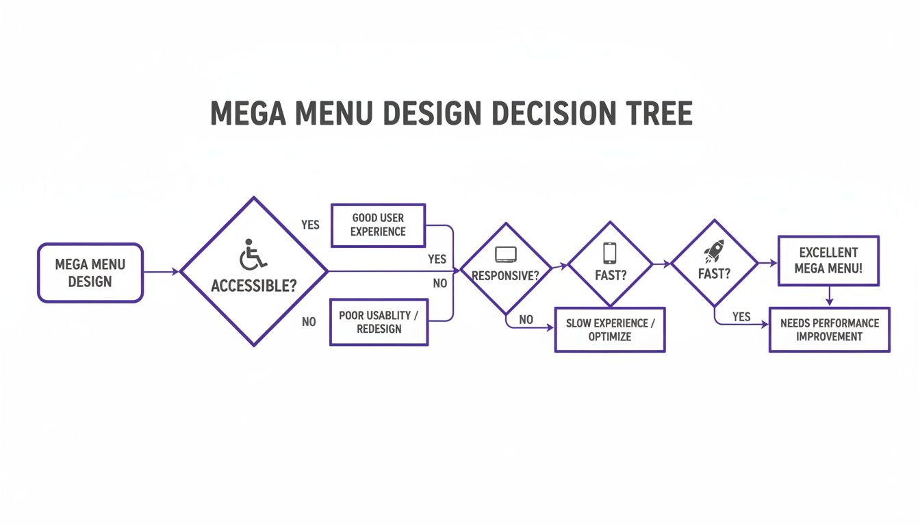
The key takeaway here is that things like accessibility, responsiveness, and speed aren't just nice-to-have extras; they're the fundamental pillars of any effective mega menu.
A hybrid approach using a tool like Divi Areas Pro can offer the best of both worlds. It gives you the design freedom of a page builder—letting you create any layout you can imagine—with the simplicity of a plugin, effectively bridging the gap between preset limitations and full custom development.
Ultimately, picking the right method is about striking a balance between flexibility and feasibility. Take a hard look at your project’s complexity and your own resources to choose the path that will give your users the best navigation experience without creating a technical headache for you down the road.
How to Build a Dynamic Mega Menu With Divi
Alright, now that we’ve covered the theory, it's time to roll up our sleeves and actually build one of these things. This is the fun part—where we take all those concepts and turn them into a real, professional-looking mega menu using the killer combo of Divi and the Divi Areas Pro plugin.
We're about to go way beyond a simple dropdown list of links. The goal here is to construct a rich, multi-column layout that can include text, images, and even dynamic content straight from your blog or store.
Getting Started With Divi Areas Pro
First things first, you'll need to get Divi Areas Pro installed and activated. This premium plugin is the secret sauce that makes our mega menu possible. It lets you design custom content "Areas" with the Divi Builder and then trigger them as popups, fly-ins, or—you guessed it—a slick mega menu.
Once the plugin is live, you’ll spot a new "Divi Areas" item in your WordPress dashboard. This is your new command center. Creating a new Area feels just like making a new page or post; you’re immediately dropped into the familiar Divi Builder, giving you total creative control.
For anyone who loves Divi, this plugin is a game-changer. It simplifies not just mega menus but also popups and fly-ins, which can be triggered by user behavior like back-button detection. This is huge for WooCommerce sites trying to win over mobile shoppers, who now make up 55% of global traffic.
Designing Your Mega Menu Layout
Here’s where you get to be creative. Inside your new Divi Area, you can build any layout you can dream up with the Divi Builder. For a classic mega menu, a multi-column row is the perfect place to start. A three or four-column layout usually hits the sweet spot for organizing your navigation.
- Add a Section and Row: Kick things off with a standard section and drop in a row with your chosen number of columns (four is a great starting point).
- Populate with Modules: Now, fill each column with Divi modules. Use Text modules for headings and link lists, Image modules for a bit of visual pop, and Button modules for clear calls-to-action.
- Use Dynamic Content: This is where this approach really flexes its muscles. You can pull in a Blog module to show off your latest posts or a Woo Products module to feature best-sellers right in the navigation.
Think of this Area less like a menu and more like a mini landing page. You have the entire Divi Builder at your disposal, so you can craft an experience that's far more engaging than a boring list of links.
This screenshot gives you an idea of what building a Divi Area looks like—it’s just a multi-column layout waiting for your content.
As you can see, the familiar Divi interface makes it easy to combine text, images, and columns to build a rich user experience directly inside your navigation.
Configuring the Trigger and Display Settings
Once your layout is dialed in, you need to tell Divi Areas Pro how and when to show it. This is all handled through a super intuitive set of controls in the Divi Area settings panel, right below the builder.
The two most critical settings here are the Trigger and the Display.
- Trigger Type: For a mega menu, you'll want to choose either "On Click" or "On Hover." The trigger element is just a CSS selector that points to the menu item you want to act as the button. For example, if your "Services" menu item has a CSS class of
.menu-item-services, you’d pop that class right in here. - Display Type: Select "Mega Menu" from the dropdown. This is what tells the Area to behave like a mega menu, positioning it perfectly below the header and pushing your page content down.
Don't know how to find a menu item's CSS class? No problem. Just head to Appearance > Menus in WordPress. Click "Screen Options" in the top right and make sure "CSS Classes" is checked. A new field will appear for every menu item where you can add your own custom class.
Assigning the Area to a Menu Item
With your Divi Area designed and configured, the final step is to hook it up to your main navigation. You’ve already told the Area what should trigger it (the CSS class), so now we just need to make sure that menu item actually has that class.
Go back to Appearance > Menus and find the top-level menu item you want to use (like "Shop" or "Services"). In its settings, look for the "CSS Classes" field and type in the exact same class name you used in the Divi Area's trigger settings. For example, if you set the trigger to .shop-trigger, you'll add shop-trigger to the CSS class field here.
Save the menu, and that's it—your new mega menu is live! When a visitor hovers over or clicks that menu item, the beautiful Divi Area you built will appear seamlessly. It's a far more powerful and flexible system than what comes with most themes out of the box. For more ideas on what's possible, check out our deep dive on creating a mega menu in Divi, which covers some other cool techniques.
By using Divi Areas Pro, you completely sidestep the usual limitations of WordPress menus and unlock the full design power of the Divi Builder. This lets you create dynamic, content-rich navigation that doesn't just help users find what they're looking for—it actively promotes your most important content, products, and offers.
Real-World Examples of High-Performing Mega Menus
Theory and design principles are great, but seeing a WordPress mega menu in action is where the ideas really start to click. Let's break down how some major brands use these powerful navigation tools to guide users, show off products, and create an experience that just flows. These examples show how to turn a simple menu into a strategic asset.
Looking at how successful sites structure their navigation gives you a practical blueprint for your own projects. Pay attention to how each one manages to pack a ton of information into a clean, scannable layout.
E-commerce Powerhouses Like Home Depot
Big retailers like Home Depot have mastered the art of organized complexity. When you hover over "All Departments," you aren’t hit with a massive, overwhelming list. Instead, you get a clean, multi-column layout that makes perfect sense.
- Logical Grouping: Categories are neatly arranged under clear headings like "Appliances" and "Building Materials."
- Visual Hierarchy: Bolded subheadings guide your eyes, making it easy to scan and find what you need in a snap.
- Promotional Space: They often use a column to feature a "Shop by Brand" section or highlight current sales, blending navigation with a bit of marketing.
This approach transforms what could be a chaotic catalog into an intuitive shopping guide. You can find more inspiration by exploring our collection of other great mega menu design examples.
Streamlined Navigation From Office Depot
Office Depot offers a masterclass in focused navigation. Their menu keeps things simple by limiting the top-level items, proving that sometimes, less really is more.
A high-performing mega menu doesn't just list links; it curates pathways. By anticipating user needs and creating clear visual hierarchies, brands can significantly reduce friction and guide visitors to their goals more effectively.
This approach immediately simplifies the user's choices. Office Depot’s menu, for instance, has just three main options—Products, Services, and Deals—but it efficiently organizes a huge number of links under them. As WordPress has grown to power 43.1% of the web, mega menus have become a go-to solution for managing site complexity across its millions of websites. For a full breakdown of these numbers, you can explore detailed WordPress statistics.
Walmart’s All-in-One Approach
Walmart’s website has to deal with an immense inventory, and its mega menu is built to handle it. When you open their "Departments" menu, you see a comprehensive system at work. They use icons next to text labels to help you recognize categories faster and even include images for featured products or special offers.
This mix of text, icons, and promotional graphics makes their menu more than just a navigation tool. It becomes an interactive part of the shopping experience itself, guiding you to what you need while pointing out important deals and product lines along the way.
Common Questions About WordPress Mega Menus
Even with a solid plan, jumping into mega menus can still bring up a few nagging questions. It’s a powerful tool, no doubt, but building one touches on critical parts of your site—SEO, mobile experience, and just overall design clarity.
Let's run through some of the most common questions I hear. Think of this as the final pre-flight check. You’ve mapped the route and built the plane; now it's time to double-check the little details that guarantee a smooth trip.
Can a WordPress Mega Menu Hurt My SEO?
This is a big one, and the short answer is no—if you do it right. In fact, a well-structured WordPress mega menu can be a huge win for SEO. It lays out a clear site architecture, making it far easier for search engine crawlers to find and index pages that might otherwise be buried. All those extra internal links to important pages can also signal their value to Google.
But a badly built menu? That's another story. Here’s what to watch out for:
- Page Speed: If you cram your menu with massive, unoptimized images or clunky scripts, it will slow your site down. Since page speed is a confirmed ranking factor, that will absolutely hurt your SEO.
- Keyword Stuffing: It's tempting to shove every keyword you can think of into your menu links. Don't. Keep your link text natural and focused on the user. Over-optimization just looks spammy to search engines.
- HTML Structure: Make sure your menu is built with clean, semantic HTML. This gives crawlers the context they need to understand the hierarchy and importance of your links.
At the end of the day, a fast, well-organized menu that helps users is also a menu that helps search engines understand your site.
How Do I Make My Mega Menu Mobile-Friendly?
This isn't just a suggestion; it's essential. Simply trying to shrink a huge, multi-column desktop menu onto a small screen is a recipe for disaster. It creates a frustrating, unusable mess for anyone on a phone.
The best practice is to design a completely separate navigation experience for mobile users. Instead of a wide, sprawling panel, you need to adapt the menu's content into a format that works vertically.
For mobile, think "transform," not "shrink." Your goal is to deliver the same level of organization and clarity in a format that feels native to a touchscreen, like a clean accordion or a slide-out panel.
A few common mobile-friendly patterns work really well:
- Accordion Menus: Top-level items can be tapped to expand and reveal the links underneath. This keeps the initial view clean and manageable.
- Slide-In "Hamburger" Menus: A classic for a reason. The menu is tucked away off-screen and slides into view when the user taps the icon.
- Multi-Level Menus: Tapping a parent item takes the user to a new "screen" inside the menu that shows only its child links, always with a clear "back" button.
When you're using a tool like Divi Areas Pro, this is straightforward. You can design one Area specifically for desktops and a second, mobile-optimized Area, then just use the built-in visibility settings to show the right one for the device.
What Is the Biggest Mistake to Avoid When Designing a Mega Menu?
The single biggest mistake I see people make is information overload. The whole point of a mega menu is to bring clarity and order to a complex site, not to become a dumping ground for every single page you've ever created.
A cluttered, disorganized menu just overwhelms people, cranks up their cognitive load, and completely defeats the purpose. You're supposed to be guiding users, not paralyzing them with too many choices.
To avoid this, be ruthless with prioritization. Insist on a strict hierarchy with clear, descriptive headings. Group related links in a way that makes logical sense, and use visual elements like whitespace and icons to create separation. Focus on your most important pages and the paths your users take most often. Remember, the goal of your WordPress mega menu is efficiency, not completeness.
Ready to stop wrestling with basic menus and start building powerful, dynamic navigation? With Divimode, you can unlock the full potential of the Divi Builder. Create stunning mega menus, popups, and fly-ins that engage users and drive conversions with Divi Areas Pro.
Take your Divi site to the next level with Divi Areas Pro.
More Articles You Will Like