 Alex Martin
When you hear the term "website design element," what comes to mind? It's really just a fancy way of describing the fundamental pieces you use to build a web page. Think of it like a single brick in a house or one ingredient in a recipe. These elements cover everything from the visual stuff, like color schemes and fonts, to the more structural things, like your site's layout and navigation. When you put them all together, they shape the entire user experience.
Unpacking The Building Blocks Of Your Website
It helps to think of your website not as one big thing, but as a carefully constructed system of individual parts. Every single design element has a job to do, and how they all work together determines whether a visitor sticks around, gets engaged, or clicks away in frustration. These components are the unspoken language you use to communicate with your audience.
From the moment someone lands on your page, these elements get to work. The layout acts as a blueprint, guiding their eyes to the most important information. Colors immediately set an emotional tone, while your choice of typography establishes a personality and makes everything readable. Even the empty space—what designers call whitespace—plays a vital role in cutting through the clutter and sharpening focus.
Why Every Element Is Crucial
The stakes for getting this right are incredibly high. It’s a bit shocking, but studies show that users form an opinion about a website in just 50 milliseconds. What's more, a whopping 94% of that first impression is design-related.
A poor mix of elements has instant, real-world consequences. Thirty-eight percent of people will abandon a site if they find the design unappealing, and an eye-watering 88% are unlikely to ever come back after a bad user experience. For Divi users building e-commerce stores, these aren't just abstract design principles—they're directly tied to your bottom line.
A website is a conversation between your brand and a user. Every design element—from the hero image to the button text—is a part of that dialogue. The goal is to make the conversation intuitive, engaging, and valuable for the user.
As these foundational ideas evolve, it’s also worth keeping an eye on how the current AI revolution in web design is shaping how they're used. Mastering these fundamentals means you're not just dropping modules onto a page; you're engineering a high-performing digital experience that solves real business problems for you or your clients.
Building A Strong Foundation With Layout And Hierarchy
Ever walked into a physical store for the first time? The layout instantly tells you where to find what you need, what’s on sale, and where the checkout counter is. A website’s layout and hierarchy do the exact same job. Think of them as the architectural blueprints that guide your visitor's journey and keep them from feeling lost.
These two concepts are partners in crime. Layout is the big picture—the arrangement of everything on a page. Visual hierarchy, on the other hand, is the art of making certain elements pop to grab and direct attention. Get this wrong, and even the most beautiful design elements will just create a confusing mess, sending your bounce rate through the roof.
Guiding The User's Eye With Layout Patterns
Over the years, we’ve all developed predictable reading habits online, whether we realize it or not. Smart designers tap into these patterns to arrange content in a way that just feels natural and intuitive.
You’ve definitely seen these two in the wild:
- The F-Pattern: This is how we read dense blocks of text, like a blog post or a news article. Our eyes scan horizontally across the top, then down the left side, occasionally darting across for another horizontal scan. It’s perfect for text-heavy pages.
- The Z-Pattern: This one’s a winner for simpler, less crowded pages like landing pages. The eye naturally moves from the top-left to the top-right, cuts diagonally down to the bottom-left, and then zips across to the bottom-right. This path conveniently hits the four most important spots on the page.
Knowing these patterns is step one. For Divi users, bringing them to life is all about mastering sections, rows, and columns. If you're ready to build more advanced structures, you should explore our guide on CSS grid layout examples.
The Power Of Visual Hierarchy And Whitespace
Visual hierarchy is all about telling a user what to look at first, second, and third. It's how you create a focal point and control the narrative of your page. You don't need complex tools to pull this off; a few simple techniques do the trick:
- Size: It’s simple—bigger things get noticed first. Your main headline should always be larger than your subheadings.
- Color: A bright, high-contrast call-to-action button just begs to be clicked when it’s set against a more muted background.
- Placement: We’re conditioned to see elements placed higher up or right in the center of a page as more important.
This diagram shows how these foundational principles—structure and visuals—are completely intertwined and ultimately shape the user's entire experience.
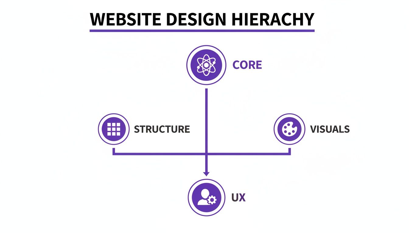
It’s a great reminder that a successful design isn’t just about looking good. It’s built on a logical foundation that supports a seamless and positive UX from the ground up.
Finally, let’s talk about whitespace. That empty area around your content? It’s not wasted space. It’s an active and powerful design tool that gives your content room to breathe, dramatically improving readability and reducing that feeling of being overwhelmed. Good use of whitespace makes any layout feel clean, professional, and effortless to navigate.
Defining Your Brand With Color And Typography
If the layout is your website's skeleton, then color and typography are its personality. These are the elements that give your site its voice, inject emotion, and establish your brand identity from the moment a visitor lands on the page. They aren’t just decorative afterthoughts; they’re powerful communication tools that shape perception and guide user behavior.
Get the combination right, and your brand can feel trustworthy, innovative, or playful. Get it wrong, and you create a jarring experience that feels unprofessional or completely disconnected from your message. It's the kind of mistake that can make users lose confidence before they’ve read a single word.
Harnessing The Power Of Color Psychology
Color is way more than an aesthetic choice—it’s a direct line to human emotion. Different hues evoke specific feelings and can even drive certain actions, a field known as color psychology. It's no accident that financial and tech companies lean heavily on blue to convey trust and security, or that health brands use green to connect with nature and wellness. Red creates urgency, perfect for a "Buy Now" button.
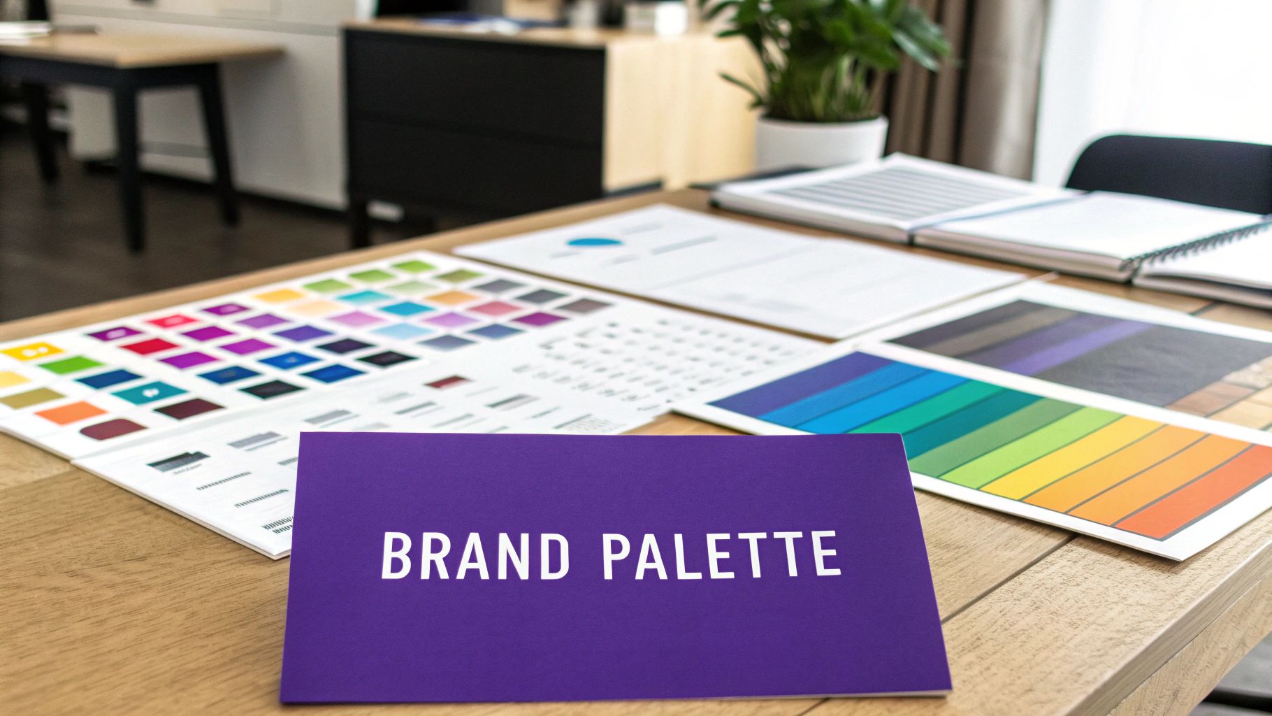
A well-defined color palette is the bedrock of brand consistency. The best way to approach this is by assigning roles to your colors:
- Primary Colors: These are the one or two core colors that dominate your design. Think of them as the main character of your brand.
- Secondary Colors: These act as the supporting cast, complementing your primary colors and adding balance and depth to less critical elements.
- Accent Colors: Use these sparingly. Their job is to pop off the page and draw the eye to the most important actions, like calls-to-action, links, or form submission buttons.
Choosing your brand colors is like choosing the tone of voice for a conversation. Your palette should instantly communicate your brand's core values—whether that's reliability, creativity, or affordability—without saying a word.
Once you’ve settled on your palette, Divi’s Theme Customizer is your best friend. You can apply these colors globally, ensuring every button, link, and heading stays perfectly on-brand across your entire website.
Making Your Message Clear With Typography
Typography is the art of making your written words both legible and beautiful. It's the voice of your content, and a thoughtful, consistent typography system is absolutely critical for a good user experience.
The goal is to create a clear typographic hierarchy that tells people what’s important. A tried-and-true method is pairing two complementary fonts—often a classic serif font (with the little decorative strokes) for headings and a clean sans-serif font (without strokes) for body text. This contrast adds visual interest while keeping everything incredibly easy to read.
If you're ready to go deeper, learning how to pair the right fonts for your website will seriously level up your design game.
But it’s not just about the font you choose. Font size, line height (the vertical space between lines), and letter spacing are just as important. Nailing these details makes your content scannable and easy to digest. Rushing these decisions can leave your site feeling cluttered and overwhelming, which is a surefire way to send visitors heading for the back button.
Getting Around: Intuitive Navigation and Interaction
If your website's layout is the architectural blueprint, then navigation is the signage that helps people find their way around the building. A great navigation system is the unsung hero of a successful website. It works quietly in the background, guiding users to what they need without a second thought. When it works, people don't even notice it's there.
But when it fails? It’s a complete disaster.
Poor navigation is one of the fastest ways to frustrate someone, leading to sky-high bounce rates and lost sales. Imagine walking into a massive department store with no signs—you might wander aimlessly for a minute, but you'll probably just give up and leave. Every single element a user interacts with needs to feel logical and predictable.
Designing the Pathways of Your Website
Good navigation is so much more than just a menu slapped at the top of the page. It’s a whole system of interconnected parts, each with a specific job in helping users find their bearings and move through your site.
To get it right, you need to master these core elements:
- Main Menu/Header: Think of this as your website’s primary roadmap. It should list your most important pages in a logical order, using plain English. Now is not the time for clever jargon that might leave visitors scratching their heads.
- Footer Navigation: The footer is your safety net. It's the perfect spot for secondary links like your contact page, privacy policy, careers, or social media profiles. These are important, but they don't need to clutter up the main journey.
- Breadcrumbs: For larger sites with lots of pages and subpages, breadcrumbs are a lifesaver. They show users the exact path they took to get where they are, making it easy to backtrack one or two steps without mashing the "back" button.
Together, these elements create a smooth, seamless flow for your visitors. As you design them, keep the old "three-click rule" in mind. While it’s not a strict law, the principle is solid: a user should be able to find any key piece of information within three clicks. It’s a great reminder to keep your site structure simple and efficient.
Crafting Interactive Elements That Convert
Beyond the main navigation, every clickable element on your site—from a button to a form field—is a tiny conversation with your user. The design of these interactive pieces can have a huge impact on your click-through rates and conversions. Small tweaks to color, size, and even the text (often called microcopy) can make all the difference.
Take a call-to-action (CTA) button, for example. It needs a high-contrast color that practically jumps off the page. Its size should communicate its importance, and the text needs to be action-oriented. "Get Your Free Quote" is always going to perform better than a passive word like "Submit."
Great interaction design anticipates what the user wants to do next. Every button, link, and form field should feel like a helpful guide, not an obstacle, leading them smoothly toward their goal.
For Divi users ready to take their navigation to the next level, a plugin like Divi Areas Pro is a true game-changer. Instead of a basic dropdown menu, you can build powerful mega menus that act like miniature content hubs. Imagine a menu that doesn't just link to your services but also showcases featured blog posts, product images, or even a short video—all without overwhelming the user. This turns a simple website element into a powerful tool for improving the user journey, especially on larger, more complex websites.
Optimizing For Every User With Responsive Design
Imagine building a stunning storefront, only to realize the front door is too small for half your customers to get through. That’s what a website without responsive design feels like. It’s the art of creating a single site that automatically and beautifully adapts to any screen it's viewed on, from a massive desktop monitor to the smartphone in your pocket.
In today's world, this isn't a "nice-to-have" feature; it's absolutely essential.

The numbers don't lie. Mobile devices now account for over 61% of all web traffic. A clunky, hard-to-navigate mobile site isn't just a minor annoyance—it's a deal-breaker. In fact, mobile users are five times more likely to give up and leave if a site isn’t optimized for their device.
For Divi stores running on WooCommerce, where over 70% of online sales happen on mobile, a poor mobile experience directly translates into lost cash. You can get more insights on these mobile commerce trends on amst.com.
Making Your Divi Site Truly Responsive
The good news is that Divi gives you granular, built-in controls to dial in the experience for every device. Instead of just hoping your site looks okay on a phone, you can take charge and fine-tune every single element for tablet and mobile views.
Here are a few adjustments you should be making on nearly every project:
- Adjusting Typography: That bold headline that looks perfect on a desktop can feel like it's shouting on a phone. Use Divi’s responsive controls to scale down font sizes and create a more comfortable reading experience on smaller screens.
- Modifying Spacing: Generous padding and margins create a clean, uncluttered look on a large screen, but on mobile, they just waste precious real estate. Tighten up that spacing to keep your content front and center.
- Hiding Elements: Some complex sections or heavy background images might just be too much for a mobile experience, slowing things down. Divi makes it easy to hide specific sections, rows, or modules on certain devices to keep the view clean and fast.
By actively designing for each breakpoint (desktop, tablet, and mobile), you're ensuring your site isn’t just usable, but genuinely enjoyable for every visitor. For a deeper dive into more advanced techniques, check out our guide on responsive design with CSS.
Optimizing Your Media For Speed And Access
Your images and videos are often the heaviest assets on any page. If they aren't optimized, they can absolutely tank your site’s loading speed, leading to frustrated users bouncing away and search engines pushing you down in the rankings.
A beautiful, high-resolution image is useless if it causes a user to abandon your page before it even finishes loading. Performance is a core part of the design process, not an afterthought.
Always compress your images before you upload them. The goal is to get the smallest file size possible without a noticeable drop in quality. And just as important, every single image needs descriptive alt text. This simple text serves two vital functions: it makes your site accessible to users with screen readers, and it gives search engines crucial context to understand what your page is about. It's a small step that makes your site better for both people and bots.
Boosting Engagement With Interactive Elements
Static pages are fine, but a website that truly connects with visitors feels more like a two-way conversation. That's where interactive elements come in. Think of them as smart helpers that pop up at just the right moment—to offer a hand, present a deal, or guide someone to their next step.
When you use them right, these types of website design elements can turn a passive browse into an active, personal journey. Instead of shouting the same message at everyone, you can tailor what people see based on how they act, creating an experience that's far more relevant and effective.
Using Behavior to Trigger Interactions
The secret to making interactive elements work is all about timing and context. A random popup that interrupts someone mid-sentence is just plain annoying. But a helpful message that appears exactly when they need it? That feels like magic.
This is all made possible by using triggers based on what your visitors are actually doing:
- Exit-Intent: When a cursor drifts toward the top of the browser—the classic "I'm about to leave" signal—you can show a last-minute offer or a friendly reminder to subscribe.
- Scroll Depth: You could trigger a fly-in or a related posts box, but only after a user has scrolled 70% of the way down an article. At that point, you know they're hooked on the content.
- Time on Page: If someone is lingering on a product page for over 45 seconds, a helpful tooltip or a live chat prompt can appear to answer questions they might be wrestling with.
These triggers make sure your interactive elements are adding real value instead of just causing a distraction. They show you're paying attention to the user's journey and are there to help, which is a fantastic way to build trust and, ultimately, drive conversions.
Practical Implementation With Divi Plugins
For Divi users, bringing these kinds of smart interactions to your site is surprisingly easy with the right tools. A plugin like Popups for Divi is a great free starting point. It lets you build simple, beautiful popups with the Divi Builder you already know and love, making it perfect for basic lead capture or announcements.
But when you're ready for more fine-tuned control, a premium tool like Divi Areas Pro unlocks a whole new world of possibilities.
Instead of just making popups, you can design tooltips that clarify tricky form fields, fly-ins that promote related products, or even conditional content that only appears for logged-in users. It transforms a static page into a dynamic, responsive environment.
For example, with Divi Areas Pro, you could create a "15% off" promotion that only shows up when a WooCommerce customer adds something to their cart and then tries to leave the site. This is a highly targeted, behavior-driven interaction that can recover a potentially lost sale without bugging every single visitor. By tying your design directly to user behavior, you make every website design element work that much smarter.
Common Questions About Website Design Elements
Working in web design, you start to see the same questions pop up time and time again, especially when you're trying to get that perfect balance between a site that looks amazing and one that performs like a champ. Let's tackle some of the most common things designers and developers puzzle over.
How Many Fonts Should I Use?
This is a classic. The best rule of thumb is to keep it simple: stick to two or three fonts, maximum. You'll typically want one font for your headings and another for your body text. If you really want to add a third, use it for small accents like pull quotes, but stop there. Anything more and your design starts to feel cluttered and amateurish.
What's the Single Most Important Element for UX?
If I had a dollar for every time this question came up… While everything plays a part, clear navigation is arguably the most critical piece of the puzzle. Think about it: if your visitors can't find what they're looking for, it doesn't matter how beautiful the design is. Your navigation is the roadmap that makes your entire website usable.
A great design is not just what it looks like and feels like. A great design is how it works. Your goal should always be to make the user's journey as frictionless as possible.
How Can I Use High-Quality Images Without Killing My Site Speed?
This is the eternal struggle, isn't it? Gorgeous visuals versus lightning-fast load times. The good news is you can have both, and the secret is optimization.
You should always compress your images before you upload them. Use tools that can shrink the file size way down without any noticeable drop in quality. It's also a smart move to use modern image formats like WebP, which offer way better compression than older formats.
Here’s the short version:
- Keep your font library small to maintain brand consistency and speed.
- Make intuitive navigation your top priority—it's the backbone of good UX.
- Always, always optimize your media to keep your site fast and responsive.
Putting these principles into practice is what separates good sites from great ones. To see how these elements come together in the real world, you can explore a portfolio of well-designed websites and get some inspiration for your next Divi project.
Ready to transform your static Divi pages into dynamic, interactive experiences? Divimode provides the tools you need. Check out our powerful plugins, including the free Popups for Divi and the advanced Divi Areas Pro, at https://divimode.com.
More Articles You Will Like