
 Alex Martin
In today's digital marketplace, building a website that everyone can use is not merely an ethical consideration; it's a fundamental business requirement. For millions of individuals who depend on assistive technologies, website accessibility determines their ability to access information, purchase products, or engage with your services. Overlooking these principles effectively excludes a significant audience and can expose your business to legal risks and missed revenue. For designers and developers using Divi, the challenge is to harness the builder’s powerful features while adhering to established standards to create genuinely inclusive digital experiences.
This guide moves beyond generic advice to provide a comprehensive roundup of the most critical website accessibility best practices. We offer actionable strategies and developer-focused insights tailored specifically for the Divi framework. You will learn how to implement everything from semantic HTML and keyboard navigation to proper form labeling and screen reader optimization. We will break down complex topics into practical, step-by-step instructions that you can apply to your projects immediately.
A common pain point for Divi users is ensuring that dynamic modules, such as popups or complex menus, are fully compliant. Throughout this listicle, we will demonstrate how to overcome these hurdles. We'll show you how to structure your content and configure Divi's built-in options to meet and exceed modern accessibility standards. This article will equip you with the knowledge needed to build more robust, user-friendly, and compliant websites for every visitor.
1. Semantic HTML Structure
One of the most fundamental yet impactful website accessibility best practices is using semantic HTML. This means choosing HTML elements based on their meaning and purpose, not just their appearance. A well-structured document acts as a clear roadmap for assistive technologies like screen readers, enabling users to understand the hierarchy and relationship between different pieces of content, and to navigate the page efficiently.
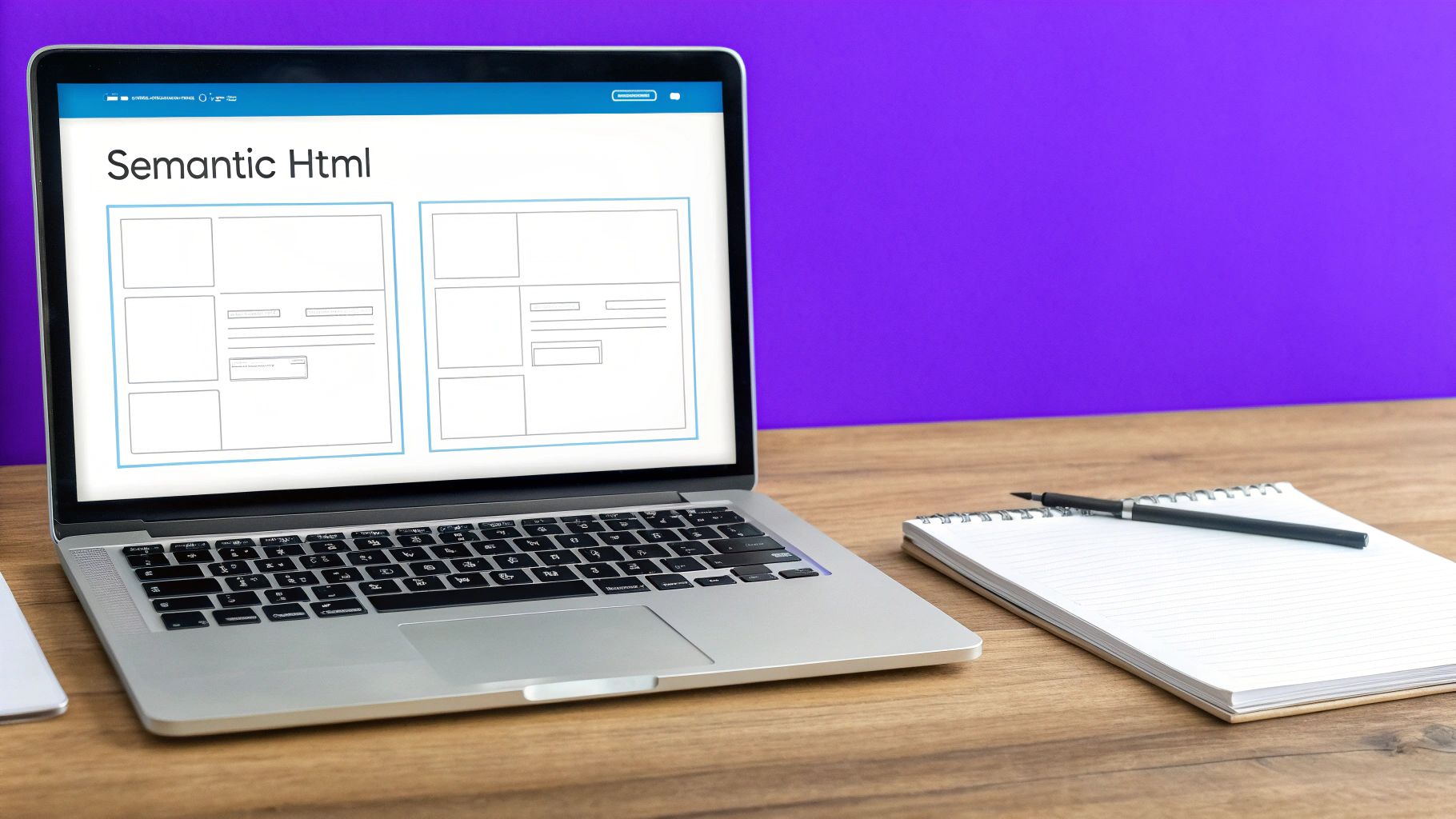
When a page relies on styling to create structure, like using bold, large text instead of a proper <h1> tag, it looks correct visually but is meaningless to a screen reader. For Divi users, this requires a mindful approach. It's crucial to use the correct modules and settings to build a logical document outline that flows correctly even without CSS.
Why It Matters for Accessibility
Proper semantic structure provides context that is essential for non-visual users. It allows screen readers to announce "heading level 2" or "navigation menu," giving users a clear understanding of the page layout. This is why websites like GOV.UK and the BBC News are often cited as prime examples; their clean, semantic markup makes their vast amounts of information highly navigable for everyone.
Key Insight: A logical HTML structure is the skeleton of your website. Without it, your content is just a formless blob to assistive technologies, making navigation confusing and frustrating.
How to Implement Semantic HTML in Divi
While Divi provides immense design freedom, it's easy to create inaccessible structures by mistake. Here are some actionable steps to ensure your Divi site is built on a solid, semantic foundation:
- Use Headings Hierarchically: Never skip heading levels. Your page should have one
<h1>, followed by<h2>s, then<h3>s, and so on. In Divi’s Text module, you can directly select the heading tag from the format dropdown. Avoid using a Text module styled to look like a heading; use the actual heading tag. - Leverage Divi's Theme Builder for Landmarks: Define your site-wide header, footer, and main content areas using the Theme Builder. To ensure they are wrapped in the correct landmark tags, you can add a Code module at the start of your header section with
<header>and another at the end with</header>. Do the same for your footer (<footer>) and main body content (<main>). - Use Proper List Elements: For any list of items, use Divi’s Text module and format the content as an unordered (
<ul>) or ordered (<ol>) list. Do not create "fake" lists using separate Text modules for each item preceded by a hyphen or number.
2. Keyboard Navigation Support
Another critical pillar of website accessibility best practices is ensuring comprehensive keyboard navigation support. This means that every interactive element on a page, from links and buttons to form fields and sliders, can be accessed and operated using only a keyboard. Many users with motor disabilities, visual impairments relying on screen readers, or even power users, depend entirely on keyboard navigation to browse the web.
A site that looks perfect but traps users in a "keyboard trap" or has an illogical tab order is fundamentally broken for these individuals. For Divi users, this means paying close attention to the structure of interactive modules and ensuring that custom scripts or complex layouts don't interfere with the natural flow of keyboard focus. The goal is to make the experience seamless for someone using the Tab, Shift+Tab, Enter, and arrow keys.
Why It Matters for Accessibility
Without keyboard support, parts of your website become completely inaccessible. Imagine trying to submit a contact form but being unable to reach the "Submit" button. This is the reality for users who cannot use a mouse. Powerhouse platforms like Gmail and Slack excel here, offering extensive keyboard shortcuts that not only enable access but also dramatically improve efficiency for all users.
Key Insight: If a user cannot complete a core action on your site without a mouse, your site is not accessible. Keyboard navigation is not an optional feature; it's a fundamental requirement for equal access.
How to Implement Keyboard Navigation in Divi
Ensuring your Divi site is fully keyboard-navigable requires both careful setup and testing. The default behavior of most Divi modules is reasonably accessible, but custom designs and third-party plugins can introduce problems. Here are some actionable steps:
- Implement "Skip to Content" Links: For pages with extensive navigation menus, a "skip to content" link is essential. This allows keyboard users to bypass the long list of header links and jump directly to the main content. You can add this using a Code module at the very top of your header template with an anchor link pointing to your main content section's ID.
- Ensure Visible Focus Indicators: When a user tabs through your site, the currently selected element must have a clear visual outline. Divi sometimes removes the default browser outline. You can restore and style it using custom CSS in Divi’s Theme Options with the
:focusor the more modern:focus-visiblepseudo-class. For example:a:focus-visible, button:focus-visible { outline: 2px solid #007cba; }. - Maintain a Logical Tab Order: The tab order should follow the visual flow of the page: header, main content, then footer. Divi’s structure generally handles this well, but be mindful when using absolute positioning or manually changing the DOM order with code, as this can create a confusing and illogical navigation path.
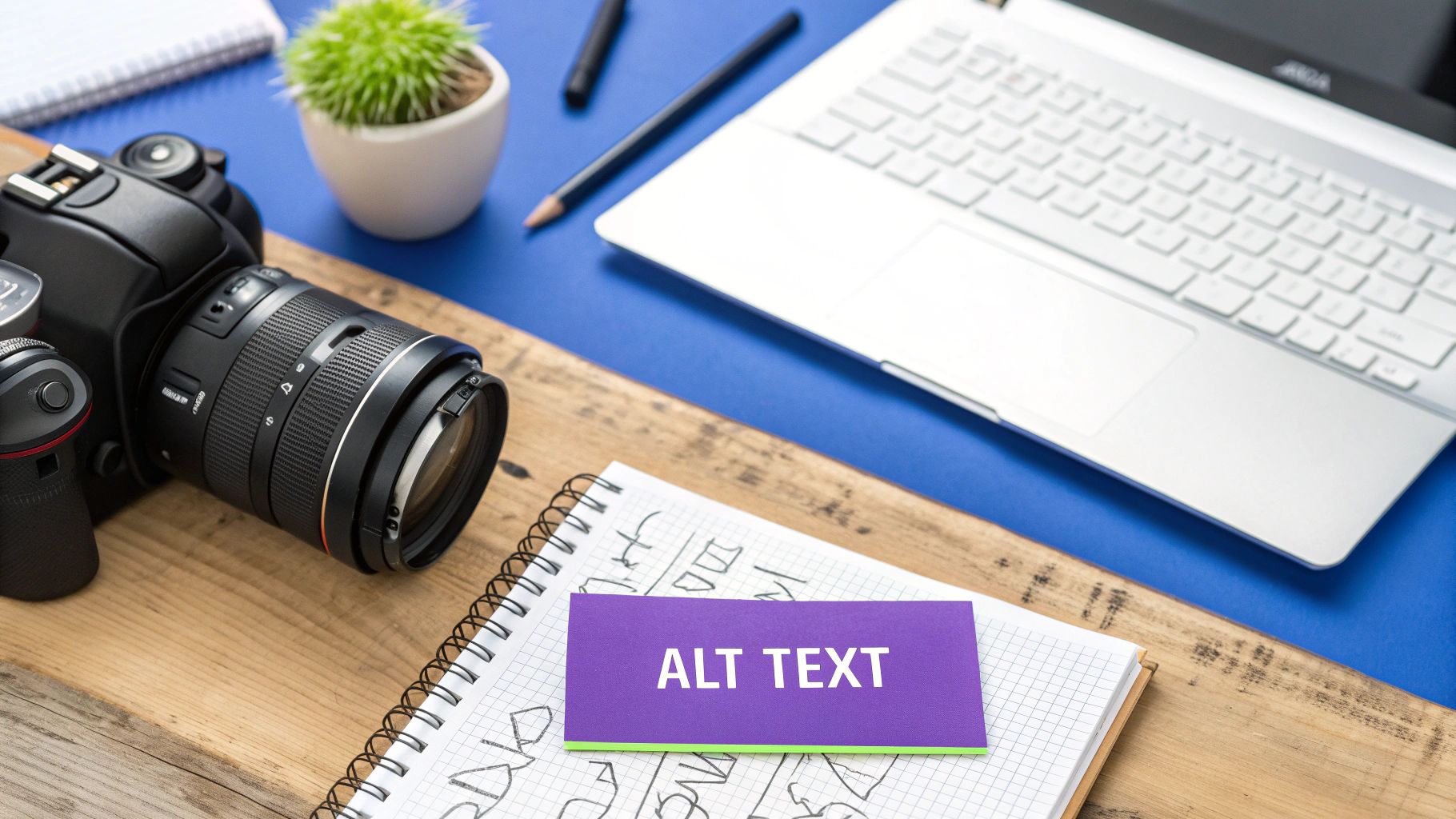
3. Alternative Text for Images
One of the cornerstones of website accessibility best practices is providing meaningful alternative text (alt text) for images. Alt text is a written description of an image that is read aloud by screen readers, displayed when an image fails to load, and indexed by search engines. It ensures that users who cannot see the image receive the same information or understand its purpose within the context of the page.

Effectively implementing alt text means conveying the essential content and function of every image. This isn't just about describing what an image shows; it's about communicating its role on the page. For Divi users, adding alt text is a straightforward process within the Media Library or the Image module settings, yet it's often overlooked or poorly executed, creating significant barriers for users with visual impairments.
Why It Matters for Accessibility
Without descriptive alt text, images are invisible and silent to screen reader users. This can make content incomprehensible, especially when images contain important information or serve as functional elements like links or buttons. Websites like National Geographic excel at this, providing vivid descriptions that allow all users to experience the richness of their visual storytelling. Similarly, Wikipedia's educational content relies on precise alt text to make complex diagrams and historical photos understandable to everyone.
Key Insight: Alt text is not just a description; it is an equivalent experience. If the image's information is crucial for understanding the content, its alt text must convey that information with equal clarity and purpose.
How to Implement Alternative Text in Divi
Adding alt text in Divi is simple, but writing effective alt text requires thoughtful consideration. Here’s how to do it correctly for various image types:
- Informative Images: For images that convey information (like charts, infographics, or photos that add context), describe what you see. In the Divi Image module settings, go to the Content tab, open the Image toggle, and fill in the "Image Alt Text" field. Be concise but descriptive. For a photo of a person, include their name if relevant: "Dr. Jane Smith speaking at a podium."
- Functional Images: If an image is a link or button, the alt text should describe its function or destination, not the image itself. For example, if a logo links to the homepage, its alt text should be "[Your Company Name] Homepage," not "Company Logo."
- Decorative Images: For images that are purely for visual flair and add no informational value, use an empty alt attribute (
alt=""). In Divi, you can do this by leaving the "Image Alt Text" field blank. This tells screen readers to ignore the image, preventing unnecessary auditory clutter. While alt text is vital, it's also important to understand the broader context of visual media on your site. For more guidance on handling images responsibly, you can learn more about image attribution and its importance on Divi Mode.
4. Color Contrast and Visual Design
Another critical pillar of website accessibility best practices is ensuring sufficient color contrast and thoughtful visual design. This involves choosing text and background colors that are distinct enough for people with visual impairments, including color blindness, to read comfortably. It also means never using color alone to convey important information, as this can exclude users who cannot perceive color differences.
When text and background colors are too similar, users with low vision or color vision deficiencies may find the content unreadable. For Divi users, the vast color palette options make it easy to inadvertently create low-contrast combinations. A mindful approach to color selection is essential to creating a visually appealing design that is also functional and inclusive for all visitors.
Why It Matters for Accessibility
Sufficient color contrast is a non-negotiable requirement for readability. The Web Content Accessibility Guidelines (WCAG) set specific minimum contrast ratios: 4.5:1 for normal text and 3:1 for large text. Meeting these standards ensures your content is legible to a wider audience. Companies like Apple and Microsoft integrate high-contrast modes and accessible color palettes directly into their operating systems, demonstrating the importance of this principle at a foundational level.
Key Insight: Relying solely on color to communicate information (like indicating an error with a red outline) is a major accessibility barrier. Always pair color cues with text labels, icons, or patterns to ensure the message is universally understood.
How to Implement Color Contrast in Divi
Divi's design controls offer complete freedom, which means the responsibility for accessible color choices rests with the designer. Here are actionable steps to ensure your Divi site meets contrast and visual design standards:
- Check Contrast Ratios Continuously: Before finalizing your brand colors, use a tool like the WebAIM Contrast Checker or the Stark design plugin to verify your combinations. Enter your foreground (text) and background hex codes to see if they pass WCAG AA and AAA levels.
- Don't Rely on Color Alone: When designing forms in Divi, don't just make the border of an invalid field red. Use Divi's design options to add an error icon and a descriptive text message below the field. For links within a paragraph, ensure they are not only colored differently but also underlined.
- Design and Test in Grayscale: A powerful technique is to view your design in grayscale. This quickly reveals if you are relying too heavily on color to differentiate elements. If your design becomes confusing or loses meaning without color, you need to add other visual cues.
- Provide High-Contrast Options: For advanced accessibility, consider offering a high-contrast mode toggle. You can achieve this in Divi by using custom CSS and a little JavaScript to allow users to switch between your default stylesheet and a high-contrast alternative.
5. Form Accessibility and Labeling
Accessible forms are critical for user interaction, lead generation, and e-commerce. Ensuring forms are clearly labeled, provide helpful instructions, and manage errors gracefully is a core tenet of website accessibility best practices. When a user cannot understand what a form field is for or how to correct an error, they will likely abandon the task, leading to lost conversions and a frustrating user experience.
For Divi users, the default Contact Form module often hides labels, relying on placeholder text. This is a common accessibility pitfall, as placeholders disappear on input and are not consistently read by all screen readers. Making forms accessible requires moving beyond default settings to ensure every user can complete them successfully.
Why It Matters for Accessibility
Properly labeled forms provide a clear and unambiguous path for completion. For screen reader users, the programmatic link between a label and its input (e.g., <label for="name">) allows the software to announce the purpose of each field as the user navigates. Without this, users are left guessing. Great examples of this in practice can be seen in the UK Government Digital Service form patterns and Shopify's checkout process, which prioritize clarity and simplicity.
Key Insight: An inaccessible form is a dead end. If users can't understand what you're asking for or how to fix a mistake, your form might as well not exist. Clear labeling and error handling turn a potential point of failure into a seamless interaction.
How to Implement Accessible Forms in Divi
The Divi Contact Form module requires some adjustments to become fully accessible. Here are the essential steps to take for any form on your Divi site:
- Explicitly Link Labels to Inputs: The most crucial step is to ensure every form field has a visible, correctly associated
<label>. While Divi's default behavior hides them, you can enable them with a small amount of CSS or use a plugin. For a step-by-step guide, you can learn more about how to show labels on fields in the Divi contact form on divimode.com. - Group Related Fields: When you have a set of related inputs, such as radio buttons or checkboxes for a single question, wrap them in a
<fieldset>element with a<legend>tag to describe the group. This can be done by adding Code modules around the relevant fields in Divi to provide the necessary HTML structure. - Provide Clear Instructions and Error Messages: Use the "Help Text" field in Divi's field settings to provide extra context. This text is programmatically linked via
aria-describedby, giving screen reader users the additional information they need. For error validation, ensure messages are specific (e.g., "Please enter a valid email address" instead of just "Error") and appear close to the field in question.
6. ARIA Labels and Landmarks
When native HTML semantics fall short, Accessible Rich Internet Applications (ARIA) attributes step in to bridge the gap. ARIA is a set of special accessibility attributes that can be added to any HTML element to provide additional context and information to assistive technologies. This is especially crucial for complex, dynamic web components like custom menus, sliders, or tabbed interfaces that don't have a standard HTML equivalent.
Using ARIA allows you to define roles, states, and properties for elements, making interactive components understandable to screen reader users. For Divi builders creating highly customized user interfaces, ARIA is an essential tool in their website accessibility best practices toolkit. It transforms visually intuitive interactions into a format that assistive technologies can interpret and communicate effectively.
Why It Matters for Accessibility
ARIA provides clarity where native HTML cannot. It can announce that a set of tabs is a "tab list," that a specific tab is "selected," or that a button expands or collapses a section of content. Without ARIA, a user relying on a screen reader would encounter a series of generic <div> or <span> elements with no understanding of their function or relationship. Complex web applications like Google Docs and Trello rely heavily on ARIA to make their intricate, drag-and-drop interfaces navigable and usable for everyone.
Key Insight: ARIA should be used to enhance, not replace, native HTML semantics. If a standard HTML element like
<button>or<nav>exists for your purpose, always use it first. Use ARIA only when necessary to add a layer of accessibility that HTML alone cannot provide.
How to Implement ARIA in Divi
Adding ARIA attributes to Divi modules requires accessing the element's HTML. This is typically done within the module's "Advanced" tab under "CSS ID & Classes" or by using a Code module for more complex structures.
- Assign Landmark Roles: While the Theme Builder method with
<header>or<footer>tags is best, you can also assign roles directly. For instance, in a Divi module serving as your main search bar, go to Advanced > Attributes and add a custom attribute. Set "Attribute Name" toroleand "Attribute Value" tosearch. Other key landmark roles includenavigation,main, andcomplementary. - Use
aria-labelfor Unlabeled Controls: If you have an icon-only button (like a search icon in a Button module), it's silent to screen readers. In the module's Advanced > Attributes settings, add an attribute with the namearia-labeland a value like "Search Website." This provides a descriptive, audible label. - Indicate Element States: Use attributes like
aria-expandedfor accordions or toggles. For a Divi Accordion module, you can use JavaScript to dynamically addaria-expanded="true"to the active accordion item and"false"to the inactive ones, clearly communicating their state. - Announce Dynamic Content with
aria-live: If you have a Divi form that shows a success or error message without a page reload, screen readers may not notice it. Wrap the message container (e.g., a Text module) in a<div>witharia-live="polite". This tells screen readers to announce the new content when they have a moment, without interrupting the user.
7. Responsive and Scalable Design
A core component of modern web design, responsive design is also a critical website accessibility best practice. It ensures that your website provides a functional and coherent experience across a vast range of devices, from small mobile phones to large desktop monitors. More than just adapting to screen sizes, true accessibility requires scalability, allowing users with low vision to magnify content up to 200% without breaking the layout or losing functionality.
This means building with flexibility in mind. Layouts should reflow gracefully, text should resize without becoming illegible or overlapping, and interactive elements must remain easy to use. Divi’s built-in responsive editing tools are powerful, but they must be used intentionally to create a site that is not just mobile-friendly but also truly scalable and accessible to all users.
Why It Matters for Accessibility
Users with low vision often rely on browser zoom features to read content comfortably. A fixed-width, pixel-based design can force horizontal scrolling when zoomed, creating a disorienting and frustrating experience. Similarly, touch-based navigation requires larger targets than a precise mouse pointer. Sites like The Guardian excel here; their content reflows perfectly at any size, ensuring readability is never compromised.
Key Insight: A responsive and scalable design doesn't just cater to mobile users. It directly supports users with motor impairments and low vision, ensuring your content is accessible regardless of the device or visual adjustments they need.
How to Implement Responsive and Scalable Design in Divi
Divi offers robust controls for responsiveness, but achieving true scalability requires a specific approach. Here are actionable tips for your Divi projects:
- Prioritize Relative Units: Whenever possible, use relative units like
em,rem, and%for font sizes, padding, and margins instead of fixed pixels (px). This allows elements to scale proportionally when a user zooms their browser. You can enter these values directly into Divi’s input fields. - Test Zoom Functionality: Regularly test your pages by zooming in to 200% in your browser (
Ctrl++orCmd++). Check for overlapping text, broken layouts, or content that requires horizontal scrolling to read. This is a key requirement of WCAG 2.1 Success Criterion 1.4.4 (Resize text). - Ensure Sufficient Touch Target Size: For all interactive elements like buttons, links, and form inputs, ensure the clickable area is at least 44×44 pixels. In Divi, you can achieve this by adding custom padding to buttons and other modules, especially in the Tablet and Phone views.
- Optimize Your Viewport: Make sure your site includes the proper viewport meta tag:
<meta name="viewport" content="width=device-width, initial-scale=1.0">. Divi adds this by default, but it's crucial to ensure it isn't accidentally removed or altered, as it's fundamental for responsive behavior on mobile devices. For a deeper dive, check out these key tips for better Divi mobile responsiveness.
8. Screen Reader Optimization
A visually stunning website is only half the story; for millions of users who rely on screen readers, the auditory experience is what truly defines its accessibility. Screen reader optimization involves building and structuring your content so that assistive technologies can interpret and announce it logically and descriptively. This practice ensures that users with visual impairments can navigate, understand, and interact with your site as effectively as sighted users.
When a site is not optimized, a screen reader user might hear a jumble of disconnected elements, meaningless link text like "click here," or be unable to bypass repetitive navigation to reach the main content. This creates a deeply frustrating experience. For Divi users, this means going beyond visual design and actively considering the non-visual, linear flow of information your site presents.
Why It Matters for Accessibility
Screen reader compatibility is non-negotiable for digital inclusion. It allows users with visual impairments to perceive content, understand its structure, and navigate with confidence. Organizations like WebAIM provide extensive resources for testing, and major platforms like Amazon have heavily invested in optimizing their product pages for screen readers, demonstrating its importance in a commercial context. For users relying on these tools, your site's content is transformed into an audio interface, and you can learn more about text-to-speech technology to better understand how this process works.
Key Insight: Optimizing for screen readers isn't just a technical task; it's about translating your visual design into a coherent and functional auditory experience. A failure to do so effectively renders your website invisible to a significant audience.
How to Implement Screen Reader Optimization in Divi
Ensuring your Divi site works seamlessly with tools like NVDA, JAWS, and VoiceOver requires deliberate action. Here are some critical website accessibility best practices for screen reader users:
- Provide "Skip to Content" Links: Users should not have to listen to the entire navigation menu on every single page. Use a Code module at the very top of your global header in the Theme Builder to add a "skip link," a link that is visually hidden until focused but allows screen reader users to jump directly to the main content area.
- Write Descriptive Link and Button Text: Avoid generic phrases. Instead of a button that says "Learn More," make it descriptive, such as "Learn More About Our Divi SEO Services." In Divi's Button module, this is as simple as writing clear, contextual text in the "Button" field.
- Check the Logical Reading Order: Divi’s column-based layouts can sometimes create a confusing reading order. Use the Tab key to navigate through your live page to simulate the path a screen reader will take. If the focus jumps erratically, you may need to restructure your rows and columns to create a more logical, linear flow.
- Use Proper Table Markup: If you display data in tables, use the Code module to build them with proper HTML, including
<table>,<thead>,<tbody>,<tr>,<th>(for headers), and<td>(for data cells). This allows screen readers to announce column and row headers, giving context to the data.
Accessibility Best Practices Comparison
| Accessibility Feature | Implementation Complexity 🔄 | Resource Requirements ⚡ | Expected Outcomes 📊 | Ideal Use Cases 💡 | Key Advantages ⭐ |
|---|---|---|---|---|---|
| Semantic HTML Structure | Moderate – requires understanding of semantic tags and hierarchy | Low – mainly developer skill/time | Improved SEO, screen reader navigation, easier maintenance | All web content needing clear structure | Better accessibility, SEO, and cross-device support |
| Keyboard Navigation Support | High – complex focus management and custom event handling | Moderate – requires testing and coding | Enhanced usability for keyboard-only users, motor-impaired users | Interactive web apps, complex UI | Essential for motor disabilities, power user efficiency |
| Alternative Text for Images | Low to Moderate – requires descriptive writing | Low – primarily content authoring | Visual content accessible to blind users, SEO boost | Image-heavy sites, informative or functional images | Accessibility for blind users, improved SEO |
| Color Contrast and Visual Design | Moderate – color choices constrained by guidelines | Moderate – design and testing effort | Improved readability, reduced eye strain | Text-heavy content, UI with important status info | Better readability, support for low vision users |
| Form Accessibility and Labeling | Moderate – needs clear label and error implementations | Moderate – coding and testing | Reduced abandonment, improved experience and support | Any form-based interface | Enhances screen reader use, lowers user errors |
| ARIA Labels and Landmarks | High – requires knowledge of ARIA roles and attributes | Moderate to High – advanced coding and testing | Improved navigation in complex, dynamic web apps | Dynamic content, rich web applications | Bridges semantic gaps, improves assistive tech support |
| Responsive and Scalable Design | High – needs flexible, tested layouts and scalable elements | Moderate – design and testing across devices | Works well on all devices and zoom levels | Mobile-first sites, diverse device environments | Future-proof design, better mobile and low vision access |
| Screen Reader Optimization | High – requires detailed content structuring | Moderate to High – testing with multiple screen readers | Essential accessibility for blind users, SEO improvement | Content-heavy and multimedia sites | Improves screen reader experience, SEO, voice control |
Building a More Inclusive Web, One Divi Site at a Time
We've explored a comprehensive set of website accessibility best practices, moving from foundational principles to specific, actionable techniques you can implement directly within your Divi projects. The journey to a fully accessible website is not about checking off a list and moving on; it is an ongoing commitment to inclusive design and a fundamental shift in how we approach web development. By embracing this mindset, you are not just aiming for compliance, you are striving for connection, ensuring every user has the opportunity to engage with your content meaningfully.
The eight pillars we've discussed, from semantic HTML and robust keyboard navigation to thoughtful color contrast and descriptive ARIA labels, form the bedrock of an accessible experience. They are not isolated tasks but interconnected elements that work in concert to create a seamless and empowering user journey for everyone, including individuals using assistive technologies. Mastering these concepts elevates your work from merely functional to truly user-centric.
From Theory to Action: Your Next Steps
The true test of understanding is application. Don't let this wealth of information remain theoretical. The most impactful way to internalize these website accessibility best practices is to put them into practice immediately. Here’s a clear path forward:
- Conduct a Mini-Audit: Choose one of your existing Divi websites. Using the principles from this article, perform a self-audit. Can you navigate the entire site using only your keyboard? Are all images equipped with meaningful alt text? Use a color contrast checker on your key pages. This hands-on exercise will reveal real-world gaps and make the concepts tangible.
- Integrate into Your Workflow: Make accessibility a non-negotiable step in your development process, not an afterthought. Create a pre-launch accessibility checklist based on the topics we covered. This ensures that every new site you build has a strong accessible foundation from day one, saving you significant remediation time later.
- Leverage a Screen Reader: There is no substitute for experiencing your website as a visually impaired user would. Install a free screen reader like NVDA (for Windows) or use the built-in VoiceOver (on Mac/iOS) and navigate your site. This practice builds empathy and uncovers critical usability issues that automated tools often miss.
The Broader Impact of Accessibility
Adopting these practices does more than just tick a WCAG compliance box. An accessible website is inherently a more robust, usable, and search-engine-friendly site. Clear semantic structure improves SEO, responsive design enhances mobile user experience, and logical navigation benefits all users, regardless of ability.
By prioritizing accessibility, you are future-proofing your projects, expanding your potential audience, and mitigating legal risks. More importantly, you are taking an active role in dismantling digital barriers and championing a more equitable internet. Every form you label correctly, every ARIA landmark you define, and every image you describe contributes to a more inclusive digital world. Let this guide be the catalyst that transforms your approach, empowering you to build Divi websites that are not only beautiful but are also open and welcoming to all.
Ready to streamline your accessibility efforts in Divi? Divimode builds powerful plugins designed with accessibility at their core, helping you create complex, interactive elements like popups and mega menus that meet WCAG standards without the custom coding headache. Explore our solutions at Divimode and start building more accessible, effective websites today.
More Articles You Will Like