
 Alex Martin
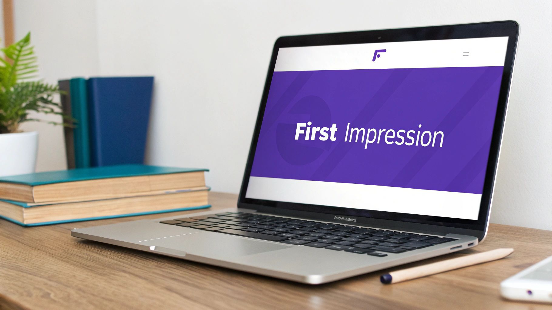
Your website’s header is its digital handshake. It’s the very first thing a visitor sees, and it single-handedly shapes their entire first impression.
A great header doesn't just sit there looking pretty. It immediately tells users who you are, what you do, and where they can go next. From the very first second, it builds trust and guides their journey.
Why Your Header Is Your Most Critical First Impression
Think of your header as the lobby of a physical building. A first-time visitor walks in and instantly makes a judgment call. Is it clean, professional, and easy to figure out? Or is it a cluttered, confusing mess?
That split-second evaluation determines whether they stick around to explore or turn right back around and leave. Your webpage header serves this exact purpose, acting as a powerful tool for orientation, branding, and navigation.
When someone lands on your site, they're really asking one simple question: "Am I in the right place?" An effective header answers that with a confident "Yes." It's not just a decorative banner; it’s a functional workhorse doing several critical jobs at once.
The Anatomy of a High-Performing Webpage Header
Every great header is made up of a few essential parts that work together to create a smooth, intuitive user experience. We can break these down into a simple table.
| Component | Primary Function | Why It Matters for User Experience |
|---|---|---|
| Logo & Brand Identity | Instantly communicates who you are and reinforces your brand. | Provides immediate recognition and builds trust. Users know they're on the right site. |
| Primary Navigation | Acts as a clear, predictable map to the most important pages. | Eliminates confusion and helps users find what they're looking for without frustration. |
| Call-to-Action (CTA) | Guides users toward the most important conversion goal. | Makes it easy for visitors to take the next step, like "Get a Quote" or "Sign Up." |
| Utility Navigation | Offers access to secondary but important links like Login, Cart, or Search. | Provides quick access to essential tools without cluttering the main navigation. |
Neglecting any one of these can lead to confused visitors and high bounce rates. They all need to be there, working in harmony.
A website's header is the digital equivalent of a firm handshake and a friendly greeting. It establishes trust, communicates confidence, and sets the stage for a positive interaction, all within a few crucial seconds.
The impact of this first interaction is massive. Research shows that 94% of users' first impressions are directly tied to website design, and the header leads that charge. That immediate gut reaction dictates trust and credibility, which is everything in a competitive market.
Understanding these fundamentals is key. For example, any guide on vacation rental website design that gets bookings will tell you just how critical every on-page element is, starting right at the top.
A confusing header is like a cluttered storefront; it silently tells people to go somewhere else. By focusing on clarity, strong branding, and a clear path to action, you can build a header that turns that first handshake into a long-term relationship.
Building Blocks of Effective Header Design
Great design doesn't just happen; it's the result of smart, intentional choices. When it comes to your website's header, a few core principles can turn a simple navigation bar into a powerful tool that builds trust and keeps users engaged.
Think of it like setting up your living room. You wouldn't just toss the couch, TV, and coffee table in a pile. You'd arrange them to create a clear flow and make the space feel inviting. Your header needs that same thoughtful approach.
The real goal is to create a structure so intuitive that users don't even have to think about it. They just know exactly where to look and what to do next.
Establish a Clear Visual Hierarchy
Visual hierarchy is all about telling your visitors where to look first, then second, then third. Without it, your header is just a jumble of elements all shouting for attention at the same time. You can create that necessary order with a few simple techniques.
- Size and Scale: Make your most important elements the biggest. Your logo should be prominent to establish your brand, and your main call-to-action (CTA) button needs to pop more than the regular navigation links.
- Color and Contrast: A bright "Book a Demo" button against a more muted background is impossible to miss. This kind of contrast instantly separates the primary action you want users to take from their secondary navigation options.
- Strategic Spacing: Don't underestimate the power of empty space. Giving your header elements room to breathe prevents that cluttered, chaotic feeling and makes it far easier for people to scan and find what they need. A well-spaced header just feels calmer and more professional.
By mastering hierarchy, you're essentially creating a visual roadmap that guides users from your brand (the logo), to their options (the navigation), and finally to your desired action (the CTA).
A strong visual hierarchy isn’t about making things look pretty; it's about making them make sense. It’s the silent director guiding your user’s attention, ensuring they see what matters most without having to think about it.
Champion Simplicity and Clarity
When it comes to header design, less is almost always more. A crowded header bombards users with too many choices, which can lead to "decision fatigue" and cause them to just give up and leave. Simplicity isn't just a trendy look; it's a cornerstone of a great user experience.
The best way to achieve this is to be ruthless with your navigation links. Do you really need ten different items in your main menu? Probably not. You can often group related pages under a single dropdown. For instance, "About Us," "Our Team," and "Careers" can all comfortably live under a single "About" link. This cleans up the visual space and simplifies the journey for your visitors. You can dive deeper into the basics of building website headers with Divi to see these principles in action.
Maintain Unshakeable Brand Consistency
Your header is like a brand ambassador—it shows up on almost every single page. Because of that, it absolutely must reflect your brand’s identity through its colors, fonts, and overall tone. If your logo is fun and your brand colors are bright, a stiff, corporate-looking header will feel completely out of place and create a jarring experience for users.
This consistency is what builds brand recognition and reinforces trust. When someone clicks from your homepage to your blog, that familiar header is a subtle reassurance that they're still in the right place. Every element should feel like it belongs to the same cohesive brand story. For a broader look at how different design elements work together, checking out ecommerce website design best practices can offer some great insights that apply beyond just ecommerce.
By locking in these three building blocks—hierarchy, simplicity, and consistency—you’re setting the stage for a header that’s not just nice to look at, but also incredibly functional. It becomes a reliable guide that improves the user experience on every page of your site.
Exploring Common Header Design Patterns
Picking the right header design is a bit like choosing the right tool for a job. A hammer is great for a nail, but pretty useless for a screw. In the same way, the header that’s perfect for a slick creative portfolio might be a total disaster on a massive e-commerce site.
Your choice should always come back to your website's main goal and what your visitors actually need. Let's break down the most common and effective header design patterns—what they are, when to use them, and why they just plain work.
The Classic Static Header
This is the old reliable, the traditional workhorse of header design. The static header sits right at the top of the page and scrolls out of view as you move down. It's simple, everyone knows how it works, and it’s predictable. That makes it a safe bet for a lot of websites.
This pattern is a solid choice for sites with shorter pages or where having the navigation always visible isn't a top priority. Think of a simple business brochure site, a focused landing page, or a blog where the reader's main job is to just read without distractions. It gets the job done with zero fuss.
The Modern Sticky Header
Now, unlike its static cousin, the sticky header (or fixed header) "sticks" to the top of the screen, staying put no matter how far down a user scrolls. This one simple trick can make a huge difference to the user experience, especially on pages loaded with content.
A sticky header is pretty much the standard for sites where people need constant access to key actions.
- E-commerce Sites: It keeps the shopping cart, account login, and search bar right there, ready to go. This seriously cuts down on friction for shoppers.
- Blogs and News Sites: Readers can easily jump to other categories or articles without the tedious scroll all the way back to the top.
- Complex Web Apps: It ensures the main navigation controls are always within reach, which is a must for good usability.
By keeping navigation persistent, you smooth out the user's journey and can even bump up conversions by making your main call-to-action an ever-present option.
If you're trying to figure out which pattern lines up with your goals, this decision tree can help you map out the process.
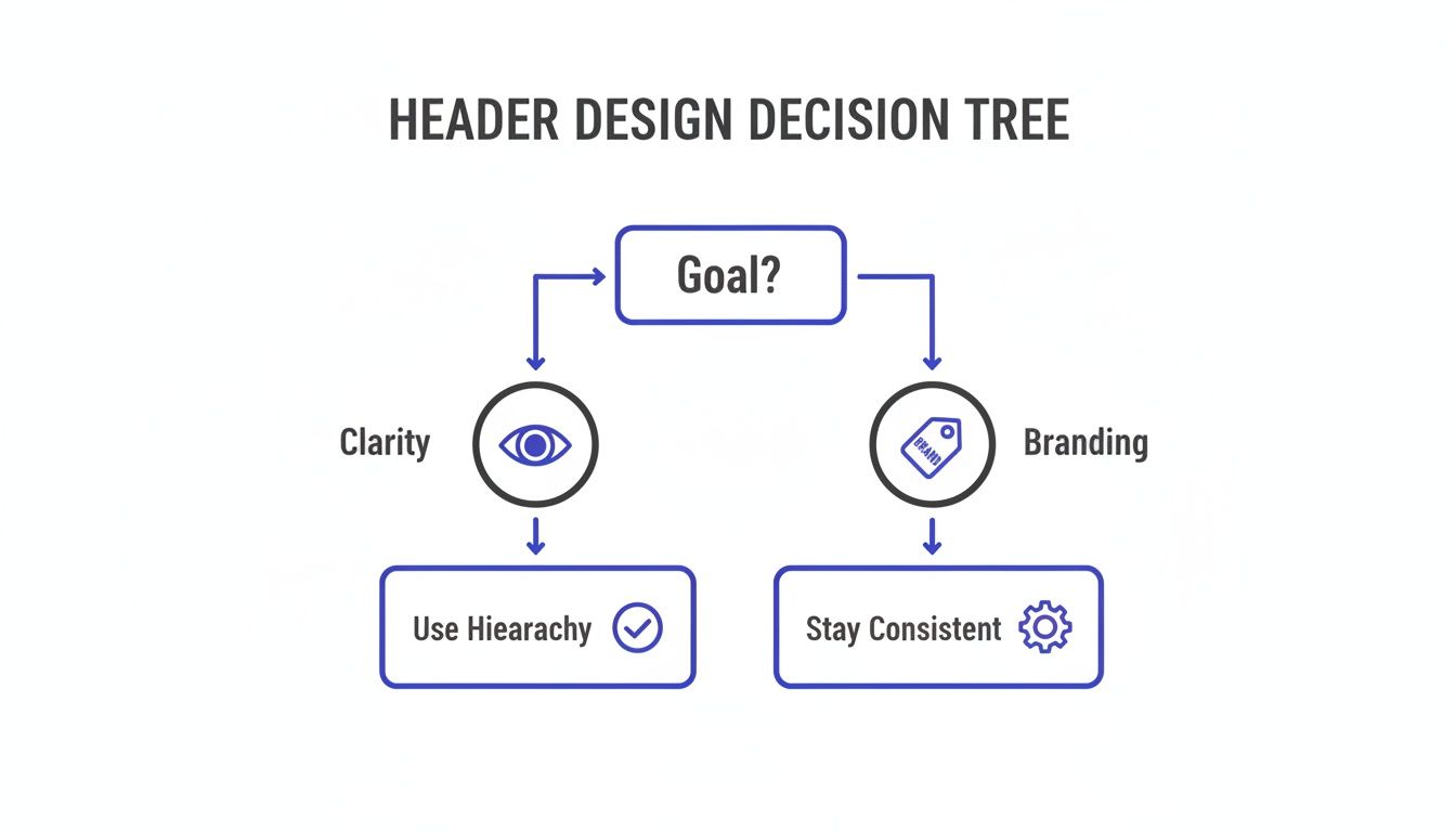
As you can see, your header's main job—whether that’s establishing a strong brand identity or providing crystal-clear navigation—should really drive its entire structure from the get-go.
The Minimalist Hamburger Menu
Originally born out of necessity for tiny mobile screens, the hamburger menu has found a home on desktops, too, especially for sites going for an ultra-clean, minimalist vibe. It cleverly tucks the entire navigation behind a simple three-line icon, freeing up a ton of screen real estate.
This pattern is a natural fit for:
- Mobile-first designs where every pixel counts.
- Portfolio websites that want the visuals to do all the talking.
- Web apps with so many navigation links they'd clutter up a traditional header.
But a word of caution: use it wisely. Hiding the navigation by default can sometimes hurt discoverability. It forces users to take an extra step just to see their options, which can be a point of friction.
The Immersive Hero Header
The hero header isn't just a navigation bar; it's a full-blown visual introduction. It typically fills the entire screen "above the fold" and pairs a powerful background image or video with just a little bit of text and a single, unmissable call-to-action.
This is the pattern you reach for when you need to make a strong, immediate emotional or visual punch. It’s perfect for creative agencies, photographer portfolios, product launch pages—any brand that leans on compelling storytelling. The idea isn't to give users a dozen choices, but to captivate them and steer them toward one specific action.
A hero header doesn't just show users where to go; it tells them why they should care. It’s a statement piece that sets the tone for the entire brand experience before the user ever scrolls.
Advanced Patterns Like the Mega Menu
For websites with an absolute mountain of content—think huge e-commerce stores or major news outlets—a simple dropdown menu just isn't going to cut it. That's where the mega menu steps in. Instead of a basic list of links, it expands to show a large panel with multi-column layouts, icons, and sometimes even images.
Mega menus effectively turn your navigation into a rich, well-organized sitemap. They let you group a huge number of options logically, making it much easier for people to scan and find what they’re looking for without feeling completely overwhelmed. It transforms your header from a basic map into a detailed, helpful directory.
To help you decide which header is the best fit, here’s a quick comparison of the patterns we've covered.
Choosing the Right Header for Your Website
| Header Pattern | Best For… | Key Advantage |
|---|---|---|
| Static Header | Simple brochure sites, blogs, landing pages | Familiar, unobtrusive, and straightforward. |
| Sticky Header | E-commerce, news sites, complex web apps | Keeps navigation constantly accessible, improving usability. |
| Hamburger Menu | Mobile-first designs, minimalist portfolios | Maximizes screen space for content. |
| Hero Header | Creative agencies, product launches, brand-focused sites | Makes a strong visual and emotional first impression. |
| Mega Menu | Large e-commerce stores, news portals, universities | Organizes a vast amount of content clearly and logically. |
Ultimately, the best header is one that feels invisible—it helps users achieve their goals so effortlessly they don't even have to think about it. Consider your site's complexity and your audience's expectations, and you'll land on the right pattern.
Designing Responsive and Accessible Headers for Everyone
A beautiful header that breaks on a smartphone or is impossible for someone with a disability to use isn't just a design flaw—it's a failure. In modern web design, two principles are non-negotiable pillars of success: responsiveness and accessibility. A header that works for everyone isn't a bonus feature; it's a fundamental requirement for building trust and reaching the widest possible audience.
Think of your header as a friendly guide. On a huge desktop screen, it has plenty of room to stretch out and show you around. But on a narrow mobile phone, that same guide needs to get straight to the point. If it doesn't adapt, it becomes a roadblock, frustrating the 58% of website traffic that now comes from mobile devices.
Mastering Responsive Header Design
Making a header "responsive" simply means it fluidly adapts its layout and features to fit any screen size. The goal is a consistent and usable experience, whether someone is visiting on a 27-inch monitor or a 6-inch phone.
This usually involves transforming a wide, horizontal desktop header into something more compact for mobile. The most common solution is the iconic hamburger menu, which neatly tucks navigation links behind a three-line icon, saving precious screen space.
Keep these key things in mind for a solid responsive header:
- Touch-Friendly Targets: Buttons and links have to be big enough for a thumb to tap easily without accidentally hitting something else. Think chunky and clear.
- Optimized Logos: Always use a scalable vector graphic (SVG) for your logo. It'll look crisp on any screen without adding hefty file size that slows down load times.
- Smart Breakpoints: A breakpoint is the screen width where your header's layout changes. Choosing the right one ensures the switch from desktop to mobile view is smooth and happens before the header starts looking cramped.
Why Accessibility Is Not Optional
While responsiveness makes your header work on all devices, accessibility ensures it works for all people. An estimated 16% of the global population lives with a significant disability. Building an accessible header is about creating an inclusive experience for everyone, including those who rely on screen readers or navigate with a keyboard.
Accessibility isn't just a compliance checklist; it's a commitment to empathy. It means recognizing that not everyone interacts with your website in the same way and designing a header that welcomes them all.
Ignoring accessibility doesn't just alienate a huge portion of your potential audience; it can also open you up to legal risks. More importantly, it sends a clear message that your brand isn't concerned with providing an equitable experience for all.
Practical Steps for an Accessible Header
Making your header accessible comes down to a few key technical and design practices. These adjustments are often small but make a world of difference for many users.
- Use Semantic HTML: Structure is everything for a screen reader. Use the
<header>tag for the header itself,<nav>for the main navigation, and<ul>for the list of menu links. This provides a clear, logical map for assistive technologies. - Ensure Keyboard Navigability: Not everyone uses a mouse. A user must be able to hit the "Tab" key to move logically through every interactive element in your header—from the logo to each link and button. The currently focused item needs a clear visual indicator, like an outline.
- Provide Sufficient Color Contrast: Text and interactive elements must pop against their background. The Web Content Accessibility Guidelines (WCAG) recommend a contrast ratio of at least 4.5:1 for normal text. This is a game-changer for users with visual impairments like color blindness.
- Add ARIA Labels for Clarity: ARIA (Accessible Rich Internet Applications) attributes can give extra context to screen readers. For instance, you can add an
aria-label="Open main menu"to your hamburger icon so a user knows exactly what that button does.
By focusing on both responsiveness and accessibility, your header goes from being merely functional to truly inclusive. It becomes a reliable and welcoming entry point for every single visitor, no matter who they are or what device they're using. If you're looking for more guidance on ideal dimensions, our article covering optimal header sizes for websites offers additional practical tips.
Your website's header is so much more than a navigation bar—it's a silent workhorse that has a huge say in your site's technical performance. Get it wrong, and it becomes dead weight, dragging down your page speed and confusing search engines. But when you engineer it thoughtfully, a header becomes a powerful asset for both speed and search engine optimization (SEO).
Too many designers get caught up in the aesthetics and completely miss the technical baggage hiding in plain sight. Heavy image files, bloated code, and uncompressed logos can absolutely crush your load times. This isn't just a minor inconvenience; it directly torpedoes user experience and your most important performance scores.
The Need for Speed and Core Web Vitals
Slow-loading headers are one of the biggest reasons for poor Largest Contentful Paint (LCP) scores, a critical Core Web Vitals metric. LCP simply measures how long it takes for the biggest visual thing on the screen to show up. Since your header is almost always sitting right at the top of the page, a massive logo or a heavy background image can stall the whole process. Visitors get frustrated before they even see what you have to offer.
Your header is often the first and heaviest element a browser must render. Optimizing it isn't just a best practice—it's the first step in winning the race for a user's attention.
And the consequences are very real. A sluggish LCP leads to higher bounce rates and can even ding your search engine rankings, as Google uses Core Web Vitals as a direct ranking signal.
To get your header design lean and fast, focus on these moves:
- Compress All Images: Never, ever upload a full-resolution logo or background image. Use image compression tools to slash the file size without making it look fuzzy.
- Embrace SVGs for Logos: Scalable Vector Graphics (SVGs) should be your go-to for logos. They're incredibly lightweight and scale perfectly to any size, so your logo stays crisp on every device without bogging things down.
- Minimize Code: Every line of code adds a little more weight. Keep your header's HTML, CSS, and JavaScript as clean and efficient as you can. Ditch the overly complex animations or scripts that add more load than value.
Boosting Your SEO with a Structured Header
Beyond just speed, your header is a crucial roadmap for search engine crawlers trying to figure out your site's structure. A well-organized header with clear navigation acts like a mini sitemap. It helps bots discover your most important pages and understand the relationships between them, which in turn helps spread "link equity" (or authority) across your site.
Did you know that users spend a staggering 57% of their time looking at content above the fold? This just drives home how critical the header is for immediately signaling your site's purpose to both people and search engines. You can find more stats like this over at VWO's blog.
To squeeze every bit of SEO value out of your header, put these strategies into play:
- Use Descriptive Navigation Links: Skip generic labels like "Services." Instead, use keyword-rich terms that actually describe the page's content, like "Divi Web Design Services" or "Local SEO Consulting." This gives crawlers way more context.
- Implement Schema Markup: Adding structured data is like giving search engines a cheat sheet. Use SiteNavigationElement schema to explicitly tell them which links are your main navigation. You can also add Logo schema to identify your official logo, which can help it pop up in Google's Knowledge Panels.
- Ensure Crawlable Links: This is non-negotiable. Your navigation links must be standard
<a>HTML tags with a directhrefattribute. Don't try to get fancy with JavaScript-generated links; it can make it incredibly difficult for search bots to follow them and properly index your site.
When you start treating your header as a technical asset, you're not just designing a menu—you're building the foundation for a faster, more search-friendly website.
Inspiring Header Designs and How to Build Them
Theory is great for laying the groundwork, but nothing sparks creativity quite like seeing exceptional webpage header design in action. Let's move past the abstract principles and dive into some real-world examples, break down what makes them tick, and explore how you can bring that same inspiration to your own site.
Each of these examples is more than just a pretty face; it’s a lesson in strategic design. We'll connect these designs back to the core concepts we've talked about—hierarchy, simplicity, and guiding the user—and give you a mini-guide for recreating similar effects with Divi.
The Bold Hero Header
Picture a creative agency's website. The moment it loads, you’re greeted with a stunning, full-screen video background. The navigation is stripped back to the essentials: just a transparent, sticky bar at the top holding a logo, a few key links, and a high-contrast "Contact Us" button. Here, the header isn't just a menu; it's an immersive experience that instantly screams bold, visual-first branding.
This type of header is a master storyteller. It uses powerful imagery to forge an emotional connection before the user even reads a single word, making it an absolute winner for portfolios, brand-focused sites, and big product launches.
How to build it: Start with a full-width section and drop in a video background. Add a Divi Menu module, set its background to transparent, and then change its position to "Fixed" to get that sticky effect. The final touch? Give your CTA button a distinct background color so it pops against the moving video.
The Efficient Mega Menu
Now, think about a massive e-commerce store with thousands of products. Instead of a messy, endless dropdown, their header is a clean, simple navigation bar. But when you hover over "Shop," a mega menu gracefully expands. It’s not just a list—it's an organized catalog with columns for product categories, featured items with crisp images, and even current promotions. It transforms navigation from a chore into a rich, browsable experience.
How to build it: This is exactly what tools like Divi Areas Pro were made for. You can design your entire mega menu layout inside a Divi Area, complete with image and text modules. Once it's ready, just set it to trigger on hover for a specific menu link. Easy as that.
The Minimalist Split Header
A design studio might opt for a split header to achieve a clean, perfectly symmetrical look. The logo sits right in the center, with the main navigation links divided evenly on either side—"Our Work" and "Services" on the left, "About" and "Blog" on the right. This balanced approach feels deliberate and sophisticated, creating a sense of calm and order that perfectly mirrors the studio's design philosophy.
How to build it: You can pull this off right in Divi’s built-in header builder. Just place the logo in a central column and then create two separate menu modules to flank it on the left and right.
If you're looking for even more ideas, check out our guide on different headers for website design. By studying these kinds of patterns, you'll be well on your way to building a header that’s not just functional, but truly memorable.
Frequently Asked Questions About Header Design
Even after you've got the core principles down, a few common questions always seem to pop up during the design process. I've been there myself, tweaking pixels and debating choices late into the night. Getting these details right is what separates a good header from a great one.
Let's walk through some of the most frequent hurdles designers and site owners face, with some straightforward advice to help you make the right call.
What Is the Ideal Height for a Website Header?
There’s no magic number here, but I’ve found that most effective headers land somewhere between 60px and 120px tall. It really comes down to what you need to fit inside it and your overall site aesthetic. The goal is to give your navigation room to breathe without hogging too much screen real estate—especially on mobile, where every pixel is precious.
When you're working with a sticky header, leaning toward the shorter end of that range, around 60-80px, is usually a smart move. This keeps the navigation accessible as users scroll, but it doesn't get in the way of your actual content.
Should My Website Header Be Sticky?
For most sites, the answer is a resounding yes. A sticky (or fixed) header can be a game-changer for user experience, especially on pages with a lot of scrolling. Think about it: nobody enjoys having to scroll all the way back to the top just to find the menu. Making the header "stick" removes that friction entirely.
I'd say this is a non-negotiable for:
- E-commerce sites: You need that shopping cart and search bar visible at all times.
- Blogs and news sites: It makes jumping between categories so much easier.
- Complex web apps: When primary controls have to be instantly accessible, a sticky header is the way to go.
Just be careful it doesn't become a bulky monster on small mobile screens. Keep it lean.
How Many Links Should I Put in My Main Navigation?
This is a big one. It's tempting to cram everything into the main menu, but that just overwhelms people. You've probably heard of "choice paralysis"—it's a real thing, and a cluttered navigation is a prime culprit.
As a rule of thumb, aim for five to seven top-level menu items. If your site has a more complex structure, don't be afraid to use dropdowns or a mega menu to group related pages. A well-designed mega menu is a fantastic tool for large sites, letting you lay out tons of options in a way that's organized and easy to scan.
Ready to build advanced headers, mega menus, and popups that truly captivate your audience? With Divimode, you can create a more interactive and high-performing Divi website. Discover what's possible.
More Articles You Will Like