 Alex Martin
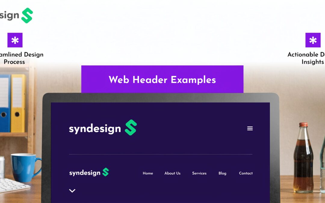
A client hands over the brief. The homepage goals are clear enough, but the header is still a blank strip at the top of the canvas. That single area now has to orient first-time visitors, carry brand cues, support navigation, and create the first meaningful click. In Divi, that decision can stall a build faster than almost any other layout choice.
Generic inspiration galleries do not help much. A stack of screenshots can show style, but it rarely shows behavior. You need to study how modern headers work in context. How the hero sets hierarchy. How the sticky state changes on scroll. How a mega menu handles product depth without turning the first screen into clutter.
That is the point of this guide. It is not a gallery of pretty header shots. It is a working shortlist of places to research header patterns, compare what they are doing well, and decide what is worth rebuilding in Divi. If you need a refresher on website header design patterns that support usability and conversion, start there, then use the sources below to gather sharper references.
For Divi projects, the practical question is never “Which header looks nicest?” It is “Which header solves this site’s job?” A SaaS homepage may need a lean sticky bar with one primary CTA. A WooCommerce store may need search, account access, cart visibility, and a category path that stays easy to use on smaller screens. A publisher may need to balance density and clarity without burying subscriptions.
Divi Theme Builder handles the core structure. Divi Areas Pro fits naturally when the header needs more advanced behavior: mega menus, flyout panels, timed announcements, injected promos, or different header content by page, device, or user state.
The sources in this article are useful because they help you study headers as systems, not decorations. That shift usually leads to better builds, fewer revisions, and header decisions you can defend to clients.
1. Awwwards

Awwwards is where I go when a client wants the header to feel current instead of competent. Not safe. Not recycled. Current.
The reason it works for header research is simple. You are not browsing static compositions. You’re seeing live production sites with real scroll states, transitions, transparent nav bars, oversized heroes, motion-led menus, and branded interactions that often define the entire first screen.
What it’s best for
Awwwards is strong when you need to study higher-end patterns:
- Scroll-reactive headers: Transparent to solid transitions, shrinking logos, and navigation that changes state without feeling abrupt.
- Immersive hero treatments: Full-viewport headers where typography, media, and CTA hierarchy all compete for space.
- Experimental navigation: Fullscreen menus, split layouts, layered hover states, and directional motion.
Because entries link out to live sites, you can inspect the behavior instead of guessing from a screenshot. That matters. A header can look polished in a gallery and still feel clumsy when you scroll it.
For Divi users, the smartest move is to treat Awwwards as a concept library, not a copybook. Pull the pattern apart. Ask what the header is trying to do. Is it clarifying navigation, setting a premium tone, or using motion to direct attention?
Practical rule: If the header needs custom animation to make sense, it’s probably too dependent on frontend engineering to port directly into a routine Divi build.
That doesn’t mean it’s useless. It means you should extract the transferable pieces. Maybe the scroll behavior is worth recreating, but the layered WebGL intro isn’t.
Where it breaks down
Awwwards can push you toward overbuilding. Many featured sites are portfolio, brand, or campaign experiences with room for heavier animation and more visual risk. That’s often the wrong model for a product grid, a service business, or a WooCommerce store that needs fast orientation.
One source used for header inspiration notes that Topaz Labs improved add-to-cart performance with a header that combined system requirements, a prominent “$299 Buy” CTA, and a before-and-after video comparison, producing a 35 percent uplift in add-to-cart rate after implementation (Vev’s header examples). The lesson isn’t “use video.” The lesson is “put proof and action near the top.”
That’s a much better filter when translating Awwwards ideas into client work.
For practical Divi implementation, pair your inspiration pass with a grounded build plan. Divimode’s guide to website header design is useful when you want to move from visual reference to an actual Theme Builder structure.
2. Land-book

Land-book earns its spot for a different reason than Awwwards. It is a working library for commercial patterns.
If the project is SaaS, consulting, ecommerce, or a local service business, Land-book usually gets me to relevant header ideas faster because the filtering is tighter. You can sort by industry, style, color, and layout cues, then study examples that already match the business model. That matters when the goal is not to admire a hero section. The goal is to find header patterns you can analyze, adapt, and build in Divi without dragging in a custom frontend stack.
Why it works in real projects
Land-book is good at showing repetition across good sites. That is useful.
Instead of chasing novelty, study what keeps appearing in the same category:
- Header density: How many top-level links fit before the nav starts competing with the hero.
- CTA strategy: Whether one clear action in the top right is enough, or whether the page needs a second action in the hero.
- Utility layers: Whether high-performing layouts separate account, contact, search, or cart functions from the main navigation.
- Visual restraint: Whether the header frames the message cleanly or pulls too much attention away from it.
Its Sections view makes this easier because you can isolate the header area instead of judging the whole page at once. For this article’s purpose, that is a key advantage. Land-book helps you study hero-plus-header relationships, sticky behavior, and menu structure as reusable UX patterns, not polished screenshots.
After you find a structure worth borrowing, translate it into a build plan. Divi users can use this guide on how to design a website header to map the reference into Theme Builder parts that are realistic to maintain.
What to study before you copy anything
Land-book rarely explains the reasoning behind the design. You have to read the header like a system.
Check what the header is trying to help the visitor do in the first few seconds. Is it orienting new visitors, pushing a demo request, shortening the path to products, or supporting repeat users with account and search access? Those are different jobs, and they produce different header structures.
Sticky headers are a good example. Many modern sites use them because persistent navigation can reduce friction, but that does not mean every site should pin the full desktop menu on scroll. In Divi builds, a smaller sticky state often works better. Keep the logo compact, preserve one primary CTA, and trim anything that does not need to follow the user down the page. If the reference uses a large multi-row header, that is usually the first thing I simplify.
A clean header is only good if it still exposes the choices the visitor needs.
That trade-off shows up fast in Divi and WooCommerce work. A brochure site can get away with five links and one button. A store with multiple categories, search, account access, and cart state usually needs more structure, and Divi Areas Pro can help by offloading complexity into targeted popups, slide-ins, or off-canvas menu states instead of forcing every option into the top bar.
That is why Land-book is useful. It helps you compare stripped-down headers against more operational ones, then decide what belongs in the header, what belongs in the hero, and what should move into a secondary interaction pattern.
3. One Page Love

One Page Love is where header clarity gets easier to spot. Because the gallery leans so heavily toward one-page sites and landing pages, the above-the-fold area carries more responsibility. There’s less room to hide weak decisions.
That makes it one of the best sources for web header examples when your main problem isn’t aesthetics. It’s message hierarchy.
What to study here
One-page designs force discipline at the top of the page. The best entries usually answer four questions fast:
- Who is this for
- What is being offered
- What should I click first
- What proof supports the claim
That’s valuable in Divi because the Theme Builder makes it easy to assemble pieces, but it also makes it easy to overstack them. Logo, nav, announcement bar, headline, subtitle, button group, trust icons, and media can turn into a crowded first screen if you don’t control the order.
One Page Love is excellent for studying headline length, supporting copy, and CTA grouping. Many examples are clean enough to rebuild with standard Divi modules plus a bit of CSS.
What usually ports well to Divi
The most transferable patterns tend to be simple:
- Single primary action: One obvious button in the header or hero, with a secondary text link if needed.
- Compact nav: Fewer top-level items, with the rest moved lower on the page or into a menu overlay.
- Strong hero separation: A header that frames the hero instead of competing with it.
This is also where header statistics can be used well, if they’re real and useful. One source on high-converting headers recommends using three to four impactful numbers in this area and highlights examples such as Australian Business For Sale displaying “36 Years of Experience,” “250 Business Owners Every Month,” and “0% Sales Commission” in the header area (Cultbooking’s article on high-converting website headers). Used well, those numbers work as immediate proof. Used badly, they become decoration.
Don’t add stats to a header because you have empty space. Add them because they remove doubt before the first scroll.
One Page Love won’t give you deep implementation notes, but it will sharpen your judgment about what deserves to stay above the fold. That’s half the battle in a Divi build.
4. Lapa Ninja

Lapa Ninja sits in a sweet spot between polished inspiration and buildable marketing design. It doesn’t feel as experimental as Awwwards, and it’s often more editorially useful than raw screenshot directories.
That makes it a practical source when you need a header that sells, not a header that performs design gymnastics.
Why marketers and Divi builders get value from it
The gallery naturally emphasizes landing pages, so the top section usually carries the conversion load. You can learn a lot by paying attention to spacing and sequencing.
Lapa Ninja is especially good for noticing:
- Headline-to-subcopy ratios: How much text the best hero sections can support before they start dragging.
- CTA stacking: When two actions help, and when they dilute each other.
- Media balance: How screenshots, illustrations, and product visuals sit beside the navigation without making the header feel top-heavy.
Some entries also lead you toward Figma freebies or trend roundups, which can speed up prototyping before you commit to a Divi layout.
Where to be careful
Because Lapa Ninja leans toward modern landing pages, it can bias you toward startup-style headers even when the client doesn’t need one. Not every local service brand needs a glossy SaaS hero with floating cards and abstract gradients.
This is also a good place to remember that motion and interactivity can work against usability when they’re excessive. Guidance on accessible headers points out that mainstream inspiration content often ignores semantic structure such as proper <header> and <nav> use, along with accessible behavior for dynamic navigation patterns (UC Denver’s accessible headers resource). In Divi, that gap matters because it’s easy to focus on visuals and forget keyboard access, focus order, and screen reader clarity.
If you pull inspiration from Lapa Ninja, translate it with constraints:
- Keep the semantic structure clean: Use a real navigation region and meaningful link labels.
- Treat motion as optional polish: Hover and reveal effects should never be required to understand the menu.
- Prototype mobile first: A beautiful desktop header often collapses badly once the menu, CTA, and announcement bar all fight for space.
Lapa Ninja is best when you need a modern marketing header that still feels attainable inside Divi Builder. It’s less useful if you need highly specific navigation architecture. For that, a more specialized resource works better.
5. Best Website Gallery

A client wants the header to feel expensive, calm, and clear. That brief sounds simple until you start comparing real sites. Best Website Gallery helps with that part. I use it to study execution, not just concepts.
BWG is one of the better places to judge disciplined header work across a large archive. You can spot the small decisions that separate a header that feels considered from one that feels crowded. That matters in Divi, because the builder makes it easy to add another button, another icon, another sticky effect, and call it improvement.
What BWG is good at
BWG is strongest for quieter header patterns where craft shows up in proportion and restraint.
Look at details like these:
- Logo size compared to the navigation
- Top-bar height before the page starts to feel heavy
- Spacing between menu items and the primary CTA
- Hover states that clarify clickability instead of showing off
- Sticky transitions that reduce friction instead of stealing attention
The live-site links are a key advantage. Screenshots are fine for hero composition, but headers need motion, scroll, and interaction to be judged properly. Open the site. Scroll once. Then ask whether the sticky state earns its space or just follows the user because it can.
That review habit pays off when you bring the pattern into Divi. A clean desktop header often turns into a bulky stack once you add a CTA button, account link, announcement bar, and mobile trigger. BWG helps you catch that problem early because many featured sites already solve it with tighter spacing and clearer priorities.
How to study BWG like a builder
BWG does not isolate navigation patterns for you, so the analysis has to come from you. That is a good thing if your goal is to build stronger headers rather than collect screenshots.
Use a simple filter:
- Does the header frame the hero, or compete with it?
- What changes on scroll, and is each change useful?
- How many actions are visible before the design starts splitting attention?
- Would this structure still work once translated into a Divi Theme Builder header?
For Divi projects, I also check whether the idea depends on custom frontend engineering or whether it can be reproduced with standard modules, fixed positioning, scroll effects, and conditional content. If the concept needs different sticky states for logged-in users, promo campaigns, or page-specific navigation, that is usually the point where Divi Areas Pro becomes the practical layer that keeps the build maintainable.
The trade-off
BWG includes older work, and that cuts both ways. Some archived examples still teach excellent hierarchy. Others reflect header styles that feel too animated, too compressed, or too decorative for current usability expectations.
Use the archive as a calibration tool, not a trend oracle.
A polished header usually improves because one distracting behavior gets removed. BWG is useful for training that instinct. If you want to get better at spotting why a header converts, feels easy to use, and survives translation into Divi, this gallery earns a place in the toolkit.
6. Godly

Godly is selective, and that selectiveness is the product. The catalog is smaller, but the signal is high. When a project needs a premium or campaign-style header concept, Godly is one of the fastest ways to find work that feels polished without digging through endless average examples.
Best use case
Use Godly when the brief includes words like premium, editorial, launch, brand, immersive, or flagship.
The header patterns here often lean toward:
- Stronger art direction
- Bolder type
- Immersive hero integration
- Navigation that feels designed as part of the story
That’s useful when the client doesn’t want a generic SaaS top bar. It’s also useful when you need permission to push a concept a little further before bringing it back down into a production-ready Divi build.
The practical limit
Godly can tempt you into solving a business problem with atmosphere. That’s risky.
Many of the best-looking headers in this kind of gallery depend on custom frontend work, precise media treatment, and careful performance control. In a WordPress and Divi environment, you need to decide what survives translation.
Performance is a key filter. Analysis focused on interactive headers in WordPress ecosystems points out that unoptimized headers can contribute heavily to poor Core Web Vitals, and it specifically calls out the need to think about lazy-loading assets and interaction cost in Divi-style builds (Webflow’s discussion of header design examples). Even without repeating every benchmark, the message is clear. A premium header that delays the page isn’t premium once it hits production.
For Divi users, that usually means adapting the concept:
- Keep the visual hierarchy
- Simplify the motion
- Compress or replace heavy media
- Move nonessential flourish out of the first render path
Godly is excellent for direction-setting. I’d use it early in discovery or concept development, especially for homepages and campaign landers. I wouldn’t use it as a literal implementation blueprint unless the build budget, frontend control, and performance envelope all support that level of ambition.
7. Navbar Gallery

A client signs off on the homepage direction, then the inherent friction appears in the header. The menu is too shallow for ecommerce, too busy for services, or too hidden on mobile. That is the point where Navbar Gallery becomes more useful than a broad design showcase.
Its value is focus. You are not sorting through full-page inspiration to find one useful menu idea. You are comparing the header patterns that change how people move through a site.
Fastest way to solve a navigation-specific header problem
Navbar Gallery works well during pattern selection. It lets you review dropdowns, mega menus, sidebar navigation, search-led headers, announcement bars, and mobile menu treatments without getting distracted by the rest of the layout.
That makes it practical for decisions like these:
- Mega menu or standard dropdown
- Visible search or icon-triggered search
- Announcement bar above the header or integrated into it
- Fullscreen mobile menu or compact slide-in panel
- Category-heavy WooCommerce navigation or a trimmed service-site menu
That speed matters in real projects. Header inspiration is only useful if it helps you choose a structure quickly, then translate it into a build plan.
For Divi users, that usually means defining the pattern first, then mapping the interaction. If the review points you toward a large, category-based menu, Divimode’s guide to building a mega menu in Divi is the natural next step.
Strong for ecommerce, useful for everyone else
Navbar Gallery is especially helpful on WooCommerce builds because store navigation fails in very specific ways. A catalog with multiple departments, sale links, account access, and search needs a different header from a local service business with five core pages and one primary CTA.
That sounds obvious, but galleries often blur those cases together. Navbar Gallery keeps the comparison tight enough that you can study menu depth, grouping, label length, and utility-link placement without the noise of the full page design.
It also reflects a practical truth about modern headers. Mobile constraints forced navigation decisions to get sharper. Large desktop menus still matter, but the better examples usually show how the hierarchy collapses, what stays visible, and what gets pushed behind a trigger.
Its main limitation is the lack of analysis. You get screenshots and outbound examples, not much editorial guidance. For experienced Divi builders, that is usually enough. The useful part is the pattern library itself.
A good rule for client work is simple: solve information architecture first, then style the header. In Divi, that approach leads to better sticky headers, cleaner mobile menus, and fewer redesigns after launch.
7 Web Header Examples Compared
| Resource | Implementation Complexity 🔄 | Resource Requirements ⚡ | Expected Outcomes ⭐ | Results / Impact 📊 | Ideal Use Cases | Key Advantages & Tips 💡 |
|---|---|---|---|---|---|---|
| Awwwards | High (advanced interactions, 3D and motion examples) | High (developer skills, WebGL or heavy animations) | ⭐⭐⭐⭐ (strong visual impact and prestige) | 📊 High "wow" value; can hurt performance if copied verbatim | High-end brand sites, portfolios, experimental campaigns | Curated jury picks with live links; capture essence with Divi motion effects instead of full rebuild |
| Land-book | Medium (practical, industry-matched patterns) | Low to Medium (mostly design reference and layout replication) | ⭐⭐⭐ (context-aligned, pragmatic headers) | 📊 Good fit for industry conversion when matched properly | SaaS, ecommerce, agency sites needing context fit | Rich filters and section views; replicate layouts in Divi and use Areas Pro for CTA forms |
| One Page Love | Low to Medium (focused on hero clarity and CTA hierarchy) | Low (straightforward to implement in builders) | ⭐⭐⭐⭐ (optimized above-the-fold clarity and CTA focus) | 📊 Strong conversion potential for single-page flows | One-page sites, product launches, landing hubs | Large one-page corpus; use dual headers (transparent + sticky) in Divi for polished UX |
| Lapa Ninja | Low (marketing-first, replicable hero/header patterns) | Low (Figma freebies and simple layouts available) | ⭐⭐⭐ (practical, conversion-oriented headers) | 📊 Effective for lead gen and campaign pages | Landing pages, promo campaigns, lead capture funnels | Editorial roundups and freebies; use Areas Pro to trigger video lightboxes for secondary CTAs |
| Best Website Gallery (BWG) | Medium (emphasis on micro-interactions and craft) | Medium (review live sites to reproduce subtle behaviors) | ⭐⭐⭐⭐ (high craft, refined micro-interactions) | 📊 Excellent benchmark source for polished navigation UX | Sites needing refined nav, hover/scroll polish, benchmarking | Consistent curation; many effects reproducible with Divi hover states or Areas for advanced tooltips |
| Godly | High (premium, often experimental concepts) | High (may require custom dev for immersive effects) | ⭐⭐⭐⭐ (refined brand expression and aesthetic) | 📊 Strong brand positioning; can be heavy for performance-sensitive sites | Exclusive brands, campaigns needing a high-end "wow" factor | Editorialized premium picks; replicate immersive menus via full-screen Divi Areas for manageable implementation |
| Navbar Gallery | Low (component-focused (megamenus, tabs, search)) | Low (quick to prototype and test) | ⭐⭐⭐ (highly effective for nav/header problems) | 📊 Immediate UX improvements for navigation and discovery | Building megamenus, announcement bars, complex nav patterns | Fast pattern comparison; build mega-menus in Divi Areas and trigger on hover/click for dynamic menus |
From Inspiration to Implementation Your Action Plan
A header screenshot can give you the wrong kind of confidence. It is easy to save something polished, drop a similar layout into Divi, and miss the reason it worked in the first place. Strong headers are built from decisions about priority, behavior, and intent.
Start with the job the header needs to do. A SaaS homepage usually needs clarity and one primary CTA. A service business may need trust signals, contact access, and a sticky call button. An ecommerce header often needs search, promo space, account access, and a menu that can carry more depth without turning into clutter. If you want a broader reference set beyond gallery sites, reviewing live responsive web design examples can help you spot how those priorities shift across industries and screen sizes.
Once you collect inspiration, stop looking at it like a designer and start reading it like a builder. Ask direct questions. What appears before scroll. What remains visible after scroll. What gets removed on tablet and mobile. Which item gets visual weight, and which one is available but not competing for attention.
A simple audit framework keeps that process useful:
- Structure: logo, utility links, navigation, CTA, announcement bar, search, account access
- Behavior: static, sticky, shrinking, transparent, slide-down, off-canvas, full-screen overlay
- Priority: which action or message gets first attention
- Mobile logic: what collapses, stacks, hides, or moves into a menu panel
- Build cost: native Divi settings, CSS adjustments, JavaScript, or Divi Areas Pro triggers and conditions
Build cost matters. I have seen headers that looked restrained in a gallery and turned into maintenance problems once the client needed mobile refinements, accessibility fixes, and campaign-specific variations. I have also seen very plain headers outperform stylish ones because the CTA path, sticky state, and menu structure were easier to use.
For Divi builds, the cleanest workflow is to create the core header in Theme Builder first. Lock down spacing, hierarchy, breakpoints, and sticky behavior before adding anything advanced. Divi Areas Pro can fit naturally here for the pieces Divi alone handles less elegantly, such as mega menus, targeted announcement bars, flyout panels, dynamic search overlays, and conditional content inside the header. On lighter builds, Popups for Divi can cover simpler overlays without adding unnecessary complexity.
Keep the first implementation pass honest. Test keyboard access before you polish hover effects. Check whether the sticky header steals too much vertical space on smaller laptops. Open the mobile menu with one hand and ask whether the important paths are still obvious. If a beautiful concept depends on motion, overlays, or layered interactions, measure the trade-off in load and usability before committing to it.
Trust elements need the same discipline. Add proof that supports the next action, not decoration that competes with it. A customer count, review snippet, service area, partner logo, or short value statement can do more for conversion than another line of navigation.
There is also a skill-building advantage to working this way. Header analysis forces good UI judgment into a very small area. Every pixel has a job. Every extra element creates a cost.
Pick one pattern and rebuild it this week in Divi. A cleaner sticky header. A better utility bar. A mega menu that helps people find what they need. That kind of practice raises your standard faster than collecting another folder of screenshots.
A strong header earns its place by helping visitors act with less friction.
If you build with Divi regularly, Divimode is worth keeping in your toolkit. Its plugins and tutorials focus on interactive Divi builds, and Divi Areas Pro is especially useful when a header needs mega menus, fly-ins, content injection, or behavior-based targeting without leaving the Divi workflow.
More Articles You Will Like