
 Alex Martin
Think of your website's header as its digital handshake—it's the first, and often most lasting, impression you make. In the split second a visitor lands on your page, the header sets the tone for their entire experience. A cluttered, confusing header signals chaos, while a clean, intuitive one builds immediate trust and guides users forward.
Your Digital Handshake: Why Site Header Design Matters

As the very first thing people see and interact with, your header is the anchor for their entire journey. For anyone building with Divi—whether you're a developer, designer, or running an e-commerce store—mastering site header design isn't just about looks. It’s a strategic move that has a real impact on user behavior, bounce rates, and ultimately, your conversions.
A well-designed header is a reliable roadmap. It gives visitors clarity and confidence from the moment the page loads because it’s consistent and predictable. When people instantly know where to find the logo, navigation, or search bar, they feel in control. This comfort level is a cornerstone of a strong user experience—a field dedicated to making technology feel intuitive and genuinely helpful. If you want to dive deeper, we have a whole article explaining what is user experience design.
The Critical First Impression
The speed at which people form an opinion online is just staggering. Research shows visitors make up their minds about a website in just 0.05 seconds. Even more telling, a staggering 94% of those first impressions are purely design-related.
This snap judgment is massively influenced by the polish and professionalism of your header. A sloppy header can kill credibility in an instant. This is exactly why savvy Divi users turn to tools like Divimode's Divi Areas Pro to build sophisticated mega menus and fly-ins—they elevate the header's function without creating a cluttered mess. The payoff is real, too: sites with clean, intuitive headers can see bounce rates drop by as much as 30%. You can find more insights like this in this great roundup of web design statistics.
A Roadmap for Success
A great header doesn't just look pretty at the top of the page; it actively works for you, helping to steer visitors toward your business goals. Think of this guide as your complete roadmap to building headers that do just that—perform brilliantly.
We're going to cover everything from the basic anatomy of an effective header to advanced strategies specifically for Divi.
Here’s what you can expect to learn:
- The fundamental components of a high-performing header.
- Key user experience principles for intuitive navigation.
- Responsive patterns that ensure a flawless mobile view.
- Advanced techniques using Divimode plugins to create dynamic, interactive headers.
The Anatomy of a High-Converting Header

Before you can build a header that truly works for your business, you need to understand its essential building blocks. Think of your header less like a single banner and more like a dedicated welcome crew. Just like the entryway of a physical store, each piece has a specific job, from greeting visitors to pointing them exactly where they need to go.
A truly successful site header design is one where all these parts work together in a smooth, intuitive way. When every element is placed with clear intention, your header transforms from a simple navigation bar into a powerful tool that guides users and drives your business goals.
So, let's break down the core anatomy.
The Unmistakable Logo
Your logo is the visual anchor of your entire website—the North Star for your brand. Its primary job is to provide instant brand recognition while also serving as a reliable "home" button. Users have been trained for years to look to the top-left corner for the logo, and putting it there meets their expectations and builds immediate trust.
Countless usability studies have confirmed this: placing your logo in the top-left corner is the gold standard for brand recall. Trying to get creative here often just leads to confusion and disrupts a user's natural flow. It's one convention that's absolutely worth following.
Intuitive Main Navigation
Your main navigation is the roadmap for your visitors. It needs to contain links to your most important pages, organized logically and labeled with clear, simple language. Steer clear of vague terms like "Resources" and use specific labels like "Blog," "Case Studies," or "Pricing."
The whole point is to reduce cognitive load—the mental effort it takes to use your site. A simple menu with 5-7 top-level items is the sweet spot for most websites. If your site is more complex, this is where tools like mega menus come in, allowing you to display deeper navigation without overwhelming the user.
A Powerful Call-to-Action
Your Call-to-Action (CTA) is arguably the single most important element for driving conversions. This is your "Get a Quote," "Sign Up," or "Shop Now" button—the thing that prompts users to take the one action you want them to take most.
To be effective, a CTA must stand out visually. Use a contrasting color that draws the eye and compelling, action-oriented text that tells users exactly what will happen when they click. Placing it in the top-right corner is a common pattern that users recognize.
Essential Supporting Elements
Beyond the big three, a few other components can complete the anatomy of a truly high-converting header. Each one adds a layer of functionality that makes the user experience that much better. To get the most out of these elements, it helps to understand the bigger picture of conversion rate optimization best practices.
Let's look at the key supporting players you might need:
- Search Bar: For content-heavy sites like blogs or large e-commerce stores, a visible search bar is non-negotiable. It gives users the power to find exactly what they're looking for fast, preventing frustration and stopping them from bouncing.
- Contact Information: Including a phone number or a clear link to your contact page right in the header makes your business feel accessible and builds credibility. It's a simple signal that you're a real company ready to connect.
- E-commerce Icons: For any WooCommerce site, icons for the shopping cart, user account, and even a wishlist are essential. They provide shoppers with quick access to critical functions, streamlining the entire path to purchase.
By combining these core and supporting components with purpose, you create a header that is far more than just a pretty design. You build an intuitive, efficient navigation system that serves your users and, in turn, drives your business forward.
Core Principles of User-Friendly Header Design
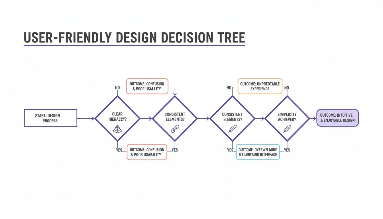
Having the right components is only half the battle. The real magic happens when you bring them together using proven design principles. A great site header design isn’t just a random collection of links and buttons—it's an intuitive system, guided by fundamentals that make navigation feel completely effortless.
To build a header that truly works, you need a solid grasp of fundamental user experience (UX) design principles. These principles are the invisible forces that turn a merely functional header into one that actively helps, engages, and converts visitors. For any Divi user, getting these concepts right is the key to building sites that feel professional, trustworthy, and a breeze to use.
Establish a Clear Visual Hierarchy
Visual hierarchy is all about arranging elements to show their order of importance. Think of a newspaper headline—your eyes are naturally drawn to the biggest, boldest text first. The same idea applies to your header. Your most critical elements, like the logo and the main call-to-action (CTA), should instantly command the most attention.
You can pull this off with a few simple techniques:
- Size: Make your logo or primary CTA button just a bit larger than other elements.
- Color: Use a high-contrast color for your CTA to make it pop right off the background.
- Placement: The top-left (for the logo) and top-right (for the CTA) are prime real estate that users instinctively check first.
This strategic emphasis guides your user's eye and makes it obvious what to do next, cutting down on hesitation and nudging them toward action.
Champion Simplicity and Clarity
A cluttered header is a one-way ticket to confusion. When users are hit with too many choices, they often don't make one at all. It’s a classic case of cognitive overload. The goal here is to present information so it's easy to scan and understand in a heartbeat.
Your header should be a masterclass in efficiency. Every single element needs to earn its spot. If a link, icon, or bit of text doesn't serve a clear purpose in helping the user navigate, it's probably just adding noise.
To keep things simple, stick to clear navigation labels. Use straightforward terms like "Services" instead of something vague like "What We Do." Generous white space around elements also works wonders, giving each component room to breathe and making the whole header feel less intimidating and much more approachable.
Maintain Unwavering Consistency
In web design, consistency is the bedrock of trust. Your header should look and behave the exact same way on every single page of your site. When the logo, navigation links, and CTA are always in the same spot, users quickly build a mental map of how your site works.
This predictability makes them feel confident and in control. They don't have to re-learn where things are every time they click to a new page, which creates a seamless, frustration-free experience. This is especially vital for e-commerce sites, where a consistent cart icon and account link are non-negotiable for a smooth shopping journey.
Prioritize Accessibility for All Users
A truly excellent header is one that everyone can use, regardless of their abilities. Designing for accessibility isn’t just a nice-to-have; it's a necessity for creating an inclusive web. Following the Web Content Accessibility Guidelines (WCAG) helps ensure your header is usable for people with visual impairments, motor difficulties, and other disabilities.
Key accessibility considerations for your header include:
- Keyboard Navigation: All header links and buttons must be fully navigable using only the Tab key. No exceptions.
- Sufficient Color Contrast: Text and interactive elements need a strong contrast ratio against their background to be readable for everyone.
- Descriptive Link Text: Links should make sense on their own. Avoid vague phrases like "Click Here" or "Learn More."
- ARIA Labels: Use ARIA (Accessible Rich Internet Applications) labels to give context to screen readers, especially for icons that don't have text, like a search magnifying glass or a hamburger menu icon.
By weaving these principles into your design process from the start, you create a header that isn't just visually appealing but is fundamentally user-centric.
Mastering Responsive and Mobile Header Patterns
Designing a header for a desktop screen is one challenge; making it work flawlessly on a smartphone is another entirely. In a world where mobile devices dominate web traffic, your site header design must adapt gracefully to smaller viewports. A one-size-fits-all approach just doesn’t cut it anymore, and a clunky mobile header can send visitors bouncing faster than you can say "user experience."
The core challenge? Screen real estate. You have far less horizontal space to work with, meaning a sprawling desktop menu becomes an unusable mess on a mobile device. This is where responsive header patterns come in, offering smart solutions to condense complex navigation into a clean, touch-friendly format.
Choosing the right mobile pattern is crucial. Your decision should be guided by core UX principles like hierarchy, consistency, and simplicity—getting this right is the difference between a site that feels intuitive and one that feels broken.
The key takeaway is that an effective mobile header prioritizes what's most important, maintains a familiar structure, and removes clutter. The goal is to let users navigate without any friction at all.
The Ubiquitous Hamburger Menu
Let's start with the one everyone knows. The hamburger menu—those three horizontal lines—is easily the most recognized pattern for mobile navigation. When tapped, it reveals a hidden menu, often sliding in from the side of the screen. This approach allows designers to tuck away extensive navigation links, keeping the header clean and uncluttered.
Its main strength is its ability to house a large number of links, making it ideal for websites with complex information architecture, like large e-commerce stores or content-heavy blogs. The flip side, though, is that it hides navigation by default. If users don't see key pages, they might not bother to explore.
The hamburger menu is your go-to when your site has more than five primary navigation items that need to be accessible on mobile. It’s a space-saving solution for complexity, but be aware of the potential drop in discoverability.
The App-Style Tab Bar
Borrowing a page from native mobile app design, the tab bar pattern places a few key navigation icons at the bottom of the screen. This "bottom navigation" is incredibly ergonomic, as it puts the most important actions within easy reach of a user's thumb.
This pattern is perfect for sites where users need to switch frequently between a small number of core sections—think a social media feed, messages, and a user profile. Its main limitation is space; you can typically only fit three to five icons before it starts to feel crowded.
Choose a tab bar when:
- Your site has a few distinct, high-priority sections.
- You want to encourage frequent interaction and exploration.
- Your user goals are task-oriented and repeatable.
The Priority+ Navigation Pattern
The Priority+ pattern is a clever, adaptive solution that strikes a balance between visibility and saving space. It displays as many navigation links as can fit on the screen and neatly tucks the rest into a "More" dropdown menu. As the screen size changes, more or fewer links are revealed automatically.
This is a fantastic option because it keeps the most important links visible while still providing access to everything else. It avoids the all-or-nothing approach of the hamburger menu, which can seriously improve the discoverability of your primary pages. It works best for sites with a clear hierarchy of navigation links.
This adaptive approach is a core part of modern web design, as responsive visuals secure 11% higher engagement rates than static ones. With mobile now accounting for a whopping 63.15% of all web traffic, headers that adapt flawlessly are essential—non-responsive sites will struggle to retain visitors. Tools like our own Divi Areas Pro excel here, enabling Divi developers to create targeted mega menus and popups that directly combat the 38% of visitor loss caused by poor design. For Divi users looking to implement these varied approaches, our guide explains how to show a different Divi navigation menu on desktop, tablet, and phone.
Comparing Mobile Header Navigation Patterns
With all these options, which one should you choose? It really depends on your site's structure and what you want users to do. A simple blog has very different needs than a massive online store.
This table breaks down the common patterns to help you decide.
| Pattern | Best For | Pros | Cons |
|---|---|---|---|
| Hamburger Menu | Sites with 5+ main navigation items, like e-commerce stores or large blogs. | Saves a lot of space; can hold unlimited links; universally recognized. | Hides navigation by default, reducing discoverability of key pages. |
| Tab Bar (Bottom Nav) | Task-oriented sites with 3-5 core sections, like social or productivity apps. | Extremely thumb-friendly and ergonomic; high visibility for key actions. | Very limited space; not suitable for complex navigation structures. |
| Priority+ Pattern | Sites with a clear hierarchy of pages where some are more important than others. | Keeps top-priority links visible; adaptive and flexible across screen sizes. | Can feel inconsistent if the "More" menu contains important items. |
Ultimately, the best pattern is the one that makes life easiest for your specific audience. Test your designs on real devices and see what feels most natural. The goal is always to create a seamless path for your users, no matter how they access your site.
Supercharge Your Divi Header with Advanced Tools
Once you’ve mastered the fundamentals, it's time to explore what's possible beyond a standard header layout. The principles we've covered are your foundation, but the right tools are what elevate a static header into a dynamic, interactive conversion machine. For those of us in the Divi world, this is where Divimode plugins really shine, bridging the gap between design theory and powerful, real-world execution.
A default Divi header gets the job done, but a tool like Divi Areas Pro transforms it from a simple navigation bar into an intelligent asset. It’s what lets you break free from the usual constraints and build a header that actively responds to user behavior, creating a much more personal and effective experience.
Build Rich Experiences with Mega Menus
For an e-commerce store or a large content-heavy site, a standard dropdown menu just doesn't cut it. They’re often clumsy and overwhelming. Mega menus are the answer, opening up multi-column layouts that can be filled with images, icons, and even dynamic content. They give users a clear, organized bird's-eye view of a complex site, making it far easier to find exactly what they’re looking for.
With Divi Areas Pro, you can design these visually engaging menus right inside the Divi Builder. Picture a clothing store's mega menu that doesn’t just list categories but showcases featured products with images and prices. Navigation instantly becomes a compelling visual catalog, which is a massive upgrade to the shopping experience.
Drive Conversions with Conditional Fly-Ins and Popups
Your header is prime real estate, and it’s not just for navigation. It can be a seriously powerful lead-generation tool. By using conditional triggers, you can pop targeted messages in front of users at the perfect moment.
Here are a few ways this plays out in the real world:
- Exit-Intent Offers: Just as a user’s cursor moves to leave the page, a fly-in can slide down from the header with a last-minute discount. This one simple action can be incredibly effective at recovering otherwise lost sales.
- Time-Delayed Promotions: A visitor has been browsing your services for over a minute. A subtle popup can appear, offering a free consultation or a downloadable guide, capturing their interest when they're most engaged.
- Personalized Welcome Messages: Greet logged-in users by name or show special offers to returning customers directly within the header space.
These conditional interactions make the header feel alive and responsive to the user's journey. If you’re just starting out, the free Popups for Divi plugin is a fantastic way to begin experimenting with these kinds of interactive elements.
Inject Dynamic Content for Maximum Relevance
Content injection is a game-changing feature that lets you display specific content within your header based on a huge range of conditions. This goes way beyond simple popups, allowing you to tailor the header's content with surgical precision.
Think of content injection as creating a "smart" header. Instead of showing the same promotion to every single visitor, you can display unique offers based on the page they're on, their location, or whether they clicked through from a specific ad campaign.
This level of targeting ensures that the messages users see are always relevant, which dramatically increases their effectiveness. For freelancers and agencies, this is where you can deliver immense value, turning a static design element into a revenue-generating asset that adapts to each user's context. Of course, building a solid foundation is key; you can learn more about the initial setup by checking out our guide on how to create a global header with Divi.
Fast-loading, responsive headers are non-negotiable; studies show 41% of visitors will bounce if a site’s images are slow to load. On the flip side, optimized headers can extend user sessions by 35% and slash bounce rates by 22%. For Divi users with global audiences, Divi Areas Pro is especially powerful, with features like content injection and back-button detection that ensure a smooth experience for users across the 1.88 billion websites online. With scroll-triggered animations now appearing in 52% of modern designs and boosting interactions by 27%, dynamic headers are clearly the future.
By integrating these advanced tools, you can elevate a Divi header from a simple navigational element into a strategic part of your marketing funnel. It becomes a space for interaction, personalization, and conversion—all powered by the flexibility of the Divi Builder.
Your Top Site Header Design Questions, Answered
As you get your hands dirty building or refining a website, some very practical questions about site header design are bound to pop up. This final section tackles the common head-scratchers that designers and developers run into, with clear, straightforward answers to help you build with confidence—especially if you're working in the Divi world.
How Tall Should a Website Header Be?
There’s no magic number for the "perfect" header height. It really comes down to what's in your header and how it fits with your overall design. The goal is to strike a balance: it needs to be prominent enough to be useful, but not so massive that it shoves your important page content below the fold.
A good rule of thumb for a standard desktop view is to aim for a height somewhere between 80px and 120px. This range usually feels right. On mobile, you’ll want to slim that down to between 60px and 80px to save every bit of that precious screen real estate.
The most important thing is to avoid a header that feels like it's bullying the rest of the page. It’s a guide, not a giant billboard. Always, always test your design on different screen sizes to make sure it feels balanced and not overbearing.
Can Each Web Page Have a Different Header?
Technically, yes, but it’s almost always a bad move. Consistency is a cornerstone of good UX. When the header looks and acts the same on every page, you build familiarity and trust. Users instinctively know where to find the logo, the menu, and other key actions without having to think about it.
That said, there are a few sensible exceptions where a subtle variation is okay:
- Homepage vs. Interior Pages: You might use a transparent header on the homepage that overlays a big, beautiful hero image, while interior pages get a solid-colored header for maximum readability against text content.
- Landing Pages: For a focused landing page, you might strip the header down to just a logo, removing all navigation to keep the visitor locked in on a single call-to-action.
- Checkout Process: E-commerce sites often simplify the header during checkout, ditching navigation and other potential distractions to smoothly guide the user toward completing their purchase.
Even in these cases, core elements like your logo should stay put. It’s the brand anchor that ties the whole experience together.
What Is a Sticky Header and Should I Use One?
A sticky header—also called a fixed or persistent header—is one that "sticks" to the top of the screen as the user scrolls down the page. This keeps your main navigation, search bar, and cart icon within easy reach at all times.
The biggest win here is usability. Nobody likes having to scroll all the way back to the top of a long page just to get somewhere else. Sticky headers eliminate that friction. In fact, some studies have shown that sticky navigation helps users find what they're looking for up to 22% faster.
But be careful. A clunky, oversized sticky header can be a real nuisance, especially on mobile where it eats up valuable screen space. A great compromise is the "reveal on scroll up" header, which disappears when scrolling down but instantly reappears the moment the user starts scrolling back up. It offers the best of both worlds.
How Many Links Should Be in My Main Navigation?
To keep from paralyzing your visitors with too many choices, keep your main navigation tight and focused. A long-standing guideline is to aim for five to seven top-level menu items. This isn't just a random number; it aligns with the psychological principle of limiting cognitive load, making it much easier for people to scan, understand, and decide where to go next.
If your site is huge and has tons of pages, resist the temptation to cram everything into that top-level menu. That's what a well-designed mega menu is for. You can neatly organize secondary and even tertiary links into clean, multi-column layouts without making your main header a cluttered mess. The primary navigation stays clean, but the deeper content is still just a click away.
Ready to build a header that does more than just navigate? With Divimode, you can create dynamic mega menus, conditional popups, and targeted content injections directly within the Divi Builder. Transform your header into a powerful conversion tool today. Start building smarter headers with Divimode.
More Articles You Will Like