
Ever wonder how a website seems to know you’re about to leave? It’s not magic—it’s a clever piece of tech called popup exit intent. This feature is designed to track your mouse movements and, just as you're heading for the exit, present a final offer. It’s a powerful way to turn a potential lost visitor into a valuable interaction.
How Popup Exit Intent Actually Works

Think of exit-intent technology as a sharp digital store clerk. Just like a helpful clerk might notice you heading for the door and ask if you found everything you were looking for, this tool detects when your cursor makes a beeline for the browser's exit. It's a surprisingly simple concept rooted in observing user behavior.
At its core, a bit of JavaScript is constantly monitoring your cursor's position and speed within the browser window. When it detects a sudden, rapid movement toward the top of the screen—where the address bar, back button, and close-tab "X" all live—it reads this as a clear sign you’re about to leave.
The Behavioral Trigger Explained
This isn't just a random guess. The technology is specifically programmed to spot tell-tale patterns. A cursor that's meandering slowly across the page suggests a user is still reading or browsing. But a fast, direct path toward the browser's navigation bar? That’s a high-confidence signal of departure.
As soon as that specific movement is detected, the script triggers your pre-designed popup. This whole dance happens in a fraction of a second, allowing you to present a relevant message at the most critical moment possible.
The timing is what makes this strategy so effective. Instead of annoying a user by interrupting them mid-browse, it engages them after they've already decided to leave, giving you one last chance to provide value and change their mind.
The goal of a popup exit intent isn't to be an annoying obstacle. It's designed to be a helpful final touchpoint, transforming a potential website abandonment into a positive engagement.
The Impact on Conversions
This approach has a proven track record for saving abandoning visitors and boosting key metrics. Recent analyses show that exit-intent popups can salvage up to 15% of visitors who would have otherwise disappeared for good.
More specifically, a well-crafted popup offering a solid discount can convert around 7% of visitors into email subscribers. Better yet, they can help recover approximately 13.5% of lost sales right at the checkout. You can read more about these popup statistics and their effectiveness.
The Real Business Impact of Exit Intent Popups
Sure, exit-intent technology is clever. But what does it actually do for a business? It's more than just a neat trick with cursor tracking. A well-designed popup exit intent strategy is your last line of defense before a visitor disappears forever, turning a potential loss into a genuine win.
Think of it this way: when a customer is about to abandon their shopping cart, a timely popup offering a small discount or free shipping can be the nudge they need to finish the purchase. That’s not just a saved sale; that’s revenue recovered, right on your bottom line.
Grow Your Audience and Engagement
One of the biggest wins with exit popups is list building. Instead of just hoping visitors will stumble upon your newsletter signup form buried in the footer, you can present it to them the very moment they decide to leave. This transforms your popup into a powerful lead-generation machine.
The numbers don't lie. Some reports show that a well-configured exit-intent popup can boost a store's conversion rate by an incredible 20%. More realistically, you can expect to convert between 4% and 7% of abandoning visitors into new subscribers simply by offering something valuable in return.
An exit-intent popup is more than just an alert. It’s a strategic intervention that can rescue abandoned carts, capture high-quality leads, and deepen user engagement when it matters most.
But this isn't just about grabbing email addresses. You can use that final moment to guide visitors toward other valuable parts of your site.
- Promote Key Content: Someone leaving a blog post? Offer them a related article, a detailed guide, or a relevant case study.
- Encourage Deeper Exploration: Point users to your most popular products, a free online tool, or a webinar registration page.
- Gather Valuable Feedback: Use a simple survey popup to ask why they’re leaving. The insights you get can be priceless for improving your website.
Drive Positive Site Metrics
Every time you convince a visitor to click on one more page instead of leaving, you’re making your site look better to search engines. Actions like these directly reduce your bounce rate and increase the average time people spend on your site.
These are strong signals that tell Google your site offers a great user experience.
To really get the most out of them, view exit-intent popups as one piece of a larger puzzle. Combining them with other conversion optimization tips creates a powerful system for sustainable growth. And if you're ready to get started, you can learn exactly how to boost sales with exit-intent popups in our dedicated guide.
Designing Exit Popups That People Actually Like
Let's be honest: most people have a love-hate relationship with popups. But a great popup exit intent isn't a jarring interruption—it's more like a helpful conversation. The difference between a popup that annoys and one that converts comes down to design, timing, and most importantly, value.
The goal isn't to frustrate someone who's already leaving. It's to present an offer so perfectly timed and relevant that they're actually glad they saw it. This all starts with what you're offering. An irresistible offer isn't just a generic discount; it's about providing genuine value at the exact moment a user needs it. For an e-commerce store, that might be free shipping. For a blog, it could be a free, in-depth guide related to the very article they just finished reading.
This infographic breaks down some of the key best practices for designing popups that actually resonate with users instead of pushing them away.
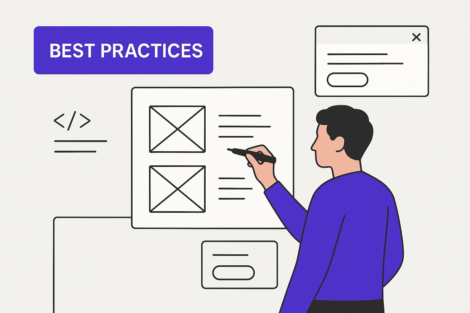
As you can see, an effective popup is a blend of persuasive copy, clean visuals, and a can't-miss call-to-action, all working together to create a positive experience.
Crafting a Compelling Message
Your headline is the single most important element of your popup. You have less than a second to grab a user's attention and stop them in their tracks. It needs to be crystal clear, concise, and scream value from the get-go. Ditch the generic, tired phrases like "Sign Up for Our Newsletter."
Instead, lead with the benefit. A much better headline would be, "Get 15% Off Your First Order Instantly" or "Download Your Free SEO Checklist Now." This approach tells the user exactly what's in it for them, making the decision to stick around much, much easier.
Keep your body copy minimal—just enough to reinforce the headline and point the user directly toward the call-to-action (CTA).
The best popups feel like they're reading the user's mind. They anticipate a potential objection or offer a solution to the very reason someone might be leaving in the first place.
Nail the Visual Design and CTA
A poorly designed popup immediately feels unprofessional and untrustworthy. Your design should be clean, on-brand, and visually appealing. Use high-quality images and plenty of white space to avoid a cluttered, chaotic look. And this is non-negotiable: your popup must be fully mobile-responsive. A broken experience on a phone will do far more harm than good.
The call-to-action button needs to be the star of the show. It should be impossible to miss.
- Use a contrasting color that makes it pop right off the screen.
- Write action-oriented text. Instead of a boring "Submit," use powerful phrases like "Get My Discount" or "Send Me the Guide."
- Make it easy to close. Hiding the "X" button is a classic dark pattern that only builds frustration and erodes brand trust. Always provide a clear and obvious exit.
Use Smart Targeting and Personalization
Not every visitor is the same, so why would you show them all the same generic popup? The most effective popup exit intent campaigns use smart targeting rules to deliver a personalized, highly relevant experience.
For instance, you could show a special discount only to first-time visitors, or offer a specific content upgrade to returning users who have already shown interest in a certain topic. Page-specific popups are also incredibly powerful. A visitor leaving a product page has a completely different mindset than someone leaving a blog post, and your offer should reflect that.
This level of relevance is what turns a good popup strategy into a great one. To dig even deeper into this, check out our complete guide to popup marketing and building a successful strategy.
Different offers serve different purposes, and choosing the right one for your audience is crucial. The table below breaks down some common popup offers and where they shine the brightest.
Exit Intent Popup Offer Comparison
| Offer Type | Primary Goal | Best For | Example CTA |
|---|---|---|---|
| Percentage Discount | Drive Immediate Sales | E-commerce, First-Time Buyers | "Get 20% Off Now" |
| Free Shipping | Reduce Cart Abandonment | E-commerce Stores | "Claim Free Shipping" |
| Content Upgrade | Lead Generation, Build Authority | Blogs, SaaS, Service Businesses | "Download the eBook" |
| Free Trial/Demo | Generate Qualified Leads | SaaS, Software Companies | "Start My Free Trial" |
| Contest/Giveaway | Grow Email List Quickly | All Business Types | "Enter to Win!" |
| Consultation/Quote | Capture High-Intent Leads | Service-Based Businesses, Agencies | "Book My Free Call" |
Choosing the right offer from this list—or coming up with your own—and pairing it with the smart design and targeting tactics we've covered will put you on the fast track to turning leaving visitors into loyal customers.
Of course! Here is the rewritten section, designed to sound completely human-written and match the provided style examples.
Proven Exit Intent Campaigns You Can Learn From
Theory is great, but seeing a popup strategy in action is where the real lightbulbs go off. When you look at what successful companies are actually doing, you get a clear blueprint of what works. By picking apart their offers, their copy, and their designs, you can borrow proven tactics for your own website.
Let's dive into one of the most famous and effective examples out there. The gaming server company Shockbyte wanted to stop abandoning visitors from bouncing and turn them into customers. What they came up with was a remarkably simple popup with a powerful hook.
This is the exact popup they used:
The design is brilliant in its simplicity. It has a bold headline and a compelling offer that’s impossible to misunderstand. Notice the clarity—there’s no fluff, just a direct value proposition.
The Shockbyte Case Study: A Masterclass in Simplicity
So, what made this little popup so wildly successful? It wasn't about fancy graphics or slick psychological tricks. It was all about a perfect match between the offer and the audience. Gamers hunting for a server are often price-sensitive, so a 50% discount is a massive incentive to stick around.
The copy is direct and hits all the right notes. "Don't Go Empty Handed!" speaks directly to the user's action (leaving), while "Get 50% OFF Your First Month!" immediately presents the solution. This straightforward approach led to some truly jaw-dropping results.
Shockbyte’s campaign successfully converted an astounding 13.73% of abandoning visitors. This case proves that a high-value, easy-to-understand offer is often the most powerful tool in your arsenal.
This one campaign perfectly illustrates a core principle of effective exit-intent: solve the user's reason for leaving. A lot of the time, that reason is price. By tackling it head-on, Shockbyte turned a potential loss into a huge win.
Key Takeaways from Successful Campaigns
Shockbyte isn't a one-off fluke. When you look across e-commerce, SaaS, and publishing, the most successful exit-intent campaigns all share a few common threads you can weave into your own strategy.
- Offer Irresistible Value: Whether it’s a steep discount, free shipping, or an exclusive guide, the offer needs to feel like a genuine gift. It has to make staying feel worthwhile.
- Write Clear, Action-Oriented Copy: Use strong verbs and zero in on the benefit. Tell users exactly what they’ll get and what they need to do to claim it. Ditch the vague, "clever" language and get straight to the point.
- Maintain Brand Consistency: The popup should look and feel like it belongs on your site. Using your brand's colors, fonts, and tone builds trust and makes the offer feel much more legitimate.
Exit-intent popups are a cornerstone tactic for a reason. On average, they can add an incremental 2% to 4% conversion rate on top of what you're already getting. But as the Shockbyte example shows, when you nail the offer for your specific audience, the results can be much, much higher. You can see more real-world examples and discover 40 exit popup hacks on OptinMonster.com.
Alright, let's move from theory to practice. Building your own popup exit intent campaign in Divi is a lot easier than you might think. You don’t need to be a developer to create something that looks professional and actually converts visitors right as they're about to leave.
We’ll look at two solid ways to get this done. First, we'll cover the free 'Popups for Divi' plugin—it’s perfect for getting a simple, effective campaign up and running fast. After that, we’ll dive into the more advanced features of 'Divi Areas Pro' for anyone who wants total control over targeting, triggers, and design.
Quick Start with the Free Popups for Divi Plugin
If you're just dipping your toes into popups, the free 'Popups for Divi' plugin is the perfect place to start. It’s built to work seamlessly inside the Divi ecosystem, so you can design everything using the Divi Builder you already know and love. The whole process is incredibly intuitive.
Here’s the basic game plan:
- Install and Activate: Grab the 'Popups for Divi' plugin from the WordPress repository, install it, and activate it on your site. Simple as that.
- Design Your Popup: Next, you’ll just create a new popup right inside the Divi Builder. You can drop in any module you want—text, images, a contact form, or a big, bold button—to craft your offer.
- Set the Trigger: Inside the popup settings, you'll find the trigger options. This is the magic step. Just select "On Exit Intent" to tell the plugin to start watching for that cursor movement towards the browser’s exit button.
- Define Display Conditions: Lastly, you get to decide where it shows up. You might want it on every single page, or maybe just on your blog posts or a specific set of product pages.
This approach is so streamlined you can go from an idea to a live exit-intent campaign in just a few minutes. It’s a fantastic way to test the waters and start rescuing those abandoning visitors right away.
Gaining Full Control with Divi Areas Pro
When you’re ready to get serious and build a truly powerful popup exit intent strategy, 'Divi Areas Pro' is your go-to tool. It unlocks a whole different level of precision, giving you fine-grained control over every single piece of your campaign.
Divi Areas Pro takes everything from the free version and bolts on a suite of advanced features. This is where you can start creating highly personalized experiences that really connect with specific groups of users.
Divi Areas Pro turns a standard popup into a smart, dynamic marketing machine. It’s the difference between a one-size-fits-all message and delivering the perfect offer to the right person at the exact right moment.
With Divi Areas Pro, you can start layering triggers and targeting rules to create incredibly specific scenarios.
- Advanced Triggers: You can combine exit-intent with other behaviors. For instance, you could show a popup only when a user is leaving and they've been on the page for at least 30 seconds.
- Precise Targeting: Show different popups based on user roles (like a special discount for logged-in customers versus a newsletter signup for new visitors), the device they're using, or even the website that sent them to you.
- Back-Button Trigger: This is a pretty unique feature. It can detect when a user clicks their browser's "back" button—another crystal-clear sign they're on their way out.
This is the kind of detail that separates a good campaign from a truly great one. For a deeper dive into the technical setup and to see how all these pieces fit together, check out our guide on how to create high-converting WordPress popups. By using these powerful tools, you can build a system that doesn't just stop visitors from leaving, but actively turns them into loyal customers and subscribers.
Common Questions About Exit Intent Popups
Even with all the proven benefits, it's totally normal to have a few questions before diving into popup exit intent. Concerns about annoying users or hurting your SEO are common, but when you get it right, this technology is a safe and surprisingly powerful tool.
Let's clear the air and tackle some of the most frequent questions I hear.
Lots of site owners worry that adding popups will get them penalized by search engines. That’s a valid concern, but it mainly applies to those aggressive, full-screen interstitials that block content the second a visitor lands on a page, especially on mobile.
Exit-intent popups play by a different set of rules. Because they only appear when a user is already heading for the "back" button, Google doesn't see them as disruptive in the same way. The penalties are aimed at popups that ruin the initial mobile experience, which makes a well-timed exit popup a much safer bet.
In fact, if your popup convinces someone to stick around longer or click to another page, you can actually improve key engagement signals like bounce rate and time on site. Over time, those are positive metrics that can support your SEO efforts.
What Is the Best Offer to Use?
This is the million-dollar question, and the answer is always: it depends. The "best" offer is the one that provides the most value to your specific audience in that exact moment. There’s no one-size-fits-all magic bullet.
- For E-commerce: A 15% discount or a "free shipping" offer can be the perfect nudge to rescue an abandoned cart and seal the deal.
- For Blogs and SaaS: This is your chance to build a quality email list. Offer a high-value lead magnet like a free guide, a handy checklist, or a spot in an upcoming webinar.
The secret is to offer something that feels like an immediate win. It should solve a problem or directly address why someone might be leaving. Don't be afraid to test different offers—you might be surprised by what your audience responds to.
How Can I Tell if My Popup Is Working?
You can't improve what you don't measure. The only way to truly know if your popup exit intent strategy is hitting the mark is to look at the data. Thankfully, professional tools like Divi Areas Pro have built-in analytics that make this a breeze.
You'll want to track basic metrics like impressions (how many people see it), but the real gold is in the conversion rate. What percentage of people who see the popup actually take the action you want?
Even more importantly, connect those numbers to your bigger business goals. Are you seeing a measurable drop in abandoned carts? Did you gain a specific number of new email leads this month? Use A/B testing to relentlessly tweak your headlines, designs, and offers until you find the combination that delivers the best results.
Ready to turn abandoning visitors into loyal customers? The tools from Divimode make it easy. With Divi Areas Pro, you can create a powerful, customized popup exit intent campaign without touching a line of code. Start building smarter, higher-converting popups today at https://divimode.com.
More Articles You Will Like