Building an effective menu is arguably the most important step you can take toward a user-friendly WordPress site. Think of your menu as a GPS for your visitors; it guides them to the good stuff, helps them find what they're looking for, and keeps them from getting lost and giving up.
Your Website's Roadmap: Mastering Navigation
Ever landed on a website and felt completely disoriented? That’s exactly what happens when site navigation fails. A well-structured menu is the tool that guides visitors, massively improves their experience, and keeps them engaged. For any site owner, mastering WordPress menus is a core skill that directly impacts user satisfaction, bounce rates, and even your SEO.
A great menu does more than just list pages. It tells a story about your website's structure and priorities. For your visitors, it's the main way they'll interact with your content.
- Improved User Experience: A logical menu helps people find information fast, which means less frustration and a happier audience.
- Lower Bounce Rates: When visitors can easily find their way around, they're far more likely to stick around and explore more of your site.
- Enhanced SEO: Search engines actually use your menu structure to understand your site’s hierarchy and figure out what content is most important.
The good news is that WordPress comes with a powerful, built-in system for creating and managing your navigation. And because WordPress powers a staggering 43.4% of all websites as of 2025, you can bet this system is constantly being refined. It means you're working with a tool that's been tested and trusted by millions. You can read more about the latest WordPress statistics and trends on Hostinger.
A well-crafted menu is more than just a list of links—it's a cornerstone of your digital strategy.
This guide will walk you through everything, from the basic concepts to advanced techniques. We'll show you how to turn a simple list of links into a strategic asset that makes every part of your site better.
Understanding How WordPress Menus Work
To really get the hang of menus in WordPress, you have to understand the simple—yet powerful—system working behind the scenes. It isn't just one single feature; it's a combination of three distinct parts that all work together. Once you see how they connect, you can build just about any kind of navigation you can imagine.
Before we dive in, it’s worth noting that this flexibility is a huge part of what makes WordPress so popular. If you're curious about the bigger picture, it's helpful in understanding the WordPress platform compared to other website builders. This adaptability really shines in its menu system.
The Three Core Menu Components
Think of building a menu like putting together a piece of furniture. You have the overall design, the individual parts, and a specific spot in the room where it's supposed to go. WordPress menus follow that same logic.
Menu Structure: This is your blueprint—the complete navigation setup you design. You can create multiple structures, like one for your main header and a completely different one for your footer links.
Menu Items: These are the individual pieces that make up your menu. Each item is a link, whether it's to a page, a blog post, a category, or even a custom link pointing to another website entirely.
Menu Locations: These are the designated spots in your room. Your theme defines specific areas where a menu can appear, such as “Primary Menu,” “Secondary Menu,” or “Footer Menu.”
This setup is what guides your visitors through the site, and getting it right has a direct impact on how they engage with your content.
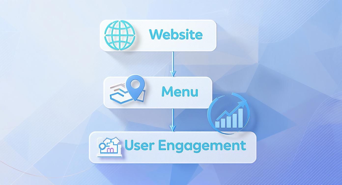
As you can see, the menu is the critical bridge connecting your website to your user. It’s their roadmap.
Finding the Menu Editor
With these concepts in mind, let's go find where all the magic happens. The main hub for all things menu-related is located right inside your WordPress dashboard.
To get there, just log into your WordPress admin area and navigate to Appearance > Menus in the left-hand sidebar. This single screen is where you'll create new menus, add items to them, and tell WordPress which theme locations they should show up in. It’s your command center for site navigation.
Building and Organizing Your First Menu
Alright, now that you've got the lay of the land, it's time to roll up our sleeves and build your first menu. This is where you start creating the clear, intuitive navigation that guides visitors exactly where you want them to go. Thankfully, the WordPress menu editor gives you a straightforward, visual way to make it all happen.
First things first, head over to Appearance > Menus in your WordPress dashboard. If you've never been here before, WordPress will prompt you to create a new menu. Go ahead and give it a descriptive name like "Main Navigation" or "Header Menu" to make your life easier later. Don't worry, this name is just for you—it won't show up on your website.

Adding Items to Your Menu
With your new menu structure ready, you can start adding the actual links, which WordPress calls menu items. Look to the left side of the screen, and you'll find a few collapsible boxes filled with different types of content you can pop into your menu.
- Pages: This is for your essential static pages—think "Home," "About Us," or "Contact."
- Posts: Want to highlight a specific blog post? You can link directly to it from here.
- Custom Links: Perfect for linking to external sites, like your social media profiles, or any other custom URL.
- Categories: This creates a link that sends users to an archive page showing all the posts from a specific category, like "News" or "Tutorials."
Just tick the checkbox next to any item you want to add and hit the "Add to Menu" button. You'll see it instantly appear in the menu structure panel on the right.
Structuring and Organizing Your Menu
This is where the magic happens. The menu editor’s drag-and-drop system is incredibly intuitive. You can reorder your menu items just by clicking and dragging them up or down. The sequence you create here is exactly how they'll appear on your live site.
Want to create a dropdown submenu? It’s simple. Just drag a menu item slightly to the right, positioning it underneath its parent item. WordPress will automatically indent it, giving you a clear visual cue that it’s now a sub item. You can even create multiple levels of dropdowns by nesting items further.
Think of your menu structure as an outline for your website. The main items are your chapter headings, and the sub items are the sections within each chapter. It helps visitors quickly understand your site's hierarchy at a glance.
Once you’ve got everything arranged just right, the final step is to tell WordPress where this menu should live. At the bottom of the menu settings, you'll see a section called "Display location." Check the box for the location you want, like "Primary Menu," to assign it.
Finally, smash that blue "Save Menu" button, and your new navigation is live! While this gets your header sorted, don't forget that good navigation is key in other spots, too. For some extra ideas, check out our guide on how to add menus to your Divi footer. Mastering this process gives you a solid foundation for managing all the menus in WordPress.
Customizing Menus with Themes and Builders
While the standard WordPress menu editor is great for getting your links in order, the real design magic happens when you bring themes and page builders into the mix. These tools take you way beyond basic structure, giving you granular control over how your menu looks, feels, and behaves. They hand you the keys to the design studio.
Think of the default WordPress menu system as the solid, reliable skeleton of your navigation. Themes and page builders like Divi and Elementor are the skin and style you layer on top, letting you dial in every visual detail. Instead of being stuck with your theme's default look, you can customize everything from fonts and colors to spacing and hover animations.
Page Builders vs. The WordPress Customizer
The native WordPress Customizer (found under Appearance > Customize) offers a few basic styling options. Depending on your theme, you can usually tweak menu typography and colors. It's a decent starting point for simple changes, but modern page builders take things to a completely different level with dedicated menu modules.
These modules give you a visual, drag-and-drop interface to build and style menus right on the front end of your site. This live preview is a game-changer. You see your changes in real-time as you make them, which completely eliminates the guesswork of the old save-and-refresh dance.
Page builders transform menu creation from a backend chore into a front-end design experience. You're no longer just organizing links; you're visually sculpting the user's primary path through your site.
There's a reason a huge chunk of the WordPress community relies on these builders. In fact, as of 2025, approximately 23.3% of all WordPress sites use the Elementor page builder alone, with Divi commanding a massive user base as well. These tools empower creators to build highly customized menus in WordPress that are both interactive and perfectly mobile-friendly. You can dive deeper into these stats with these WordPress market share insights from Blogging Wizard.
A quick comparison shows just how much more power page builders offer for menu customization. While the Customizer is convenient for quick tweaks, page builders provide a full suite of design tools for those who need more control over the look and feel of their navigation.
WordPress Menu Customization Methods Compared
| Feature | WordPress Customizer | Page Builders (Divi/Elementor) |
|---|---|---|
| Styling Control | Basic (colors, fonts, spacing) | Advanced (hover effects, animations, dividers, icons) |
| Layout Options | Limited to theme-defined locations | Full control (vertical, horizontal, dropdown styles) |
| Responsive Design | Basic mobile menu toggle | Detailed control over breakpoints, icons, mobile layouts |
| Editing Interface | Backend/Live Preview Hybrid | Visual, front-end, drag-and-drop editing |
| Advanced Features | None | Mega menus, sticky headers, conditional logic |
Ultimately, page builders give you a much more robust and intuitive toolkit, allowing for the creation of truly unique and functional navigation systems that the native Customizer just can't match.
Achieving a Responsive Menu Design
One of the most critical parts of modern web design is making sure your navigation works flawlessly on mobile devices. A menu that looks perfect on a desktop can easily become a jumbled, unusable mess on a smartphone. This is where page builder menu modules really shine.
They come packed with specific responsive settings that let you:
- Set a Mobile Breakpoint: You get to choose the exact screen width where your standard menu collapses into a mobile-friendly version (often called a "hamburger" menu).
- Customize the Hamburger Icon: Style the color, size, and even the animation of the mobile menu icon to match your brand.
- Design the Mobile Dropdown: Control the colors, typography, and spacing of the menu that appears when a user taps the icon.
This level of control ensures your navigation isn't just functional on all devices—it's beautiful and consistent, providing a professional user experience for every single visitor, no matter how they find you.
Exploring Advanced Navigation Techniques
Once your site starts to grow, a simple dropdown menu might feel less like a helpful guide and more like a cramped closet. For content-heavy sites—think sprawling e-commerce stores or bustling online magazines—it's time to graduate to more advanced navigation patterns that can handle the load without overwhelming your visitors.
These techniques transform your menu from a basic list into a genuinely interactive experience.
The undisputed champion of advanced navigation is the mega menu. Instead of a narrow, single-column dropdown that seems to scroll on forever, a mega menu opens up into a large, multi-column panel when a user hovers over a link. This layout is a game-changer because it lets you organize a ton of links into logical groups, often spruced up with icons or even product images.
Imagine an online store where hovering over "Shop" reveals categories like "Men's," "Women's," and "Sale," each with its own column of sub-links and maybe even a featured product image. Or a news site that groups topics into clean columns for "World News," "Tech," and "Culture." It’s all about giving users a bird's-eye view of your site's structure in one go.
Dynamic Menu Styles for Modern Websites
Beyond the mighty mega menu, other dynamic styles offer a slicker, more focused way to navigate. These are usually triggered by a click, keeping your header clean and distraction-free until the user decides they need to find something.
- Fly-in or Slide-in Menus: These are the menus that glide gracefully into view from the side of the screen. They have a sleek, modern vibe and work especially well on mobile, where every pixel of screen real estate counts.
- Popup Menus: Clicking a menu icon can trigger a full-screen overlay or a centered popup that puts the entire navigation front and center. This is a great way to eliminate distractions and focus a user's attention completely on where they want to go next.
The real skill is knowing when to use these techniques. A complex mega menu on a small five-page website is just overkill and can confuse visitors. The goal is always to match the complexity of your menu to the scale of your content.
Implementing Advanced Menus in WordPress
While core WordPress is slowly catching up, the quickest and most flexible way to build these menus is with dedicated plugins or the power of a page builder. Tools like Divi, especially when paired with specialized add-ons, give you the visual controls to craft these experiences without touching a single line of code.
You can design multi-column layouts, drop in images, and even embed shortcodes for login forms right inside the menu structure. If you’re curious about building one, our guide on how to create a mega menu with Divi is a great place to start.
This strategic approach to menus in WordPress takes your site's usability to the next level, turning simple navigation into a powerful tool that helps people discover exactly what they’re looking for, faster than ever.
Improving Menu Accessibility and SEO
A great menu does more than just show people where to go. It’s also a powerful tool for search engines and visitors who use assistive tech. When you build a menu that’s both accessible and SEO-friendly, you’re creating a quiet powerhouse that boosts your user experience and search rankings at the same time.
Think of it like adding a ramp next to a staircase. You're not changing the destination, you're just making sure everyone can get there easily.
Making Menus Work for Everyone
First up is accessibility. This is all about making sure your navigation works for people with disabilities. A critical starting point is ensuring your menu is 100% keyboard navigable. Someone should be able to tab through every single link, open dropdowns, and select items without ever touching a mouse.
Another key piece of the puzzle is using ARIA (Accessible Rich Internet Applications) labels. These little tags add context for screen reader users, helping them understand the purpose and structure of your menu in a way that visual cues can’t.

Optimizing Menus for Search Engines
From an SEO perspective, your menu is basically a roadmap you hand directly to Google. It tells search crawlers which pages you think are the most important, creating a clear hierarchy and spreading page authority (often called "link equity") throughout your site.
Here are a few simple but effective tips to get your menu SEO in top shape:
- Use Descriptive Labels: Ditch generic terms like "Services" or "Products." Get specific! Use keyword-rich labels like "Divi Web Design" or "WooCommerce Optimization." This tells both users and search engines exactly what they'll find on the other side of that click.
- Keep Your Structure Flat: Submenus are great for organization, but don't bury your important pages three or four levels deep. If a page is hard for a human to find, you can bet it's going to be harder for a search crawler to find and index properly.
- Prioritize Your Key Pages: Place your most valuable links higher up in the menu and further to the left. In most Western cultures, these positions are seen as more prominent, and that perception carries over to how search engines weigh their importance.
If you really want to dig into how site structure affects your search rankings, checking out a tool for optimizing your WordPress site for search engines with Rank Math is a fantastic next step.
A well-optimized menu acts as an internal linking strategy on autopilot. It consistently tells Google which content is foundational to your website, reinforcing its relevance for key search terms.
By applying these ideas to all your menus in WordPress, you build a navigation system that’s smarter and more effective for everyone. This also includes creating a killer experience on mobile, which is a whole topic on its own. You can learn more in our guide to effective mobile menu design.
Got Questions About WordPress Menus?
Even after you've got the basics down, WordPress menus can throw a curveball now and then. We've all been there—staring at the screen, wondering why something isn't working the way it should. This section is all about tackling those common head-scratchers with quick, clear answers so you can get back to building.
Why Is My Menu Not Showing Up?
This is easily the most common frustration. You’ve built the perfect menu, hit save, and… nothing. It’s nowhere to be found on your live site. Before you start pulling your hair out, take a deep breath. The fix is usually surprisingly simple.
Nine times out of ten, the culprit is a single missed step: assigning the menu to a theme location. After you’ve arranged all your menu items, you must tell WordPress where to display it by checking a box under "Display location" (like "Primary Menu"). Forget that, and your menu will exist in the backend but never appear on the front end.
If you’ve already checked that box, here are a couple of other usual suspects:
- Plugin Conflicts: A misbehaving plugin can absolutely interfere with your theme's menu display. The quickest way to check is to deactivate your plugins one by one and see if your menu suddenly pops back into view.
- Caching Issues: If you're using a caching plugin or your host has aggressive server-side caching, your site might be showing you an old, saved version of the page. Always clear all caches after making menu changes to make sure you're seeing the latest version.
How Can I Add Icons to My Menu?
Icons are a fantastic way to add a bit of visual flair and make your navigation feel more intuitive. They act as little signposts that help visitors find what they're looking for faster. Luckily, adding them is pretty straightforward.
The easiest route is to grab a dedicated plugin like Menu Icons by Themeisle. It integrates right into the menu editor, giving you a simple interface to pick and choose icons for each menu item. No code required.
For those who like a bit more hands-on control, you can enable the CSS Classes field in the "Screen Options" tab at the top of the menu editor. This lets you manually add CSS classes from an icon library like Font Awesome directly to each menu item.
Adding icons is a small tweak with a surprisingly big impact on user experience. A little house icon for "Home" or a shopping cart icon for "Cart" provides instant recognition, speeding up how people navigate your site.
Can I Show Different Menus on Different Pages?
Absolutely! Displaying unique menus on specific pages is a powerful strategy for creating a more tailored user journey. For example, you might want to show one menu to logged-in members and a different one to first-time visitors, or create a completely separate menu just for your blog section.
While this isn't a native WordPress feature, it's easily unlocked with plugins. Search for "conditional menus" and you'll find tools that let you set simple rules to control where and when your menus appear. It's a pro-level technique for creating a focused, relevant navigation path for every segment of your audience.
Ready to build navigation that goes way beyond the basics? With Divimode, you can use the Divi builder you already know and love to create stunning mega menus, popups, and fly-ins. Stop being limited by default menus and start creating a truly interactive experience. Take full control by visiting https://divimode.com today.
