
 Alex Martin
When you boil it all down, optimizing a website for mobile really comes down to three things: a responsive design, lightning-fast load times, and a thumb-friendly user experience. Your site absolutely has to adapt to any screen size, load in under three seconds, and have big, tappable buttons and easy-to-read text. If you get these right, you’re well on your way to keeping mobile users happy and ranking higher on Google.
Why Your Business Lives or Dies on Mobile
Let's get one thing straight: mobile optimization isn't just a "nice-to-have" anymore. It's a matter of survival. The modern customer journey almost always starts on a smartphone, whether someone's looking up a local service, comparing products on the fly, or just scanning reviews. This isn't a trend; it's a permanent shift in how people behave, and it has a direct impact on your business.
A clunky, slow, or hard-to-use mobile site is more than just a minor inconvenience—it's a direct blow to your bottom line. It sends a clear message to potential customers that you don't value their time or experience, pushing them right into the arms of a competitor who does. A surprising number of businesses are still running on outdated sites that just don't work on mobile. Understanding the common issues with non-mobile friendly websites is really the first step to fixing the problem.
The Mobile-First Indexing Mandate
Google's shift to mobile-first indexing wasn't just some behind-the-scenes technical update. It was the search engine's way of officially catching up to reality. Google now primarily looks at the mobile version of your site to decide how to index and rank it. If your mobile site is just a stripped-down, clunky version of your desktop site, well, that's exactly what Google is judging you on.
This means a rock-solid mobile experience directly influences:
- Search Engine Rankings: A poor mobile site is going to have a tough time ranking for anything competitive.
- User Retention: Let's be honest, people have zero patience for slow speeds or confusing navigation on their phones.
- Brand Perception: Your mobile site is often the first handshake a new customer has with your brand. A bad experience can erode trust in a split second.
The data absolutely backs this up. By 2025, mobile devices are expected to drive roughly 64% of all global website traffic. With that kind of dependency, a mobile-friendly site isn't just a good idea for engagement and sales—it's non-negotiable.
Think of it this way: your mobile website is your new front door. If the door is locked, slow to open, or hard to navigate, your customers aren't going to stick around. They’ll just walk away. Optimizing for mobile is an urgent business priority that keeps you relevant, protects your revenue, and ensures your brand can actually compete.
Building a Truly Responsive Foundation
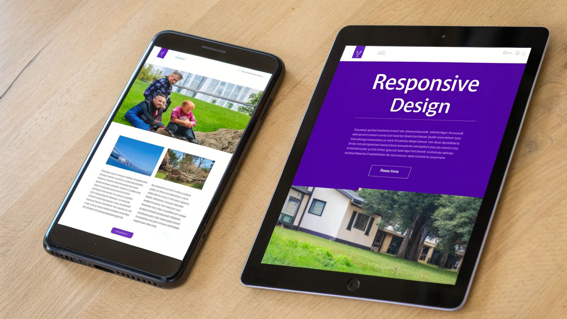
Getting mobile optimization right begins with a truly responsive design, but it’s so much more than just making things smaller. A classic mistake I see all the time is designers simply shrinking the desktop layout. This always ends in disaster: tiny, unreadable text and buttons that are impossible to tap with a thumb.
Instead, you have to completely rethink the user’s journey for a smaller, touch-first world.
This is where the core principles of responsive design come into play: fluid grids and flexible images. A fluid grid uses relative units like percentages instead of fixed pixels, which lets your layout stretch or shrink gracefully. At the same time, flexible images scale right along with their containers, stopping them from breaking the layout on smaller screens.
Mastering Your Layout with CSS Media Queries
This is how you get granular control over the mobile experience. CSS media queries are the secret sauce that makes a responsive design feel intelligent. They let you apply specific style rules based on a device's characteristics, like its width, height, or even its orientation.
For instance, you can tell a two-column layout on a desktop to stack neatly into a single, scrollable column on a phone. This simple trick prevents that awful horizontal scrolling and keeps your content perfectly legible. I often use media queries to fine-tune font sizes, swap out a complex navigation menu for a mobile-friendly one, or even hide non-essential elements to cut down on clutter for mobile users.
A truly responsive site doesn't just work on mobile—it feels designed for it. The goal is to create an experience that feels natural and intuitive, regardless of whether the user is on a 27-inch monitor or a 6-inch phone.
Practical Tips for Thumb-Friendly Usability
Beyond the technical setup, usability is what separates a good mobile site from a great one. You have to think about how people actually hold and interact with their phones. For a deeper look at the nuts and bolts, checking out a guide on how to make a responsive website can provide more specific steps.
Here are a few practical tips I always follow to improve thumb-friendliness:
- Generous Tap Targets: Make sure your buttons and links are at least 48×48 pixels. This is the sweet spot for the average thumb and helps prevent those frustrating mis-taps.
- Smart Spacing: Use ample padding around interactive elements. It creates clear visual separation and gives users a bigger margin for error.
- Simplified Navigation: That sprawling desktop menu just won't cut it on mobile. Convert it into a clean, accessible "hamburger" menu that neatly tucks away options until they're needed.
- Readable Typography: Stick to clean, simple fonts and set your body text to at least 16px. This is widely seen as the baseline for comfortable reading on mobile screens without forcing users to pinch and zoom.
If you’re a Divi user, applying these principles is refreshingly simple. For platform-specific walkthroughs, you can explore the ultimate guide to optimizing Divi for mobile devices for detailed tutorials. By combining these foundational techniques, you can transform your site from just being functional into a genuinely intuitive and high-performing mobile experience.
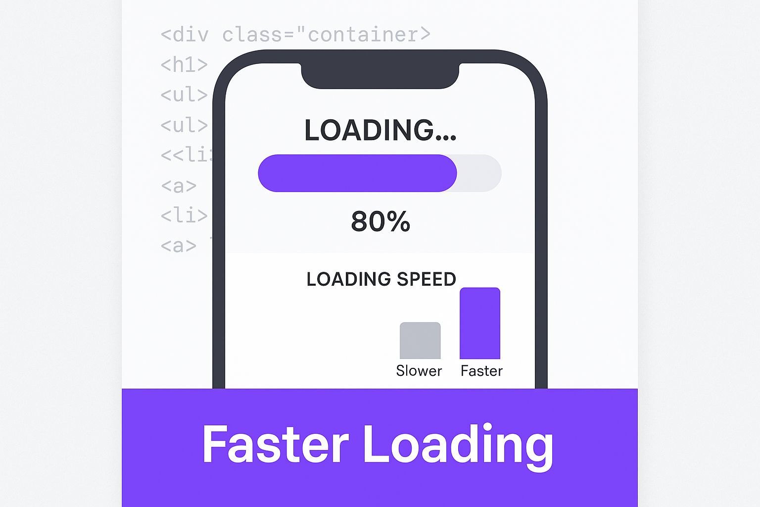
Winning the Mobile Speed Race
On a mobile device, every millisecond of load time feels like an eternity. A slow site doesn’t just frustrate your visitors; it actively sends them packing to your competitors before they even get a glimpse of what you offer. To win the mobile speed race, you have to get ruthless about performance.
Start by targeting the heaviest elements on your page. This almost always means getting aggressive with your image optimization. Modern formats like WebP are a game-changer, often slashing file sizes compared to old-school JPEGs or PNGs with no noticeable drop in quality. When you pair this with tools that strip out unnecessary image data, you can shave precious kilobytes off every single visual.
Beyond images, your code itself can be a major source of bloat. Minifying your HTML, CSS, and JavaScript is a non-negotiable step. This process strips out all the junk—whitespace, comments, line breaks—that browsers don't need to render the page. The result? A much leaner, faster-loading file.
Harnessing Browser and Server Power
Once someone visits your site, you want their next visit to be even faster. This is where smart browser caching comes into play. By telling a visitor's browser to save static files locally—think your logo, CSS stylesheets, and fonts—you stop them from having to re-download everything on return visits. This makes a massive difference for repeat traffic.
The stakes for mobile speed are incredibly high. Mobile bounce rates are generally much higher than on desktop, with 54% of mobile users abandoning websites that take longer than three seconds to load.
Despite this impatience, the mobile ad market is booming, expected to rocket past $450 billion by 2025. There’s a huge audience out there, but they’ll only stick around for sites that deliver a snappy experience. You can dig into more stats on mobile traffic trends and user behavior.
The data speaks for itself. Slow load times directly correlate with lost visitors and conversions.
Impact of Load Time on Mobile User Behavior
This table shows just how quickly user patience runs out on mobile devices. Even a couple of seconds can have a dramatic impact on your bottom line.
| Load Time | Bounce Rate Increase (vs. 1s) | Conversion Rate Impact |
|---|---|---|
| 1-3s | +32% | Can decrease by up to 12% per second |
| 1-5s | +90% | Conversion can drop by 40% or more |
| 1-6s | +106% | Often sees a 50%+ drop in conversion |
| 1-10s | +123% | Minimal conversion likely |
As you can see, every second—even fractions of a second—matters. Optimizing for speed isn't just a technical task; it's a core business strategy.
This really drives home the point: every single element, from your code to your images, plays a role in that final load time and, ultimately, how users perceive your site's speed.
Your Hosting Is Your Secret Weapon
You can optimize everything on your site, but it's all for nothing if your server is slow to respond. Your server's response time, or Time to First Byte (TTFB), is a crucial metric. It's the measure of how long it takes for a browser to get that very first piece of data back from your server. A slow TTFB is a classic sign of subpar hosting.
Honestly, choosing the right hosting is often the single biggest speed improvement you can make. Sure, shared hosting is cheap, but you're sharing resources with hundreds of other sites, which almost always leads to a sluggish TTFB.
If you're serious about speed, look into these hosting-related boosters:
- Upgrade Your Plan: Moving from shared hosting to a VPS or a quality managed WordPress host gives you dedicated resources. This can slash your server response time.
- Choose a CDN: A Content Delivery Network (CDN) is a must. It stores copies of your site in data centers worldwide, serving content from the server closest to each user. For a global audience, this is a night-and-day difference.
- Ensure Modern Tech: Your host should be using the latest tech. This means recent versions of PHP and support for the HTTP/2 protocol, both of which are built for faster, more efficient data transfer.
By using tools like Google PageSpeed Insights to find your performance bottlenecks and then systematically fixing them, you can build a mobile experience that’s not just acceptable, but genuinely fast.
Designing a Flawless Mobile User Experience
A technically sound responsive design gets you halfway there, but a truly great mobile site is all about the user experience (UX). This is where we move beyond just making things fit on a small screen and start designing an experience that feels completely intuitive.
It’s about anticipating what someone on the go actually needs and removing every little bit of friction that could make them give up and leave.
Think Touch, Not Clicks
The first rule of mobile UX? You're designing for thumbs, not a precise mouse cursor. That means every single interactive element—buttons, links, menu items—needs to be a big, fat, easy-to-tap target.
Aim for a minimum tap target size of 48×48 pixels for your most important buttons. Just as important is the space around those buttons. Generous padding is your best friend here, as it prevents the classic "fat finger" problem where users accidentally tap the wrong link, a surefire way to send your bounce rate through the roof.
Streamline Your Mobile Navigation
A sprawling desktop menu is a guaranteed disaster on a phone. Forcing users to pinch, zoom, and scroll sideways just to find the "About Us" page is a cardinal sin of mobile UX.
The solution is simple: clean it up. Convert that complex navigation into a crisp, universally understood "hamburger" menu. This keeps your interface uncluttered while still giving users access to everything they need.
But don't just hide it all away. Think about what your mobile visitors are most likely looking for. If you run an e-commerce store, it's a smart move to keep the "Cart" and "Search" icons visible and outside the main hamburger menu. Instant access is key.
A great mobile experience isn't about what you can add; it's about what you can intelligently take away. The goal is to get users where they want to go in the fewest taps possible.
Optimize Fonts and Forms for Readability
Reading on a small screen can be a real strain on the eyes, so your typography choices matter—a lot. Stick with clean, highly legible fonts and make sure your body text is at least 16px. This is widely accepted as the sweet spot for comfortable reading on mobile without forcing users to zoom in.
Pairing your font choice with a high-contrast color scheme is just as critical. Colors that look perfectly fine on a big monitor can become a washed-out, unreadable mess in the bright glare of sunlight. Use a color contrast checker to make sure your site is accessible to everyone, including those with visual impairments.
Finally, let's talk about forms. Let's be honest, nobody enjoys filling out long forms, especially on a phone. Here’s how to make them less of a chore:
- Keep It Minimal: Only ask for what is absolutely essential. Do you really need a fax number in 2024? Probably not.
- Go Big: Make your form fields tall and wide so they’re easy to tap into.
- Embrace Autofill: Use the correct HTML attributes (like
autocomplete="email") so browsers can helpfully fill in common details for the user. - Use the Right Keypad: Set the input type for phone number fields to
type="tel". This brings up the numeric keypad automatically, saving users a tap and a moment of frustration.
These small, thoughtful adjustments add up to create an experience that feels smooth and respectful of your user's time. For anyone building with Divi, these UX principles are absolutely essential. If you want a more detailed, step-by-step walkthrough, our guide on how to make a mobile-friendly website with Divi breaks down exactly how to put these ideas into practice. By focusing on these finer UX details, you’ll build a site that people don’t just use, but actually enjoy.
Using the Right Tools to Test and Measure

Trying to optimize for mobile without data is like flying blind. You might eventually get where you're going, but you’ll probably hit some turbulence along the way. To really dial in your website for mobile users, you have to stop guessing and start measuring with the right set of tools.
These tools do more than just tell you if your site is broken; they give you a clear roadmap for what to fix and why. Running a regular website health check is a non-negotiable for identifying issues that could be tanking your mobile performance. Think of it as a routine tune-up that keeps your site running smoothly.
Start with Google's Mobile-Friendly Test
Your first stop should always be Google's own Mobile-Friendly Test. It’s a free tool that gives you a straightforward pass-or-fail verdict on any URL. Just pop in your page, and in seconds, Google will tell you if it thinks your site is usable on a mobile device.
More importantly, it pinpoints specific page loading issues. You might find out that certain resources are blocked or that your content is wider than the screen. These are immediate, actionable red flags you can tackle right away, often with just a few quick tweaks in your Divi settings.
Using these tools isn't just about passing a test. It’s about gaining the crucial insights needed to enhance user experience, which is the cornerstone of effective mobile optimization and long-term SEO success.
Understanding the direct line between these technical fixes and your search rankings is key. To see just how deep that connection goes, check out our detailed look at the impact of mobile optimization on WordPress SEO.
Dig Deeper with PageSpeed Insights
Once you've cleared the basic mobile-friendly check, it's time to get serious about speed with Google PageSpeed Insights. This tool goes way deeper, serving up detailed performance metrics for both mobile and desktop. This is where you'll find those all-important Core Web Vitals scores.
PageSpeed Insights doesn't just grade you; it gives you a to-do list with specific opportunities for improvement, such as:
- Eliminating render-blocking resources: It will identify specific CSS or JavaScript files that are slowing down the initial page view.
- Properly sizing images: It flags images that are way too big for mobile screens and are just wasting bandwidth.
- Reducing initial server response time: This can help you figure out if your hosting is the bottleneck.
Every suggestion is a direct instruction for making your site faster and more efficient for your mobile visitors.
Emulate Devices with Browser Developer Tools
For the most hands-on, real-time testing, nothing beats your browser’s built-in developer tools. With a simple keyboard shortcut (Ctrl+Shift+I or Cmd+Option+I), you can pull up the device emulator.
This incredibly powerful feature lets you see exactly how your website renders on dozens of different devices, from iPhones to Google Pixels and iPads. You can simulate different network conditions, test touch interactions, and squash visual bugs on the spot. It's the closest you can get to having a drawer full of physical devices for testing.
Common Questions on Mobile Optimization
Even with a solid game plan, you're bound to run into specific questions as you dive into mobile optimization. It happens to everyone. Getting these common hurdles sorted out ahead of time will help you build with confidence and avoid mistakes that could undo all your hard work. Let's dig into some of the most frequent questions we hear from Divi site owners.
One of the first things that trips people up is the difference between a responsive design and a separate mobile site. Getting this right is fundamental to your whole approach.
A responsive design means you have one website with a flexible layout that fluidly adapts to any screen size it's viewed on. This is what Google recommends. Why? Because you're working with a single URL, which keeps your SEO clean and makes site management infinitely easier.
A separate mobile site, on the other hand (often found on a subdomain like m.yourdomain.com), is a completely different version built just for mobile devices. This method is pretty outdated now. It often leads to duplicate content headaches and means you have to maintain and update two separate websites.
How Do I Handle Images for Mobile?
This is a big one. How do you get image file sizes down for speedy mobile loading without turning your beautiful visuals into a pixelated mess? It’s not about one magic trick; it’s a multi-step process I use on every project.
First, always resize your images to the largest dimensions they’ll be displayed on your site before you even upload them to WordPress. Don't upload a 4000px image for a 800px space. Next, embrace modern image formats like WebP, which provides way better compression than old-school JPEGs or PNGs.
Finally, you need to use the srcset attribute. This is a powerful HTML feature that lets the browser choose the best image size from a set of options you provide, all based on the user's screen. This little bit of code ensures a smartphone doesn't waste time and data downloading a massive desktop image, which drastically cuts load times while keeping everything looking sharp.
Do Pop-Ups Hurt My Mobile SEO?
In a word: yes. They absolutely can. Intrusive pop-ups are a huge pain point for mobile users, and they’re a major red flag for Google. Specifically, the search engine penalizes sites that use large pop-ups—what they call "interstitials"—that block the main content right after a user lands from a search result.
These are especially frustrating on small screens, where trying to hit that tiny "close" button feels like a cruel game. To stay on Google’s good side, opt for less disruptive elements like small banners or inline calls to action that are part of the page flow.
Of course, there are a few exceptions where pop-ups are okay:
- Legal Stuff: Pop-ups for cookie consent or age verification are generally fine.
- Logins: Forms for logging into a site are also exempt from this rule.
- Reasonable Banners: Small banners that take up minimal screen space and are easy to dismiss typically won't get you penalized.
How Often Should I Test Mobile Performance?
Mobile performance is never a "set it and forget it" task. Think of it more like regular maintenance. You should be running tests regularly, especially right after you make any big changes to your website. That includes installing a new plugin, updating your Divi theme, or adding a major piece of new content.
Beyond that, I make it a habit to run a full audit with tools like PageSpeed Insights at least once every 3-6 months. This routine check-up helps you keep an eye on your Core Web Vitals and catch any new performance bottlenecks before they start dragging down your user experience and search rankings.
Ready to create advanced pop-ups, fly-ins, and mega menus that are perfectly optimized for mobile? Divimode gives you the tools to build a high-performing, interactive Divi website. Check out our powerful plugins and expert tutorials at https://divimode.com.
More Articles You Will Like