
 Alex Martin
Making a website mobile-friendly is all about responsive design—a fancy way of saying your layout needs to look good and work well on any screen it’s viewed on. It means your images resize properly, your fonts are easy to read, and your buttons are actually tappable on a small phone screen. The end game? A seamless experience for everyone, no matter if they’re on a huge desktop monitor or a tiny smartphone.
Why a Mobile-Friendly Website Is Non-Negotiable

Let's cut right to the chase. If your website isn’t built for mobile, you're not just behind the times—you're actively pushing potential customers away and hurting your brand. Thinking of mobile optimization as some technical, back-burner task is a huge mistake. It’s a core part of modern business strategy. The conversation is no longer about if people are on their phones; it's about how you can deliver the best possible experience when they get there.
A clunky mobile site is so much more than a minor annoyance. It’s a source of friction that directly costs you money. When your visitors have to pinch-and-zoom just to read your text or struggle to find a navigation menu, they're not going to stick around. We're not just talking about a higher bounce rate here; we're talking about lost sales, abandoned contact forms, and a tarnished reputation.
The Data Speaks for Itself
The shift to mobile isn't exactly breaking news, but its total dominance is impossible to ignore. As of early 2025, mobile devices are responsible for roughly 59.7% of all global website traffic. To put that in perspective, back in 2015, that number was just under 35%. This isn't just a random statistic; it’s a profound change in how people live and browse online. You can find more data on this trend over at Tekrevol.
This massive mobile audience has high expectations. For instance, websites that take longer than three seconds to load will lose 53% of their mobile visitors before the page even finishes loading. On the flip side, a smooth, responsive design can boost the likelihood of a purchase by a whopping 67%. The proof is right there: a great mobile experience directly fattens your wallet.
Your mobile website is often the first—and sometimes the only—impression a potential customer will have of your brand. Make it count by ensuring it's fast, intuitive, and helpful.
Beyond User Experience to Search Engine Dominance
And if that wasn't enough, the stakes get even higher when you factor in search engines. Google's mobile-first indexing is the standard now, meaning it primarily uses the mobile version of your site for ranking and indexing. A slow, broken, or hard-to-use mobile site can absolutely tank your visibility in search results. We cover this in-depth in our guide on the impact of mobile optimization on WordPress SEO.
At the end of the day, knowing how to make a website mobile-friendly isn't just a technical skill. It's about meeting your audience where they are and giving them an experience that builds trust and drives action. This guide is all about giving you the practical, hands-on skills to do exactly that with your Divi website.
Understanding Responsive Design Fundamentals
Before you start clicking around in Divi’s settings, it’s worth taking a moment to get a solid grip on the concepts that actually make responsive design tick. This isn't just theory; understanding the fundamentals helps you make smarter design choices and troubleshoot frustrating issues like a pro.
Think of it as learning the rules of gravity before trying to build a bridge. This is the essential knowledge that holds everything together.
At its core, responsive design really boils down to three key ideas working together to create a fluid, adaptable experience for every visitor, no matter their device.
- Fluid Grids: Imagine your website layout isn't built on a rigid, fixed-width frame but on a flexible, percentage-based grid. Instead of telling a sidebar to be "300 pixels wide," you tell it to be "30% of the screen." This simple shift allows your layout to stretch and shrink gracefully, fitting any screen size perfectly.
- Flexible Images: In the same way, your images need to be able to resize within their containers. By setting image widths to a percentage (like 100% of their container), they automatically scale down on smaller screens. This is what prevents that awkward horizontal scrolling you see on older, non-responsive sites.
- Media Queries: This is the CSS magic that ties it all together. Media queries are simple rules that apply specific styles only when certain conditions are met—like the screen being below a certain width. This is how you can say, "On screens smaller than 768px, make the font larger and stack the columns vertically." Our guide on https://divimode.com/responsive-design-with-css/ dives much deeper into this.
The All-Important Viewport Meta Tag
There's one more critical piece to this puzzle: the viewport meta tag. It’s just a tiny snippet of code in your website’s header, but it tells the browser how to control the page's dimensions and scaling.
Without it, mobile browsers will try to display your full desktop site on a tiny screen, forcing users to pinch and zoom just to read anything. This single line of code is the foundational step for any mobile-friendly site. It essentially tells the phone, "Hey, don't shrink my whole website down. Render it at your actual device width, and I'll handle the layout adjustments from there."
Knowing these fundamentals shifts your thinking from "how do I fix this on mobile?" to "how can I design this to work everywhere?" It’s a proactive approach that saves a ton of time and prevents headaches down the road.
The web has decisively shifted to a mobile-first world. It's not an opinion anymore; it's a fact. By mid-2025, mobile devices accounted for 64.35% of all website traffic, a massive leap from just 6.1% back in 2011.
This data really hammers home why making your site mobile-friendly isn't just a technical task—it's a core business necessity. If you want to dig deeper into structuring designs for mobile UIs, this guide on user interface design frameworks for mobile apps is a great resource.
Adjusting Your Layout for Key Mobile Breakpoints
https://www.youtube.com/embed/FQ6rEbHxsjc
Now that we've covered the foundational concepts, it's time to get our hands dirty inside the Divi Builder. This is where theory becomes practice, and we can finally start transforming a desktop design into a clean, intuitive mobile experience.
Let's work through a real-world scenario. Imagine a common service page layout on a desktop: a three-column row showcasing different service tiers, complete with icons, headings, short descriptions, and call-to-action buttons. It looks great on a wide screen—balanced and informative. On a phone, however, it becomes a cramped, unreadable mess. Our goal is to gracefully stack these columns into a single, easy-to-scroll vertical layout.
Activating Divi's Responsive Views
The real magic for mobile optimization in Divi lies within its responsive editing modes. Look at the bottom of the builder, and you'll find icons for desktop, tablet, and mobile views. Clicking these doesn't just resize the preview; it activates a special mode where any design changes you make apply only to that specific view and any smaller ones.
This is your command center for creating device-specific layouts without messing up your desktop design.
First, switch over to the tablet view. You might notice the three columns already feel a bit tight. Now, jump to the mobile view. By default, Divi does a decent job of automatically stacking the columns, but the styling—things like font sizes, spacing, and margins—almost always needs some manual refinement.
The key thing to remember is that changes made in a specific view cascade down. An adjustment in tablet view also affects mobile, but an adjustment in mobile view does not affect tablet or desktop. Always work from the largest screen down to the smallest.
Fine-Tuning Spacing and Typography
With the mobile view active, hover over any module and open its design settings. You'll start noticing a small mobile phone icon next to many of the options, like font size, line height, padding, and margins. When you click this icon, it reveals tabs for desktop, tablet, and mobile, letting you set a unique value for each.
Here's a practical workflow you can use for our three-column service section:
- Adjust Heading Sizes: Those big H2 or H3 headings that looked perfect on a desktop are probably way too overpowering on a phone. Click the mobile icon next to "Heading Text Size" and dial it back to a more comfortable size—maybe from 32px down to 24px.
- Refine Body Text: In the same way, make sure the body text is perfectly readable. I've found that a font size of 16px is a solid baseline for mobile readability.
- Manage Spacing: Desktop layouts often use a lot of padding and margins to create whitespace. On mobile, this can push important content too far down the page. Reduce the top and bottom padding on your sections and rows specifically for the mobile view to create a tighter, more connected flow between elements.
Using Visibility Controls for a Cleaner Experience
Sometimes, certain elements that add value on a desktop just create clutter on a phone. This could be a complex background image, a secondary decorative element, or a wide gallery with multiple images. Instead of trying to shrink it down to fit, the better option is often to just hide it completely on smaller devices.
Divi’s visibility controls make this incredibly simple. In any section, row, or module's "Advanced" settings, you’ll find the "Visibility" options. Here, you can just check a box to disable the element on phones, tablets, or desktops.
For our example, if we had a decorative divider between each service column on the desktop, we could simply hide it on phone and tablet to save precious screen real estate. This is how you ensure your mobile design isn’t just a scaled-down version of your desktop site; it’s an experience that’s been genuinely optimized for the user's context.
Using Custom CSS for Finer Mobile Control
Divi’s built-in responsive tools are impressive, but they can't always get you that last 10% of polish. You’ve probably been there: a stubborn element that refuses to align, or a hover effect that looks slick on desktop but feels clumsy on a touchscreen.
This is exactly where custom Cascading Style Sheets (CSS) becomes your secret weapon for achieving a pixel-perfect mobile design.
Don't let the idea of writing code intimidate you. For mobile tweaks, you usually just need a few simple, targeted rules. It’s less about becoming a full-blown developer and more about learning a handful of commands to fix common frustrations. A few lines of well-placed code can give you total control over how your site behaves on smaller screens.
Pinpointing Elements with Browser DevTools
Before you can write any CSS, you first have to know exactly which element you're trying to change. The best tool for this job is already in your browser: the developer tools. Just right-click on the element you want to adjust on your live site and select "Inspect."
This pops open a panel that shows your website's HTML structure on one side and its corresponding CSS on the other. As you hover over different lines in the HTML, your browser will highlight that part of the page. This makes it super easy to find the specific class or ID you need for your code.
For instance, you might discover a button with a class like .et_pb_button_0. That unique identifier is precisely what you'll use in your CSS to apply custom styles only to that specific button.
Custom CSS isn't about rewriting your whole design; it's about making precise, surgical adjustments. Think of it as a fine-tipped brush for perfecting the details that Divi's broader strokes might miss.
This level of detail is more important than ever. Mobile-friendly design isn't just a best practice; it's a critical part of digital success. By 2025, it's projected that over 70% of global web traffic will come from mobile devices.
On top of that, Google's mobile-first indexing and the fact that 61% of consumers are more likely to buy from mobile-friendly sites directly impact your visibility and revenue. For a closer look at these trends, check out the latest findings on mobile website design from Digichefs.
Practical CSS Snippets for Common Mobile Issues
Let's dive into a few practical examples you can adapt right away. A very common issue is a desktop hover effect that just doesn't translate well to touch devices. You can easily disable it for mobile using a media query.
@media (max-width: 767px) {
.project-item:hover .overlay {
opacity: 0;
}
}
This simple snippet tells the browser, "On screens 767px wide or smaller, don't show the overlay when a .project-item is hovered." Problem solved.
Another frequent headache is overlapping elements on mobile, often caused by negative margins that looked great on desktop. You can reset them for smaller screens like this:
@media (max-width: 767px) {
.special-section {
margin-top: 0 !important;
}
}
The !important rule is a powerful tool here, ensuring your custom style overrides any conflicting styles from Divi. If you want to explore more techniques like these, our guide on creating a responsive webpage with CSS has plenty more examples.
To apply your new CSS snippet, just navigate to Divi > Theme Options > General > Custom CSS in your WordPress dashboard. Paste your code into the box, save your changes, and you're all set.
For quick reference, here are some of the most common CSS properties you'll find yourself using to fine-tune your Divi site for mobile.
Essential CSS Properties for Mobile Responsiveness
| CSS Property | What It Does | Example Usage |
|---|---|---|
display |
Controls how an element is shown. Use display: none; to hide elements on mobile or display: block; to stack them. |
.hide-on-mobile { display: none; } |
font-size |
Adjusts the size of text. Crucial for ensuring readability on smaller screens. | h1 { font-size: 24px; } |
margin |
Sets the space outside an element's border. Use it to adjust spacing between elements. | .card { margin-bottom: 20px; } |
padding |
Sets the space inside an element's border. Perfect for giving text and images room to breathe. | .button { padding: 10px 15px; } |
text-align |
Aligns text horizontally. Often used to center-align headings or text on mobile. | .centered-text { text-align: center; } |
flex-direction |
Changes the direction of flex items. Set to column to stack items vertically on mobile. |
.flex-container { flex-direction: column; } |
Keep this table handy! These six properties alone can solve a huge number of common mobile responsiveness issues you'll encounter.
A Realistic Workflow for Mobile Friendliness Testing
Making design tweaks in Divi is the easy part. The real challenge? Making sure those changes actually work for everyone, on every device they might be using. If you just poke around randomly, you're guaranteed to miss bugs and leave visitors with a clunky, frustrating experience. A solid, repeatable workflow is the only way to catch problems before your users do.
Your first line of defense is built right into your web browser. Tools like Chrome DevTools, Firefox Developer Tools, and Safari’s Responsive Design Mode are your best friends for quick checks. They let you instantly emulate how your layout morphs across different screen sizes, from a tiny iPhone SE to a sprawling tablet.
This is the perfect sandbox for live CSS adjustments. You can spot an issue, inspect the element, write a quick media query to fix it, and see the result in seconds. No more saving, uploading, and refreshing over and over again.
Browser Emulation: What It's Good For (and What It's Not)
Browser tools are fantastic for catching the big stuff—layout breaks, wonky font scaling, and general responsiveness issues. They give you an immediate, high-level picture of how your design is holding up.
But here's the catch: they aren't real devices. Emulators can't perfectly replicate the tiny differences in rendering engines, the feel of touch interactions, or device-specific performance glitches. A hover effect might look perfectly fine with your mouse cursor, but feel completely awkward or buggy when a real thumb tries to tap it.
Use browser developer tools for 80% of your responsive testing. It’s the fastest way to squash the obvious layout problems. Save the final 20% of your time for actual hardware to find those subtle, real-world quirks.
Getting Real with Devices and Tools
This infographic really nails the core cycle of tweaking mobile styles. It’s all about inspecting, coding, and then immediately testing your work.
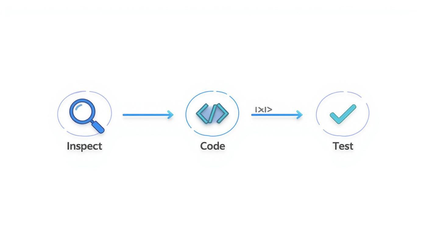
It’s this loop of inspecting and validating that’s absolutely crucial to getting your site truly mobile-friendly.
Once you’ve smoothed out the major layout wrinkles in your browser, it's time to grab some physical hardware. Start with your own smartphone. Don't just look at the site—use it. Tap buttons, try to fill out forms, and interact with every slider and menu. Be on the lookout for anything that feels clunky, slow, or just plain difficult to use.
If you need to cover more ground, especially if you don't own a bunch of different phones, cloud-based platforms are a lifesaver. A service like BrowserStack gives you access to thousands of real device-and-browser combinations. This is where you'll catch those weird bugs that only show up on a specific version of Android or an older iPhone.
Finally, let Google have the last word. Run your URL through their free tools:
- Mobile-Friendly Test: This gives you a straightforward pass/fail score directly from Google. It’ll point out specific usability problems, like content being wider than the screen or tap targets being too close together.
- PageSpeed Insights: This tool dives deep into mobile performance, which is a massive part of being "mobile-friendly." It will flag things like oversized images or slow server response times that kill the user experience on a cellular connection.
By combining quick browser checks with focused testing on real devices and a final review with Google's own tools, you build a comprehensive workflow that actually works. This systematic approach ensures your Divi site doesn't just look good on mobile—it performs brilliantly for every single visitor.
As you start wrestling with your Divi site's mobile experience, you'll inevitably run into a few classic head-scratchers. Everyone does. Let's walk through some of the most common questions that pop up and get you some clear, practical answers.
How Should I Handle Navigation on Mobile?
Let's be honest: those sprawling desktop menus with multiple dropdowns are a complete disaster on a phone. When it comes to mobile navigation, simplicity is your best friend. The go-to solution for a reason is the "hamburger" menu—that clean, collapsible icon that tucks your navigation away until it's needed. It's a massive space-saver.
But don't just dump your entire desktop menu in there. Think like a mobile user. What are they really looking for on the go? It's usually contact info, your main services, or maybe a blog post. Prioritize those key pages. Oh, and make sure the hamburger icon itself is big enough for a thumb to tap easily. Nothing's more frustrating than a tiny tap target.
Should I Use a Separate Mobile Site or Responsive Design?
This question comes up a lot, but in today's world, the answer is almost always responsive design.
Building a completely separate mobile site (the kind you see on subdomains like m.yoursite.com) is an old-school approach that just creates double the work. You're stuck maintaining two different versions of your site, which is a headache and can cause all sorts of SEO issues like duplicate content.
Responsive design is the modern standard and what we've been focused on. It's one website, one set of content, that intelligently adapts to any screen size. It’s far more efficient, much better for SEO, and gives your visitors a consistent experience no matter what device they're on.
It really boils down to this: a responsive site is one site that adapts to all screens. A separate mobile site is an entirely different website built just for phones. Stick with responsive. It’s the right call.
What Font Size Is Best for Mobile Readability?
There's no single magic number that works for every font and every design, but a solid starting point for body text on mobile is 16px. Anything smaller often forces people to pinch-and-zoom, which is an experience you want to avoid.
For headings, you're looking for a clear visual hierarchy without a giant headline hogging the entire screen. Something in the 24px to 32px range for a main heading usually works well.
Don't just trust the numbers, though—always test it on your actual phone. Readability is about more than just size. Line height and the font itself play a huge role. Simple sans-serif fonts like Roboto or Open Sans are generally much easier on the eyes on a digital screen than complex, ornate serif fonts.
Ready to build mobile experiences that truly pop? The tools at Divimode are built to help you create interactive popups, fly-ins, and other dynamic content that grabs attention on every device. Learn more about Divi Areas Pro.
More Articles You Will Like