
 Alex Martin
To build a website that works well on phones, you need what's called a responsive design. This just means the site layout automatically shifts and changes to fit whatever screen it's on. It involves using flexible grids and images that resize themselves, all while making sure your content is easy to read and use on a small device. Nailing the site speed and user experience is what separates the good from the great.
Why a Mobile-Friendly Website Is Non-Negotiable
Let's be clear: having a mobile-friendly website isn't a "feature" anymore—it's the price of admission. The internet has fundamentally shifted from desktop screens to the palms of our hands. Any business that hasn't adapted is actively turning away most of its potential audience and, frankly, leaving money on the table.
A poor mobile experience has immediate, real-world consequences. Picture a potential customer trying to browse your products on their phone, only to be met with tiny text, buttons they can't possibly tap, and endless side-scrolling. They won't stick around to figure it out; they'll just leave.
This frustration translates directly to:
- Higher Bounce Rates: People get annoyed and abandon your site almost instantly.
- Damaged Brand Perception: A clunky mobile site looks unprofessional and untrustworthy.
- Lost Revenue: If users can't easily browse or buy, you lose sales. It's that simple.
The Overwhelming Dominance of Mobile Traffic
The data tells an undeniable story. To really grasp how much things have changed, let's look at the numbers over the last decade or so.
Mobile vs Desktop: A Decade of Change
| Metric | A Decade Ago | Today |
|---|---|---|
| Global Web Traffic Share | Mobile: 0.72% (Early 2009) | Mobile: 64.35% (July 2025) |
| Primary User Behavior | Research & long sessions | Quick lookups, social, shopping |
| Search Engine Priority | Desktop-first indexing | Mobile-first indexing |
| Design Approach | Desktop-focused, mobile as an afterthought | Mobile-first, responsive design is standard |
As of July 2025, a staggering 64.35% of global web traffic now comes from mobile devices. This isn't just a trend; it's the new reality of how people live and interact with the web. The link between a great mobile site and business growth is direct and powerful. An effective online presence, starting with mobile-friendliness, is fundamental for any successful strategies to increase online sales.
Beyond just keeping users happy, Google's mobile-first indexing means the mobile version of your site is the only version that matters for search rankings. A poor mobile site will directly torpedo your visibility and organic traffic.
Ultimately, you just can't afford to ignore mobile optimization. It touches every part of your business, from user satisfaction to your bottom line. Understanding the impact of mobile optimization on WordPress SEO is the first step toward building a site that actually meets modern user expectations and drives the results you're looking for.
Mastering Responsive Design for Any Device
Responsive design is the secret sauce that makes a website feel right on any device. It's not about just shrinking your desktop site down to a phone screen. It's about creating a layout that intelligently adapts, making sure every visitor has a great experience, whether they're on a giant monitor or a tiny phone.
Let's get past the theory and into how this actually works.
For years, we built sites with rigid, fixed-pixel layouts—think containers that were exactly 960px wide. That was fine on a big screen, but it’s a total disaster on mobile. It forces users to pinch, zoom, and scroll sideways just to read a single sentence. Nobody wants that.
Embrace Fluid Grids and Flexible Units
The modern way to build is with flexible units that scale relative to the screen size. Instead of locking things down with pixels, you’ll want to get comfortable using percentages (%) and viewport units (vw, vh).
For example, a simple two-column layout on a desktop could have each column set to width: 50%;. This tells the browser to make each column take up half of the available space, no matter how wide the screen is. It’s a simple change that forms the foundation of a fluid grid system, allowing your content to reflow gracefully.
You can see this in action right inside Divi. The theme’s built-in device previews are perfect for visualizing how your layout will shift.
Here’s a look at Divi’s responsive controls, showing how you can toggle between desktop, tablet, and mobile views to fine-tune your styles for each breakpoint.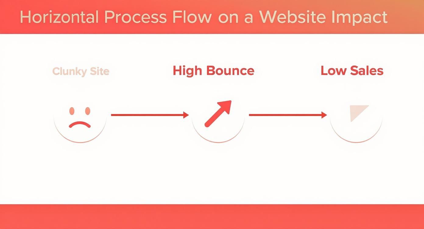
This is your command center. You can apply device-specific settings without ever touching code, making it easy to see how flexible units behave in a real-world context.
The Power of CSS Media Queries
Fluid grids are a fantastic starting point, but sometimes you need more direct control. That’s where CSS media queries come into play. These are simple rules that apply specific CSS styles only when certain conditions are met, like when the screen width drops below a certain point.
Think about that two-column layout again. On a small screen, those 50% columns can get pretty squished. To improve readability, you’d probably want them to stack on top of each other, each taking up the full width.
A media query for that scenario would look something like this:
@media (max-width: 768px) {
.two-column .column {
width: 100%; /* Columns become full-width on screens 768px or smaller */
float: none;
}
}
This bit of code tells the browser, "Hey, when the screen width is 768 pixels or less, make any element with the class .column take up 100% of the width." It’s the magic behind how complex desktop layouts transform into clean, single-column mobile experiences.
If you want to dive deeper into the code side of things, check out our complete guide on achieving responsive design with CSS. Getting this stuff right is non-negotiable—get it wrong, and you’re just driving visitors away with a frustrating experience.
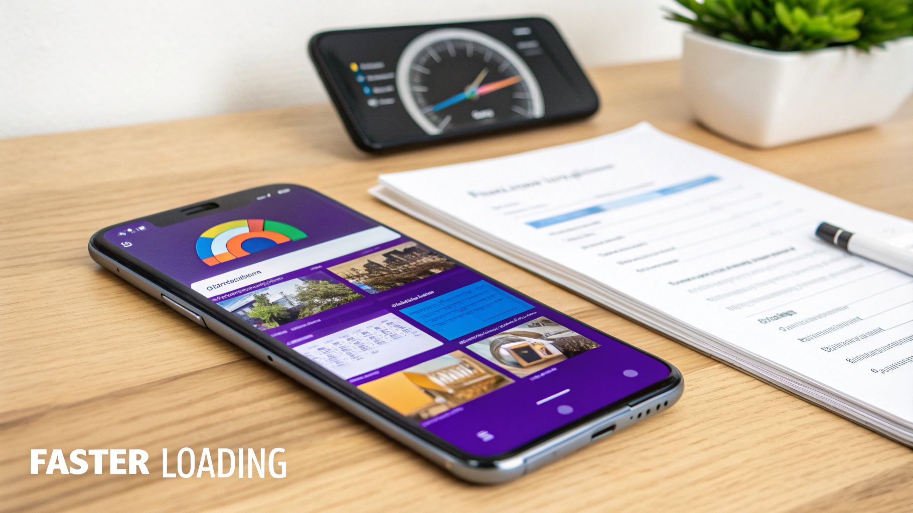
Optimizing Your Website Speed for Mobile Users
On mobile, every second counts. I mean that literally. A slow-loading site is probably the fastest way to lose a potential customer before they even see what you're offering.
User expectations are higher than ever. A staggering 53% of mobile users will bounce if a site takes more than three seconds to load. That’s over half your audience gone, just like that, because of a performance snag.
This isn't just about keeping people on your page. It's about revenue. A slow site is a frustrating site, and that frustration has a direct impact on your bottom line. Speed optimization isn't just a nice-to-have; it's a critical part of building a mobile-friendly website that actually works.
Compress Your Images Intelligently
Let's talk about the biggest speed killer I see on mobile sites: unoptimized images. Those beautiful, high-resolution photos look amazing on a desktop, but they can absolutely cripple a mobile connection. The trick is to find that perfect balance between image quality and file size.
And you don't need to be a Photoshop guru to pull this off. There are some fantastic free online tools that make it dead simple:
- TinyPNG: This is a classic for a good reason. Just drag your PNG or JPEG files over, and it'll shrink them down without any noticeable quality loss. It’s my go-to for quick and easy compression.
- Squoosh: A more powerful, browser-based tool from Google. It gives you a ton of control over compression settings and lets you see a real-time preview of the results. Great for when you need to be a bit more precise.
Make image compression a non-negotiable step in your workflow. It's one of the most effective ways to slash your page weight and boost load times, especially for visitors on slower mobile networks.
Pro Tip: Don’t stop at compression. Always upload images at the exact dimensions they will be displayed. If an image container is 600px wide, don't upload a 4000px image and let the browser do the heavy lifting. That wastes bandwidth and processing power. Resize it first!
Leverage Browser Caching
Think of browser caching as giving your returning visitors an express lane to your site. The first time someone visits, their browser has to download every single thing—images, stylesheets (CSS), scripts (JavaScript), you name it. Caching is a way of telling the browser, "Hey, hang on to these files for a while."
So, on their next visit, the browser just loads most of the site's assets straight from its local storage instead of downloading them all over again. The result? A much, much faster experience for repeat visitors. This little trick helps build loyalty and keeps people coming back. The good news is most WordPress caching plugins will handle all of this for you with just a few clicks.
Minify Your Code
Your website’s code—the HTML, CSS, and JavaScript—is often full of extra stuff like spaces, comments, and line breaks. These are great for developers trying to read the code, but for a browser, they're completely unnecessary junk.
Minification is the process of stripping all that extra baggage out. It takes your code files and compacts them into the smallest possible size, which reduces the amount of data that needs to be transferred. It's a simple, easy performance win.
Many performance plugins, including those specifically designed to optimize WordPress speed, can minify your code with a single checkbox. To learn more about why these small tweaks are so vital for user retention and SEO, check out this excellent breakdown on the importance of speed performance for your website.
Designing a Superior Mobile User Experience
Getting your layout to be responsive is just the first step. That gets people in the door, but a fantastic user experience (UX) is what convinces them to stick around. This is where we go beyond the technical side of things and really dig into how people actually use their phones.
Think about it for a second. Desktop users have a precise mouse pointer. Mobile users? They have thumbs—all different sizes and not nearly as accurate. This one difference changes everything.
If your buttons and links are tiny or crammed together, you’re not just creating a small annoyance. You're creating a roadblock that can lead directly to an abandoned cart or a lost lead. It's a deal-breaker.

This focus on mobile UX is more critical now than ever before. Mobile devices accounted for 60% of all global e-commerce sales in 2023, and that number is only going up. An incredible 96.3% of people worldwide use their phones to get online, cementing mobile as the primary way most of us experience the internet. If you want to dig deeper, you can learn more about how mobile browsing dominates the web and see just how powerful these trends are.
Create Generous Tap Targets
One of the most common—and frustrating—mobile UX mistakes is creating tiny, un-tappable links and buttons. It’s a guaranteed way to make users want to throw their phones. The fix is simple: design larger tap targets, which is the clickable area around any interactive element.
- Minimum Size: Apple’s guidelines are a great place to start. Aim for a minimum tap target size of 44×44 pixels. This gives most thumbs a fair shot at hitting the mark.
- Sufficient Spacing: Don't crowd your elements. Make sure there’s plenty of white space between buttons and links to prevent fat-finger mistakes and accidental taps.
- Full-Width Buttons: On mobile, it's often best to make your main call-to-action buttons span the full width of the screen. They're impossible to miss and incredibly easy to tap.
A great user experience feels invisible. When someone can browse your site, fill out a form, and make a purchase without ever having to think about how to do it, you've nailed it. Frustration only creeps in when the design gets in the way.
Prioritize Readability and Simple Navigation
What looks great on a 27-inch monitor is a cluttered mess on a 6-inch screen. For mobile viewers, you absolutely have to simplify and prioritize your content.
Typography is the perfect place to start. A baseline font size of 16px for body text is the gold standard for mobile readability. Anything smaller forces people to pinch and zoom, which is a dead giveaway that your design isn’t truly mobile-friendly.
Next, take a hard look at your navigation menu. That complex, multi-level desktop menu with all its fancy dropdowns? It’s a usability nightmare on a phone. The best practice is to consolidate everything into a clean hamburger menu. That little three-line icon is universally recognized and keeps your interface tidy, giving users access to navigation when they need it without cluttering the screen.
By focusing on these core UX principles, you can build a site that not only looks good but is a genuine pleasure to use on any device.
So, you've tweaked your responsive layouts and squeezed every last drop of performance out of your site. But how do you really know if it’s working? Guessing isn't an option. You need to put your work to the test with the right tools to validate your efforts and hunt down any gremlins that might still be hiding.
The good news is you don't need a drawer full of phones and tablets to see how your Divi site holds up. There are some fantastic—and free—tools out there that give you instant, actionable feedback. This creates a really practical workflow: find a problem, fix it, and immediately re-test to see if you nailed it.
https://www.youtube.com/embed/p17bmM-nwkc
Using Google’s Mobile-Friendly Test
If you want a simple, straight-to-the-point verdict, start with Google’s own Mobile-Friendly Test. This is the definitive check because it uses the exact same criteria Google’s search algorithm does. There’s no grey area here—either your page is mobile-friendly in Google’s eyes, or it isn’t.
All you have to do is plug in your site’s URL and let the tool do its thing.
Here’s what you want to see—a nice, clear confirmation that you're on the right track.
The tool gives you that "Page is mobile-friendly" verdict and even shows you a screenshot of how Googlebot renders your page on a phone, confirming everything is showing up as it should.
But what if it fails? The tool won't just leave you hanging. It'll flag specific issues like "Content wider than screen" or "Clickable elements too close together" and give you pointers. These errors are direct clues that tie back to the responsive design principles we've been talking about. For instance, a "content wider than screen" error is almost always a sign that a stubborn, pixel-based width is hiding somewhere in your design and needs to be swapped for a flexible unit like a percentage.
Simulating Devices with Chrome DevTools
For more detailed, real-time debugging, your web browser is your absolute best friend. Chrome DevTools has a brilliant device simulation feature that lets you see exactly how your site looks and feels on all sorts of phones and tablets.
Getting to it is easy: right-click anywhere on your page and hit "Inspect." Then, just click the little icon that looks like a phone and tablet (it's called the "Toggle device toolbar"). Boom—your site instantly reflows into a mobile view.
From there, the real fun begins. You can:
- Pick specific devices: Use the dropdown to see your site on popular models like iPhones, Samsung Galaxys, and Pixels.
- Test different orientations: A quick click lets you flip between portrait and landscape modes to make sure your layout doesn't break.
- Simulate network conditions: This one is super useful. You can throttle your connection to mimic slower 3G networks to get a real sense of how your speed optimizations are performing in the wild.
This hands-on approach is perfect for squashing bugs. You can inspect elements, tweak CSS live right in the browser, and perfect your responsive styles without having to constantly save and refresh a live site.
Essential Mobile Friendliness Testing Tools
To give you a quick reference, I've put together a list of the most practical tools for checking your site’s mobile readiness. Each one has its own strengths, so it's good to have a few in your toolkit.
| Tool Name | Primary Use | Key Feature | Cost |
|---|---|---|---|
| Google’s Mobile-Friendly Test | Quick pass/fail SEO check | Uses Google's official criteria to validate mobile friendliness. | Free |
| Chrome DevTools | Real-time debugging and simulation | Live CSS editing and device-specific emulation in your browser. | Free |
| BrowserStack | Real-device cloud testing | Test on thousands of real mobile devices and browsers. | Paid Plans |
| Responsive Design Checker | Quick viewport visualization | See your site on multiple screen sizes simultaneously. | Free |
While tools like Google's test give you the official verdict, nothing beats the hands-on, interactive debugging you get with Chrome DevTools. For mission-critical projects where you need to be absolutely certain, a paid service like BrowserStack offers the ultimate peace of mind by letting you test on actual physical devices.
Got Questions About Mobile-Friendly Websites?
Even with the best game plan, questions pop up. As you get the hang of making a Divi site work beautifully on mobile, a few common uncertainties can stop you in your tracks. I've put together this little FAQ section to tackle those persistent questions with straight, simple answers.
Think of this as a quick reference guide to help you push past those roadblocks with confidence.
What’s the Real Difference Between Responsive and Adaptive Design?
This is easily one of the most common points of confusion I hear. Let's break it down.
Think of responsive design like water; it fluidly fills whatever container it's in. You're working with a single, flexible layout that automatically adjusts to fit any screen, whether it's a tiny smartphone or a massive desktop monitor.
Adaptive design, on the other hand, is more like having a collection of custom-tailored suits. It uses several distinct, fixed layouts designed for specific screen sizes (one for phones, one for tablets, one for desktops). When someone visits your site, the server figures out what device they're on and serves up the correct pre-built layout.
For almost any website you build today, especially with a modern tool like Divi, responsive design is the way to go. It's far more efficient to manage one flexible layout than a handful of fixed ones, and it's what Google strongly prefers.
How Much Does Mobile-Friendliness Actually Impact SEO?
The impact isn't just big—it's everything. Since 2019, Google has been using mobile-first indexing. In simple terms, this means Google primarily looks at the mobile version of your website to decide how to rank it. If your site is a mess on a phone, your search rankings will suffer, no matter how slick the desktop version looks.
Google essentially sees your mobile site as the real version.
On top of that, a clunky mobile experience causes visitors to leave in droves. High bounce rates and low engagement tell Google that your site isn't helpful, which directly pushes you down in the search results.
What Is the Single Most Common Mobile Design Mistake?
Without a doubt, the mistake I see most often is creating un-tappable elements. We’re talking about buttons that are too small, links packed too closely together, or menu items that are impossible to hit accurately with a thumb.
This one issue is an absolute conversion killer. If people can't easily tap your "Add to Cart" or "Contact Us" button, you're literally blocking them from doing what you want them to do.
Always aim for a minimum tap target size of 44×44 pixels, and give those elements plenty of breathing room. It’s a small detail that makes a world of difference in user frustration (or the lack thereof).
Ready to create popups, menus, and fly-ins that look perfect on any device? With Divimode, you can build highly engaging, mobile-friendly experiences directly within the Divi Builder. Discover how Divi Areas Pro can transform your website today!
More Articles You Will Like