
 Alex Martin
Want the quick and dirty answer to making a mobile-friendly site? Use a responsive framework like Divi, crush your image and code optimization for speed, and then test, test, test on real phones. It’s all about creating an experience that just works on any screen, from a huge desktop monitor down to the phone in your pocket. This isn't just a good idea anymore; it's the absolute bedrock of a solid online presence.
Why a Mobile-Friendly Website Is Non-Negotiable
Let's be real: having a mobile-friendly website isn't just a "nice-to-have" feature. It’s the very backbone of digital success today. When someone lands on your site from their phone and they’re forced to pinch, zoom, and hunt for information, they're not going to stick around. That terrible first impression does more damage than you might think.
This isn't just about avoiding user frustration; it directly impacts your visibility online. Google now runs on a mobile-first indexing system, meaning it primarily looks at the mobile version of your site to decide how to rank you. If your mobile site is a mess, your search rankings will tank, no matter how slick your desktop version looks.
The True Cost of a Poor Mobile Experience
A clunky, slow mobile site is more than just an annoyance—it's a direct hit to your bottom line. Just think about the last time you bailed on a site because it was impossible to use on your phone. Your potential customers are doing the exact same thing.
Here’s exactly what you’re risking with a site that isn’t built for mobile users:
- Lost Customers: People have zero patience for bad experiences. A frustrating mobile site is an invitation for them to leave and head straight to a competitor who got it right.
- Damaged Credibility: A professional, seamless mobile experience screams competence and builds trust. A broken or slow one suggests you don't care about the details, which erodes confidence in your entire brand.
- Tanking Conversion Rates: Simple actions like filling out a form or making a purchase become a nightmare on a poorly designed mobile site. The result? Your conversion rates will plummet.
A website that works flawlessly on mobile is no longer a technical checkbox. It's a fundamental signal to your audience that you value their time and are serious about giving them a quality experience.
Before we dive into the "how," let's quickly break down what a mobile-friendly site truly needs to deliver.
Core Pillars of a Mobile-Friendly Website
This table sums up the essential components you need to nail for a great mobile user experience. Getting these right is the first step toward a site that performs as well in your user's hand as it does on a desktop.
| Component | Why It Matters | Key Goal |
|---|---|---|
| Responsive Design | Ensures the layout adapts fluidly to any screen size, from smartphones to tablets. | Provide a consistent, accessible experience on all devices without pinching or zooming. |
| Fast Load Times | Mobile users are often on slower connections and have less patience. | Deliver content almost instantly to reduce bounce rates and keep users engaged. |
| Simple Navigation | Small screens demand clear, concise navigation menus (like the "hamburger" menu). | Help users find what they need with minimal taps and effort. |
| Touch-Friendly UI | Buttons, links, and forms must be large enough to be tapped easily with a finger. | Prevent mis-taps and frustration, making interaction smooth and intuitive. |
| Readable Content | Font sizes and line spacing must be optimized for readability on small screens. | Ensure users can consume your content comfortably without straining their eyes. |
Mastering these pillars is crucial. They are the foundation upon which every successful mobile strategy is built.
Mobile Traffic Is King
The shift to mobile browsing isn't just a trend; it's the new reality. Data shows that as of 2025, well over 55% of global website traffic is coming from mobile devices. Digging deeper, you’ll find that over 74% of mobile users are more likely to return to sites that are mobile-friendly. Even better, businesses with optimized sites can see a purchase likelihood increase of up to 67%.
At the heart of all comprehensive web design strategies is the simple truth that a website must perform flawlessly on every device. Treating your mobile site as an afterthought is a guaranteed way to alienate the majority of your audience.
Now, let's move from the "why" to the "how." In the next sections, I’ll walk you through actionable steps you can take in Divi to make sure your site absolutely shines where it matters most: in the hands of your users.
Mastering Divi's Responsive Design Controls
Alright, moving from the why to the how is where Divi really starts to shine. The builder gives you direct, visual control over how your site looks and feels on different devices, which takes all the guesswork out of building a mobile-friendly website. You absolutely do not need to be a coding whiz to make powerful tweaks; you just have to know where to find the right tools.
The heart of this whole system is Divi's set of device preview icons, which you'll find tucked away at the bottom left of the builder. Those three little icons—Desktop, Tablet, and Mobile—are your window into your users' world. Clicking on them instantly reflows your entire layout to mimic that screen size, letting you make targeted changes that only apply to that specific view.
This feature is the first thing you need to master. It turns the abstract idea of "responsive design" into a hands-on, visual editing session.
Fine-Tuning Your Design for Every Screen
Once you've switched over to the Tablet or Mobile view, any adjustment you make can be set specifically for that device. You’ll start noticing a tiny phone icon that pops up next to many settings when you hover over them. Clicking this icon is the key—it unlocks the ability to set different values for desktop, tablet, and mobile.
Let's run through a common scenario. Imagine you have a big, bold headline on your desktop homepage. It looks great! But on a mobile screen, that same massive font size is just obnoxious, forcing people to scroll just to read one sentence.
Here's the quick fix using Divi's responsive controls:
- Switch to Mobile View: Just click the mobile phone icon in the Divi builder.
- Edit the Text Module: Open the settings for that oversized headline.
- Adjust the Font Size: Head over to the Design tab, open the "Heading Text" toggle, and find "Heading Font Size." Hover over it and click the mobile icon that appears.
- Set a Mobile-Specific Size: Now you can dial that font size way down to something more reasonable, like 24px, just for mobile visitors. Your desktop font size won't change a bit.
This same logic applies to pretty much every design setting you can think of. You can tweak margins, padding, letter spacing, and element widths to get the layout just right on smaller screens without messing up your beautiful desktop design.
Creating Space and Improving Layouts
One of the biggest giveaways of a poorly optimized mobile site is a lack of "breathing room." Elements that look perfectly spaced on a desktop can feel totally cramped and chaotic on a phone. This is where getting comfortable with responsive margin and padding adjustments is so important.
For instance, you might have a two-column layout on desktop with 80px of padding inside each column. When Divi automatically stacks those columns on mobile, that huge padding can push your content into an awkward, narrow "tunnel" down the middle of the screen.
The fix is simple: switch to the mobile view, find the padding setting, and reduce it to something like 20px. Instantly, the layout looks more balanced and professional. This little tweak makes your content far more readable and the whole page feel less constrained. If you want to see what this looks like, the image below shows Divi's device view toggles in action.
This immediate visual feedback loop is what makes Divi so powerful. You can see the impact of your changes across different breakpoints in real-time.
Using Responsive Visibility Controls
Sometimes, just resizing and spacing things isn't enough. Certain elements that are brilliant for a desktop experience—like a complex interactive map or a wide data table—are just plain unusable on a phone. In these situations, the best move is to hide them completely on smaller screens.
Divi's visibility controls make this incredibly easy.
Head to any Section, Row, or Module's "Advanced" tab and find the "Visibility" settings. From there, you can choose to disable the element on Phone, Tablet, or Desktop. This is an absolute game-changer for crafting a truly optimized mobile experience.
Instead of trying to cram a desktop-first element onto a mobile screen, you can just hide it and create a simpler, mobile-specific alternative. For example, you could hide a complicated pricing table and replace it with a simple, stacked list or a clean button linking off to a separate pricing page. This lets you serve two completely different experiences from a single page, guaranteeing every visitor gets the best version of your content.
You can dive deeper into these ideas by checking out some key tips for better Divi mobile responsiveness, which build on these core controls.
By mastering these built-in tools, you can solve the vast majority of responsive design challenges right inside the Divi builder. The result is a seamless experience for every user, no matter what device they're on.
Solving Tricky Layouts with Custom CSS
Divi’s responsive controls are fantastic for handling most of the mobile design challenges you'll face. But every now and then, you hit a wall—a stubborn layout issue that the visual builder just can't seem to wrestle into submission.
This is where a few lines of custom CSS can feel like a superpower. It gives you the surgical precision needed to perfect your mobile-friendly website. You don’t need to be a coding wizard to make these tweaks, either. The real key is knowing when to reach for CSS and how to apply it correctly within Divi.
Think of it as the final 10% of polish that takes a good mobile design and makes it truly flawless.
For instance, I’ve often found that the default line height on a heading looks great on a desktop but feels way too spaced out on a mobile screen, wasting precious vertical space. While Divi lets you adjust font sizes for different devices, line height is often locked. A tiny CSS snippet can fix this in seconds.
This is where a tool like Media Queries comes in handy, letting you apply specific styles for different screen sizes.
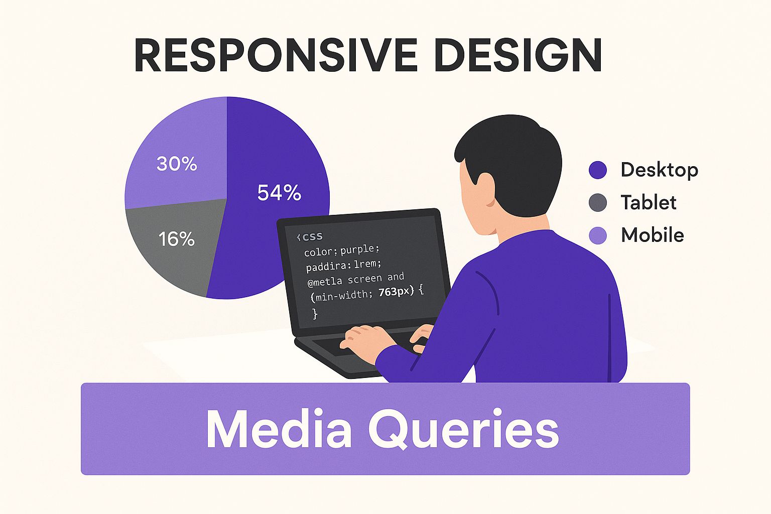
As you can see, media queries are the secret sauce for telling browsers to apply your custom styles only on screens of a certain size, like a smartphone.
When To Use Custom CSS Instead of Divi's Settings
Knowing which tool to grab is half the battle. You don’t want to be writing custom code for something Divi can handle with a single click in the settings. But trying to force the builder to fix an issue it wasn’t designed for is just a recipe for frustration.
So, when should you stick with Divi's responsive settings, and when is it time to write a little CSS? This table breaks it down based on common situations I run into.
Divi Responsive Settings vs Custom CSS: When to Use Each
| Scenario | Best Tool to Use | Reasoning |
|---|---|---|
| Adjusting font size, margins, or padding | Divi Responsive Settings | Divi's built-in controls are fast, visual, and designed for these common tweaks. It's the most efficient method by far. |
| Fixing a horizontal scrollbar | Custom CSS | This is usually caused by an element with a fixed width that's too wide for the screen. CSS is the direct way to override that style. |
| Modifying element order on mobile | Divi Responsive Settings | Divi's column stacking order settings can often resolve this without any code, though very complex cases might need a CSS nudge. |
| Fine-tuning line height or letter spacing | Custom CSS | The visual builder doesn't always offer responsive controls for these specific typography details, making CSS the go-to solution. |
| Hiding an element on mobile | Divi Responsive Settings | The "Visibility" options in the Advanced tab are the easiest and most reliable way to show or hide elements on different devices. |
Deciding between these tools correctly makes the whole process smoother and saves you a ton of time.
It's worth the effort. Mobile commerce is exploding—by 2025, it’s estimated that over 75% of all eCommerce sales globally will happen on mobile devices. Fixing even minor layout issues is critical for protecting your revenue. You can dive deeper into how mobile is reshaping online business by exploring these mobile marketing statistics from WebFX.
Adding CSS with Media Queries
The magic behind mobile-specific CSS is the media query. It's a simple rule that tells the browser, "Only apply these styles if the screen is a certain size." This lets you write CSS that targets only mobile phones or tablets, leaving your beautiful desktop design completely untouched.
The most common breakpoint for mobile phones is 767px. So, a media query for mobile would look something like this:
@media (max-width: 767px) {/* Your mobile-only CSS goes here */}
This code block tells the browser to apply whatever styles you put inside the curly braces, but only when the screen width is 767 pixels or less.
You can add this code in a few different places in Divi:
- In Divi > Theme Options > Custom CSS: This is the spot for site-wide changes.
- In the Advanced tab of a specific Module/Row/Section: Best for targeted fixes that only affect one element.
- In a Child Theme stylesheet: This is the recommended practice for larger, more complex customizations.
Real-World CSS Fixes for Common Mobile Problems
Let's put this into practice. Here are a couple of common headaches that Divi’s settings can’t quite solve on their own.
Fixing the Dreaded Horizontal Scrollbar
This is one of the most annoying mobile usability issues out there. It usually happens when an element is given a fixed pixel width that’s wider than a phone’s screen.
- The Problem: A row or module stubbornly refuses to shrink, causing that ugly side-to-side scroll.
- The Fix: Find the element causing the problem (Chrome DevTools is your best friend here). In its Advanced tab, give it a unique CSS Class, like
no-mobile-overflow.
Then, add this little snippet of CSS:
@media (max-width: 767px) {.no-mobile-overflow {overflow-x: hidden !important;}}
This forcefully tells the browser to just hide anything that tries to "overflow" its container horizontally on mobile screens.
Pro Tip: Before you jump to
overflow: hidden, always check if you can fix the root cause. Is there a module with a fixed width, likewidth: 800px;? Try changing it to a percentage, likewidth: 100%;. Fixing the source is always the better approach.
Adjusting Mobile Line Height for Readability
Sometimes the default spacing between lines of text is just too tight or too loose on mobile, making it hard to read.
- The Problem: A headline's text feels cramped and squished on a small screen.
- The Fix: Add a CSS class, like
mobile-headline-spacing, to your text module.
Then, pop this CSS into your theme options or page settings:
@media (max-width: 767px) {.mobile-headline-spacing h2 {line-height: 1.2em !important;}}
This tiny adjustment can make a huge difference in how professional and readable your content feels on a phone. Once you get the hang of a few of these simple CSS tricks, you'll have the power to solve pretty much any mobile layout problem Divi can throw at you.
Optimizing Your Site for Mobile Speed
A responsive design that looks perfect on a phone is only half the battle. If that beautiful layout takes ten seconds to load over a spotty mobile network, your visitors are gone.
Performance isn't just a technical detail; it's a core part of the user experience. A slow site feels broken, unprofessional, and frankly, frustrating.
This is especially true as the internet continues to shift toward handheld devices. Data shows mobile devices accounted for roughly 59.7% of global website visits as of April 2025—a massive jump from just under 35% back in 2015. This isn't a fleeting trend; it’s a fundamental change in how people browse, making mobile speed a top priority. For more on this, check out the rise of mobile web traffic from Tekrevol.
Fortunately, Divi comes loaded with some powerful, built-in tools to help you tackle performance head-on.
Activate Divi’s Built-in Performance Features
Before you even think about installing a bunch of optimization plugins, start with what Divi already gives you. Just navigate to Divi > Theme Options > General > Performance. In there, you'll find a series of toggles that can make a huge difference with a single click.
Be sure to enable these key options:
- Dynamic Module Framework: This clever feature stops Divi from loading the code for modules you aren't actually using on a specific page. Less code, faster load.
- Static CSS File Generation: This one is huge. It takes all the dynamic styles Divi creates and compiles them into a single, static CSS file that browsers can cache and load much, much faster.
- Lazy Load Images: A must-have for mobile. This stops off-screen images from loading until a user actually scrolls down to them, dramatically improving what we call "perceived load time."
Flipping these switches is the lowest-hanging fruit for a faster Divi site. Just remember to clear your Divi static CSS cache after making changes to make sure they take effect.
Master Your Image Optimization Workflow
I'm just going to say it: large, uncompressed images are the number one cause of slow websites. Period.
While Divi’s lazy loading helps, you still need to optimize your images before you even upload them to your WordPress media library. Simply uploading a high-resolution photo straight from your camera is a recipe for disaster on mobile.
Here’s a simple, effective workflow I use on every project:
- Resize Your Images: A full-width hero image rarely needs to be wider than 1920 pixels. For smaller images inside your content, resize them to the maximum dimensions they'll ever be displayed at. Don't make the browser do the work.
- Compress Them: After resizing, run your images through a compression tool. Online tools like TinyPNG or desktop apps like ImageOptim can shrink file sizes by over 70% without any noticeable drop in quality. It's like magic.
- Choose the Right Format: Use JPEGs for photographs and PNGs for graphics that need transparency. Better yet, modern formats like WebP offer even better compression and are now widely supported by all major browsers.
Getting into the habit of optimizing every single image will have a more significant impact on your mobile load times than almost any other single action you can take. It’s that important.
Choose Quality Hosting
Think of your web host as the foundation of your website. No amount of on-site tweaking can make up for a slow, underpowered server.
Those cheap, shared hosting plans might be tempting, but they often cram hundreds (sometimes thousands) of websites onto a single server. This leads to painfully slow response times, especially when you get a sudden spike in traffic.
Investing in quality managed WordPress hosting is one of the best moves you can make for your site's speed. These providers optimize their servers specifically for WordPress and Divi, often including server-level caching and other performance goodies you just can't get with budget hosts.
If you’d like a complete breakdown of performance tweaks, we’ve got you covered in our detailed guide to optimize your WordPress speed for more advanced strategies.
By combining Divi’s internal settings with a disciplined approach to image optimization and a solid hosting foundation, you can ensure your mobile site doesn't just look great—it feels fast and fluid, too.
How to Test Your Mobile-Friendly Website
After pouring all that effort into designing, tweaking, and optimizing, it’s tempting to just hit "publish" and move on. But launching a mobile-friendly site without testing it first is like serving a meal to guests without ever tasting it—you’re just crossing your fingers and hoping for the best.
Don't just assume your site works on mobile. You need to prove it with a solid testing workflow.
This whole process isn't nearly as complicated as it sounds. It’s really about catching those awkward layout breaks, weird usability quirks, and frustratingly slow load times before your visitors do. A few minutes of testing now can save you from making a terrible first impression, which can be incredibly costly in the long run.
Start With the Obvious: Your Own Phone
Before you even think about fancy tools, the most practical first step is to just grab your own smartphone. This is hands-down the quickest way to get a real feel for how your site actually performs for a human being. We're not worried about technical metrics yet; this is all about the user experience.
Pull up your website and start clicking around. As you navigate, ask yourself these crucial questions:
- Can you read the text easily without pinching and zooming?
- Are the buttons and links big enough to tap comfortably with your thumb?
- Do the forms actually work, and are they a pain to fill out on a small screen?
- How does the site feel? Is it quick and snappy, or does it feel sluggish?
This simple, real-world check will often uncover 80% of the most glaring issues. It’s also a great idea to ask a friend or colleague to do the same on their device. A fresh pair of eyes can spot problems you’ve become completely blind to.
Level Up With Browser Emulation Tools
Your phone is a great start, but it only represents one screen size and one operating system. To really see how your design holds up across a wider range of devices, you can use the powerful emulation tools built right into your web browser. Google Chrome’s "Device Mode" is a fantastic—and totally free—option.
To get there, just right-click anywhere on your webpage and select "Inspect." In the panel that pops up, click the small tablet/phone icon in the top-left corner. Boom—you're now in a mobile emulator.
From there, you can select from dozens of preset device profiles, from an iPhone SE to a Galaxy Fold, to see how your layout adapts. This is absolutely critical for spotting those awkward line breaks or elements that look perfect on your phone but completely fall apart on another.
Validate Your Work With Third-Party Tools
Using real devices and browser tools is essential for checking the visual and functional sides of your site. But to make sure you’re meeting industry standards—especially Google’s—you need to run your site through a dedicated testing tool. The most important one, without a doubt, is Google’s own Mobile-Friendly Test.
This free tool scans your URL and gives you a straight-up pass-or-fail verdict. It’s specifically looking for common mobile pitfalls like text that’s too small, clickable elements that are crammed too close together, and content that’s wider than the screen.
Here’s what it looks like when you get the all-clear:

Getting a "Page is mobile-friendly" result is a huge green light, signaling that you're on the right track with Google's technical requirements. If the tool does flag any problems, it will give you specific, actionable feedback to help you fix them.
Key Takeaway: Testing isn't a one-and-done task. You have to make it a routine part of your workflow. Test after every significant design change or content update to ensure your mobile experience stays flawless.
A great mobile layout is only one piece of the puzzle. For a deeper dive into the overall user experience, a comprehensive website usability checklist can help you evaluate everything from navigation clarity to accessibility, ensuring your site is truly user-centric. By combining manual testing, browser emulation, and automated tools, you can create a repeatable process that guarantees a polished, professional mobile experience every time.
Got Questions? We've Got Answers
Even with Divi's amazing responsive tools, you're bound to hit a few snags. It happens to everyone. This section is all about tackling those common, real-world problems that can leave you scratching your head for hours.
Think of this as your cheat sheet for quick fixes and practical insights, so you can get back to building without the frustration.
Why Does My Divi Layout Look Broken on Mobile but Perfect on Desktop?
This is, without a doubt, the number one issue Divi users run into. Nine times out of ten, the culprit is a rogue setting or a bit of custom code that just doesn't agree with smaller screens.
First, take a hard look at any custom CSS you've dropped into the Advanced tab of a section, row, or module. If that CSS isn't wrapped in a proper media query, it’s going to apply to all screen sizes and can easily wreck your mobile layout. Also, hunt down any fixed pixel widths (like width: 800px;) and swap them for a flexible percentage (like width: 100%;).
Finally, don't forget to clear your caches! After you make a change, pop over to Divi > Theme Options > Builder > Advanced and hit the "Clear" button for Static CSS File Generation. Then, give your browser cache a good clearing to make sure you’re seeing the live, updated version of your site.
A plugin conflict is another classic reason for mobile-only styling weirdness. The easiest way to diagnose this is to temporarily deactivate your other plugins one by one. It’s a surefire method to see if another tool is stepping on Divi's toes.
How Can I Make My Divi Menu Mobile-Friendly?
Divi is smart enough to create a "hamburger" menu icon on mobile devices automatically, but you have a ton of control over how it actually looks and works. For simple tweaks, the WordPress Theme Customizer is your first stop.
Just head to Appearance > Customize > Header & Navigation. In there, you can easily adjust colors, font sizes, and other basic styles for the default mobile menu.
But if you want total control, the Divi Theme Builder is where the real magic happens.
- Start by building a new custom global header.
- Inside that header, add two different menu modules.
- Use Divi’s built-in responsive visibility settings to make one menu visible only on Desktop/Tablet and the other visible only on Phone.
This approach lets you build a completely custom mobile menu from scratch. You can design an experience that perfectly fits your brand and gives your mobile users exactly what they need.
What’s the Best Way to Handle Images for Mobile?
Let's be blunt: large, unoptimized images are the biggest killer of mobile site speed. A zippy, mobile-friendly website absolutely depends on a smart image strategy.
First things first: always, always, always compress your images before you upload them to the WordPress Media Library. Your goal should be to get file sizes well under 150KB without making them look grainy. Tools like TinyPNG are fantastic for this.
Next, make sure you've enabled Divi’s built-in "Lazy Load Images" feature. You'll find it under Divi > Theme Options > General > Performance. This simple toggle stops images from loading until a user actually scrolls to them, which makes a huge difference in initial page load time. For even more firepower, a dedicated plugin like ShortPixel or Smush can automate the entire process for you.
At Divimode, we build tools that empower you to create stunning, high-performing websites. Take your mobile experience to the next level with Divi Areas Pro, the ultimate plugin for creating targeted popups, fly-ins, and dynamic content that engages users on any device. Learn more at https://divimode.com.
More Articles You Will Like