 Alex Martin
You are staring at a Divi header that is almost right.
The menu works. The links are there. But it does not feel like a deliberate set of horizontal navigation buttons. Maybe the spacing is off, the hover states look generic, the mobile version collapses too early, or the menu is technically visible but awkward to use with a keyboard.
That is where most Divi builds hit a ceiling. The default tools are good enough for a standard navigation bar, but not always good enough for a polished button-style navigation system that has to carry branding, usability, and conversion intent at the same time.
Two approaches solve this cleanly. One uses Divi’s native Menu module and a layer of focused CSS. The other uses a custom-built menu area with Divi Areas Pro for more advanced layouts, dynamic content, and behavior control. If you are already working with custom headers, this walkthrough pairs well with a global header setup in Divi.
Moving Beyond Default Divi Navigation
Divi gives you a solid starting point, but the default menu pattern is built for broad compatibility, not precision. That matters when a project calls for navigation links that look and behave like purpose-built buttons.
The friction points show up fast. You want tighter control over spacing between items. You need one item to stand out as a CTA. You want the whole row to stay balanced when labels vary in length. Then mobile enters the picture and the nice desktop layout turns into a stack of cramped links or a toggle that hides too much.
Where the native setup starts to feel limited
The built-in Menu module is strongest when you need a standard navigation bar with light styling. It gets harder when you need:
- Button-like link styling with custom padding, borders, backgrounds, and active states
- Different behavior by device instead of one menu pattern forced across every breakpoint
- Advanced layouts such as multi-row groups, utility buttons, or mixed content inside navigation
- Contextual visibility for logged-in users, WooCommerce customers, or campaign-specific CTAs
That does not mean the native method is wrong. It means you should choose it for the right kind of project.
The two practical paths
For most brochure sites, a native Divi menu with careful CSS is enough. It loads cleanly, keeps the setup simple, and is easy to hand off to a client who only needs standard menu editing in WordPress.
For more advanced builds, I stop treating navigation as a menu and start treating it as a designed interface component. That is where a Divi Area becomes useful. You can build the bar with Button modules, text, icons, WooCommerce elements, and conditional content instead of being boxed into the menu module’s structure.
Tip: If the header needs to do more than list page links, the native menu often becomes a workaround. That is usually the signal to switch methods instead of forcing more CSS onto a structure that was not designed for it.
The right choice depends less on visual style and more on how much control the site needs across desktop, mobile, accessibility, and content logic.
Why Strategic Navigation Buttons Boost UX and Conversions
Navigation is not decoration. It is orientation, decision support, and friction control in one small strip of interface.
When horizontal navigation buttons are clear, spaced well, and limited to the right number of choices, people move through a site with less hesitation. That is one reason the long-standing recommendation is to keep a primary navigation bar to 5 to 7 items, a convention tied to Miller’s Law and discussed in the usability context by Van Ons on the science behind navigation bars.

Placement changes behavior
Many designers underestimate the impact of layout. Navigation buttons are not neutral. Their position and visual treatment change what people do next.
Research comparing navigation button configurations found that placing Next and Previous horizontally on the left reduced break-off to 8.2% compared with 10.1% in an alternate arrangement, and reduced Previous-button usage by 79% in one comparison of prominence and placement patterns, according to Survey Practice’s study on navigation button placement and design.
That research focused on surveys, but the lesson maps cleanly to Divi headers. Position, orientation, and prominence shape behavior. If your primary action is buried visually or your secondary link looks equally important, users hesitate or backtrack more than they should.
Better navigation lowers friction
A good button bar does three jobs at once:
- It reduces choice overload by limiting top-level options.
- It sets visual priority so important actions stand out.
- It improves flow by helping users predict where to click next.
That is the practical side of better website UX. Small interface decisions often decide whether a visitor keeps moving or stalls.
What works in real Divi builds
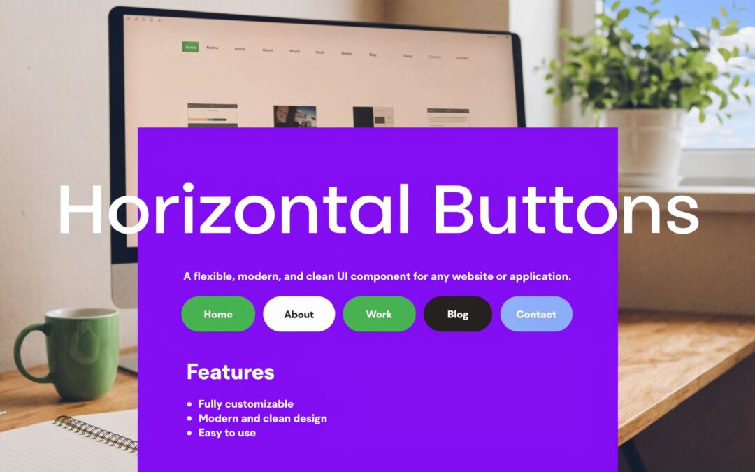
The strongest horizontal navigation buttons usually share a few traits:
| Pattern | What tends to work | What usually fails |
|---|---|---|
| Item count | 5 to 7 core items | Overpacked bars with every page exposed |
| Visual hierarchy | One distinct CTA button, supporting links quieter | Every item styled as the same loud button |
| Placement | Stable position across templates | Menus shifting between page types |
| Labels | Short, specific wording | Long labels that force awkward spacing |
Key takeaway: A navigation bar should not try to say everything. It should help users choose the next sensible step fast.
For WooCommerce sites, that often means keeping top-level navigation lean and letting deeper product discovery happen through category pages, search, or controlled mega menus instead of crowding the header.
Method 1 Crafting Buttons with the Native Divi Menu
If the site needs a clean row of horizontal navigation buttons without advanced content logic, the native Divi method is still the fastest route.
The trick is to stop expecting the Menu module to look polished out of the box. Use it as the structural layer, then shape the links into buttons with spacing, backgrounds, borders, and hover states.

Build the right menu foundation first
Start in Appearance > Menus in WordPress.
Create a menu specifically for your header, and keep the top level tight. Use concise labels. If one item is the commercial priority, such as Book a Demo or Shop Sale, decide now which one should become the button-style standout.
Then assign the menu to your Divi header template.
Style it inside the Menu module
Open the Theme Builder header or your page-level header section and add a Menu module.
Use these settings as the baseline:
- Layout: Keep the orientation horizontal.
- Menu Text: Increase weight slightly for readability.
- Dropdowns: Keep them restrained. If every top-level item opens a complex submenu, the bar stops feeling like buttons.
- Spacing: Add enough left and right padding in the row or module area so the bar can breathe.
The goal is not to make the whole header flashy. The goal is to make each link feel intentional.
Turn links into button-style items with CSS
Divi’s design controls get you close, but custom CSS finishes the job. Add a custom class to the Menu module, such as custom-nav-buttons, then use this in Divi > Theme Options > Custom CSS or the page settings.
.custom-nav-buttons .et-menu-nav > ul {
  display: flex;
  flex-wrap: wrap;
  gap: 12px;
  align-items: center;
}

.custom-nav-buttons .et-menu-nav > ul > li > a {
  display: inline-flex;
  align-items: center;
  justify-content: center;
  padding: 12px 18px;
  border: 1px solid #6200ea;
  border-radius: 999px;
  background: transparent;
  color: #6200ea;
  text-decoration: none;
  transition: all 0.2s ease;
}

.custom-nav-buttons .et-menu-nav > ul > li > a:hover,
.custom-nav-buttons .et-menu-nav > ul > li.current-menu-item > a {
  background: #6200ea;
  color: #ffffff;
}

.custom-nav-buttons .et-menu-nav > ul > li {
  margin: 0;
}
This gives you rounded horizontal navigation buttons without changing the underlying WordPress menu workflow.
Use one highlighted item, not six
If you want one menu item to read like a CTA, assign a CSS class in the WordPress menu screen, such as nav-cta, and target it separately.
.custom-nav-buttons .et-menu-nav > ul > li.nav-cta > a {
  background: #6200ea;
  color: #fff;
  border-color: #6200ea;
}

.custom-nav-buttons .et-menu-nav > ul > li.nav-cta > a:hover {
  background: #4e00bb;
  border-color: #4e00bb;
}
That creates hierarchy without turning the entire bar into noise.
The native method is best when simplicity matters
This approach is a good fit for:
- Service sites with a small set of core pages
- Agency builds that need easy client editing
- Landing-style headers where a standard menu plus one CTA is enough
A quick visual walkthrough helps if you want to compare settings inside the builder:
Pro tip: If you find yourself adding custom code to fake multi-row groups, custom visibility rules, or embedded promo content inside the menu, stop and reassess. You are beyond what the native Menu module handles gracefully.
Unlocking Advanced Navigation with Divi Areas Pro
A common breakpoint in Divi projects shows up after the first client revision. The header starts as five simple links. Then it needs a sale badge, a member-only shortcut, a cart prompt, and different content for logged-in users. At that point, styling the native Menu module harder usually creates brittle CSS and awkward mobile behavior.
Divi Areas Pro solves a different problem than the native menu. It lets you build the navigation itself with Divi modules and controlled display logic, instead of forcing advanced behavior into standard menu markup. If you want a baseline example of a common pattern for horizontal navigation bars, that still helps. But for stores, memberships, and campaign-driven headers, the primary work is in layout control, conditional content, and touch-friendly behavior on smaller screens.

Why this method earns its keep
A Divi Area gives you freedom the Menu module does not. You can place Button modules, blurbs, icons, WooCommerce elements, and conditional blocks in the same horizontal navigation pattern, then decide exactly how they stack, wrap, or swap on mobile.
That matters in real builds.
On a WooCommerce header, I often need one row for primary actions and a separate row for account or promo links. On membership sites, guests may need a sign-up button while members need dashboard and billing links. The native menu can imitate parts of that setup. Divi Areas Pro handles it with far less friction and fewer CSS workarounds.
A practical setup flow
The cleanest setup is to build a dedicated Divi Area for the navigation panel or mega menu, then attach it to a trigger in your header.
- Create a new Area and choose a Mega Menu style when you need a wider horizontal layout.
- Build the navigation row with Divi modules instead of relying on default menu items alone.
- Keep the structure semantic. Use a
<nav>wrapper, a clear label, and a real list of links when possible. - Set link sizing for touch use. Button-style links need enough height and padding to work well on phones and tablets.
- Connect the Area to a trigger in the header, such as a top-level menu item, icon, or button.
If you want examples of display rules and conditional layouts, this guide on displaying content with Divi Areas Pro is worth reviewing before you finalize the header logic.
Mobile needs special attention here. A horizontal button bar that feels polished on desktop can become cramped fast on a phone. That is why I treat mobile-first design principles as an important part of the build plan, not cleanup after the desktop version is done.
Example layout for a WooCommerce site
A typical store header often needs more than a row of category links. It may need:
- Shop
- New Arrivals
- Sale
- My Account
- Help
- Cart
Inside a Divi Area, those links can become a structured interface instead of a single overloaded row. Put primary shopping actions on the first line. Place support links or a campaign button on the second. Show account shortcuts to logged-in users, and swap those blocks for sign-in or first-purchase prompts for guests.
That is an important trade-off. The native menu stays easier for clients to edit. Divi Areas Pro gives you better control over behavior, hierarchy, and responsive layout when the header has to do more than list pages.
Recommended code patterns
If you build the links manually inside a Code module or custom markup block, use a structure like this:
<nav class="dap-horizontal-nav" aria-label="Primary navigation">
  <h2 class="screen-reader-text">Navigation</h2>
  <a class="skip-link" href="#main-content">Skip to content</a>
  <ul>
    <li><a href="/shop/">Shop</a></li>
    <li><a href="/new/">New Arrivals</a></li>
    <li><a href="/sale/">Sale</a></li>
    <li><a href="/account/">My Account</a></li>
  </ul>
</nav>
Then pair it with CSS like this:
.dap-horizontal-nav ul {
  display: flex;
  flex-wrap: wrap;
  gap: 12px;
  list-style: none;
  margin: 0;
  padding: 0;
}

.dap-horizontal-nav a {
  display: inline-flex;
  align-items: center;
  justify-content: center;
  min-width: 44px;
  min-height: 44px;
  padding: 10px 16px;
  border-radius: 999px;
  text-decoration: none;
}

.skip-link {
  position: absolute;
  left: -9999px;
}

.skip-link:focus {
  left: 10px;
  top: 10px;
  z-index: 9999;
}
That markup does two jobs well. It keeps the navigation readable for assistive tech, and it gives you a stable base for the responsive CSS patterns that matter later on tablets and phones.
Native menu versus Area-based build
| Need | Native Divi Menu | Divi Area approach |
|---|---|---|
| Standard page links | Strong | Strong |
| Button-level styling | Moderate | Strong |
| Dynamic content | Limited | Strong |
| User-role visibility | Limited | Strong |
| Multi-row menu composition | Awkward | Natural |
| Client simplicity | Strong | Moderate |
Tip: Use the native menu for simple site structure and easy client handoff. Use a Divi Area when the header needs conditional content, richer modules, or tighter control across desktop and mobile.
Essential CSS and Responsive Tweaks for Perfect Display
Desktop is the easy part. Mobile is where horizontal navigation buttons either prove their value or become a usability problem.
The challenge is not fitting the links. It is preserving clarity, tap comfort, and discoverability. Guidance for mobile adaptations is still thin, and the common fallback is a hamburger menu, even though Nielsen Norman Group notes that hidden navigation can cut discoverability by almost half in its discussion of hamburger menus. For Divi builds, that is a reason to be selective, not automatic, about collapsing everything behind an icon.

Decide between wrap, scroll, or collapse
There is no single best pattern. Use the one that matches the menu’s job.
Let buttons wrap when the menu is short
For a lean set of core links, wrapping into two rows on tablet can work well.
.responsive-nav-wrap .et-menu-nav > ul,
.responsive-nav-wrap .dap-horizontal-nav ul {
  display: flex;
  flex-wrap: wrap;
  gap: 10px;
}
This keeps links visible and avoids hiding options unnecessarily.
Use horizontal scrolling for category-heavy bars
For shop navigation with several categories, a swipeable row can preserve visibility better than an early hamburger collapse.
.responsive-nav-scroll .et-menu-nav > ul,
.responsive-nav-scroll .dap-horizontal-nav ul {
  display: flex;
  flex-wrap: nowrap;
  overflow-x: auto;
  gap: 10px;
  -webkit-overflow-scrolling: touch;
  scrollbar-width: thin;
}

.responsive-nav-scroll .et-menu-nav > ul > li,
.responsive-nav-scroll .dap-horizontal-nav li {
  flex: 0 0 auto;
}
This pattern is especially useful for sub-navigation or product category buttons.
Collapse only when the button bar becomes unreadable
A hamburger still has a place. It is not the first answer for every mobile breakpoint.
If you do collapse, give users another visible cue such as a “Menu” label, and make sure the touch area is generous.
Set touch targets for real thumbs
One practical rule matters here. Touch targets should be large enough to tap without precision.
The guidance in the mobile navigation discussion specifically points to 48×48 pixels minimum for touch-optimized sizing in responsive scenarios, and that aligns well with broader mobile-first design principles which are important when designing a Divi header for smaller screens.
Use this pattern for either method:
.mobile-nav-buttons a {
  min-width: 48px;
  min-height: 48px;
  padding: 12px 14px;
  display: inline-flex;
  align-items: center;
  justify-content: center;
}
Fine-tune Divi breakpoints with intention
Divi’s responsive editing controls are helpful, but they work best when paired with clear breakpoint logic.
A practical setup looks like this:
- Desktop: Full horizontal navigation buttons with comfortable spacing
- Tablet: Allow wrap or reduce padding before collapsing
- Phone: Keep only the most important actions visible, or move lower-priority items into a controlled overlay
If you need separate navigation behavior by device, this guide on showing different Divi navigation menus on desktop, tablet, and phone is one of the cleaner ways to avoid forcing one menu pattern everywhere.
A responsive starter pack
Use this CSS as a practical base:
@media (max-width: 980px) {
  .adaptive-horizontal-nav ul {
    display: flex;
    flex-wrap: wrap;
    gap: 8px;
  }

  .adaptive-horizontal-nav a {
    min-width: 48px;
    min-height: 48px;
    padding: 10px 12px;
    font-size: 15px;
  }
}

@media (max-width: 767px) {
  .adaptive-horizontal-nav ul {
    flex-wrap: nowrap;
    overflow-x: auto;
    white-space: nowrap;
  }

  .adaptive-horizontal-nav li {
    flex: 0 0 auto;
  }
}
Pro tip: Do not optimize only for whether the menu fits. Optimize for whether the user can still understand and tap it quickly.
That one shift in thinking improves most mobile header decisions.
Final Polish Accessibility and Performance Takeaways
A horizontal button menu usually breaks in the last 10 percent of the build. It looks right in the Visual Builder, then a keyboard user tabs through it and loses focus visibility. Or the buttons fit on desktop, but on a narrow phone they turn into a cramped row that is hard to tap. That final polish is what separates a styled header from a dependable navigation system.
Accessibility starts with markup and interaction, not color. Use real navigation structure with <nav>, <ul>, and <li>. Keep every tappable item large enough to hit comfortably, add a skip link for repeated header content, and make focus states obvious without relying on hover. As noted earlier, accessible navigation also improves completion rates and reduces hesitation, especially on mobile where precision is lower and header mistakes cost more.
Accessibility checks worth doing before launch
Run these checks on the live site, not inside Divi’s builder preview:
- Keyboard focus: Every link should be reachable in a logical order, with a visible focus state.
- Skip link: Keyboard and screen-reader users should be able to jump past the header.
- Semantic grouping: The menu should be announced as navigation, not as generic containers.
- Visible states: Focus, active, and current-page states should be clear without depending on hover alone.
- Touch targets: Keep button areas large enough for thumbs, especially after mobile padding changes.
This focus treatment is a good baseline:
.horizontal-nav a:focus {
  outline: 3px solid #005fcc;
  outline-offset: 2px;
}
The native Divi menu usually wins on simplicity. It is easier for clients to maintain, lighter by default, and less likely to create accessibility regressions if the menu content is straightforward. A Divi Areas Pro setup gives far more control, but that freedom adds responsibility. Custom triggers, injected layouts, and conditional content need extra testing for focus order, mobile behavior, and screen-reader clarity.
Performance follows the same pattern. Heavy icon packs, autoplay effects, and oversized mega menu content slow the header first because it loads on every page. Keep the top level fast. Add richer interactions only where they solve a real problem, such as surfacing account-specific links or compressing complex navigation into a cleaner mobile pattern.
Which method should you choose
Choose the native Divi menu if the goal is a clean horizontal button treatment, predictable responsive behavior, and easy handoff to a client who will manage links later.
Choose the Divi Areas Pro approach if the header needs dynamic sections, conditional visibility, advanced layouts, or separate desktop and mobile experiences that Divi’s default menu cannot handle cleanly.
The better choice is the one you can keep accessible under real traffic and real device conditions.
Done well, horizontal navigation buttons do more than tidy up a header. They reduce friction, clarify priority actions, and help visitors move with confidence from the first click.
If you want more control over headers, mega menus, dynamic content, and interaction design inside Divi, Divimode is worth exploring. It is especially useful when a standard menu is no longer enough and you need navigation that adapts to users, devices, and real site behavior.
More Articles You Will Like