 Alex Martin
A website's header is far more than a simple navigation bar; it's the digital handshake that greets every single visitor. This critical space sets the immediate tone for your brand, establishes user trust, and guides the entire user journey from the very first click. A well-executed header can significantly improve engagement and conversions, while a poor one can lead to high bounce rates and lost opportunities. Getting this element right is non-negotiable for a successful online presence.
This guide moves beyond generic advice to provide a deep, strategic breakdown of seven essential header designs for websites. We will analyze real-world examples to uncover the specific tactics that make them effective. For each design, you’ll find actionable takeaways and practical steps to replicate these high-performing layouts using Divi, transforming your site's most valuable real estate into a powerful, goal-driven asset.
We will explore a range of styles, from clean, minimalist headers that keep the focus on content to sophisticated mega menus designed for large-scale e-commerce. You will learn not just what these designs look like, but why they work and how to implement them for your own projects. Let's dive in.
1. Fixed/Sticky Header: The Ever-Present Navigator
The fixed or "sticky" header is one of the most enduring and effective header designs for websites. This design stays anchored to the top of the viewport, remaining visible as a user scrolls down the page. The core benefit is straightforward: it provides constant access to primary navigation, search, and key calls-to-action, eliminating the need for users to scroll back to the top.
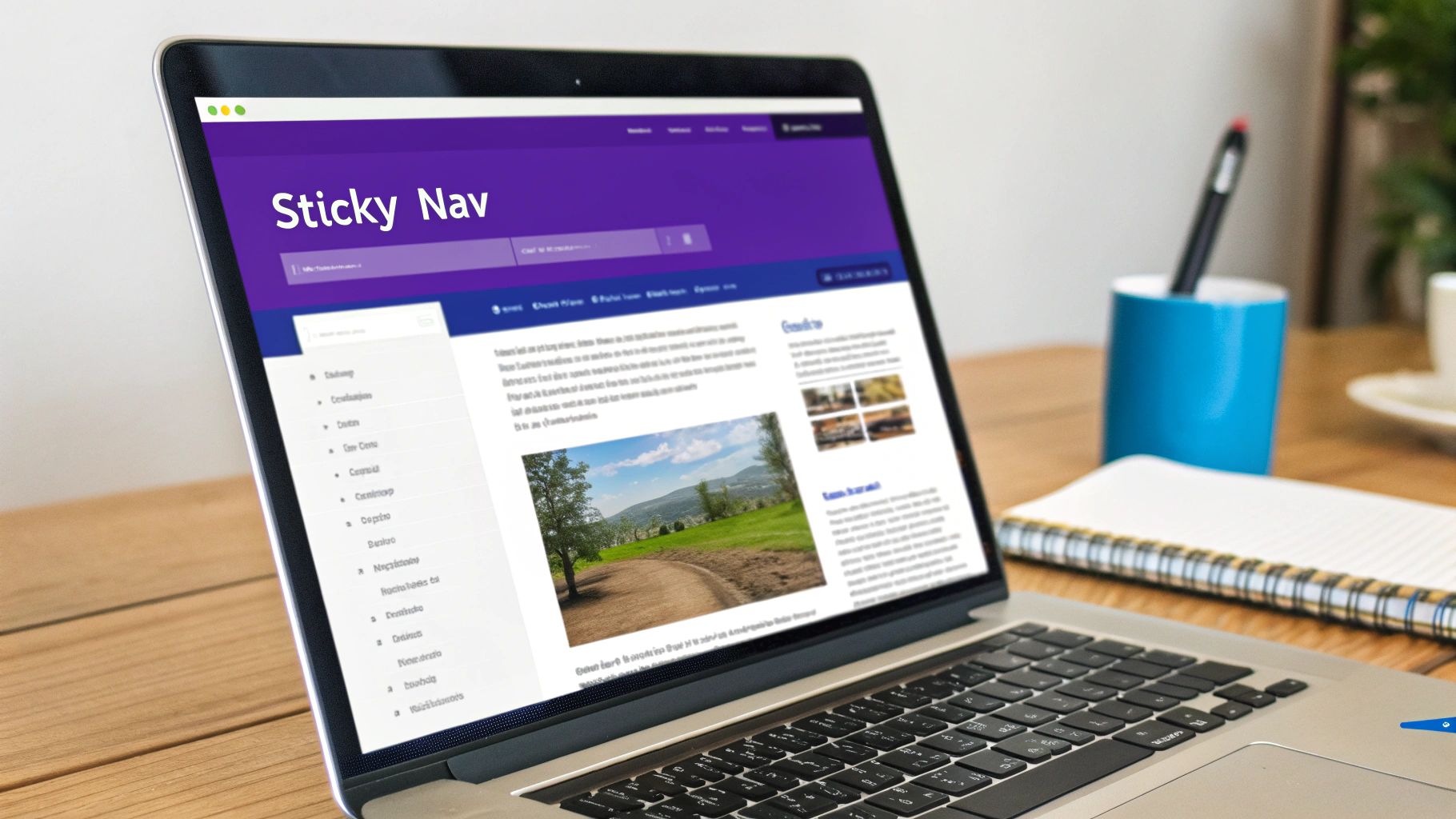
This approach significantly enhances user experience, especially on content-heavy pages or e-commerce sites where effortless navigation is critical. A well-executed sticky header keeps users oriented and reduces friction, guiding them smoothly through their journey.
Strategic Analysis: Stripe
A stellar example is Stripe, which uses a subtle yet powerful sticky header. Initially, their header is transparent over a hero section. As the user scrolls, it transitions to a solid background, creating a clear visual distinction from the page content.
- User Focus: The header contains only essential links: Products, Solutions, Developers, Resources, and Pricing. This avoids overwhelming the user.
- Action-Oriented: A prominent "Sign in" button is always accessible, catering to returning users without distracting new visitors.
- Seamless Transition: The shift from a transparent to a solid background is smooth and non-jarring, preserving a premium feel.
Key Insight: A sticky header doesn't have to be static. It can transform on scroll to save space or change context, a technique known as a "shrinking header." This makes the design less intrusive while retaining its navigational benefits.
Actionable Takeaways for Divi Users
Implementing this type of header design in Divi is highly effective. The Divi Theme Builder gives you precise control over its behavior.
- Keep it Lean: Aim for a height under 80px on desktop to avoid obscuring too much content.
- Add Subtle Effects: Use Divi’s scroll effects to change the header’s background color, shrink its size, or hide secondary elements as the user scrolls.
- Optimize for Mobile: Ensure your sticky header uses a hamburger menu on smaller screens to save precious vertical space.
- Test Performance: A poorly optimized header can cause scroll lag. Keep animations simple and test thoroughly on various devices.
For a comprehensive walkthrough on creating this effect, you can learn more about the basics of building website headers with Divi on divimode.com.
2. Hamburger Menu Header: The Minimalist Space-Saver
The hamburger menu header is a ubiquitous design pattern that hides the primary navigation behind a compact icon, typically three horizontal lines (☰). Initially conceived for mobile interfaces to conserve screen real estate, its clean, minimalist aesthetic has led to widespread adoption on desktop websites, especially those prioritizing a content-first or visually driven experience.
This design declutters the interface by tucking away navigation links until the user actively clicks the icon to reveal them. When implemented correctly, it creates a sleek, modern look. However, its effectiveness hinges on user recognition and intuitive interaction, as hiding navigation can sometimes impact discoverability.
Strategic Analysis: Spotify
A prime example of this header design in action is Spotify. On both its desktop and mobile web platforms, Spotify uses a hamburger menu to house key navigational elements like "Premium," "Support," and "Download," keeping the main interface focused on music discovery and the prominent "Log in" and "Sign up" calls-to-action.
- Content Focus: By concealing secondary navigation, the design directs the user’s full attention to the primary content and conversion goals.
- Brand Consistency: Using the hamburger menu across all devices creates a cohesive and predictable user experience, regardless of how a user accesses the service.
- Clear Interaction: The menu slides in smoothly from the side, providing a clear visual cue and a large, easily scannable list of options once opened.
Key Insight: The success of a hamburger menu depends on context. For sites with a clear, singular focus or a tech-savvy audience, it enhances minimalism. For complex sites with many primary categories, hiding navigation can be a usability risk.
Actionable Takeaways for Divi Users
Divi's Theme Builder and Menu module make creating a functional hamburger menu header straightforward for all screen sizes, not just mobile.
- Label for Clarity: Consider adding the word "Menu" next to the hamburger icon (☰) to remove any ambiguity for less experienced users.
- Use Smooth Transitions: In the Divi Menu module, use animation effects for the dropdown to make the reveal feel fluid and professional rather than abrupt.
- Implement a Full-Screen Overlay: For a more immersive experience, configure the menu to open as a full-screen overlay with your navigation links clearly displayed. This is a powerful option in Divi's Menu module settings.
- Ensure an Obvious Close Icon: When the menu is open, the hamburger icon should transform into a clear "X" to make closing the menu intuitive.
For a deeper dive into crafting effective menus for smaller screens, you can learn more about mobile menu design on divimode.com.
3. Hero Header: The Immersive Introduction
The hero header is a visually dominant design that merges navigation with a large, impactful "hero" section. This approach goes beyond simple navigation, using high-quality imagery, bold typography, and a compelling call-to-action (CTA) to create an immersive introduction that immediately captures visitor attention and communicates the brand's core message.
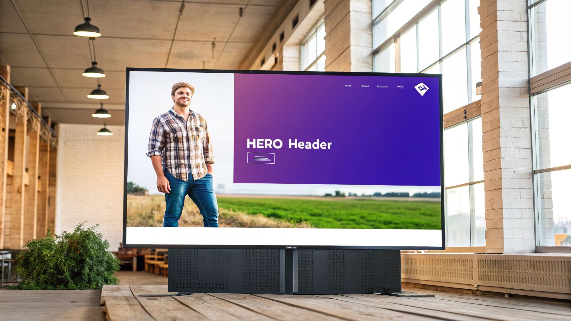
This design is highly effective for brands that want to make a strong first impression, guide users toward a single, primary action, or tell a powerful visual story. It serves as both a functional header and a strategic marketing tool right at the top of the funnel.
Strategic Analysis: Tesla
Tesla masterfully employs the hero header to showcase its products. The design is minimalist, clean, and places the vehicle front and center, creating an immediate sense of desire and innovation. The navigation is unobtrusive, allowing the stunning product visuals to do the heavy lifting.
- Product as the Hero: The entire viewport is dedicated to a high-resolution image or video of a car, making the product the undeniable focus.
- Minimalist Navigation: The top navigation bar is simple and slightly transparent, providing essential links without distracting from the main visual.
- Clear, Dual CTAs: Two prominent buttons, "Order Now" and "Demo Drive," offer clear, direct paths for users at different stages of the buying journey.
Key Insight: A hero header's success hinges on the synergy between its visual and textual elements. The headline must be concise and powerful, the imagery must be emotionally resonant, and the CTA must provide a clear, logical next step.
Actionable Takeaways for Divi Users
The Divi Theme Builder is perfect for creating stunning hero headers, as it allows you to combine sections, rows, and modules to craft a fully integrated design.
- Optimize Your Imagery: Use high-quality but compressed images (WEBP format is ideal) to ensure your hero section loads quickly. A slow-loading hero header defeats its purpose.
- Ensure Readability: Place a subtle overlay on your background image or video to ensure your headline text and navigation links have enough contrast to be easily readable.
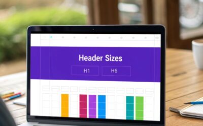
- Craft a Compelling Headline: Your H1 tag is critical here. It should be short, benefit-driven, and capture the essence of your offer.
- Test Your CTA: Use Divi's A/B testing features to experiment with different button colors, copy, and placement to maximize conversions.
For a visual guide on building a dynamic and engaging header section, this tutorial offers practical steps.
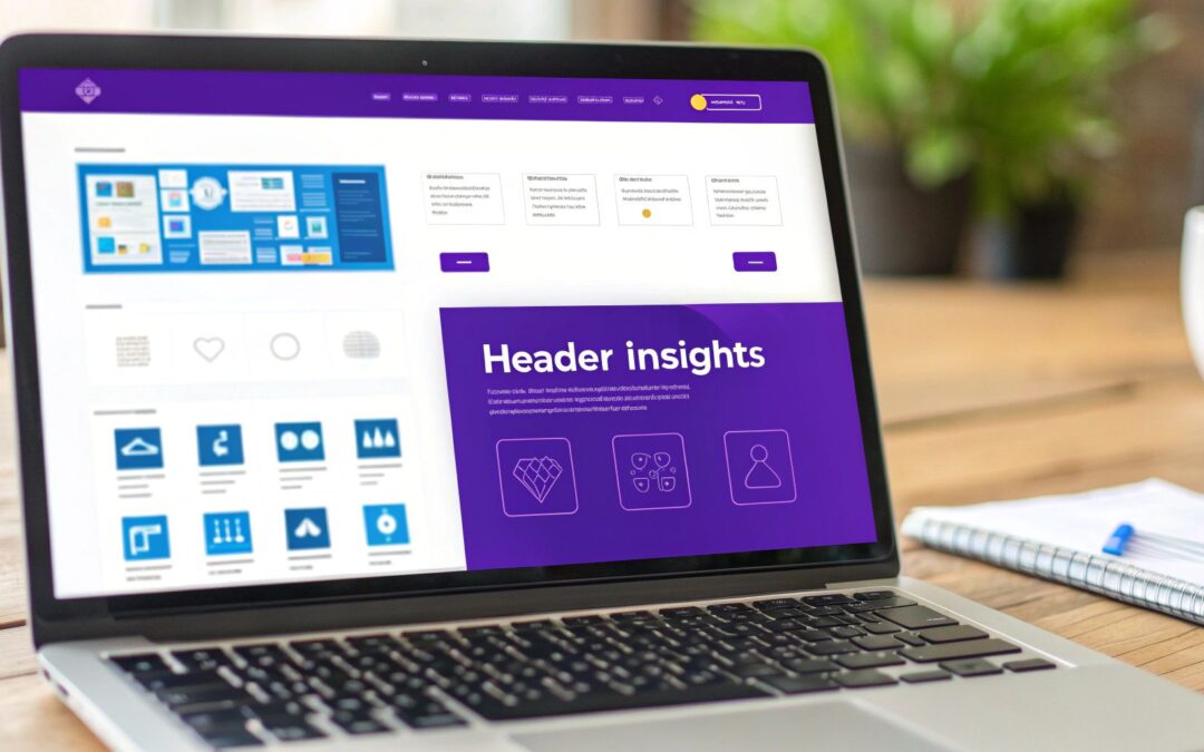
4. Mega Menu Header: The All-in-One Navigator
The mega menu header is a powerful solution for content-rich websites, transforming a standard dropdown into a large, multi-column panel. Instead of a simple list, it can display a rich tapestry of links, categories, images, and even interactive elements, offering a comprehensive overview of the site's architecture at a glance. This design is perfect for e-commerce stores, news portals, and large corporate sites with extensive offerings.
This infographic visualizes a typical mega menu's hierarchical structure, showing how top-level items branch into organized sub-links to streamline user navigation.
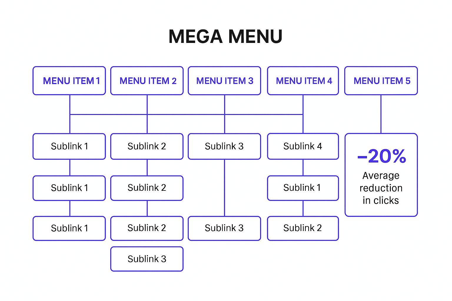
By grouping related content visually, a well-designed mega menu can significantly improve findability and reduce the number of clicks a user needs to make.
Strategic Analysis: Adobe
Adobe masterfully uses a mega menu to organize its vast suite of products and services. When a user hovers over "Creativity & Design," a clean, expansive menu appears, categorizing products by user needs like "Photo," "Graphic Design," and "Video."
- Logical Grouping: The menu uses clear headings and visual hierarchy to group products logically, preventing user overwhelm despite the large number of options.
- Visual Cues: Subtle icons and short descriptions accompany product links, helping users quickly identify the tool they need.
- Action-Oriented Links: Prominent calls-to-action like "View all products" and "See plans and pricing" are included directly within the menu, guiding users toward key conversion points.
Key Insight: A mega menu's strength lies in its ability to tell a story through structure. It’s not just a list of links; it’s a visual sitemap that reveals the breadth and depth of a website’s content without requiring a single click.
Actionable Takeaways for Divi Users
Implementing a mega menu is one of the more advanced header designs for websites, but Divi’s Theme Builder makes it manageable. A well-executed menu can dramatically boost usability on complex sites.
- Plan Your Hierarchy: Before building, map out your navigation structure. Group items into logical categories with clear, concise labels.
- Use Visuals Sparingly: Incorporate icons or small images to improve scannability, but avoid cluttering the menu. The goal is clarity, not a billboard.
- Design for Scannability: Use bold headings, whitespace, and columns to create a clear visual path for the user’s eye to follow.
- Prioritize Mobile: A full mega menu won't work on mobile. Design a streamlined, multi-level accordion or drill-down menu for smaller screens to ensure a good user experience.
You can learn how to build a powerful mega menu in Divi on divimode.com.
5. Minimalist Header: Simplicity as a Statement
The minimalist header design strips navigation down to its absolute essentials, championing the idea that less is more. This approach prioritizes content by eliminating visual clutter, typically featuring only a logo and the most critical navigation links. It creates a clean, sophisticated aesthetic that directs the user’s focus squarely on the website’s primary message or product.
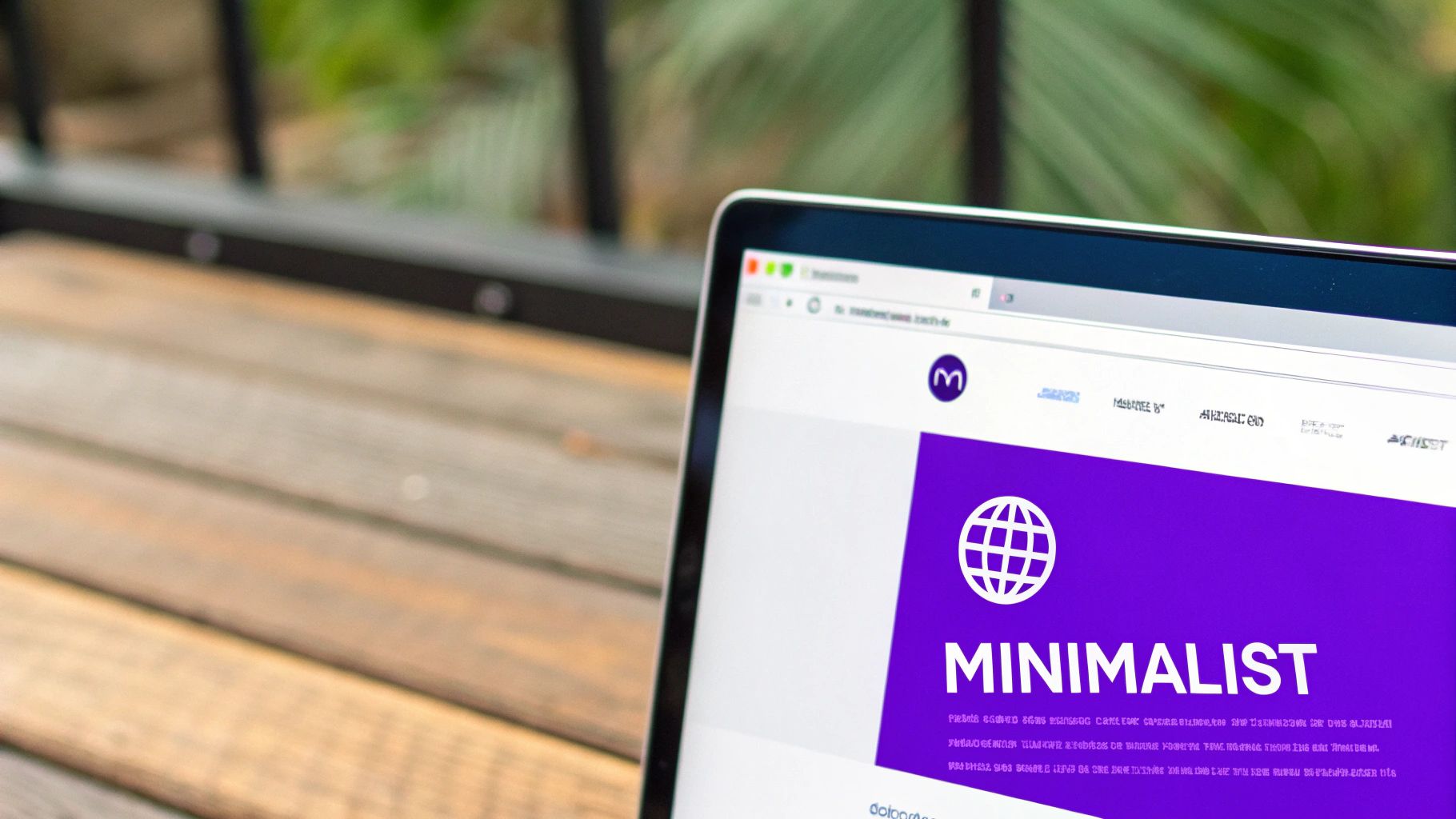
This design philosophy is particularly effective for portfolios, SaaS companies, and high-end brands where a calm, focused user experience is paramount. By removing distractions, a minimalist header enhances readability and projects an image of confidence and clarity, making it a powerful choice in modern header designs for websites.
Strategic Analysis: Apple
Apple is the quintessential master of minimalist design, and its website header is a perfect reflection of this ethos. The design is exceptionally clean, using negative space, a simple logo, and a highly curated set of product links.
- Content-First Focus: The header is deliberately unobtrusive, ensuring that the stunning product photography and marketing copy below it take center stage.
- Intuitive Navigation: Despite its simplicity, the navigation is highly effective. Key product categories are clearly labeled, with secondary items like "Support" and "Bag" icons providing functionality without adding wordiness.
- Premium Feel: The use of a subtle, semi-transparent background and refined typography (the custom "San Francisco" font) conveys a sense of premium quality and attention to detail.
Key Insight: Minimalism isn't about removing everything; it's about making every remaining element count. Every link, icon, and pixel of space in a minimalist header must have a clear purpose to guide the user effectively.
Actionable Takeaways for Divi Users
You can achieve this clean, focused look with the Divi Theme Builder by prioritizing precision and restraint.
- Perfect Your Spacing: Use Divi’s margin and padding controls to create generous negative space around your logo and menu items. Balanced spacing is the foundation of good minimalist design.
- Choose Typography Wisely: Select a single, highly readable font family. Use font weight and size variations, not different fonts, to establish a clear visual hierarchy.
- Implement Subtle Interactions: Use Divi’s hover options to add a simple color change or underline effect to menu links. These micro-interactions provide user feedback without creating visual noise.
- Ensure Accessibility: In a minimal design, color contrast is crucial. Ensure your text and background colors meet WCAG AA standards at a minimum to maintain readability for all users.
6. Split Navigation Header: A Study in Balance
The split navigation header is a sophisticated layout that divides navigation elements, creating a strong sense of visual balance and hierarchy. Typically, this design places the brand logo in the center, with primary navigation links split to the left and right. This arrangement draws immediate attention to the brand identity while keeping key navigation accessible.
This design is particularly effective for brands with a distinct visual identity and a limited number of primary navigation categories. By creating symmetry, it guides the user's eye naturally across the header, making it one of the more elegant header designs for websites focused on aesthetics and brand prominence.
Strategic Analysis: Starbucks
An excellent example of this design is Starbucks, which uses its header to reinforce its brand while simplifying navigation. The iconic logo sits squarely in the middle, acting as a visual anchor and a reliable "home" button.
- Brand Prominence: Placing the logo in the center makes it the undeniable focal point, reinforcing brand recognition with every page view.
- Hierarchical Clarity: Primary navigation ("MENU," "REWARDS," "GIFT CARDS") is on the left, while secondary actions ("Find a store," "Sign in") and a call-to-action ("Join now") are on the right. This cleanly separates browsing from action-taking.
- Symmetrical Design: The layout feels balanced and uncluttered, which mirrors the brand’s clean and modern coffeehouse aesthetic.
Key Insight: A split navigation header forces you to be selective with your main menu items. By limiting the space on either side of the logo, it encourages a more focused and streamlined information architecture that benefits the user.
Actionable Takeaways for Divi Users
The Divi Theme Builder makes creating a balanced split navigation header straightforward. You can use a multi-column row structure to achieve the perfect layout.
- Use a Three-Column Row: Dedicate the center column for your logo and the outer columns for your menu modules. This gives you precise control over spacing and alignment.
- Balance Your Menus: Assign distinct WordPress menus to each side. Keep the number of links roughly equal to maintain visual symmetry. For example, place three items on the left and three on the right.
- Plan Mobile Collapse: A split header will not work on mobile. Plan its collapse into a single hamburger menu early. Use Divi’s responsive controls to hide the split layout on tablet and mobile and show a mobile-friendly version instead.
- Maintain Visual Weight: Ensure the font sizes, styles, and button designs on both sides are consistent to avoid making one side feel heavier than the other.
7. Transparent/Overlay Header: The Immersive Introduction
The transparent or overlay header is a visually striking design where the header background is removed, allowing it to float directly over the page's hero section. This technique creates a seamless, immersive experience from the moment a user lands on the site, blending navigation with powerful imagery or video backgrounds. It's one of the most popular header designs for websites focused on aesthetics and strong first impressions.
This design choice is perfect for portfolios, creative agencies, and high-end brands that want to showcase a hero image without a solid header block breaking the visual flow. When executed well, it feels modern and elegant, drawing the user directly into the content. However, ensuring text legibility over a dynamic background is the primary challenge.
Strategic Analysis: Zara
Fashion giant Zara expertly uses a transparent header on its campaign-driven landing pages. The header elements (logo, search, login, cart) are placed over a full-screen video or high-fashion photograph, immediately establishing a sophisticated and brand-centric atmosphere.
- Legibility First: Zara ensures its white text and icons have a subtle, soft drop shadow, making them readable against both light and dark areas of the background video.
- Minimalist Approach: The navigation is stripped down to essential icons, preserving the impact of the visual content and avoiding a cluttered look.
- Contextual Transition: As the user scrolls down, the header often transitions to a solid white background, shifting from an immersive to a functional state for product browsing.
Key Insight: The success of a transparent header hinges on contrast and context. The header must remain legible against any part of the hero image while adapting its appearance once the user scrolls into different sections of the page.
Actionable Takeaways for Divi Users
The Divi Theme Builder makes creating this elegant header design straightforward, especially with its scroll effects and positioning controls.
- Ensure Readability: Place a semi-transparent gradient overlay on your hero section (from black at 20% opacity to transparent) to create a darker area for your header text.
- Use Scroll Effects: In the Divi Theme Builder, set the header section's default background to transparent. Then, use the Scroll Effects tab to add a solid background color on scroll, creating a seamless transition.
- Test on Multiple Backgrounds: Preview your transparent header over various images to ensure the logo and navigation links are always visible. You may need a "light" and "dark" version of your logo.
- Mobile Considerations: On mobile, a transparent header can be difficult to read. It's often better to switch to a solid-background sticky header on smaller screen sizes.
7 Popular Website Header Designs Comparison
| Header Type | Implementation Complexity 🔄 | Resource Requirements ⚡ | Expected Outcomes 📊 | Ideal Use Cases 💡 | Key Advantages ⭐ |
|---|---|---|---|---|---|
| Fixed/Sticky Header | Medium – requires CSS positioning and scroll optimization | Moderate – needs performance tuning for smoothness | Constant navigation visibility, higher conversions, better brand recall | Sites needing persistent navigation, CTAs | Improved UX, reduced bounce rates, constant access |
| Hamburger Menu Header | Low to Medium – toggle and animation logic needed | Low – minimal UI elements | Space saving, clean appearance, familiar UX | Mobile-first sites, content-focused layouts | Saves screen space, clean design, user familiar pattern |
| Hero Header | Medium to High – large media and overlay navigation | High – high-quality images/videos | Strong first impression, high conversions | Landing pages, product showcases | Powerful visual impact, clear value proposition |
| Mega Menu Header | High – complex multi-column dropdowns and rich content | High – extensive design and content | Efficient for deep navigation, improved SEO | Large catalogs, complex websites | Reduces clicks, featured content display, SEO benefits |
| Minimalist Header | Low – simple layout and limited elements | Low – minimal assets | Fast loading, clear focus, timeless design | Content-focused sites, portfolios | Excellent performance, usability, timeless style |
| Split Navigation Header | Medium – requires balanced layout and responsive handling | Moderate – balanced UI elements | Visually balanced, clear navigation hierarchy | Corporate sites, brands seeking symmetry | Professional look, balanced info hierarchy |
| Transparent/Overlay Header | Medium to High – dynamic opacity and contrast handling | Moderate to High – needs testing on backgrounds | Immersive experience, seamless integration | Portfolio sites, brands with strong visuals | Modern aesthetic, maximizes background impact |
Choosing and Building Your Perfect Header in Divi
We've journeyed through a diverse landscape of powerful header designs for websites, from the ever-present guidance of the sticky header to the immersive elegance of the transparent overlay. Each design serves a unique strategic purpose, acting as the digital handshake that introduces users to your brand and guides their experience. The examples showcased throughout this article are not just about aesthetics; they are masterclasses in user-centric design, each one a testament to how a well-crafted header can elevate a website from good to exceptional.
The core lesson is this: your header is not merely a container for your logo and navigation. It's the command center of your user's journey. It sets the tone, establishes brand credibility, and directly impacts usability and conversion rates. A minimalist header declutters the experience for a portfolio site, while a robust mega menu empowers shoppers on a sprawling e-commerce platform. The right choice is always a reflection of your site's specific goals and your audience's needs.
From Inspiration to Implementation
Understanding these strategies is the first step, but putting them into action is what truly matters. As a Divi user, you are uniquely equipped to translate these concepts into reality. The Divi Theme Builder provides a powerful, visual canvas for creating custom headers that break free from template constraints. You can build, test, and refine any of the styles we've discussed.
Here are your actionable next steps:
- Define Your Primary Goal: Before you open the builder, ask yourself: what is the single most important action I want a user to take from my header? Is it to "Shop Now," "Request a Quote," or "Explore Our Work"? This will dictate your CTA's prominence.
- Audit Your Content: Map out your site's primary pages and user flows. Does your structure demand the organizational power of a mega menu, or would a streamlined split navigation better serve your key conversion funnels?
- Prototype and Test: Use the Divi Theme Builder to create a few different header variations. Test how a fixed header feels versus a transparent one on your key landing pages. Don't be afraid to experiment to find the perfect fit for your brand and content.
Mastering these header designs for websites is a skill that pays dividends. A thoughtfully designed header builds trust, reduces friction, and guides users toward their goals and yours. It’s an investment in user experience that enhances every other aspect of your site, ensuring the first impression is both beautiful and highly functional.
Ready to take your Divi headers to the next level with advanced features and pre-built layouts? Explore the extensive library of professional Divi modules and layouts from Divimode. Our tools empower you to build sophisticated, high-converting header designs for websites faster than ever before. Visit Divimode to unlock your creative potential.
More Articles You Will Like