A custom WooCommerce checkout page is your chance to ditch the generic, one-size-fits-all layout and create a branded, smooth experience designed to stop cart abandonment in its tracks. It's not just a facelift; it's a powerful business tool that gives you complete control over the most critical step in the entire customer journey.
Why Your Default Checkout Is Costing You Sales
The standard WooCommerce checkout works, but let's be honest, it's far from perfect. It’s a generic solution that often throws up unnecessary roadblocks, causing potential buyers to get cold feet right at the finish line. This isn't just a minor design hiccup; it's a direct bottleneck choking your revenue.

The Hidden Friction Points
Think about it from the customer's perspective. They found your product, loved it, and confidently added it to their cart. Then they land on a checkout page that feels totally disconnected from your brand. It might demand too much information, or the layout is just plain confusing.
This is exactly where doubt creeps in. These small frustrations pile up and contribute to a massive problem for online stores. In fact, cart abandonment rates for WooCommerce hover around a staggering 70%. A closer look reveals that 18% of customers bail simply because the checkout process is too long or complicated. The good news? Stores that switch to a streamlined, custom checkout can see their conversion rates jump by as much as 30%.
Let’s quickly compare the default experience with what's possible when you take control.
Default vs. Custom WooCommerce Checkout At a Glance
This table breaks down the common pain points of the standard checkout and how a custom design directly solves them.
| Feature | Default WooCommerce Checkout | Custom WooCommerce Checkout |
|---|---|---|
| Brand Experience | Generic, unbranded layout that feels disconnected. | Fully branded design that builds trust and reinforces credibility. |
| User Flow | Often has too many fields, some of which are unnecessary. | Streamlined, multi-step, or single-page flow tailored to your products. |
| Distractions | Includes standard site header, footer, and other links. | Distraction-free design that keeps the user focused on payment. |
| Upsells | No native way to add order bumps or related offers. | Strategically placed order bumps to increase average order value. |
| Mobile Experience | Functional, but can be clunky and hard to navigate. | Optimized for mobile with touch-friendly fields and a clear layout. |
| Trust Signals | Lacks dedicated space for testimonials or security badges. | Prime real estate for social proof, trust seals, and guarantees. |
As you can see, moving away from the default isn't just a minor tweak—it's a strategic overhaul of the most important page on your site.
A Strategic Opportunity for Divi Users
For those of us using Divi, this challenge is really a massive opportunity. Building a custom WooCommerce checkout page is about so much more than aesthetics. It's about grabbing the reins of the user experience when it counts the most.
By moving beyond the default, you can:
- Reinforce Brand Credibility: A cohesive, branded checkout feels professional and makes customers feel secure handing over their payment info.
- Increase Average Order Value: A custom layout is the perfect place to strategically add relevant order bumps or last-minute offers.
- Reduce Distractions: You can finally remove that distracting header, footer, and sidebar links that tempt shoppers to click away.
A custom checkout page transforms the final step from a transactional hurdle into a seamless part of your brand experience. It reassures customers they made the right choice, directly impacting your bottom line.
Ultimately, fixing the flaws in the default system is a critical move for any serious e-commerce store. If you're bleeding sales at the last minute, you should also check out our guide on how to reduce cart abandonment for more powerful strategies.
Visually Crafting Your Checkout with Divi and Divi Areas Pro
For those of us who live and breathe Divi, building a custom WooCommerce checkout page is one of the most satisfying ways to take back control of the user experience. You're no longer stuck with the default, one-size-fits-all template. Instead, you can lean on the familiar Divi Builder to piece together a layout that’s not just beautiful, but strategically built to convert. This is about more than just a fresh coat of paint; it's about redesigning the entire flow.
The whole idea is to start with a blank canvas—a new page—and construct the checkout experience using Divi's own WooCommerce modules. This method is a game-changer for designers who want total creative freedom without having to get their hands dirty with PHP. It lets you build a focused, distraction-free environment that gently nudges customers toward that final click.
Setting Up Your Custom Checkout Page
First things first, you'll need to create a new page in WordPress and fire up the Divi Builder. The objective here is to design a clean slate. I almost always use a blank page template for this, as it strips away the site's default header and footer. It's a simple move, but it's incredibly effective at removing tempting navigation links that could pull a shopper away at the most critical moment.
With your blank page ready, it's time to add the core checkout components. Divi comes packed with several WooCommerce-specific modules that are essential for this task.
- Woo Checkout Billing: This module pulls in all the necessary billing fields—name, address, email, you name it.
- Woo Checkout Shipping: Use this to display the shipping address form. Of course, if you're only selling digital goods, you can just hide this.
- Woo Checkout Order: This is the order summary box where customers can review their items, subtotals, and shipping costs.
- Woo Checkout Payment: Here’s where you’ll present the available payment gateways, like Stripe or PayPal.
Because these are all individual modules, you can arrange them however you see fit. A popular and effective layout is a modern two-column design, with billing and shipping details on one side and the order summary on the other. This simple visual separation makes a long form feel much less overwhelming.
Enhancing the Experience with Divi Areas Pro
While the Divi Builder gives you the structural foundation, Divi Areas Pro is the secret weapon that takes your checkout from functional to exceptional. It’s what lets you inject dynamic content exactly where it’s needed most, using smart triggers and conditions that react to what your users are doing. This is where you can add the kind of powerful, conversion-boosting elements that a standard checkout just can't handle.
Picture this: a customer is on the verge of buying but starts to move their mouse toward the back button. With Divi Areas Pro, you could trigger a last-second, exit-intent popup offering a small discount. That one little interaction can mean the difference between a completed sale and another abandoned cart.
Here’s a glimpse at the kind of powerful conditional logic you can tap into with Divi Areas Pro to control what content shows up, and when.
This interface really shows off the granular control you have. You can display content based on user roles, what page they're on, or even the device they're using, making your checkout truly responsive to the individual user.
For a deeper look into setting up these rules, check out this guide on displaying content with Divi Areas Pro to see just how flexible this tool can be. It really unlocks a ton of possibilities for personalizing the checkout journey.
Practical Applications for Conversion
The real magic happens when you combine Divi's layout control with Divi Areas Pro's dynamic content. You're no longer just building a form; you're crafting a persuasive final step in your customer's journey.
Think about adding these kinds of high-impact elements:
- Inject Trust Seals: Use a Divi Area to drop security badges (like SSL certificates or payment logos) right below the payment module. This is a huge trust signal.
- Display Customer Testimonials: A small, rotating testimonial slider placed just above the "Place Order" button can provide the social proof a hesitant buyer needs to feel confident.
- Offer Dynamic Help: Create a helpful tooltip or a small popup that explains shipping options when a user hovers over that section. Proactive support like this smooths out friction points.
The combination of Divi's layout control and Divi Areas Pro's dynamic content injection turns your checkout page into a responsive, intelligent sales tool that actively works to close the deal.
Polishing the Final Design with CSS
Even with all the power of Divi, a few lines of custom CSS can add that final layer of professional polish. For instance, you might want to tweak the styling of the form field labels or change the color of the "Place Order" button so it perfectly matches your brand's main call-to-action color.
Adding these small adjustments through the Divi Custom CSS panel or your child theme’s stylesheet ensures every single element on the page is perfectly on-brand. This kind of attention to detail contributes to a trustworthy and seamless checkout experience, which ultimately builds customer confidence and boosts your bottom line.
Leveraging Specialized Checkout Plugins for Faster Results
While building a custom layout with Divi gives you incredible creative freedom, sometimes you just need advanced functionality right out of the box. This is where specialized checkout plugins really shine. These aren't just simple add-ons; they are purpose-built tools designed to completely replace the default WooCommerce checkout flow with a high-performance, conversion-focused experience—often with just a few clicks.
If you need to implement complex sales funnels or simply want a modern, multi-step checkout without touching a line of code, these plugins are your fastest path to a professional result. They do all the heavy lifting, letting you focus on your sales strategy instead of wrestling with development.
This decision tree can help you figure out which path—total creative control or feature-rich speed—makes the most sense for your project.
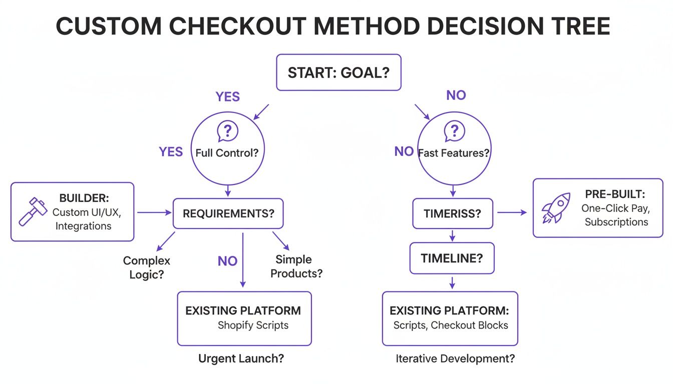
The key takeaway here is that your primary goal should dictate your approach from the start. Are you after total design control, or do you need to deploy advanced features as quickly as possible?
When to Choose a Dedicated Plugin
A dedicated plugin becomes the clear choice when your project goals go beyond simple layout tweaks. These tools come packed with features that would otherwise require a ton of custom development work.
You should seriously consider a plugin if you need to:
- Implement Sales Funnels: Quickly add one-click upsells, order bumps, and post-purchase offers to boost your average order value.
- Simplify the User Experience: Offer a sleek, distraction-free, multi-step checkout. Breaking the process into smaller chunks reduces cognitive load for the customer and can seriously cut down on abandonment.
- Deploy Express Checkouts: Easily integrate one-click payment options like Apple Pay and Google Pay, which mobile shoppers are increasingly coming to expect.
These plugins are especially valuable for stores with a large catalog or those running aggressive marketing campaigns where squeezing every last dollar out of each transaction is critical.
Comparing Top Solutions: FunnelKit and CheckoutWC
In the world of WooCommerce checkout customization, two names pop up constantly: FunnelKit (which used to be WooFunnels) and CheckoutWC. While both aim to improve the checkout experience, they cater to slightly different needs.
FunnelKit is an all-in-one sales funnel builder. Its real strength is creating sophisticated, multi-step funnels. If your main goal is to maximize average order value with strategically placed offers, FunnelKit is an absolute powerhouse. It’s perfect for businesses selling digital products, courses, or physical goods where cross-selling is a core part of the sales strategy.
CheckoutWC, on the other hand, is laser-focused on perfecting the checkout experience itself. It replaces your default page with a beautiful, three-step checkout that feels incredibly smooth and modern. Its primary mission is to reduce friction and cart abandonment by making the process as simple as possible. If your priority is a clean, fast, and user-friendly interface that inspires confidence, CheckoutWC is an excellent choice.
Choosing between them really comes down to your primary objective. Do you need a robust sales engine with upsells and downsells (FunnelKit), or do you need a flawlessly streamlined and modern user interface to reduce friction (CheckoutWC)?
With WooCommerce now processing a staggering 23% of all global online orders, a custom page is essential to capitalize on this volume. By simplifying fields and enabling guest checkout, stores can cut abandonment by 20%. Even better, a load time under two seconds can lead to 40% higher conversions.
Integrating with Divi and Payment Gateways
The good news is that both FunnelKit and CheckoutWC play nicely with Divi. They typically take over the checkout page using their own template, but you can still use the Divi Builder to create custom headers, footers, or content sections to display around the checkout form. This lets you maintain brand consistency while getting all the benefits of the plugin’s core functionality.
When you're choosing a checkout plugin, don't forget about your payment gateway. It's crucial to ensure compatibility, security, and the right fit for your business needs. A detailed payment gateway comparison can be an invaluable resource in making this decision, especially if you have specific or high-risk requirements. Ultimately, pairing the right plugin with the right gateway creates a seamless transaction process that builds customer trust and drives revenue.
Gaining Granular Control with Code Snippets and Hooks
While visual builders and plugins offer fantastic speed and convenience, there are times when you need surgical precision that only code can provide. For developers and anyone comfortable with a bit of PHP, WooCommerce hooks and filters are the keys to unlocking a truly custom checkout. This approach gives you a level of control that visual tools simply can't match, letting you modify the very DNA of the checkout process.
This method isn’t about reinventing the wheel. It's about making small, targeted adjustments to the default WooCommerce structure. By using a child theme and adding code snippets to your functions.php file, you can modify fields, rearrange sections, and add new functionality without ever touching the core WooCommerce plugin files. This is mission-critical for ensuring your customizations are safe from being overwritten during future updates.
Setting Up Your Child Theme
Before you write a single line of code, the absolute first step is to have a child theme active. Any custom PHP you add should live in your child theme's functions.php file. Honestly, this practice is non-negotiable for maintaining a stable and updatable website.
Without a child theme, any changes you make directly to your parent theme's files will be completely wiped out the next time the theme is updated. That can break your checkout and cause some serious headaches. If you're using Divi, creating a child theme is a straightforward process and the essential foundation for any custom development work.
Rearranging Checkout Fields with Hooks
One of the most common requests I get is to reorder the checkout fields. By default, WooCommerce follows a standard sequence, but this might not align with the logical flow your customers expect. For example, maybe you want to move the email field to the very top to capture it early in the process.
This is where the woocommerce_checkout_fields filter hook comes into play. It gives you direct access to an array of all the checkout fields, allowing you to unset them, add new ones, or just change their order.
Let's say you want to move the billing email field to be the first field in the form. You can get that done with a simple PHP snippet.
add_filter( 'woocommerce_checkout_fields' , 'custom_reorder_checkout_fields' );
function custom_reorder_checkout_fields( $fields ) {
$fields['billing']['billing_email']['priority'] = 1;
return $fields;
}
By changing the priority value, you can dictate the exact order of appearance. Lower numbers come first. It’s a clean, efficient way to optimize the form's flow without needing a bulky plugin.
Removing Unnecessary Checkout Fields
Another powerful tweak is removing fields that don't apply to your business. A leaner form is almost always a better-converting form. If you don't need the "Company name" or a second address line, getting rid of them reduces clutter and friction for the user.
You can use the same woocommerce_checkout_fields hook to remove fields entirely. This is done by "unsetting" the specific field from the fields array.
add_filter( 'woocommerce_checkout_fields' , 'custom_remove_checkout_fields' );
function custom_remove_checkout_fields( $fields ) {
unset($fields['billing']['billing_company']);
unset($fields['shipping']['shipping_company']);
return $fields;
}
This snippet removes the company field from both the billing and shipping sections. You can apply this logic to any non-essential field, creating a much simpler and faster checkout experience for your customers.
The real power of hooks is their ability to make precise, targeted changes. You're not overriding the entire checkout template; you're just fine-tuning the parts that matter most to your specific business needs.
Adding a Custom Field to Your Checkout
What if you need to collect extra information, like delivery instructions or a gift message? Hooks make this possible, too. You can add a completely new field to the checkout form and save the data to the order meta.
This involves using the woocommerce_after_checkout_billing_form action hook to display the field and then hooking into woocommerce_checkout_create_order to save the submitted data. It's a bit more involved, but it shows the deep level of customization available. This approach is highly flexible and far more lightweight than installing a dedicated "custom fields" plugin for a simple addition.
These code-based customizations are incredibly powerful, and they build on the same foundational principles you might use elsewhere in your store. For instance, if you're comfortable with these snippets, you can apply similar logic to modify your WooCommerce product page and create a cohesive, custom experience across the entire customer journey.
When you're implementing custom code, it's always wise to consider long-term maintainability. Thinking about strategies for reducing technical debt ensures your codebase remains clean, efficient, and easy to manage as your store grows. Trust me, this forward-thinking approach will save you countless hours down the road.
Optimizing Your New Checkout for Maximum Conversions
So, you’ve built a beautiful, custom WooCommerce checkout page. That’s a huge win, but design is only half the battle. Now comes the real work: turning that polished design into a high-performance conversion machine.
This is where we move beyond just aesthetics and dive deep into the strategic details that actually persuade customers to complete their purchase.
It’s all about Conversion Rate Optimization (CRO), which is really a fancy term for continuous improvement. You'll need to analyze how users behave, test different elements, and fine-tune your page to eliminate every last bit of friction. A well-optimized checkout doesn’t just look good; it actively builds trust, reduces anxiety, and guides users smoothly across the finish line.
Building Unshakeable Trust and Credibility
When a customer is about to hand over their credit card details, trust is non-negotiable. Your custom checkout is the perfect place to reinforce their confidence with powerful social proof and security signals.
Think beyond just slapping an SSL lock icon somewhere. You need to strategically place these trust-builders where they’ll have the most impact.
- Prominent Trust Seals: Display logos from payment providers like Stripe and PayPal directly within the payment section. This visual reassurance confirms you’re using reputable gateways they already know and trust.
- Customer Testimonials: A short, impactful quote from a happy customer placed near the "Place Order" button can be the final nudge a hesitant buyer needs.
- Clear Guarantees: Showcase your money-back guarantee, satisfaction promise, or secure checkout badges. These reduce the perceived risk and make the purchase feel much safer.
By weaving these elements into your design, you’re not just asking for a sale—you’re earning it by proving your store is credible and trustworthy.
Slashing Friction with a Simplified User Experience
Every unnecessary field and confusing step is a friction point, and friction is a notorious conversion killer. Study after study confirms that long or complicated checkout processes are a top reason for cart abandonment. Streamlining your custom WooCommerce checkout page directly tackles the 18% of abandonments caused by an overly complex process.
The goal is to make the entire experience feel effortless. Consider this: checkouts that load in under two seconds can boost conversions by a whopping 40%, while a clean one-page design can add another 30% lift. And on mobile, where the abandonment rate can be a staggering 85% compared to desktop, speed and simplicity are absolutely critical. You can dig into more insights on improving WooCommerce checkouts on hostinger.com.
Your objective should be to create a checkout so simple that the user doesn’t even have to think. The path to purchase should be obvious, intuitive, and lightning-fast.
This means ruthlessly cutting optional fields, enabling address auto-completion, and always offering a guest checkout option. Every click you save is a small victory that contributes directly to a higher conversion rate.
The Non-Negotiable Role of A/B Testing
You can follow every best practice in the book, but you won't truly know what works for your audience until you test it. A/B testing is the bedrock of effective conversion optimization. It’s how you make data-driven decisions instead of just guessing what your customers want.
Start by testing the big stuff. Don't get bogged down in tiny color changes right away. Focus on changes that can produce significant, measurable results.
Here are a few powerful A/B tests you can run on your new checkout page:
- Headline Variations: Test a benefit-driven headline (e.g., "You're a Few Clicks from Better Sleep") against a simple, direct one ("Secure Checkout").
- Call-to-Action Text: Does "Complete My Order" outperform "Place Order Now"? The specific wording can have a surprising impact on user psychology.
- Form Layout: Compare a single-column layout against your two-column design. One might feel less intimidating and more straightforward to your customer base.
Use a tool like Google Optimize or VWO to run these tests. Make sure you let each test run long enough to gather statistically significant data, then implement the winning variation. This iterative process of testing, learning, and refining is exactly how you transform a good checkout page into a great one.
Common Questions About Custom WooCommerce Checkouts
Even after you've picked your tools and mapped out a plan, a few questions always seem to pop up when building a custom WooCommerce checkout page. I get these all the time from store owners and designers, so let's tackle the big ones head-on.
Think of this as your quick-reference guide for clearing those final hurdles. Whether you’re worried about plugin conflicts, security, or how an update might undo all your hard work, these answers should give you the confidence to push forward.
Will Customizing My Checkout Page Break My Site During Updates?
This is a huge—and totally valid—concern. Nobody wants to see their beautiful checkout revert to the default after a routine update. The short answer is: it depends entirely on how you built it.
If you got your hands dirty and edited your parent theme's files directly (like page.php or functions.php), then yes, you're in for a bad time. Those changes will almost certainly be wiped out. This is exactly why a child theme is non-negotiable for any kind of code-based customization.
Here’s a quick breakdown of the safe routes:
- The Child Theme Method: Any custom PHP or CSS you add to a child theme's
functions.phpor stylesheet is protected. This is the industry-standard way to do it. - The Divi Builder Method: When you build your checkout on a standard page using Divi modules, you're completely insulated from theme updates. It's one of the biggest perks of this approach.
- Dedicated Plugins: Tools like FunnelKit or CheckoutWC are built to be self-contained. Their developers handle the updates, and your settings are always preserved.
Key Takeaway: The safest paths are using a child theme for your code, a page builder like Divi for design, or a well-supported plugin. Just promise me you'll never edit core theme or plugin files directly.
Can I Have Different Checkout Pages for Different Products?
Absolutely, and you should! This is a fantastic strategy for bumping up conversions. You might want a super-simple, one-click style checkout for a digital download, but a more detailed form for a complex product with shipping variations and add-ons.
You've got two main ways to pull this off:
- Using a Funnel Builder Plugin: This is where tools like FunnelKit really shine. They're designed to let you create product-specific sales funnels, each with its own unique checkout page. You can set it up to trigger a specific checkout flow based on what’s in the cart.
- Custom Code with Conditionals: For the developers out there, you can use PHP to load different checkout templates or apply specific hooks depending on the contents of the cart. It requires more technical chops but gives you ultimate control.
For most folks, a funnel builder plugin is the most direct and manageable way to create and maintain multiple checkout experiences.
How Do I Ensure My Custom Checkout Is Secure?
Security is non-negotiable, especially when you're handling payment details. The good news is that WooCommerce and the big-name payment gateways do most of the heavy lifting. Your main job is to make sure the environment around the transaction is locked down.
Here’s what you need to focus on:
- Use an SSL Certificate: This isn't optional anymore. Your entire site, and most critically your checkout page, must be served over HTTPS to encrypt the data exchanged between your customer and the server.
- Choose Reputable Plugins: Only install well-vetted, regularly updated plugins for anything related to your checkout. A poorly coded plugin can easily open up security holes.
- Rely on Trusted Payment Gateways: Gateways like Stripe and PayPal use their own secure, tokenized systems to process credit card numbers. The sensitive data never actually touches your server, which dramatically reduces your security risk and PCI compliance burden.
Your design work—the CSS, the layout, the text—generally doesn't touch this core security infrastructure. Just stick to best practices and use tools with a solid reputation.
Ready to build a checkout that doesn’t just process payments, but actively boosts them? Divimode provides the tools and expert guidance you need. With Divi Areas Pro, you can easily add dynamic popups, trust seals, and targeted offers to your custom WooCommerce checkout page, turning a simple form into a powerful sales machine. See what you can create at https://divimode.com.
More Articles You Will Like