
 Alex Martin
If you’re not thinking about how your website looks and works on a phone, you're already behind. Making your site mobile-friendly isn't just about shrinking your desktop design; it's about using responsive design to create a layout that intelligently adapts to any screen it's viewed on.
This means your grids need to be fluid, your images flexible, and your CSS smart enough to re-arrange content for phones, tablets, and everything in between. The goal is simple: let people read and navigate your site without the dreaded pinch-and-zoom or horizontal scrolling.
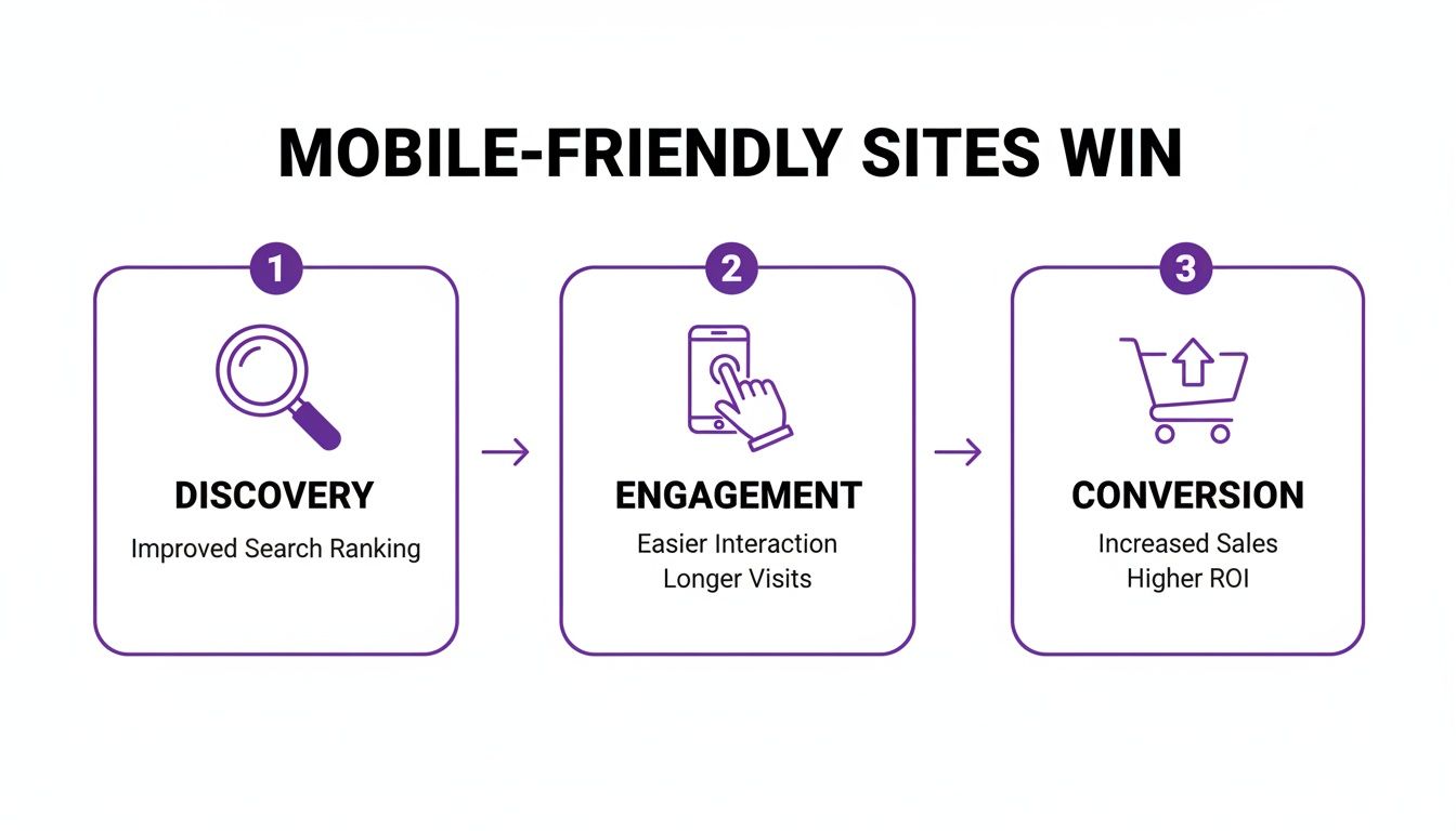
Why a Mobile Friendly Website Is Non-Negotiable
Treating your mobile site as an afterthought is a surefire way to become irrelevant. Your audience is already on their phones, and if your site is a clunky, frustrating mess, they'll bounce to a competitor without a second thought. This isn't just about looking good; it's about the health of your business.
The shift in how people browse the web has been massive. By mid-2025, it's expected that mobile devices will drive roughly 62–64% of all global web traffic. Think about that: for every ten visitors, at least six are likely using a smartphone. This trend exploded from under 1% in 2009 to over 50% by late 2016. Businesses still clinging to a desktop-first mindset are actively pushing away the majority of their potential customers.
The Real-World Impact on Your Business
A bad mobile experience directly hits your wallet and your visibility. When someone lands on a page they can't easily read or use, they leave. That high bounce rate tells search engines your site isn't helpful, which can tank your rankings over time. For a closer look at how this works, check out this great resource on the importance of a mobile-first approach for website ranking.
On the flip side, a great mobile site builds trust and gets people to take action.
Here's what a mobile-first strategy really does for you:
- A Better User Experience: When visitors can find what they need without a struggle, they stick around longer.
- Higher Conversion Rates: A whopping 61% of consumers say they're more likely to buy from a business with a well-designed mobile site. Smooth navigation and simple forms make it easy for them to say "yes."
- A Big SEO Boost: Google switched to mobile-first indexing years ago. This means the mobile version of your site is the baseline for how it ranks everything. If you're using WordPress, you'll want to read up on the impact of mobile optimization on WordPress SEO.
The expectations of a mobile user are completely different from someone sitting at a desktop. This isn't just about screen size; it's about context, attention span, and intent.
Mobile vs Desktop User Expectations
| Consideration | Mobile User Experience | Desktop User Experience |
|---|---|---|
| User Goal | Quick answers, task completion (e.g., find hours, make a call). | In-depth research, content consumption, complex tasks. |
| Attention Span | Shorter, often multi-tasking and on-the-go. | Longer, more focused and willing to read. |
| Navigation | Simple, thumb-friendly menus. Minimal clicks. | Complex menus, sidebars, and multi-level navigation are acceptable. |
| Content Priority | Key information first. "Above the fold" is critical. | More tolerance for scrolling to find information. |
| Interaction | Touch, tap, swipe. Buttons and links need to be large. | Precise clicks with a mouse. Smaller targets are okay. |
| Connection Speed | Often relies on cellular data, which can be slower. | Typically stable, fast Wi-Fi or wired connections. |
Understanding these differences is key. You're not just designing for a smaller screen; you're designing for a different mindset and environment.
In short, a mobile-friendly website isn't an isolated technical task. It's a fundamental part of your customer acquisition, user retention, and brand credibility strategy. Every pinch, zoom, and frustrating tap costs you potential customers.
Getting the Fundamentals of Responsive Design Right
To make a website that works beautifully on mobile, you have to stop thinking in terms of fixed, rigid designs. The old way of building for one screen size is dead. Instead, we need to create something that flows and adapts to the countless screen sizes out there. That's the real core of responsive web design.
The goal is to build one website that delivers a fantastic experience for everyone, whether they're on a tiny 4-inch phone or a massive 27-inch desktop monitor. This isn't just a "nice-to-have" anymore; it's what your visitors expect.
And it's not just about looks. A smooth mobile experience is what connects a user's first visit to a final sale, making it a non-negotiable part of any real growth strategy.
As you can see, getting the mobile experience right is the bridge between user engagement and hitting your business goals.
Build with Fluid Grids
The entire foundation of a responsive layout is the fluid grid. This means you stop defining your layout elements with fixed units like pixels (px) and start using relative units, most commonly percentages (%).
Think about a standard layout: a main content area and a sidebar. In a fixed design, you might have set the content to 800px and the sidebar to 400px. That's fine on a big screen, but on a phone, it completely breaks the layout and forces that dreaded horizontal scrollbar.
With a fluid grid, you'd define them as proportions. The content area could be 66.66% of the screen width, and the sidebar 33.33%. Now, no matter how wide or narrow the screen gets, those elements always take up their designated slice of the available space. It's a simple change that creates a naturally adaptive structure.
Make Images and Media Flexible
There's nothing that ruins a mobile layout faster than a giant, static image. If an image has a fixed width of 800px, it's going to spill out of its container on a 375px phone screen, wrecking the entire user experience.
The fix is surprisingly simple: make your images and other media (like videos or iframes) flexible. You can handle this with a single, powerful CSS rule that I use in pretty much every project:
img, video, iframe {
max-width: 100%;
height: auto;
}
This tiny snippet does two crucial things:
max-width: 100%: This tells the browser that the image can never be wider than the container it's in. If the container shrinks, the image gracefully scales down with it.height: auto: This makes sure the image keeps its original aspect ratio as it resizes, so it never looks stretched or squished.
Honestly, this little piece of code is one of the most important things you'll learn on your journey to making a website mobile-friendly.
Use CSS Media Queries to Set Breakpoints
Fluid grids and flexible images will get you about 80% of the way there. But sometimes, a layout that works great on a tablet still feels too cramped or awkward on a smartphone. That's where CSS media queries come into play.
Think of media queries as "if/then" statements for your CSS. They let you apply specific styles only when certain conditions are met—most often, the width of the browser window. The points where these rules kick in are called breakpoints.
A breakpoint is a specific viewport width where your website's layout changes to better suit the screen size. It's the point where you might stack columns, increase font size, or switch to a mobile-friendly navigation menu.
If you want to go deeper into the technical side, our guide on https://divimode.com/responsive-design-with-css/ covers these concepts from top to bottom.
Here’s what a media query looks like in practice:
/* Default styles for desktops and larger screens */
.container {
display: flex;
}
.main-content {
width: 70%;
}
.sidebar {
width: 30%;
}
/* Media query for tablets and phones (768px or smaller) */
@media (max-width: 768px) {
.container {
flex-direction: column;
}
.main-content, .sidebar {
width: 100%;
}
}
In this example, on any screen wider than 768px, the content and sidebar sit next to each other. But as soon as the screen gets narrower than 768px, the media query activates. It changes the layout to a single column, stacking the sidebar below the main content and making each one take up 100% of the width.
This fundamental shift ensures your content is always readable and easy to navigate without any horizontal scrolling. To dig even deeper into creating interfaces that really work, check out these proven strategies for mobile friendly website design. Mastering this technique is at the very heart of great mobile design.
Designing for Touch Instead of Clicks
Getting your layout to reflow on smaller screens is a great start, but it's only half the story. A truly mobile-friendly website needs to feel right in someone's hands. This means shifting your design mindset away from the pixel-perfect accuracy of a mouse cursor and toward the clumsy, real-world imprecision of human thumbs.
Think about how you hold your phone right now. Chances are, you’re navigating with one hand, and your thumb is doing all the work. This creates a natural "thumb-friendly" arc across the bottom and middle of the screen—this is prime real estate. Placing your most critical interactive elements, like navigation icons or "Add to Cart" buttons, right in this zone makes your site feel effortless to use.
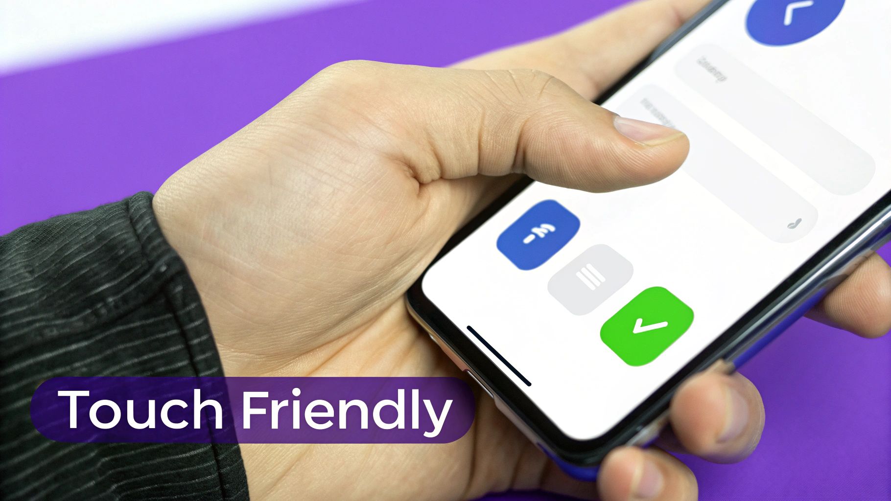
On the flip side, burying key actions in the top corners forces an awkward grip change. That little bit of friction is enough to frustrate a user. Your most important buttons should live where thumbs naturally rest.
Make Your Touch Targets Big Enough
One of the most common—and most annoying—mobile design mistakes is making buttons and links too small. A mouse gives you pinpoint precision, but a fingertip is big and blunt. When a user tries to tap a tiny link and ends up hitting the one next to it, they won't blame their finger; they'll blame your website.
This is where you need to think about touch target sizes. That's the entire clickable area of an element, including any invisible padding you add around it.
Industry giants have already done the research on this, and their guidelines are a great starting point:
- Apple: Recommends a minimum target size of 44×44 pixels.
- Google: Suggests a slightly larger 48×48 pixels.
- Microsoft: Advises a minimum of 34×34 pixels but with at least 10px of space between targets.
Aiming for that 44×44 pixel sweet spot is a safe bet for most projects. It's generous enough to prevent frustrating "fat finger" errors and can be the difference between a smooth interaction and a user giving up and leaving your site.
A responsive layout gets users to your content, but thoughtful touch design is what keeps them there. Never force a user to pinch and zoom just to tap a link. Your buttons should be generous, and the space between them should be even more so.
Prioritize Readability with Mobile Typography
Text that looks crisp and clear on a 27-inch monitor can easily become an unreadable mess on a 6-inch phone screen. Optimizing typography for mobile is about more than just picking a nice font; it's a careful balance of size, spacing, and contrast.
For body copy, 16px is the modern standard for a reason. Anything smaller and you’re forcing people to squint or zoom, which is a major usability fail. From there, build a clear visual hierarchy with larger headings to guide the eye (e.g., 24px for an H2, 20px for an H3).
But size isn't everything. You also need to pay close attention to line height—the vertical space between lines of text. A good rule of thumb is a line-height of around 1.5 times the font size. This gives the text room to breathe and makes it much easier for a user's eye to track from one line to the next without getting lost.
Simplify Forms for Mobile Input
Filling out a form on a desktop is a chore. On mobile, a poorly designed form can be an absolute nightmare and a guaranteed conversion killer. The goal here is to make the process as painless as possible.
One of the easiest wins is to use the correct HTML5 input types for your form fields. It’s a tiny code change that makes a massive difference to the user experience by triggering the right keyboard on mobile devices.
For example:
<input type="email">pulls up a keyboard with the "@" and "." keys front and center.<input type="tel">brings up the numeric keypad, ideal for phone numbers.<input type="number">shows a simple number pad.
This simple step saves users from having to constantly switch keyboard layouts, reducing taps and speeding up the process. Beyond that, keep your forms laser-focused. Only ask for what's absolutely necessary. If you have a longer process, break it up into smaller, more manageable steps to avoid overwhelming users on a small screen.
Your Mobile Users Won't Wait: A Guide to Blazing-Fast Performance
On mobile, speed isn't a feature—it's everything. A slick responsive design is worthless if your page takes an eternity to load, especially for someone on a shaky cellular connection. Let's be honest, impatient visitors will bounce from a slow site without a second thought, and they're taking their business with them.
The stakes are sky-high. Page speed has a direct, measurable impact on user behavior. Most people expect a site to load in about three seconds, and anything slower sends abandonment rates through the roof.
Think about this: a page that loads in one second can hit a conversion rate approaching 40%. But add just a few more seconds, and that number plummets. Ever wonder why e-commerce cart abandonment often hovers around a staggering 70%? Slow-loading pages are one of the biggest culprits.
To win on mobile, your site has to be fast. Lightning fast. That means optimizing every single asset and ruthlessly cutting anything that adds dead weight.
Tame Your Images: Compress, Compress, Compress
Images are almost always the heaviest items on a webpage, making them the number one performance bottleneck. Huge, unoptimized photos will bloat your page size and grind your load times to a halt. The trick is to strike that perfect balance between sharp visuals and a lean file size.
- Use Modern Formats: Start by using next-gen image formats like WebP. It offers way better compression than old-school JPEGs and PNGs, often with no visible drop in quality. The file sizes are significantly smaller, and nearly all modern browsers support it.
- Compress Before You Upload: Don't just upload a photo straight from your camera. Use tools or plugins to intelligently compress your images before they hit your media library. This process strips out unnecessary data from the file, shrinking its size dramatically.
For a deeper dive into site performance, our complete guide on how to optimize your WordPress speed covers image optimization and a whole lot more.
Minify Code and Put Caching to Work
It's not just images that can slow you down. Your website’s code—all the CSS, JavaScript, and HTML—can be trimmed down for a speed boost. These files are often full of extra spaces, developer comments, and line breaks that are useful for humans but completely ignored by the browser.
Minification is the process of automatically stripping all that junk out.
By minifying your CSS and JavaScript files, you can slash their size by 20-40%. That translates directly into faster load times. The good news is that most caching plugins can handle this for you with the flick of a switch.
Speaking of caching, it's one of the most powerful tools in your speed arsenal, especially for repeat visitors. Browser caching tells a user's device to store static parts of your website—like your logo, CSS files, and key scripts—after their first visit.
When they come back, their browser just loads those saved files locally instead of re-downloading everything. The result? Your site feels like it loads almost instantly.
Your mobile users won't wait. Every kilobyte you shave off your page size and every millisecond you cut from your load time is a direct investment in better user experience, higher engagement, and increased conversions.
Streamline How Your Code Gets Delivered
How your website loads its code is just as important as the code's size. Poorly managed scripts can actually stop the rest of your page from rendering, leaving your visitor staring at a blank white screen. We call these render-blocking resources, and they're a conversion killer.
To fix this, you need to defer the loading of non-critical JavaScript. This basically tells the browser, "Hey, load the important stuff first, and you can grab things like the chatbot or analytics tracker after the user can see the page."
Another great practice is to combine your CSS files into one. Every separate stylesheet requires another request from the browser to your server. By consolidating them, you reduce the number of these back-and-forth trips, which helps your site's styles get applied much faster.
These little technical tweaks might seem small, but they add up to a much snappier and more professional mobile experience.
How to Test and Validate Your Mobile Website
You've done the work, you've tweaked the layouts, and now it's time for the moment of truth: does your site actually work on mobile? Building a responsive site is one thing, but making sure it delivers a flawless experience across dozens of different devices is a whole other ball game. This is where rigorous testing comes in—it's the final, and most critical, step.
Don't worry, you don't need a high-tech lab filled with every phone imaginable to get started. Your own web browser is a surprisingly powerful first line of defense. Both Google Chrome and Mozilla Firefox come packed with robust developer tools that include a device simulator. This lets you quickly see how your layout bends and flexes across various screen sizes, from a tiny iPhone SE to a larger Google Pixel or tablet.
Use Browser Simulators for Quick Checks
Getting into this mode is simple. In Chrome, just right-click anywhere on your page, select "Inspect," and click the little tablet-and-phone icon to toggle the device toolbar. Bam! Your site instantly reflows into a mobile viewport, and you can pick from a dropdown of preset device dimensions. It's the fastest way I know to spot glaring issues like text overflowing its container or images that forgot to scale down.
But remember, these are just simulations. They're fantastic for catching major structural problems, but they can't perfectly replicate the quirks of different operating systems or the reality of a shaky network connection. That's why this is just your first stop.
Get an Authoritative Verdict with Online Tools
Next, it's time to get an opinion from the one that matters most for search: Google. The free Google Mobile-Friendly Test is an absolute must-use. You plug in your URL, and it gives you a straight pass-or-fail verdict, flagging any specific usability problems it finds.
This tool isn't just checking boxes; it shows you how Googlebot actually sees and renders your page on a mobile device.
Seeing that "Page is mobile friendly" message is a huge relief. It's a strong signal that your core responsive setup is technically sound from an SEO perspective. The tool even gives you a screenshot of the rendered page, which helps you spot visual bugs that Google's crawler might be seeing.
This validation is non-negotiable because Google uses mobile-first indexing. That means its ranking of your site is based primarily on the mobile version. Passing this test confirms you've met the baseline for a positive mobile ranking signal.
Simulators and online tools are great for checking your layout and code. But they can never truly replicate the experience of holding a device in your hand. Performance lags, awkward touch targets, and navigation issues only become obvious with real-world use.
Nothing Beats Testing on Real Devices
This brings us to the most important phase of testing: using actual hardware. Grab a real iPhone and an Android phone. It doesn't have to be the latest model—in fact, testing on slightly older, mid-range phones gives you a more realistic picture of what many users experience.
Get hands-on. Try navigating your site with one thumb, fill out a contact form, and tap on buttons and links. This is where you'll uncover the subtle but critical flaws that simulators always miss:
- Performance Issues: Does the site feel sluggish or jerky when you scroll on an average Android phone with a spotty Wi-Fi connection?
- Touch Target Accuracy: Are the buttons actually easy to tap without accidentally hitting the link next to them? That's a classic user frustration.
- Interaction Glitches: Do your cool animations or interactive elements behave strangely on iOS versus Android?
This hands-on approach is irreplaceable. It shifts your focus from how the site looks to how it feels, which is the very essence of a great user experience. By combining quick browser checks, official validation from Google, and real-world device testing, you can move forward confidently, knowing your website is truly ready for every visitor.
Practical Tips for WordPress and WooCommerce
Putting all this responsive theory into practice is surprisingly straightforward on a platform like WordPress, especially if you’re using a page builder. Tools like Divi or Elementor have powerful, built-in controls designed from the ground up to help you dial in the mobile experience. These aren't just afterthoughts; they are core features for crafting custom designs for every device.

A game-changing feature that many people miss is device visibility. Instead of just letting your desktop layout stack awkwardly on smaller screens, you can actually hide entire sections on mobile. Then, you can display a completely different, mobile-optimized section in its place.
Imagine a complex, multi-column grid on your desktop homepage. For mobile users, you could simply hide that and show a clean, single-column version with bigger, thumb-friendly buttons. This approach gives you a truly custom layout, not just a shrunken-down one.
Optimizing the WooCommerce Experience
If you run a WooCommerce store, the mobile shopping journey is everything. A huge chunk of your traffic is coming from phones, so a clunky experience is a direct path to an abandoned cart. The name of the game is simplicity and speed. You need to make it dead simple for customers to buy from you on the go.
Start by pulling up your product pages on your phone. Are the "Add to Cart" buttons large, obvious, and easy to tap with a thumb? Can you swipe through the product gallery without any annoying lag?
Here are a few things I always focus on for my e-commerce clients:
- Streamline Your Checkout: Get rid of every unnecessary field on the mobile checkout form. If you don't absolutely need it to process the order, cut it.
- Design for One-Handed Use: Make sure crucial elements like the cart icon, search bar, and main CTAs are within easy reach of a thumb.
- Build Touch-Friendly Galleries: Product images have to load fast and support intuitive gestures like swiping and pinch-to-zoom.
By zeroing in on these specific touchpoints, you can transform your mobile store from a merely functional site into a high-converting sales machine. Every small improvement works together to create a smoother, faster path to purchase.
This is where page builders like Divi really shine. You have granular control to adjust button sizes and spacing, tweak column layouts for tablets and phones, and even use device-specific popups with a tool like Divi Areas Pro to show targeted offers just to mobile shoppers. Mastering these settings is what separates an okay mobile site from a great one.
Got questions about going mobile? You're not alone. Let's tackle some of the most common questions that pop up when you're optimizing your site.
Responsive vs. Adaptive Design: What’s the Real Difference?
I get this question a lot. It's easy to get them mixed up, but the approach is fundamentally different.
Think of responsive design like a single, flexible liquid. It uses one codebase that fluidly expands or contracts to fit whatever screen it's on, from a tiny phone to a huge monitor. It’s the go-to choice for a reason—it’s efficient and Google loves it.
Adaptive design is more like having a set of different-sized t-shirts (small, medium, large). The server detects the user's device and loads a specific, pre-built layout designed for that screen size. While it can offer a more customized experience for certain devices, it's generally more work to maintain.
How Much Does a Mobile-Friendly Site Really Affect SEO?
It's not just a factor; it's one of the biggest. Google now uses mobile-first indexing. This means the mobile version of your site is the primary one it looks at for ranking and indexing. Period.
A clunky mobile experience is a major red flag for Google. It tells the search engine that your site isn't user-friendly, which often leads to higher bounce rates and, you guessed it, lower rankings. A great mobile site almost always climbs higher in search results, especially since most searches happen on phones now.
Can I Make My Current Site Mobile-Friendly Without a Full Redesign?
Absolutely. In many cases, a full rebuild isn't necessary, especially if you're on a platform like WordPress.
Sometimes, the fix is as simple as switching to a modern, responsive theme. That one move can solve 80% of your mobile issues almost instantly.
If your site is custom-coded, you can retrofit it by adding CSS media queries. This lets you apply specific styles that adjust your layout for smaller screens. It's a solid middle-ground approach to get mobile-friendly without tearing everything down and starting over.
Ready to create truly dynamic and engaging mobile experiences on your Divi site? With Divimode, you can build targeted popups, fly-ins, and conditional content that adapt to every user on any device. Learn more at https://divimode.com.
More Articles You Will Like