 Alex Martin
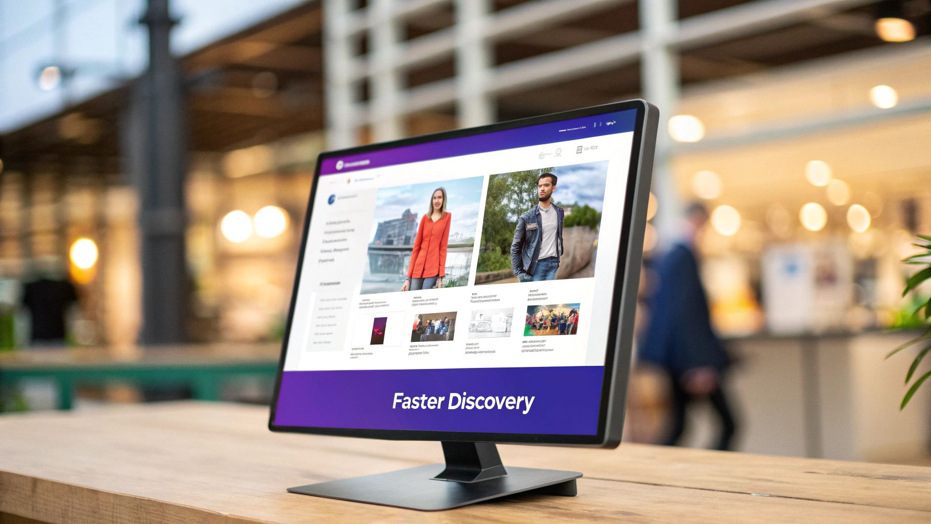
You’ve probably seen them on big e-commerce or news sites, but what is a mega menu, really?
Think of it as a supercharged version of a regular dropdown menu. Instead of a single, simple list of links that appears when you hover over a menu item, a mega menu opens up a large, multi-column panel. This space can be filled with links, images, icons, and even interactive content.
It’s designed to give your visitors a bird’s-eye view of your website’s structure, helping them find what they need on large, content-rich websites without having to dig around.
What Is a Mega Menu Anyway?
Let’s use an analogy. A standard dropdown menu is like a simple list of street names. It's functional, sure, but if the list gets too long, it becomes a nightmare to scan.
A mega menu, on the other hand, is like unfolding a detailed city map right on your dashboard. It doesn’t just list the streets; it shows you entire districts, landmarks, and main roads all at once, organized into logical groups.
This approach is a game-changer for sites with a ton of content. It’s especially critical for websites with extensive offerings, such as:
- E-commerce Stores: Showcasing product categories, sub-categories, and even featured items with images.
- Large News Portals: Organizing articles by topic, region, and content type (like videos or podcasts).
- University Websites: Detailing different schools, academic programs, and admissions information in one clear view.
From Simple Lists to Rich Experiences
The whole point of a mega menu is to make your site’s architecture visible and accessible from the get-go. It trades the one-dimensional list for a rich, two-dimensional layout. This allows you to use smart grouping, visual hierarchy with different font sizes, and even small images or icons to give users context at a glance.
The goal is to reduce the cognitive load on the user. Instead of forcing them to remember where content might be hidden, a mega menu lays everything out in a clear, digestible format.
This isn’t just a new trend; it’s a proven technique that emerged in the early 2000s as websites started getting more complex. Research from usability experts at the Nielsen Norman Group has shown that well-designed mega menus can dramatically improve navigation. In fact, they can cut down the clicks needed to find content by up to 50%, making it much easier for people to explore your site.
Want to dive a bit deeper into the user experience benefits? Check out this great article on enhancing user experience with mega menus.
A quick table helps illustrate the difference.
Traditional Dropdown vs Mega Menu at a Glance
This comparison breaks down exactly where these two navigation styles shine and where they fall short.
| Feature | Traditional Dropdown | Mega Menu |
|---|---|---|
| Structure | Single column, text-based list. | Multi-column, two-dimensional layout. |
| Content | Typically just text links. | Can include text, images, icons, and CTAs. |
| Usability | Good for simple navigation with few items. | Excellent for complex sites with many categories. |
| Scannability | Can be difficult to scan when long. | Highly scannable due to grouping and visuals. |
| Ideal For | Blogs, small business sites, portfolios. | E-commerce, universities, large corporations. |
As you can see, it's not about one being "better" than the other—it's about choosing the right tool for the job. For simple sites, a dropdown is perfect. But when your site grows, a mega menu is the way to go.
The Real Benefits of Using a Mega Menu
Putting a mega menu on your site is about so much more than just a slick design choice. It brings real, tangible benefits that can seriously boost your site's performance and how users interact with it. The most immediate win? A massively improved user experience (UX).
Think about it. Instead of making people hunt and peck through layers of dropdowns, a mega menu lays everything out in one clean, organized panel. This clarity cuts down on clicks, reduces user frustration, and gets visitors where they want to go—fast. When navigation feels that easy, people are far more likely to stick around and see what you have to offer.
That better experience has a direct impact on your site's vitals. By making your content easier to find, you can pull visitors deeper into your site. This is a game-changer if you’re trying to figure out how to reduce bounce rate and keep people engaged for longer.
More Than Just Links
Here’s where it gets really powerful: a mega menu isn't just a list of links. It's a dynamic marketing canvas built right into your main navigation, opening up a ton of strategic possibilities.
- Showcase Featured Products: Instantly grab attention for new arrivals, bestsellers, or items on sale with eye-catching images.
- Display Promotional Banners: Got a limited-time sale or a big announcement? Put it front and center in a spot no one can miss.
- Guide User Journeys: Use icons and crisp typography to steer users toward your most valuable pages or nudge them toward a specific goal.
A well-designed mega menu doesn’t just show users where to go; it tells a story about what your site offers, all at a single glance. It's a strategic blend of navigation and marketing.
From an SEO standpoint, a mega menu also gives search engines a beautifully clear, crawlable map of your site. It creates a direct highway of internal links from your homepage to your most important category and product pages. This helps spread link authority around and cements your site's structure, telling search engines exactly which pages matter most.
When to Choose a Mega Menu for Your Site
Deciding to use a mega menu isn't just about following a design trend; it's a strategic move. It's the perfect fix when your website's navigation has simply outgrown a basic dropdown list. A mega menu can tame that complexity, but it’s definitely not the right tool for every single job.
Think of it like this: you wouldn't use a massive three-ring binder to organize a handful of sticky notes. In the same way, a small business site with five service pages or a personal blog has no need for a sprawling navigation panel. A simple, clean menu is much faster and more intuitive in those cases—a mega menu would just be overkill.
Ideal Scenarios for a Mega Menu
So, when does it actually make sense to make the switch? The answer really comes down to the scale and structure of your content. Mega menus truly shine on sites that are large, layered, and packed with diverse information.
Here are a few classic examples:
- Large E-commerce Stores: If you're juggling dozens of product categories and sub-categories, a mega menu can lay them all out at once. This lets shoppers visually scan entire departments like "Men's," "Women's," and "Kids'," along with sub-categories like "Shirts" or "Shoes," without getting lost in a maze of clicks.
- University and College Websites: These institutions are masters of information overload. A mega menu can cleanly organize huge sections for "Admissions," "Academics," and "Student Life," giving direct links to specific degrees, financial aid details, and campus resources.
- Major News or Media Outlets: For sites that publish hundreds of articles a day, a mega menu is a lifesaver. It can categorize content by topic (like Politics, Tech, or Sports) and even by format (like Articles, Videos, or Podcasts).
A mega menu is your best option when you need to make a large number of choices visible and scannable in a single glance. It transforms a potentially confusing user journey into a clear and efficient one.
The impact of that clarity is huge, especially for e-commerce. Data shows that retailers with well-designed mega menus saw user engagement metrics climb by 15-25%. One case study even revealed that customers found products 40% faster after a redesign. You can dive deeper into how mega menus increase site performance and drive real results.
Designing a Mega Menu That Actually Works
A great mega menu should feel like a helpful guide, not a chaotic explosion of links. The real difference comes down to thoughtful design—the goal is to gently guide users, not overwhelm them with a wall of text. It all starts with clear organization and a smart use of space.
Instead of just dumping a list of links, group them into logical, intuitive categories. Put yourself in your customer's shoes: what words would they use to find something? And don't be afraid to use whitespace generously. It’s what keeps the menu from feeling cramped and makes the entire layout a breeze to scan.
Prioritize Clarity and Usability
Once you have your structure sorted, focus on making it visually intuitive. Little things like small icons or subtle images can make a huge difference in scannability, helping users spot categories much faster than with text alone. Just be sure to optimize those images so they don't slow down your site. The idea is to add a bit of visual context, not build a photo gallery.
If you're looking for some inspiration on how to strike that perfect balance, checking out different mega menu design examples is a fantastic place to start.
Good design isn't just about what it looks like; it's about making information accessible and easy to digest. Your mega menu should be a perfect extension of this principle, offering a clear path to your content.
Accessibility Is Not an Option
At the end of the day, a truly effective mega menu is one that works for everyone. This means building it with accessibility in mind from the very beginning. A user needs to be able to navigate the entire menu using just their keyboard, and it has to be fully compatible with screen readers. To really get this right, it helps to understand the broader concepts of mastering user experience design principles.
This isn’t just a nice-to-have; it's a critical part of modern web standards. Accessibility standards like WCAG 2.1 AA now affect approximately 15% of all internet users who live with disabilities. The industry is catching on, too. By 2024, around 67% of mega menus featured full keyboard accessibility and proper ARIA roles—a massive jump from just 23% back in 2018. This trend shows a clear and powerful shift toward more inclusive design.
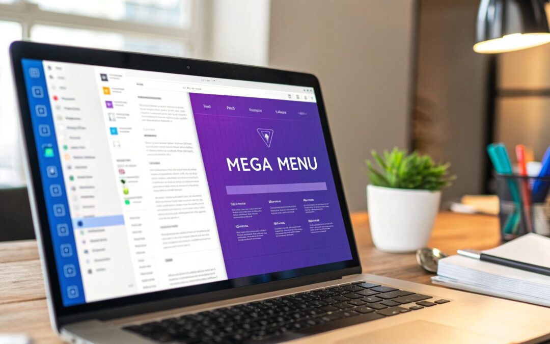
How to Build Your First Mega Menu in Divi
Alright, enough with the theory. Let's get our hands dirty and actually build something. You might be surprised at just how straightforward it is to create your first mega menu in Divi. You can get a lot done with Divi’s built-in tools, and then bring in the heavy hitters (like a dedicated plugin) when you need more firepower.
Everything starts in a familiar place: the WordPress dashboard, under Appearance > Menus. Divi cleverly hooks into the standard WordPress menu system, using a special CSS class to tell it when to activate its mega menu magic. All you have to do is add this class to your main menu item, and Divi will automatically transform the nested sub-items into a slick, multi-column layout.
Getting Started with Native Divi Menus
Let's walk through the steps for creating a basic mega menu without touching a single plugin. It's a surprisingly simple process that unlocks a ton of potential right out of the box.
- Enable CSS Classes: First things first, head to your menu editor and look for the "Screen Options" tab in the top-right corner. Click it, and make sure the "CSS Classes" box is checked. This adds a new input field to each of your menu items.
- Structure Your Menu: Now, think about your menu's hierarchy. Your top-level item (like "Services") is what users will hover over. The items you nest directly underneath it will serve as your column headers (think "Web Design," "SEO," etc.).
- Activate the Mega Menu: Go to that top-level menu item, find the "CSS Classes" field you just enabled, and type in mega-menu. That’s it. This one class is the trigger that tells Divi to work its magic.
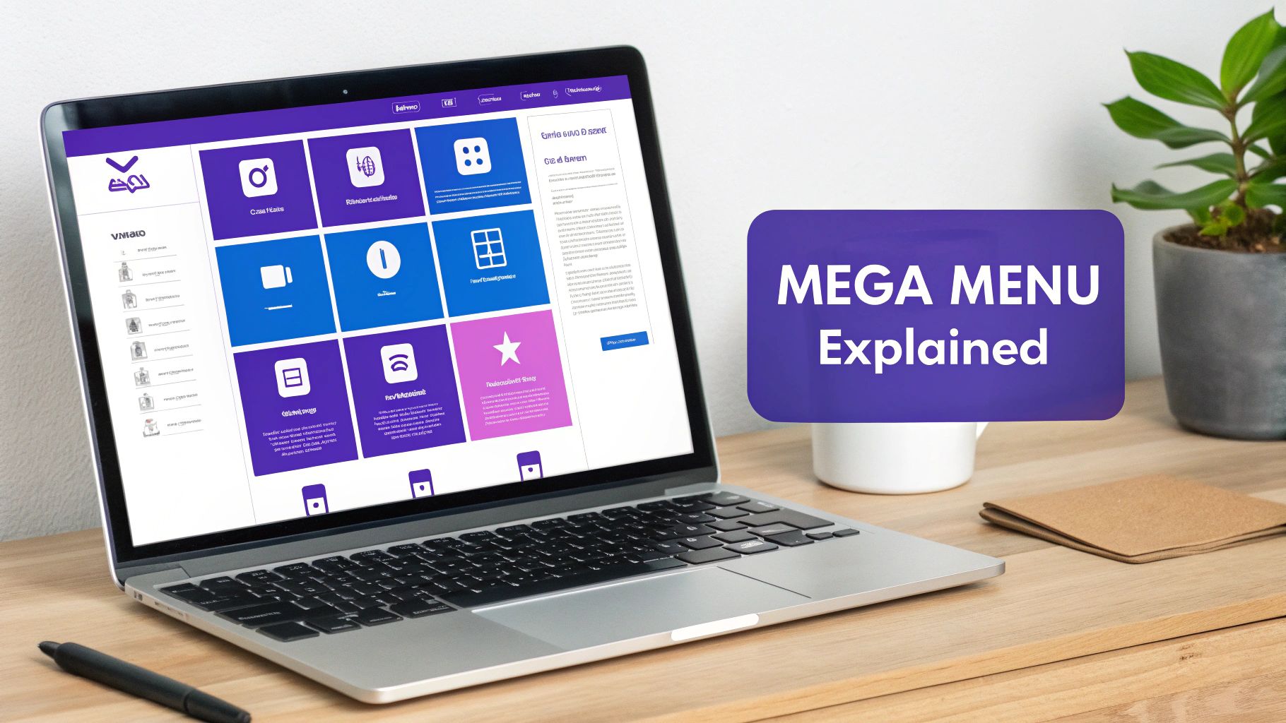
As you can see, the basic workflow really comes down to grouping your content logically, arranging the layout, and making sure it doesn't fall apart on mobile.
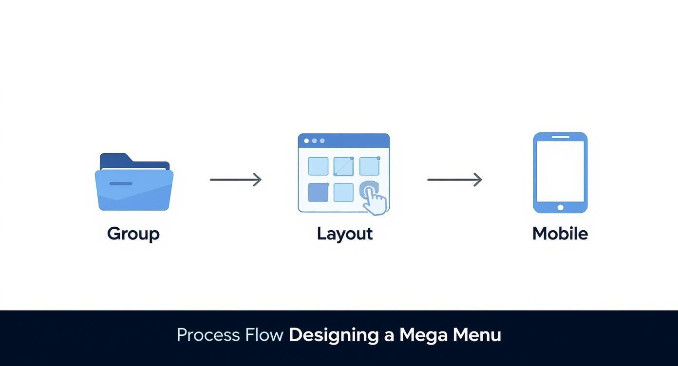
The infographic above really drives this home. A successful mega menu isn't just about cramming links in; it's about thoughtful organization and a design that works flawlessly whether you're on a desktop or a phone.
Unlocking Advanced Designs with Divi Areas Pro
Divi’s built-in feature is a fantastic starting point, but it has its limits—you're pretty much stuck with text links. If you want true creative freedom to add images, call-to-action buttons, or completely custom layouts, you'll need a tool like Divi Areas Pro. Instead of just adding links, you get to build a layout with the Divi Builder and then assign that entire design to a menu item.
This approach completely changes the game. Your navigation goes from being a simple list of links to a fully customizable design canvas. You can drop in any Divi module you want to create something truly unique and interactive for your visitors.
With a plugin, you're no longer boxed in by the rigid structure of a standard WordPress menu. You can inject dynamic content, feature promotional banners, or even place a contact form right inside your navigation. For a deep dive into this more advanced method, check out our comprehensive guide to creating powerful Divi mega menus. This is where you get complete freedom to build a menu that truly reflects your brand and helps you hit your goals.
Got Questions About Mega Menus?
Even with all their perks, I get it—mega menus can raise a few eyebrows. I've heard the same worries from developers and site owners time and again, especially when it comes to SEO, mobile, and site speed. Let's tackle these common questions head-on.
Are Mega Menus Bad for SEO?
Not at all. In fact, when you build them right, they're fantastic for SEO. A good mega menu creates a clean, crawlable network of internal links pointing to your most important pages, which is a huge signal to search engines about your site's structure. Think of it as a clear roadmap that helps distribute your homepage's authority throughout your site.
The key is to avoid going overboard. Stuffing them with hundreds of links is a surefire way to dilute their SEO value and look spammy. Stick to linking to your primary categories and pillar content, and make sure the underlying code is clean.
How Do I Make a Mega Menu Mobile-Friendly?
Here’s the golden rule: don't just shrink your desktop mega menu onto a smaller screen. I’ve seen that mistake countless times, and it always results in a cluttered, unusable mess. The real solution is to design a completely separate navigation experience just for mobile users.
This usually means rethinking the whole layout and opting for something more streamlined. A few approaches that work well are:
- A vertical accordion menu that expands and collapses.
- A multi-level "hamburger" menu that lets users drill down into categories.
The goal is simple: make it easy to use on a small, touch-based screen. Users should find what they need with just a few taps, no frustrating pinching and zooming required.
Can a Mega Menu Slow Down My Website?
Yes, it absolutely can—but only if it's poorly built. Heavy, uncompressed images and bloated scripts are the usual suspects here. In my experience, every millisecond counts for user experience, so performance is non-negotiable.
A well-coded mega menu should have a minimal impact on your site's performance. The trick is to be mindful of what you put inside it.
To keep things lightning-fast, always use optimized, next-gen image formats like WebP, lazy load any visuals, and ensure the underlying code is as efficient as possible.
Ready to build a powerful mega menu without the guesswork? With Divimode, you can use Divi Areas Pro to design fully custom, high-performing mega menus that engage users and boost your site's usability. Start building better navigation today.
More Articles You Will Like