 Alex Martin
A successful website is more than just a pretty face; it’s a carefully engineered experience built from fundamental design elements for websites working in harmony. From the structural layout that guides a user’s journey to the colors that evoke specific emotions, each component plays a critical role in communicating your message and achieving your business goals. Getting these elements right is the difference between a site that frustrates and one that converts.
This comprehensive guide deconstructs the 10 most crucial design elements that form the foundation of any effective digital presence. We'll move beyond abstract theory to provide actionable insights into each component, from responsive design and visual hierarchy to accessible forms and compelling calls-to-action.
More importantly, we will show you how to implement these principles directly within the Divi ecosystem. You'll learn practical techniques for using tools like Divi Areas Pro to create dynamic, high-performing, and user-centric online experiences. Whether you are a seasoned designer building for clients or a business owner refining your online store, mastering these building blocks is the key to unlocking your website's true potential. Let's dive into the core components that will transform your site into a digital masterpiece.
1. Responsive Design / Mobile-First Approach
In today's digital landscape, a mobile-first approach is no longer optional; it's the foundation of effective web design. This methodology prioritizes designing for the smallest screen (mobile) first and then scaling up to larger devices like tablets and desktops. Given that mobile traffic often surpasses desktop, this ensures the majority of users have an optimized, seamless experience. It's one of the most critical design elements for websites to get right from the start.

Why It's an Essential Design Element
A responsive design ensures your website is accessible and functional for everyone, regardless of their device. This directly impacts user satisfaction, conversion rates, and even SEO, as Google prioritizes mobile-friendly sites in its search rankings. Sites like Apple.com and Spotify.com master this by offering fluid layouts and adaptive interfaces that feel native to any screen. For a comprehensive understanding of this critical aspect, delve into our guide on mobile responsive design essentials.
How to Implement a Mobile-First Strategy
Successfully executing a mobile-first strategy involves more than just shrinking content.
- Prioritize Content: Determine the most crucial content and calls-to-action for mobile users and ensure they are prominent.
- Optimize Performance: Use compressed images and lazy loading to guarantee fast load times on mobile connections.
- Touch-Friendly Navigation: Design large, easily tappable buttons and interactive elements, with a minimum target size of 44×44 pixels.
- Use Media Queries: Leverage CSS media queries to apply different styles at specific breakpoints, adapting the layout for tablets and desktops.
Divi and Divi Areas Pro Implementation
Divi's built-in responsive editing tools make this process intuitive. You can easily adjust module settings, typography, and spacing for tablet and mobile views directly within the Visual Builder. For more advanced control, use Divi Areas Pro to create unique popups or slide-ins that are triggered and displayed only on specific devices, ensuring your marketing messages are perfectly tailored to the user's context.
Dive deeper into our guide and learn more about responsive design best practices with Divi.
2. User Navigation and Information Architecture
Effective Information Architecture (IA) is the backbone of a user-friendly website. It involves organizing, structuring, and labeling content in a way that helps users find information and complete tasks efficiently. Think of it as the digital blueprint for your site; without a clear plan, users will get lost. This is one of the most fundamental design elements for websites because it directly influences how easily visitors can engage with your content.
Why It's an Essential Design Element
A logical navigation structure reduces bounce rates, increases time on site, and guides users toward conversion goals. When users can find what they need intuitively, their trust in your brand grows. For instance, Amazon's success is partly due to its masterful category-based navigation, while Microsoft.com uses comprehensive mega-menus to manage its vast array of products and services, making everything accessible from one central point.
How to Implement Strong Navigation
Building an intuitive user journey requires strategic planning and a focus on clarity.
- Limit Main Menu Items: Stick to a maximum of 5-7 top-level navigation items to avoid overwhelming users.
- Use Descriptive Labels: Choose clear, familiar language for your menu labels instead of industry jargon.
- Maintain Consistency: Ensure your navigation menu remains in the same location and functions identically on every page.
- Provide Visual Cues: Use indicators like bold text, a different color, or an underline to show users which page they are currently on.
- Implement a Search Function: A robust search bar with auto-suggest helps users find specific content quickly.
Divi and Divi Areas Pro Implementation
Divi provides powerful tools to build and customize your site's navigation. You can use the Theme Builder to create a global header with a clean menu that reflects your information architecture. For larger sites with many categories, Divi Areas Pro is invaluable. It allows you to create sophisticated mega-menus that display rich content, like images and interactive elements, when a user hovers over a menu item.
For a step-by-step guide, explore how you can build a powerful mega menu in Divi.
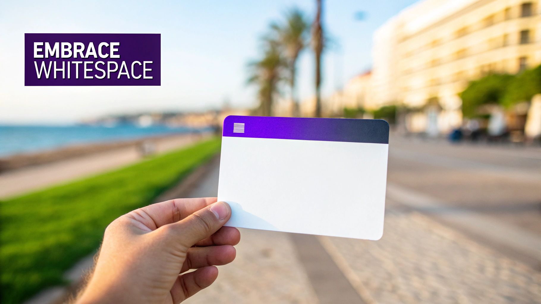
3. Whitespace (Negative Space)
Often misunderstood as "empty" space, whitespace (or negative space) is the deliberate, unmarked area between and around elements on a page. It is a powerful, active component that guides the user's eye, reduces cognitive load, and enhances visual hierarchy. Rather than being wasted space, it is one of the most fundamental design elements for websites for creating a clean, sophisticated, and user-friendly interface.

Why It's an Essential Design Element
Effective use of whitespace directly improves readability and comprehension by creating separation between unrelated elements and grouping related ones. This clarity allows users to focus on key content and calls-to-action, leading to a more pleasant and effective experience. Tech giants like Apple.com and Google.com are masters of this principle, using generous whitespace to convey simplicity, elegance, and confidence in their products.
How to Implement Whitespace Effectively
Leveraging whitespace is about balance and intention, not just leaving areas blank.
- Create Visual Hierarchy: Use more whitespace around important elements like a primary call-to-action button to make it stand out.
- Improve Readability: Increase the line height (leading) and spacing between paragraphs to make long blocks of text easier to read.
- Group Related Items: Place related elements closer together with less space (proximity) to signal they belong together.
- Don't Fear Emptiness: Resist the urge to fill every pixel on the screen. A cluttered interface overwhelms users and dilutes your message.
Divi and Divi Areas Pro Implementation
Divi provides granular control over whitespace through its spacing options (margin and padding) available in every module, row, and section. You can easily adjust these values for desktop, tablet, and mobile to ensure optimal spacing across all devices. With Divi Areas Pro, you can design popups and slide-ins that use whitespace strategically to draw immediate attention to a specific offer or message without cluttering the main page content.
4. Visual Hierarchy and Typography
Visual hierarchy is the art of arranging design elements to guide a user's eye across the page in a deliberate order of importance. A key component of this is typography, where font size, weight, color, and spacing are used to create a clear informational structure. This makes content easily scannable and navigation intuitive, ensuring users can find what they need without friction. It is one of the most fundamental design elements for websites for creating a logical and user-friendly experience.

Why It's an Essential Design Element
A strong visual hierarchy reduces cognitive load, allowing users to process information quickly and efficiently. It directs attention to key elements like headlines, calls-to-action, and important information, which directly improves user engagement and conversion rates. Websites like Mailchimp and The Guardian master this by using distinct typography to separate headlines, subheadings, and body text, creating a seamless reading experience that feels both authoritative and approachable.
How to Implement a Strong Visual Hierarchy
Effective implementation goes beyond simply making headlines bigger. It requires a thoughtful approach to both layout and text.
- Establish a Typographic Scale: Use a consistent scale for your headings (H1, H2, H3) and body text. For example, use a larger font like 32px+ for your main H1.
- Limit Font Families: Stick to two or three font families at most to avoid visual clutter and maintain a cohesive brand identity.
- Prioritize Readability: Ensure body text is at least 16px and use a line height of around 1.5 for optimal readability.
- Leverage Contrast and Weight: Use bold weights and color variations to make key elements stand out, but ensure a minimum 4.5:1 contrast ratio for accessibility.
Divi and Divi Areas Pro Implementation
Divi's Theme Builder and Visual Builder offer granular control over your site's typography. You can set global font styles for headings and body text in the Theme Customizer to ensure consistency across your entire website. With Divi Areas Pro, you can take this a step further by creating popups or promotional bars where the typography is specifically designed to grab attention, using larger, bolder fonts that stand apart from the main page content to highlight a special offer or call-to-action.
5. Color Scheme and Color Psychology
Color is far more than an aesthetic choice; it’s a powerful communication tool that evokes emotion and drives user action. A well-defined color scheme, grounded in color psychology, can shape brand perception and guide user experience. This strategic use of color is one of the most impactful design elements for websites, capable of building immediate brand recognition and influencing conversions.
Why It's an Essential Design Element
Your color palette speaks volumes before a single word is read. It sets the tone, reinforces your brand's personality, and can make your site feel trustworthy, energetic, or serene. Brands like Coca-Cola (energetic red) and Facebook (trustworthy blue) have built empires on the psychological power of a single color. A strategic color scheme improves readability, highlights key information, and creates a cohesive visual journey for the user.
How to Implement a Strategic Color Scheme
Choosing the right colors involves a blend of art and science. A structured approach ensures your palette is both beautiful and effective.
- Follow the 60-30-10 Rule: A balanced approach where 60% of your space is a dominant primary color, 30% is a secondary color, and 10% is an accent color for CTAs and highlights.
- Prioritize Accessibility: Use tools to check color contrast, ensuring text is legible for all users, including those with visual impairments. WCAG guidelines recommend a contrast ratio of at least 4.5:1 for normal text.
- Leverage Color Psychology: Choose a primary color that reflects your brand's core values. Blue often conveys trust, green suggests growth, and yellow can evoke optimism.
- Ensure Consistency: Your chosen color palette should be used consistently across your website, marketing materials, and social media to build strong brand recall.
Divi and Divi Areas Pro Implementation
Divi's Global Colors feature is a game-changer for maintaining color consistency. Define your brand's palette once, and any changes you make to a global color will update automatically across every module using it. For targeted campaigns, use Divi Areas Pro to create popups or notification bars with distinct accent colors that grab attention without disrupting your site's primary scheme. You can trigger these areas based on user behavior, ensuring your high-impact colors are seen at the most effective moments.
6. Call-to-Action (CTA) Buttons and Conversion Elements
Call-to-Action (CTA) buttons are the signposts of your website, guiding users from passive browsing to active engagement. These strategic interactive elements are meticulously designed to prompt specific actions like making a purchase, signing up for a newsletter, or downloading a resource. Effective CTAs are one of the most vital design elements for websites because they bridge the gap between user intent and business goals, directly impacting conversion rates.
Why It's an Essential Design Element
A well-designed CTA transforms your website from a simple brochure into a powerful conversion tool. It provides clear direction, reduces friction, and creates a sense of urgency or value that encourages users to take the next step. E-commerce giants like Amazon master this with their high-contrast "Add to Cart" button, while SaaS companies like Slack use prominently placed "Get Started" CTAs to drive user acquisition.
How to Implement Effective CTAs
Creating CTAs that convert involves a blend of design, psychology, and strategic placement.
- Use Action-Oriented Copy: Start with a strong verb that communicates value, such as "Get Your Free Quote" or "Join Our Community."
- Create Visual Contrast: Your button's color should stand out from the background and surrounding elements, immediately drawing the user's eye.
- Strategic Placement: Position CTAs logically where a user is most likely to act, such as after a compelling product description or value proposition.
- Optimize for Touch: Ensure buttons have a minimum target size of 44×44 pixels to be easily tappable on mobile devices.
Divi and Divi Areas Pro Implementation
Divi’s Button module offers extensive customization options for color, text, and hover effects, allowing you to design visually striking CTAs. You can easily test different versions using Divi's A/B testing feature to see what copy or color converts best. To elevate your strategy, use Divi Areas Pro to create dynamic popups or slide-ins containing a CTA. For example, you can trigger a "Limited Time Offer" popup when a user shows exit intent, capturing a potential conversion before they leave.
7. High-Quality Imagery and Visual Content
Visual content is often the first thing a user notices and the last thing they forget. Strategic use of professional photography, illustrations, icons, and video communicates your brand's message faster than text ever could. High-quality visuals establish credibility, evoke emotion, and guide the user's eye, making them one of the most impactful design elements for websites.
Why It's an Essential Design Element
Great visuals do more than just decorate a page; they tell a story, explain complex concepts, and build a powerful brand identity. They can significantly boost engagement and conversion rates by creating an immediate emotional connection. Companies like Apple use stunning product photography to convey premium quality, while sites like National Geographic master visual storytelling to captivate their audience.
How to Implement High-Quality Visuals
Effectively integrating imagery requires a balance of quality, performance, and relevance.
- Optimize for Performance: Use tools like TinyPNG to compress images without sacrificing quality and implement lazy loading for images below the fold.
- Ensure Accessibility: Always include descriptive alt text for every image. This is crucial for screen readers and also benefits your SEO.
- Maintain Consistency: Develop a consistent visual style that aligns with your brand identity. This applies to photography, iconography, and illustrations.
- Use Modern Formats: Leverage formats like WebP for superior compression and quality compared to traditional JPEGs or PNGs.
Divi and Divi Areas Pro Implementation
Divi’s Image and Gallery modules offer extensive customization, including built-in tools for animations, borders, and filters. You can use Divi's responsive settings to serve different image sizes on various devices. To take it a step further, use Divi Areas Pro to create a lightbox-style gallery popup triggered by a button click, providing an immersive visual experience without cluttering the page layout.
8. Loading States and Performance Feedback
Nothing kills a user experience faster than a slow or unresponsive website. Loading states and performance feedback are visual cues that manage user expectations during waits, reassuring them that the system is working. This prevents frustration and the assumption that a page is broken, turning moments of friction into opportunities for engagement. As key design elements for websites, they are crucial for maintaining user confidence and a sense of professionalism.
Why It's an Essential Design Element
Effective feedback mechanisms reduce perceived wait times and keep users engaged. By showing that something is happening behind the scenes, you improve the overall user experience and can even prevent page abandonment. Major platforms like LinkedIn and Facebook use "skeleton screens" that mimic the page's final layout, making the transition from loading to loaded feel seamless and instantaneous.
How to Implement Effective Loading States
Implementing thoughtful loading states goes beyond a simple spinning wheel.
- Use Skeleton Screens: Instead of a generic spinner, display a placeholder layout of the content that is about to load. This makes the transition feel much faster.
- Provide Progress Indicators: For longer processes like file uploads or data processing, show a progress bar to set clear expectations.
- Brand Your Animations: Ensure any loading animations or spinners align with your brand's visual identity for a cohesive look.
- Optimize Perceived Performance: Focus on how fast your site feels. Smooth animations and transitions can make the actual load time seem shorter than it is.
Divi and Divi Areas Pro Implementation
While Divi includes basic loading animations, you can take this further. Use Divi Areas Pro to create a custom, full-screen "preloader" Area that displays before the page content is fully visible. You can design this preloader with Divi's builder, adding branded animations, skeleton layouts, or even helpful tips. Trigger it to show on page load and automatically hide once the content is ready, creating a sophisticated and professional user experience.
9. Forms and Data Input Design
Web forms are the primary point of interaction for capturing user data, from simple contact inquiries to complex checkouts. Strategic form design focuses on maximizing completion rates by minimizing user friction. This involves a thoughtful balance between the data you need to collect and the user's effort, using clear labels, logical flow, and smart validation to create a smooth, intuitive experience. When done right, forms are one of the most powerful design elements for websites for converting visitors into leads or customers.
Why It's an Essential Design Element
Poorly designed forms are a major cause of user abandonment. An effective form design builds trust, reduces cognitive load, and encourages completion, directly impacting lead generation and sales. Companies like Typeform and Stripe excel here; Typeform uses a conversational, one-question-at-a-time approach, while Stripe's checkout is a masterclass in minimalism, asking only for essential information in a clean, single-column layout.
How to Implement Effective Form Design
Building a high-converting form requires a user-centric approach focused on simplicity and clarity.
- Keep It Simple: Only ask for essential information. Every additional field increases the chance of abandonment. Use a single-column layout for better readability and mobile compatibility.
- Provide Clear Guidance: Use descriptive labels above each field, not just placeholder text. Implement real-time validation to give users immediate, helpful feedback.
- Show Progress: For longer, multi-step forms, use a progress bar to manage user expectations and reduce feelings of being overwhelmed.
- Optimize for Mobile: Use appropriate input types (e.g.,
type="email",type="tel") to trigger the correct mobile keyboards, making data entry faster and easier.
Divi and Divi Areas Pro Implementation
Divi’s Contact Form and Email Optin modules provide a solid foundation for building clear, functional forms. You can easily customize fields, labels, and button styles within the Visual Builder. For more complex scenarios, Divi Areas Pro can be used to create multi-step forms that appear in popups or slide-ins. You can trigger the next step of a form based on a button click, showing progress and breaking down a long data collection process into manageable, user-friendly chunks.
10. Accessibility (WCAG Compliance and Inclusive Design)
Inclusive design is the practice of creating websites that are usable by everyone, including people with disabilities. This means considering visual, auditory, motor, and cognitive accessibility from the outset, adhering to standards like the Web Content Accessibility Guidelines (WCAG). Making accessibility a core part of your process isn't just about compliance; it's about providing an equitable experience for all visitors, making it one of the most fundamental design elements for websites.
Why It's an Essential Design Element
An accessible website expands your audience reach and demonstrates social responsibility. It improves user experience for all, not just those with disabilities, and is crucial for avoiding legal issues. To ensure your website is accessible to all users, a crucial design element, refer to this comprehensive ADA compliance checklist for websites. Leading organizations like Microsoft and the BBC champion these principles, proving that accessible design is also excellent design.
How to Implement Accessibility
Integrating accessibility requires a proactive and thoughtful approach to every component of your site.
- Follow WCAG 2.1 AA: Use this as your minimum standard for compliance, focusing on perceivable, operable, understandable, and robust content.
- Use Semantic HTML: Structure content with proper headings, lists, and landmarks to provide context for screen readers.
- Ensure Keyboard Navigation: All interactive elements, including menus and forms, must be fully operable using only a keyboard.
- Provide High Contrast: Maintain a minimum color contrast ratio of 4.5:1 for normal text to ensure readability for users with low vision.
Divi and Divi Areas Pro Implementation
Divi includes built-in features that support accessibility, such as an accessibility checker and controls for ARIA labels. You can ensure color contrast ratios are met using the color picker tool. With Divi Areas Pro, you can create accessible popups and notifications by managing focus correctly, ensuring screen readers can interpret the content, and allowing users to dismiss them easily with the keyboard.
Explore our detailed guide to learn more about website accessibility best practices with Divi.
10 Key Website Design Elements Comparison
| Design Pattern / Element | Implementation Complexity 🔄 | Resource Requirements ⚡ | Expected Outcomes 📊 | Ideal Use Cases 💡 | Key Advantages ⭐ |
|---|---|---|---|---|---|
| Responsive Design / Mobile-First Approach | Medium–High — planning, fluid grids, breakpoints | Moderate — developer time, device testing | High — improved mobile UX, SEO, cross-device consistency | Mobile-focused sites, new builds, broad audiences | Single codebase, future-proof, better search rankings |
| User Navigation & Information Architecture | Medium — research, taxonomy, iterative testing | Low–Moderate — UX research, content audits | High — faster findability, lower bounce, better SEO | E‑commerce, large content sites, knowledge bases | Reduces friction, improves conversions and discoverability |
| Whitespace (Negative Space) | Low–Medium — layout decisions, spacing rules | Low — design time, layout adjustments | Medium — improved readability, visual clarity, perceived quality | Editorial, portfolios, premium brand sites | Directs attention, reduces cognitive load, elevates aesthetics |
| Visual Hierarchy & Typography | Medium — typographic system and consistency | Low–Moderate — fonts, style guides, testing | High — better scannability, readability, brand voice | Content-heavy sites, blogs, SaaS landing pages | Guides attention, strengthens brand, supports accessibility |
| Color Scheme & Color Psychology | Low–Medium — palette selection, testing for context | Low — design work, palette tools, accessibility checks | Medium — stronger brand recognition, emotional influence | Brand sites, CTA-focused pages, marketing campaigns | Shapes perception, improves CTA performance and recall |
| CTA Buttons & Conversion Elements | Low–Medium — design + A/B optimization | Moderate — design, analytics, testing tools | High — increased conversions, clearer user paths | Landing pages, e‑commerce checkouts, lead funnels | Direct impact on conversion rates; easy to iterate and test |
| High-Quality Imagery & Visual Content | Medium — production, styling, optimization | High — photography/video costs, asset management | High — increased engagement, credibility, conversions | Product pages, storytelling, marketing hubs | Communicates quickly, builds trust and emotional connection |
| Loading States & Performance Feedback | Medium — UI + backend coordination | Low–Moderate — dev time, UX testing, assets | Medium — reduced abandonment, improved perceived speed | Apps, heavy-data pages, file uploads/downloads | Lowers user anxiety, retains users during waits |
| Forms & Data Input Design | Medium — validation, progressive disclosure | Moderate — dev, UX, integrations, testing | High — higher completion rates, fewer errors | Signups, checkout flows, lead capture forms | Improves conversions and data quality; reduces support load |
| Accessibility (WCAG & Inclusive Design) | Medium–High — planning, semantic markup, testing | Moderate — audits, developer training, assistive tech testing | High — legal compliance, wider audience, SEO benefits | Government, public sector, large-audience and regulated sites | Expands reach, reduces legal risk, benefits all users |
Start Building a Better Website Today
We've journeyed through the ten foundational design elements for websites, exploring how each piece contributes to a powerful, user-centric online experience. From the structural integrity of a mobile-first approach and clear information architecture to the nuanced artistry of whitespace, typography, and color psychology, it's clear that exceptional web design is a holistic discipline. It's not about isolated components; it's about how these elements work in harmony to guide, inform, and persuade your audience.
Mastering these concepts transforms your role from simply a builder of pages to an architect of digital experiences. A well-designed CTA is more than a button; it's a gateway to conversion. High-quality imagery doesn't just fill space; it tells a story and builds brand trust. And critically, a commitment to accessibility isn't a technical checkbox; it's a declaration that your digital doorstep is open to everyone. Each element we've discussed is a tool in your arsenal, ready to be deployed with purpose and precision.
From Knowledge to Action: Your Next Steps
The true value of understanding these core principles lies in their application. Don't let this knowledge remain theoretical. The path forward involves deliberate action and continuous refinement. Here’s how you can start implementing these insights today:
- Conduct a Design Audit: Use the ten elements in this article as a scorecard for your own website or a client's project. Go through each point and critically assess where the site excels and where it falls short. Is the visual hierarchy clear? Are the forms intuitive? How does it perform on mobile?
- Prioritize for Impact: You don't have to overhaul everything at once. Identify the one or two elements that will have the most significant impact on your user experience and business goals. For an e-commerce site, this might be optimizing your CTA buttons and conversion elements. For a content-heavy blog, it could be refining your typography and whitespace for better readability.
- Leverage Your Divi Toolkit: For those in the Divi ecosystem, the next step is to translate these design principles into tangible features. Instead of just having a standard navigation menu, use Divi Areas Pro to create conditional, user-aware mega menus that enhance your information architecture. Elevate your conversion elements from static buttons to dynamic popups and fly-ins that appear based on specific user behavior, creating a more responsive and engaging experience.
Ultimately, mastering the essential design elements for websites is an ongoing process of learning, testing, and iterating. It's about developing an empathetic understanding of your user's journey and using design as the primary vehicle to make that journey seamless, enjoyable, and effective. By moving from theory to practice, you will not only build better websites but also drive better results, fostering a loyal audience that returns time and again.
Ready to elevate your Divi projects and implement these advanced design elements with unparalleled control? Explore how Divimode's suite of plugins, including Divi Areas Pro, can unlock dynamic content, conditional logic, and powerful conversion tools. Visit Divimode to see how you can transform your static designs into interactive, results-driven experiences.
More Articles You Will Like