 Alex Martin
If your WordPress site feels like it’s wading through mud, there's a good chance bloated images are the culprit. Getting your image optimisation for WordPress right is the single most effective way I’ve found to speed up a page, keep visitors from bouncing, and get a nice little boost in SEO rankings. This isn't just a minor tweak; it's a foundational fix for a healthy, high-performing website.
Why Image Optimisation Is Your Biggest Performance Win

It’s easy to get lost in the technical weeds of website performance, but the reality is often much simpler. Heavy, unoptimised visuals are the dead weight dragging your site down. Every single high-resolution photo or detailed graphic adds to the total page size, forcing your visitors to sit and wait for the content to finally appear.
That waiting game has real consequences. A slow website is a frustrating website, and frustrated users will abandon your page before it even finishes loading. That jump in your bounce rate sends a clear negative signal to search engines like Google, which can absolutely tank your rankings over time.
The Tangible Business Cost of Slow Images
Think about a real-world scenario we see all the time: an e-commerce store built with Divi. The owner uploads gorgeous, high-resolution product photos straight from their camera, each one several megabytes in size. The images look incredible, sure, but the product pages now take five, six, or even more seconds to load.
What happens next? Potential customers browsing on their phones get impatient and click away, abandoning their carts without a second thought. The result is lost sales and wasted marketing spend, all because the images were too heavy. This isn't just a technical problem—it's a direct hit to the bottom line. Sharpening your image strategy is a critical step to optimize your WordPress speed and stop these preventable losses.
The Data Behind the Delay
The numbers don't lie. Images often make up 60% of a WordPress site's total page size, making them the single biggest factor in website performance. Research from folks like MageComp shows that even a one-second delay in page load time can slash conversions by 7%. When you tackle your images, you're addressing the largest and most impactful piece of the performance puzzle.
The truth is, no amount of server-side tweaking or caching magic can fully compensate for massively oversized images. Getting your image optimisation strategy right from the start is the highest-impact change you can make.
A smart image strategy creates a powerful ripple effect across your entire site. We've seen it time and time again with our own projects. A little effort here goes a long way.
To really drive this home, here’s a quick breakdown of what happens when you get your image optimisation right.
The Real Impact of Image Optimisation on WordPress Metrics
This table breaks down the tangible benefits of a smart image strategy, connecting specific optimisation actions to measurable improvements in site performance, SEO, and user experience.
| Metric | Impact of Unoptimised Images | Benefit of Optimisation |
|---|---|---|
| Page Load Speed | Drastically increased load times, often adding 5-10+ seconds. | Significantly faster loading, leading to better Core Web Vitals. |
| User Experience (UX) | High frustration, increased bounce rates, and lower engagement. | A smooth, snappy experience that keeps users engaged and on-site longer. |
| SEO Rankings | Penalized by search engines for slow speeds and poor user signals. | Favored by Google's algorithm, leading to improved search visibility. |
| Conversion Rates | Potential customers abandon carts and forms due to delays. | Reduced friction in the user journey leads to more sign-ups and sales. |
| Hosting Costs | Higher bandwidth and storage usage can increase hosting bills over time. | Lower resource consumption, potentially reducing hosting expenses. |
Focusing on image optimisation in WordPress isn’t just about making your site faster. It's about building a stronger, more reliable foundation for your entire online presence and, ultimately, for your business growth.
Choosing the Right Format and Dimensions for Your Images
The road to a fast WordPress site starts long before you ever drag a file into your Media Library. Seriously. Getting the fundamentals right—specifically, your image format and dimensions—is the single most powerful way to prevent performance headaches down the line. It's the difference between a site that flies and one that crawls.
We've all seen it: someone uploads a massive, multi-megabyte photo straight from their camera to use as a tiny blog thumbnail. It's a classic, costly mistake. Doing this forces your server to work way too hard and often leaves you with a blurry, badly cropped image. A few minutes of prep work can shave literal seconds off your visitors' load times.
JPEG vs PNG: The Only Two Formats You Really Need
For 99% of what you'll do on a website, the choice boils down to just two file types. Knowing when to use each one is crucial for that perfect balance of quality and speed.
JPEG (or JPG): This is your workhorse for photographs and any image with complex colors and gradients. JPEGs use "lossy" compression, a clever trick that throws away tiny bits of data your eyes probably won't even notice. The result? Significantly smaller files. Think hero banners, product shots, and portfolio galleries—JPEG is almost always the right call.
PNG: Save this format for graphics, logos, icons, or anything that needs a transparent background. PNGs use "lossless" compression, meaning every single pixel is preserved perfectly. This gives you incredibly crisp lines and sharp text. The trade-off is that PNG files can get quite large, especially if you try to save a photograph as one.
Picking the right format from the start prevents common amateur mistakes, like a logo with a fuzzy, artifact-ridden background. That’s a dead giveaway it was saved as a low-quality JPEG when it should have been a PNG.
Size Your Images Before You Upload
Okay, you've picked the right format. The next mission-critical step is resizing your image to the actual dimensions it will appear on your site. For instance, if your blog's main content area is 800 pixels wide, there is zero benefit to uploading a 4000-pixel-wide image. All you're doing is forcing visitors to download a huge file that their browser then has to shrink.
Let's walk through a real-world scenario. Imagine a portfolio artist wants to add a new painting to their online gallery.
- Original File: The photo straight from their camera is
painting-final.tif. It's a monstrous 6000×4000 pixel image and over 50MB. Perfect for a giant canvas print, but absolute poison for a website. - Format Choice: It's a photo with rich, complex colors, so they save it as a JPEG.
- Dimension Check: On their website, the theme displays gallery images at a maximum of 1200 pixels wide. Using a simple tool like Photoshop, Affinity Photo, or a free online resizer, they change the dimensions to 1200×800 pixels.
- Final Result: The new file, properly named
impressionist-seascape-painting.jpg, is now just 250KB. That's a staggering 99% reduction in file size before any compression plugin even gets a look at it.
This simple, pre-upload workflow is the real secret to keeping a website lean and fast.
By resizing images to their final display dimensions before uploading, you are taking direct control of your site’s performance. This single habit prevents WordPress from having to resize massive images on the fly, a process that consumes server resources and can lead to inconsistent results.
A Quick Guide to Common Image Dimensions
While every WordPress theme is a little different, here are some solid, practical starting points for common image sizes. Aiming for these dimensions will cover you in most situations.
| Image Type | Recommended Width | Rationale |
|---|---|---|
| Full-Width Hero Image | 1920px | Covers most standard desktop screens without being excessively large. |
| Blog Post Content | 800px – 1200px | Matches the typical width of a website's main content column. |
| WooCommerce Product | 800px – 1000px | Provides enough detail for zoom features while keeping file size reasonable. |
| Thumbnail / Icon | 150px – 300px | Small and lightweight for use in sidebars, galleries, and related post sections. |
Starting with the right format and dimensions builds a strong foundation. It means your images are already optimized before you even think about more advanced tricks like automated compression and lazy loading, which we'll dive into next.
Once you’ve nailed down the right format and dimensions for your images, it’s time for the real magic: compression. This is where you’ll see the most dramatic performance gains, as algorithms work to shrink your image’s file size. Getting this part right is the key to a lightning-fast media library.
The first thing to get your head around is the two main types of compression. Think of it as a choice between perfect preservation and smart reduction.
Lossless vs. Lossy: A Practical Breakdown
At its heart, compression is all about removing redundant data from an image file to make it smaller. The method you choose determines what kind of data gets tossed out.
Lossless Compression: This is like vacuum-sealing your clothes for a trip. It strips out unnecessary metadata and packs the data more efficiently, but it doesn't discard a single pixel. When a browser "unzips" the image, you get a perfect 1-to-1 replica of the original. This is great for technical diagrams or screenshots where absolute clarity is a must, but the file size reduction is usually pretty modest.
Lossy Compression: This approach is a bit more aggressive. It intelligently removes bits of visual data that the human eye isn't likely to notice anyway. For a photo of a landscape, for instance, it might slightly blend similar shades of blue in the sky. The drop in quality is often imperceptible, but the file size reduction can be massive—often over 70%.
For the vast majority of websites, a well-calibrated lossy compression is the winning strategy. The slight, often invisible, trade-off in quality is more than worth the huge boost in loading speed, which directly impacts user experience and SEO.
Automating Compression with WordPress Plugins
Look, manually compressing every single image before you upload it is tedious and just not practical, especially for a busy site. This is where dedicated WordPress plugins become your best friend. Tools like ShortPixel, Smush, and Imagify plug right into your Media Library and automate this whole workflow.
You set them up once, and they just get to work in the background, compressing every new image you upload based on your rules. Most even have a "bulk optimization" feature to go back and crush all the images you've already uploaded.
This infographic is a great visual reminder of how choosing the right format before you even get to compression sets you up for success.
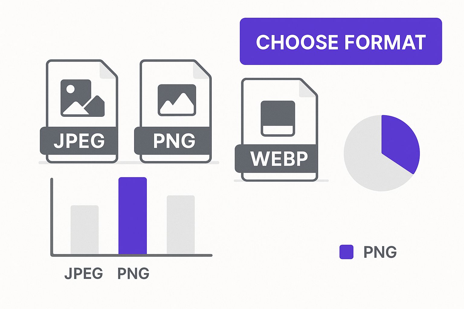
Starting with the right format, as you see above, ensures your compression plugin can do its best work.
To help you decide which tool is right for you, here’s a quick comparison of the top players in the game.
Comparing Top WordPress Image Optimisation Plugins
This comparison table highlights the core features, compression methods, and ideal use cases for the leading plugins, helping you choose the right tool for your specific needs and budget.
| Plugin | Key Features | Compression Type | Ideal For |
|---|---|---|---|
| ShortPixel | WebP conversion, glossy JPEG option, PDF optimization, command-line tools. | Lossy, Lossless, Glossy | Users needing maximum compression with advanced options and WebP support. |
| Smush | Bulk optimization, lazy loading, incorrect size detection, directory smushing. | Lossy, Lossless | Beginners and users who want a simple, free, and reliable solution integrated into their workflow. |
| Imagify | 3 compression levels, WebP conversion, visual comparison tool. | Normal, Aggressive, Ultra | Those who want a simple UI with clear compression levels and the ability to visually compare results. |
Each of these plugins offers a fantastic "set-it-and-forget-it" approach. You just need to find the one whose features and pricing model fit your site's needs the best.
The impact of these plugins is real and measurable. It's not uncommon to see a JPEG drop from 250KB to 80KB or a PNG shrink from 400KB to 120KB with no visible loss in quality. This "set-it-and-forget-it" approach to image optimisation in WordPress is what makes these tools so essential. You establish your settings—say, a medium level of lossy compression for all uploads—and the plugin handles the rest.
This frees you up to focus on creating content, confident that your site's performance isn't being held back by heavy visuals. For a deeper dive into these tools and more advanced techniques, check out our complete guide on optimizing images for WordPress.
Using Modern Formats and Responsive Images
Okay, so you've nailed resizing and compressing your JPEGs and PNGs. That’s a huge step. But the next level of image optimization involves thinking smarter, not just smaller. It's all about serving the right image, in the right format, to the right device.
This is where next-gen formats and responsive images come into play, and frankly, they are absolute game-changers for site speed. We’re moving beyond the classic formats we've relied on for years. Modern browsers can handle much more efficient alternatives that deliver the same quality in a smaller, faster package.
Embrace the Power of WebP
The most important modern format you need to know is WebP. It was developed by Google, and it consistently produces files that are 25-34% smaller than comparable JPEGs and PNGs without any noticeable drop in quality. It’s incredibly versatile, too, supporting transparency and animation, making it a solid replacement for both older formats.
The best part? You don't have to manually convert every single image you own. Most of the top-tier optimization plugins I use, like ShortPixel or Imagify, will automatically create WebP versions of your images the moment you upload them.
These plugins then intelligently serve the WebP version to browsers that support it (which is most of them, like Chrome, Firefox, and Edge) while providing the original JPEG or PNG as a fallback for the few that don't. This setup ensures 100% compatibility while giving the vast majority of your visitors a much faster experience.
This automatic process is a core benefit of modern image optimization. Your server detects the user's browser capabilities and sends the most efficient file format it can, all without you having to lift a finger after the initial setup.
Making Your Images Responsive
Just as important as the format is the size of the image being delivered. A visitor on a tiny smartphone screen absolutely should not be forced to download a massive 1920-pixel-wide hero image designed for a desktop monitor. That's a huge waste of their data and your server's bandwidth.
Fortunately, WordPress has handled the basics of responsive images for you since version 4.4. When you upload an image, WordPress automatically creates several smaller versions (thumbnail, medium, large, etc.). It then adds special srcset and sizes attributes to the image's HTML.
These attributes essentially give the browser a menu of available image sizes. The browser then uses this info, plus its knowledge of the device's screen size and resolution, to request the smallest possible image that will still look perfectly sharp. It's a brilliant, efficient system that happens completely behind the scenes.
A Real-World Responsive Image Scenario
Let's imagine how this plays out with a big hero image on a business website built with a flexible theme like Divi.
- The Upload: You upload your beautiful hero image at
2000x1200pixels. WordPress immediately gets to work, creating several smaller copies—maybe at1200px,800px, and400pxwidths. - Desktop Visitor: Someone visits your site on a large laptop. Their browser checks the
srcsetattribute, sees it has a big screen, and requests the full-size2000pxversion. The image is crisp and fills the screen perfectly, just as you intended. - Mobile Visitor: Another person pulls up your site on their phone. Their browser sees the small, high-density screen and calculates that the
800pxversion is the most efficient choice—it's large enough to look sharp on a retina display but is a much smaller file than the original.
The mobile visitor gets a much faster load time because they didn't have to download that huge desktop file. This is the heart of a great user experience and a critical piece of modern image optimisation in WordPress. When you're building custom layouts, especially with a page builder, it's essential to understand and properly set up your images for different breakpoints. For a deeper dive on this, you might be interested in the ultimate guide to using images with Divi, which really gets into these device-specific details.
By combining next-gen formats like WebP with the built-in responsive powers of WordPress, you’re making sure every visitor gets the best possible version of an image, leading to a faster, smoother, and more enjoyable experience for everyone.
Speed Up Delivery with Lazy Loading and a CDN
Getting your images perfectly compressed and converted to a next-gen format is a huge win. But that’s only half the battle. The journey that file takes from your server to your visitor's screen is just as critical for performance.
Even a tiny 80KB image can feel sluggish if it has to travel halfway across the globe.
This is where we shift our focus from the image file itself to its delivery. We'll use two powerful techniques to close that final gap and make sure your site feels lightning-fast to every single visitor.
The first strategy is all about timing. Your website shouldn't waste time and energy loading images your visitors can't even see yet.
How Lazy Loading Boosts Initial Page Speed
Lazy loading is a clever trick that tells a browser, "Hey, don't bother downloading the images at the bottom of the page until the user actually scrolls down to them."
This one change dramatically speeds up the initial page load because the browser only has to render the content currently visible in the viewport—what we call "above the fold."
Ever since WordPress 5.5, this feature is baked right into the core. It automatically adds the loading="lazy" attribute to most images, meaning this critical piece of image optimisation for WordPress is likely already working for you without any extra effort on your part.
So, why is this so effective?
- Faster Initial Render: The browser can build and display the visible part of the page much more quickly.
- Saves Bandwidth: Visitors on mobile data plans won't burn through their data downloading images they never even see.
- Improves Core Web Vitals: By shrinking the initial download size, lazy loading gives a direct boost to metrics like Largest Contentful Paint (LCP).
While the native WordPress feature is great, I've found that many caching plugins like WP Rocket or Smush offer more advanced options. They give you finer control, letting you exclude certain images or customize how they transition into view.
Closing the Distance with a CDN
Lazy loading handles when images are loaded, but a Content Delivery Network (CDN) manages where they're loaded from.
A CDN is a globally distributed network of servers that stores copies (or caches) of your website's static files, including all your images. When someone visits your site, the CDN automatically serves those images from the server that's physically closest to them.
This simple change can have a massive impact on load times by slashing network latency—the time it takes for data to travel from point A to point B.
I like to think of a CDN as a global franchise for your media library. Instead of forcing every customer to travel to your one headquarters, you open local branches all over the world. Everyone gets faster service.
A Real-World CDN Scenario
Let’s make this practical. Imagine your website is hosted on a server in New York. You have two visitors—one in Toronto, and another way over in Sydney, Australia.
Visitor Without a CDN: The user in Sydney requests an image. That request has to travel over 9,900 miles across undersea cables to get to the New York server. Then, the server has to send the image file all the way back. Even on a fast connection, this round trip adds a noticeable delay, tacking on hundreds of milliseconds for just one image.
Visitor With a CDN: The same Sydney user makes the request. But this time, the CDN intercepts it and serves the image from its local "edge" server right there in Sydney. The data only has to travel a few dozen miles. The load time is slashed, and the image appears almost instantly.
This geographical advantage is what makes a CDN an essential tool for any site with a global audience. It ensures a consistently fast experience for everyone, no matter where they are.
By pairing an intelligent loading strategy like lazy loading with a global delivery network like a CDN, you’re not just optimizing the images themselves—you're optimizing the entire delivery pipeline for maximum speed.
Boosting Your SEO with Image Best Practices

After you've shrunk down file sizes and figured out how to deliver them faster, the final piece of the puzzle is turning your visuals into genuine SEO assets. It’s a step too many people skip. They treat images like decoration, but every single one is a chance to send strong relevancy signals to search engines and open up a new stream of organic traffic. This is where all that technical work starts turning into real, measurable marketing wins.
This process actually starts before you even upload a single image to WordPress. The file name itself is your first opportunity to tell Google what the image is all about. A generic name like IMG_8432.jpg gives search engines absolutely nothing to work with.
By getting into the habit of renaming files with descriptive, keyword-focused language, you’re handing crawlers a critical piece of information they can use to index your content properly. It's a small change that directly impacts your ability to rank in both standard and image search results.
Writing File Names and Alt Text That Actually Work
Think of your file name as the image's headline and the alt text as its core description. Both need to be crystal clear, descriptive, and tightly aligned with the content on the page.
- Be Descriptive: Your file name should accurately describe what's in the picture. No shortcuts.
- Use Keywords Naturally: If it makes sense, weave in your target keyword or related terms. For instance,
vegan-chocolate-chip-cookies-recipe.jpgis infinitely more valuable thanphoto-1.jpg. - Keep It Concise: Use hyphens to separate words. Steer clear of long, spammy file names that look like you're trying too hard.
- Write for Humans: The primary job of alt text is accessibility—it describes the image for visitors using screen readers. The good news is that great alt text naturally includes keywords because it’s simply describing the image's content.
Let's look at a real-world example from a food blog to see how this plays out.
The Wrong Way:
- File Name:
DSC00123.jpg - Alt Text:
cookies
The Right Way:
- File Name:
chewy-vegan-chocolate-chip-cookies-recipe.jpg - Alt Text:
A close-up shot of freshly baked chewy vegan chocolate chip cookies stacked on a white plate.
See the difference? The "Right Way" example provides rich, contextual information for search engines and massively improves the experience for visually impaired users. It’s a true win-win.
By treating your image file names and alt text with the same care as your page titles and headings, you unlock a new channel for search visibility. It’s a simple, repeatable process that builds SEO value over time with every image you upload.
The cumulative effect here is huge. We know that content with well-optimized images can see as much as a 94% increase in views, and every second you shave off your load time can boost conversions by up to 7%. These SEO-friendly habits don't just help you rank better; they contribute directly to a better user experience and, ultimately, your bottom line. You can dig deeper into how visuals impact performance by reading this 2025 image optimization guide.
When you combine technical optimizations—like compression and modern formats—with these on-page SEO best practices, your image optimisation in WordPress becomes a complete strategy. You end up improving speed, accessibility, and search rankings all at the same time.
Got Questions About WordPress Image Optimisation?
Even with a solid game plan, you're bound to run into a few practical questions once you start digging in. Let's tackle some of the most common hurdles I see people face when they first get into image optimisation in WordPress. Clearing these up should give you the confidence to dive right in.
Can I Optimise Images Already on My Site?
Yes, you absolutely can. Most of the go-to image optimisation plugins like Smush, ShortPixel, or Imagify come with a "Bulk Optimise" feature.
This is a lifesaver. It scans your entire Media Library and applies whatever compression settings you’ve chosen to all your existing images. It saves you from the nightmare of having to manually re-upload every single file.
Think of bulk optimisation as a reset button for your media library's performance. It’s the fastest way to bring years of legacy content up to modern standards, and you'll often see immediate, noticeable speed improvements across your whole site.
Will Compressing My Images Make Them Look Blurry?
That’s a common fear, but it’s entirely avoidable if you know what you’re doing. Modern compression algorithms are incredibly sophisticated.
- Lossless compression is your safest bet. It shrinks file sizes with zero quality loss, making it perfect for logos, icons, or any graphic where sharp detail is non-negotiable.
- Lossy compression is where you get the biggest bang for your buck. It achieves much larger file savings by removing tiny bits of data the human eye usually can't perceive.
The best plugins let you find that perfect sweet spot. You can dial in the compression level and even preview the results to make sure your images stay crisp and clear while dropping a ton of weight.
Do I Need a Caching Plugin Too?
For the best possible results, yes. Image optimisation and caching plugins do two different, but highly complementary, jobs. Getting them to work together is how you really maximize your site's speed.
An image optimiser’s job is to shrink your image files before they're ever requested by a browser. A caching plugin then takes over, saving static copies of your pages—including those newly lightweight images—so it can deliver them to visitors almost instantly. It's a powerful one-two punch for performance.
Ready to create stunning, high-performing popups and interactive elements on your Divi site? Check out what Divimode can do for you at https://divimode.com.
More Articles You Will Like