
 Alex Martin
A great website header isn't just a design element; it’s the command center for your entire user experience. It needs to seamlessly blend your brand identity, provide dead-simple navigation, and feature a compelling call-to-action. It’s the first impression that sets the tone for everything else.
Why Your Header Is Your Most Valuable Real Estate
Think of your header as your website's digital handshake. It’s the very first thing visitors see, and it has mere milliseconds to communicate who you are and what you're all about. Getting this right isn't just a design exercise—it’s a critical business strategy that directly shapes how users perceive you from the moment they arrive.
The speed of this judgment call is pretty wild. Users form an opinion about your brand’s credibility in a fraction of a second, and that snap decision is heavily influenced by your header's clarity and professionalism. A cluttered, confusing, or just plain ugly header can instantly scream "untrustworthy," sending visitors bouncing before they even scroll.
The Foundation of User Experience
A high-performing header has to do more than just look pretty; it's the primary tool for guiding visitors through your site. It instantly answers their core questions: Where am I? What can I do here? And where should I go next? By giving them clear pathways, you slash friction and make it effortless for them to find what they need. That kind of seamless navigation is the backbone of a fantastic user experience.
Your header is the anchor of your website. It provides consistency and orientation, reassuring users that they are in the right place, no matter which page they are on. It’s a constant, reliable guide in their journey through your site.
More Than Just a Menu
While navigation is job one, a truly effective header design integrates several key components that have to work in harmony. Each piece has a specific role, and when they come together, they create a cohesive journey that doesn't just inform users but actually converts them into customers.
Let's break down what those essential components are and why they matter.
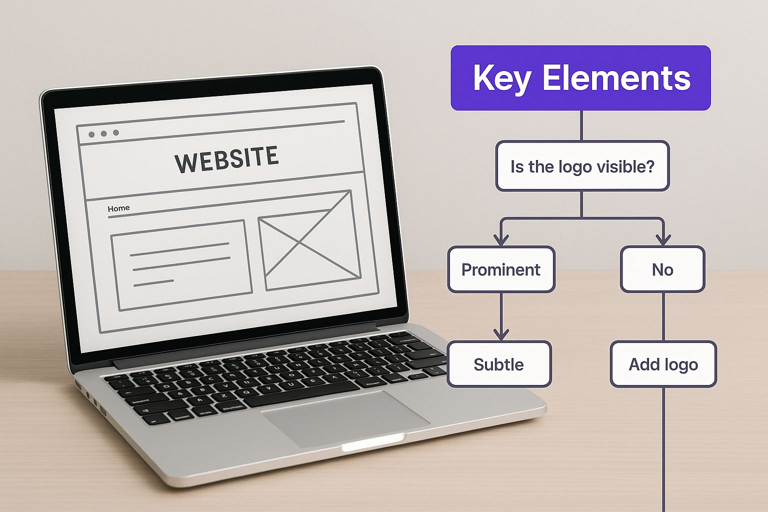
Core Components of a High-Performing Website Header
This table gives you a quick overview of the non-negotiable elements that make a header work and the role each one plays in the bigger picture.
| Component | Primary Function | Design Goal |
|---|---|---|
| Logo | Brand Recognition | Clear, prominent placement to reinforce identity. |
| Navigation | User Guidance | Intuitive, simple links to key pages. |
| Call-to-Action | Conversion | A clear, compelling button for the primary user goal. |
| Search Bar | Information Retrieval | Easy access for users who know what they're looking for. |
| Utility Links | Secondary Actions | Access to login, cart, or contact information. |
Getting these elements right is the first step toward a header that not only looks great but also performs like a champ.
A well-executed header is also your best tool for reinforcing brand identity at every single touchpoint. The strategic placement of your logo, the consistent use of brand colors, and sharp typography all come together to build a strong, memorable presence. This visual consistency builds recognition and helps foster a deeper connection with your audience, turning a simple visit into a branded experience.
One of the most critical jobs of the header is shaping that all-important first impression. Research consistently shows that 94% of a user's initial impression of a site is tied directly to its design. Visitors make up their minds in as little as 0.05 seconds, which means your header has to be immediately engaging and functionally clear to earn their trust from the get-go. You can dig into more of these fascinating web design statistics on Hostinger if you're curious.
Choosing a Header Style That Fits Your Brand
When it comes to website headers, a one-size-fits-all approach just doesn't cut it. The right style is a careful blend of your site's purpose, your brand's unique personality, and what you need your visitors to do. Let's move past the theory and dig into the header types I see working best in the wild.
Your header choice has a massive impact on everything from site usability to how people feel about your brand. Every style comes with its own trade-offs. We’ve done a deep dive into how various headers for website design impact performance, and it’s clear there’s a perfect fit for almost any scenario.
This graphic breaks down some of the key things you should be thinking about.
As you can see, the real challenge is finding that sweet spot between branding, navigation, and user goals.
The Classic Fixed Header
The fixed or "sticky" header is probably the most popular choice out there, and for good reason. It stays locked to the top of the screen while the user scrolls, which is a huge win for user experience. Your logo and navigation are always just a click away.
I find this style to be a real workhorse for a few key site types:
- Blogs with long articles: Readers can jump to another section without the frustration of scrolling all the way back to the top.
- E-commerce sites: A persistent cart icon and search bar make the shopping experience so much smoother.
- Service-based businesses: Keeping that "Get a Quote" button in sight at all times is a simple way to keep your main call-to-action front and center.
Just be careful with its height. A bulky sticky header can chew up precious screen space, especially on mobile, and that can get annoying fast.
The Minimalist Header
If your site is all about the content—like a portfolio, personal blog, or an online magazine—a minimalist header is your best friend. This approach strips away everything but the essentials. We're talking just a logo and a simple menu, which might even be tucked behind a hamburger icon on desktop.
The whole point here is to kill distractions and create a clean, modern vibe. By getting out of the way, a minimalist header lets your photography, articles, and design do the talking. It signals a confident brand that values substance over flash.
The Immersive Hero Header
Need to make a huge first impression? Nothing beats a hero header. This isn't just a navigation bar; it's a full-blown storytelling canvas that combines your menu with a massive, eye-catching image or video that fills the entire screen.
A hero header is your brand's opening statement. It’s perfect for launching a new product, promoting a key message, or creating an emotional connection from the moment a visitor lands on your site.
This style is a go-to for SaaS companies, creative agencies, or any brand with a strong visual story to tell. The trick is making sure your call-to-action is impossible to miss and that the navigation doesn't get lost in the background.
Advanced Navigation Solutions
When you're dealing with a massive website, a simple navigation bar just won't cut it. You'll quickly run into some complex structural challenges, and that's where more advanced solutions come into play.
- Mega Menus: These are the standard for huge e-commerce stores and news sites. A mega menu is basically an expandable dropdown on steroids, showing multiple columns of links, images, and icons. It's the best way I know to organize hundreds of pages without completely overwhelming your users.
- Hamburger Menus: Once a mobile-only feature, the hamburger icon is now common on desktop for minimalist and design-forward sites. It tidies up the interface by hiding the main navigation. While it definitely creates a cleaner look, remember that it adds an extra click to get anywhere—a trade-off you need to weigh carefully based on who your audience is.
Creating Navigation That Actually Helps Your Users
A gorgeous header that makes people feel lost is just bad design. Simple as that. This is where we stop thinking purely about style and start focusing on what makes a website’s navigation feel effortless and intuitive for the person on the other side of the screen.
Great navigation isn't just a list of pages. It’s about anticipating what your visitor needs and showing them the way without them having to think too hard about it.

This whole process kicks off with solid information architecture—which is really just the fancy term for organizing your content in a way that makes sense. Think of it as the blueprint for your website. Before you even open the Divi Builder, you should map out the user's journey. What are the top 3-5 things you want them to do? Those priorities should be front and center in your navigation.
Establishing a Clear Visual Hierarchy
Visual hierarchy is all about telling the user's eye where to look first, second, and third. For a header, this means making your most important elements impossible to miss. Your primary call-to-action (CTA) button, for example, should never get lost in a sea of secondary links.
You can create this clarity with a few tried-and-true techniques:
- Color and Contrast: Give your main CTA—like "Book a Demo" or "Shop Now"—a bold, contrasting color. This single tweak can make a massive difference in how many people click it.
- Size and Weight: Make your most important navigation links just a little bit bigger or bolder than less critical ones like "Login" or "Support."
- Spacing: Don't be afraid of whitespace. A header crammed with links feels chaotic and overwhelming. Giving elements room to breathe creates a sense of order and makes it way easier for visitors to scan and find what they’re looking for.
When you master this visual language, you guide users without them even noticing. For a deeper dive, check out these essential website navigation best practices that will help you create a better user experience and boost conversions.
Writing Menu Labels That Make Sense
The words you choose for your menu are just as crucial as the design. Using clever or ambiguous labels is one of the fastest ways to confuse people. A visitor shouldn't have to spend brainpower trying to figure out what "Solutions" or "Offerings" actually means.
Keep your labels direct, short, and focused on the user. For instance, instead of "Our Services," just say "What We Do." Instead of "Company," use "About Us." The goal here is clarity, not creativity.
When designing your header's navigation, always prioritize clear communication over clever marketing jargon. If a user has to stop and think about what a link means, you've already introduced unnecessary friction into their experience.
A quick little test I like to do is to show the navigation to someone who has never seen the site before. I'll ask them what they expect to find behind each link. If they hesitate, I know the labels need another look.
Integrating Essential Header Features
Beyond your primary menu links, a few key features can seriously improve usability when placed in the header. Including them shows you've thought about different user needs and provided the right tools.
A prominent search bar is a big one. For any site with a lot of content or an e-commerce store, a search function is non-negotiable. Data shows time and again that users who use site search are often ready to buy and convert at a much higher rate. If you have the space, don't hide it behind a tiny icon—make it an actual input field.
Accessibility is another piece you can't afford to overlook. Your header has to be navigable for everyone, including people who use screen readers or rely on their keyboard to get around. This means taking practical steps like:
- Logical Tab Order: Make sure users can tab through your navigation links in an order that makes sense.
- ARIA Labels: Use ARIA (Accessible Rich Internet Applications) labels to give context to screen readers, which is especially important for icons or buttons that don't have text.
- Sufficient Contrast: Double-check that your text and background colors meet WCAG (Web Content Accessibility Guidelines) contrast ratios. This ensures people with low vision can actually read your menu.
By baking these elements into your design process, you're not just creating a pretty header. You're building a truly functional tool that works for everyone.
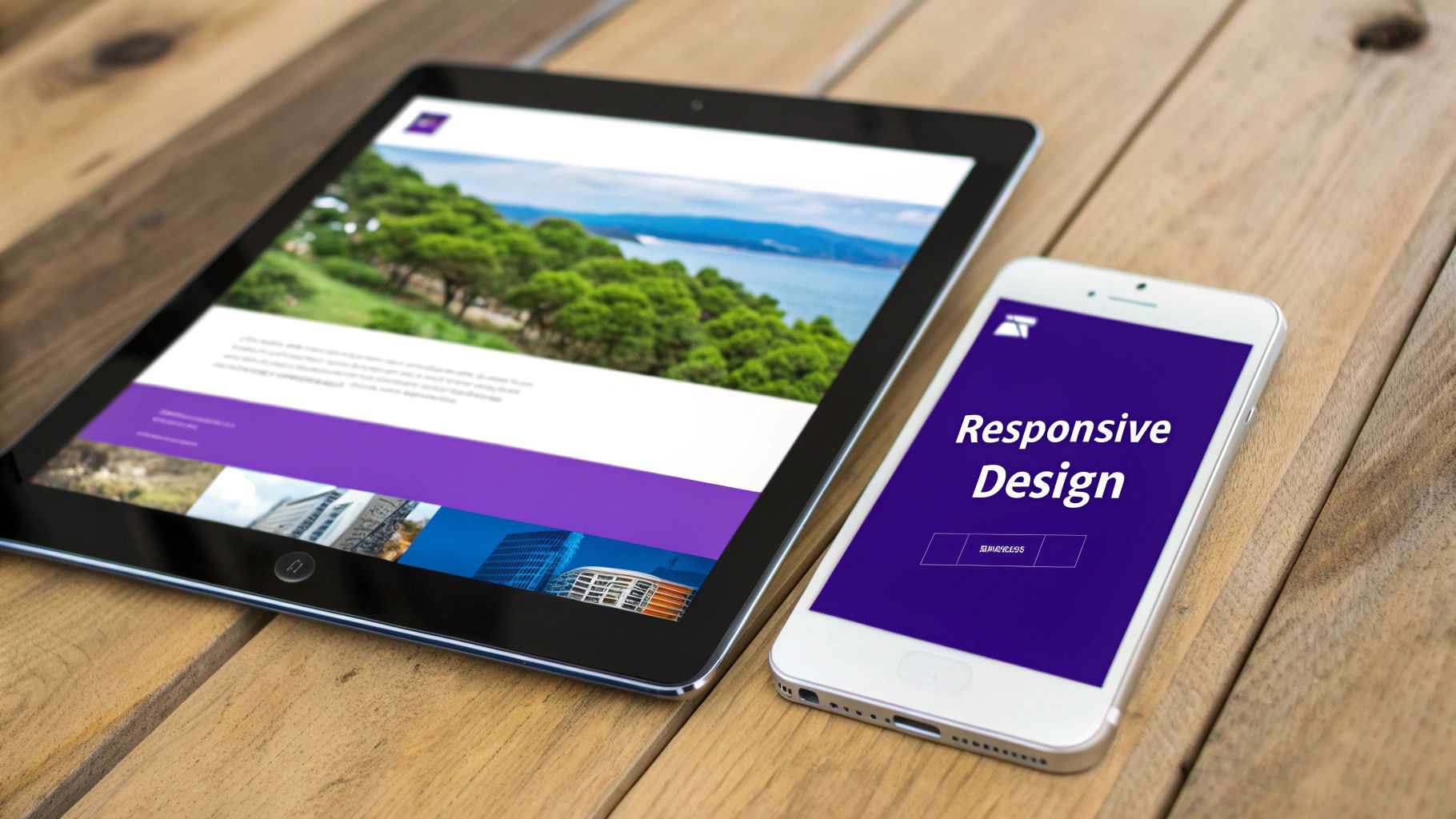
Building a Responsive Header for Every Screen
Let’s be honest: a gorgeous desktop header that completely falls apart on a smartphone is a design failure. In a world where we all jump between laptops, tablets, and phones, a header that breaks on mobile is an instant deal-breaker for your visitors. Designing a truly responsive header isn't about making it smaller; it's about making sure the experience is consistent, functional, and intuitive on any screen.
This isn't just a friendly suggestion anymore—it's the standard. Today, roughly 90% of all websites are built with responsive design in mind, ensuring their headers adapt smoothly. This approach is what maintains usability and visual consistency, which is absolutely critical for keeping people on your site. For a closer look at the data, Hostinger has some great insights on web design statistics.
Adapting Navigation for Small Screens
One of the biggest hurdles with mobile headers is figuring out what to do with a complex navigation menu. A desktop menu with seven or eight links just won't fly on a narrow screen. The go-to solution, for good reason, is the hamburger menu.
That little three-line icon is universally understood. It acts as a trigger to reveal the navigation in a much more digestible format. When a user taps it, the menu usually appears in one of two ways:
- Slide-In Menu (Off-Canvas): The navigation slides in from the side of the screen, typically overlaying part of the main content. This is great because it keeps the user oriented on their current page while still giving them full menu access.
- Full-Screen Overlay: The menu takes over the entire screen, often with a semi-transparent background to hint at the page underneath. This option is perfect for creating focus, especially for sites with extensive menus and sub-items.
Whichever you choose, make sure the transition is slick and the icon itself is easy to tap.
Optimizing Touch Targets for Usability
On a desktop, we have the pixel-perfect precision of a mouse cursor. On mobile, we have our thumbs. That fundamental difference means you have to design for "touch targets"—the actual area of the screen that responds when a user taps.
If your buttons and links are tiny or crammed together, you're setting users up for "fat-finger" syndrome, where they accidentally tap the wrong thing. It’s incredibly frustrating and a surefire way to increase your bounce rate. To sidestep this, just follow these simple guidelines:
- Minimum Size: Apple's own Human Interface Guidelines recommend a minimum target size of 44×44 pixels. It’s a solid benchmark.
- Adequate Spacing: Always leave enough breathing room between tappable elements to prevent mis-clicks.
This applies to everything in your mobile header, from the hamburger icon and logo to your call-to-action button.
A responsive header is more than just a shrunken-down version of your desktop design. It requires a complete rethinking of layout, interaction, and priority to serve the unique needs of a mobile user.
Maintaining Brand and CTA Visibility
As you rejig your header for smaller screens, it's crucial not to lose your brand identity or your most important call-to-action. Your logo should still be clearly visible, although you might want to switch to a simplified version or just an icon (a "logomark") to save precious real estate.
Your main CTA button is just as important. If you can help it, don't bury it inside the hamburger menu. For so many businesses, keeping a button like "Book Now" or "Get a Quote" always visible in the mobile header can make a real difference to conversions. You might need to shrink the text or tweak the button's style, but its constant presence is what counts.
For those of you using Divi, the Theme Builder is your best friend for managing these different layouts. You can even build a completely separate, streamlined header just for mobile and assign it to phone and tablet views. Our guide on how to create a global header with Divi walks you through setting up these foundational structures from scratch. Handling these breakpoints gracefully ensures your header works beautifully, no matter how someone finds your site.
Optimizing Header Performance for Speed and SEO
You can craft the most beautiful, user-friendly header in the world, but if it drags down your site's performance, it’s actively working against you. A slow-loading header makes a terrible first impression, often frustrating visitors before they even see what your site is about. This isn't just a minor annoyance; it's a direct hit to your SEO rankings and conversion rates.
The numbers don't lie. Poor header design and clunky content issues are enough to drive away 38% of visitors. And the biggest offender? Slow-loading images, which cause 39% of users to simply give up and leave. This data really hammers home the need to optimize every single asset at the top of your page.
Getting performance right means putting on your technical hat for a moment. By focusing on speed, you ensure all your hard design work actually supports your business goals instead of sabotaging them.
Identifying Common Performance Killers
Before you can fix a slow header, you have to know what's actually causing the bottleneck. Most of the time, the problems boil down to a few usual suspects that add unnecessary weight and complexity, forcing browsers to work way harder than they should.
Here’s what I typically look for first:
- Oversized Image Files: This is the big one. Large, uncompressed logos, hero backgrounds, or icons are the number one cause of header bloat.
- Render-Blocking Resources: These are the CSS and JavaScript files that demand to be loaded before any of your page content can appear. They literally block everything.
- Excessive Code: Clunky, inefficient code from themes or page builders can add hundreds of milliseconds to your load time without you even realizing it.
- Too Many HTTP Requests: Every single element in your header—each image, script, and stylesheet—requires a separate request to the server. These add up incredibly fast.
Running a quick audit of your header for these specific issues is the essential first step toward a faster, more effective website.
A fast header directly impacts your Core Web Vitals, especially Largest Contentful Paint (LCP). Optimizing it isn't just about shaving off a few milliseconds; it's about improving the key metrics Google uses to rank your site.
A Practical Checklist for Header Optimization
Turning a heavy, bloated header into a lean, fast-loading one comes down to a series of small but incredibly impactful adjustments. By methodically tackling these technical details, you can make a huge difference in both user experience and search engine visibility.
Image and Asset Optimization
I always start with the media files. This is where you'll find the biggest and quickest wins.
- Compress All Images: Use a tool like TinyPNG or ShortPixel. They can slash the file size of your JPEGs and PNGs without any noticeable drop in quality. It’s a no-brainer.
- Use SVGs for Logos and Icons: For anything that isn't a photograph, SVGs are the way to go. Scalable Vector Graphics are incredibly lightweight and stay perfectly crisp at any size, making them the ideal format for logos and simple icons.
- Serve Next-Gen Formats: Convert your images to modern formats like WebP. It offers far superior compression compared to old-school JPEGs and PNGs, meaning faster load times for the same quality.
Code and Script Management
Once your images are sorted, it’s time to look at the code that powers your header.
- Minify CSS and JavaScript: Minification is a process that strips out all the unnecessary characters from your code (like spaces, comments, and line breaks). This makes the files smaller and faster for browsers to download and process.
- Defer Non-Critical Scripts: You can tell the browser to wait until the rest of the page has rendered before loading certain scripts. This simple change prevents non-essential JavaScript from blocking the initial page view, making your site feel much faster to the user.
Focusing on these key areas allows you to systematically chip away at the resources needed to load your header. To really take things to the next level, you should explore broader expert WordPress speed optimization strategies that apply to your entire site. And if you're looking for platform-specific advice, we’ve also put together a detailed guide to optimize WordPress speed that covers caching, database cleanup, and more. After all, a faster site starts with a faster header.
Connecting Header Design to Real Business Growth
We've spent a lot of time breaking down the nuts and bolts of header design, from layouts and navigation to performance tweaks. But now it's time to connect every single pixel and decision back to what really matters: tangible business results. A well-designed header isn’t just a line item on an invoice; it's a powerful engine for growth.
https://www.youtube.com/embed/UE09Qa-_TWE
When you simplify navigation and build immediate trust, a strategic header directly improves the metrics that move the needle. Think about it. An intuitive menu helps users find what they need, which lowers your bounce rate. A clear, compelling call-to-action in a sticky header is always visible and ready for a click, boosting conversion rates.
Driving Conversions and Shortening the Sales Cycle
The moment a potential customer lands on your site, a professional header instantly signals that you're credible and trustworthy. That first impression makes them far more willing to engage, whether that means signing up for a newsletter, requesting a demo, or pulling out their credit card.
The easier you make it for them to take that next step, the shorter your sales cycle becomes.
For a service-based business, a "Get a Quote" button right there in the header will pull in way more qualified leads than a site where contact info is buried three clicks deep. The header becomes a consistent, reliable lead-gen tool on every single page of your website.
The Financial Case for a Better Header
Investing in user experience, especially in a critical spot like the header, delivers a crystal-clear return. There's a reason the global web design market, valued at $61.23 billion in 2025, is projected to rocket to $92 billion by 2030—businesses are seeing the financial upside of effective design.
In fact, it's not uncommon for businesses to see a return of around $100 for every $1 spent on UX improvements like the ones we've covered. If you're interested in the numbers, you can find more stats on web design's financial impact on Agency Handy.
A great header isn't an artistic choice; it's a strategic investment. Every element—from the logo placement to the navigation labels—should be designed to guide users toward a specific business goal.
Ultimately, designing website headers with usability, clarity, and performance in mind is a cornerstone of any successful digital strategy. It's what turns your website from a simple online brochure into a high-performing asset that actively contributes to your bottom line, proving its value with every single click and conversion.
Answering Your Top Header Design Questions
When you're deep in the weeds of building a website, the same header design questions seem to pop up over and over again. Getting these fundamentals right from the start is crucial, as they directly impact how users interact with your site. Let's tackle a few of the most common ones I hear from clients and colleagues.
How Tall Should My Header Be?
This is easily the most frequent question. While there isn't a single "perfect" number, my rule of thumb for desktop headers is to stay somewhere between 60px and 120px tall. This range gives you enough room to work with—for your logo, navigation, and maybe a CTA—without chewing up too much of that precious above-the-fold screen space.
Should I Use a Sticky Header?
The debate over sticky headers is a classic. For most websites where users will be scrolling down the page, my answer is a resounding yes. A sticky header is a massive win for user experience. It keeps your primary navigation and call-to-action always in view, which can genuinely boost conversions by making it easier for people to take the next step.
Of course, there are exceptions. If you're building a simple one-page portfolio or a landing page with very little content, a sticky header might just be overkill.
How Many Links is Too Many in My Navigation?
Finally, let's talk about navigation bloat. It's tempting to cram every important page into your main navigation, but that's a recipe for confusion. Simplicity is your best friend here.
My go-to advice is to aim for 5 to 7 main navigation items, max. This forces you to prioritize what's truly essential and prevents overwhelming your visitors with too many choices, leading to a much cleaner and more focused user journey.
If you're running a massive site, like an e-commerce store with tons of categories, don't panic. This is where mega menus or thoughtfully designed sub-menus become your secret weapon for keeping things organized without cluttering up the main header.
Ready to build headers that do more? With Divimode, you can create advanced mega menus, sticky bars, and targeted popups right inside the Divi Builder. Check out our powerful tools at https://divimode.com.
More Articles You Will Like