 Alex Martin
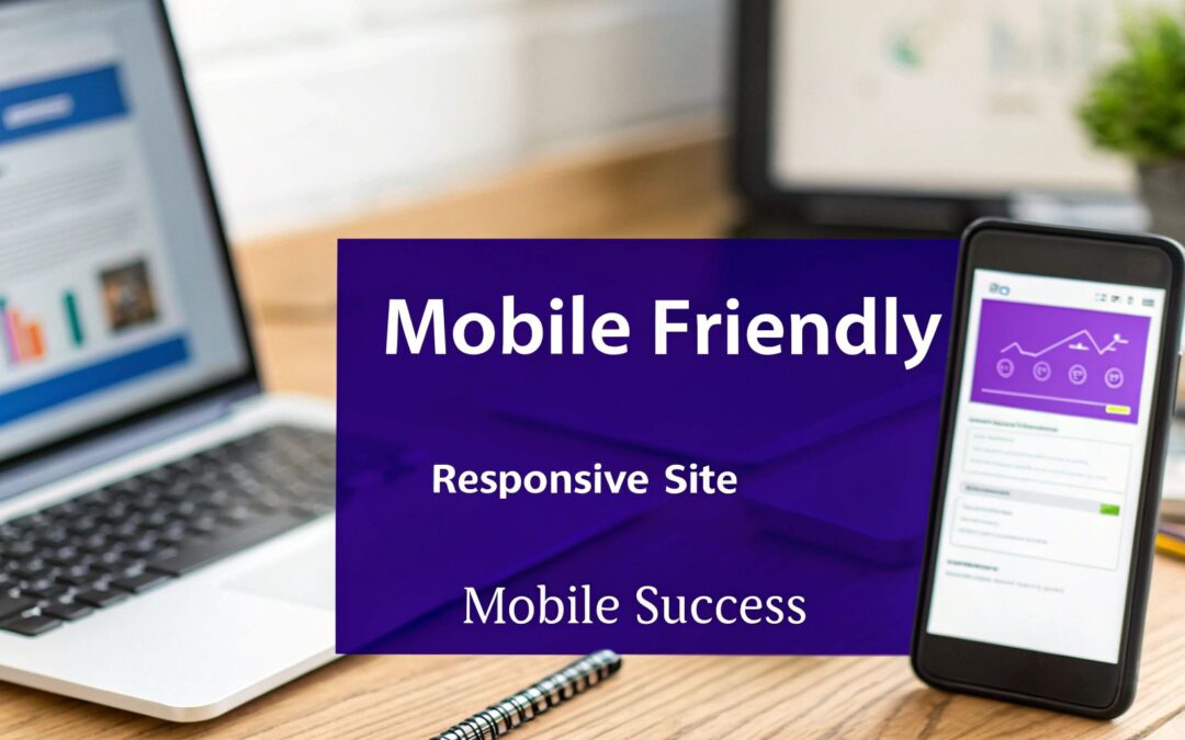
Building a mobile-friendly site is about much more than just making your desktop version smaller. It's about crafting an experience that feels intuitive and effortless on a smartphone. The secret sauce is responsive design—a smart approach that automatically reshapes your content, images, and layout to fit any screen perfectly, ensuring every visitor has a great experience.
Why Mobile Experience Is Your New Homepage
Let's get one thing straight: the days of designing for the desktop first are long gone. For most businesses, your mobile site is the real front door. It’s where the majority of your audience will meet your brand for the first time. If you drop the ball here, you’re not just missing an opportunity; you're actively turning away potential customers who expect a fast, smooth experience on their phones.
This isn’t a passing trend. It's a seismic shift in how people use the internet. The numbers don't lie: as of 2025, mobile devices drive a staggering 59.7% of global website traffic. That's a huge leap from just under 35% back in 2015. This decade-long surge sends a clear message: if your site isn’t built for mobile, you're invisible to most of your audience. You can dive deeper into these mobile traffic statistics to see just how dramatic this change has been.
The Modern User Expectation
Today's users don't just prefer mobile-friendly sites; they flat-out demand them. They’ve been conditioned by top-tier apps and websites, and their standards are incredibly high.
- Speed is Non-Negotiable: Pages need to load almost instantly. A delay of just a few seconds is enough to send visitors bouncing away to a competitor.
- Effortless Navigation: Buttons, menus, and links must be easy to find and tap with a thumb. If someone has to pinch-to-zoom just to click a link, you've already failed.
- Readability is Key: Text should be big enough to read comfortably without squinting. Paragraphs need to be short, sweet, and scannable.
Think of it this way: a clunky mobile site is the digital equivalent of a physical store with a locked door, poorly lit aisles, and products thrown on the floor. It creates frustration and sends a clear message that you don't value your customer's time.
Mobile vs. Desktop: A Quick Comparison
Understanding these core differences is the first step in building a site that works everywhere. The priorities are fundamentally different.
| Design Factor | Desktop Priority | Mobile Priority |
|---|---|---|
| Screen Real Estate | Expansive, multi-column layouts | Single-column, vertical scrolling |
| Navigation | Detailed menus with hover effects | Simple, thumb-friendly "hamburger" menus |
| Interaction | Precise mouse clicks | Imprecise touch targets and gestures |
| User Context | Focused, task-oriented sessions | Quick, on-the-go information gathering |
Recognizing these distinctions helps frame every design decision. What looks brilliant on a 27-inch monitor can be an absolute disaster on a 6-inch screen. This is why learning how to make a mobile-friendly site is less about a checklist and more about adopting a new mindset—one centered on accessibility, speed, and simplicity.
How Google's Mobile-First Indexing Impacts You
Learning how to make a mobile-friendly site isn't just a "best practice" anymore. It’s a hard requirement if you want to be seen on Google. The search giant fundamentally changed how it sees and ranks websites, and if you haven't caught up, your site is likely already paying the price.
The whole thing is called mobile-first indexing. Put simply, Google now predominantly uses the mobile version of your site for indexing and ranking. It doesn't just glance at your mobile site; it treats it as the primary version. This isn't a new trend—by 2025, it became the undisputed standard, solidifying why exceptional mobile design is non-negotiable.
The implications are huge. If your mobile site is a stripped-down, clunky afterthought, your search rankings are going to suffer. It doesn't matter if your desktop site is a masterpiece. Google's crawler, Googlebot, looks at your mobile version first and judges your entire domain on that experience.
The Content Parity Rule
A classic mistake I still see people make is hiding valuable content on mobile to "clean up" the design. In the past, designers would just remove entire text sections, key product details, or customer reviews from the mobile view to make things look less cluttered.
With mobile-first indexing, that’s a disastrous strategy. If that content isn't on your mobile version, Google simply assumes it doesn't exist. Period. You must ensure content parity between your desktop and mobile sites.
This means all the important stuff has to be present and accessible on all devices, including:
- Main Body Content: The core articles, descriptions, and text that provide real value.
- Structured Data: That special markup that helps Google understand your content (like for reviews, events, or products).
- Metadata: Your page titles and descriptions that show up in search results.
If your mobile site is missing the rich, detailed content from your desktop version, you're essentially telling Google your site is less valuable than it actually is. This directly torpedoes your ability to rank for the keywords you're targeting.
Beyond Content: Your Mobile Experience Matters
But Google doesn't just look at what's on the page; it also evaluates the user experience. A site can have perfect content parity and still fail if it's a nightmare for mobile users.
Googlebot analyzes usability signals, looking for red flags like:
- Clickable Elements: Are your buttons and links crammed together? If they're tough to tap accurately with a thumb, that’s a huge problem.
- Readable Text: Is the font big enough to read without squinting and zooming? Users should never have to pinch-to-zoom just to read a paragraph.
- Viewport Configuration: Does your content fit the screen, or is the user forced to scroll sideways to see everything?
These technical details directly feed into your ranking potential. For those of us using Divi, getting these elements right is everything. We actually put together a guide with key tips for better Divi mobile responsiveness that covers specific techniques.
Ultimately, building a truly mobile-friendly site means treating your mobile visitors as your most important audience—because in Google's eyes, they are.
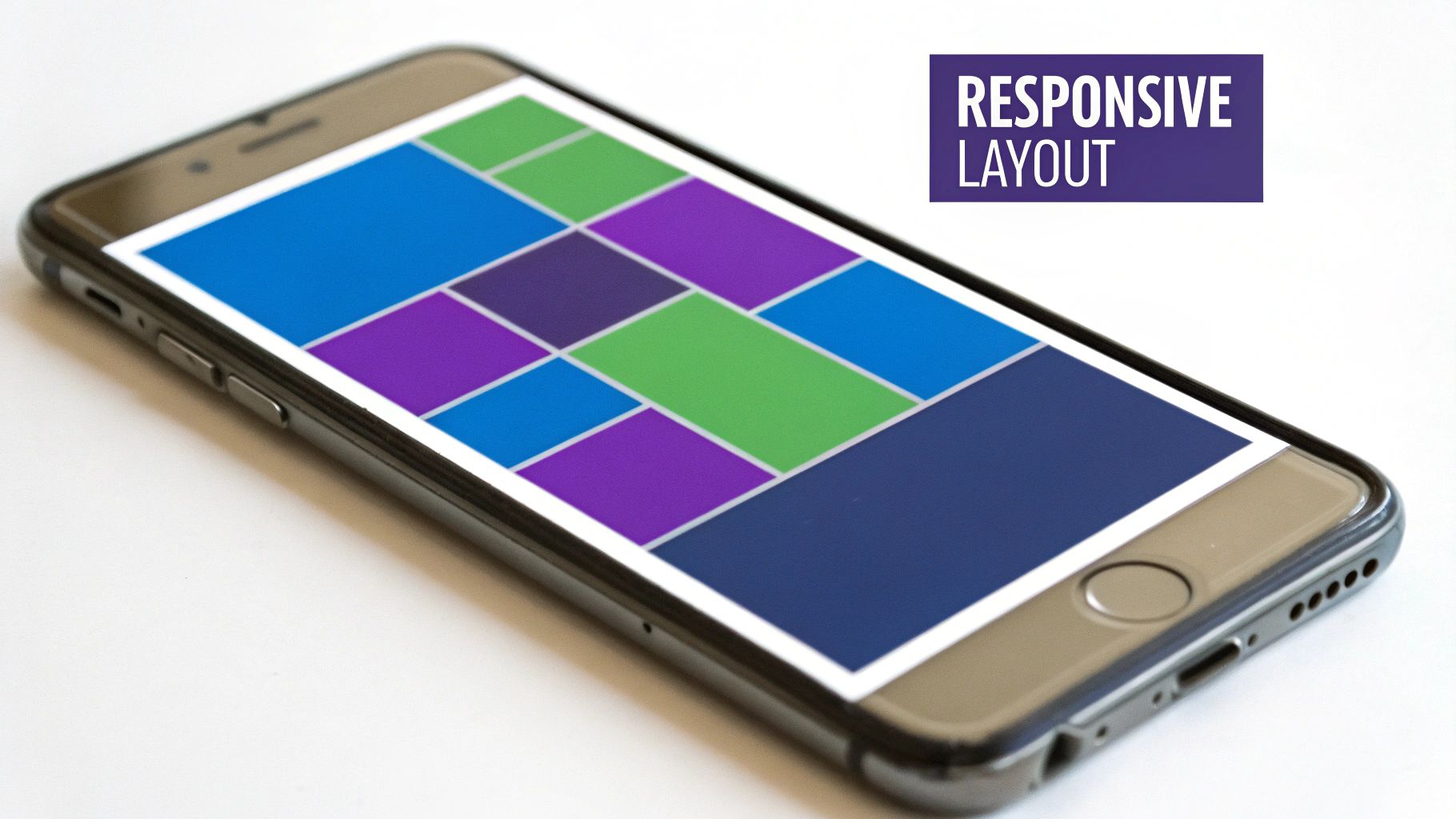
Building Responsive Layouts with Divi
Alright, let's roll up our sleeves and move from theory to practice. This is where the real work of building a mobile-friendly site happens, and with Divi, you’ve got a powerful toolkit ready to go. We're not just flipping a switch here; we're making deliberate, device-specific tweaks to ensure your site is a joy to use, no matter the screen size.
The magic really lies within the Divi Builder’s responsive editing modes. For nearly every design setting you can think of—from padding and margins to font sizes and colors—Divi lets you set different values for desktop, tablet, and mobile. This granular control is what separates a truly responsive site from one that just clumsily shrinks to fit.
Mastering Divi's Responsive Views
The first habit to build is to constantly switch between Divi’s device previews. You'll find icons for desktop, tablet, and mobile right at the bottom of the builder screen. Don't just think of these as previews; they are your distinct design canvases.
As you edit a module, row, or section, hover over any setting's title (like "Padding" or "Font Size"). You'll see a small mobile phone icon pop up. Clicking it opens the responsive tabs, letting you set a unique value for each device. Any setting you apply to the desktop view will automatically cascade down to tablet and mobile unless you specifically override it.
For instance, a hero section might have a generous 150px of top and bottom padding on a desktop to create a spacious, high-impact look. On a mobile device, that much padding would push your headline and call-to-action right off the screen. By activating the responsive settings for padding, you can keep the desktop value while setting a more practical 50px for the mobile view. It’s a simple adjustment that makes a world of difference.
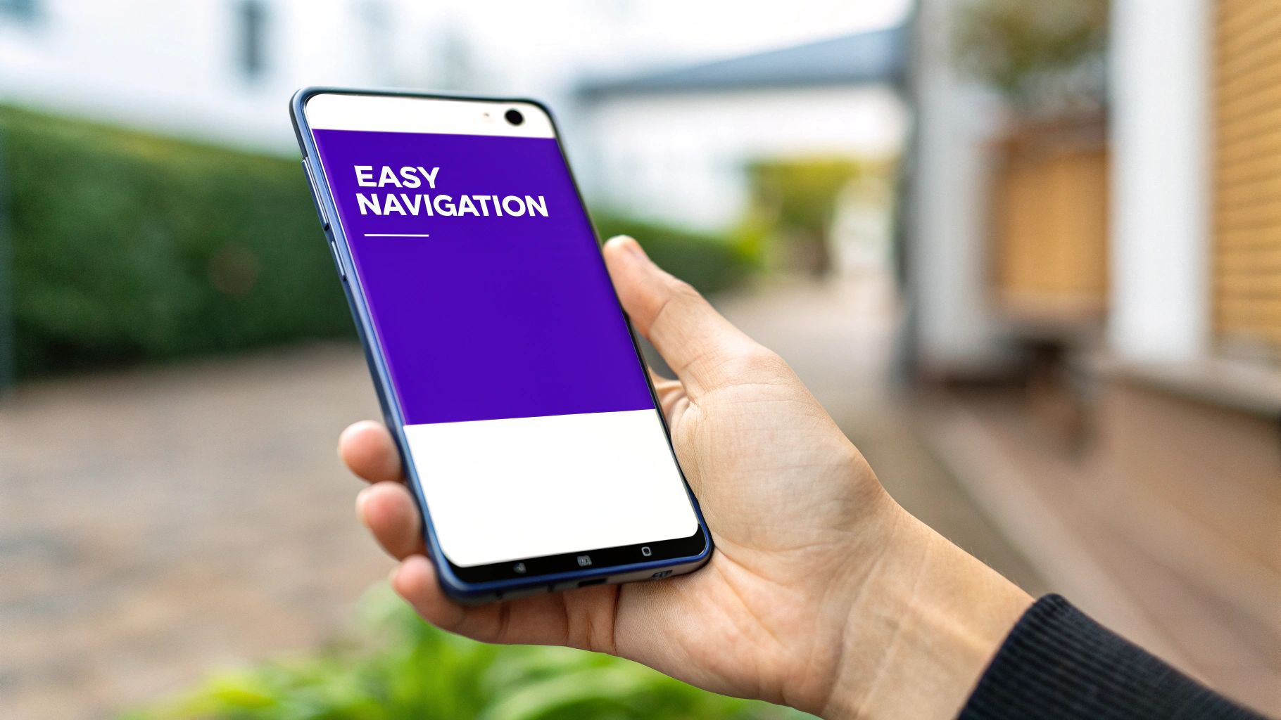
Crafting Comfortable Touch Targets
One of the most common blunders on mobile sites is making interactive elements too small or cramming them too close together. Remember, your users are navigating with their thumbs, not a pixel-perfect mouse cursor. Divi gives you everything you need to fix this.
- Increase Button Padding: A button that looks perfectly fine on a desktop can become a frustratingly tiny target on a phone. Use the responsive settings to add more padding just for the mobile view, making the button physically larger and easier to press.
- Space Out Links: If you have a row of text links, maybe in a footer, they can easily become a jumbled mess on a smaller screen. You can adjust the line height or add a bottom margin to these links only for mobile, creating that much-needed breathing room.
- Enlarge Clickable Icons: Social media icons and other small graphical links must be big enough for a thumb to tap confidently. Tweak their font size (for font icons) or image dimensions in the mobile view to ensure they're easy to hit.
This isn't just about aesthetics; it's a functional necessity. The user experience is immediately torpedoed when someone can't reliably click the element they want.
Remember, a frustrated user is a lost user. Research consistently shows that mobile users are five times more likely to leave a site that isn't mobile-friendly. Failing to adapt your design for touch interaction means you are actively pushing away a huge chunk of your audience. You can find more compelling data about why a mobile-friendly site is crucial for business growth.
Adjusting Typography for Readability
What looks crisp and well-proportioned on a large monitor can quickly turn into an unreadable jumble on a phone. Typography is one of the most critical elements when figuring out how to make a mobile-friendly site.
That bold, oversized H1 headline that looks so good on a desktop might need to be taken down from 64px to a more manageable 38px on mobile. In contrast, your body text might be a comfortable 16px on desktop, but you may want to bump it up to 17px or 18px on mobile to make it easier to read on a smaller, high-resolution screen. Once again, Divi's responsive settings make these precise adjustments a breeze.
This is an example of an image optimization tool interface, showing how file size reductions are tracked and managed.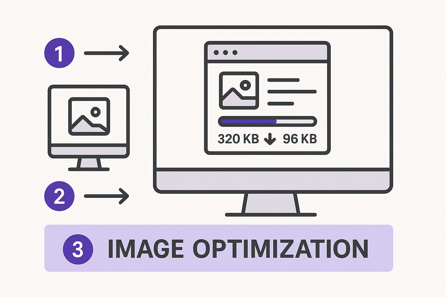
The takeaway here is that visual tools help you make data-driven decisions, letting you strike the right balance between image quality and the file size reductions needed for quick mobile loading.
Using Visibility Controls Intelligently
Let's be honest: not everything on your desktop site needs to be on the mobile version. While you should maintain content parity for SEO purposes, you can—and should—hide purely decorative elements that just clutter the mobile experience or weigh down loading times.
Imagine a complex background video or a large, atmospheric image on your desktop homepage. It looks great, but it serves no functional purpose. On a mobile connection, that element is likely just eating up bandwidth and distracting the user from what they actually came for.
Inside the "Advanced" tab of any section, row, or module, you’ll find the Visibility settings. This is where you can choose to hide an element on phone, tablet, or desktop. It's an incredibly powerful feature for tasks like:
- Hiding Decorative Images: Get rid of large, non-essential background images on mobile.
- Disabling Animations: Complex scroll effects that are smooth on a desktop can sometimes feel clunky on mobile browsers. You can hide the entire section and create a simpler, mobile-only alternative.
- Creating Device-Specific Content: For really complex layouts that just don't translate well, you can build two versions of a section—one for desktop and one for mobile—and use visibility controls to show the right one.
Learning how to make a mobile-friendly site with Divi is really an exercise in using these responsive and visibility controls with intention. When you start thinking about the user's experience on each specific device, you move beyond just "making it fit" and start building genuinely thoughtful, high-performing websites.
Boosting Performance for On-The-Go Users
Let’s be honest: a perfectly responsive layout doesn't mean much if your site takes an eternity to load on a spotty mobile connection. Speed isn't just a bonus feature; it’s a fundamental part of the mobile experience. For your on-the-go users, every millisecond counts. Patience is a resource in very short supply.
Put yourself in their shoes. They’re trying to find your business address while walking down the street or looking up a product review during a commercial break. If your page doesn't pop up almost instantly, they're gone. Google's own research backs this up, showing that as page load time goes from one to three seconds, the probability of a visitor bouncing skyrockets by 32%.
This is why understanding how to make a mobile friendly site is just as much about performance tuning as it is about responsive design.
Shrink Your Images, Not Your Quality
Images are almost always the heaviest elements on a webpage, making them the number one culprit for slow mobile load times. The goal is to slash their file sizes without turning your beautiful visuals into a pixelated mess. This balancing act is called image compression.
Never upload a huge 2MB photo straight from your camera. It needs to be optimized first. For us Divi users, plugins like Smush or ShortPixel are lifesavers. They can automate this process, compressing images right as you upload them. They find that sweet spot between file size and visual quality, so your site looks great without the performance hit.
Beyond compression, always serve images at the correct dimensions. If a container in your layout is only 400 pixels wide on a phone, don't force a 2000-pixel-wide image into it. That just makes the user's browser waste precious time and data resizing it on the fly.
Tell Browsers to Remember Your Site
The first time someone visits your site, their browser has to download everything—images, scripts, stylesheets, the works. If they come back the next day, it has to do it all over again by default. This is where browser caching comes in to save the day.
By enabling browser caching, you're essentially telling the visitor's browser to save certain static files on their device. When they return, their browser can load those files from its local storage instead of re-downloading them from your server. This makes repeat visits significantly faster, which is fantastic for building user loyalty.
A faster experience for returning visitors is key to building loyalty. Implementing browser caching is like giving your frequent customers an express lane, improving their perception of your brand with every visit.
You can set up browser caching in minutes with a good performance plugin like WP Rocket or W3 Total Cache. These tools make it easy to define rules for how long browsers should keep your files.
Minify Your Code Files
Your website’s code—specifically its CSS and JavaScript files—contains a lot of characters that are only there for human readability. Think spaces, comments, and line breaks. While helpful for developers, they're useless to a browser and just add to the file size.
Minification is the process of stripping out all these unnecessary characters. The result is a much smaller file that downloads faster, which is exactly what mobile users need. Most performance plugins handle this automatically, often combining multiple CSS or JavaScript files into a single, minified file to reduce server requests even further.
If you really want to get into the weeds, our complete guide to optimizing Divi for mobile devices covers these code optimizations in much more detail.
The Power of Quality Hosting and a CDN
Your web host is the foundation of your site's performance. All the optimization tricks in the world can't save you from a cheap, slow hosting plan. Since mobile users often have weaker internet connections to begin with, a sluggish server response can make the total loading time unbearable.
Investing in a quality WordPress host is one of the single most effective things you can do for site speed. Providers like SiteGround or Kinsta are well-known for their performance-focused infrastructure.
On top of that, a Content Delivery Network (CDN) can give you a massive speed boost, especially for a global audience. A CDN works by storing copies of your site's static files (like images and scripts) on servers all around the world.
When someone visits your site, the CDN delivers those files from the server that's physically closest to them. This drastically cuts down on latency—the time it takes for data to travel from the server to the user. For a visitor in London, assets are served from a European server, not one in Los Angeles. This simple change is a game-changer for creating a fast, truly mobile-friendly experience.
How to Test Your Mobile Website Correctly
After all that hard work tweaking your design and boosting performance, you can't just cross your fingers and hope your site works on mobile. You have to actually test it—and not just once, but regularly. Assuming you know how your site feels on a phone without ever picking one up is a fast track to a lousy user experience.
The good news? You have a whole arsenal of tools ready to go, from quick browser tricks to the gold standard of real-world device testing. This cycle of building, testing, and refining is the only way to be sure your mobile visitors get the smooth experience they deserve. It’s a core part of learning how to make a mobile-friendly site that works for actual people.
Start with Browser Developer Tools
Your first and fastest line of defense is built right into your web browser. Tools like Chrome DevTools have a device simulation mode that gives you a surprisingly accurate peek at how your layout will look on different screens.
In Chrome, just right-click anywhere on your page, choose "Inspect," and then click the little tablet/phone icon in the corner of the developer panel. This "Toggle device toolbar" lets you instantly see your site on a simulated iPhone, Samsung Galaxy, or even an iPad. It's perfect for quick checks on things like:
- Layout Breaks: See if your columns are stacking correctly.
- Font Sizing: Is your text actually readable?
- Element Spacing: Make sure your padding and margins don't look cramped on a smaller canvas.
This method is fantastic for rapid-fire checks while you're in the middle of building with Divi. You can make a change, hit save, and immediately see the result in the simulator.
Use Google’s Official Testing Tools
While browser simulators are great for checking layouts, they don't tell you what Google thinks. For that, you need to go straight to the source. Google gives us two essential tools that every single site owner should be using.
- Google's Mobile-Friendly Test: This is a simple, direct pass-or-fail tool. You plug in your URL, and Google tells you if your page meets its basic standards for mobile usability. It’s the final word on whether you're at risk of being penalized by the mobile-first index.
- PageSpeed Insights: This tool goes way deeper. It analyzes your site's performance on both mobile and desktop, giving you a score from 0-100 and a detailed report card of what's slowing you down. It's crucial for understanding the mobile experience, because speed is a massive part of mobile-friendliness.
Getting a "pass" on the Mobile-Friendly Test is just the beginning. The real gold is in PageSpeed Insights, which reveals how your site feels to someone on a mobile network—slow, fast, or stuck somewhere in between.
The Ultimate Test: Real Devices
Simulators and automated tools are invaluable, but they can't replicate the little quirks of a real-world user experience. They don’t have spotty Wi-Fi, smudged screens, or the clumsy imprecision of a thumb tap. There is simply no substitute for real-device testing.
Grab your own smartphone. Ask friends or colleagues to use theirs. Try to get your hands on a mix of devices—an iPhone, an Android, maybe even an older model if you can. As you navigate your site, look for the subtle issues that simulators always miss.
- Are the buttons really easy to tap?
- Do desktop hover effects cause weird "sticky" problems on a touchscreen?
- Is the navigation menu intuitive and smooth to operate?
- Does scrolling feel natural, or is it choppy and frustrating?
This hands-on approach is where you uncover the human-centric problems that automated tests just can't see. For those building with Divi, this is the moment you get to truly appreciate the results of your effort. You can explore our complete guide on how to make a mobile-friendly website with Divi for more techniques that will make your site shine during these real-world tests. The feedback from this final, crucial step is what elevates a site from just "responsive" to genuinely user-friendly.
Still Have Questions About Mobile-Friendly Design?
Even after getting the hang of responsive layouts and performance tweaks, you might still have a few questions buzzing around. That’s completely normal. Making a site mobile-friendly often brings up some common "what-ifs" and practical concerns. Let's clear up some of the most frequent ones so you can move forward with confidence.
Responsive Design vs. A Separate Mobile Site
One of the most common points of confusion is the difference between a responsive design and having a completely separate mobile site, which you might have seen on an "m." subdomain in the past.
Think of it this way: a responsive design is like having one incredibly versatile outfit that looks great no matter the occasion. It uses a single URL and one set of code that smartly adapts to fit every screen, big or small.
A separate mobile site, on the other hand, is like owning two entirely different wardrobes. It’s a completely distinct, second website built just for phones. While this was a common approach years ago, it's now seen as outdated and clunky. Both Google and developers strongly prefer responsive design because it's far easier to manage, avoids tricky duplicate content issues for SEO, and provides a much more consistent user experience.
How Can I Quickly Check If My Website Is Mobile-Friendly?
You don’t need to be a developer to get a quick read on your site's mobile readiness. The most definitive answer comes from Google's official Mobile-Friendly Test tool. Just plug in your URL, and Google will give you a clear pass-or-fail verdict. It's the ultimate source of truth.
For a faster, on-the-fly preview, you can use your browser’s built-in developer tools. In Chrome, for instance, the "Toggle device toolbar" gives you a great idea of how your site looks on various phone screens. But don't just stop there.
The most crucial test is the one you do with your own two hands. Open your website on your smartphone. Then, ask a few friends to do the same on their devices. This real-world interaction will reveal subtle usability issues that no simulator can ever catch.
Will a Mobile-Friendly Site Hurt My Desktop Experience?
This is a valid concern, but when done right, the answer is a firm no. A well-executed responsive design doesn't take anything away from the desktop version; in fact, it enhances the overall project by forcing you to prioritize what truly matters on every screen.
Modern tools like the Divi Builder are designed for this exact challenge. They let you define specific styles, spacing, and even element visibility for desktop, tablet, and mobile. This means you aren’t creating a single, compromised design. Instead, you're crafting an optimized experience for each context. It’s not about making your desktop site look like a phone app—it's about giving every single user the best possible version for their device.
What's the Cost of Making a Website Mobile-Friendly?
The investment can vary quite a bit. If you're building a new website with a modern theme like Divi, responsive design is a built-in feature, so the "cost" is simply part of the standard development process.
For an older, non-responsive site, the price can range from a few hundred dollars for simple CSS adjustments to several thousand for a complete redesign and content migration. It's crucial, however, to weigh this against the cost of doing nothing. A site that alienates over half of its potential visitors isn't just underperforming; it's a liability. Lost traffic, poor search rankings, and a damaged brand reputation almost always end up costing more in the long run.
Ready to go beyond basic responsive design and create truly dynamic mobile experiences? With Divimode, you can build advanced popups, fly-ins, and conditional content that perfectly adapt to mobile users. Check out Divi Areas Pro to see how you can create smarter, more engaging interactions for every visitor, on any device.
More Articles You Will Like