 Alex Martin
At its core, responsive web page CSS is what allows a website's layout to seamlessly adapt to any screen, whether it's a huge desktop monitor or the smartphone in your pocket. The magic happens through a combination of fluid grids, flexible images, and media queries. When used together, they create a consistent, high-quality experience for every single visitor. Getting this right isn't just a "nice-to-have"—it's an absolute must for modern web development.
Why Responsive Web Page CSS Is a Core Skill
Not too long ago, we could get away with building websites at a single, fixed width designed for desktops. But those days are over. People now browse the web on an incredible variety of devices, and they expect your site to work perfectly on all of them.
If it doesn't, it’s not just a small inconvenience. It's a surefire way to lose visitors, frustrate customers, and leave money on the table.
The switch to mobile isn't a trend; it's the new reality. By early 2025, smartphones accounted for roughly 59.16% of all global website traffic. A site that isn't responsive is essentially turning its back on the majority of its potential audience. This simple fact makes responsive CSS a non-negotiable skill for any developer or designer who wants to build for the modern web.
The Business Cost of a Rigid Design
A website that makes mobile users pinch, zoom, and scroll sideways is actively sabotaging itself. People have very little patience for a bad user experience. If a site is a pain to use on their phone, they'll just leave and find a competitor who gets it right.
This leads to some very real, and very damaging, business consequences:
- High Bounce Rates: Visitors land on your site, realize it's unusable on their device, and leave almost immediately.
- Lost Conversions: An impossible-to-use checkout form or an unreadable product page is a recipe for abandoned carts and lost sales.
- Damaged Brand Perception: A clunky, rigid website makes a business look outdated and signals that it doesn't value its customers' experience.
- Poor SEO Performance: Search engines like Google have been prioritizing mobile-friendly sites for years. A non-responsive design will sink your search rankings.
A responsive layout is no longer a feature—it's the foundation of good user experience. It's the silent handshake that tells your visitors you respect their time and their choice of device.
Impact of Responsive Design on Key Business Metrics
Investing in responsive design isn't just about aesthetics; it has a measurable and direct impact on your bottom line. The table below highlights how it influences crucial business metrics, providing a clear snapshot of why it's such a critical part of any successful digital strategy.
| Metric | Impact of Responsive Design | Statistic |
|---|---|---|
| User Engagement | Drastically reduces bounce rates and increases time on site by providing a seamless experience. | Mobile-friendly sites can see a 15% lower bounce rate. |
| Conversion Rates | A user-friendly mobile experience can more than double conversion rates on mobile devices. | Companies have seen mobile conversion rates increase by over 160%. |
| SEO Rankings | Google's mobile-first indexing directly rewards responsive sites with better search visibility. | 60% of users say they are unlikely to return to a site they had trouble accessing on mobile. |
| Brand Perception | Creates a professional, modern, and customer-centric image. | 57% of users won't recommend a business with a poorly designed mobile site. |
Ultimately, these numbers tell a powerful story: a positive user experience, driven by responsive design, translates directly into better business outcomes.
Gaining a Competitive Advantage
On the flip side, a website built with solid responsive principles gives you an immediate leg up on the competition. It screams professionalism and shows you’ve put the user first, right from the very first click. When your layout adapts gracefully, your text stays readable, and your buttons are easy to tap, you build trust and keep people engaged.
While learning the specific techniques of responsive CSS is crucial, it’s just as important to understand why you’re doing it. For a deeper look at the tangible rewards, it's worth exploring the Benefits of Responsive Website Design. Investing in these skills isn’t just about making a site look good; it’s about making sure it actually works across the entire digital ecosystem.
Building Your Foundation with Fluid Layouts

To build a website that truly works everywhere, you have to start with a fluid foundation. So many sites "break" on different devices because they're built on rigid, pixel-based layouts. The single most important shift you can make is to stop thinking in static pixels and start designing with flexible, relative units.
It's a complete change in mindset. Instead of saying, "This sidebar needs to be 300 pixels wide," you start thinking, "This sidebar should take up 30% of its container." This simple pivot allows your design to stretch and shrink gracefully, adapting to the user's screen instead of fighting it.
Embracing Flexible CSS Units
At the heart of any fluid layout are relative units. These units define an element's size in relation to something else—like its parent container or the browser window itself—which is what makes the structure inherently flexible.
- Percentages (
%): This is the classic unit for creating fluid designs. A width of50%means an element will always fill half of its parent container's width, no matter how that container resizes. - Viewport Units (
vw,vh): These are powerhouses for modern layouts. They're relative to the viewport (the visible part of the browser window). So,1vwis 1% of the viewport's width, and1vhis 1% of its height. They're fantastic for full-screen sections or for typography that scales perfectly with the browser window. - Relative Units (
em,rem): These are my go-to for typography and spacing. Anemis relative to its parent's font size, but the real star is therem(root em). It's relative to the root<html>element's font size, which makes it perfect for creating a consistent and accessible UI scale for margins, padding, and text.
By abandoning fixed pixels for widths and embracing percentages or viewport units, you create a layout that is intrinsically responsive. It’s a proactive approach that solves many layout problems before they even happen.
A Practical Fluid Transformation
Let's walk through a common scenario: a simple two-column layout for a blog post. A static, old-school approach might look something like this:
.container {
width: 960px;
}
.main-content {
width: 640px;
float: left;
}
.sidebar {
width: 320px;
float: right;
}
This layout is incredibly brittle. On any screen smaller than 960px, you get a dreaded horizontal scrollbar. On a much larger screen, your content looks lost in a sea of whitespace. Not a great experience either way.
Now, let's make it fluid. The first step is to convert those pixel widths into percentages using a simple formula: target / context * 100 = result.
In our example, the context is the .container width of 960px.
- Main Content:
640px / 960px * 100 = 66.666% - Sidebar:
320px / 960px * 100 = 33.333%
With those numbers, our new, resilient CSS looks like this:
.container {
width: 100%; /* The container now fills its parent */
}
.main-content {
width: 66.666%;
float: left;
}
.sidebar {
width: 33.333%;
float: right;
}
Just like that, the columns automatically resize with the browser window, always maintaining their proportional relationship. This is the core principle of building a responsive site from the ground up.
Taming Fluidity with max-width
Of course, a purely fluid layout can sometimes be too fluid. On huge desktop monitors, lines of text can become uncomfortably long, hurting readability. This is where max-width comes in as your secret weapon.
By adding a max-width to your main container, you get the best of both worlds. The layout stays perfectly fluid on smaller screens, but it stops expanding once it hits a certain point, preserving the ideal reading experience.
.container {
width: 90%; /* Fluid width /
max-width: 1200px; / But don't get wider than this /
margin: 0 auto; / Center the container on the page */
}
This combination is a classic, powerful pattern in responsive design. It gives you flexibility where you need it and control where it counts, setting a solid foundation for all the other responsive techniques we'll cover.
Using Media Queries for Targeted Device Styles
If a fluid layout is the foundation of your responsive page, then CSS media queries are the engine that brings it to life. Think of them as conditional rules that let you apply specific styles only when certain conditions are met, like the width of a user's screen. This is how we move beyond a one-size-fits-all design and start creating experiences truly tailored for every device.
While it's easy to pigeonhole media queries as just a tool for phones, their real power is much broader. You can target screen resolution, device orientation (portrait vs. landscape), and even whether the user has a fine-pointed mouse or is using their finger for touch.
Getting this right isn't just a technical exercise; it has a real business impact. Data shows that a staggering 73.1% of visitors will leave a website if its design isn't responsive. On the flip side, well-optimized mobile sites can see a 40% higher conversion rate. The numbers prove it: thoughtful responsive design directly translates to better user retention and sales.
This infographic visualizes how flexible grids, a key part of this process, help layouts adapt.
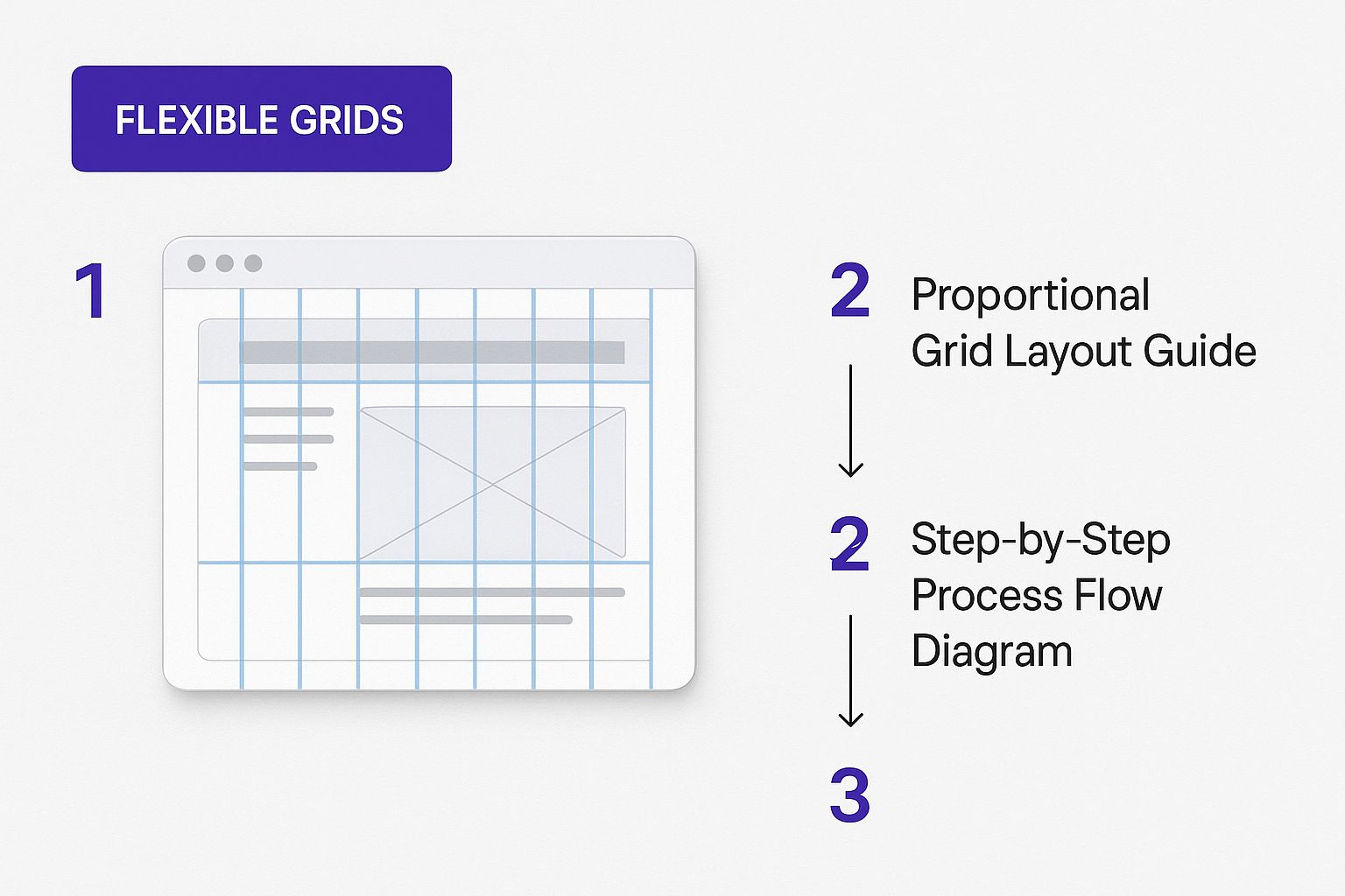
As you can see, the grid columns reflow as the screen shrinks to keep everything readable and easy to use. That's exactly the kind of smart adaptation we're aiming for with media queries.
Adopting a Mobile-First Mindset
The most effective way I've found to structure responsive CSS is with a mobile-first approach. This means you write your base styles for the smallest screens first, without any media queries at all. Then, you use min-width media queries to add or change styles as the screen gets bigger.
This strategy pays off in several ways:
- Cleaner CSS: Mobile layouts are often simpler (think single-column with larger text). Starting there gives you a clean, logical foundation to build upon.
- Better Performance: Mobile devices download less CSS because they don't have to parse the more complex desktop styles, which are layered on top.
- Future-Proofing: It forces you to prioritize your content and build a more resilient design that works on new devices by default.
Here’s a practical, mobile-first example for a simple two-column layout:
/* Base mobile styles – single column by default */
.container {
display: block;
}
.main-content, .sidebar {
width: 100%;
}
/* Tablet and larger styles – switch to two columns /
@media (min-width: 768px) {
.container {
display: flex;
}
.main-content {
flex: 70%; / Or width: 70%; /
}
.sidebar {
flex: 30%; / Or width: 30%; */
}
}
With this code, mobile users get a simple, stacked layout. Only devices with a screen width of 768px or more will download and apply the CSS needed for the two-column flexbox layout. For Divi users looking to apply these principles, check out the ultimate guide to optimizing Divi for mobile devices.
Choosing Content-Driven Breakpoints
A classic mistake I see all the time is basing media query breakpoints on specific device sizes (e.g., 320px for an old iPhone, 768px for an iPad). This is a fragile strategy because the device market is always changing. New phones and tablets are released every year.
A much better approach is to set content-driven breakpoints.
It's simple: just resize your browser window. When your content starts to look "broken"—maybe a line of text gets too long, a navigation bar wraps awkwardly, or elements start to overlap—that’s your breakpoint. That’s where you add a media query.
Your content, not a specific device, should dictate when your layout needs to change. This ensures your design is robust and looks great at any size, not just a few predefined widths.
This method results in layouts that feel completely natural and custom-fit at every stage of resizing. It frees you from the exhausting cycle of chasing new device dimensions and lets you focus on what really matters: the user's experience.
Mastering Modern Layouts with Flexbox and Grid
While fluid layouts and media queries lay the foundation for a responsive page, a couple of modern CSS tools truly bring our designs to life: Flexbox and Grid. These layout modules are the secret sauce that lets you build sophisticated, intricate arrangements—moving far beyond simple stacked columns—with surprisingly clean code.
At first glance, they might seem interchangeable, but Flexbox and Grid were actually designed to solve very different layout challenges. Understanding that core distinction is what separates developers who wrestle with layouts from those who build them with confidence.
When to Use Flexbox
Flexbox, short for Flexible Box Layout, is your go-to for one-dimensional layouts. Think of it as the ultimate tool for arranging items in a single row or a single column. It absolutely excels at distributing space and aligning elements within a container.
This makes it the perfect choice for smaller-scale components and UI elements where you need pinpoint control along a single axis.
- Navigation Menus: Horizontally aligning menu items, perfectly distributing space between them, and making them collapse gracefully on smaller screens.
- Button Groups: Ensuring a set of action buttons are evenly spaced and perfectly aligned, no matter how much text is inside each one.
- Form Controls: Neatly positioning a label next to its input field and submit button.
- Card Components: Vertically aligning a title, description, and "Read More" link inside a card so they look sharp, even when the content length varies from card to card.
Flexbox is all about giving a container the power to adjust its items' dimensions to best fill the available space. It's built for flexibility and alignment in a straight line.
When to Use Grid
In contrast, CSS Grid is engineered for two-dimensional layouts. It empowers you to control both rows and columns at the same time, making it the supreme tool for orchestrating the entire page structure. If Flexbox handles the content inside the boxes, Grid is what you use to arrange the boxes themselves.
Anytime you're managing a layout that involves both vertical and horizontal alignment across a whole group of elements, Grid is almost always the right tool for the job.
Here are a few scenarios where Grid really shines:
- Overall Page Layout: Defining your main content area, a sidebar, the header, and the footer.
- Complex Dashboards: Creating a mosaic of different-sized widgets and data visualizations.
- Image Galleries: Arranging thumbnails in a perfect grid that reflows beautifully on any screen size.
- Magazine-Style Layouts: Positioning articles and images in more creative, non-uniform, or even overlapping patterns.
Think of it this way: Grid builds the house, defining the rooms and how they relate to each other. Flexbox arranges the furniture within each of those rooms.
Combining Flexbox and Grid for Ultimate Control
The real magic happens when you stop thinking in terms of "Flexbox versus Grid" and start seeing them as partners. Many of the most robust and elegant responsive layouts use both. You can lean on Grid for the big-picture page structure and then apply Flexbox to perfectly align the items within each of those grid areas.
Let's walk through a common example: building a product feature section. On a desktop, we want a three-column layout. On mobile, it needs to stack into a single column. And inside each column, we want an icon, a heading, and some text to be perfectly centered.
First, we'll define the main structure with Grid, taking a mobile-first approach.
/* Mobile-first: single column by default /
.features-container {
display: grid;
gap: 2rem; / Adds nice spacing between our feature boxes */
}
/* On larger screens, switch to a 3-column grid /
@media (min-width: 800px) {
.features-container {
grid-template-columns: repeat(3, 1fr); / 3 equal-width columns */
}
}
This is a textbook use case for Grid. It handles the two-dimensional arrangement of our feature boxes and responsively adjusts their flow.
Now, for the content inside each feature box, we'll turn to Flexbox to handle the one-dimensional vertical alignment.
.feature-box {
display: flex;
flex-direction: column; /* Stack items vertically /
align-items: center; / Center them horizontally /
justify-content: center; / Center them vertically */
text-align: center;
padding: 1.5rem;
border: 1px solid #ddd;
}
By combining the two, we've created a sophisticated, fully responsive layout with clean, declarative code. Grid manages the main layout, while Flexbox takes care of the fine-tuned alignment inside each component. This is a foundational technique for building modern web pages.
Debugging and Browser Support
Don't worry too much about browser compatibility. Modern browsers have excellent support for both Flexbox and Grid. In fact, a 2024 developer survey showed that popular frameworks like Bootstrap and Tailwind CSS, which depend heavily on these modules, are used by a combined total of over 30% of developers.
Unless you're supporting truly ancient browsers (think Internet Explorer 10-11), you can use them with confidence. For fixing the inevitable layout puzzle, your browser's built-in developer tools are your best friend. They have fantastic visual inspectors for both Grid and Flexbox that show you exactly how your alignment and spacing are being calculated.
Making Your Images and Typography Adapt
A responsive layout is only half the battle. If your content—especially images and text—doesn’t actually adapt along with the containers, the user experience will still feel clunky and broken. A truly responsive strategy has to account for how these elements scale to keep things both high-performing and readable on any device.
This means we need to move beyond some of the older, basic tricks. For images, it’s about more than just preventing them from overflowing their containers. And for text, we have to make sure it stays perfectly legible, whether it’s on a tiny phone screen or a massive desktop monitor.
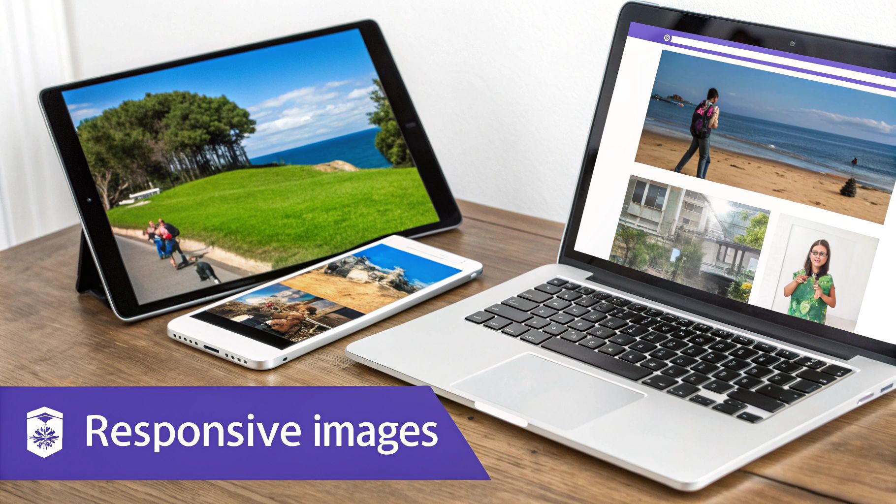
Crafting Truly Responsive Images
The classic img { max-width: 100%; height: auto; } is a fine starting point. Everyone uses it, and it solves the most obvious problem: stopping big images from breaking your layout.
But it has a huge drawback. That one line of code forces a small mobile device to download the exact same large, high-resolution image file that's meant for a 4K desktop display. This wastes a ton of bandwidth and can seriously slow down your page load times, which is terrible for both user experience and your SEO.
To build a faster, more efficient site, we can use the HTML <picture> element and the srcset attribute. These tools let the browser pick the best image to download based on the user's screen size, resolution, or even pixel density.
- Resolution Switching with
srcset: This lets you give the browser a list of different-sized versions of the same image. The browser then intelligently grabs the smallest one it needs to look sharp on that specific screen. - Art Direction with
<picture>: Sometimes, a wide landscape image that looks fantastic on a desktop is just a mess when it gets cropped on a narrow mobile screen. The<picture>element is the perfect fix, letting you serve up completely different images—for instance, the full landscape shot for desktop and a tight, portrait-oriented crop for mobile.
This isn't just a minor performance tweak; it's a core part of modern, professional design. For a deeper look into creating sites that are both beautiful and functional, check out these essential web design tips for 2023.
Think of
srcsetand<picture>as you telling the browser, "Here are all my image options. You figure out which one makes the most sense for this user right now." It’s a simple, proactive step toward much better performance and a more polished final design.
Implementing Fluid Typography
Just like your images, your text needs to adapt. Relying on a pile of media queries to tweak font sizes at different breakpoints gets messy fast. It also leads to those awkward "jumps" in text size as a user resizes their browser window.
A much more elegant solution is fluid typography.
Fluid typography lets font sizes scale smoothly and continuously with the viewport's width. The best way to do this with modern CSS is the clamp() function. It’s a game-changer.
The clamp() function takes three values: a minimum, a preferred (or scalable) value, and a maximum.
font-size: clamp(1rem, 2.5vw, 1.5rem);
Let's break that down:
1rem(Minimum): The font size will never get smaller than16px(assuming a standard root font size). This guarantees your text is always readable, even on the smallest phones.2.5vw(Preferred): This is the magic part. The font size will try to be 2.5% of the viewport's width. As the screen gets bigger, the text grows right along with it.1.5rem(Maximum): The font size will stop growing once it hits24px. This is your safety net to prevent headlines from becoming absurdly large on giant monitors.
This single line of CSS replaces a whole mess of media queries, leading to cleaner code and a perfectly smooth scaling effect. It makes sure your typography always feels proportional to the screen, creating a more harmonious and readable experience for everyone.
Choosing the Right Responsive Framework
While there’s no substitute for mastering vanilla CSS to get total control, project deadlines often have other plans. That’s where responsive frameworks come into play. They're a fantastic way to speed things up, giving you pre-built systems and components for your responsive web page css project. But choosing one isn't just about speed; it's about picking the right tool for the job.
You'll generally find frameworks fall into two main camps: component-based, like Bootstrap, and utility-first, like Tailwind CSS. Your choice here will completely shape your workflow. Bootstrap is great for getting off the ground quickly. It hands you a whole set of ready-to-use, styled components like navigation bars, buttons, and modals, which is perfect for building standard interfaces or prototyping in a hurry.
On the other hand, a utility-first framework like Tailwind CSS gives you a massive toolbox of low-level classes. Instead of grabbing a pre-made btn-primary, you build your own button by combining tiny classes like bg-blue-500, text-white, and py-2. This approach gives you way more design freedom but definitely requires a shift in how you think about building UIs.
Framework Adoption and Considerations
The development community has really leaned into these tools to standardize responsive design. Bootstrap, with its classic grid system, is still a powerhouse, used by over 19% of developers. Meanwhile, the more modern, utility-first approach of Tailwind CSS is gaining serious ground, with its adoption growing to around 11%. For a deeper dive into these kinds of industry stats, you can discover more insights about responsive web design on Uplers.com.
So, which one makes sense for you?
- Choose Bootstrap if: You need to get a standard-looking application up and running fast and appreciate having components ready to go out of the box.
- Choose Tailwind CSS if: You want complete creative control and prefer to build unique designs from small, reusable pieces without writing custom CSS from scratch.
A framework is a tool, not a crutch. Use one to speed up what you already know how to do, not to skip learning the fundamentals of responsive CSS.
At the end of the day, performance is what matters most. Pulling in a large framework can lead to some serious CSS bloat if you aren't careful. If you go the utility route, always run a tool like PurgeCSS to strip out any unused styles before you push to production.
And for those of you in the Divi world, we've got a dedicated guide on how to make a mobile-friendly website with Divi that you'll find helpful.
Common Responsive CSS Questions Answered
Even with powerful tools like Flexbox and Grid at our fingertips, running into questions is a totally normal part of building a responsive web page with CSS. Let's walk through some of the most common sticking points I see, so you can clear up any confusion and write cleaner, more effective code.
One of the first hurdles people often face is the "responsive vs. adaptive" debate. What's the real difference?
Responsive design uses fluid grids and media queries to create a single, flexible layout that smoothly adjusts to any screen size. On the other hand, adaptive design uses a set of static layouts built for specific screen widths (or breakpoints) and serves up the one that fits best.
While both can get you a mobile-friendly site, the industry standard has shifted. Google has long recommended responsive design because it's simpler to manage with a single URL structure.
My take? Responsive design is almost always the right choice for new projects. It’s far more flexible and easier to maintain down the road. I typically only see adaptive design used when a team is trying to retrofit a massive, older website for mobile—it can be less disruptive than a complete responsive overhaul in those rare cases.
Is It Better To Design Mobile-First or Desktop-First?
This is a classic question, but these days, the answer is pretty clear: always start with mobile-first.
When you design for the smallest screens first, you're forced to prioritize what really matters. This naturally leads to cleaner HTML and more efficient CSS. You're starting with a simple foundation and progressively adding complexity as the screen gets larger, which is much easier than trying to strip things away from a cluttered desktop design.
Designing desktop-first often means you'll end up writing a ton of messy CSS overrides just to simplify the layout for mobile. That bloats your stylesheet and makes maintenance a headache. A mobile-first approach will give you a better-performing and more future-proof responsive web page css structure.
How Do I Handle Very Large or Very Small Screens?
It’s easy to get hyper-focused on phones and standard desktops, but what about the outliers? I'm talking about ultra-wide monitors and tiny smartwatches. The key here isn't to target every single device, but to build a resilient layout.
- For ultra-wide screens: The simplest fix is to apply a
max-widthto your main content container. A common value is something like1200pxor1440px. This stops your design from stretching into an unreadable, chaotic mess, keeping it comfortably centered. - For very small screens: Your mobile-first approach should handle most of this gracefully. But for an extra layer of polish, consider using fluid typography with the
clamp()function. This ensures your text scales down smoothly without becoming tiny and illegible on the smallest devices.
Ultimately, the goal is to create a design that feels intentional at every width, not just at your main breakpoints. The best responsive web pages don't just "work" on different screens; they feel like they were designed for them.
Ready to build powerful, responsive popups and menus on your Divi site? Divimode provides the tools and expert guidance you need. Check out our premium plugins at https://divimode.com and see what's possible.
More Articles You Will Like