 Alex Martin
Ever wonder what the perfect size is for your website's header? It's a question I get asked all the time. The honest answer is there's no single, magic number. The ideal header height is really a balancing act between showcasing your brand and giving your users a great experience.
For most desktop sites, a header height somewhere between 70px and 100px is a fantastic starting point. When you move to mobile, you'll want to slim that down to the 50px to 70px range to save precious screen real estate. The goal is always to make navigation crystal clear without getting in the way of your actual content.
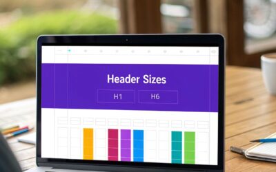
Finding the Perfect Header Size for Your Website

Think of your website's header like the entryway to a home. It needs to be inviting enough to welcome visitors and show them around, but you don't want it so big that it blocks the view into the main rooms. A perfectly sized header isn’t a fixed number; it’s a flexible range that changes depending on who's visiting and what device they're using.
Getting the header proportions right instantly builds trust and makes your site feel professional. It’s home base for your logo, menu, and other key links, giving users a consistent and predictable way to navigate. Nailing this balance is one of the fundamentals for creating a site that feels intuitive from the moment it loads.
Core Principles of Header Sizing
Before we start throwing pixel values around, it's important to understand why we're choosing certain dimensions. To really get a feel for this, it helps to zoom out and consider the bigger picture of website design essentials. Your header should always be designed to:
- Prioritize Content: Your content is the star of the show. The header is just the supporting act—it should never overshadow the main message.
- Ensure Easy Navigation: People need to find what they're looking for, fast. Links have to be legible and easy to tap or click without any frustration.
- Adapt to All Devices: A header that looks amazing on a huge desktop monitor can feel like a monster on a small phone screen. Responsive design here isn't just a suggestion; it's a requirement.
The best headers are functionally invisible. They provide everything a user needs—branding, navigation, key actions—without ever feeling like an obstacle to the content below.
Ultimately, picking the right dimensions is less about sticking to a strict rule and more about serving your audience. The real goal is to create a seamless entryway that guides people effortlessly to what they came for.
For a quick reference, here’s a table with some solid starting points I recommend for different devices.
Recommended Header Height Quick Guide
| Device Type | Typical Height Range (pixels) | Key Consideration |
|---|---|---|
| Desktop | 70px – 100px | Balance brand presence with ample space for content. |
| Tablet | 60px – 80px | A middle ground that works well in both portrait and landscape. |
| Mobile | 50px – 70px | Maximize vertical screen space for content consumption. |
These aren't rigid rules, but they are tried-and-true ranges that work for the vast majority of websites. Think of them as your baseline, and then feel free to tweak them to perfectly fit your logo, navigation items, and overall design aesthetic.
Why Header Size Directly Impacts User Experience
Think of your website's header like the sign above a physical storefront. It needs to be big enough for people to notice, clear enough to read the store's name, and give a hint of what's inside. But what if that sign was so massive it completely blocked the window display? Customers would get annoyed and leave without ever seeing what you have to offer. The same thing happens in the digital world.
The size of your header is one of the very first things that shapes a user's impression, all within a matter of milliseconds. It determines how much of your actual content is visible "above the fold"—that is, the part of the screen someone sees without having to scroll. A bulky header shoves your most important message down the page, forcing visitors to work just to get to the good stuff.
The Balancing Act of Space and Functionality
A well-proportioned header doesn't just look good; it builds instant trust. It feels professional and offers a clear, predictable way to get around, which is a huge part of a positive user experience. When users feel confident and guided, they’re far more likely to stick around and see what you have to say.
Get the size wrong, though, and you can run into some serious problems:
- An oversized header hides your key information and can make the page feel cramped, which is a surefire way to increase bounce rates.
- An undersized header can make navigation links a pain to click, especially on a phone, and it can weaken your brand's visual punch.
Finding that sweet spot is all about guiding users toward your goals without getting in their way. This delicate balance is a core part of designing website headers that are both beautiful and genuinely effective.
Your header's job is to offer a clear map without obscuring the landscape. When done right, it enhances the journey, guiding users smoothly toward their destination—whether that's a purchase, a sign-up, or a piece of information.
From Pixels to Profit
At the end of the day, these design choices have a real impact on your business. A thoughtfully designed header is a key player in creating a positive user experience, which is often a big factor in achieving a good conversion rate for ecommerce. This isn't just about making things pretty; it's about performance.
And speaking of performance, load speed is another piece of the puzzle. A header bloated with huge, unoptimized images will slow your entire site down. We know from research that websites taking more than two seconds to load can lose a staggering 60% of their visitors. Even a one-second delay can lead to a 7% drop in conversions, which for online retailers, can mean billions in lost revenue.
By making sure your header is lean and efficient, you're not just improving the design—you're respecting your user's time and protecting your bottom line.
Mastering Responsive Header Design for Every Device
A one-size-fits-all header is a relic of the past. In today’s world, your visitors are coming from dozens of different screen sizes, and your header needs to adapt gracefully to every single one. Thinking responsively means designing a distinct experience for desktop, tablet, and mobile users to keep navigation intuitive and accessible.
On a desktop, you've got the most screen real estate to play with. A header height between 70px and 100px usually hits the sweet spot. This gives you plenty of room for a full logo, a complete navigation menu, and maybe a call-to-action button, all without feeling cramped or pushing your main content too far down the page.
Adapting to Smaller Screens
As you move to smaller devices, the game changes. The new priority is preserving vertical space. For tablets, a slightly more compact header in the 60px to 80px range is a great target. This is often where a full menu starts to feel clunky and transitions to a more compact version or even a hamburger icon, especially when the tablet is held upright.
But mobile is where header optimization is absolutely critical. With such limited screen height, every single pixel counts. The best header size for a website viewed on a phone is a slender 50px to 70px. This minimalist approach puts the content first, relying on a clean hamburger menu icon and a simplified logo to handle branding and navigation.
The diagram below shows just how much these sizing decisions can impact your website’s key metrics.
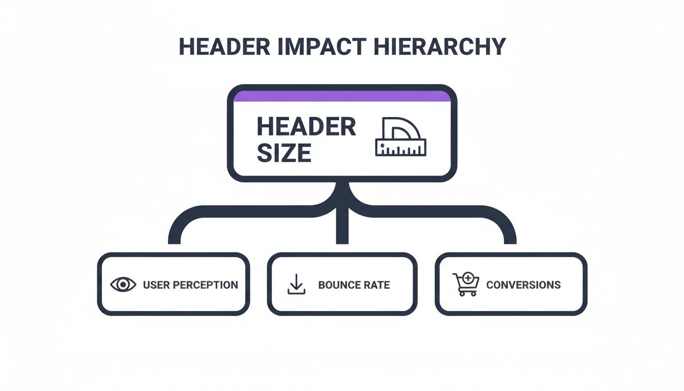
As you can see, a well-proportioned header improves how users perceive your site, which in turn helps lower your bounce rate and gives your conversions a nice boost.
Responsive Header Breakpoint Best Practices
Achieving a fluid transition across devices isn’t just about tweaking the height; it involves a series of deliberate adjustments at each responsive breakpoint. The goal is to reconfigure the header elements to make the best use of the available space.
Here’s a quick table outlining common adjustments for standard screen sizes.
| Breakpoint | Screen Width | Recommended Header Height | Common Adjustments |
|---|---|---|---|
| Desktop | 1200px and up | 70px – 100px | Full logo, complete horizontal menu, CTA button, social icons. |
| Tablet | 768px – 1199px | 60px – 80px | Smaller logo, reduced padding, menu may collapse to a hamburger icon on smaller tablets. |
| Mobile | 767px and below | 50px – 70px | Compact logo, minimal padding, hamburger menu is standard, CTA button may be removed. |
These are, of course, just starting points. The key is to test on actual devices and ensure the user experience feels natural at every size, which is a core principle of good responsive design best practices.
Implementing Responsive Adjustments in Divi
Modern tools, especially within Divi, give you incredibly precise control over these changes. It’s not magic—it’s a strategy.
Here are the key adjustments you should be making as the screen gets smaller:
- Shrink the Logo: Use Divi's responsive controls to reduce the max-width of your logo image for tablet and mobile views.
- Reduce Padding: Trim the top and bottom padding of the header section on smaller screens to reclaim valuable vertical space.
- Reconfigure the Menu: This is a big one. Switch from a standard horizontal menu to a hamburger menu icon at the tablet or mobile breakpoint.
Getting your mobile header right is non-negotiable. It’s expected that by 2025, responsive design will be a standard feature on 90% of all websites. The data backs this up: mobile-optimized sites see 40% higher conversion rates. On the flip side, a clunky mobile experience can lead to bounce rates as high as 60%, which is a powerful reminder of why a well-executed responsive header matters so much.
Optimizing Your Sticky Header for Better Navigation
A sticky header—sometimes called a "fixed header"—is that trusty navigation bar that stays locked to the top of the screen, even as you scroll down the page. It’s a simple feature, but it’s incredibly powerful. Think of it as a permanent GPS for your website.
This little trick keeps users oriented and completely removes the annoying need to scroll all the way back up just to find the menu. Users always have an escape hatch to another part of your site, which is especially handy on long, content-heavy pages.
The Shrink-on-Scroll Technique
Of course, a sticky header that’s too big can quickly go from helpful to obnoxious, hogging precious screen real estate. This is where the “shrink on scroll” technique saves the day. It's the perfect compromise.
The header starts out at its full height when you first land on the page, but the moment you start scrolling, it gracefully animates to a more compact version. It's a hallmark of modern, user-friendly design.
This approach gives your brand a strong first impression without getting in the user's way once they start digging into your content. Here’s a typical before-and-after:
- Initial State: The header might be 90px tall, proudly displaying your full-sized logo and menu with plenty of breathing room.
- Scrolled State: As the user scrolls, it shrinks down to maybe 60px. The logo gets a bit smaller, and the padding around the menu links tightens up.
The key is to make this transition smooth and subtle, not jarring. The goal is to free up that extra 30px of vertical space so naturally that the user barely even notices the change.
A well-executed shrink-on-scroll header gives you the best of both worlds: a bold, brand-forward introduction and a discreet, functional navigation tool that stays out of the way. It’s an elegant solution to a common design problem.
When to Use a Sticky Header
Sticky headers are fantastic, but they aren't the right tool for every job. The decision should always come down to the user experience and the structure of your site.
You should definitely consider a sticky header if your site fits one of these descriptions:
- E-commerce Stores: Customers need constant access to the search bar, shopping cart, and product categories while they browse. Don't make them hunt for it.
- Long-Form Content: For lengthy blog posts, tutorials, or documentation, a sticky header prevents readers from feeling lost in a sea of text.
- Conversion-Focused Sites: Keeping a primary call-to-action (like "Get a Quote" or "Sign Up") visible at all times can make a real difference in your conversion rates.
On the other hand, for a simple one-page site or a short brochure-style page with minimal scrolling, a fixed header might just be unnecessary clutter. It's also critical to make sure your sticky header doesn't cause other problems, like covering up in-page anchor links. If you're building with Divi, you might find this guide for dealing with an anchor link target hidden behind Divi's sticky menu useful.
By carefully thinking through when and how you implement this feature, you can make navigating your site a breeze for every visitor.
Creating Advanced and Interactive Website Headers

Getting your header size right is the starting point, but let's be honest—a truly great header does more than just sit there. It should be an active part of your website's strategy, pulling its own weight when it comes to conversions. When you move past a simple list of links, you can transform this prime real estate into an intelligent system that actually guides users and gets them to take action.
One of the slickest ways to do this is with a mega menu. Forget those clunky, single-column dropdowns. A mega menu unfurls on hover to reveal a rich, multi-column layout where you can showcase anything from featured products and recent blog posts to key sub-categories. It’s an incredibly elegant way to handle a site with a lot to offer, without overwhelming your visitors.
Building Conversion-Focused Header Elements
Your header isn't just for navigation; it's the perfect spot for promotions and announcements that need to be seen. A popular and effective trick is to add a thin notification bar or a promotional banner right above your main header. This "sub-header" space is perfect for things like:
- Announcing a flash sale or a limited-time free shipping offer.
- Displaying critical alerts or company updates.
- Promoting your latest ebook, webinar, or blog post.
This keeps your main navigation clean and focused while still taking full advantage of the header's high visibility. For instance, with a tool like Divi Areas Pro, you could create a banner that only shows up on certain pages or is triggered by a user's behavior, like when they're about to leave the site. That’s how a simple design element becomes a targeted marketing machine.
The goal is to build an intelligent header system. This means it should not only help users find their way but also actively contribute to your business goals—from capturing leads to guiding visitors through a sales funnel.
Making Headers Smart and Conditional
This is where things get really interesting. Imagine a header that shows a "Welcome Back!" message to a returning visitor, or a special discount banner to someone who has items in their cart. Conditional logic makes this possible. This kind of personalization makes the user feel seen and understood, which is a massive driver in today's web design market.
The global web design market has exploded, hitting $58.5 billion in 2022, with the US market alone reaching $43.5 billion in 2024. What’s fueling this growth? The demand for smarter, more effective websites. Interactive and conditional headers are a huge piece of that puzzle. By making your header dynamic, you're not just keeping up; you're creating a site that isn't just seen, but experienced. You can discover more web design statistics to see just how important these forward-thinking approaches are.
Common Questions About Website Header Sizing
As we've worked through the details of header dimensions, responsive behavior, and sticky navigation, a few questions tend to pop up again and again. This section cuts right to the chase, giving you clear answers to the most common queries about website header size.
Think of this as your quick-reference guide. It's here to clear up any lingering doubts and help you make those final design decisions with confidence.
What Is the Best Header Size for SEO?
This is a smart question, but search engines don't actually look at the pixel height of your header. Instead, your header's size affects SEO indirectly through user experience signals and performance metrics that search engines care about a lot.
A header that's too big can cause problems. It pushes your most important content "below the fold," forcing users to scroll just to see what your page is about. If they can't find what they're looking for right away, they might leave, leading to a higher bounce rate. Search engines often see that as a sign of a bad user experience.
On top of that, a large header stuffed with heavy, unoptimized images will slow your site down. This directly impacts your Largest Contentful Paint (LCP) score, which is a huge piece of Google's Core Web Vitals.
The best header for SEO is one that loads fast, looks great on mobile, and helps users find their way around—it shouldn't get in their way. Nail the speed and usability, and your SEO will thank you.
How Do I Make My Header Smaller on Mobile Devices?
Shrinking your header on mobile is a non-negotiable part of modern responsive design. Thankfully, most website builders and themes, including Divi, have built-in controls for this, so you don't have to touch a line of code.
Typically, you'll edit your header template and look for settings like "Padding," "Sizing," or "Spacing." You’ll usually see little device icons (desktop, tablet, mobile) next to these settings. Just click the mobile icon, and you can enter smaller values that only apply to that specific view.
Here are the most effective tweaks you can make:
- Slash the Vertical Padding: This is the quickest win. Reduce the top and bottom padding of your header's section or row to instantly trim its height.
- Shrink Your Logo: Set a smaller max-width for your logo image on mobile and tablet. This ensures it scales down nicely and doesn't dominate the smaller screen.
- Tighten Up the Menu: If your theme allows it, you can reduce the spacing between menu items or the padding around the hamburger icon to reclaim some precious pixels.
Should My Website Header Include a Search Bar?
That’s a great question, and the answer really depends on the kind of website you have. A search bar isn't a one-size-fits-all feature.
For sites with tons of content, a search bar is an absolute must-have. Think about:
- E-commerce Stores: Customers need to find specific products, fast.
- News Sites or Big Blogs: Visitors are often hunting for articles on a particular topic.
- Knowledge Bases or Documentation Sites: Here, search is the primary way users find answers.
But for smaller, more focused websites, a search bar can just be clutter. If your site has fewer than 20-30 pages—like a portfolio, a simple brochure site, or a dedicated landing page—users can probably find what they need in your main navigation. In those cases, a cleaner, more streamlined header is usually the better call.
What Is the Difference Between a Header and a Hero Section?
It’s easy to get these two mixed up since they both live at the top of the page, but they do completely different jobs.
The header is your site's navigation bar, and it stays consistent on pretty much every page. Its whole purpose is site-wide navigation, housing your logo, menu, and other key links like "Contact" or "Login." It's a utility—a map that helps people get around.
The hero section, on the other hand, is the big, eye-catching area directly below the header. You'll typically only find it on the homepage or major landing pages. Its job is to grab a visitor's attention, communicate your main value proposition with a killer headline, and guide them toward a primary call-to-action (CTA).
In short: the header is the map; the hero section is the billboard.
Ready to build advanced, interactive headers that do more than just navigate? Divimode provides the tools and tutorials you need to create dynamic popups, mega menus, and conditional content that converts. Check out our powerful plugins at https://divimode.com to see how you can take your Divi site to the next level.
More Articles You Will Like