When you’re running an ecommerce store, it’s easy to get pulled in a million different directions. But if you want to turn visitors into customers—and keep them coming back—you need to focus on what truly matters. It all boils down to four critical areas: technical speed, on-page SEO, user experience (UX), and customer retention.
Get these right, and you’re building a high-performance machine. Get them wrong, and you're leaving money on the table. A slow, confusing, or clunky store doesn't just frustrate visitors; it actively kills sales and erodes brand trust.
Your Blueprint for a High-Performing Store

Let's skip the fluff and get straight to what works. Optimizing your online store is a holistic strategy, not just a checklist of minor tweaks. This guide is your roadmap, starting with the absolute non-negotiable: site speed. Why? Because a slow site is a silent sales killer.
We'll start with the foundational technical bits that make your store fly. From there, we’ll dive into crafting product pages that actually sell, smoothing out the user journey from the first click to checkout, and finally, bringing customers back for more with smart retention tactics. Think of this as your practical playbook for building a store that's not just functional, but genuinely great to use.
The Four Pillars of Ecommerce Optimization
To really move the needle, you have to tackle several key areas at once. Neglecting one pillar can completely undermine all your hard work on the others. For instance, what good is brilliant SEO if your site takes ten seconds to load? Or a lightning-fast site if customers can't find what they're looking for?
Here’s a breakdown of the core pillars we’ll be covering:
Technical Performance: This is the engine under the hood. It’s all about your hosting, caching setup, image optimization, and using a Content Delivery Network (CDN) to ensure your store loads instantly for everyone, everywhere.
On-Page SEO and Content: This is how new customers find you in the first place. It involves smart keyword usage, writing product descriptions that resonate, optimizing meta titles, and building an internal link structure that helps both users and search engines navigate your site.
User Experience and Conversion: This is the path to purchase. A solid UX means intuitive navigation, a frictionless checkout process, stunning product photos, and clear calls-to-action that guide customers effortlessly toward making a purchase.
Customer Retention: This is where you build a sustainable business. Using tools for email marketing to re-engage past customers—think abandoned cart reminders, post-purchase follow-ups, and personalized offers—is essential for long-term growth.
To put this into perspective, let's summarize these core concepts. Building a successful online store requires a balanced approach, where each pillar supports the others to create a seamless and profitable customer journey.
Key Pillars of Ecommerce Site Optimization
| Optimization Pillar | Primary Goal | Impact on Business |
|---|---|---|
| Technical Performance | Achieve lightning-fast page load times and site stability. | Reduces bounce rates, improves user experience, and positively impacts SEO rankings. |
| On-Page SEO & Content | Increase organic visibility and attract qualified traffic. | Drives targeted visitors from search engines, building brand authority and trust. |
| User Experience (UX) | Create an intuitive, frictionless path from browsing to purchase. | Increases conversion rates, boosts average order value, and reduces cart abandonment. |
| Customer Retention | Encourage repeat purchases and build long-term customer loyalty. | Increases lifetime customer value (LTV) and creates a sustainable revenue stream. |
Each of these pillars is crucial. For example, the average conversion rate for ecommerce sites hovers between 2% and 4%. But consider this: just a one-second delay in page load time can slash conversions by 7%. That single stat shows exactly why technical performance is our starting point. If you want to dig deeper into these numbers, you can find more great insights about ecommerce conversion rates on Network Solutions.
Key Takeaway: Real ecommerce optimization is a balanced act. It demands a holistic strategy that boosts site speed, makes you visible in search, simplifies the customer journey, and keeps people coming back long after the first sale.
Building the Technical Foundation for Speed
Before you ever get to wow customers with killer designs and persuasive product descriptions, you need to build an engine that won't stall under pressure. Let's be honest: a slow, clunky site is a conversion graveyard. This is where your technical foundation comes into play, and it’s the absolute first thing you need to lock down for your store to have a fighting chance.
Your website’s performance starts with its home—the server it lives on. I see it all the time with new stores: they start on cheap shared hosting to save a few bucks. But as soon as traffic picks up or you add more products, that shared plan becomes a serious bottleneck. You're sharing server resources with dozens, sometimes hundreds, of other websites. When one of them gets a traffic spike, your store slows to a crawl right along with it.
For any serious ecommerce business, graduating to a more robust solution isn't optional. A Virtual Private Server (VPS) or a dedicated managed WordPress/WooCommerce host gives you your own slice of the pie—dedicated resources that ensure consistent performance, even when you're running a flash sale. This investment pays for itself almost immediately by preventing lost sales from frustrated customers bouncing off your slow-loading pages.
Demystifying Caching for Instant Load Times
With solid hosting in place, the next layer of speed is all about caching. Think of caching as your site’s short-term memory. Instead of forcing the server to rebuild a page from scratch every single time someone visits, it cleverly stores a ready-made version and serves it up almost instantly.
There are a few different types of caching, and they each have a specific job:
- Browser Caching: This tells a visitor's web browser to save static files—like your logo, CSS, and JavaScript—right on their own device. When they click to another page, their browser doesn't have to re-download all those assets, making navigation feel incredibly snappy.
- Server Caching (Page Caching): This is the real workhorse. It creates a full HTML copy of your pages and serves it directly from the server's memory. This is what plugins like WP Rocket are famous for, and it dramatically slashes the Time to First Byte (TTFB), a critical speed metric.
- Object Caching: For a dynamic WooCommerce site, this is a total game-changer. It stores the results of complex database queries. So, instead of constantly bugging the database with questions like, "How many blue widgets are in stock?", it remembers the answer for a short time, freeing up your server to handle more important tasks.
Getting your caching set up just right can feel a bit technical, but it's one of the highest-impact moves you can make. While this guide is for Divi, many principles are universal. For instance, many of the same concepts in good Shopify page speed optimization apply here, showing just how fundamental these steps are.
The Global Reach of a Content Delivery Network
So what happens when a customer from London tries to visit your store hosted on a server in Los Angeles? That data has a long way to travel, creating noticeable lag. A Content Delivery Network (CDN) solves this geographic problem by creating copies of your site's static files on a worldwide network of servers.
When that London customer visits, the CDN serves images, CSS, and JavaScript from a server located right there in Europe, not all the way from Los Angeles. This simple trick drastically cuts down latency and makes your store feel local and fast for everyone, no matter where they are. Services like Cloudflare or BunnyCDN are must-haves in your performance arsenal.
A fast website isn't just a technical trophy; it's a fundamental part of the customer experience. Studies have shown that a mere one-second delay in page load time can cause a 7% drop in conversions. For a store earning $100,000 a year, that’s $7,000 in lost revenue down the drain.
This three-pronged approach is how you start building a rock-solid, speed-optimized foundation.
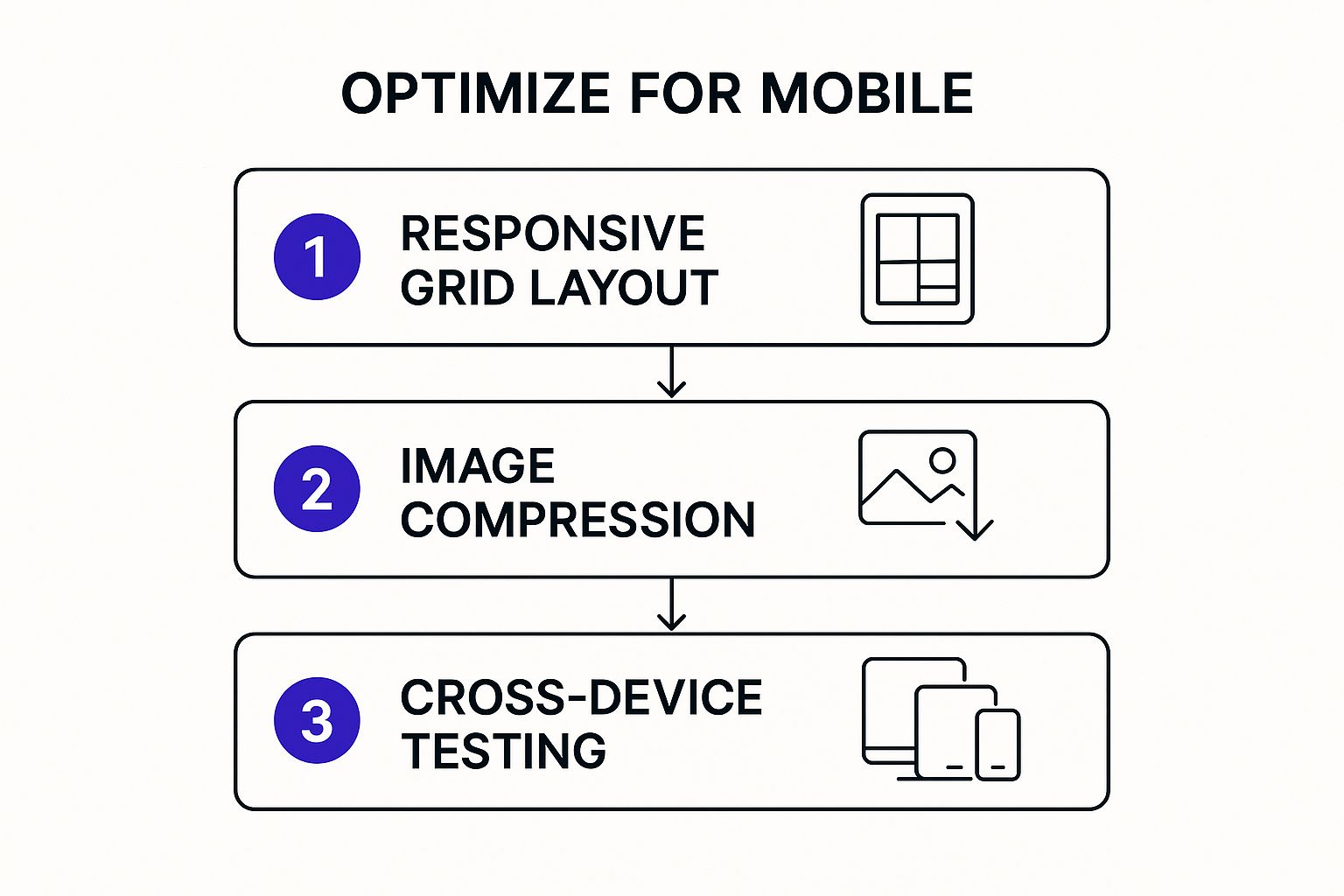
The image above breaks down the layers of optimization, showing that it’s a process that builds from a strong base to a polished, tested final product.
By combining powerful hosting, intelligent caching, and a global CDN, you create a resilient technical backbone for your store. This foundation ensures your Divi and WooCommerce site can handle sudden traffic spikes, deliver a fantastic user experience, and, most importantly, convert more visitors into paying customers. If you're ready to dive deeper, our complete guide has even more ways to optimize an ecommerce website. Nailing this technical setup is the launchpad for all the other on-page and user experience tweaks that truly make a difference.
Optimizing On-Page Elements That Drive Sales
Once you've got a solid, speedy technical foundation, it's time to turn your attention to what your customers and search engines actually see: your on-page content. This is where the magic happens. It’s how you connect with shoppers, solve their problems, and convince them that your product is the one they've been looking for.
This isn't about just stuffing keywords into your product pages. It’s about crafting a compelling story that resonates. We're talking about writing product descriptions that hit on an emotional level, optimizing images for both beauty and speed, and creating titles that are impossible not to click.
Let's break down how to get these crucial elements right and start turning your traffic into actual sales.
This handy diagram from Wikipedia shows just how central on-page SEO is to the bigger picture of getting your site seen. The stuff we're about to tackle is a core piece of the puzzle.

As you can see, the on-page elements we're about to refine are fundamental to improving your site's overall visibility and performance.
Crafting Product Descriptions That Convert
Think of your product descriptions as your 24/7 digital salespeople. Simply listing features and specs is a surefire way to put your visitors to sleep. You need to sell the outcome, not just the object. Get inside your customer's head—what are their pain points? What are they hoping to achieve? How does your product make their life better?
Don't just say "waterproof hiking boots." Paint a picture. Describe the feeling of confidently splashing through a creek, knowing your feet will stay warm and dry.
The trick is to translate every feature into a real-world benefit.
- Feature: "Made with Gore-Tex material."
- Benefit: "Keeps your feet bone-dry through rain, mud, and morning dew, so you can focus on the trail ahead, not on soggy socks."
Pro Tip: Structure your descriptions for scanners. Hook them with a strong opening paragraph, then use a bulleted list for the key benefits. This lets shoppers grab the essential info in seconds.
Mastering Image Optimization for SEO and Speed
High-quality images are an absolute must in ecommerce. In fact, 67% of consumers say product images are "very important" when they're making a purchase decision. But here’s the catch: massive, unoptimized images are one of the biggest reasons for slow-loading websites.
The goal is to find that perfect sweet spot between stunning visuals and tiny file sizes. Here’s how you do it:
- Choose the Right Format: For most product photos, WebP is the way to go. It’s a modern format that delivers fantastic quality at a much smaller file size than old-school JPEGs and PNGs. Plus, it's supported by every major browser.
- Compress Before You Upload: Never, ever upload a full-resolution photo straight from your camera. Use a tool like TinyPNG or the export settings in your favorite image editor to shrink it down first. This one step can slash file sizes by over 70% without anyone noticing the difference in quality.
- Write Descriptive Alt Text: This is huge for both accessibility and SEO. Alt text describes the image for visually impaired users and tells search engines exactly what your product is. Be specific and try to include your target keyword if it fits naturally.
- Bad: "boot"
- Good: "Men's brown leather waterproof hiking boot on a rocky trail"
Writing Titles and Meta Descriptions That Win the Click
Your title tag and meta description are your first impression in a crowded Google search. Their one and only job is to convince a potential customer to click on your link instead of the ten others on the page.
A great title tag should be around 60 characters. It needs to include your main keyword, your brand name, and something that makes it stand out. Words like "Sale," "Free Shipping," or "Guaranteed" can make a massive difference in your click-through rate.
Your meta description gives you a little more space (about 160 characters) to seal the deal. Use it to briefly highlight the product’s biggest benefit and add a clear call to action, like "Shop Now" or "Discover the Collection." Think of it as a tiny ad for your page.
Building an Internal Linking Strategy That Guides Users
A smart internal linking strategy works on two levels. First, it helps search engines crawl your site more efficiently, spreading authority between your pages. Second, it guides your visitors on a natural path toward making a purchase.
For example, if you have a blog post about the "10 Essentials for Your Next Camping Trip," you should be linking directly to the product pages for the tents, sleeping bags, and portable stoves you sell. When you properly optimize your ecommerce site this way, you create a seamless journey for the user.
This approach doesn't just boost your SEO; it creates a much better user experience by connecting helpful information with relevant products. It bridges the gap between your blog content and your product pages, encouraging people to explore and, ultimately, to buy.
Designing a User Experience That Converts
A lightning-fast site and perfect on-page SEO will get people in the door, but it’s a seamless user experience (UX) that actually turns that traffic into revenue. This is where you connect all the dots, guiding a visitor from a casual browser to a happy customer. When you optimize an ecommerce site for UX, you're not just making it look pretty—you're removing friction and building a path to purchase that feels intuitive and trustworthy.
The goal is to make shopping so easy that customers don't even have to think about it. Let’s walk through mapping out the entire customer journey, starting with effortless navigation, moving to product pages that sell, and finishing with a checkout process that slams the door on last-minute hesitation.
Creating Intuitive Navigation and Search
Your site’s navigation is its roadmap. If it's confusing, shoppers will get lost and leave. Simple as that. The best navigation systems are logical, predictable, and frankly, a bit boring. You want to think like your customers and structure your categories exactly how they'd expect to find them.
For instance, a clothing store shouldn’t just throw everything under a single "Apparel" category. That’s a recipe for frustration. A logical breakdown would look more like this:
- Men: Shirts, Pants, Outerwear
- Women: Dresses, Tops, Bottoms
- Collections: New Arrivals, Best Sellers, Seasonal Picks
This structure lets users quickly drill down to what they’re looking for. Alongside a clean menu, a powerful search function is absolutely non-negotiable. Modern shoppers expect search to be smart. It needs to handle typos, suggest related terms, and—most importantly—offer robust filtering options. Once a user lands on a category page, let them refine the results by size, color, price, and brand. This one feature can transform a frustrating hunt into an efficient, satisfying shopping experience.
Anatomy of a High-Converting Product Page
The product page is the moment of truth. This is where the most critical decision is made, and it needs to answer every potential question and build enough confidence for a customer to hit "Add to Cart." Every single element has to work together to tell a compelling story about your product.
Let's break down the essential components that make a product page work:
High-Resolution, Zoomable Images: Customers can't touch or feel your products, so your images have to do all the heavy lifting. Show the product from every angle, show it in context being used, and if you can, include a short video. It’s no surprise that 67% of consumers say image quality is "very important" to their purchase decision. Make sure users can zoom in and see every little detail.
A Compelling Call-to-Action (CTA): Your "Add to Cart" button should be impossible to miss. Use a contrasting color that pops off the page, and write clear, action-oriented text. Always place it "above the fold" so it’s visible without any scrolling. Don't make people hunt for it.
Transparent Pricing and Shipping Info: Hidden fees are the number one reason for cart abandonment. Display the price clearly, and if you offer free shipping, shout it from the rooftops right on the product page. A simple line like "Free shipping on orders over $50" builds immediate trust and removes a major point of friction.
Authentic Customer Reviews and Social Proof: Shoppers trust other shoppers far more than they trust you. Displaying star ratings and written reviews is one of the most powerful ways to build credibility. Set up a post-purchase email to encourage customers to leave reviews, and think about featuring user-generated photos to show your products out in the real world.
A product page isn’t just a listing; it’s your final sales pitch. It must anticipate and answer a customer's questions, remove all doubt, and make the decision to buy feel like the natural next step.
Slashing Cart Abandonment at Checkout
You've done all the hard work to get a customer to the checkout—this is the last place you want to lose them. The average cart abandonment rate is a staggering 70%, which means most shoppers who add items to their cart never actually finish the purchase. The good news? Most of the reasons are completely fixable.
The checkout process needs to be as short and simple as humanly possible. Every extra field you ask them to fill out is another chance for them to get distracted and give up.
Here are some proven tactics to streamline your checkout:
Offer Guest Checkout: Forcing users to create an account is a notorious conversion killer. Always provide a big, obvious guest checkout option. You can always ask them to create an account on the confirmation page after they've already given you their money.
Minimize Form Fields: Do you really need their phone number? Or their middle name? Cut your forms down to the absolute essentials: name, email, address, and payment info. Using tools that auto-fill address information makes the process even faster and reduces errors.
Display Trust Signals Prominently: Remind customers their information is safe. Display security badges (like SSL certificates) and accepted payment logos (Visa, PayPal, etc.) clearly throughout the checkout process. According to research, 44% of visitors will leave a site if it lacks contact information, a key element that erodes trust.
Provide Multiple Payment Options: Don't limit how people can pay you. In addition to standard credit cards, offer popular digital wallets like PayPal, Apple Pay, and Google Pay. These options can dramatically speed up the process, especially for mobile users who don't want to type in their card details.
By focusing on these key user experience principles—intuitive navigation, persuasive product pages, and a frictionless checkout—you can build a store that not only attracts visitors but consistently turns them into loyal customers. It’s the final and most important step in a successful optimization strategy.
Using Email Marketing to Boost Repeat Business
Getting that first sale is a great feeling. But the real secret to long-term ecommerce success? Turning that one-time buyer into a repeat customer. That's where a smart email marketing strategy becomes your most valuable player.
We’re not talking about sending out generic weekly newsletters and hoping for the best. To really move the needle, your emails need to be personal, timely, and automated. It’s all about setting up flows that trigger based on what your customers actually do on your site.
Crafting a Winning Welcome Series
First impressions are everything. The moment someone subscribes to your email list is when they're most interested in your brand. A killer welcome series lets you capitalize on that excitement, tell your story, and nudge them toward their first purchase.
A great welcome series goes way beyond a simple "Thanks for signing up." It needs to:
- Deliver the goods: If you promised a discount for signing up, put it in that very first email. No delays.
- Introduce your brand: Share your mission, what makes you different, or the story behind your products.
- Showcase your top sellers: New subscribers don't know where to start. Show them what everyone else is buying.
- Set expectations: Let them know what’s coming—how often you'll email and the kind of value you'll provide.
This initial sequence is all about building trust from day one. If you're looking for ways to get more subscribers in the first place, our guide on how to increase ecommerce sales with popups is the perfect place to start.
Recovering Lost Sales with Abandoned Cart Emails
Did you know that nearly 70% of online shopping carts are abandoned? That's a staggering amount of potential revenue just sitting there. An automated abandoned cart sequence is hands-down one of the most effective ways to claw a huge chunk of that back.
The trick is to be helpful, not aggressive. The first email, sent an hour or so after they leave, can be a simple, friendly reminder. Later emails might create a little urgency or offer a small discount to seal the deal.
Key Takeaway: Think of an abandoned cart series less as a sales tactic and more as a customer service tool. You're simply reminding shoppers about products they were clearly interested in and making it easy for them to pick up where they left off.
When done right, email automation prints money. Personalized campaigns see an average conversion rate of 10.3%. Even something as specific as a back-in-stock alert can convert at 7.28% because it delivers exactly what the customer was waiting for.
Driving Repeat Business with Post-Purchase Flows
The customer's journey doesn't end when they click "buy." The post-purchase window is a golden opportunity to strengthen that new relationship and set the stage for the next sale.
You can easily automate a flow that keeps the conversation going:
- Send a thank-you email: Go beyond the standard order confirmation. Show some genuine appreciation.
- Ask for a review: A week or two after the product arrives, ask for their feedback. This builds priceless social proof.
- Recommend related products: Based on what they bought, suggest something complementary they might also love.
By automating these simple touchpoints, you create a thoughtful experience that keeps your brand top-of-mind. This is how you turn one-time buyers into loyal fans who come back again and again.
A Few Common Questions About Ecommerce Optimization
Diving into ecommerce optimization always stirs up a lot of questions. With so many moving parts—from technical speed to the psychology of user experience—it’s natural to wonder where you should even start. This section tackles some of the most frequent questions we hear from store owners just like you.
My goal here is to cut through the noise and give you clear, straightforward answers. Let’s clear up the confusion so you can move forward with confidence.
How Often Should I Optimize My Ecommerce Site?
This is a big one. The short answer? Optimization is a continuous loop, not a one-and-done project. Think of it like maintaining a high-performance car; you don't just tune it up once and assume it’ll run perfectly forever. Staying competitive means building a consistent rhythm for improvements.
So, what does that look like in practice? A major technical audit at least once a year is a good rule of thumb. That’s when you’ll go deep on your hosting, plugins, and Core Web Vitals. But you should be actively monitoring performance, refreshing content, and testing conversion elements much more frequently.
A great schedule to follow is checking your site speed and key user metrics monthly. Then, aim to launch a new A/B test on a product page or checkout flow each quarter. That’s how you drive steady, incremental growth.
What Are the Most Important Metrics to Track?
To know if your optimization efforts are actually working, you need to track the right data. It's incredibly easy to get lost in a sea of analytics, so focus on a handful of metrics that paint a complete picture of your store’s health—both from a business and a technical standpoint.
For business health, keep your eyes locked on these four:
- Conversion Rate: The percentage of visitors who actually make a purchase.
- Average Order Value (AOV): How much, on average, a customer spends in a single order.
- Cart Abandonment Rate: The percentage of shoppers who add items to their cart but leave without buying.
- Customer Lifetime Value (CLV): The total revenue you can expect from a single customer over time.
For technical performance, it’s all about speed and user experience:
- Core Web Vitals: Pay special attention to Largest Contentful Paint (LCP), which measures how fast the main content loads.
- Time to First Byte (TTFB): This tells you how quickly your server responds to a visitor's request.
- Overall Page Load Time: The total time it takes for a page to become fully interactive for the user.
Should I Optimize for Mobile or Desktop First?
Mobile first. Always. This isn't just a trendy phrase; it's a fundamental reality of how people shop today. The vast majority of product discovery and initial browsing happens on a smartphone. While your desktop conversion rates might still be higher in some niches, that first touchpoint on mobile is where you either win or lose a potential customer for good.
If someone has a frustrating mobile experience, they're gone. You lose them before they ever get a chance to sit down at a desktop. A solid mobile-first design ensures a great experience that scales up beautifully to tablets and larger screens, which is far more effective than trying to shrink a clunky desktop design down.
Do I Need a Professional for Optimization?
Honestly, you can handle a lot of this yourself. Many high-impact optimization tasks are absolutely within your reach. Things like compressing images, writing killer product descriptions, and setting up a basic caching plugin don't require a computer science degree.
But for the really advanced stuff, bringing in an expert can be a game-changer. Deep technical SEO, server-level speed tuning, or complex conversion rate analysis are areas where an experienced pro can deliver a massive return on your investment. They can also help you set up sophisticated experiments to fine-tune your user experience. If you’re just starting out, learning what is A/B testing is a fantastic way to understand how small, data-driven changes can lead to huge wins.
Ready to create a truly high-performing Divi and WooCommerce store? Divimode provides the tools and expert guidance you need. With our premium plugin, Divi Areas Pro, you can easily build advanced popups, fly-ins, and mega menus that engage visitors and drive conversions. Start building a better ecommerce experience today at Divimode.
More Articles You Will Like