 Alex Martin
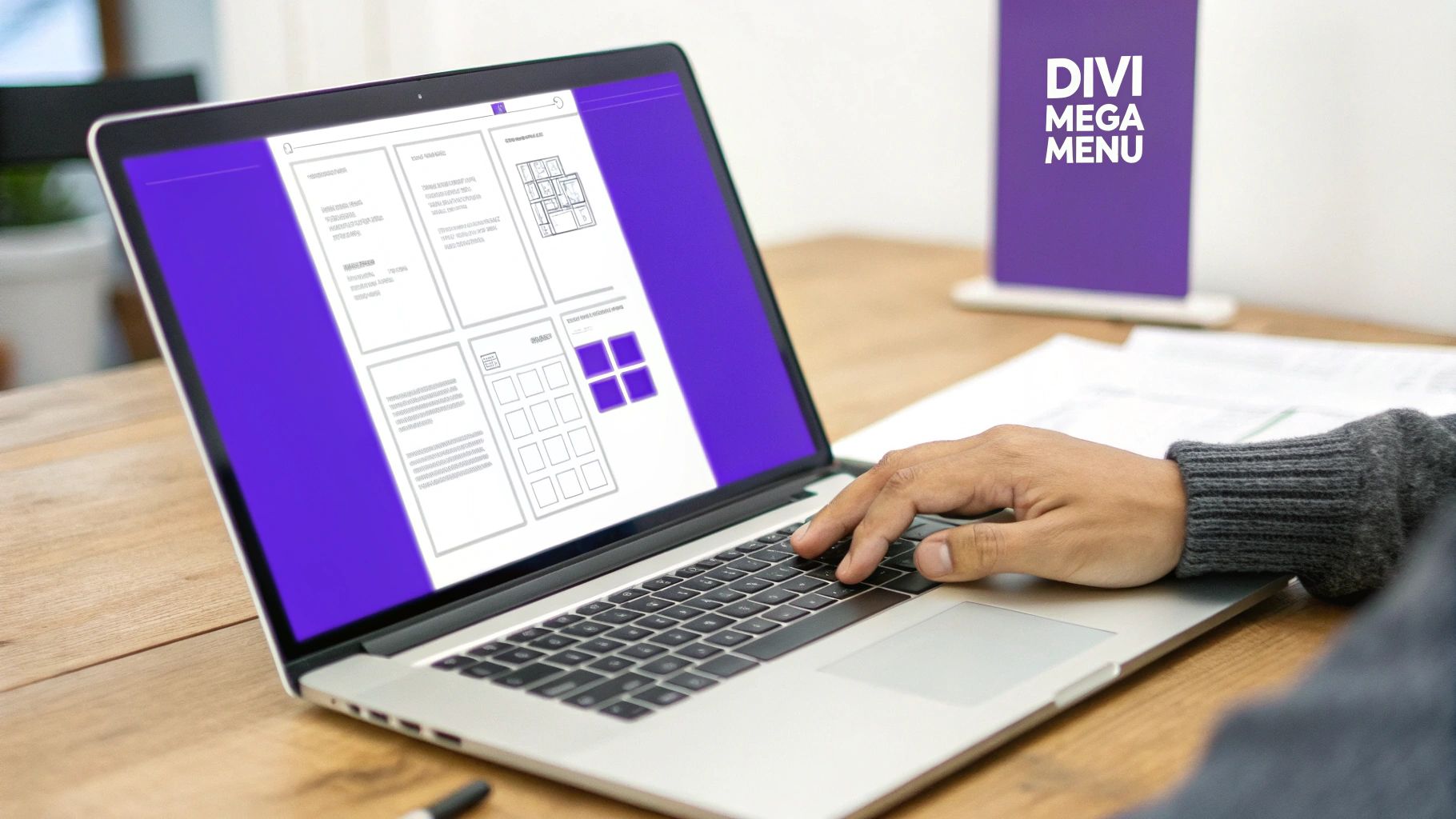
A mega menu is a big, expandable menu that goes way beyond a simple dropdown list. Think of it as a rich dashboard for your site's navigation, often laid out in columns with images and other helpful content. For complex sites like e-commerce stores or big blogs, it's a game-changer.
Why Your WordPress Site Needs Better Navigation
Let’s be honest, those standard dropdown menus just don't cut it on bigger WordPress sites. As your site grows—adding more pages, products, or posts—that single-column list becomes a frustrating bottleneck. I've seen it time and again: users get lost, they get annoyed, and they leave. That friction leads directly to higher bounce rates and missed opportunities.
A great navigation system isn't just a sitemap; it's a core part of your conversion funnel. If you're running an e-commerce store with lots of product categories or a content-heavy blog, your ability to guide visitors is everything. This is exactly where a mega menu can transform the entire user experience.
From Confusion to Clarity
Instead of forcing people to click through endless nested links, a mega menu lays out your site's architecture at a glance. You can showcase key products, highlight your most popular articles, or even feature special promotions right in the navigation. It’s a strategy I’ve used with great success on countless Divi and WooCommerce sites, turning a confusing journey into an intuitive one.
The first impression is everything. Visitors form an opinion about your site within seconds, and a mega menu immediately communicates organization and professionalism, encouraging them to stick around and explore.
When you consider that WordPress powers around 43.1% of all websites, you realize the scale of this navigation challenge is massive. User research has shown that about 38% of visitors will judge a site based on its layout and navigation alone. They spend an average of just 6.44 seconds checking out the main menu before deciding what to do next. A mega menu helps designers expose multiple levels of information architecture right away, which drastically cuts down the clicks needed to find something.
Ultimately, a mega menu isn't just a design choice—it's a strategic tool for user engagement. To get a better handle on the impact of menu design, it's worth exploring the broader principles of website navigation best practices. By presenting a clear, organized path through your content, you empower visitors, reduce frustration, and create a much more effective user journey.
Comparing Your Options for Building a Mega Menu
When you decide to build a mega menu in WordPress, you're essentially standing at a fork in the road. There are a few different paths you can take, and each one comes with its own trade-offs in flexibility, ease of use, and overall creative control. Picking the right one really boils down to your technical comfort level, what theme you're using, and what you're ultimately trying to achieve with your design.
Many WordPress themes, including Divi itself, come with some built-in menu features. These are usually limited to simple, multi-column dropdowns. They're a decent starting point if your needs are basic, but they almost always lack the rich content features and design freedom that make a mega menu a true powerhouse. Sure, you can list out columns of links, but forget about easily adding images, forms, or dynamic content without diving into custom code.
Dedicated WordPress Mega Menu Plugins
This is where dedicated plugins enter the picture. Tools like Max Mega Menu have become wildly popular because they do one thing and do it well: build advanced menus. They bolt onto the standard WordPress menu editor, giving it a much-needed power-up and letting you add widgets and apply some basic styling.
The sheer adoption of these plugins shows you just how essential this navigation pattern has become. Max Mega Menu, one of the most common choices, currently boasts over 400,000 active installations. When you consider the WordPress ecosystem has tens of thousands of plugins, seeing a single navigation tool hit that number tells you that mega menus are firmly in the "must-have" category for countless professional sites. You can read more about the popularity of WordPress mega menu plugins to get a sense of their place in modern web design.
While these plugins are definitely powerful, they can sometimes feel a bit disconnected from your theme's builder. You often find yourself working in a separate, and frankly, less intuitive interface. This can create a clunky workflow, especially if you're used to a visual, drag-and-drop experience.
The Divi Builder and Divi Areas Pro Approach
For those of us in the Divi world, combining the Divi Builder with a tool like Divi Areas Pro offers a much more elegant and integrated solution. Instead of being stuck inside a restrictive menu editor, you build your mega menu's content as a completely separate layout—what we call an "Area"—using the full power of the Divi Builder.
This opens up a world of possibilities. You can add any Divi module you can think of:
- Image galleries to show off your top products.
- Contact forms for quick, on-the-spot lead generation.
- Video modules to feature promotional content.
- Dynamic content that automatically pulls in your latest blog posts.
The real game-changer here is that you get to treat your mega menu just like any other part of your website. You're not just building a list of links; you're designing an interactive, content-rich experience with the same visual tools you already know and love.
Mega Menu Creation Methods Compared
To help you decide, here's a quick rundown of the pros and cons for each approach.
| Method | Best For | Design Flexibility | Ease of Use | Performance Impact |
|---|---|---|---|---|
| Native Theme Options | Simple, text-only dropdowns with basic column layouts. | Very Low | High | Low |
| Dedicated Menu Plugins | Adding widgets and styling beyond what a theme offers. | Medium | Medium | Medium |
| Divi + Divi Areas Pro | Divi users needing full design control and rich content. | Very High | High | Low to Medium |
| Custom Code | Unique, complex navigation requiring expert-level control. | Unlimited | Very Low | Varies |
Ultimately, the best method depends on your specific project needs, but for Divi users, the flexibility of building your menu with the Divi Builder is hard to beat.
This decision tree helps visualize the central question: is your site complex enough to need a mega menu, or will a standard one do the job?
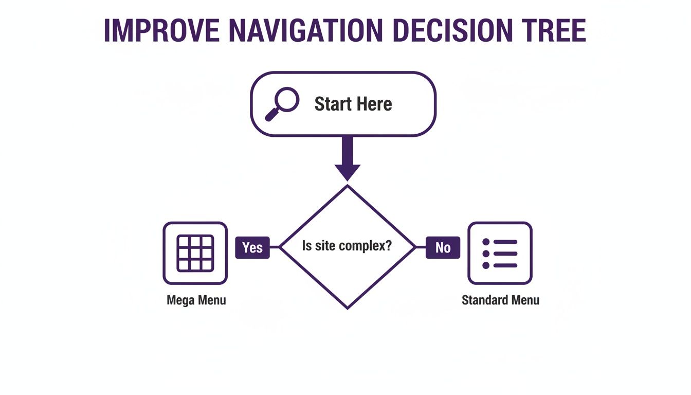
The key takeaway is that as a website grows, a mega menu stops being just a design flourish and becomes a strategic tool for organizing information. For anyone building a complex site, particularly with Divi, the sheer flexibility offered by the Divi Areas Pro method makes it a clear winner.
How to Build Your Mega Menu with Divi Areas Pro
Alright, this is where the real fun begins. Instead of being stuck inside the rigid WordPress menu system, Divi Areas Pro basically hands you a blank canvas. Anything you can build on a page with the Divi Builder, you can now pop right into your navigation.
The whole concept is refreshingly simple. You create a piece of content called an "Area" and then tell a menu item to show that Area when someone hovers over it. This completely disconnects the content of your menu from the default editor's structure, giving you total creative freedom.
Creating Your First Divi Area
The journey starts by heading to Divi Areas in your WordPress dashboard and hitting "Add New." Give your Area a clear title you'll recognize later, something like "Main Services Mega Menu." Don't worry, this is just for your own reference and won't show up on the live site.
Once you launch the Divi Builder, you're in familiar territory. But you're not just adding simple links anymore; you're designing a small, interactive webpage.
- Structure Your Content: Start with a multi-column row. A three or four-column layout is a classic choice for a mega menu, letting you neatly organize different groups of links.
- Add Essential Modules: Fill your columns with modules like Text (for headings and link lists), Image (for product shots or icons), and Buttons (for those powerful calls-to-action).
- Use Visual Hierarchy: Make the menu easy to scan by using bold headings for each column. This helps users find what they need in a split second without having to read every single link.
Think of each column as a mini-landing page. For an e-commerce store, one column might be "Shop by Category," another could show "New Arrivals" with product images, and a third might feature a huge "SALE" banner.
This visual approach is miles more engaging than a boring list of text and can seriously improve your click-through rates on key pages.
Configuring the Area as a Mega Menu
After you've designed your Area, the real magic happens in the settings panel. This is where you connect your slick layout to your actual website navigation. In the Divi Area post settings, look for the "Type" dropdown menu and select Mega Menu.
This one click reveals a new set of options built specifically for this job. You'll need to attach the Area to a "Trigger Element," which is just a fancy way of saying the CSS class of the menu item you want it to appear under. So, if your main menu has an item for "Services," you'd go into the WordPress menu editor and give it a CSS class like services-nav-item.
Then, you just copy that same CSS selector (.services-nav-item) into the Trigger Element field in your Area's settings. Just like that, Divi Areas Pro knows exactly which menu item should activate your custom layout.
Adding Dynamic Content and Animations
Here’s where a tool like Divi Areas Pro really flexes its muscles. You're not limited to static content. You could drop in a Blog module to automatically pull in your latest posts or a Woo Products module to showcase featured items—right in your navigation. This keeps your menu fresh without you having to lift a finger.
Finally, you can fine-tune the user experience:
- Set the Position: Configure the mega menu to appear directly below its trigger.
- Choose an Animation: Add a subtle "Fade In" or "Slide Down" animation for a smooth, professional entrance.
- Define the Trigger: Set the Area to appear on hover, which is the most intuitive behavior for a desktop mega menu.
By combining the design power of Divi with the clever logic of Divi Areas Pro, you can build a highly functional and visually impressive mega menu in WordPress. For a deeper dive, you can learn more about how to display content using Divi Areas Pro and really explore all the possibilities.
Optimizing Your Mega Menu for Mobile Devices
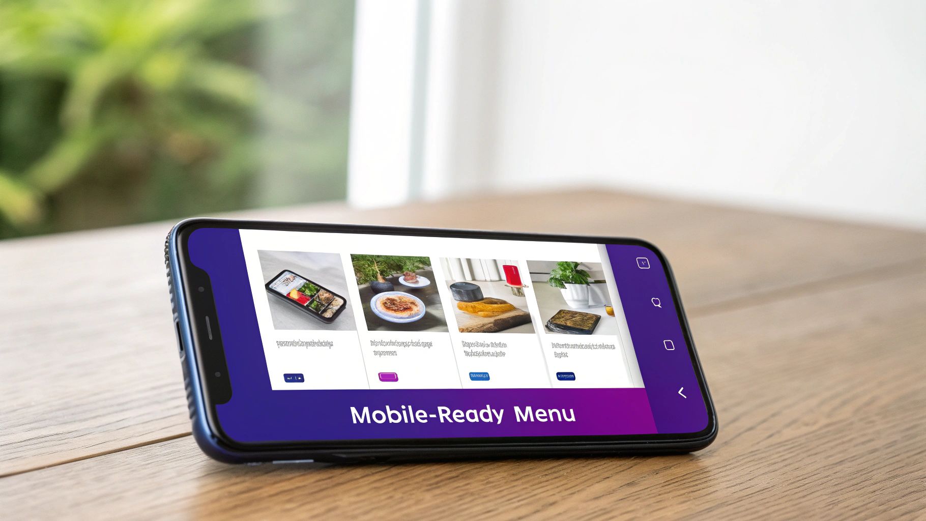
A visually rich mega menu can be a huge win on desktop, but it can quickly turn into a usability nightmare on smaller screens. Those beautiful multi-column layouts, large images, and intricate designs that look so great on a wide monitor just don't translate well to a phone held vertically.
Without a solid mobile strategy, your carefully crafted navigation can become a frustrating, pinch-and-zoom mess that sends visitors scrambling for the back button.
This is where a mobile-first mindset is non-negotiable. From both a performance and user experience perspective, your mega menu in WordPress has a huge impact on engagement, especially when you remember that mobile devices drive most internet traffic. In fact, mobile accounted for 58.66% of all internet traffic in 2025, which means well over half your audience is navigating your site on a small screen.
A responsive mega menu, properly optimized for touch targets and vertical scrolling, isn't a luxury anymore—it's an absolute necessity.
Choosing Your Mobile Menu Strategy
Instead of trying to just shrink your desktop menu, the real goal is to transform it into a mobile-friendly format. You have a few great options, each suited to different types of content and complexity.
- The Accordion Method: This is one of the most popular and effective approaches for a reason. Each top-level menu item becomes a clickable header that expands to show the sub-links below it. This keeps the initial menu clean and compact while letting users drill down into the sections they care about.
- The Simplified List: For menus that aren't overly complex, you can simply hide the rich content (like images and icons) on mobile and present a clean, multi-level list of links. It prioritizes speed and direct navigation over visual flair.
- A Completely Separate Mobile Menu: Sometimes, the smartest move is to create a dedicated mobile menu that’s fundamentally different from its desktop counterpart. This gives you total control to streamline the options for users who are on the go.
A great mobile menu is invisible—it works so intuitively that users don't even think about it. The moment they have to struggle, you've lost them. Your main goal should be to reduce taps and make information easy to find.
Implementing a Responsive Menu with Divi
If you're building with Divi and Divi Areas Pro, you have a huge advantage here. You can create two separate "Areas"—one designed as your full-featured desktop mega menu and a second, simplified version built specifically for mobile.
Then, using Divi Areas Pro's visibility settings, you can easily configure the desktop Area to be hidden on tablet and mobile, while the mobile-friendly Area is hidden on desktops. It's a clean and powerful solution.
This approach lets you deliver a perfectly tailored experience for every user without making compromises. For a deeper dive, you can explore our complete guide on crafting the perfect mobile menu design.
Once you have it set up, testing your website on different devices is the final, crucial step to make sure everything looks and works perfectly across all screen sizes. This way, your mega menu remains a powerful asset, not a mobile liability.
Advanced Techniques for a Smarter Mega Menu
Once you’ve got the basic structure of a mega menu nailed down, it's time to unlock its true potential. A static menu is fine, but a dynamic one can actively drive sales, personalize the user journey, and adapt to your audience on the fly. We're talking about transforming your menu from a simple sitemap into an intelligent, interactive part of your website.

Think about it. If you're running a WooCommerce store, you could stop manually updating links to your latest sale. Instead, you can pop a Woo Products module right into your Divi Area and set it to dynamically pull in any items currently marked "On Sale." Just like that, your menu is always promoting your most important products without you lifting a finger.
Leveraging Conditional Logic for Personalized Menus
This is where things get really powerful. Using conditional logic to show different menu content to different people is a game-changer. Tools like Divi Areas Pro are built for this, letting you set specific display rules that open up a world of possibilities.
Here are a few real-world scenarios I’ve implemented for clients:
- Wholesale vs. Retail: Imagine showing a completely different mega menu to logged-in users with a "Wholesale" role—one filled with bulk pricing and product bundles. Meanwhile, regular visitors see your standard retail offerings.
- Member-Exclusive Content: You could have a special section of the menu with links to exclusive articles or downloads that only appears for users subscribed to a specific membership plan.
- Geotargeted Promotions: If your business serves different regions, you could even show a menu highlighting local events or promotions based on the visitor's location.
A smart mega menu doesn’t just show users what is on your site; it shows them what is most relevant to them at that moment. This level of personalization can significantly boost engagement and guide users more effectively toward conversion.
Essential Best Practices for Advanced Menus
As your mega menu grows more complex, it's crucial to stick to some core principles. The goal is to add power, not confusion.
First, prioritize accessibility. Every single interactive element inside your menu needs to be fully navigable using only a keyboard. Can users tab through links, use arrow keys to move between sections, and hit Escape to close it? This isn't just a nice-to-have; it's a fundamental requirement for an inclusive website.
Second, use a clear visual hierarchy. Don't just dump a hundred links into a grid. Guide the user's eye with bold headings, icons, and even small images to break up the content. A scannable menu lets visitors find what they need in seconds. If you want to get a better handle on pulling data into your layouts, check out our guide on working with Divi dynamic content.
Finally, don't overwhelm your visitors. The "paradox of choice" is very real. Too many options can lead to decision paralysis, causing users to just give up. Carefully curate your menu, highlighting only the most important pages and categories. Your mega menu should be a helpful guide, not a confusing encyclopedia.
Got Questions About WordPress Mega Menus?
Whenever I'm helping someone build a mega menu in WordPress, a few key questions always pop up. These are the real-world concerns that come from trying to blend ambitious design with a fast, reliable user experience. Nailing these down early will save you a ton of headaches later on.
The big one, without a doubt, is performance. Everyone wants to know if adding all this extra goodness to their navigation is going to slow things down.
Will a Mega Menu Slow Down My WordPress Site?
It can, but it definitely doesn't have to. A poorly built mega menu stuffed with huge, unoptimized images or complex database calls will absolutely bog down your site. The trick is to build it smart right from the start.
Using a well-coded tool like Divi Areas Pro and sticking to best practices means your menu stays snappy and lightweight. For us, that always means:
- Lazy-loading images so they don’t even think about loading until a user actually opens the menu.
- Crushing asset file sizes by compressing images and using modern formats like WebP.
- Writing efficient queries for any dynamic content you might be pulling in.
The goal here is that perfect sweet spot between a rich, engaging menu and lightning-fast performance. Modern tools make this completely achievable.
Accessibility isn't just a checkbox; it's a fundamental part of good design. A beautiful menu that a chunk of your audience can't use is, frankly, a failure.
How Do I Make My Mega Menu Accessible?
This one is non-negotiable. Your menu has to be fully usable with just a keyboard. Someone should be able to hit Tab to cycle through the links, press Enter to make a selection, and use the Escape key to close it. Every interactive element also needs a clear focus state—that little outline that shows keyboard users exactly where they are.
Beyond that, you need to use proper semantic HTML (think headings, lists, and buttons) so screen readers can make sense of it all. If you’re building your menu with Divi Areas Pro, double-check that every module is descriptive and that all your images have meaningful alt text.
Can I Add a Contact Form or a Shortcode?
Absolutely! This is where using a builder-based approach really shines. Since you're using the Divi Builder to craft the menu's content, you can drop in any module you like.
I've seen people add small contact forms, use a code module to drop in a third-party shortcode, or even embed an email opt-in. This is how your navigation goes from being just a site map to an interactive, lead-generating powerhouse right in your header.
At Divimode, we build powerful tools like Divi Areas Pro to help you create advanced, high-performing websites with ease. Unlock the full potential of your Divi site by exploring our plugins and tutorials at https://divimode.com.
More Articles You Will Like