 Alex Martin
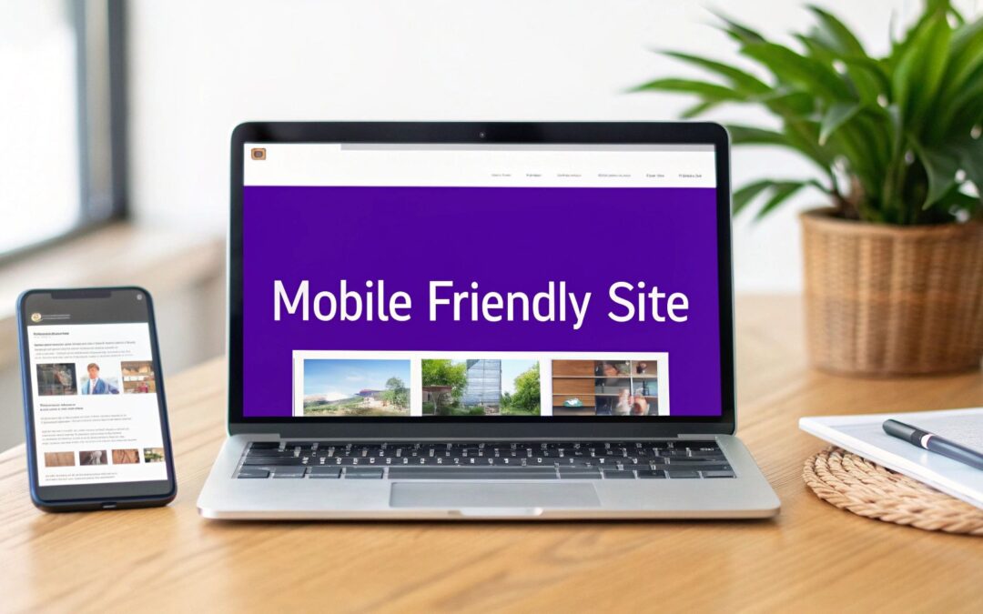
When we talk about a "mobile-friendly" website, we're really talking about building a site that's responsive, blazing fast, and dead simple to use on a small screen. The whole game has shifted. You have to prioritize the mobile user's experience first, making sure everything from the navigation to the content is perfect for their device before you even think about adapting it for a desktop.
Why a Mobile-Friendly Website Is Non-Negotiable
In this day and age, treating the mobile version of your site as an afterthought is a massive business mistake. It's just not how people use the internet anymore, and your website has to reflect that reality. Figuring out "how to create a mobile friendly website" isn't just a box to check on a technical to-do list; it’s a core part of your strategy.
The numbers don't lie. As of 2025, a staggering 59.7% of global website traffic is coming from mobile devices. That's a huge jump from just under 35% a decade ago. This isn't just a trend; it's a fundamental change in user behavior. People expect—and demand—instant access to information wherever they are.
Beyond a Shrunken Desktop Site
A truly great mobile experience is so much more than just squeezing your desktop design onto a smaller screen. It requires a complete rethink of the user's journey. Someone on a phone often has a different goal—they're looking for quick, task-oriented information.
Before we dive into the "how-to," let's quickly break down the essential components that make a site truly mobile-friendly. Each of these elements plays a critical role in shaping the user's perception of your brand and directly impacts whether they stick around or bounce.
Core Elements of a Mobile-Friendly Website
| Element | Description | Impact on User Experience |
|---|---|---|
| Responsive Design | The layout automatically adapts to any screen size. | Prevents frustrating pinching and zooming, making content easy to consume on any device. |
| Touch-Friendly Navigation | Buttons and links are large and well-spaced. | Eliminates accidental clicks and makes interacting with the site feel effortless and intuitive. |
| Optimized Performance | The site loads quickly, even on slower cell networks. | Reduces bounce rates by delivering information almost instantly, respecting the user's time. |
| Readable Content | Fonts are clear and paragraphs are short and scannable. | Allows users to find what they need quickly without eye strain, improving engagement. |
Understanding these core principles is the first step. When these elements work together seamlessly, they create an experience that feels natural and efficient, which is exactly what mobile users are looking for.
A poor mobile experience does more than just frustrate visitors; it actively drives them away. Research consistently shows that users who have a negative experience on a mobile site are significantly less likely to engage with that brand in the future.
This means a clunky, slow, or hard-to-navigate mobile site directly hurts your bottom line, impacting everything from lead generation to sales. On the flip side, a seamless mobile experience builds trust and keeps people coming back.
To get the full picture, you really need to understand what mobile responsive design is at its core. Our comprehensive guide also shows you exactly how to make a mobile-friendly site that actually converts. In the next sections, we'll get into the practical, step-by-step process of planning, building, and optimizing your site to meet these modern standards.
Mapping Out Your Mobile First Strategy

Before you even think about opening Divi or picking out a color palette, the most important work happens away from the computer. A solid, well-thought-out strategy is the bedrock of any website that actually works on mobile. I’ve seen it time and again—skipping this step is like trying to build a house without a blueprint. Sure, you might end up with something standing, but it’ll be a nightmare to live in.
The key is to truly embrace a mobile-first mindset. This isn't just some buzzword; it's a practical way of thinking where you design for the smallest screen first and then expand from there. Why? Because it forces you to be ruthless with your priorities. When you’ve only got a few inches of screen to work with, you have to make tough calls about what's essential and what's just noise.
Get to Know Your Mobile Audience
Your mobile visitors are not your desktop visitors. It’s that simple. Their context, their goals, and especially their patience levels are completely different. A desktop user might be leaning back, casually browsing. A mobile user is often on the go, looking for one specific thing right now—like your phone number, your address, or your hours.
To build a site that serves them, you have to put yourself in their shoes. What are the most common reasons someone would pull up your site on their phone? Are they lost and need directions? Are they trying to buy something quickly on their commute? This context is everything; it should drive every design and content decision you make.
Adopting a mobile-first approach fundamentally changes your design process. It forces you to focus on core functionality and content from the very beginning, leading to a cleaner, faster, and more user-centric experience across all devices.
This shift in perspective ensures the most important stuff is front and center, which is non-negotiable for holding onto visitors who are short on time and attention.
Prioritizing Content for Small Screens
Once you know what your mobile audience wants, the next move is to prioritize your content. On a big desktop screen, you have plenty of room to spread out. On mobile, every single pixel counts. Your most critical information and calls-to-action (CTAs) absolutely must be visible without scrolling.
Here’s a simple way I like to break it down:
- Identify the "Must-Haves." What are the top 1-3 things a user has to be able to do? Maybe it’s "Book an Appointment," "View the Menu," or "Get Directions." These have to be impossible to miss.
- Sort out the "Nice-to-Haves." This is where things like blog posts, detailed team bios, or big photo galleries fit in. This content is still valuable, but it can live further down the page or be tucked away in a menu.
- Be honest about the "Don't-Needs." It's time for some tough love. What's just clutter? Decorative flourishes or long-winded paragraphs that look fine on a desktop often add zero value on mobile and should be cut completely.
Sketch Out Simple User Flows and Wireframes
You don’t need to be a professional designer to map out your site's bones. Simple sketches, or wireframes, are one of the most powerful planning tools you can use. Seriously, just grab a pen and paper and start drawing boxes to represent where key elements will go.
Focus on the user’s journey, which we call a user flow. For example, how does someone get from a Facebook ad, to your product page, and finally through the checkout? Sketch out each screen in that path.
This simple exercise is amazing for spotting roadblocks before they become expensive problems. You might realize your checkout form has way too many fields, making it a total pain to fill out on a phone. By catching this at the wireframing stage, you can simplify it before a single line of code is written or a Divi module is placed. A solid plan like this makes the actual build process infinitely smoother and more successful.
Building a Responsive Design with Divi

This screenshot really captures the magic of Divi’s visual builder. You can see exactly how your layout will look and feel on a desktop, tablet, or phone, and you can edit it directly in that view. See those little device icons at the bottom? Those are your gateways to dialing in the perfect mobile experience, all without ever leaving the page editor.
With your mobile-first strategy mapped out, it’s time to actually build the thing. This is where theory meets practice, and thankfully, tools like Divi make it less about wrestling with code and more about intuitive design. The visual builder is specifically designed to give you precise control over your mobile-friendly website.
Instead of creating one rigid layout and just hoping it doesn't break on a phone, Divi lets you tailor the experience for different screen sizes. You can make specific tweaks for tablets and phones that won't mess up your desktop design at all. Think of it like having three separate, intelligently linked canvases to work with.
Mastering Divi's Responsive Views
The heart of Divi's responsive power is its Responsive View Modes. Inside the visual builder, you'll spot icons for desktop, tablet, and phone displays. Clicking these instantly morphs your editing canvas into that specific view, showing you exactly what your users will see.
But this isn't just a passive preview—it's a fully interactive editing environment. You can click on any element, whether it's a text block, an image, or a button, and change its settings just for that device.
For instance, a big, bold headline that looks amazing on a desktop might feel overwhelming on a mobile screen. No problem. In Divi, you just switch to the phone view, select the headline, and set a smaller font size specifically for mobile. The desktop version remains completely untouched. This granular control is what separates a decent mobile site from a truly great one.
Fine-Tuning Key Elements for Mobile Users
As you start adapting your design for smaller screens, you'll find that a few key areas consistently need the most attention. Getting these right is absolutely fundamental to making your website easy to use on a phone.
Here are the most critical adjustments you can make right inside Divi:
- Typography: What’s perfectly readable on a desktop can be a squint-fest on a phone. Use the responsive options in Divi’s design tab to dial down font sizes for tablet and mobile. A good rule of thumb for body text on mobile is around 16px for easy reading.
- Spacing and Padding: Elements with beautiful breathing room on a desktop can look either cramped or awkwardly spaced on a phone. Divi lets you adjust margin and padding values for each device. This is crucial for creating "thumb-friendly" buttons that have enough space around them to prevent frustrating mis-taps.
- Element Visibility: Some things that add value on a desktop—like a complex sidebar or decorative images—just create clutter on a mobile screen. With Divi's visibility settings, you can completely hide certain sections, rows, or modules on specific devices. This is one of the most powerful tools you have for streamlining the mobile experience.
Hiding non-essential elements on mobile isn't about cutting content; it's about curating focus. By decluttering the view, you make it dead simple for visitors to find what they're looking for, which has a huge impact on usability and conversions.
Imagine a pricing table with four columns on desktop. On a phone, that would be a squished, unreadable disaster. Using Divi, you could either stack the columns vertically or, even better, hide the detailed table entirely and just show a simple, mobile-specific call-to-action button.
Strategic Reordering for a Better Flow
Beyond just resizing and hiding things, Divi also lets you change the order of columns on mobile devices. This is a total game-changer for creating a logical user flow.
Let's say you have a classic two-column layout: a compelling image on the left and a headline with a call-to-action button on the right. By default, the left column (the image) will stack on top of the right one on mobile. That means your user has to scroll past the image just to find the button you want them to click. Not ideal.
Divi gives you a simple toggle to reverse this stacking order just for mobile. With one click, you can make sure the headline and CTA appear first on the phone, grabbing the user's attention immediately, with the image appearing below. This simple tweak can have a massive impact on engagement. For a deeper dive into techniques like this, check out our guide on 9 responsive design best practices for Divi.
By using these built-in responsive settings, you can systematically turn a complex desktop design into an elegant, high-performing mobile experience. The key is to constantly flip between the device views, putting yourself in your user's shoes and ensuring every interaction feels natural and effortless, no matter what screen they're on.
Optimizing for Mobile Speed and SEO

A beautiful, responsive design is a fantastic start, but it's only half the battle. If that perfectly crafted mobile layout takes forever to load, your visitors will be gone before they ever get to see it. Speed isn't just a nice-to-have feature; it's the bedrock of a good mobile experience and a massive factor in how you rank on Google.
This is where we need to roll up our sleeves and dive into some technical optimization. We have to look under the hood and make sure your site's engine is running as efficiently as possible. Think of it this way: your responsive design is the car's sleek, aerodynamic body, but speed optimization is the high-performance engine that actually gets you down the road.
Shrink Your Images, Not Your Quality
One of the biggest culprits of a slow mobile site? Large, unoptimized images. Those high-resolution photos that look stunning on a 27-inch monitor can bring a mobile connection to a grinding halt. When your visitor is on a spotty cellular network, every single kilobyte matters.
The good news is you don't have to sacrifice quality for speed. The key is smart compression and modern file formats.
- Use Compression Tools: Before you even think about uploading an image, run it through a compression tool. This simple step dramatically reduces the file size with little to no visible loss in quality.
- Embrace WebP: This next-gen image format from Google offers way better compression than old-school JPEGs and PNGs. It means much smaller file sizes and faster load times, and thankfully, it's now widely supported by all major browsers. Divi and WordPress make it incredibly easy to use WebP images.
Understanding Google’s Mobile-First Indexing
Getting your mobile speed right isn't just about keeping users happy—it's about being visible on Google in the first place. One of the biggest technical shifts in recent years is Google's mobile-first indexing policy. This policy, which is set to be fully in place by 2025, means Google primarily uses the mobile version of your site for indexing and ranking.
In short, your mobile site is no longer a secondary version—it's the main event. Google sees your website the same way a mobile user does. If your mobile site is slow, a pain to navigate, or missing content that's on your desktop version, your SEO will suffer across the board.
This makes every optimization we're talking about here even more critical. You aren't just making a faster site for users; you're building a stronger foundation for your search engine visibility.
More Technical Tweaks for Peak Performance
Beyond images, a few other technical adjustments can give your mobile site a serious speed boost. While these might sound complex, many can be handled with a good hosting provider or a quality caching plugin.
Leverage Browser Caching
Browser caching tells a visitor's browser to store static files—like your logo, CSS files, and JavaScript—on their device. When they come back to your site, their browser can load these files from its local cache instead of re-downloading them. This makes return visits feel almost instant.
Minify Your Code
Your website's code (HTML, CSS, and JavaScript) is often full of unnecessary characters like spaces, comments, and line breaks. Minification is the process of automatically stripping out all this extra baggage, making the files smaller and faster for a browser to download and process.
Choose Quality Hosting
Your web host is the literal foundation of your website's performance. A cheap, shared hosting plan might be fine for a simple hobby site, but for a business, a reliable host with servers optimized for speed is non-negotiable. Look for a provider that offers modern technologies and excellent support—it's an investment that pays for itself.
All these elements work together to improve your Core Web Vitals, which are specific metrics Google uses to measure a page's real-world user experience. A site that loads quickly, is interactive, and is visually stable will not only please your visitors but will also be rewarded by search engines. For a more detailed walkthrough, explore The Ultimate Guide to Optimizing Divi for Mobile Devices to ensure your site is performing at its absolute best.
Testing Your Site on Real Devices
After all the planning, building, and tweaking, there's one final step that truly separates a good mobile-friendly site from an exceptional one. It’s tempting to call it a day when everything looks great in the preview window, but you can't stop there.
The real world is messy. It's full of different devices, countless browser versions, and unpredictable network speeds. The only way to guarantee your site holds up is to test it in that environment. Divi's responsive previews are a fantastic starting point, but they're still just a simulation. To really know how your site performs, you have to get it on actual hardware.
Going Beyond Basic Previews
Your first line of defense after the Divi Builder is your browser's own developer console. If you're on Chrome, the "Device Mode" is an incredibly powerful feature that simulates how your site appears on everything from the latest iPhone to older Google Pixel models.
But it’s not just about screen size. This tool lets you throttle your network connection to mimic what a user on a slow 3G network would see. This is a massive reality check. A site that feels instant on your blazing-fast office Wi-Fi might be painfully slow for someone on their morning commute.
A design isn't truly finished until it's been stress-tested. Simulating slow networks and older devices uncovers hidden performance bottlenecks and usability issues that you'd otherwise never notice on a high-speed connection.
This simple step helps build empathy for your users. It ensures your site is functional for everyone, not just those with the latest and greatest tech.
The Power of Third-Party Testing Tools
While browser tools are great, they don't perfectly replicate the unique rendering engines and hardware quirks of every device. For mission-critical projects where you can't leave anything to chance, using a third-party testing platform is a game-changer.
Services like BrowserStack give you access to a massive cloud library of physical devices. You can see exactly how your site renders on a three-year-old Android phone or the newest iPad, catching visual bugs that only pop up on specific hardware. This level of testing ensures your meticulously crafted design doesn’t fall apart on a device you don't personally own.
The image below really drives home just how much network conditions can impact a user's experience, showing the stark difference in load times.
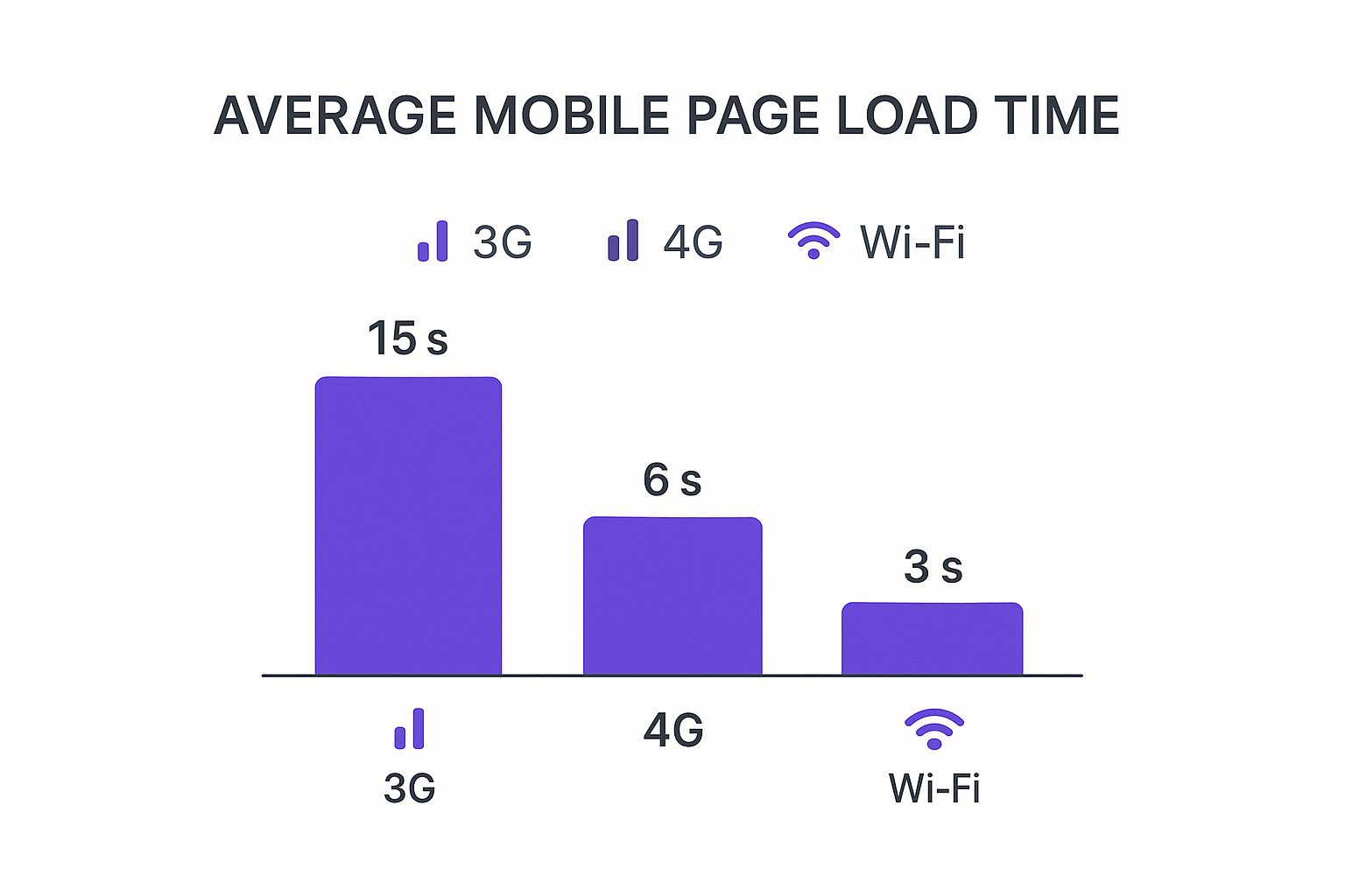
As you can see, a user on a 3G network could wait five times longer than someone on Wi-Fi. That makes every single optimization you've made absolutely critical.
Choosing the right testing approach depends on your project's needs and budget. This table breaks down the most common methods to help you decide.
Mobile Website Testing Methods Comparison
| Testing Method | Pros | Cons | Best For |
|---|---|---|---|
| Browser Simulators | – Free & easily accessible – Great for quick layout checks – Simulates various screen sizes |
– Not 100% accurate – Doesn't replicate hardware quirks – Can miss device-specific bugs |
Quick design validation and initial responsive checks during development. |
| Cloud-Based Platforms | – Access to hundreds of real devices – Highly accurate rendering – Great for catching device-specific bugs |
– Can be expensive (subscription-based) – Slight latency during testing |
Mission-critical projects, cross-browser compatibility testing, and final QA before launch. |
| Real-World Testing | – The most accurate feedback possible – Uncovers real usability issues – Inexpensive (just needs a person) |
– Time-consuming – Limited to devices you have access to – Not easily scalable |
Finding genuine usability problems and getting unfiltered feedback on user experience. |
Ultimately, a combination of these methods will give you the most comprehensive picture of your site's performance and usability.
Nothing Beats Real-World Usability Testing
At the end of the day, automated tools and simulations can only tell you so much. They're great for spotting technical errors and rendering glitches, but they can’t tell you if your site is genuinely intuitive to use. For that, you need a human.
The most valuable test you'll ever run is also the simplest. Just hand your phone to a friend or colleague and ask them to complete a task on your site without any hints.
- "Can you find our contact information?"
- "Try adding this product to the cart."
- "Where would you go to learn about our services?"
Then, just watch. Don't help them. See where they hesitate, what they struggle to tap, or where they look confused. This raw, unfiltered feedback will uncover usability bottlenecks that no software could ever find. You’ll quickly learn if your navigation is clunky, your buttons are too small, or your copy is unclear. This is the final, essential ingredient in learning how to create a mobile friendly website that people actually enjoy using.
Got Questions About Mobile-Friendly Websites?
Even with a solid plan, you're bound to run into some questions. Building a truly mobile-friendly website has a lot of moving parts, so it's perfectly normal to hit a few snags along the way. Let's walk through some of the most common questions we get from designers and business owners alike.
Getting these basics down can clear up a ton of confusion and give you the confidence to push forward. Knowing the lingo or how to quickly check your own work saves a massive amount of time and headaches down the road.
Responsive Versus Adaptive Design
One of the first hurdles people encounter is the difference between responsive and adaptive design. They both want to create a great mobile experience, but they get there in completely different ways.
Responsive design is fluid. Think of it like a liquid that fills any container it's poured into. It uses a single layout that automatically stretches or shrinks to fit whatever screen it’s on. This is, by far, the most common approach and the one Google prefers because one version of your site works everywhere.
Adaptive design is more like having a few different-sized suits in your closet. The server figures out what device the user has (like a specific iPhone model) and then serves up one of several pre-built layouts designed specifically for that screen size.
While adaptive design can feel more tailored for certain devices, responsive is way more flexible, easier to manage, and won't break when the next new phone with a weird screen size hits the market. For almost every project, responsive is the way to go.
How Can I Tell if My Site Is Mobile-Friendly?
Wondering if your current site actually passes the test? You don't have to guess. There are a couple of quick, reliable ways to find out.
The easiest method is to use Google's free Mobile-Friendly Test tool. Just pop in your website's URL, and in under a minute, you'll get a clear pass-or-fail verdict. If it finds any problems, it will even give you some actionable tips to fix them. It's the official word from the search engine that matters most.
But honestly, automated tools only tell part of the story. The best test is the one you do yourself. Pull up your website on your own smartphone and just try to use it. If you have to pinch and zoom to read anything or find yourself struggling to tap a tiny button, you can bet your visitors are having the same frustrating experience.
This real-world gut check often uncovers usability issues a tool might miss. It’s the ultimate test of whether your site is just technically compliant or genuinely user-friendly.
Do I Have to Do a Full Redesign to Fix It?
So, your site isn't mobile-friendly, but you don't have the budget or time for a complete overhaul. It's a common spot to be in, and thankfully, you usually have options.
If you’re on a flexible platform like WordPress, sometimes the fix is as straightforward as switching to a modern, responsive theme like Divi. You can often do this while keeping all your existing content intact. For older, custom-coded sites, a developer might be able to patch things up by adding responsive CSS code to tackle the most glaring layout problems.
But it’s important to be realistic here. If the site's foundation is outdated, these fixes are often just a band-aid. In many cases, a full redesign ends up being the smarter, more cost-effective solution in the long run, giving you far better performance, user experience, and SEO results.
Ready to build popups, fly-ins, and other interactive elements that look perfect on every device? Divimode gives you the tools you need. Discover how Divi Areas Pro can elevate your mobile website at https://divimode.com.
More Articles You Will Like