 Alex Martin
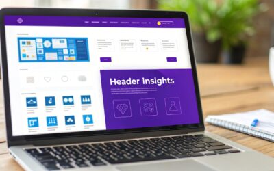
The first thing a visitor sees, the website header, is more than just a navigation bar; it's the digital handshake that sets the tone for their entire experience. A well-crafted header builds trust, guides users effortlessly, and showcases your brand's identity in a single glance. With fleeting attention spans being the norm, mastering headers for website design is non-negotiable for anyone looking to convert visitors into loyal customers. This guide moves beyond simple inspiration and dives deep into the strategic implementation of seven distinct header styles.
We will analyze high-impact examples and provide actionable, Divi-specific tactics to help you build them. From crafting dynamic mega menus to setting up conditional transparent headers for specific pages, you'll learn how to transform your website's most valuable real estate. We will break down each design, exploring the strategy behind its layout, features, and user experience impact. Prepare to move beyond a simple menu and start building a strategic conversion tool that grabs attention and directs user flow from the very first pixel.
1. Fixed/Sticky Header
A fixed or "sticky" header is a navigation bar that remains locked in place at the top of the viewport as a user scrolls down the page. This design pattern ensures that essential navigation links, the company logo, and key calls-to-action like "Log In" or a shopping cart icon are always accessible. It provides a consistent, reliable user experience by eliminating the need to scroll back to the top to navigate the site.
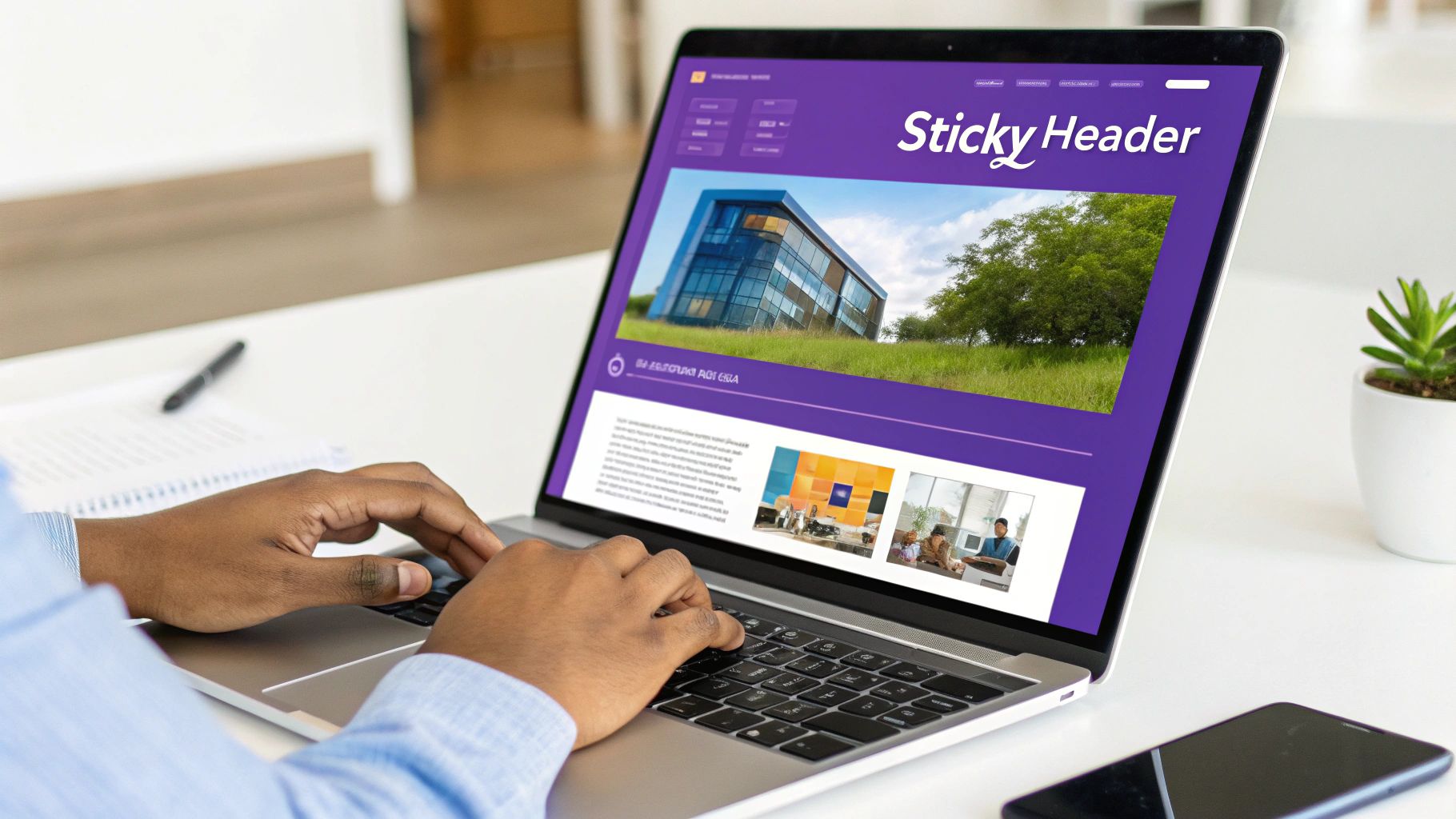
This persistent navigation is one of the most popular and effective choices in modern headers for website design, popularized by platforms like GitHub and Shopify for its sheer utility. For e-commerce sites, it keeps the cart in view, reducing friction in the buying process. For content-heavy sites or SaaS platforms, it maintains access to primary features and user accounts, improving overall site usability.
Strategic Analysis
The core benefit of a sticky header is improved navigation efficiency. By keeping primary links always visible, you drastically reduce the effort required for users to move between different sections of your website. This is particularly crucial for sites with long pages or complex structures.
Key Insight: A fixed header transforms navigation from a "destination" a user must scroll to into a "constant companion" that follows them. This simple change significantly boosts user engagement and can lower bounce rates by making site exploration effortless.
Actionable Tips for Implementation
To create an effective fixed header, especially with a versatile tool like Divi, consider the following tactics:
- Minimize Height: Keep your sticky header’s height compact, ideally under 70px. A tall sticky header can obstruct too much screen real estate, especially on smaller devices.
- Shrink on Scroll: Implement a subtle animation that reduces the header's height and logo size after the user begins scrolling. This saves precious vertical space while maintaining accessibility.
- Embrace Transparency: On the initial view (at the top of the page), your header can be transparent. It can then transition to a solid background color upon scrolling, creating a dynamic and modern visual effect.
- Mobile Optimization: Use a hamburger menu icon to condense navigation links on mobile. Ensure the sticky header on mobile is lean and doesn't interfere with the primary content.
Building this functionality from scratch can be complex, but Divi's Theme Builder simplifies the process. You can visually design your header and apply sticky options directly. For a step-by-step guide, you can learn how to create a global header with Divi on divimode.com. This allows you to apply a consistent, high-impact sticky header across your entire website efficiently.
2. Hero Header with Full-Screen Background
A hero header occupies the full viewport with a striking background image or video, overlaid with a compelling headline, subtext, and a primary call-to-action (CTA) button. This immersive design combines the navigation bar with the hero section, creating a powerful first impression that immediately communicates the brand’s core value proposition and captivates the visitor.
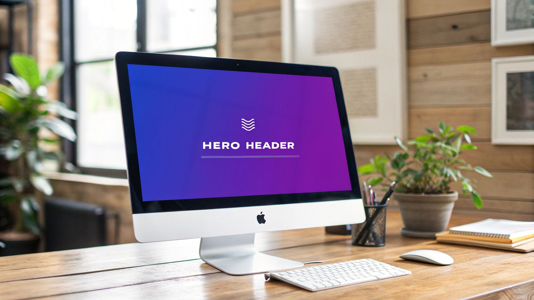
This impactful approach is a staple of modern headers for website design, effectively used by industry leaders like Apple and Stripe. It transforms the top of your page from a simple navigation utility into a storytelling canvas. For product-focused brands like Tesla, it showcases offerings in a grand, cinematic way. For service-based companies, it sets an immediate professional tone and directs users toward a single, focused action.
Strategic Analysis
The primary advantage of a hero header is its ability to create maximum emotional impact and clarity. By dedicating the entire initial screen to a single, focused message and stunning visual, you eliminate distractions and guide the user's attention exactly where you want it. This is ideal for landing pages, homepages, and product launches where a strong first impression is critical.
Key Insight: A hero header isn't just a navigation element; it's a strategic tool for brand storytelling. It frames the user's entire experience from the first second, establishing tone, value, and a clear path forward before they even scroll.
Actionable Tips for Implementation
Creating a visually stunning and high-performing hero header in Divi is straightforward with its built-in modules. Consider these tactics for a polished result:
- Optimize Your Background: Use a high-quality, but highly compressed, image (WebP format is ideal) or video. A large, unoptimized file will severely slow down your page load time.
- Ensure Text Readability: Add a color overlay or a gradient to your background media. This increases the contrast between the text and the background, ensuring your headline and CTA are legible and meet accessibility standards.
- Craft a Compelling CTA: Your call-to-action button should be the focal point. Use a contrasting color and clear, action-oriented text (e.g., "Explore Our Services," "Get Started Free") to drive conversions.
- Add Subtle Animation: Use Divi’s built-in animation options to make your headline, text, and button fade or slide into view on page load. This adds a layer of professional polish and draws the eye to key elements.
You can learn how to create a dynamic hero section with Divi by exploring tutorials on creating full-screen headers. The Divi Builder gives you granular control over backgrounds, overlays, and responsive settings, making it easy to create these impressive headers for website design without writing code. For a visual guide, the video below demonstrates building a full-screen hero section.
3. Hamburger Menu Header
A hamburger menu header is a minimalist design that hides the primary navigation links behind a compact icon, typically composed of three horizontal lines. This approach creates a clean, uncluttered interface by prioritizing content over navigation elements. Initially a staple of mobile design due to limited screen space, it has gained traction on desktop sites for brands like IKEA and Behance that favor a minimal, content-forward aesthetic.
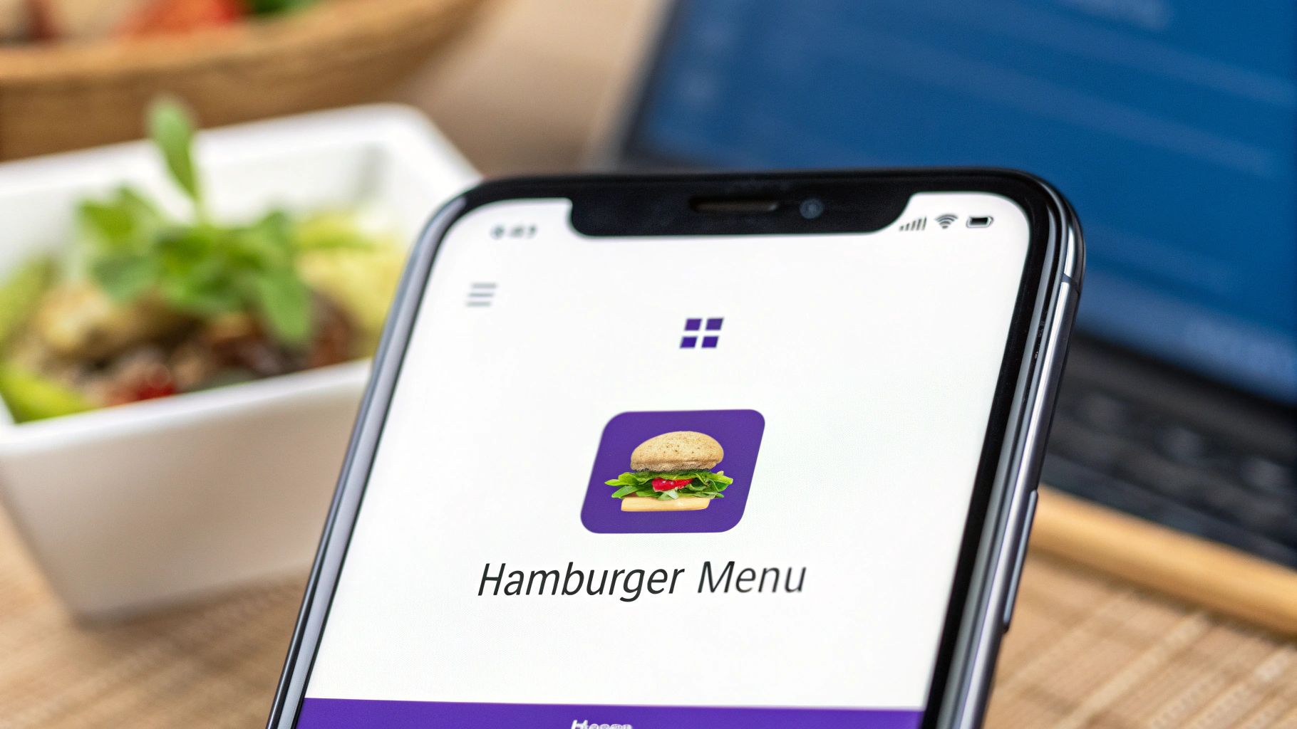
This header style is a deliberate choice to simplify the visual field, directing user attention to key imagery, messaging, or a prominent search bar. By tucking away numerous links into an on-demand menu, it helps to create a more focused and less overwhelming user experience, which is particularly effective for creative portfolios, minimalist brands, and websites where navigation is secondary to content consumption.
Strategic Analysis
The core benefit of the hamburger menu header is maximized screen real estate and reduced cognitive load. By concealing navigation, you immediately give more prominence to the page's main content, whether it's a stunning hero image, a product showcase, or a compelling headline. This makes it a powerful tool for visual storytelling and brands with a strong aesthetic identity.
Key Insight: A hamburger menu treats navigation as an intentional, user-initiated action rather than a persistent visual element. This can increase focus on the primary user journey, but it also introduces an extra click to explore the site, a trade-off that requires careful consideration of your audience.
Actionable Tips for Implementation
To implement a hamburger menu header that enhances usability instead of hindering it, especially with a tool like Divi, focus on clarity and user feedback.
- Add a "Menu" Label: Don't rely solely on the icon. Placing the word "Menu" next to the hamburger icon significantly improves clarity and click-through rates, especially for less tech-savvy audiences.
- Use Smooth Transitions: Animate the menu's appearance with a smooth slide-in or fade effect. A clunky, abrupt transition can feel jarring and cheapen the user experience.
- Ensure an Obvious Close Action: The menu overlay should have a clear "X" icon or a close button in the same location where the hamburger icon was. Additionally, allow users to close it by clicking outside the menu area.
- Consider a Hybrid Approach: For many sites, a pure hamburger menu on desktop hides critical links. Consider a hybrid model where you display 1-3 essential links (like "Shop" or "Log In") and place secondary links inside the hamburger menu.
Divi's Theme Builder offers excellent tools for this. You can design a standard header section and a separate, full-screen section for your menu overlay. Then, use click triggers and Divi's motion effects to create a seamless, professional hamburger menu experience that works beautifully across all devices.
4. Transparent/Overlay Header
A transparent or overlay header sits directly on top of the hero section or page content, lacking a solid background color on the initial view. This design choice creates a seamless, immersive experience by blending navigation with the primary visual element of the page. As the user scrolls, it typically transitions to a solid or semi-transparent background to ensure readability and maintain navigational clarity against varying content.
This elegant approach is a staple for headers for website design in industries where aesthetics are paramount. It is heavily favored by high-end brands like Apple, creative agencies like those found on Webflow's showcase, and luxury fashion retailers. The initial transparency makes a bold, confident statement, allowing stunning photography or videography to take center stage without interruption from a conventional navigation bar.
Strategic Analysis
The primary advantage of a transparent header is its ability to maximize visual impact upon landing. By removing the traditional horizontal bar that segments the navigation from the content, you create a more cohesive and sophisticated first impression. This technique is especially effective for homepages or landing pages where a powerful hero image or video is the focal point.
Key Insight: A transparent header dissolves the boundary between navigation and content, making the user interface feel less like a container and more like an integrated part of the brand's visual story. This enhances the perceived quality and modernity of the design.
Actionable Tips for Implementation
Creating a transparent header that is both beautiful and functional requires careful attention to detail. When using a tool like Divi, you can implement this style effectively with these tips:
- Ensure Readability: Use high-contrast text colors and consider adding a subtle text shadow or a soft gradient overlay to the hero image itself. This ensures navigation links are legible against a complex background image.
- Implement a Scroll Transition: The most crucial element is the transition. Use Divi's Theme Builder sticky options to change the header's background from transparent to a solid color (e.g., white or dark gray) once the user scrolls past the hero section. This maintains usability throughout the page.
- Plan Your Hero Section: Design your hero image or video with the header in mind. Ensure the top portion of the media has a relatively simple or dark area where the transparent header's text will sit, avoiding busy patterns that would clash with your links.
- Test Contrast Rigorously: Check your transparent header against various screen sizes and potential background images used across your site. What is readable on one hero image might be illegible on another. A fallback solid background is a non-negotiable for accessibility.
5. Mega Menu Header
A mega menu header is an expansive dropdown panel that displays navigation options in a multi-column, grid-like layout. Instead of a simple list of links, it can contain a rich mix of text links, images, icons, and even featured content. This design is ideal for large websites with complex information architectures, like major e-commerce stores, news portals, and university websites. It organizes a vast amount of content into logical groups, making it scannable and accessible.
This powerful navigation tool was popularized by giants like Amazon and Microsoft to tame their extensive product and service catalogs. It allows users to see a wide range of options at a glance, understand the site's structure, and jump directly to deeper pages, significantly improving the user journey on content-heavy platforms.
Strategic Analysis
The primary advantage of a mega menu is its ability to present complex site hierarchies without overwhelming the user. By using typography, icons, and imagery, you can create clear visual groupings that guide users to their desired destination efficiently. This prevents the "pogo-sticking" effect where users must repeatedly navigate back and forth to find what they need.
Key Insight: A mega menu transforms navigation from a simple list into a visual map of your website's most important content. It provides context and clarity, empowering users to make informed choices quickly and reducing cognitive load.
This infographic visualizes a common mega menu structure, showing how top-level categories branch out into featured items.
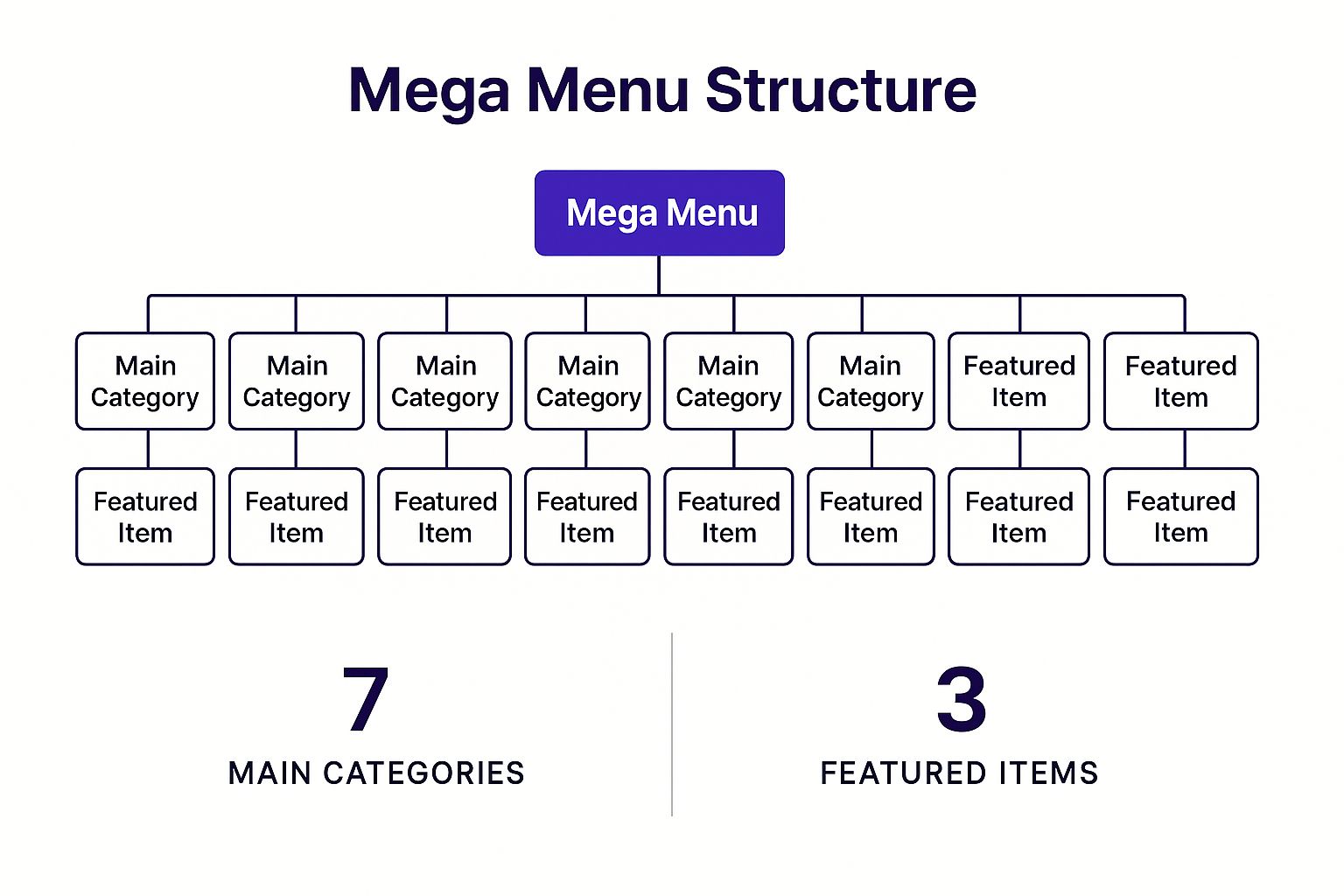
This hierarchical approach allows you to highlight key products or popular articles directly within the navigation, funneling traffic to high-priority pages.
Actionable Tips for Implementation
To build a user-friendly mega menu, especially when considering headers for website design with a tool like Divi, focus on clarity and organization:
- Group Logically: Use clear headings and visual dividers to group related links. Organize content into columns to create a clean, scannable layout.
- Incorporate Visuals: Use icons or small thumbnail images to add context and visual appeal, helping users process information faster than text alone.
- Highlight Key Items: Dedicate a section of the menu to feature "New Arrivals," "Popular Categories," or "Special Offers" to direct user attention strategically.
- Ensure Mobile Usability: Mega menus don't translate directly to small screens. Implement a mobile-friendly approach, like a multi-level accordion menu, to ensure a smooth experience on all devices.
Creating this type of advanced header is made much simpler with Divi's built-in controls. You can discover how to build a fully functional and stylish menu by following this guide on how to create a mega menu with Divi on divimode.com. This enables you to craft a sophisticated navigation system without needing to write complex code.
6. Split Header Design
A split header design divides the header space into distinct sections, typically separating the logo and branding on one side from navigation and action items on the other. This balanced approach creates visual harmony while clearly organizing different header functions. Popularized by SaaS platforms like Trello and professional networks like LinkedIn, this design is excellent for achieving a clean, modern aesthetic.
The layout often features a logo on the far left and primary navigation or call-to-action buttons on the far right, with ample white space in between. This separation makes it easy for users to distinguish between brand identity and actionable site elements, improving clarity and directing user focus. It's a hallmark of many modern headers for website design where balance and organization are paramount.
Strategic Analysis
The primary advantage of a split header is visual balance and organizational clarity. By placing key elements at opposite ends of the horizontal axis, you create a symmetrical, uncluttered feel. This design forces a deliberate organization of header content, preventing the crowdedness that can plague a single-sided navigation bar.
Key Insight: A split header uses negative space as an active design element. The space between the logo and navigation isn't empty; it's a visual cue that separates brand identity from user actions, making each component more distinct and impactful.
Actionable Tips for Implementation
To build an effective split header, especially with a flexible builder like Divi, focus on maintaining its inherent balance:
- Maintain Visual Weight: Ensure that the elements on both sides feel visually balanced. If your logo is large and heavy, your navigation links and CTA buttons on the right should have enough presence to match it.
- Use Flexbox for Alignment: When building this in Divi's Theme Builder, use CSS Flexbox properties. Set the main header row to
display: flexand usejustify-content: space-betweento automatically push the logo to the left and navigation to the right. - Consistent Vertical Alignment: Align all elements along their vertical center. Misaligned items can make the entire header look sloppy and disrupt the clean aesthetic you’re aiming for.
- Plan Mobile Collapse: Decide how the split will merge on smaller screens. Typically, the logo remains on the left while the right-side elements collapse into a hamburger menu, preserving the familiar mobile pattern.
- Test with Different Logos: Ensure your design accommodates both square and wide logo formats without breaking the layout’s balance.
7. Animated/Interactive Header
An animated or interactive header uses motion and user-triggered effects to create a dynamic and engaging first impression. This type of header moves beyond static layouts, incorporating subtle animations, hover effects, or scroll-triggered transformations to add personality and guide user attention. This approach transforms the header from a simple navigational tool into a memorable brand experience.
This advanced technique in headers for website design is prominent on sites for creative agencies, tech companies like Stripe, and award-winning portfolios. By adding purposeful motion, these headers can communicate sophistication and innovation. For instance, a logo might subtly morph on hover, or menu items could animate into view, turning a standard interaction into a delightful micro-moment that reinforces brand identity.
Strategic Analysis
The primary advantage of an animated header is its ability to create an immersive brand narrative. Motion captures attention far more effectively than static elements, allowing you to tell a story or highlight key features from the very first moment a user lands on your page. It adds a layer of polish and craftsmanship that can significantly elevate user perception of your brand.
Key Insight: Interactive elements turn passive viewing into active engagement. When a user's cursor movement triggers a subtle response, it creates a feedback loop that makes the interface feel more responsive, alive, and intelligently designed, fostering a stronger connection with the user.
Actionable Tips for Implementation
To implement an engaging animated header without sacrificing performance, focus on subtlety and purpose. Divi's built-in animation and hover effect options provide a powerful toolkit for this.
- Use Purposeful Motion: Animations shouldn't be decorative distractions. Use them to guide the eye, such as having a call-to-action button gently pulse or animating an underline on a hovered menu link.
- Optimize for Performance: Rely on lightweight CSS transitions and transforms rather than heavy JavaScript libraries whenever possible. This ensures your animations are smooth and don't slow down page load times.
- Subtle Hover Effects: Add gentle zoom, color shift, or shadow effects to navigation links and icons on hover. This provides clear visual feedback that an element is interactive.
- Respect User Preferences: Always implement your animations with accessibility in mind. Use the
prefers-reduced-motionCSS media query to disable or reduce animations for users who have requested it in their system settings.
With Divi, you can apply these effects directly within the Visual Builder. For a deeper dive into creating these experiences, you can learn how to add interactive content on your Divi website on divimode.com, which covers techniques you can apply directly to your header design.
7 Website Header Styles Comparison
| Header Type | Implementation Complexity 🔄 | Resource Requirements ⚡ | Expected Outcomes 📊 | Ideal Use Cases 💡 | Key Advantages ⭐ |
|---|---|---|---|---|---|
| Fixed/Sticky Header | Moderate: CSS position fixed/sticky + JS for dynamics | Low to Moderate: CSS + optional JS | Consistent navigation access, higher conversions | Content-heavy sites, e-commerce, web apps | Improved UX, navigation accessibility, branding visibility |
| Hero Header with Full-Screen Background | High: large media, overlays, accessibility handling | High: large images/videos, optimization needed | Strong visual impact, engagement, high conversions | Landing pages, portfolios, marketing campaigns | Maximum brand impression and engagement |
| Hamburger Menu Header | Moderate: menu toggle with animations | Low to Moderate: CSS/JS for toggle | Clean UI, space-saving, may reduce navigation discoverability | Mobile apps, minimalist & content-focused sites | Minimalist design, mobile-friendly, flexible navigation |
| Transparent/Overlay Header | High: dynamic color/opacity adjustments + animations | Moderate to High: requires performance tuning | Elegant aesthetics, content visibility, smooth transitions | Premium brands, creative agencies, image-heavy sites | Modern look, visual depth, maximizes content space |
| Mega Menu Header | High: multi-column dropdowns, rich content | High: complex layout, content management | Improved discoverability, navigation for complex sites | E-commerce, large orgs, news portals, educational sites | Organizes complex structure, enhances SEO |
| Split Header Design | Moderate: layout balancing and responsive tweaks | Low to Moderate: CSS flex/grid techniques | Balanced and clear header organization | Business sites, SaaS, professional services | Visual harmony, flexible layout, strong branding |
| Animated/Interactive Header | High: animations, interactive JS, performance optimization | High: animations, JS libraries, graphics | Engaging UX, strong brand personality | Creative agencies, tech startups, entertainment | High engagement, modern appearance, differentiation |
From Blueprint to Reality: Choosing and building Your Perfect Header
We've journeyed through a dynamic gallery of headers for website design, deconstructing everything from the functional utility of the fixed header to the immersive storytelling of the full-screen hero. We've seen how the minimalist hamburger menu can streamline mobile experiences, while the sophisticated mega menu can masterfully organize vast e-commerce catalogs. The key insight woven through each example is this: a header is not merely a navigation tool; it is a strategic asset.
The most effective header is never chosen arbitrarily. It is a direct reflection of your website’s core purpose, your brand’s personality, and your user’s expectations. Your mission now is to move from inspiration to implementation, using the strategic frameworks we've discussed as your guide.
Synthesizing Strategy into Design
Before you open the Divi Builder, take a moment to evaluate your own project’s needs. This critical step ensures the header you build serves a distinct purpose, elevating the user experience rather than just occupying space. Ask yourself these key questions:
- Content & Complexity: How large is your site? A simple five-page business site has vastly different navigational needs than a sprawling online store with hundreds of products. A split header might be perfect for a portfolio, while a mega menu is non-negotiable for a large retailer.
- Brand & Aesthetics: What feeling do you want to evoke? A transparent overlay header can create a sleek, modern, and premium feel. In contrast, a bold, animated header can communicate energy, innovation, and creativity.
- User Goals: What is the primary action you want users to take? If driving sign-ups is the goal, your header must make that call-to-action impossible to miss. For content-driven sites, a sticky header that keeps search and categories accessible is paramount for engagement.
Your Actionable Next Steps
With a clear strategy, you can now build with confidence. Revisit the examples in this article that most closely align with your goals. The tactical breakdowns and Divi-specific tips provide a replicable blueprint for success. Remember that mastering headers for website design is an iterative process. Build, test, and refine. Pay attention to user behavior through heatmaps and analytics to see how visitors interact with your navigation. For more specific inspiration on overall design, including how headers integrate into various layouts, consider reviewing inspiring hair salon website design examples.
Ultimately, a well-executed header does more than guide users from point A to point B. It establishes trust, reinforces brand identity, and reduces friction, directly contributing to higher engagement and better conversion rates. It is the first handshake with your visitor, setting the tone for their entire journey. Make it a firm, confident, and welcoming one.
Ready to transform your header designs from standard to stunning? At Divimode, we create premium Divi modules and layouts that empower you to build more creatively and efficiently. Explore our powerful tools at Divimode and unlock new possibilities for your next project.
More Articles You Will Like