
 Alex Martin
Think of your website design guidelines as the architectural blueprint for your entire digital presence. They're the master plan that ensures every single element—from the smallest button to the biggest headline—works together to build trust and hit your business goals. These aren't just fluffy suggestions about aesthetics; they're your strategic defense against a messy brand and a frustrating user experience.
Why Strong Website Design Guidelines Are Not Optional
Jumping into a website build without clear guidelines is a rookie mistake, and an expensive one at that. It’s like starting construction on a house without a blueprint. Sure, you might get some walls up, but the whole thing will lack structural integrity. For a website, this means visitors get lost, navigation makes no sense, and you’re left with a money pit of endless, time-consuming fixes.
A solid set of design guidelines makes sure every component plays its part. This consistency is what creates a professional and trustworthy vibe. When users land on a site that feels predictable and intuitive, they instantly feel more confident in your brand.
The Core Pillars of Effective Design
To build a site that actually gets results, your guidelines need to rest on four core pillars. Each one tackles a different part of the user's journey, and when they all come together, you get a seamless and powerful experience.
- Intuitive User Experience (UX): This is all about the underlying logic and flow of your site. Good UX creates a clear, frustration-free path for visitors to find what they need and take action.
- Engaging User Interface (UI): This is the fun part—the visuals and interactive elements. A strong UI uses color, typography, and layout to make the user's journey not just easy, but genuinely enjoyable.
- Universal Accessibility: This simply means making your website usable by everyone, including people with disabilities. It’s not just a compliance checkbox; it’s a smart move that opens your doors to a much wider audience.
- Peak Performance: This pillar is all about speed and responsiveness. In today's world, a fast, mobile-friendly site is non-negotiable for keeping visitors around and staying on Google's good side.
This strategic approach turns your website from a simple digital brochure into a hard-working business asset. And the impact of getting it right is massive. First impressions are almost entirely driven by what people see.
Research shows that a staggering 94% of consumers say web design is the main reason they trust or reject a website. Even worse, 38% of visitors will bounce if they find the design and content unappealing. You can dig into more of these eye-opening numbers in VWO's web design statistics.
These figures make it crystal clear: a guideline-driven approach is the only reliable way to build a website that not only looks professional but actively drives your business forward. By setting up clear design rules from the start, you’re investing in a digital future that’s sustainable, scalable, and successful.
Mastering User Experience and Interface Design

If you’ve ever landed on a website and felt completely lost, you’ve hit a wall built by poor User Experience (UX) and User Interface (UI). These two concepts are the absolute heart and soul of great web design, turning a site that merely works into one that's a genuine pleasure to use. People often lump them together, but they’re two very different—and equally critical—layers of your design.
Think of User Experience (UX) as the invisible blueprint of your site. It’s the logic, the flow, the entire journey you map out for a visitor. Great UX is like a well-designed supermarket: the aisles are clearly marked, the layout is logical, and you can find the milk without a treasure map. The whole point is to make the user’s path to their goal as smooth and painless as possible.
User Interface (UI), on the other hand, is everything you actually see and touch. It’s the colors, the typography, the buttons, and the spacing. If UX is the supermarket's floor plan, UI is the beautiful signage, the clean floors, and the appealing packaging that makes you want to be there. It’s what brings the UX blueprint to life.
Designing an Intuitive User Experience
A rock-solid UX starts long before you even think about picking a color palette. It begins with one simple question: who is this for? You have to get inside your audience's head, anticipate their needs, and design a structure that feels completely natural to them. Bad UX is a one-way ticket to a high bounce rate.
The foundation here is a clear information architecture—a fancy term for organizing and labeling your content so people can find what they need without thinking too hard.
To get your UX right, stick to these core ideas:
- Clarity and Simplicity: Cut the clutter. Every single element on the page needs a reason to exist. If it doesn’t help the user, it’s just noise.
- Consistency: Your navigation, button styles, and even the words you use should be the same across the entire site. Predictability makes people feel comfortable and in control.
- User Feedback: When a user does something, the site should react. A button should change color when you hover over it or click it, giving that little bit of confirmation that says, "Yep, I got that."
A thoughtful UX isn’t just about making users happy; it's a massive business driver. In fact, a superior UX can boost visit-to-lead conversion rates by more than 400%, proving just how vital good design is.
This intense focus on the user journey builds trust and subtly guides visitors exactly where you want them to go.
Crafting an Engaging User Interface
With the UX blueprint firmly in place, the UI steps in to add the visual flair and interactivity. This is where your brand's personality really comes through. And while it’s tempting to focus purely on aesthetics, every UI decision should serve the underlying UX, making the intended path even clearer and more inviting.
Great UI is all about creating a visual hierarchy, which is basically a way of telling the user, "Look here first, then here, then here." You achieve this with smart use of size, color, contrast, and placement. A big, bold headline will always grab more attention than tiny, gray text.
Pay close attention to these UI elements:
- Color Palette: Colors aren’t just for looks; they evoke emotion and direct the eye. Use a single, strong primary color for your main calls-to-action (CTAs) to make them impossible to miss.
- Typography: Pick fonts that are easy to read. Create a clear scale for your headings, subheadings, and body text to give the page structure and improve readability.
- White Space: Don't be scared of empty space! It gives your content room to breathe, reduces mental fatigue for the user, and makes your entire design feel more polished and professional.
The business case for getting UI and UX right is crystal clear. A professional, intuitive design directly shapes how people see your brand. A staggering 75% of people base a company's credibility on its website design, which has a massive impact on trust. You can dig deeper into how these choices affect business outcomes by reading up on web design statistics and their impact.
At the end of the day, mastering UX and UI is about creating a perfect partnership between logic and beauty. It’s about building a website that doesn’t just work—it delights.
Building a Website That Is Accessible to Everyone
Let's be honest: accessibility often gets treated like a technical chore or a niche feature bolted on at the end. That’s a huge mistake. True accessibility is a cornerstone of exceptional design that makes your website better for every single visitor, not just those with disabilities. It’s about creating an inclusive digital space, and frankly, it’s a massive strategic opportunity.
When you start thinking about it from a human perspective, the benefits become crystal clear. High-contrast text is obviously essential for someone with a visual impairment, but it's also a lifesaver for anyone trying to read your site in bright sunlight on their phone.
Similarly, keyboard-only navigation is critical for users with motor disabilities, but it's also a feature power users absolutely love. When you prioritize accessibility, you're not just checking a compliance box; you're expanding your audience, boosting your SEO, and building a much stronger brand reputation. A website that works for everyone is simply a better website.
Core Accessibility Guidelines to Follow
Getting started with accessibility doesn't have to be some monumental task. By focusing on a few key principles baked into your design guidelines for a website, you can make a massive impact on usability for everyone who lands on your page. The goal is to tear down barriers and create a seamless experience, no matter who the person is or what tech they're using.
Here are the foundational practices to begin with:
- Write Descriptive Alt Text for Images: This is non-negotiable. Alternative text (alt text) gives screen readers a description of an image. It's crucial for visually impaired users, but it also helps search engines understand your content and even shows up if an image fails to load.
- Use Proper Heading Structures: Use your H1, H2, H3 tags in a logical, hierarchical order. This creates a clear outline of your content, letting screen reader users quickly scan and navigate the page just like a sighted user would.
- Ensure Sufficient Color Contrast: Text needs to stand out clearly from its background. Low-contrast designs are not just unreadable for people with visual impairments; they're frustrating for everyone else in less-than-perfect lighting.
- Make All Functionality Keyboard-Accessible: Every single interactive element—we're talking links, buttons, forms, everything—should be fully usable with only the Tab, Enter, and arrow keys. This is a must for anyone who can't use a mouse.
- Provide Clear Labels for Forms and Inputs: Every field in a form needs a clear, visible label. This helps all users understand what information you're asking for and is especially important for those using assistive tech.
If you're ready for a deeper dive, our guide on website accessibility best practices lays out more detailed steps you can put into action right away.
Why Typography and Readability Matter
A massive part of making your site accessible is just making sure people can actually read it. Your typography choices—font size, line height, and contrast—directly impact how easily people can absorb your message. This infographic breaks down the key typographic rules for a readable and accessible site.
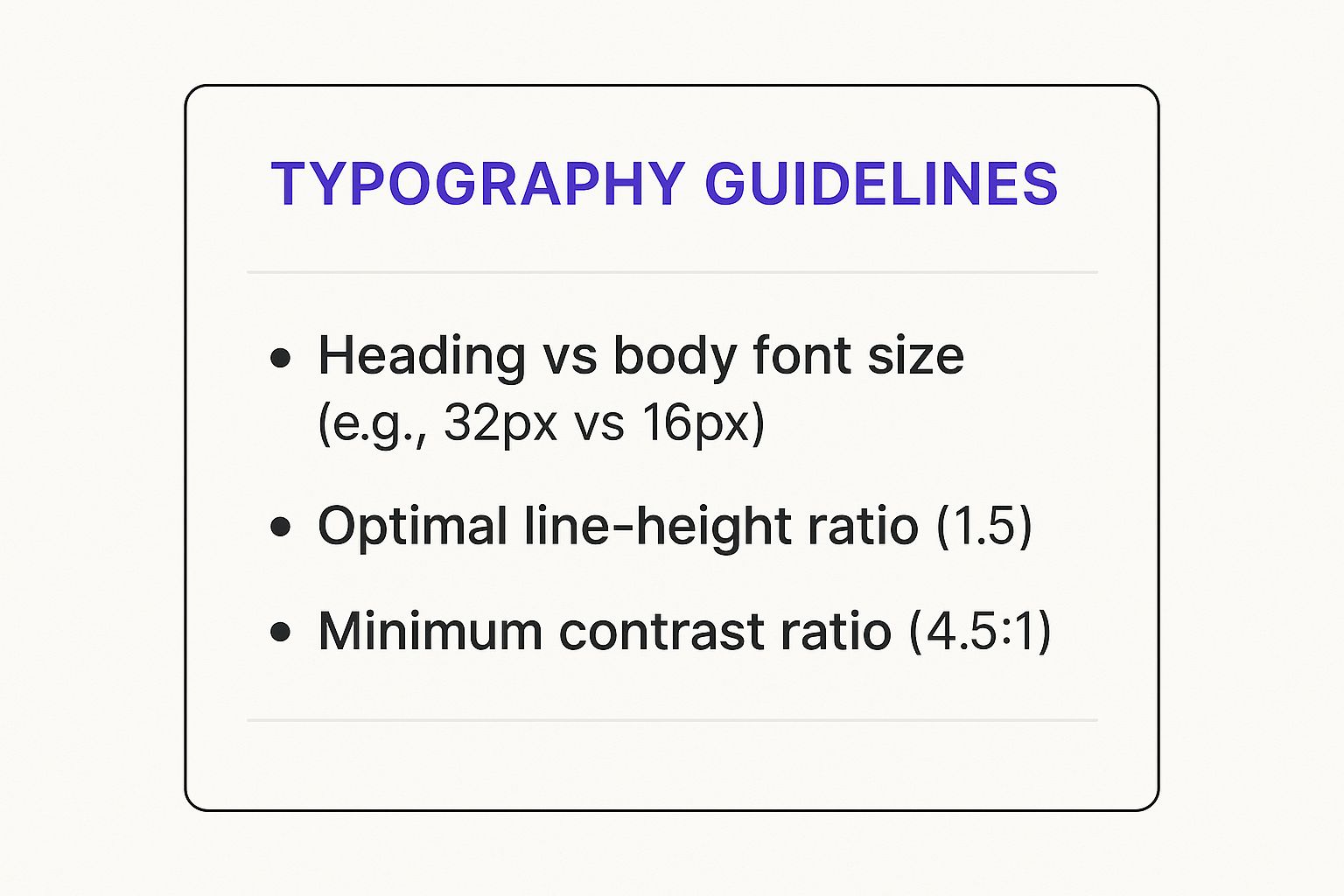
As you can see, a strong visual hierarchy with distinct heading sizes and a minimum contrast ratio of 4.5:1 is absolutely fundamental for legibility.
To get you started, here's a quick checklist covering the core principles. Think of this as your accessibility cheat sheet for making sure your site is welcoming to all users.
Core Accessibility Checklist
| Guideline | Why It Matters | Simple Implementation Tip |
|---|---|---|
| Perceivable | Users must be able to perceive the information being presented. It can't be invisible to all of their senses. | Always provide alt text for images. For videos, include captions and transcripts. |
| Operable | Users must be able to operate the interface. The interface cannot require interaction that a user cannot perform. | Ensure every link, button, and menu can be navigated and used with only a keyboard. |
| Understandable | Information and the operation of the user interface must be understandable. | Keep your navigation consistent across the site. Write in clear, simple language and avoid jargon. |
| Robust | Content must be robust enough that it can be interpreted reliably by a wide variety of user agents, including assistive technologies. | Use clean, standard HTML and follow best practices. Validate your code to catch errors. |
Following these guidelines isn't just about technical compliance; it's about creating a fundamentally better and more user-friendly website.
By framing accessibility not as a compliance task but as a core component of user-centered design, you shift your perspective from obligation to opportunity. An accessible website is more usable, has better SEO, and reaches a wider audience.
Ultimately, building an inclusive website is a strategic advantage. While the Web Content Accessibility Guidelines (WCAG) provide a technical framework, the real goal is empathy. When you consider the diverse needs of your audience from the very beginning, you create a digital presence that is welcoming, effective, and professional for absolutely everyone.
Optimizing for Speed and Mobile Devices

In today's web design world, slow is the new broken. Two of the most critical technical pillars you need to get right are your site's speed and its mobile experience.
Think of your website as a physical shop. If the front door takes forever to open, potential customers aren't going to wait around politely. They'll just turn around and walk into your competitor's store—the one with doors that swing open instantly.
This isn't just a creative metaphor; it's a financial reality. Slow-loading pages cause 39% of users to bounce, contributing to a staggering $2.6 billion in lost retail sales every year. It’s clear that performance isn't just a box to tick for your developer; it's a core business metric that directly impacts your bottom line. You can dive deeper into how design choices affect user behavior by checking out these web design statistics.
A fast, seamless experience is no longer a luxury—it's what users expect. Let’s make sure your website delivers.
Boosting Your Website’s Performance
A snappy website feels professional, keeps people engaged, and just plain works better. In fact, page speed is a confirmed ranking factor for Google, which means a faster site can directly improve your visibility in search results.
The secret to a fast site is simple: reduce the amount of "stuff" a browser has to download and process.
Here are a few practical, high-impact ways to speed things up:
- Optimize Your Images: This is the single biggest win for most websites. Large, uncompressed images are absolute performance killers. Start using modern formats like WebP, which offers fantastic compression, and always resize your images to the exact dimensions they'll be displayed at on the page.
- Minimize Your Code (HTML, CSS, JavaScript): Think of this as decluttering your site's engine room. Minification tools strip out all the unnecessary characters from your code—like spaces, comments, and line breaks—without affecting how it runs. The files become smaller and download much faster.
- Leverage Browser Caching: This technique cleverly tells a visitor's browser to save parts of your website (like your logo, CSS files, etc.) on their local device. The next time they visit, the browser can load those files from its memory instead of downloading them all over again. It's a game-changer for repeat visitors.
By focusing on these three areas, you can make a massive dent in your load times and create a much smoother journey for your users.
Adopting a Mobile-First Design Strategy
Years ago, we designed websites for big desktop monitors and then tried to awkwardly shrink them down for phones. That approach is completely backward now. With well over half of all web traffic coming from mobile devices, mobile-first design isn't just a good idea—it's the only way forward.
This strategy means you design for the smallest screen first and then scale up to larger devices. It forces you to prioritize what’s truly essential, leading to a cleaner, more focused design that benefits everyone, regardless of their device.
A mobile-first approach isn't just a trend; it's a direct response to how people live and browse today. The top-ranking websites get this, with 62% being fully optimized for mobile to meet their users where they are.
When you're designing for mobile, you have to think differently. People aren't using a precise mouse pointer; they're using their thumbs.
Here are the core principles for a great mobile experience:
- Create Adaptive Layouts: Your website has to reflow and rearrange itself perfectly for any screen size. Use a flexible grid system and media queries to ensure your content is always readable and accessible, with zero horizontal scrolling.
- Design Touch-Friendly Buttons: Buttons, links, and other interactive elements need to be big enough for a thumb to tap easily. A good rule of thumb is to aim for a target size of at least 44×44 pixels to avoid those frustrating "fat-finger" errors.
- Simplify Your Navigation: Screen real estate on a phone is precious, so complex, multi-level menus are out. Use clean, simple patterns like a "hamburger" menu or a streamlined tab bar to help users find what they need without getting lost.
Getting mobile optimization right is non-negotiable. For a more detailed walkthrough, you can learn how to optimize your website for mobile with our in-depth guide. At the end of the day, combining a lightning-fast site with a flawless mobile experience is the secret to keeping your audience happy and hitting your goals.
Putting Your Design Guidelines to Work with Divi

All those excellent design guidelines are just theory until you actually put them into practice. This is where a powerful tool like Divi becomes your greatest asset, turning abstract principles into a functional, beautiful website. Think of it as the bridge between your brand vision and a live site.
Divi gives you a centralized system to enforce consistency and build efficiently. I like to think of Divi’s Theme Customizer as the digital command center for your brand. It’s where you translate your style guide into hard-and-fast rules that apply across your entire website. Instead of tweaking a font color on a dozen different pages, you define it once and you're done. Perfect brand alignment, everywhere.
Establishing a Global Design System
The very first thing you should do is lock in your core visual identity using Divi's global settings. This simple action saves countless hours down the road and prevents "design drift"—that slow creep of tiny inconsistencies that can make a site feel unprofessional over time.
Start by hopping into the Theme Customizer to define your global defaults. This is where you can cement your brand’s identity with precision.
- Global Colors: Set up your primary, secondary, and accent colors in the Divi color palette. This makes it a breeze to apply your brand's exact hex codes throughout the site without ever having to remember or copy-paste them again.
- Global Fonts: Choose your heading and body fonts, then define their default sizes, weights, and line heights. This simple step enforces typographic consistency and guarantees readability on every single page.
- Button Styles: Design one powerful, go-to button style that reflects your main call-to-action. You can set its colors, borders, and hover effects globally, creating a predictable and compelling experience for your users.
Nailing these initial steps is crucial for maintaining brand integrity. For a complete look at how these elements fit into a larger strategy, check out our in-depth guide on website design best practices.
Building Responsive and Accessible Layouts
With your global styles in place, the Divi Builder is where the magic really happens. This is where you bring your layouts to life, and Divi’s built-in responsive editing views are your secret weapon for perfecting the user experience on every device. You can instantly switch between desktop, tablet, and mobile previews to see exactly how things look.
This isn't just about shrinking your site down. It's about optimizing it. You can adjust font sizes, tweak margins, and even hide certain elements on smaller screens to reduce clutter and keep things clean.
A mobile-first approach isn't just a buzzword; it's a direct response to how people actually use the web. With over 60% of top-ranking websites fully optimized for mobile, a flawless handheld experience is non-negotiable for any modern web strategy.
Divi also has your back when it comes to accessibility and performance. For example, the Image module includes a dedicated field for alt text, making it incredibly easy to add descriptions for screen readers.
On the performance side, Divi’s built-in options let you defer CSS and JavaScript, which directly improves your site's loading speed. By using these settings, you’re not just designing—you're turning your guidelines into a tangible, high-performing reality.
Frequently Asked Questions About Website Design Guidelines
It's natural for questions to pop up when you're navigating the world of website design guidelines. Think of this section as your cheat sheet—clear, straightforward answers to help you build a more effective online presence with confidence.
What Is the Difference Between UX and UI Design?
This one trips people up all the time, but it's simpler than it sounds. Think of User Experience (UX) as the architectural blueprint of a house. It's the logical flow—how you move from the kitchen to the living room, how easy it is to find the light switches. It’s all about the journey and whether it makes sense.
User Interface (UI), on the other hand, is the interior design. It's the paint colors, the furniture, the light fixtures—all the visual elements that bring the blueprint to life and make the house feel like a home. You need both to create a great experience, but they serve very different functions.
How Important Is Mobile-First Design Really?
Honestly? It's everything. In today's world, it's completely non-negotiable. With more than half of all web traffic now coming from mobile devices, designing for the smallest screen first isn't just a trend; it's the modern standard.
Starting with mobile forces you to be ruthless with your priorities. You have to focus on what's absolutely essential, which almost always leads to a cleaner, faster, and more focused experience for everyone, no matter what device they're on.
A strong user experience isn't just about looking good; it has a massive impact on your bottom line. Great UX design has been shown to boost conversion rates by as much as 400%. That's a game-changer when you consider that average ecommerce conversions hover between 2.5% and 3%. You can discover more insights about web design's impact on VWO.com.
Can Good Design Really Improve My SEO?
Absolutely. Long gone are the days when SEO was just about keywords. Search engines like Google are now obsessed with user experience, and they reward websites that deliver it.
Many of the core design guidelines we've discussed are direct ranking signals for Google. Things like:
- Lightning-fast page speed
- A rock-solid mobile experience
- Clear, intuitive navigation
- Accessibility for all users
When Google sees these things, it recognizes your site as high-quality. Plus, a well-designed site keeps people engaged longer, which slashes your bounce rate and sends even more positive signals to search engines, further boosting your authority.
More Articles You Will Like