 Alex Martin
Your blog's layout is the digital handshake that greets every visitor. It's the silent narrator of your brand's story, guiding readers from one post to the next and setting the tone for their entire experience. A generic, uninspired design can lead to high bounce rates and lost opportunities, while a strategic layout can captivate your audience, improve user engagement, and boost conversions. A well-structured design isn't just about aesthetics; it's a critical component of your content strategy that directly impacts how users perceive and interact with your brand.
This guide moves beyond basic templates to provide a detailed blueprint for 10 powerful blog page layouts. We will analyze the strategic purpose behind each one, exploring its unique UX and SEO implications. To truly make your blog's first impression count, it's not just about visual appeal; speed and responsiveness are crucial. You can dive deeper into key website performance optimization techniques to ensure your chosen layout loads swiftly and flawlessly.
For each layout, you'll find actionable steps for implementation using the Divi theme, complete with specific modules and performance tips. We'll also uncover advanced engagement tactics using Divimode tools like Divi Areas Pro, showing you how to enhance each design with popups, dynamic content, and powerful calls-to-action. Prepare to transform your blog from a simple content feed into a high-performing marketing asset.
1. Classic Sidebar Layout
The Classic Sidebar Layout is one of the most enduring and recognizable blog page layouts. It features a wider main content column, typically on the left, paired with a narrower sidebar on the right. This two-column structure creates a clear visual hierarchy, dedicating the largest area to the primary article content while using the sidebar for secondary navigation, discovery, and calls-to-action.
This layout’s longevity stems from its efficiency. It presents readers with a familiar, easy-to-navigate interface. Early versions of sites like TechCrunch and countless default WordPress themes have cemented its place as a standard. It excels at keeping users on-site by providing immediate access to related content, categories, and popular posts.
Strategic Analysis & When to Use It
The Classic Sidebar is ideal for content-heavy blogs aiming to maximize page views and user engagement. By surfacing navigation links, author bios, social proof, and email sign-up forms, it continuously provides next steps for the reader. This prevents dead-ends and encourages deeper exploration of the site.
Key Insight: This layout works best when the sidebar content directly supports the main article and the user's journey. Avoid using it as a junk drawer for miscellaneous links; every widget should have a strategic purpose.
Actionable Takeaways for Divi
- Structure: Use a Divi Section with a two-column row. A common and effective ratio is 2/3 for the main content and 1/3 for the sidebar.
- Modules: Populate the main column with a Blog Module or a Theme Builder template body. Fill the sidebar column with modules like Sidebar, Text (for custom CTAs), Email Optin, or a Blog Module filtered for "Recent Posts."
- Engagement: Consider making the sidebar sticky on desktop so key CTAs remain visible as users scroll.
- Responsiveness: For mobile, configure the sidebar column to stack below the main content or hide it entirely on smaller devices to prioritize the reading experience.
2. Full-Width Single Column Layout
The Full-Width Single Column Layout is a modern, minimalist approach to blog page layouts. It removes sidebars and other peripheral elements, dedicating the entire viewport width to the article content. This immersive design creates a distraction-free, focused reading environment that puts the narrative front and center.
Popularized by platforms like Medium and Substack, this layout prioritizes content clarity and legibility. By eliminating competing visual information, it guides the reader's eye directly down the page, making it ideal for long-form articles, storytelling, and thought leadership pieces. It projects an air of confidence, suggesting the content itself is the primary attraction.
Strategic Analysis & When to Use It
This layout is perfect for blogs where the quality of writing and the core message are the main draw. It excels for personal blogs, journalistic sites, and brand publications that want to establish authority. The lack of sidebars means calls-to-action must be integrated directly into or at the end of the content, which can lead to higher engagement if done thoughtfully.
Key Insight: This layout trades the constant discoverability of a sidebar for a more powerful, focused user experience. Success depends on compelling content and strategically placed inline CTAs to guide the reader's next step.
Actionable Takeaways for Divi
- Structure: Use a Divi Section with a single one-column row. In the row settings, under "Sizing," set the "Max Width" to a comfortable reading length, like
800pxor960px. This prevents text lines from becoming too long on large screens. - Modules: Build your article within the main column using a Theme Builder template. Use a series of Text, Image, and Video Modules to craft a rich, engaging narrative flow.
- Engagement: Place Email Optin or Call to Action Modules at the end of the post or subtly between major sections of your article to capture leads without disrupting the reading experience.
- Responsiveness: This layout is inherently mobile-friendly. Ensure your typography and spacing are configured to provide an excellent reading experience across all device sizes without needing major structural changes.
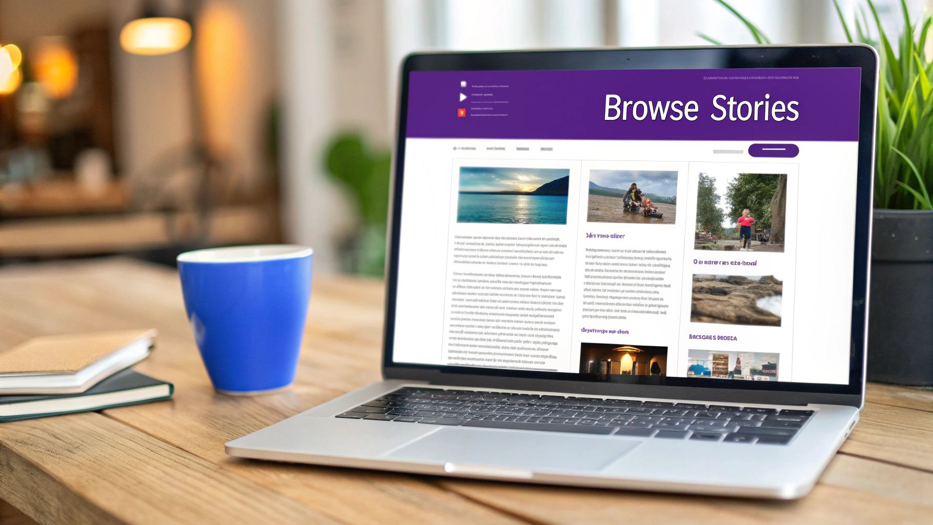
3. Magazine/Grid Layout
The Magazine/Grid Layout arranges posts in a visually dynamic grid, transforming the blog archive into a browsable, magazine-style experience. This approach moves away from a linear, chronological list to showcase multiple articles simultaneously, emphasizing visual appeal and content discovery. By presenting posts as cards, this format among blog page layouts gives equal weight to many articles at once.
Sites like Pinterest and BuzzFeed popularized this layout by prioritizing quick visual scanning and encouraging users to explore a wide variety of content. The grid format is inherently engaging, making it easy for visitors to find topics that capture their interest without extensive scrolling. It excels at surfacing a high volume of content on a single screen.
Strategic Analysis & When to Use It
This layout is perfect for blogs with strong visual elements, such as those focused on design, food, travel, or fashion. It's also ideal for publishers with a high output of content, as it prevents newer articles from immediately burying older ones. The grid encourages exploration and reduces bounce rates by presenting a buffet of options, increasing the chance a user will click through to at least one article.
Key Insight: The success of a grid layout depends on compelling featured images and headlines. If your visuals are weak or your titles aren't engaging, the layout will fail to capture user attention and can appear cluttered.
Actionable Takeaways for Divi
- Structure: Use a Divi Section with a single row and populate it with a Blog Module. In the module's Design settings, select the "Grid" layout.
- Modules: The Blog Module is the primary tool here. You can control the column count for different devices in the module's design settings, ensuring a responsive grid.
- Performance: Optimize image sizes before uploading and enable Divi's built-in lazy loading. Consistent aspect ratios for your featured images will create a more professional and visually coherent grid. Explore these concepts further with our guide on CSS grid layout examples on divimode.com.
- Engagement: Add subtle hover effects to the post cards to provide visual feedback. Consider implementing a "Load More" button or infinite scroll for pagination to keep users engaged without forcing a full page reload.
4. List-Based Layout
The List-Based Layout presents blog posts as a clean, chronological, or ranked feed, prioritizing scannability and information density. Unlike grid layouts that emphasize visuals, this is one of the most efficient blog page layouts for quickly conveying titles, excerpts, and metadata. Each post appears as a distinct row, often with a thumbnail, headline, and key details like author and date.
This format was popularized by information-driven platforms like Reddit and Hacker News, where the speed of content consumption is paramount. It excels at displaying a high volume of articles without overwhelming the user, creating an experience similar to a social media feed where users can rapidly assess which content is relevant to them.
Strategic Analysis & When to Use It
This layout is perfect for news sites, forums, or blogs that publish frequently and cater to a readership that values efficiency over elaborate visuals. It allows users to browse numerous headlines quickly, making it ideal for discovering new content or catching up on the latest updates. The linear, top-to-bottom flow is intuitive and accessible, reducing cognitive load for the reader.
Key Insight: The List-Based Layout’s strength is its simplicity. It works best when the headline and excerpt are compelling enough on their own to earn a click, making it a powerful choice for content focused on timely information or strong opinions.
Actionable Takeaways for Divi
- Structure: Use a single-column Section and Row. The core of this layout can be built with a Blog Module set to the "Fullwidth" layout option.
- Modules: In the Blog Module's Design settings, customize the "Layout" to control which elements (Featured Image, Author, Date, Excerpt) are displayed and ensure a clean, row-like appearance.
- Engagement: Add visual variety by alternating the thumbnail position (left, then right) for each post. This can be achieved with custom CSS targeting odd/even post classes.
- Responsiveness: This layout is naturally mobile-friendly. Ensure thumbnail sizes are optimized and font sizes remain legible on smaller screens to maintain the scannable nature of the feed.
5. Hero Header + Content Layout
The Hero Header + Content Layout immediately captures attention with a large, visually striking section at the top of the page. This hero area, often featuring a high-impact image, video, or bold typography, serves as a powerful introduction, setting the tone and context for the article that follows below. It's one of the most effective blog page layouts for making a strong first impression.
This layout transforms a standard blog post into a more immersive, editorial experience. It borrows from modern landing page design to elevate the content's perceived value. Prominent brands like Apple Newsroom and Stripe use this approach to create a premium, polished feel, ensuring their content stands out and immediately engages the reader.

Strategic Analysis & When to Use It
This layout is perfect for feature articles, cornerstone content, or any post where visual storytelling is key. It helps establish brand identity and is highly effective for blogs that prioritize aesthetics and a premium user experience. Use it to highlight a key theme or to build anticipation before the reader dives into the main text. Learn more about crafting impactful headers on divimode.com.
Key Insight: The hero section's primary job is to create an emotional connection and establish relevance in seconds. Ensure the headline and visuals work together to convey a single, compelling message that entices the user to scroll down.
Actionable Takeaways for Divi
- Structure: In a Theme Builder template for Posts, create a separate Section at the top for your hero. Use a full-width row with a background image or video. Place a Text Module or Post Title Module inside for the headline.
- Modules: Use a Text Module for the title and a Button Module for a clear call-to-action within the hero. The content below can be structured in a new Section containing the Post Content Module.
- Performance: Heavily optimize hero images by using modern formats like WebP/AVIF and implementing lazy loading to ensure fast page load times.
- Readability: Apply a background overlay or color gradient to your hero Section to ensure the headline text has sufficient contrast and is easily readable against the image.
6. Multi-Column Sidebar Layout
The Multi-Column Sidebar Layout expands on the classic model by featuring the main content area alongside two or more narrower sidebars. This complex structure is common on legacy news sites or portal-style websites that need to display a high density of information, such as different content categories, advertisements, and navigation widgets simultaneously.
This layout transforms the page into a dashboard, offering users multiple pathways from a single article. Sites like major news outlets have used this to great effect, framing a central news story with stock tickers, breaking news alerts, and links to various opinion sections. The goal is to accommodate a vast amount of secondary content without it feeling entirely disconnected from the main article.
Strategic Analysis & When to Use It
This layout is best suited for content-rich portals, large-scale news magazines, or complex business blogs that serve diverse audience needs. It allows for the strategic placement of different types of content, such as one sidebar for contextual navigation (categories, tags) and another for site-wide elements (popular posts, ads). The primary challenge is avoiding a cluttered user experience that overwhelms the reader and detracts from the main content.
Key Insight: This is an information-dense layout. Success depends on clear visual hierarchy and aggressive mobile optimization. The sidebars must be organized into logical, scannable groups to be effective.
Actionable Takeaways for Divi
- Structure: Use a Divi Section with a four-column row, often configured with a 1/2 + 1/4 + 1/4 layout. Another option is a custom ratio, such as 70% for content and 15% for each sidebar.
- Modules: The main column will house the Blog Module or the Theme Builder post content. The sidebars can be populated with multiple Sidebar modules, Text modules for custom widgets, Ad modules, or even filtered Blog modules for featured posts.
- Hierarchy: Use backgrounds, borders, or spacing to create clear visual separation between the columns. This prevents the page from looking like a single, chaotic block of information.
- Responsiveness: This is critical. On tablet and mobile, configure the secondary and tertiary sidebars to either stack logically below the content or hide them entirely to prioritize readability.
7. Timeline/Chronological Layout
The Timeline/Chronological Layout organizes posts along a visual axis, emphasizing sequence and progression. This is one of the more narrative-driven blog page layouts, transforming a simple list of articles into a story. It typically features a central line with posts branching off, marked by dates or key milestones, making it ideal for recounting historical events or documenting progress over time.
This layout excels at contextualizing information. Instead of just presenting articles, it shows their relationship to one another within a specific timeframe. Corporate blogs often use this to showcase company history, while project-based sites use it to document development, creating a compelling, easy-to-follow narrative for readers.
Strategic Analysis & When to Use It
The Timeline Layout is perfect for blogs where the order of events is critical to understanding the content. Use it for company milestone pages, project development diaries, historical narratives, or annual "year in review" summaries. Its linear nature guides the user through a story, making complex histories or long-term projects digestible and engaging.
Key Insight: This layout’s strength is its ability to tell a story visually. It's most effective when the chronological order itself adds value and context, rather than just being a list sorted by date.
Actionable Takeaways for Divi
- Structure: There isn't a single module for this. You'll build it manually using a one-column Section. Add a series of Rows, alternating their content's alignment (left/right) to create the staggered timeline effect.
- Modules: Use Text and Image modules within each row. A thin Divider Module running down the center of the page can act as the timeline's central spine. Use CSS pseudo-elements (like
::beforeor::after) for the connecting lines and circles. - Interactivity: Add custom CSS hover effects to each timeline entry to make it more engaging. For example, change the background color or lift the element with a box-shadow on hover.
- Responsiveness: On mobile, abandon the staggered look. Configure the columns to stack linearly in a single vertical line to ensure readability and a smooth scrolling experience on smaller screens.
8. Infinite Scroll/Progressive Load Layout
The Infinite Scroll or Progressive Load Layout is a dynamic approach to blog page layouts that ditches traditional pagination. Instead of users clicking "Next Page" links, new articles automatically load and append to the bottom of the page as the user scrolls down. This creates a fluid, continuous browsing experience designed to keep users engaged.
This layout’s popularity surged with social media feeds like those on Pinterest and Instagram, which capitalized on its ability to present a seemingly endless stream of content. For blogs, it reduces friction and encourages discovery by seamlessly serving up more posts without requiring any clicks, making it feel modern and highly interactive.
Strategic Analysis & When to Use It
This layout is best for blogs with a high volume of visually-driven or short-form content where the goal is rapid consumption and prolonged engagement. Lifestyle, photography, or news aggregate sites benefit immensely. It keeps users immersed in the content flow, increasing time on page and the number of articles viewed per session.
Key Insight: While excellent for engagement, this layout demands careful technical implementation for SEO. Use the History API to update the URL as users scroll, ensuring individual posts and "pages" of content remain indexable and shareable.
Actionable Takeaways for Divi
- Structure: Start with a standard Section and Row containing a Blog Module. The magic here isn't in the column structure but in the module's settings and potential plugins.
- Modules & Settings: In the Divi Blog Module, you can set the "Posts Per Page" count. A third-party plugin or custom JavaScript is typically required to trigger the "load more" or infinite scroll functionality. Look for plugins that integrate well with Divi's AJAX capabilities.
- Performance: Implement lazy loading for images and videos within your posts. Use lightweight loading animations or skeleton screens to provide clear visual feedback to the user that new content is being fetched.
- Accessibility: Always provide a "Load More" button as a fallback. This gives users more control and ensures the site remains accessible for those who rely on keyboard navigation or have JavaScript disabled.
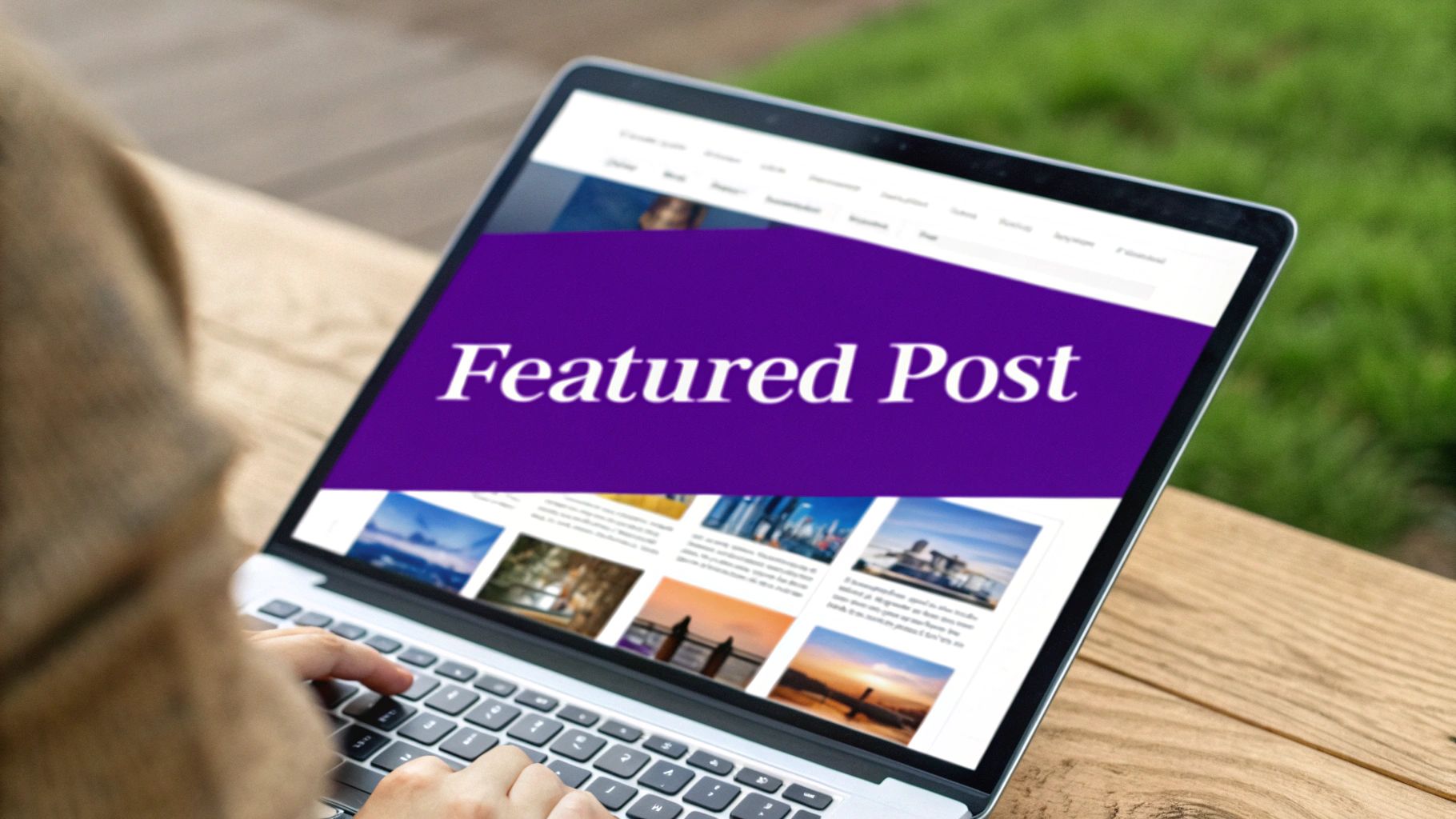
9. Card-Based Layout with Featured Post
The Card-Based Layout with a Featured Post is a visually dynamic approach among modern blog page layouts. It creates an immediate editorial focal point by dedicating a large, often full-width, area to a single prominent article. This "hero" post is then followed by a grid or list of smaller, uniform cards representing other recent or related content, guiding the user's attention effectively.
This layout, popularized by platforms like The Verge and Medium, blends the high impact of a magazine cover with the browsability of a digital grid. It allows editors to strategically highlight cornerstone content, new product announcements, or in-depth reports while still presenting a healthy volume of other articles to explore. The strong visual hierarchy ensures that your most important message is seen first.
Strategic Analysis & When to Use It
This layout is perfect for blogs that operate like online magazines or news hubs with a consistent publishing schedule. It excels at directing traffic to specific high-value articles, making it ideal for launching campaigns, promoting evergreen guides, or breaking important news. The key is to have a steady stream of quality content to populate both the featured slot and the secondary grid.
Key Insight: The success of this layout depends on the strength of the featured post's headline and image. This top spot is prime real estate; using a weak or uninteresting article here can undermine the entire page's effectiveness.
Actionable Takeaways for Divi
- Structure: On your blog's archive page template, create a top Section for the featured post and a second Section for the rest. Use the Blog Module in the top section, setting "Posts Per Page" to 1 and using a "Fullwidth" layout.
- Targeting: Use the Blog Module's "Include Categories" or "Include Tags" setting to pull a specific post into the featured slot. For instance, create a "Featured" category and assign it to only one article at a time.
- Secondary Content: In the section below, add another Blog Module in a "Grid" layout. Crucially, use its "Post Offset Number" setting and enter "1" to prevent the featured post from appearing a second time.
- Enhancement: To keep users engaged, consider adding a horizontal post carousel below the main grid. Find out how to build a carousel of related Divi blog posts to showcase even more content.
10. Modular/Customizable Widget Layout
The Modular/Customizable Widget Layout empowers users by transforming them from passive consumers into active curators of their own experience. This advanced approach to blog page layouts provides a flexible, component-based framework where content blocks or widgets can be rearranged, added, or removed, often through a drag-and-drop interface. This creates a highly personalized and dynamic reading environment.
This layout is the digital equivalent of a personalized dashboard, reminiscent of now-deprecated services like iGoogle or modern platforms like Notion. It trades a single, static design for an adaptable one, giving control to the end-user or admin to prioritize the information most relevant to them. The core principle is user agency, allowing the layout to serve individual needs.
Strategic Analysis & When to Use It
This layout is ideal for content-rich platforms, membership sites, or internal dashboards where users have diverse interests and needs. By allowing personalization, you can significantly increase user engagement and time on site, as the experience is tailored specifically to their preferences. It's also a powerful tool for sites that aggregate content from various categories, letting users build a feed that matters to them.
Key Insight: The success of a customizable layout hinges on a well-designed default state. Provide a logical and compelling initial arrangement for new visitors, as many users may not engage with customization features immediately.
Actionable Takeaways for Divi
- Structure: This is an advanced application often requiring custom development or specialized plugins. However, you can simulate it for logged-in users by using Divi's condition options to display different sections or modules based on user roles.
- Modules: Build various content "widgets" using individual Divi modules (e.g., Blog, Text, Code, Video). Each can be designed as a self-contained card or block that could theoretically be moved.
- Implementation: For a true front-end customization experience, you would likely need to integrate a JavaScript library like GridStack.js. This would allow users to drag and drop Divi-generated modules, with their preferences saved to their user profile or browser
localStorage. - User Experience: Always include a "Reset to Default" option. This ensures users who experiment with the layout can easily return to the original, curated experience if they become overwhelmed.
Comparison of 10 Blog Page Layouts
| Layout | 🔄 Complexity | ⚡ Resource requirements | ⭐ Expected outcomes / 📊 Impact | Ideal use cases | 💡 Key advantages |
|---|---|---|---|---|---|
| Classic Sidebar Layout | Medium — standard CSS with responsive tweaks | Low–Medium — widgets, simple assets | ⭐⭐⭐ — Strong readability & SEO; moderate engagement | News blogs, Business blogs, Educational content | Familiar UX; easy to add supplementary info |
| Full-Width Single Column Layout | Low–Medium — simple structure, typographic tuning | Low — minimal widgets, focus on copy & spacing | ⭐⭐⭐⭐ — Distraction‑free reading; excellent mobile UX | Long‑form journalism, Personal blogs, Thought leadership | Clean, modern aesthetic; great reading experience |
| Magazine / Grid Layout | Medium–High — grid/masonry + breakpoints | High — quality images, lazy loading, scripts | ⭐⭐⭐⭐ — High discovery & CTR; visually engaging | Design/creative blogs, Lifestyle, News aggregators | Encourages browsing; strong visual hierarchy |
| List‑Based Layout | Low — simple vertical feed | Low — thumbnails + metadata; fast loading | ⭐⭐⭐ — Very scannable & SEO‑friendly; lower visual impact | News, Tech blogs, High‑volume content sites | Fast, accessible, clear information hierarchy |
| Hero Header + Content Layout | Medium — hero media, overlays, mobile tuning | Medium–High — large assets, performance optimization | ⭐⭐⭐⭐ — Memorable first impression; strong conversions | Brand/company blogs, Featured articles, Case studies | High visual impact; effective for storytelling |
| Multi‑Column Sidebar Layout | High — complex grid & responsive collapse | High — many widgets, content management needs | ⭐⭐ — Accommodates content but risks distraction | News portals, Community sites, Portal‑style websites | Flexible monetization & rich info display |
| Timeline / Chronological Layout | Medium–High — timeline logic & interactions | Medium — date metadata, interactive scripts | ⭐⭐⭐ — Excellent for narrative engagement; limited evergreen discovery | Company history, Year‑in‑review, Project documentation | Clear chronological storytelling; memorable |
| Infinite Scroll / Progressive Load | High — JS-heavy, history API, accessibility fixes | Medium–High — server load, lazy loading, fallbacks | ⭐⭐⭐ — Increased time‑on‑site; SEO/UX tradeoffs if not handled | Social feeds, Content discovery sites, News aggregators | Seamless browsing; app‑like experience on mobile |
| Card‑Based Layout with Featured Post | Medium — featured card + responsive grid | Medium — curated images, layout tuning | ⭐⭐⭐⭐ — Balances highlight + discovery; good CTR | Editorial blogs, News sites, Magazine‑style blogs | Highlights key content while promoting discovery |
| Modular / Customizable Widget Layout | Very High — drag‑drop UI + backend persistence | Very High — dev time, storage, testing | ⭐⭐⭐ — Highly personalized but can create inconsistent UX | Dashboards, Personalized news sites, Community platforms | Maximum flexibility & personalization; good for A/B testing |
Choosing Your Perfect Layout and Bringing It to Life
We've explored a comprehensive array of blog page layouts, from the traditional classic sidebar to dynamic modular grids and focused single-column designs. The journey through these examples reveals a fundamental truth: the "best" layout is not a one-size-fits-all solution. It's a strategic decision rooted in a deep understanding of your content's purpose, your audience's behavior, and your ultimate business goals.
The choice between a visually-rich magazine grid and a scannable list-based layout directly impacts how users consume your content. One encourages browsing and discovery, while the other prioritizes speed and efficiency. Mastering these structures is the first step toward crafting a truly effective user experience that guides visitors, reduces bounce rates, and supports your content marketing objectives.
From Blueprint to a Dynamic Experience
Once you've chosen a structural blueprint, the real artistry begins. Building your chosen layout is just the foundation. The true power lies in how you enhance it. This is where Divi's Theme Builder becomes your essential tool, allowing you to move beyond template constraints and create a custom, pixel-perfect blog archive page that reflects your brand's unique identity.
Remember, every layout has implications for user engagement, SEO, and performance. A visually dense grid might look stunning, but it requires careful image optimization to maintain fast load times. Similarly, an infinite scroll offers a seamless browsing experience but needs proper implementation to ensure search engines can crawl and index your content effectively. As you build, it's crucial to consistently apply responsive web design principles to guarantee that your carefully crafted layout delivers a flawless experience on desktops, tablets, and smartphones alike.
Actionable Next Steps to Elevate Your Blog
Your journey doesn't end with selecting one of these blog page layouts. The next stage is about injecting dynamic functionality that turns passive readers into active community members and customers. Think beyond the static page and consider:
- Strategic Engagement: Where can you place a newsletter signup form that doesn't disrupt the reading flow? How can you promote a featured product within a relevant blog post category?
- User Guidance: How can you improve navigation with a well-designed mega menu, helping users discover your most valuable content pillars?
- Conversion Optimization: What targeted popups or slide-ins could you trigger based on user behavior, like exit-intent or scroll depth, to capture leads or drive sales?
Ultimately, a superior blog page layout does more than just display posts; it creates an intuitive, engaging, and goal-oriented ecosystem. By combining a thoughtful layout strategy with powerful enhancement tools, you transform your blog from a simple content repository into a high-performance marketing asset that works tirelessly for your brand.
Ready to move beyond static designs and unlock the full potential of your blog page layouts? With Divimode, you can easily add popups, mega menus, and dynamic content injection to any Divi Theme Builder template without writing a single line of code. Elevate your user engagement and drive conversions by visiting Divimode today.
More Articles You Will Like