
 Alex Martin
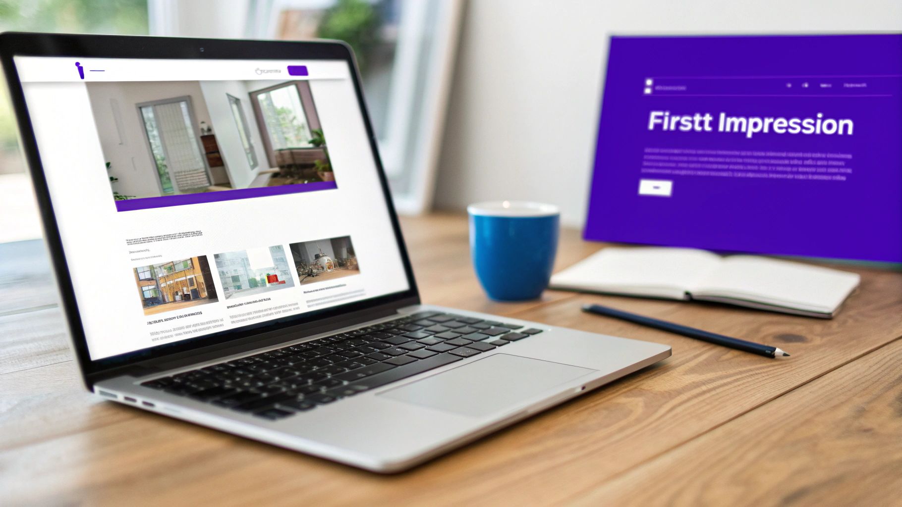
Effective website header design isn't just about making things look pretty. It's the art of creating a strategic, user-friendly navigation strip at the very top of a webpage. It thoughtfully combines your logo, primary navigation, and a clear call-to-action to guide visitors, cement your brand identity, and make a killer first impression in just a few milliseconds.
Why Your Website Header Is Your Most Critical Asset
Think of your website header as the digital front door to your business. It's the very first thing a visitor sees and interacts with, and it single-handedly sets the tone for their entire journey on your site. This isn't just a friendly "hello"—it's a split-second test of your credibility and professionalism.
That first impression is shockingly powerful. Research shows that a staggering 94% of potential customers form their entire opinion about a site based purely on its design, and the header is front and center. What's more, poor design and confusing navigation will cause 38% of web visitors to bounce immediately.
The Strategic Role of Your Header
Beyond the visuals, a well-crafted header is a strategic guide for every single user. It's the constant, reliable map that helps them explore your digital space, find what they're looking for, and ultimately take the actions you want them to. A solid header design accomplishes several business goals all at once.
- Establishes Brand Identity: The header is the most consistent visual on your site. It’s where your logo lives, reinforcing your brand with every page they visit. Learning how to build brand identity is crucial because your header is its prime representative.
- Ensures Seamless Navigation: It lays out a clear, intuitive path to your most important pages. Without a logical header, users are left adrift and frustrated, which is a fast track to them leaving for a competitor's site.
- Drives User Action: Whether it's a "Get a Quote" button or a link to your products, the header is prime real estate for your most important call-to-action (CTA). Its high visibility makes it the perfect tool to steer users toward your conversion goals.
A great header doesn't just show people where to go—it builds the confidence they need to actually go there. It transforms initial uncertainty into trust, making it a foundational tool for user retention.
At the end of the day, a thoughtfully designed header isn't just a container for links; it's a powerful business asset. It sets the stage for a positive user journey and is a key driver for keeping visitors around. Once you grasp its critical role, it's easy to see why investing in solid header design delivers a significant return. To learn more about creating that positive experience, check out our guide on how to increase website engagement: https://divimode.com/how-to-increase-website-engagement/
The Building Blocks of a High-Converting Header
Let's get one thing straight: a great header is so much more than a pretty banner at the top of your site. It's a workhorse. Think of it as your digital welcome mat and your website's tour guide, all rolled into one. When done right, it builds trust, guides visitors where they need to go, and ultimately, nudges them toward taking action.
Each piece—from the logo to the navigation links to that all-important button—has to work in harmony. By nailing a few core ideas like visual hierarchy, navigation clarity, and brand consistency, you can turn a simple design element into a powerhouse for your conversion funnel.
Establish a Clear Visual Hierarchy
Visual hierarchy is just a fancy way of saying you need to arrange things to show what's most important. A high-performing header doesn't make users guess; it intentionally leads their eye from one point to the next.
Your most critical elements need to be the most prominent. It's no accident that you see logos in the top-left corner so often. Research shows this placement can boost brand recall by as much as 89%. Why? Because in Western cultures, we read left to right. It just feels natural and expected.
"A successful header doesn't make users think. It uses size, color, and placement to create an intuitive path, telling them, 'Start here, look here next, and then click this.'"
The same logic applies to your main call-to-action (CTA) button. It absolutely has to stand out. Slap a contrasting color on it that pops against the background, making it the most visually magnetic thing to click. This isn't just about making it look nice; you're sending a clear signal about the single most important next step, whether that’s “Get a Quote” or “Shop Now.”
Build Intuitive and Simple Navigation
Your header's number one job is helping people find what they’re looking for, period. Confusing navigation is a guaranteed way to send visitors packing. The goal is to make getting from point A to point B feel completely effortless.
Start by simplifying your nav links. Throwing too many choices at someone leads to cognitive overload, and they'll just tune out. Try to stick to between five and seven essential links that cover the core areas of your website. This keeps the menu clean, scannable, and easy to digest at a glance.
A few best practices I always follow for clear navigation:
- Use Descriptive Labels: Ditch the vague jargon like "Resources" or "Solutions." Be specific. Use clear terms like "Blog," "Case Studies," or "Pricing Plans" so people know exactly what they’re getting before they even click.
- Group Related Items: If you’ve got a big, complex site, use dropdowns or mega menus to tuck sub-pages neatly under a main category. This keeps the main navigation bar tidy while giving users access to all the deeper content.
- Prioritize Key Pages: People have expectations. Put your most important links, like "Services" or "Products," right at the beginning of the menu (just after "Home") and stick the "Contact" link at the very end.
Reinforce Brand Consistency
Your header shows up on pretty much every single page, which makes it an incredibly powerful tool for hammering home your brand identity. Every little detail—the logo, the color palette, the fonts—needs to be perfectly in sync with your brand guidelines. It’s this consistency that builds familiarity and, more importantly, trust.
Make sure your logo is crisp, clear, and instantly recognizable; it's the visual anchor for your entire brand. The colors you use should come straight from your brand palette, creating a cohesive look that ties the header to the rest of the page. When you consistently apply these brand elements, you make users feel secure and confident that they’re in the right place as they browse your site.
Choosing the Right Website Header Layout
Picking the right header layout for your website is a bit like choosing the dashboard for a car. They all give you the essentials—speed, fuel, navigation—but the design and layout can completely change the driving experience. There’s no single “best” layout that fits every website; it all comes down to your site’s complexity, your brand's personality, and what you ultimately want your users to do.
Some designs are all about a clean, minimalist vibe, while others are built to juggle dozens of navigation links. The real key is to match the structure to the function. A slick e-commerce store has different needs than a content-heavy news site, and both are different from a creative portfolio. Get it wrong, and you’ll frustrate your visitors. Get it right, and you create a smooth, intuitive journey from the very first click.
This decision tree infographic is a great way to visualize the core things you need to think about—hierarchy, navigation, and calls to action—that will guide your header design choice.
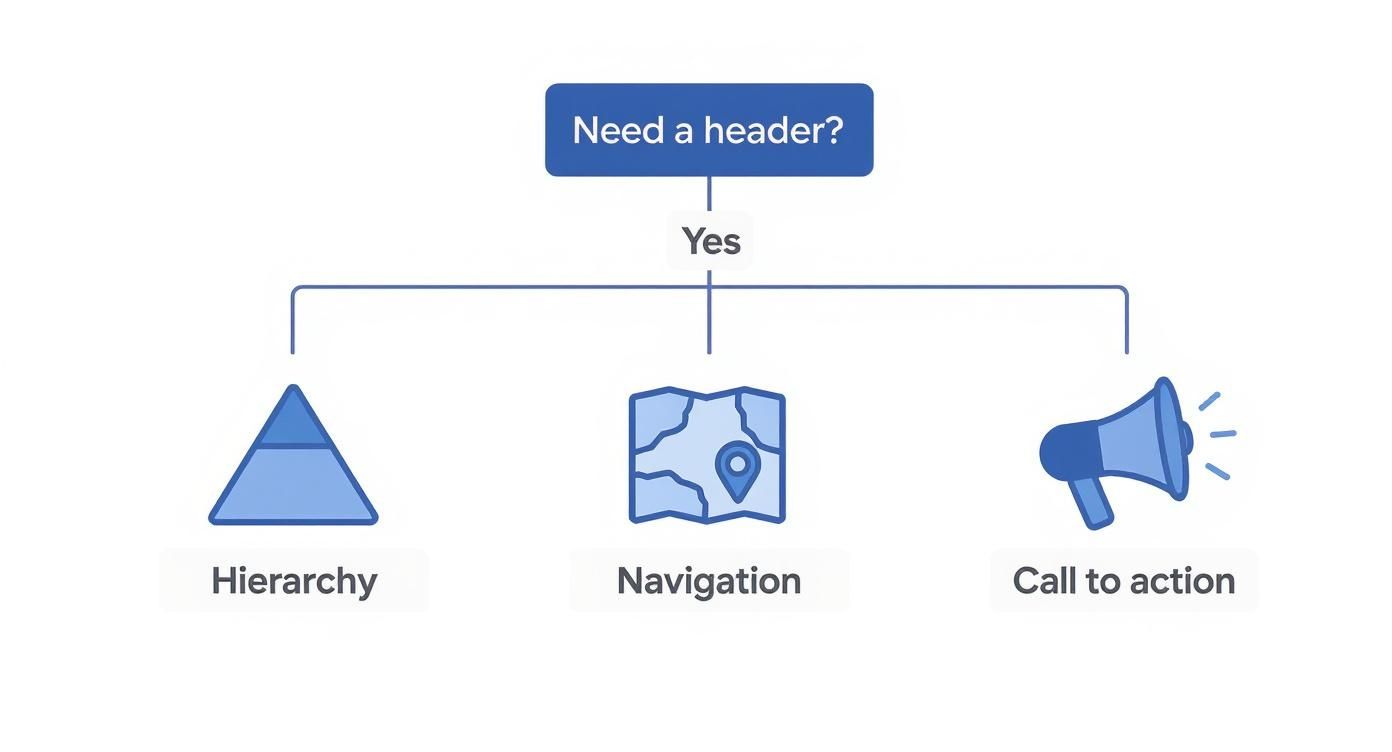
As the graphic shows, every effective header has to find a sweet spot between these three pillars to really nail the user experience.
The Classic Top-Fixed Header
This is the most common and recognizable layout out there for one simple reason: it just works. A top-fixed or "sticky" header stays locked in place at the top of the screen as users scroll down. This small feature has a huge impact on usability, keeping your logo, main navigation, and key CTAs within reach at all times.
Users never have to scroll all the way back to the top to find their way around, which cuts down on friction and keeps them engaged. It's a true workhorse, perfect for:
- E-commerce sites where the shopping cart and search bar need to be available constantly.
- Blogs or news sites with long-form articles, letting readers navigate away at any point.
- Corporate websites that want to maintain a strong brand presence and clear navigation on every single page.
The Sleek Transparent Header
A transparent header overlays a hero image or video, creating a modern, immersive first impression that can be visually stunning. This style really excels at making a site feel open and expansive because it avoids creating a hard visual break at the top of the page.
But, it does come with a catch. You absolutely have to ensure the navigation text and logo have enough contrast to be readable against whatever background image you're using. This layout is a fantastic choice for:
- Creative portfolios and design agencies looking to show off strong visuals right away.
- Travel and hospitality websites that rely on beautiful imagery to pull users in.
- Product landing pages where a single, powerful hero shot is the star of the show.
The Mobile-Friendly Hamburger Menu
Originally cooked up for mobile interfaces with very limited screen real estate, the hamburger menu has made its way onto plenty of minimalist desktop designs. It hides the main navigation behind that classic three-line icon, which users click to reveal the menu.
While it delivers an incredibly clean look, it does come with a usability trade-off. Hiding the navigation can make discovering key pages a little less intuitive for some visitors. This layout is best suited for:
- Web applications and software platforms where the main interface needs to take priority.
- Highly focused landing pages that have one primary call-to-action.
- Mobile-first websites where maintaining a minimal aesthetic is the top goal.
When you're weighing your options, remember that simplicity often wins. A recent study found that a massive 84.6% of users prefer simple, uncluttered header layouts. It also revealed that 38% of visitors check out the navigation links as one of their first moves on a site, which really highlights the need for clarity.
The Distinct Vertical Sidebar
Breaking away from the traditional horizontal format, a vertical sidebar puts the logo, navigation, and other elements into a column on the left or right side of the screen. This layout is a fantastic solution for websites with a ton of primary navigation categories that would just feel crowded in a standard top header.
It gives you plenty of room for longer link labels and can easily handle complex, multi-level menus. This approach works particularly well for:
- Online learning platforms that have numerous course categories.
- Large e-commerce stores with extensive product departments.
- Knowledge bases or documentation sites that need a clear, hierarchical structure.
Ultimately, the right header layout is all about balancing aesthetics with pure functionality. Before you settle on a style, take a moment to think about the different header sizes for websites and how your chosen layout will adapt across every device.
Crafting an Exceptional Header User Experience
A beautiful header is one thing, but a header that feels completely effortless to use? That's something else entirely. The best headers are laser-focused on the user experience (UX), making sure every click, tap, and interaction is smooth, intuitive, and frustration-free.
This is where we move beyond static design mockups and start thinking about how your header actually performs in the wild—on different devices, for different people, and during different actions. Great UX isn't about flashy animations; it's about the thoughtful little details. It's about making a button easy to tap on a small phone screen or ensuring the navigation is still there after a user has scrolled halfway down a long page.
These considerations are what separate a merely "good" header from one that actively helps users and pushes your business goals forward.
Designing for Every Device
These days, with more than half of all web traffic coming from mobile devices, a responsive header isn't just a nice-to-have—it's completely non-negotiable. A header that looks absolutely perfect on a widescreen desktop monitor can quickly become a cluttered, unusable mess on a smartphone if you're not designing with a mobile-first mindset.
The goal is to provide a consistent yet perfectly optimized experience on every screen. This usually means tucking navigation links into a hamburger menu, making sure the logo scales down without losing clarity, and prioritizing only the most critical elements, like a CTA button or a search icon. Your user should get the same core value from your header, no matter their screen size.
Accessibility and Inclusive Design
An exceptional user experience is an accessible one, period. Your header has to be usable by everyone, and that includes people with disabilities who might rely on screen readers or other assistive technologies. Following the Web Content Accessibility Guidelines (WCAG) isn't just a box to check; it’s fundamental to creating a website that welcomes all users.
Here are a few key accessibility checkpoints for your header:
- Sufficient Color Contrast: Text and icons need to stand out clearly from the background. The gold standard is a contrast ratio of at least 4.5:1 for normal text.
- Keyboard Navigation: Every single element in your header, from dropdown menus to buttons, must be fully usable with just the keyboard.
- Clear Focus States: As a user tabs through your links, there should always be a clear visual cue (like an outline) showing exactly which element is currently selected.
- Descriptive Link Text: Links need to make sense on their own. Ditch generic phrases like "Click Here" and opt for descriptive labels like "View Our Services" instead.
Mastering Touch Targets and Sticky Navigation
On mobile devices, our fingers are a lot less precise than a mouse cursor. This makes the size of your buttons and links—often called touch targets—incredibly important. To save your users from the frustration of mis-taps, make sure all your interactive elements are large enough to be pressed with confidence. A common recommendation is to aim for a minimum target size of around 44×44 pixels.
Another powerful UX technique is the sticky header. This is simply a header that "sticks" to the top of the screen as the user scrolls down the page.
A sticky header is a huge usability win, especially for long pages. It keeps primary navigation constantly accessible, preventing users from having to scroll all the way back to the top just to move to another section of your site.
When you implement a sticky header, the trick is to find the right balance. A popular approach is to have it shrink just a little bit upon scrolling, which preserves precious screen real estate while keeping your logo and key links in view. This simple feature can drastically reduce user friction and encourage people to explore your site more deeply.
Taming Complexity with Mega Menus
For large, content-heavy websites like e-commerce stores or sprawling corporate sites, a simple dropdown menu often just doesn't cut it. When you've got a ton of pages to organize, a mega menu can be a lifesaver.
A mega menu is a large, expandable panel that lays out multiple levels of navigation in a clear, organized way. Instead of a long, single-column dropdown that forces users to scroll endlessly, a mega menu can use columns, headings, and even icons or images to group related links together. This makes it much easier for users to scan all their options at a glance and find exactly what they're looking for without feeling overwhelmed. When designed well, a mega menu can turn a confusing navigation maze into a clean, efficient pathway for your users.
Web design doesn't sit still for a second, and the humble website header is no exception. That static banner you’re used to seeing is getting smarter, more interactive, and a whole lot more personal. Staying on top of these shifts is the key to creating a modern header that actually connects with people.
The biggest change coming down the pike? Artificial intelligence. AI is rapidly shifting from a sci-fi concept into a real-world tool for designers, and it’s changing the game in some pretty remarkable ways.
The Rise of AI and Personalization
AI-powered tools can now spin up multiple layout ideas, suggest color palettes that fit a brand’s vibe, and even run A/B tests on their own to figure out which designs work best. This makes it possible to iterate fast and make data-backed decisions that used to take ages.
Web designers are already jumping on board. It’s estimated that nearly 93% of designers will have these tools in their workflow by 2025. And it pays off—for example, regularly A/B testing your header can pump up conversion rates by as much as 25%.
Of course, as AI tools get better, designers also have to think about what it means to use AI-generated visuals. It’s becoming more and more important to understand how to use images for authenticity in the AI era to keep your audience’s trust.
Beyond just creating designs, AI is what makes hyper-personalization possible. Just imagine a header that changes based on who is visiting your site or where they're coming from.
A personalized header transforms the user experience from a one-size-fits-all broadcast into a one-on-one conversation. It anticipates needs and delivers relevance before the user even has to ask.
This could look like a few different things:
- For a returning customer: The header might show a "Welcome Back, [Name]!" message with a quick link to their order history.
- For a first-time visitor: It could highlight a special introductory offer or a simple "Get Started" guide.
- For someone in a specific region: The header could feature promotions or content relevant to their location.
That kind of personal touch creates a much stickier, more engaging experience. It makes people feel seen, and that’s a surefire way to build some serious brand loyalty.
Interactive and Minimalist Aesthetics
Another major trend is the push toward headers that are more interactive and dynamic. Instead of just sitting there, headers are becoming an active part of the experience. We're talking subtle animations on hover, little micro-interactions that give you feedback, and slick transitions as you scroll down the page.
When done right, these little touches can make a website feel more alive and polished. They add a layer of delight that grabs attention and pulls the user’s eye right where you want it—like your main call-to-action.
At the same time, minimalism is still a huge force in header design. Designers are stripping away all the clutter to focus on the absolute essentials: a clean logo, simple navigation, and one clear CTA. This approach cuts down on the mental heavy lifting for users, making it way easier for them to process information and find what they’re looking for.
The future of header design is smart, personal, and clean. By leaning into these trends, you can build a header that doesn't just look fresh but works overtime to engage your visitors and turn them into customers.
Inspiring Website Header Design Examples
Theory is great, but seeing a well-designed website header in action is where the lightbulb really goes on. To turn all these abstract ideas into something you can actually use, let's break down a few real-world examples that nail the principles we've covered.
Each of these designs works because it understands its audience and uses a header layout that lines up perfectly with its business goals. They show just how powerful strategic whitespace, clean navigation, and a punchy call-to-action can be when it comes to making a great first impression. Think of these as a visual guide to putting the pieces together for a cohesive and effective user experience.
The Power of Bold Simplicity
Sometimes, less is more. Minimalist headers are fantastic at cutting through the noise by focusing only on what truly matters. It's a confident approach that proves you don't need a dozen links or flashy animations to get users where they need to go.
You might see a design with nothing more than a crisp logo, three core navigation links, and a single, high-contrast CTA button. This kind of setup doesn't just guide the user's attention—it grabs it and points it directly at the most important action.
By stripping away distractions, a minimalist header makes the user's next step completely obvious. It's a deliberate design choice that respects their time and directs their journey with precision.
This screenshot from Awwwards is a perfect illustration, showcasing a variety of award-winning sites. You'll notice many of them lean on clean, impactful headers to leave a lasting mark.

The big takeaway here is that top-tier design often favors simplicity and a strong visual hierarchy. It's all about guiding the user's focus right where you want it.
Immersive and Engaging Visuals
For some brands, the goal is to create an entire mood the second a visitor lands on their site. A transparent header that floats over a stunning hero image or video is a classic way to do this. It instantly pulls people into the brand’s world.
This technique is a go-to for businesses in creative or highly visual fields, like:
- Travel and Hospitality: Think gorgeous destination photos that spark immediate wanderlust.
- Architecture and Design Firms: A chance to show off their best work in a bold, full-screen format.
- High-End Product Brands: Using cinematic visuals to create a feeling of luxury and aspiration.
The make-or-break factor with this style is readability. Your navigation links and logo absolutely must have enough contrast to stand out against the background image. A subtle overlay or a soft text shadow can often solve this problem without killing the visual vibe.
For anyone wanting to try more advanced layouts, looking into different headers for website design can spark some great ideas for things like popups and mega menus that really boost user interaction. Ultimately, this approach is all about merging beautiful aesthetics with dead-simple navigation to create a truly memorable entry point to your site.
Header Design FAQs
As we've walked through the ins and outs of solid header design, a few questions tend to pop up again and again. Let's tackle them head-on. This section is your quick-reference guide for those nagging questions that can make or break your design process.
Getting these details right is what separates a decent user experience from an intuitive and professional one. From the absolute must-haves to making it all work on a tiny screen, let’s dig in.
What Are The Most Essential Elements in a Header?
Every high-performing header is built on a few non-negotiable elements. Think of these as the foundation for clear navigation and a strong brand presence.
- Your Company Logo: This is your brand's anchor. Make sure it's crisp, instantly recognizable, and almost always links back to your homepage.
- Clear Navigation Links: These are the signposts to your most important content. Keep it clean by sticking to the essentials like "About," "Services," and "Contact" to avoid overwhelming visitors.
- A Prominent Call-to-Action (CTA): This is the one thing you want users to do. A brightly colored "Request a Quote" or "Sign Up" button is an absolute must-have.
For e-commerce sites, a shopping cart icon is just as crucial. A search bar can also be a huge help, but these three core components are the real backbone of any effective header.
How Do I Make My Header Mobile-Friendly?
Making a header mobile-friendly is all about smart adaptation, not just shrinking things down. The goal is to deliver the same core functionality in a clean interface that feels natural on a small screen. The go-to solution is collapsing the full navigation menu into a "hamburger" icon—those classic three horizontal lines.
When a user taps that icon, the full menu should expand smoothly. It’s critical to ensure all tappable elements, like the menu icon and any CTA buttons, are large enough for a thumb to hit easily. Your logo also needs to scale down gracefully without turning into a blurry mess. The key is to ruthlessly prioritize only the most vital elements for that mobile view.
A mobile header isn't just a shrunken version of the desktop design; it's a re-imagined experience optimized for touch and focus. Simplicity is your best friend here.
Should My Website Header Be Sticky?
A "sticky" or "fixed" header stays glued to the top of the screen as a user scrolls down the page. And in most cases, making your header sticky is a fantastic move for user experience, especially on longer pages. It keeps your logo and main navigation within arm's reach at all times.
This simple trick saves users the frustration of having to scroll all the way back to the top just to get somewhere else. The trick is finding the right balance. A sticky header shouldn't be so tall that it eats up precious screen real estate, particularly on mobile. Often, the best approach is a slimmed-down version of the header that appears once the user starts scrolling, keeping the important stuff handy without getting in the way.
Ready to build stunning, high-converting headers, popups, and mega menus in Divi? With Divimode, you can create interactive website elements that engage visitors and drive results. Check out our powerful plugins and tutorials to see just how easy it can be.
More Articles You Will Like